BSTAT module 3
1/35
There's no tags or description
Looks like no tags are added yet.
Name | Mastery | Learn | Test | Matching | Spaced |
|---|
No study sessions yet.
36 Terms
raw data
When data is collected from a survey or designed experiment, they must be organized into a manageable form. Data that is not organized is referred to as ________
tables, graphs, numerical summaries
Ways to Organize Data
frequency distribution
lists each category of data and the number of occurrences for each category of data.
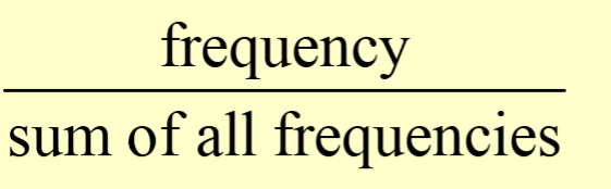
relative frequency
is the proportion (or percent) of observations within a category and is found using the formula:
relative frequency distribution
lists the relative frequency of each category of data
bar graph
is constructed by labeling each category of data on either the horizontal or vertical axis and the frequency or relative frequency of the category on the other axis
bar graph
A rectangle of equal width is drawn for each category whose height is equal to the category's frequency or relative frequency
pareto chart
is a bar graph where the bars are drawn in decreasing order of frequency or relative frequency
Pie chart
is a circle divided into sectors.
Each sector represents a category of data. The area of each sector is proportional to the frequency of the category
lower class limit
identifies the smallest possible data value assigned to the class
upper class limit
identifies the largest possible data value assigned to the class
class boundaries
the true or real limits of an interval
class boundaries
the specific points that serve to separate adjoining classes along a measurement scale for continuous variables
class boundaries
can be determined by identifying the points that are halfway between the upper and lower stated class limits, respectively, of adjoining classes
class marks/midpoints
the value halfway between the lower and upper class limits
relative frequency
obtained by dividing the class frequency by the total frequency
percentages
obtained by multiplying the relative frequencies by 100%
cumulative frequencies
the number of data items with values less than or equal to the upper class limit of each class; obtained by summing the frequencies
cumulative percentages
obtained by dividing the cumulative frequencies by the total number of cases and then multiplying the result by 100.
cumulative percentages
provide information on the percentage of values less than or equal to a specified value.
histogram
A graph consisting of a series of vertical columns or rectangles with no gaps between bars.
each bar is drawn with a base equal to the class boundaries and a height corresponding to the class frequency
histogram
a suitable graph for representing data obtained from continuous variables
frequency polygon
Constructed by plotting class marks (X) against class frequencies (Y) and connecting the consecutive points by straight lines
to close the frequency polygon, an additional class interval is added to both ends of the distribution, each with zero frequency
ogive
A graph of a cumulative frequency distribution plotting the upper class boundaries (X) against the cumulative frequencies (Y)
the lower end of the graph is connected to the X-axis by adding another interval
Ogive
Used to visually represent how many values are below a specified upper class boundary
stem and leaf plot
a type of graph that is similar to a histogram
but shows more information.
• summarizes the shape of a set of data (the distribution) and provides extra detail regarding individual values.
• the data are arranged by place value:
Stems - the digits in the largest place
Leaves - the digits in the smallest place
Summarizes quantitative data.
• Each data point is broken down into a “stem” and a “leaf.”
• First, “stems” are aligned in a column.
• Then, “leaves” are attached to the stems
uniform distribution
One way to describe the shape of a distribution is by its number of peaks, or modes
uniform distribution
has no mode because all data values have the same frequency.
symmetric distribution
the shape of the left side of the distribution is a mirror image of the right side
● its left half is a mirror image of its right half
normal distribution
symmetric distribution with a single peak and a bell shape is known as a ______
normal distribution
When the overall pattern of a large number of observations is so regular, we can describe it as a smooth curve
normal curves
are symmetric and bell-shaped, smoothed-out histograms.
symmetric distribution
mean = median = mode
skewed
the two sides of the distribution are not mirror images of each other
right skewed or positively skewed if
the values are more spread out on the right. It has a tail pulled toward the right.
For positively skewed distributions:
mean > median
left- skewed or negatively skewed
if the values are more spread out on the left, meaning that some low values are likely to be outliers.
For negatively skewed distributions:
mean < median