data science midterm
1/52
There's no tags or description
Looks like no tags are added yet.
Name | Mastery | Learn | Test | Matching | Spaced |
|---|
No study sessions yet.
53 Terms
individuals
the objects described by our data (observations, population units)
variable
any attribute of an individual, can take on different values for different individuals
categorical - can take on fixed number of labels, assigns each individual to a particular group or category based on a quantitative property (ex: favourite colour, introversion type)
quantitative - takes on numerical values, measures or counts something (ex: a person’s height, weight)
pie chart (categorical)
represents a categorical variable, telling us what values it takes and how often it takes them
Each slice’s angle or area shows the relative frequency (%) for a category.
Categories must be mutually exclusive and exhaustive, totaling 100%; otherwise, a pie chart is inappropriate.
bar chart (categorical)
consists of bars whose heights represent the proportion/frequency of values for each category
can be used to visualize data that doesn’t add up to 100% as the y-axis is quantitative and the x-axis is categorical (bars provide measure of the categories)
histograms (quantitative)
A histogram is a graphical display of a quantitative variable using adjacent bars to show the frequency (%) of values within each interval (bin).
It approximates the variable’s density, and as the number of bins increases (with narrower widths), it approaches a smooth density curve representing the overall distribution pattern.
overall pattern of histograms
Center (location): the mean or median.
Shape: symmetry or skewness.
Symmetric: left and right sides are mirror images.
Right-skewed: right tail (larger values) extends farther; mean > median.
Left-skewed: left tail (smaller values) extends farther; mean < median.
Variability (spread): measured by variance, standard deviation, range, or IQR.
Deviations (outliers): observations that break the overall pattern.
stemplot (quantitative)
a graphical display of quantitative data that uses the actual digits of the observations to help convey the distribution of the data
you can determine the shape of a distribution from a stemplot by observing the symmetry, skewness, number of peaks, and any gaps or outliers in the data
timeplot (quantitative)
a graphical display of a quantitative variable against time
time is always on the x-axis, each point represents a value at a specific time
useful for identifying trends, cycles, and patterns
mean
the sum of the values divided by the number of values
median
the midpoint of the distribution
order values from least to greatest
if n is odd, the median is the middle value
if n is even, the median is the average of the 2 middle values
measures of central tendency
tells us about the typical or average value in a dataset
mode
most frequently occurring value in the dataset
measuring variability: the quartiles
Q1 (first quartile) - the median of the lower half
Q2 (second quartile) - overall median
Q3 (third quartile) - median of the upper half
five-number summary
consists of 5 key values that provide a concise overview of its distribution
minimum (smallest value in the dataset)
Q1, Q2, Q3
maximum (largest value)
box and whisker plot
a graphical representation of the five-number summary
draw box from Q1 to Q3
mark median (Q2) inside the box
whiskers to min and max
interquartile range
a measure of statistical dispersion
calculated by Q3 - Q1 = IQR
inner fence
the interval (Q1 - 1.5 x IQR, Q3 + 1.5 x IQR)
any observation that falls outside of this interval is considered an outlier
modified boxplot
extends whiskers only to the most extreme values within the inner fence, with outliers plotted as individual points beyond the whiskers
variance
a measure of how much the values in the dataset vary/spread out from the mean
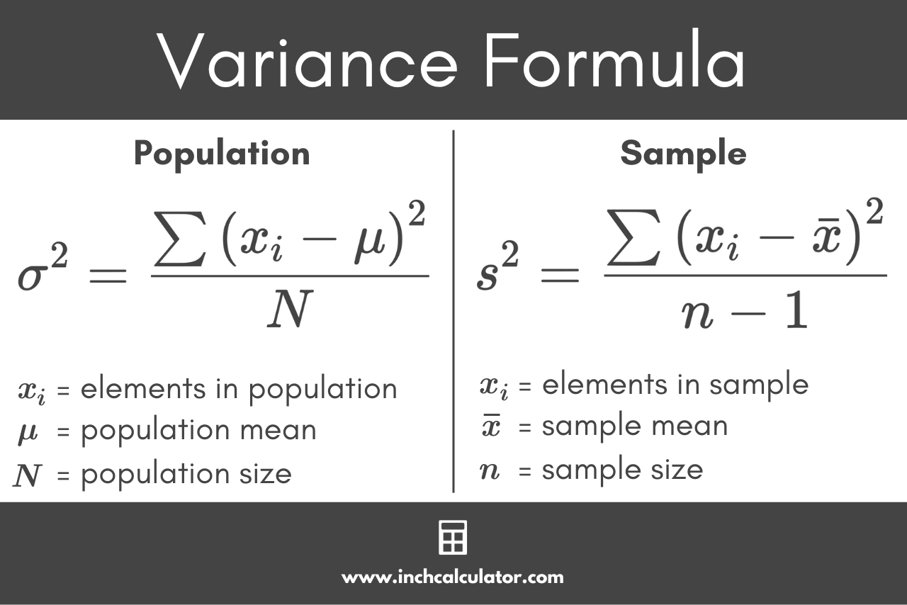
standard deviation
the square root of the variance, provides measure of spread in the same unit as data
choosing measures of centre and variability
2 options - mean and standard deviation or five-number summary
use mean and standard deviation for symmetrical distributions without outliers
use five-number summary for skewed distribution or if extreme outliers are present
density curve
A density curve f(x)is a smooth function where f(x)≥0 for all x (the curve lies on or above the x-axis).
The total area under the curve equals 1.
It can be used to compute probabilities.
The mean (μ) is the balance point of the curve.
The median (m) divides the area under the curve into two equal halves.
The mode is the point where the curve reaches its maximum height.
population
the target collection of individuals of interest
parameter
a numeric description of an attribute of the population
sample
a subset of the population which is available to collect data from
statistic
a numeric summary/description of the sample
normal distribution
A normal distribution is a common, bell-shaped distribution found in many statistical and real-world phenomena.
Notation: N(μ,σ) — mean μ, standard deviation σ
Shape: bell-shaped, symmetrical, with mean = median = mode
Empirical Rule:
68% of data within 1 standard deviation of the mean
95% within 2 standard deviations
99.7% within 3 standard deviations
cumulative proportion
of a value x in a distribution is the proportion of observations that are less than or equal to x
standard normal distribution
the normal standard distribution with mean 0 and standard deviation 1, denoted N(0,1)
standardization
the process of transforming from a normal distribution to a standard distribution
if x is an observations from a distribution that has mean μ and standard deviation σ, then the standardized value of x is z = x - μ / σ
to convert a z-score back to a raw score x = σ x z + μ
scatterplot (quantitative)
a graphical display of the relationship between 2 quantitative variables measured on the same individuals
each individual appears as a point on the plot
x and y coordinates each give the value of different variables to the same individuals
response variable
measures the outcome of a study (y-axis)
explanatory variable
may explain or influence changes in the response variable (x-axis)
interpreting scatterplots
when examining a scatterplot, looking for the following features:
outliers - an individual that falls outside the overall pattern
form - linear or non-linear
direction - positive or negative association
strength - how closely the points follow the form (strong, moderate, weak)
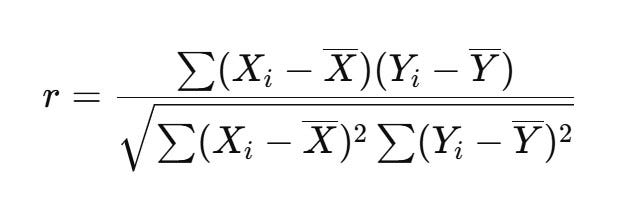
correlation r
measures the direction and strength of the linear relationship between 2 quantitative variables
ranges from -1 to +1
downsides to correlation
correlation doesn’t imply causation (may be confounding variables at play)
sensitivity to outliers
limited to linear relationships
ignores other factors (variables not being studied)
regression line
a straight line that describes how a response variable y changes as an explanatory variable x changes
least squares regression line (line of best fit)
the line that minimizes the sum of the squared differences between the observed values and the values predicted by the line
equation - ŷ = a + bx
slope - b = r x Sy/Sx
intercept - a = y -bx
coefficient of determination R²
measures the proportion of variance in the response variable explained by the explanatory variable
equation - R² = corr(x,y)²
a value of 1 means the model perfectly predicts the outcome
a value of 0 means the model explains none of the variability in the outcome variable
residual
the difference between a response variable and its corresponding predicted value from the regression line
equation - e = y - ŷ
residual plot
A residual plot helps assess whether a linear model fits the data well.
Residuals should be randomly scattered around 0
The spread of residuals should be consistent across all x-values
There should be no visible curves or clusters
Residuals should be roughly symmetric
influential observation
an observation which drastically impacts the slope/intercept of the regression line
a datapoint has high leverage if its x-value is extreme to the rest of the points
lurking variable
an unobserved variable that influences both the explanatory and response variables, potentially leading to a spurious association between them
ecological fallacy
occurs when conclusions about individual behavior are drawn from group-level data.
It involves two main errors:
Assuming that a relationship observed for groups also applies to individuals within those groups.
Overestimating the strength of the relationship based on aggregated (group-level) data.
two-way table
describes 2 categorical variables by providing counts for each possible combination of a row variable and a column variable
marginal distribution
a variable describes the value that a specific variable takes irrespective of the other (only applies in the context of multiple variables)
conditional distribution
the probability distribution of a variable given that another variable has a specific value (separate conditional distribution for each value of the other variable)
probability, risk, and odds
suppose x in some categorical variable and c is some category of x, the percent of individuals in category c is given b: # of individuals in category c / # of individuals in total x 100%
the proportion, probability, and risk of individuals in category c is given by: # of individuals in category c / # of individuals in total
the odds of category c given by: # of individuals in category c / # of individuals not in category c
relative risk (RR)
risk in 1 group (group 1) compared to the risk in another group (group 2 or baseline/reference)
convention: in medical applications in which risk refers to the negative outcome (disease, death), the baseline group is the control group
equation - RR = risk in group 1 / risk in group 2
properties of relative risk
RR = 1 - both groups have equal risk
RR > 1 - group 1 has higher risk than baseline
RR < 1 - group 1 has lower risk than baseline
odds ratio (OR)
odds in one category (group 1) compared to the odds of another category (group 2)
equation - OR = odds in group 1 / odds in group 2
properties of odds ratios
OR = 1 - both groups have equal odds
OR > 1 - group 1 has higher odds than baseline
OR < 1 - group 1 has lower odds than baseline
simpson’s paradox
occurs when a trend that appears in different groups of data disappears or reverses when the groups are combined.
This happens when a lurking variable (often a grouping variable) affects the relationship between two variables differently across subgroups. The overall aggregate data can show the opposite pattern from what is observed in each individual subgroups