Marketing 338 - Exam 1
1/99
There's no tags or description
Looks like no tags are added yet.
Name | Mastery | Learn | Test | Matching | Spaced | Call with Kai |
|---|
No analytics yet
Send a link to your students to track their progress
100 Terms
The Iceberg Principle
10% of the problem is seen and understood, 90% of the problem is not seen or understood
symptoms
visible or surface level issues
symptoms examples
company has declining sales
problem
underlying causes leading to symptoms
problem examples
poor marketing strategy, low quality products, ineffective customer service
primary data
data gathered by the researcher for a the specific purpose of addressing a research problem
primary data examples
survey, observation, experiment, interviews
secondary data
data previously collected from other sources that are already published
secondary data examples
census data, internet information, library database, books, journal articles
internal secondary database
data from within an organization
internal secondary database examples
Sales records, accounting information, customer database
external secondary database
Data from outside the organization
external secondary database examples
Industry reports, government publications, commercial databases, academic research papers
data preparation (3 steps)
integrate multiple sets of data
clean data
transform data
data integration
merges multiple data into one dataset for meaningful and valuable information
analyze data
Use appropriate analytical tools and techniques to derive insights from the data
report findings
Present the insights and recommendations in a clear and actionable manner.
relational database
A relational database is a collection of data organized into a set of tables. Each table contains data categories (variables) in columns and observations (cases) in rows
key variable
A variable common between two datasets, which can be used to link records between them.
vertical data integration
Combining datasets where each dataset contains different observations but shares the same structure (e.g., merging data from different time periods).
vertical integration excel command
append
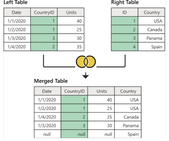
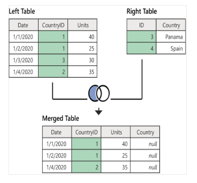
horizontal data integration
Combining datasets where each dataset contains different variables but shares the same observations (e.g., merging data from different sources for the same time period)
horizontal integration excel command
Merge
=UPPER
converts text to uppercase
=PROPER
converts text to proper case (first letter of each word capitalized)
=TRIM
removes extra spaces from text
=Remove duplicates
deletes duplicate rows
text to colums
splits text into seperate colums based on delimiters
select right delimiters
Choose the correct delimiters (e.g., comma, semicolon) to separate text into columns.
incomplete data
Data that lacks attribute values or has missing attributes of interest, also known as Missing Data
examples of missing data
Missing data as part of the data collection process.
Non-responses on survey questions.
noisy data
data that contains errors or outliers
noisy data examples
Salary = "-100" (error)
Age = "222" (outlier)
Errors due to human or computer mistakes during data entry
inconsistent data
data that contains discrepancies in codes or names
inconsistent data examples
Date represented as "2/11/2019" in one row and "2019 Feb 11" in another.
Different data sources leading to inconsistencies.
listwise deletion
Excludes the entire case (record) with missing data.
disadvantages (listwise deletion)
Can be problematic if the missing items are not at random (NMAR).
Reduces the power of the model due to a smaller sample size
advantages (listwise deletion)
Can compare analyses because the sample is the same for different variables
pairwise deletion
Only analyzes cases with available data on each variable
advantages (pairwise deletion)
Keeps as many cases as possible for each analysis.
Uses all available information for each analysis.
disadvantages (pairwise deletion)
Cannot compare analyses because the sample is different for different variables.
Can lead to different sample sizes across analyses.
imputation
The process of replacing missing data with substituted values.
mean subsititution
Filling missing values with the mean of the observed values.
outliers
An observation that lies at an abnormal distance from other values in a random sample from a population.
wide format (unstacked)
Data presented with each different variable in a separate column.
long format (stacked)
Data presented with one column containing all the values and another column listing the context of the value
when to transform (long to wide)
If the datasets are merged without transformation, multiple identical rows for demographics are created.
when to transform (wide to long)
When summarizing wide-format datasets at a glance becomes difficult due to the number of variables.
transform long to wide (excel command)
pivot columns (convert rows to columns)
transform wide to long (excel command)
unpivot columns (convert columns to rows)
data visualization
the graphical representation of information and data. By using visual elements like charts, graphs, and maps, data visualization tools provide an accessible way to see and understand trends, outliers, and patterns in data.
qualitative data
Data that describes qualities or characteristics. It is non-numerical and can be observed but not measured. (Colors, textures, smells, tastes, appearances, beauty)
quantitative data
Data that can be measured and expressed numerically. It can be counted or compared on a numeric scale (Height, weight, length, price, temperature)
when to use a word cloud
Analyzing customer feedback and reviews to identify common themes or issues.
Monitoring social media discussions to gauge public sentiment about a brand or product.
Summarizing survey responses to highlight frequently mentioned topics
Four elements for telling a story with data
understand the audience, decide key takeaways, identify the data, good criteria for data visualization
understand the audience
Know who your audience is and what they care about. Tailor your data presentation to meet their needs and expectations.
Decide Key Takeaways (Identify the Task)
Determine the main messages or insights you want to convey with your data. Focus on the most important findings that will help your audience make informed decisions
Identify the Data Type
Recognize the type of data you have (qualitative or quantitative) to select the appropriate visualization methods and analyses.
Good Criteria for Good Data Visualization
Title and Labels: Ensure visuals have clear titles, labels, and axes information.
Accurate Representation: Avoid misleading elements like non-zero baselines in bar graphs or incorrect proportions in pie charts.
Simplicity: Remove unnecessary information or clutter to make the visuals easy to understand.
scales of measurement
The process of assigning numbers or labels to certain characteristics of objects according to pre-specified rules.
scale
A classification that describes the nature of information and the process of creating a continuum on which objects are located according to the amount of the measured characteristics they possess.
types of scales
nominal, ordinal, interval, ratio
nominal scale
Uses labels without any quantitative value. There is no ordering (Gender (Male, Female), Types of fruit (Apple, Banana, Cherry))
ordinal
Ranks objects or arranges them in order, but does not indicate the magnitude of difference between them. ( T-shirt sizes (Small, Medium, Large), Rank in a competition (1st, 2nd, 3rd)
interval
Scales with equal intervals between values, but no true zero point.(Temperature scales (Celsius, Fahrenheit), IQ scores)
ratio
Scales with a true zero point, allowing for comparisons of absolute magnitude (Height, Weight, Income, Age)
Why We Should Learn Scales of Measures
Choosing the right scales is crucial as they influence our decisions about which statistical methods to use. Different scales have different properties and applications.
why are descriptive analyses important?
summarize data to provide meaningful insights. They help understand the central tendency, dispersion, and overall distribution of data
mean
the average of a dataset
mode
the most frequently occurring value in a dataset
median
the middle value when the data is ordered
range
The difference between the highest and lowest values in a dataset
variance
The average squared deviation of each value from the mean.
standard deviation
The square root of the variance, indicating the spread of data around the mean.
Why Do We Care About Dispersion?
Understanding dispersion helps us assess the variability and consistency within a dataset. It complements measures of central tendency by providing a fuller picture of data distribution.
Relationship Between Measures of Central Tendency and Dispersion and Scales of Measures:
The choice of descriptive statistics depends on the scale of measurement. For instance, mean and standard deviation are appropriate for interval and ratio scales, while mode is suitable for nominal data.
Frequency
The number of times a particular value occurs in a dataset.
percentage frequency
The frequency expressed as a percentage of the total number of observations
bar chart
Displays categorical data with rectangular bars representing different categories (Comparing discrete categories (e.g., favorite colors, types of pets))
histogram
Displays continuous data with adjacent bars representing frequency distribution (Showing the distribution of continuous data (e.g., age, income))
cross tabulation
A method to examine relationships between two categorical variables by creating a contingency table.
Side-by-Side Bar Chart
A bar chart that allows for the comparison of multiple categories side by side.
Segmented Bar Chart
A bar chart that displays stacked segments representing different sub-categories within each bar.
one variable
bar chart, histogram
two variables
cross tabulation, side by side bar chart, segmented bar chart
mode + scales of measure
nominal, ordinal, interval (if meaningful), ratio (if meaningful)
mean + scales of measure
interval, ratio
median + scales of measure
Ordinal (sometimes), interval, ratio
range + scales of measure
ordinal (sometimes), interval, ratio
variance + scales of measure
interval, ratio
standard deviation + scales of measure
interval, ratio
checklist for good data visualization
titles, labels, x- and y- axis labels
start with zero
accurate proportions (pie chart)
no unnecessary information or illustrations
when completing both vertical and horizontal integration, which do you complete first?
vertical (append) and then horizontal (merge)
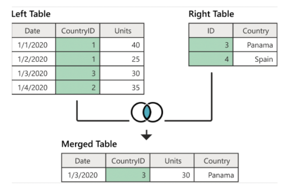
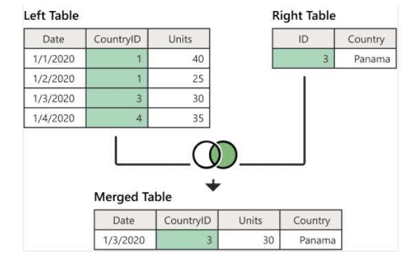
inner join
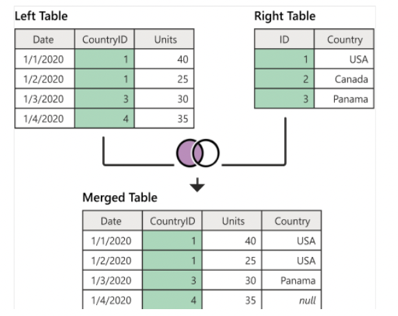
left join (left outer join)
right join (right outer join)
Full Outer Join
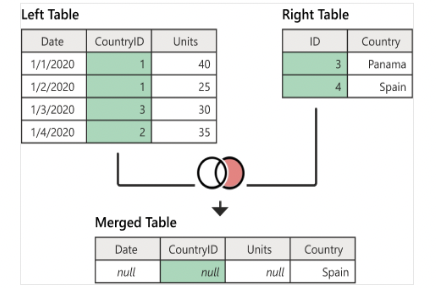
Lefti Anti Join
Right Anti Join