Module 3: CH 2. Describing Data: Frequency Tables, Frequency Distributions and Graphic Presentation
1/7
There's no tags or description
Looks like no tags are added yet.
Name | Mastery | Learn | Test | Matching | Spaced | Call with Kai |
|---|
No analytics yet
Send a link to your students to track their progress
8 Terms
What type of data is summarized in a Frequency Table?
A frequency table is a grouping of qualitative data.
What is the difference between frequency and relative frequency?
A frequency tells us how often an observation is seen within the data set (the count). The relative frequency is the fraction of how often an observation is seen in comparison to the entire data set (the percentage). For example, 5 people in the class have green eyes is a frequency, while 2% of the class has green eyes is a relative frequency
What is the difference between Mutually Exclusive and Collectively Exhaustive?
Mutually exclusive means that each observation is in only one class (an observation isn’t classified more than once), while collectively exhaustive means there is a class for each observation (no observation is left out)
What is the difference between a bar chart and a pie chart? What does each show?
A bar chart visually displays each class with bars whose height is proportional to its frequency. A pie chart shows the proportion or percentage that each class represents of the total number of observations (relative frequency)
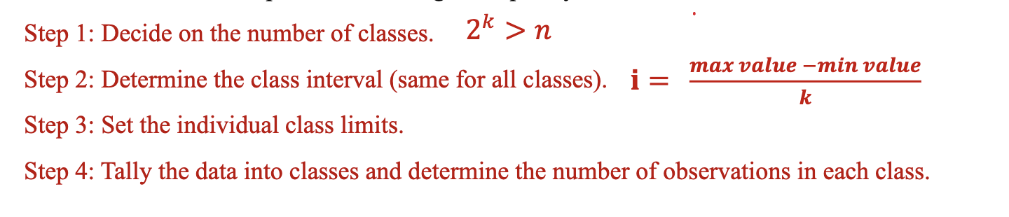
What are the steps in constructing a Frequency Distribution?
When constructing a frequency distribution, what is the difference between a class and an interval?
A class refers to a specific grouping of data values within a frequency distribution. Each class contains a range of values, and these classes are used to categorize the data. The interval refers to the width or size of each class.
What is the difference between the frequency and the cumulative frequency?
A frequency is how often an observation is seen within the data set. The cumulative frequency shows how many values have accumulated as you move from one class down to the next class. To calculate the frequency, you need to add each frequency to the frequencies before it.
What is the difference between a bar chart and a histogram?
A bar chart and histogram are similar. However, a histogram is used to visually display quantitative data. The height of the bars still represents frequency, but because the data is continuous, the shape of the histogram represents the distribution. As a result, there are NO gaps between the bars for histograms, unlike the bar chart.