economics graphs
1/25
There's no tags or description
Looks like no tags are added yet.
Name | Mastery | Learn | Test | Matching | Spaced |
|---|
No study sessions yet.
26 Terms
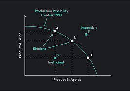
PPF Curve Explanation:
The Production Possibility Frontier (PPF) shows the maximum possible output combinations of two goods or services an economy can produce using all resources efficiently. It illustrates scarcity, opportunity cost, and efficiency.
Key points on the graph:
Axes: Usually show two goods (e.g., consumer goods and capital goods).
Point on the curve (e.g., A): Efficient use of all resources.
Point inside the curve (e.g., B): Inefficient use of resources.
Point outside the curve (e.g., C): Unattainable with current resources.
Concave shape: Reflects increasing opportunity cost — producing more of one good results in giving up increasingly more of the other.
Shifts:
Outward shift (PPF1 to PPF2): Economic growth (e.g., improved technology or increased resources).
Inward shift: Economic decline (e.g., war, natural disaster).
Movement along the curve shows a trade-off between the two goods — highlighting opportunity cost.
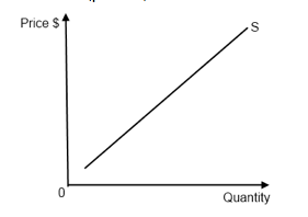
Supply Curve (Simple Explanation)
A supply curve shows how much of a product producers are willing to sell at different prices.
It usually slopes upward, meaning:
When the price goes up, producers want to sell more. When the price goes down, they sell less.
This is called the law of supply.
Movements Along the Supply Curve
A movement happens when the price changes.
If the price increases → producers supply more → move up the curve.
If the price decreases → producers supply less → move down the curve.
Price change = movement along the supply curve (supply itself doesn't change).
Shifts of the Supply Curve
A shift happens when supply changes for reasons other than price—such as changes in production costs, technology, number of sellers, or government policy.
If it becomes easier or cheaper to produce → supply curve shifts right (more supply at every price).
If it becomes harder or more expensive → supply curve shifts left (less supply at every price).
Non-price factor = shift of the entire supply curve.
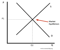
Market Equilibrium – Simple Explanation
Market equilibrium happens where the demand curve (downward sloping) and the supply curve (upward sloping) intersect. This point is called the equilibrium point (D1S1).
At this point:
The equilibrium price (P*) is where buyers and sellers agree.
The equilibrium quantity (Q*) is the amount bought and sold at that price.
There is no surplus (extra supply) and no shortage (extra demand).
If the price is above equilibrium, there is a surplus — more is supplied than demanded.
If the price is below equilibrium, there is a shortage — more is demanded than supplied.
When conditions change (like demand or supply shifts), the curves move, creating a new equilibrium price and quantity.
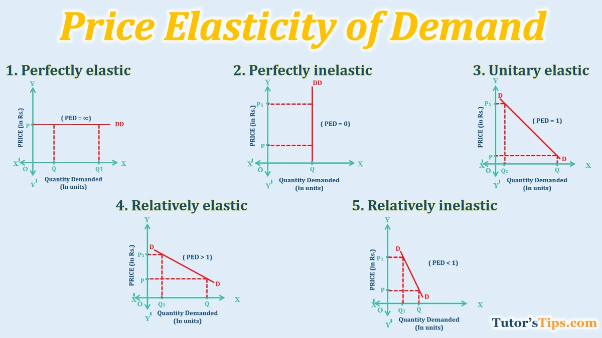
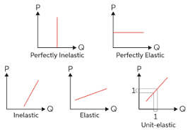
Price Elasticity of Demand (PED) measures how much the quantity demanded changes when the price changes.
PED = % change in quantity demanded ÷ % change in price
Types of Demand Curves Based on Elasticity
1. Perfectly Inelastic Demand (PED = 0)
Curve Shape: Vertical line
Meaning: No change in quantity demanded no matter how the price changes.
Example: Life-saving drugs like insulin.
2. Relatively Inelastic Demand (0 < PED < 1)
Curve Shape: Steep downward slope
Meaning: Quantity demanded changes only slightly when the price changes.
Example: Necessities like fuel or salt.
3. Unit Elastic Demand (PED = 1)
Curve Shape: Curved (not straight), total revenue stays constant
Meaning: A percentage change in price results in an equal percentage change in quantity demanded.
Example: This is more of a theoretical case and rare in real life.
4. Relatively Elastic Demand (PED > 1)
Curve Shape: Flatter downward slope
Meaning: Quantity demanded changes more than the price.
Example: Non-essentials, luxury goods, or items with close substitutes like restaurant meals.
5. Perfectly Elastic Demand (PED = ∞)
Curve Shape: Horizontal line
Meaning: Consumers will only buy at one specific price. Any increase in price causes demand to drop to zero.
Example: Perfect competition model or identical products in theory.
Price Elasticity of Supply (PES) – Explained
PES measures how much quantity supplied changes in response to a change in price.
Formula: PES = % change in quantity supplied ÷ % change in price
Types of Supply Curves Based on Elasticity:
Perfectly Inelastic Supply (PES = 0)
Curve: Vertical line
Meaning: Quantity supplied remains fixed regardless of price.
Example: Stadium seats or unique artwork (fixed supply).
Relatively Inelastic Supply (0 < PES < 1)
Curve: Steep upward slope
Meaning: Quantity supplied changes only slightly when the price changes.
Example: Agricultural products in the short run.
Unit Elastic Supply (PES = 1)
Curve: Straight line from origin
Meaning: % change in price causes an equal % change in quantity supplied.
Example: Rare, but represents proportional responsiveness.
Relatively Elastic Supply (PES > 1)
Curve: Flatter upward slope
Meaning: Quantity supplied changes more than the price change.
Example: Mass-produced goods with available resources.
Perfectly Elastic Supply (PES = ∞)
Curve: Horizontal line
Meaning: Producers will supply any amount at one price; any lower price and supply falls to zero.
Example: Theoretical, in perfectly competitive markets with constant costs.

Consumer surplus is the difference between what consumers are willing to pay for a good and what they actually pay(market price). It represents the extra benefit or utility consumers receive.
Key points on the graph:
Demand curve (D): Shows willingness to pay.
Price line (P1): Horizontal line at market price.
Consumer surplus area: The area above the price line and below the demand curve, from 0 to the equilibrium quantity (Q1).
Triangle shape: Bounded by the price (P1), demand curve, and quantity (Q1).
Example:
If someone is willing to pay £10 for a product but only has to pay £7, their consumer surplus is £3.
Changes in Consumer Surplus:
Price falls: Consumer surplus increases — buyers pay less.
Price rises: Consumer surplus decreases — buyers get less benefit.
Demand shifts right (D1 to D2): At the same price, consumer surplus increases due to more willingness to pay.
In short: Consumer surplus = ½ × base × height of the triangle under the demand curve and above the price.
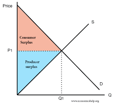
Producer surplus is the difference between the price producers actually receive and the minimum price they are willing to accept to supply a good. It represents the extra earnings producers gain from selling at the market price.
Key points on the graph:
Supply curve (S): Shows the minimum price producers are willing to accept.
Price line (P1): Horizontal line at market price.
Producer surplus area: The area below the price line and above the supply curve, from 0 to the equilibrium quantity (Q1).
Triangle shape: Bounded by the price (P1), supply curve, and quantity (Q1).
Example:
If a producer is willing to sell for £5 but receives £8, their producer surplus is £3.
Changes in Producer Surplus:
Price rises: Producer surplus increases — producers gain more per unit.
Price falls: Producer surplus decreases — earnings per unit fall.
Supply shifts right (S1 to S2): At the same price, producer surplus usually changes depending on how much more is sold and the cost structure.
In short: Producer surplus = ½ × base × height of the triangle above the supply curve and below the price.
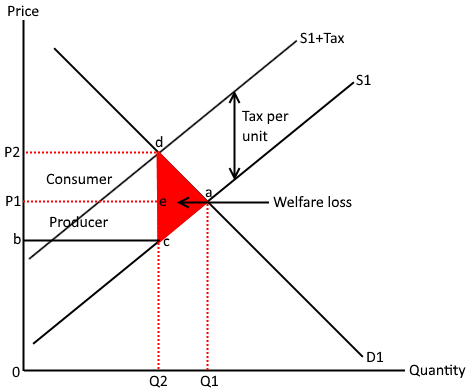
An indirect tax is a tax imposed on goods and services rather than on income or profits. It is typically paid by the producer or seller, but the cost is often passed on to the consumer through higher prices.
Types of Indirect Taxes:
Specific tax: A fixed amount per unit of a good or service (e.g., £2 per pack of cigarettes).
Ad valorem tax: A percentage of the price of a good or service (e.g., VAT).
Graph Explanation:
The original supply curve (S1) shifts to the left (upwards) to the new supply curve (S2) after the tax is imposed.
Price consumers pay increases from P1 to P2.
Price producers receive decreases from P1 to P3 (less than the price consumers pay).
The tax burden is split between consumers and producers, depending on the relative price elasticity of demand and supply:
If demand is inelastic: Consumers bear most of the tax burden.
If supply is inelastic: Producers bear most of the tax burden.
Tax Revenue:
The government collects tax revenue equal to the amount of tax per unit (e.g., £2) multiplied by the new quantity sold (Q2).
Area on the graph: The tax revenue is the rectangle between the old and new price levels (P1 to P2) and the quantity sold (Q2).
Example:
For a product taxed with £2 per unit:
Before the tax: the price consumers paid was £10, and the price producers received was £10.
After the tax: the price consumers pay increases to £12, while the price producers receive decreases to £8.
The tax burden is shared between both, and the total tax revenue is the £2 per unit multiplied by the new quantity sold (Q2).
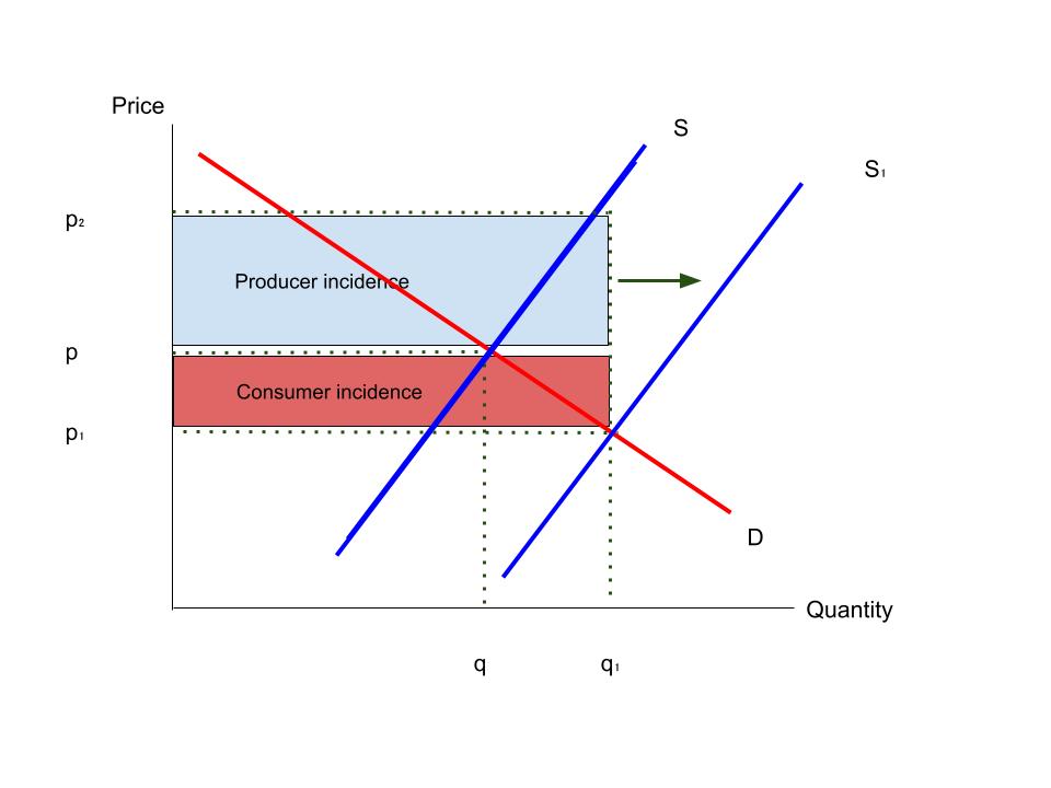
What is a Subsidy?
A subsidy is a government payment to producers or consumers to lower the price or increase the quantity of a good.
2. Graph of Subsidy:
Shift in Supply Curve: The subsidy shifts the supply curve to the right (S1 to S2), lowering the price consumers pay (P2) and increasing the quantity produced/consumed (Q2).
Price Consumers Pay: Lower (P2) than without the subsidy.
Price Producers Receive: Higher than the price consumers pay, due to the subsidy.
3. Key Effects:
Increased Quantity: The quantity increases from Q1 to Q2.
Government Cost: The government spends the difference between P1 and P2 (subsidy per unit) multiplied by the new quantity (Q2).
4. Evaluation Points:
Efficiency: Can lead to inefficiency if it encourages overproduction.
Opportunity Cost: The subsidy has an opportunity cost in terms of government spending.
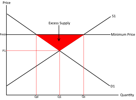
What is a Minimum Price?
A minimum price (price floor) is a government-imposed limit on how low the price can be for a good or service. It’s set above the equilibrium price to prevent prices from falling too low.
2. Graph of Minimum Price:
Price Floor: Draw a horizontal line above the equilibrium price (P1).
Impact: The price cannot fall below the price floor (Pmin), leading to a surplus.
Quantity Supplied vs. Quantity Demanded: At Pmin, quantity supplied (Q2) exceeds quantity demanded(Q3).
3. Key Effects:
Surplus: The surplus occurs because producers want to sell more at the higher price, but consumers buy less.
Producer Benefit: Producers get a higher price, but may not sell all their goods.
Consumer Disadvantage: Consumers pay a higher price and buy less.
4. Evaluation Points:
Inefficiency: A surplus leads to wasted resources.
Government Intervention: The government may need to buy the surplus, which can be costly.
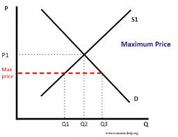
What is a Maximum Price?
A maximum price (price ceiling) is a government-imposed limit on how high the price can be for a good or service. It is set below the equilibrium price to protect consumers from excessively high prices.
2. Graph of Maximum Price:
Price Ceiling: Draw a horizontal line below the equilibrium price (P1).
Impact: The price cannot rise above the maximum price (Pmax), leading to a shortage.
Quantity Supplied vs. Quantity Demanded: At Pmax, quantity demanded (Q2) exceeds quantity supplied(Q3).
3. Key Effects:
Shortage: A shortage occurs because consumers want to buy more at the lower price, but producers are willing to supply less.
Consumer Benefit: Consumers benefit from lower prices, but there may not be enough goods.
Producer Disadvantage: Producers may supply less due to the lower price and reduced profitability.
4. Evaluation Points:
Inefficiency: The shortage leads to inefficiency, as not all consumers who want the good can get it.
Black Markets: Price ceilings can lead to black markets where goods are sold at higher prices.
Government Costs: The government may need to intervene to help address the shortage or provide additional support.
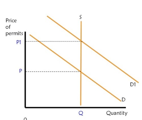
What are Tradeable Pollution Permits?
Tradeable pollution permits (also called cap-and-trade systems) are government-issued permits that allow firms to emit a certain amount of pollution. These permits can be bought and sold in the market, allowing firms that can reduce emissions more cheaply to sell their permits to firms that face higher costs.
2. Graph of Tradeable Pollution Permits:
Supply and Demand for Permits:
The government sets a total cap on pollution and issues a limited number of permits (S).
The supply curve is perfectly inelastic
The market price for permits is determined by supply and demand.
Shift in the Market:
If firms reduce emissions and have unused permits, they can sell them to other firms, leading to a more efficient allocation of pollution reduction.
3. Key Effects:
Incentive for Efficiency: Firms with lower costs for reducing pollution can sell their permits, creating a financial incentive to reduce emissions.
Market-Driven Solution: The price of pollution permits reflects the cost of reducing pollution, leading to an efficient allocation of resources.
Environmental Impact: Over time, the total cap on permits can be reduced to decrease overall pollution.
4. Evaluation Points:
Cost-Effective: Tradeable permits provide an efficient way to reduce pollution by letting firms decide how to reduce emissions at the lowest cost.
Market Volatility: The price of permits can fluctuate, making it harder for firms to predict long-term costs.
Equity Concerns: The initial allocation of permits could be seen as unfair, especially if some firms receive permits for free while others must buy them.

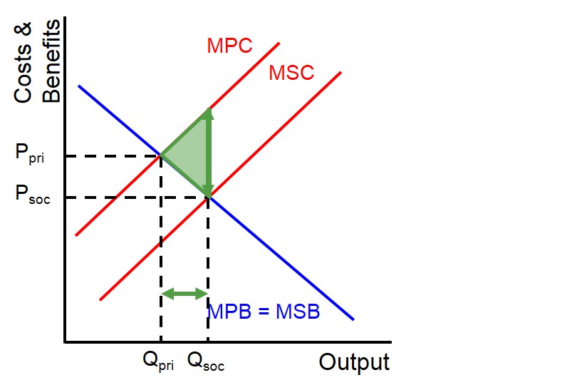
What are Negative Externalities of Production?
Negative externalities occur when the production of a good or service imposes costs on third parties not involved in the transaction. These costs are external to the market price and are not reflected in the production costs.
Common examples include pollution (air, water), noise, and environmental degradation caused by industries.
2. Graphical Representation:
Supply and Demand Curve:
Private Cost (S1): The supply curve reflects the private cost of production, i.e., the costs borne by the producer.
Social Cost (S2): The social cost is higher than the private cost because it includes the external costs (e.g., pollution) to society.
Equilibrium without Externalities: At the equilibrium price (P1) and quantity (Q1), the market ignores the external costs.
Equilibrium with Externalities: The socially optimal quantity (Q2) and price (P2) would be lower, reflecting the external cost. The welfare loss (area between the supply curves) represents the cost to society.
3. Key Effects:
Market Failure: Negative externalities lead to market failure because the price consumers pay doesn’t reflect the true cost of production, leading to overproduction and overconsumption of goods with negative side effects.
Social Cost vs Private Cost: The social cost of production is higher than the private cost, and the market produces more than the socially optimal quantity (Q1 > Q2).
Welfare Loss: The difference between the social and private cost leads to a deadweight loss to society, as the extra production causes more harm than benefit.
4. Government Intervention (Solutions):
Taxes: A tax on producers equal to the external cost (e.g., carbon tax) shifts the supply curve to the left, reducing the quantity produced and aligning the private cost with the social cost.
Regulation: Setting production limits or standards to reduce negative externalities (e.g., emissions standards).
Subsidies for Clean Technology: Providing financial support for firms adopting environmentally friendly technology or practices.
5. Evaluation Points:
Inefficiency: The market is inefficient because it doesn’t account for the full social costs, leading to overproduction.
Government Failure: Government intervention might be ineffective or too costly to implement.
Possible Innovation: In some cases, externalities can spur innovation as firms develop cleaner technologies to reduce costs or comply with regulations.
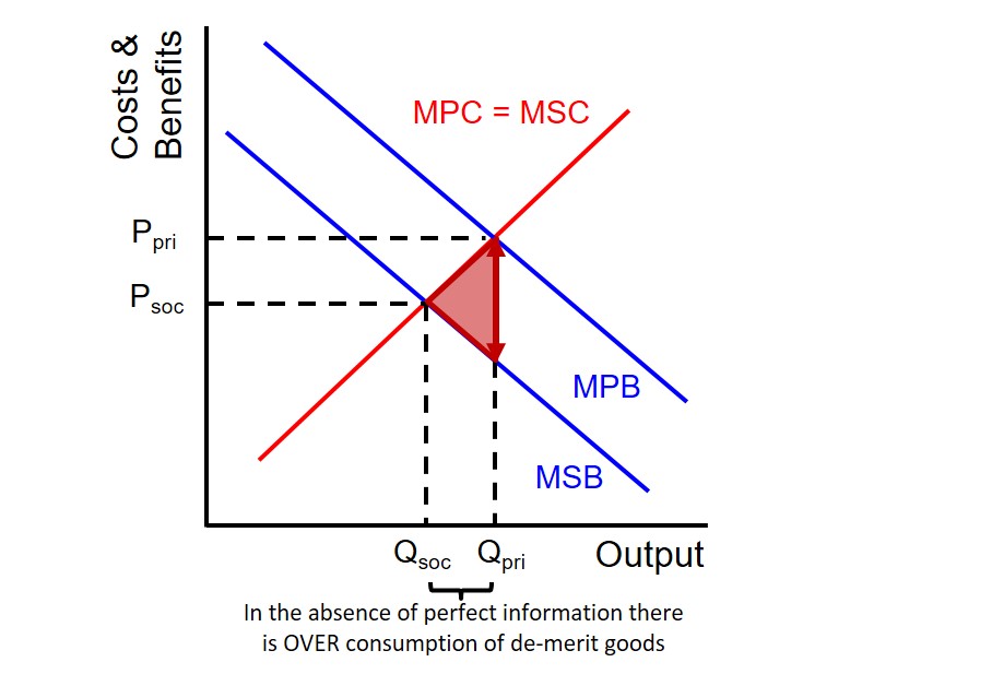
Negative externalities of consumption occur when the consumption of a good or service harms third parties. Examples include smoking, alcohol, and loud music.
2. Graph:
Private Benefit (D1): The benefit to the consumer.
Social Benefit (D2): The benefit to society is less than the private benefit because of the harm caused to others (e.g., second-hand smoke).
Overconsumption: The market consumes more (Q1) than the socially optimal quantity (Q2), leading to inefficiency.
3. Key Effects:
Market Failure: Overconsumption occurs because consumers don’t bear the full cost.
Welfare Loss: The difference between private and social benefits creates a deadweight loss.
4. Government Solutions:
Taxes: To reduce consumption (e.g., cigarette taxes).
Bans/Restrictions: Banning harmful activities (e.g., smoking in public).
Awareness Campaigns: Educating the public about harms.
5. Evaluation:
Inefficiency: Leads to overconsumption.
Government Failure: Taxes or bans might be hard to enforce or cause black markets.
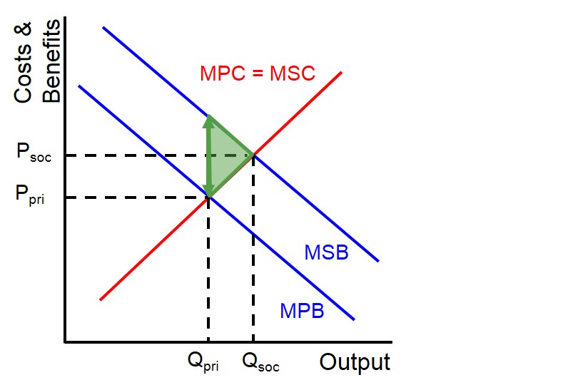
A positive externality of production occurs when a firm's production benefits third parties who aren't involved in the transaction. This means society gains from the firm’s activities without directly paying for it.
Example: A company that invests in cleaner technology, reducing pollution and benefiting the local environment.
2. Graph:
Private Cost (S1): The supply curve represents the private cost of production (borne by the firm).
Social Cost (S2): The social cost is lower than the private cost because the firm's actions benefit society (e.g., less pollution).
Underproduction: The market produces less (Q1) than the socially optimal quantity (Q2), creating a welfare loss.
3. Key Effects:
Market Failure: Underproduction occurs because firms don’t account for the positive spillover benefits to society.
Welfare Gain: The external benefit to society is not reflected in the price or quantity produced.
4. Government Solutions:
Subsidies: Governments can provide subsidies to firms that create positive externalities (e.g., for firms using clean energy).
Regulations/Encouragement: Encouraging firms to adopt socially beneficial practices.
5. Evaluation:
Inefficiency: The market underproduces goods with positive externalities.
Government Intervention: Subsidies or incentives may be required to encourage firms to produce more of these beneficial goods.
Positive Externality of Consumption
1. What Are They?
A positive externality of consumption occurs when the consumption of a good or service benefits third parties who aren't involved in the transaction.
Example: Vaccinations, where individuals who get vaccinated not only protect themselves but also reduce the spread of disease to others.
2. Graph:
Private Benefit (D1): The demand curve reflects the benefit to the individual consumer.
Social Benefit (D2): The social benefit is higher than the private benefit because of the positive spillover effects (e.g., herd immunity from vaccinations).
Underconsumption: The market consumes less (Q1) than the socially optimal quantity (Q2), leading to welfare loss.
3. Key Effects:
Market Failure: Underconsumption happens because consumers don't consider the external benefits to others.
Welfare Gain: The benefit to society is higher than what individuals are willing to pay for, leading to a deadweight loss.
4. Government Solutions:
Subsidies: The government can offer subsidies or incentives to encourage consumption (e.g., subsidizing vaccines).
Public Awareness Campaigns: Encouraging people to consume goods with positive externalities (e.g., promoting education).
5. Evaluation:
Inefficiency: The market underconsumes goods with positive externalities.
Government Intervention: Subsidies or awareness campaigns can help, but may involve high costs.
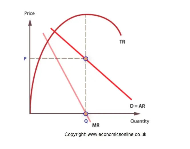
What Are Revenue Curves?
Revenue curves show the relationship between a firm's revenue and the quantity of goods sold. The three main types of revenue are:
Total Revenue (TR): The total income from selling goods, calculated as Price × Quantity (P × Q).
Average Revenue (AR): The revenue per unit of output, calculated as Total Revenue / Quantity (TR/Q).
Marginal Revenue (MR): The additional revenue from selling one more unit, calculated as the change in TR when output increases by one unit.
2. Key Revenue Curves:
Total Revenue (TR) Curve:
TR = Price × Quantity.
TR increases initially with output but starts to decrease if the price is lowered too much (as with price-sensitive demand).
The shape of the TR curve depends on the price elasticity of demand:
Elastic demand: TR increases as price decreases.
Inelastic demand: TR decreases as price decreases.
Average Revenue (AR) Curve:
AR = Total Revenue / Quantity (TR/Q).
AR curve is the same as the demand curve in a perfectly competitive market, because in perfect competition, price is equal to average revenue (P = AR).
In other market structures (like monopoly or monopolistic competition), the AR curve generally slopes downward, indicating that firms must lower the price to sell more units.
Graph Shape:
In perfect competition, the AR curve is a horizontal line at the market price level, because the firm can sell any quantity at the same price.
In monopoly or imperfect competition, the AR curve is downward sloping, meaning that to sell more, the firm must lower the price.
Marginal Revenue (MR) Curve:
MR is the additional revenue gained from selling one more unit of output.
The MR curve typically slopes downward because, in most market structures, the firm must lower its price to sell additional units, which reduces the revenue gained from earlier units.
MR is always below the AR curve in imperfect competition, and in a monopoly, MR becomes zero when TR is maximized.
3. Key Relationships:
In Perfect Competition:
AR = MR = Price: The price is constant at all output levels.
The AR curve is horizontal at the price level.
In Monopoly or Imperfect Competition:
AR > MR: The AR curve is above the MR curve because the firm must reduce the price to sell more units.
The MR curve is steeper and slopes down faster than the AR curve.
4. Graphical Representation:
Perfect Competition: The AR curve is a horizontal line, and MR equals AR.
Monopoly: The AR curve slopes down, and the MR curve lies below it, sloping down faster.
Maximizing Total Revenue: TR is maximized when MR = 0.
5. Summary of Key Points:
TR Curve: Initially rises, then decreases (depending on price elasticity).
AR Curve: In perfect competition, it's a horizontal line at price; in other market structures, it's downward sloping.
MR Curve: Always below the AR curve in imperfect competition, and it's the rate of change of total revenue.
Example in Monopoly:
If a monopolist wants to sell one more unit, they have to lower the price for all previous units, which leads to MR < AR.
Revenue maximization is the level of output where a firm achieves the highest possible total revenue (TR). This occurs where Marginal Revenue (MR) = 0, as this is the point where any further increase in output would actually decrease total revenue.
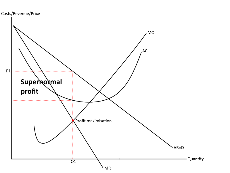
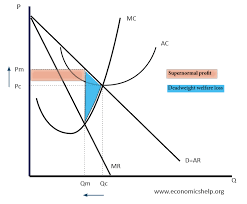
The profit maximisation graph is a fundamental concept in A Level Economics and is most commonly illustrated in the context of a firm in imperfect competition (like monopoly or monopolistic competition). Here's a detailed explanation of the graph, key curves, points, and areas:
🔹 Graph Components:
Axes
Y-axis: Price/Cost/Revenue
X-axis: Quantity of output
Curves
Demand Curve (AR): Downward sloping — represents average revenue, which is also the price the firm can charge.
Marginal Revenue (MR): Lies below the AR curve because the firm must lower the price to sell more units.
Marginal Cost (MC): Typically U-shaped due to diminishing returns.
Average Total Cost (ATC or AC): Also U-shaped and lies above the marginal cost after a certain point.
🔹 Profit Maximisation Condition:
Profit is maximised where:
Marginal Revenue (MR)=Marginal Cost (MC)Marginal Revenue (MR)=Marginal Cost (MC)
This is the point where the cost of producing an extra unit equals the revenue gained from selling it — producing more or less would reduce total profit.
🔹 Evaluation Points (for essays):
In perfect competition, abnormal profits are eroded in the long run due to free entry.
In monopoly, abnormal profits can persist due to high barriers to entry.
Profit maximisation may not be the sole objective — firms may aim for revenue maximisation, sales maximisation, or satisficing.
🔹 Key Points and Areas:
Element | Description | Label on Graph |
|---|---|---|
Q* | Profit-maximising quantity | Where MR = MC |
P* | Profit-maximising price | Found by going up vertically from Q* to the AR (demand) curve |
ATC at Q* | The average total cost at the profit-maximising output | Read from the ATC curve at Q* |
Total Revenue | P\*×Q\*P\*×Q\* | Area: price rectangle from origin to P*, Q* |
Total Cost | ATC×Q\*ATC×Q\* | Area: cost rectangle from origin to ATC, Q* |
Abnormal (Supernormal) Profit | (P\*−ATC)×Q\*(P\*−ATC)×Q\* | Area between AR (P*) and ATC, from 0 to Q* |
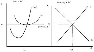
Perfect Competition – Overview
Key Characteristics:
Many buyers and sellers
Homogeneous products (no differentiation)
Perfect information (buyers and sellers know prices)
No barriers to entry or exit
Firms are price takers (they accept the market price)
🔹 Short-Run Equilibrium
In the short run, individual firms can earn abnormal (supernormal) profits or make losses depending on market price.
How it works:
The market determines the price through supply and demand.
Each firm faces a perfectly elastic demand curve at this market price.
The firm maximises profit by producing where Marginal Cost (MC) = Marginal Revenue (MR).
If the price is above Average Total Cost (ATC), the firm makes abnormal profit.
If the price is below ATC but above Average Variable Cost (AVC), the firm covers variable costs but makes a loss (still operates in the short run).
If the price is below AVC, the firm shuts down immediately.
🔹 Long-Run Equilibrium
In the long run, abnormal profits attract new firms, and losses cause some firms to exit. This continues until only normal profits are earned.
Outcomes in the long run:
Market supply increases or decreases based on firm entry/exit.
This adjusts the market price to the point where:
Price = Minimum ATC
Firms earn only normal profit
MC = MR = AR = ATC
The firm produces at the most efficient scale, achieving:
Allocative efficiency (P = MC)
Productive efficiency (output at minimum ATC)
🔑 Key Evaluation Points:
Efficiency: Perfect competition leads to both allocative and productive efficiency in the long run.
Realism: Perfect competition is rare in real life; it is more of a theoretical benchmark.
Dynamic Efficiency: Often lacking due to low profits and little incentive to innovate.
Consumer Impact: Consumers benefit from low prices and efficiency, but there’s little product variety or innovation.
Monopoly – Overview
Key Characteristics:
Single seller dominates the market (100% market share or significant control)
No close substitutes for the product
High barriers to entry (legal, financial, technological, etc.)
Firm is a price maker – it sets prices by controlling output
Downward-sloping demand curve – must lower price to sell more
🔹 Short-Run and Long-Run Equilibrium
In both the short run and long run, a monopolist can earn abnormal (supernormal) profits due to barriers preventing entry of new firms.
Profit Maximisation:
A monopolist chooses output where Marginal Revenue (MR) = Marginal Cost (MC)
The price is found by going up to the demand curve (Average Revenue)
Price > Average Total Cost (ATC) ⇒ Abnormal profit
In the long run, these profits can persist because entry is blocked
🔹 Efficiency Analysis
Type of Efficiency | Monopoly Outcome |
|---|---|
Allocative Efficiency | ❌ Not achieved: P > MC (price is above marginal cost) |
Productive Efficiency | ❌ Not achieved: output is not at minimum ATC |
Dynamic Efficiency | ✅ Potentially high: abnormal profits can fund R&D |
X-Inefficiency | ❌ May arise: lack of competition can lead to higher costs |
🔹 Consumer and Welfare Impacts
❌ Negative Impacts:
Higher prices than in competitive markets
Lower output
Consumer surplus falls
Deadweight welfare loss due to underproduction
✅ Potential Benefits:
Economies of scale (especially in natural monopolies like utilities)
Dynamic efficiency from innovation, R&D
Stable supply of essential services
🔑 Evaluation Points
Natural Monopoly: In some industries (e.g. water, rail), it’s more efficient to have one firm due to massive fixed costs and falling average costs.
Regulation: Governments may regulate monopolies (e.g. price caps, quality standards) to protect consumer interests.
Price Discrimination: A monopolist may charge different prices to different consumers if able to segment the market, extracting more consumer surplus.
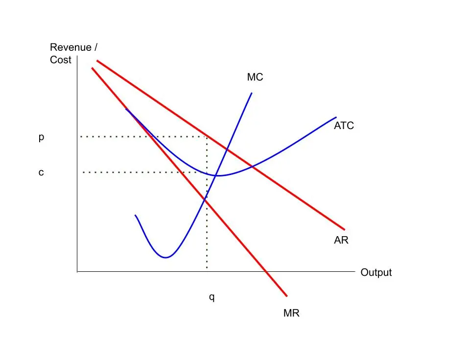
Analysis of the Monopolistic Competition Graph
🔹 Short-Run Analysis
In the short run, a monopolistically competitive firm can earn abnormal (supernormal) profits.
Key Features of the Graph:
Downward-sloping demand (AR) curve: Due to product differentiation.
MR curve lies below the AR curve.
Profit maximisation occurs where MR = MC.
Price is found from the AR curve above MR = MC.
If Price > ATC at that quantity, the firm earns abnormal profit.
Analysis Points:
Firms have some market power: The downward-sloping AR shows they are not price takers.
Inefficiency: Since P > MC, there's allocative inefficiency.
Not at minimum ATC: Also productively inefficient.
🔹 Long-Run Analysis
In the long run, abnormal profits attract new firms, increasing competition.
Key Features:
The AR curve shifts left and becomes more elastic.
The firm now earns only normal profit: Price = ATC.
Still, MR = MC at the same quantity.
The firm operates at a point where the AR curve is tangent to ATC.
Analysis Points:
Normal profit: No incentive for entry or exit — long-run equilibrium is reached.
Excess capacity: Firms do not produce at the lowest point on ATC.
Still inefficient: P > MC (allocative inefficiency), output not at minimum ATC (productive inefficiency).
Variety: Consumers benefit from diverse choices and non-price competition.

Full Analysis of the Kinked Demand Curve Graph
🔹 Graph Structure (Described in Words)
Axes:
Y-axis: Price and Revenue
X-axis: Quantity
Demand (AR) curve:
Has a kink at the current price level (P*).
Above the kink: AR is relatively elastic – a small rise in price leads to a big fall in quantity demanded.
Below the kink: AR is relatively inelastic – a price cut gains little in quantity demanded.
MR (Marginal Revenue) curve:
Has a discontinuity (gap) directly below the kink.
This gap exists because of the sudden change in elasticity of the AR curve at the kink point.
MC (Marginal Cost) curve:
Cuts through the vertical gap in the MR curve.
As long as MC shifts within the gap, price (P*) and quantity (Q*) stay the same.
📌 What the Graph Shows
🔸 1. Price Rigidity (Sticky Prices)
The firm is reluctant to change its price because:
Raising the price leads to a large loss in sales (elastic demand).
Cutting the price triggers a price war (rivals match it), gaining few new customers (inelastic demand).
As a result, prices tend to remain stable, even if costs rise or fall slightly.
🔸 2. Profit Maximisation
The firm maximises profit where MC = MR.
Because of the MR gap, a range of marginal cost shifts can occur without changing the equilibrium.
This explains why firms may not change price when costs change, unlike in perfect competition.
🔸 3. Non-Price Competition
Since firms are hesitant to change prices, they compete via:
Advertising
Branding
Customer service
Loyalty schemes
This increases consumer choice but also raises costs (and potentially prices long-term).
🔹 Evaluation of the Model
✅ Strengths
Explains real-world behaviour in oligopolies like petrol stations, supermarkets, airlines.
Shows why prices may remain “sticky” even as costs or demand shifts.
Reflects interdependence of firms, a key feature of oligopoly.
❌ Weaknesses
Does not predict the actual price level — it only explains stability around a certain price.
Based on assumptions about how rivals behave (which may not always hold).
Ignores the role of collusion, price leadership, or more strategic price setting.
📝 Example Use in an Exam
“Analyse how the kinked demand curve explains price stability in oligopolistic markets.”
You would:
Draw and label the kinked demand diagram.
Explain how the change in elasticity causes the kink.
Show that MR has a discontinuous gap.
Argue that as long as MC stays within the MR gap, price remains unchanged.
Evaluate by considering assumptions, and the role of non-price competition.
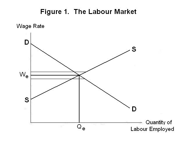
Labour Market: Supply and Demand Curves
The labour market functions like any other market, where workers supply labour and firms demand labour. The interaction of labour supply and demand determines the equilibrium wage rate and quantity of labour employed.
🔹 Labour Demand Curve
Downward sloping: As the wage rate falls, firms want to hire more workers because labour becomes cheaper.
Based on the marginal productivity of labour (MPL): Firms hire workers up to the point where the value of the marginal product of labour (VMPL) equals the wage.
If wage rises above VMPL, firms reduce demand; if wage is below, firms hire more.
🔹 Labour Supply Curve
Generally upward sloping: As wages rise, more people are willing to work or existing workers offer more hours.
Two effects influence supply:
Substitution effect: Higher wages make work more attractive compared to leisure → labour supply increases.
Income effect: Higher wages mean workers can earn the same income with fewer hours → labour supply might decrease.
At low to moderate wages, the substitution effect dominates → supply rises.
At very high wages, income effect can dominate → supply curve might bend backward (backward-bending supply curve).
🔹 Labour Market Equilibrium
Equilibrium wage (W*): Where labour supply equals labour demand.
Equilibrium quantity of labour (Q*): Number of workers employed at W*.
🔍 Graph Analysis
Axes:
Y-axis: Wage rate (price of labour)
X-axis: Quantity of labour (number of workers or hours)
Curves:
Labour demand curve (D): slopes downwards.
Labour supply curve (S): slopes upwards, may bend backward at high wages.
Key Points:
Where D = S, market clears: no excess supply or demand.
If wage is above equilibrium → surplus of labour (unemployment).
If wage is below equilibrium → shortage of labour.
🔹 Factors Affecting Labour Demand
Changes in productivity (technology, training)
Changes in demand for the product
Cost of capital and other inputs
Government regulation and taxes
🔹 Factors Affecting Labour Supply
Population size and demographics
Worker preferences (work vs. leisure)
Immigration and emigration
Alternative income sources (benefits, second jobs)
Education and skills
🔹 Backward-Bending Labour Supply Curve
At higher wages, workers may prefer more leisure → reduce hours worked despite wage increase.
This creates a backward bend in the supply curve at higher wage levels.
🔑 Exam Tip
When explaining, always relate the wage rate change to quantity of labour supplied/demanded.
Mention substitution vs. income effect when analysing supply.
Use examples (e.g., doctors working fewer hours when paid more).
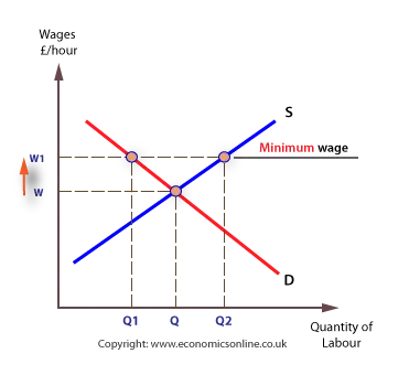
Minimum Wage – Overview
A minimum wage is a legally imposed lowest hourly wage that employers can pay workers. It is set above the equilibrium wage to ensure workers earn a basic standard of living.
🔹 Graph Analysis: Minimum Wage in Labour Market
Graph Setup:
Y-axis: Wage rate
X-axis: Quantity of labour
Curves: Labour demand (downward sloping), labour supply (upward sloping)
What Happens When a Minimum Wage is Set:
The minimum wage (W_min) is above the equilibrium wage (W*).
At this higher wage, the quantity of labour supplied (Qs) increases — more workers want to work.
The quantity of labour demanded (Qd) decreases — firms want fewer workers because labour is more expensive.
This creates a labour surplus or unemployment:
Unemployment = Qs – Qd
🔹 Effects of Minimum Wage
✅ Potential Benefits:
Increases income for low-paid workers who keep their jobs.
May reduce poverty and improve living standards.
Can increase worker motivation and productivity.
Can reduce labour turnover and training costs for firms.
❌ Potential Drawbacks:
Unemployment: Some workers lose jobs due to reduced demand.
Higher costs for firms: May lead to higher prices or reduced profits.
Could encourage informal (unreported) work.
Firms may substitute labour with capital or technology.
May reduce hours or benefits instead of jobs.
🔹 Elasticity Matters
If labour demand is elastic, a minimum wage causes a large drop in employment.
If demand is inelastic, employment effects are small but wage gains are higher.
How Trade Unions Influence the Labour Market
Trade unions can affect the labour market mainly through:
1. Bargaining for Higher Wages
Unions negotiate with employers to secure higher wages than the market equilibrium.
This can create a wage above equilibrium, similar to a minimum wage.
2. Improving Working Conditions
Push for safer workplaces, reasonable hours, benefits, and job security.
3. Restricting Labour Supply
Limit the number of workers in certain jobs via apprenticeship schemes or closed shops (where only union members can be employed).
Reducing labour supply can push wages higher.
4. Promoting Labour Rights
Protect workers against unfair dismissal.
Campaign for equal pay and anti-discrimination laws.
🔹 Graph Analysis: Trade Union Wage Effects
Setting:
Labour demand curve (downward sloping)
Labour supply curve (upward sloping)
When a union pushes for higher wages:
Union wage (W_u) is set above market equilibrium wage (W*).
At this wage, labour supply (Qs) exceeds labour demand (Qd) → unemployment or labour surplus.
Workers who keep their jobs benefit from higher wages.
Some workers may lose jobs due to reduced demand.
🔹 Effects of Trade Union Intervention
✅ Benefits:
Higher wages and improved living standards for union members.
Better working conditions and job security.
Can lead to increased productivity through motivated workforce.
Can reduce exploitation and improve fairness.
❌ Costs:
Unemployment due to wage above equilibrium.
Higher costs for firms → may lead to higher prices (cost-push inflation).
Potential reduced competitiveness of firms internationally.
Can create labour market rigidities and reduce flexibility.
Sometimes unions engage in strike action, disrupting production.
🔹 Types of Trade Union Actions
Collective bargaining: Negotiations with employers over pay and conditions.
Strikes: Withdrawal of labour to force employer concessions.
Work-to-rule: Strictly following rules to reduce productivity.
Picketing and protests.
🔹 Evaluation Points
Effectiveness depends on union power and labour market conditions.
Some unions work collaboratively with firms (partnership model).
Others may cause industrial disputes hurting the economy.
Impact varies across sectors (public vs private).
📝 Exam Tip
Draw a clear labour market diagram showing the wage set above equilibrium by unions.
Discuss both benefits and drawbacks.
Use real-world examples like the UK’s trade unions or recent strikes.
Evaluate the balance between worker welfare and market efficiency.
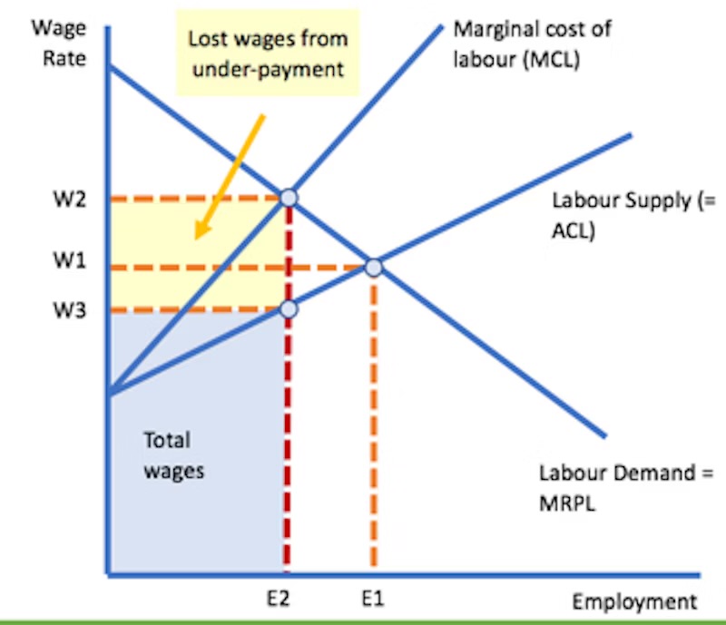
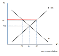
A monopsony is a market with a single dominant buyer of labour — usually one firm that has significant power to set wages because workers have few alternative employers.
🔹 Key Features of the Monopsony Graph
Axes:
Y-axis: Wage rate (price of labour)
X-axis: Quantity of labour employed
Curves:
Labour Supply Curve (S): Upward sloping — as wages increase, more workers are willing to work.
Marginal Cost of Labour (MCL): Lies above the supply curve because to hire an additional worker, the firm must raise wages not only for that worker but for all workers (assuming a single wage paid to all).
Labour Demand Curve (D or MRP): Downward sloping — based on the value of the marginal product of labour.
🔹 How the Monopsony Firm Chooses Employment and Wage
The firm maximises profit where Marginal Cost of Labour (MCL) = Marginal Revenue Product (MRP).
At this quantity (Q*), the wage paid (W*) is read off the labour supply curve, not the MCL curve.
Because MCL > supply curve, the wage W* is lower than the marginal cost of labour.
Result: The monopsony hires fewer workers and pays a lower wage compared to a competitive labour market.
Efficiency Implications
Underemployment: Fewer workers hired than socially optimal.
Wage suppression: Workers are paid less than their marginal product.
Market failure: Labour market power leads to inefficiency and potential welfare loss.
🔹 Policy Implications
Minimum wage can increase wages and employment in a monopsony.
Encouraging labour mobility reduces monopsony power.
Trade unions may counterbalance monopsony power by increasing workers’ bargaining strength.
🔍 Graph Summary
The labour supply curve (S) shows the wage required to attract workers.
The MCL curve is steeper and lies above S.
The monopsonist chooses Q* where MCL = MRP.
The wage W* is lower than in a competitive market (where wage = MRP = S).
This leads to lower employment and wages.