Business 212: Business Statistics Ch 2. Introduction to Categorical Data
1/54
There's no tags or description
Looks like no tags are added yet.
Name | Mastery | Learn | Test | Matching | Spaced | Call with Kai |
|---|
No analytics yet
Send a link to your students to track their progress
55 Terms
Data
information that is collected for analysis
Categorical Data
data that is collected in groups or topics, the number of events in each group is counted numerically
quantitative data
concerned with quantities and includes any data collected in number form
One trick to finding out if information is categorical or quantitative is to analyze the answer to the question. Which of the following is TRUE:
If the answer to the question is a characteristic, then the information is quantitative. If the answer to the question is a number, preference, etc., then the information is categorical.
If the answer to the question is numerical, then the information is quantitative. If the answer to the question is a characteristic, preference, etc., then the information is categorical.
If the answer to the question is numerical, then the information is categorical. If the answer to the question is a characteristic, preference, etc., then the information is quantitative.
If the answer to the question is an interest, then the information is quantitative. If the answer to the question is a characteristic, preference, etc., then the information is categorical.
If the answer to the question is numerical, then the information is quantitative. If the answer to the question is a characteristic, preference, etc., then the information is categorical.
David wants to collect information about his friends and how many siblings they each have. David has eight friends. How should he collect this data? Why?
Quantitatively: This information cannot be grouped into any categories.
Categorically: David will need to group the number of siblings because there is too much data to collect individually.
Categorically: Siblings are a category of information and so the data cannot be collected quantitatively.
Quantitatively: Since David isn't dealing with a large amount of information, he can simply ask each friend and analyze the data quantitatively.
Quantitatively: Since David isn't dealing with a large amount of information, he can simply ask each friend and analyze the data quantitatively.
What is data that is collected in groups or topics, where the number of events in each group is counted numerically?
Categorical data
Numerical data
Quantitative data
Stratified sampling
Cluster sampling
Categorical data
Samantha is gathering information about how many calories the athletes on her team consume during game week. Which answer correctly indicates how the data should be analyzed for both categorical and quantitative research?
The data is neither categorical nor quantifiable; it is qualitative data.
The information collected can not be categorized. Samantha is limited to analyzing the data quantitatively.
The information collected can not be quantified. Samantha is limited to analyzing the data categorically.
Quantitative Data: 1,000-1,200 cal; 1,201-1,400 cal; 1,401-1,600 cal, etc.
Categorical Data: All individual caloric consumption amounts are collected.
Categorical Data: 1,000-1,200 cal; 1,201-1,400 cal; 1,401-1,600 cal, etc.
Quantitative Data: All individual caloric consumption amounts are collected.
Categorical Data: 1,000-1,200 cal; 1,201-1,400 cal; 1,401-1,600 cal, etc.
Quantitative Data: All individual caloric consumption amounts are collected.
Katie is collecting data about the number of people that are interested in different dance styles. After passing out a survey, she has gathered the following information:
Style / Number of people interested in this style
Ballet / 20
Jazz /12
Hip Hop / 8
Lyrical / 26
Tap / 10
What type of data did Katie collect?
Categorical
Categorial data
data that can be categorized or grouped
You just took a survey asking people about their favorite class in school. After getting all the answers, you found that 10 people love English, 2 people love math, 3 people love history, and 12 love science. Please put this information in table form.
Class | Result |
|---|---|
English | 10 |
Math | 2 |
History | 3 |
Science | 12 |
You just took a survey asking people about their favorite class in school. After getting all the answers, you found that 10 people love English, 2 people love math, 3 people love history, and 12 love science. What is the percentage of people that love English?
25%
42%
50%
30%
37%
37%
You just took a survey asking people about their favorite class in school. After getting all the answers, you found that 10 people love English, 2 people love math, 3 people love history, and 12 love science. Order these subjects from most liked to least.
English, Science, Math, History
Science, English, History, Math
History, Math, English, Science
Math, History, Science, English
Math, History, English, Science
Science, English, History, Math
Which of the following is an example of a piece of categorical data?
Ethnicity
Weight
Speed
Distance
Height
Ethnicity
You just took a survey asking people about their favorite class in school. After getting all the answers, you found that 10 people love English, 2 people love math, 3 people love history, and 12 love science. What are the percentages for each class?
English | 37% |
Math | 7% |
History | 11% |
Science | 45% |
Line Graphs
the graphs that have a single line connecting the data points
Bar Graphs
the graphs that use bars to represent the data
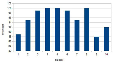
Ten students participated in a chemistry test and their scores are depicted on the bar chart below.
How many students received a 100 percent score on the test?
1
3
4
2
3
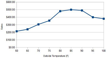
Tom is the owner of an ice cream cart and has graphed his sales for the past week based on the outside temperature. Identify the temperature where Tom will make a sales of more than $300.
55
75
60
65
75
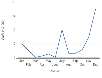
KY Company sells pencils. The graph below shows the company's monthly profits during 2015. Which two months were profits the lowest?
February and September
May and July
March and June
July and December
March and June
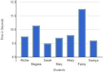
The bar chart shows the time taken for seven students to cover 75 meters.
_____ was the fastest and _____ was the slowest.
Fanny; Sarah
Hilary; Megane
Sarah; Fanny
Fanny; Saanya
Sarah; Fanny
What is the distinguishing mark of a line graph?
Pie slices being shaded by lines.
Bars joined by a line.
Tick marks on the dots.
A line connecting dots.
A line connecting dots.
line graphs
a graphical display of information that changes continuously over time
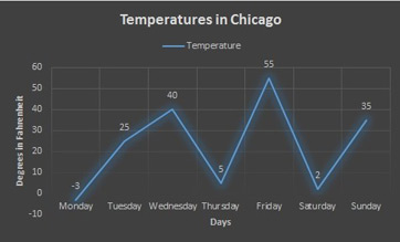
Which day was the coldest?
Friday
Monday
Saturday
Thursday
Monday
Which day was the warmest?
Tuesday
Sunday
Wednesday
Friday
Friday

What was the temperature on Wednesday?
25 degrees
40 degrees
55 degrees
35 degrees
40 degrees

When was the biggest change in temperature?
Saturday
Friday
Thursday
Tuesday
Saturday
Bar Graph
a chart that uses bars to show comparisons between categories of data
Vertical Bar Graph
compare between two or more independent variable
Horizontal Bar Graph
data has negative and positive values, but is still a comparison between two or more fixed independent variables
Range Bar Graph
represents a range of data for each independent variable
Histogram
each bar represents a range of dependent variables instead of just one data point
Grouped Bar Graph
two independent variables grouped under one location heading
Composite Bar Graph
represent data with two independent variables, the data is stacked instead of side-by-side
Complex Bar Graphs
compare data with two independent variables
What is one difference between a histogram and a bar graph?
The histogram bar represents a range of dependent variables instead of just one point.
Histograms are horizontal and bar graphs are vertical.
The histogram is vertical and the bar graph is horizontal.
Histograms deal with one variable.
The histogram bar represents a range of dependent variables instead of just one point.
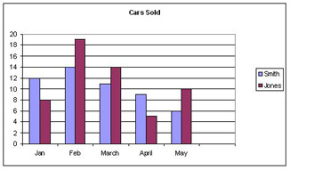
What type of bar graph is shown below?
Grouped Bar Graph
Horizontal Bar Graph
Histogram
Composite Bar Graph
Grouped Bar Graph
What type of data is best suited for a range bar graph?
percentages
census data
sales numbers
temperature ranges or price ranges
temperature ranges or price ranges
What type of data is best suited to a composite bar graph?
temperature ranges or price ranges
sales data from multiple locations
percentages
data that includes negative values
sales data from multiple locations
After labeling the horizontal and vertical axes for my bar chart, what is the next step in creating a bar chart?
Color the bars pretty colors
Gather data
Evenly distribute the numerical values along the appropriate axis.
Draw the bars the correct length.
Evenly distribute the numerical values along the appropriate axis.
Which answer best describes a graph?
None of these answers are correct.
A graph is normally used to display comparisons.
A graph is usually a line type chart.
Graphs and charts are the same thing.
A graph is normally used to display trends over time.
A graph is normally used to display trends over time.
Which answer best describes a chart?
A chart is most commonly used to display trends.
A chart is usually displayed in columns.
None of these answers are correct.
A chart is most commonly used to display comparisons.
A chart is usually displayed using lines.
A chart is most commonly used to display comparisons.
Under which ribbon menu or tab will you find the chart type commands?
None of these answers are correct.
Data
File
Insert
Charts and Graphs
Insert
There are several different types of charts in Excel. Which two are the most frequently used?
Bar and pie
Chart and graph
Line and graph
Column and bar
Pie and line
Column and bar
What is the first step in creating a chart?
Select the data for the chart
Select the Chart Style
Select the Chart type
None of these answers are correct.
Click on the Insert tab
Select the data for the chart
graph/data
a visual presentation of data
column chart
has vertical columns
bar chart
has horizontal bars
line graphs
show your data as a line
pie charts
charts that look like pies
doughnut charts
similar to pie charts except they have a hole in the middle
Sam wants to show how much of his sales come from families and college students when compared to all his sales. Which of the following charts/graphs should he use?
Bar chart
Pie chart
Column chart
Line graph
Pie chart
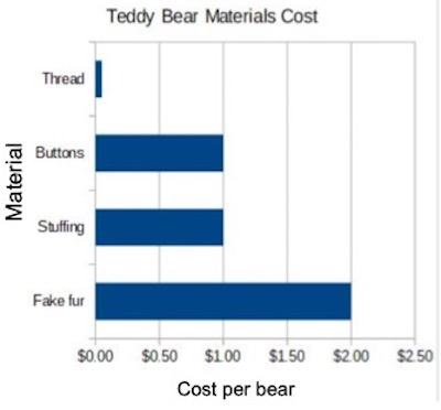
In this graph, which material is the cheapest?
Buttons
Fake fur
Stuffing
Thread
Thread
Which of the following should a business use when it wants to compare several products with each other?
Doughnut chart
Line graph
Pie chart
Column chart
Column chart
A line graph is best used for which of the following data?
Market shares
Parts of a whole
Percentages
Sales over time
Sales over time
A company wants to show how fast its cars can accelerate when compared with the competition. Which chart should it use to convey this information?
Bar chart
Doughnut chart
Pie chart
Line graph
Bar chart