ways of modelling spatial data and visual hierarchy
1/11
There's no tags or description
Looks like no tags are added yet.
Name | Mastery | Learn | Test | Matching | Spaced | Call with Kai |
|---|
No study sessions yet.
12 Terms
points vs lines vs areas (the three spatial dimensions)
points = things like cities and landmarks
lines = things like roads or artificial things (i.e. boundaries and things that arent actual features of the earth)
areas = represents bodies of water/land
things to consider when picking points, lines, and areas
the importance of scale (ex: a river on a smaller scaled map could be represented as a line, but on on a larger scaled map it could be represented as an area)
choice of dimension is dependent on the nature of the data, the scale of the data, and the application of data (what is the point of the map)
ex: if the map was made to show where to park: points can be used for area symbols of where to park, where the picnic area is, etc.)
think about symbolizing a three dimensional world in a 0, 1, 2 dimensions
a point = 0 dimensions: a location
a line = 1 dimension: a location with length (ex: a river line)
area = 2 dimensions: a location with length and width (ex: the ocean)
discrete vs continuous data
Discrete data = describes phenomena that occurs at a distinct location with space between
Isolated points, nothing happening between the points
Ex: school locations; there are schools throughout, but there is no schools between the school locations that is connecting the schools together
Continuous data = phenomena occurs throughout a region at any and every location
Ex: elevation data; it is occurring at every point of the data (even if you don't know what that elevation is)
There will be moments where there is a continuous phenomena but you only have discrete data
you can interpolate and estimate what the data might be with a continuous phenomena
but you cannot interpolate discrete data
abrupt vs smooth data
Abrupt = values change suddenly between adjacent points or areas
Ex: a cliff's elevation; moves abruptly
Smooth data = values change gradually
Ex: % of land covered by farm land by state; on the west coast there will be a medium amount and as you move to the mid west there is a greater amount and then it dwindles down as you move east
is the data for temperature, high and low, and perception continuous or discrete? smooth or abrupt? how would you symbolize them?
Temperature is continuous, changing smoothly, represented by area
High and low looks discrete, but it is continuous we just don't know all the data, changes abruptly, represented by points
Precipitation is continuous, changes smoothly, and is represented by area symbols
what are the four levels of measurement in maps
nominal (naming) = describes data that is qualitative or categorical → data tells you how you can group things together, but there is no order of value
ex: a map of religions
ordinal = grouping things together but there is a hierarchy involved (this hierarchy doesn’t involve numbers, it is purely qualitative)
ex: a map of regions based on whether it is hot, warm or cool
interval = used for numerical data; groups things together and order them with an equal numeric difference between the two groups → has an arbitrary zero point (cannot use mathematical equations)
ex: a temperature map with intervals of temperature: 21-30 degrees (dark red), 11-20 degrees (red), 0-10 degrees (pink)
ratio = groups things together and order with numeric differences with a non arbitrary zero point (can use mathematical equation) → most numerical/quantitative data will be measured in ratio data
ex: 101-150 kelvin (dark red), 51-100 kelvin (red), 0-50 kelvin (pink) → can even say 100 is twice as large as 50
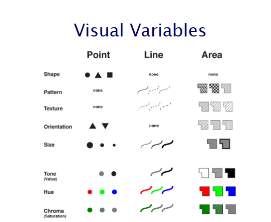
visual variables
= how we change our symbols to vary them and make them represent different sets of data
ways we can change variables:
chroma (saturation) and tone (value) is used to create gradients → good for ordinal, interval, ratio data, and qualitative data
hue is used to separate colours → good for qualitative and nominal data
how to vary qualitative data and quantitative data
qualitative data = vary shapes, patterns of lines or areas, and hue
quantitative data = vary chroma/tone/shade and vary points and thickness of lines
different ways point, line, and area symbols can be varied
mimetic symbols
= common symbols found on Atlas of Canada Topographic maps
when using these symbols use associative symbols
four cartographic conventions
= rules/guidelines for cartography; things that cartographers usually do, and what map readers are expecting things to mean → a guideline for better readability
colour connotations (ex: blue used for water features)
point symbols (ex: star circle for capital city)
line symbols (ex: solid lines for permanent features like rivers)
area symbols (ex: green area for parks) → mostly color connotation
visual hierarchy
= using similar and contrasting symbols in combination → how things go together to make it pleasing to the eye and easy to understand
important things on a map should be darker/bolded
similar things need to be similar in colour/symbols and contrasting things need to be different (ex: bodies of water should be blue, land should be green)
consider the purpose of the map
consider the technical and perceptional limitations
perceptual limitations = human eye can only differentiate 5 different color gradients
technical = low resolution files may not pick up detailed symbols
color connotations of different cultures