How to Talk Type
1/49
Earn XP
Description and Tags
2/2 of the lectures from Kresge's Typography class (8/28/24)
Name | Mastery | Learn | Test | Matching | Spaced | Call with Kai |
|---|
No analytics yet
Send a link to your students to track their progress
50 Terms
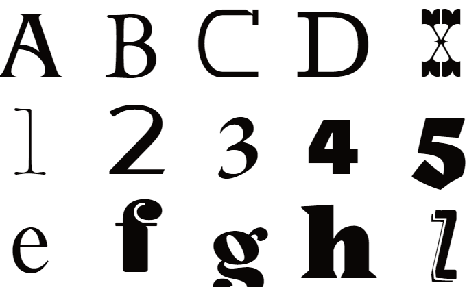
any letter or number
character
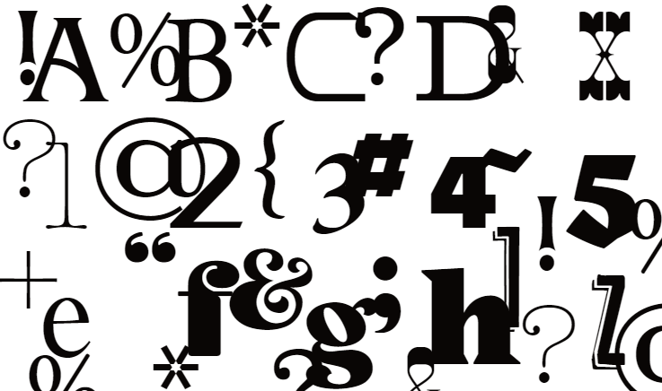
any letter, number, punctuation, dingbat, swash, etc. in a typeface
glyph

straight parts of a letterform
stroke
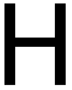
vertical stroke of a letterform
stem

round stroke of a letterform
bowl
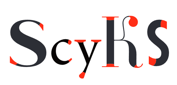
the end of any stroke
terminal
help us to align type properly
rules for alignment
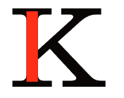
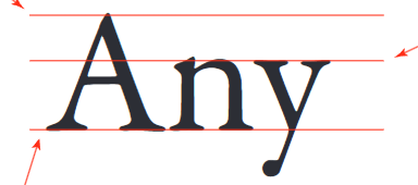
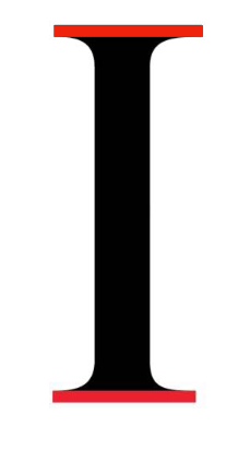
the top height for capital letters in a typeface
cap height
the top height for lowercase letters in a typeface
median
the bottom height for all letters in a typeface (except for descenders)
baseline
horizontal stroke that ends in two stems
cross bar
horizontal stroke that crosses over a stem
cross stroke
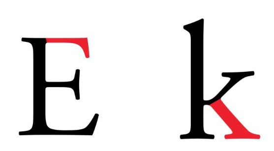
a stroke added as a stop to the beginning and end of the main strokes of a character
serif
characters without a serif
sans serif
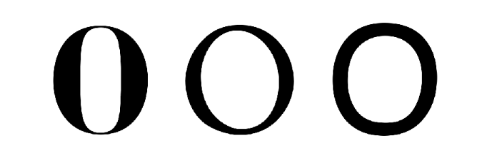
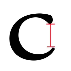
the contrast between the thickest and thinnest stroke in a character
stress
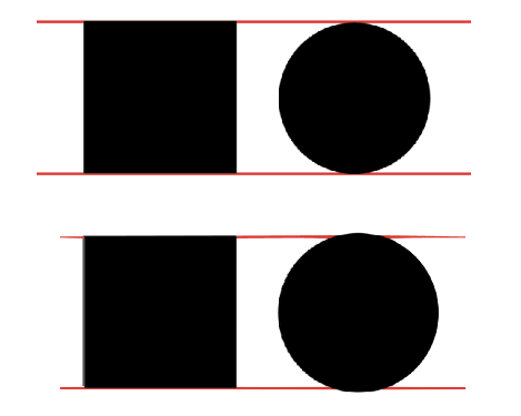
the tiny bit of letter that hangs over the alignment rule to compensate for the optical illusion and makes it look the appropriate size
overshoot
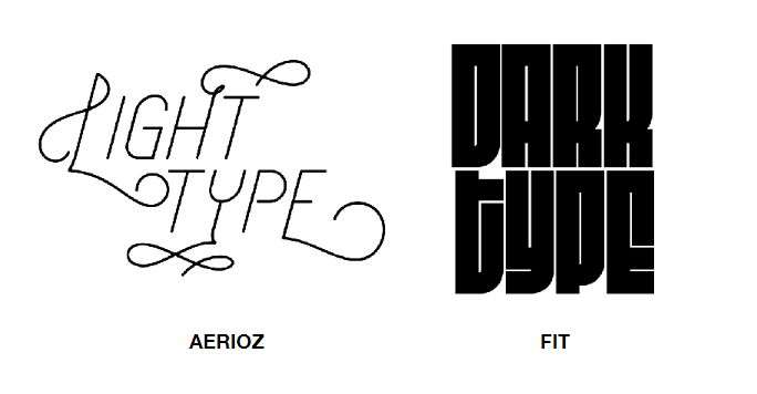
type’s lightness and darkness compared to the negative space
typographic color
upright, straight characters
roman
characters with a slant; developed to increase the amount of words that can be printed on one page
italic
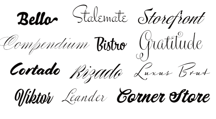
any typeface that is designed to emulate cursive handwriting
script
typefaces that are designed to be used mainly for large bodies of text; books, newspaper
text typefaces
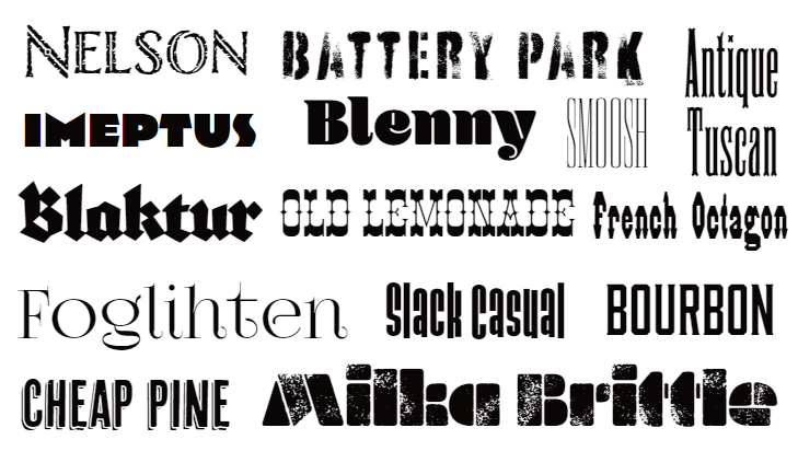
decorative typefaces that are meant to be used sparingly to attract attention; logos, headlines
display typefaces
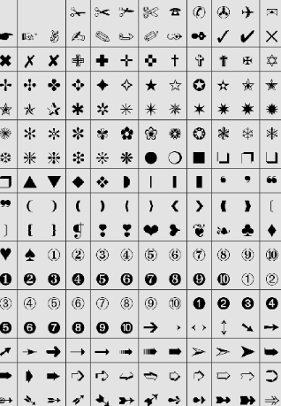
symbols, marks, or images that are designed to work as part of a system as a typeface
dingbats
a stroke that attaches to a stem on one side; arm attaches at the top of a letterform, leg attaches at the bottom
arm + leg
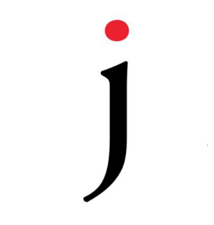
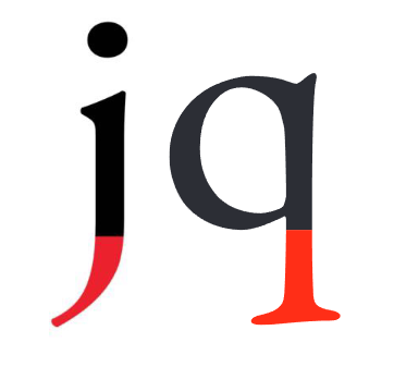
small distinguishing mark, such as on a lowercase j or i
tittle
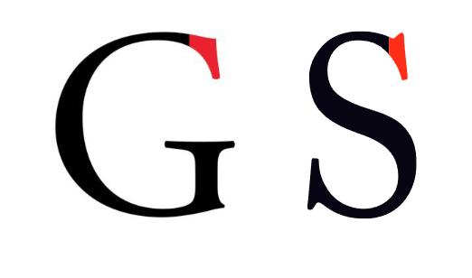
decorative stroke at the end of a curved stroke in a G or S
barb
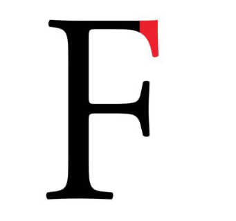
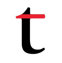
decorative stroke at the end of a letter, similar to a serif (E, F, T)
beak
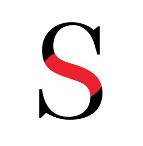
the main curved stroke of the S or s
spine
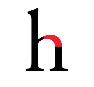
curved stroke projecting from a stem (h, m, n)
shoulder
the part of a character that descends below the baseline (p, y, j, g, q)
descender
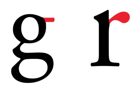
small stroke that projects from the top of lowercase g or r
ear
outside point at the bottom of a character where two strokes meet
vertex
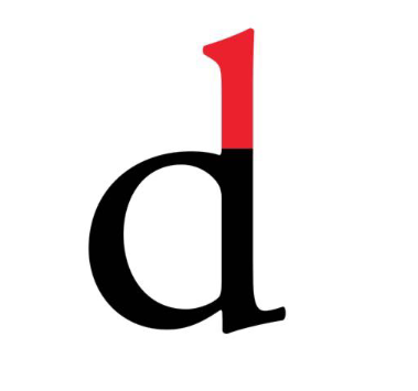
part of a letter that extends above the median (b, d)
ascender
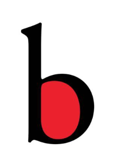
partially or fully enclosed space within a character; open or closed
counter
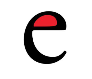
the counter specific to a lowercase e
eye
the opening of an open counter
aperture
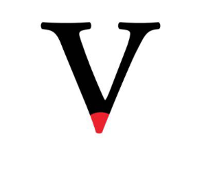
the inside area of a letterform where two diagonal strokes converge
crotch
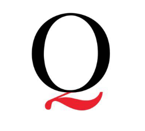
the descender on an uppercase Q
tail

curved bit that attaches the serif to the stem/stroke
bracket
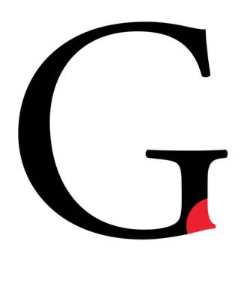
small projection off of a main stroke found on many capital Gs
spur
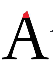
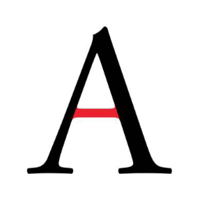
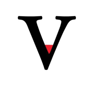
the point where two diagonal strokes meet at the top (A)
apex
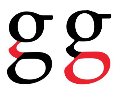
one kind of lowercase g
link + loop
one kind of lowercase g
hook
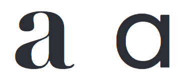
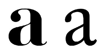
two varieties of the lowercase a (single story and two story)
stories
ball and teardrop
special terminals
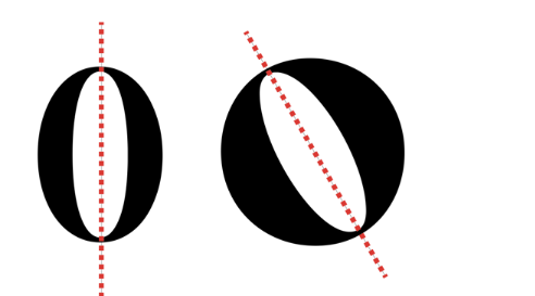
an imaginary line drawn bisecting thinnest strokes in an O
axis
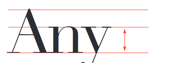
space between the baseline and the median; height of a lowercase x
x-height
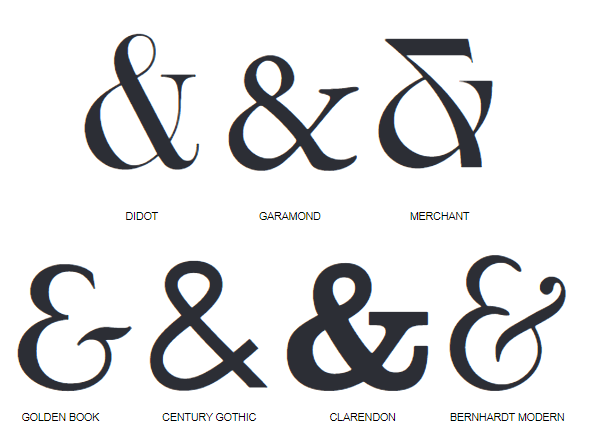
symbol to replace the word and
ampersand
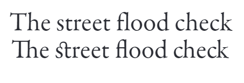
two characters joined to make a single glyph; helps with spacing
ligature
exaggerated decorative serif, terminal, or tail
swash