lecture 3- data visualisation
1/15
There's no tags or description
Looks like no tags are added yet.
Name | Mastery | Learn | Test | Matching | Spaced | Call with Kai |
|---|
No study sessions yet.
16 Terms
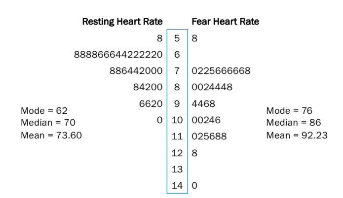
Stem and leaf plots
stems- represent the tens
Leaf- the units
Scores are ordered from smallest to largest
Can be used to compare 2 data sets.
Can calculate mean, median, mode
Histograms are better
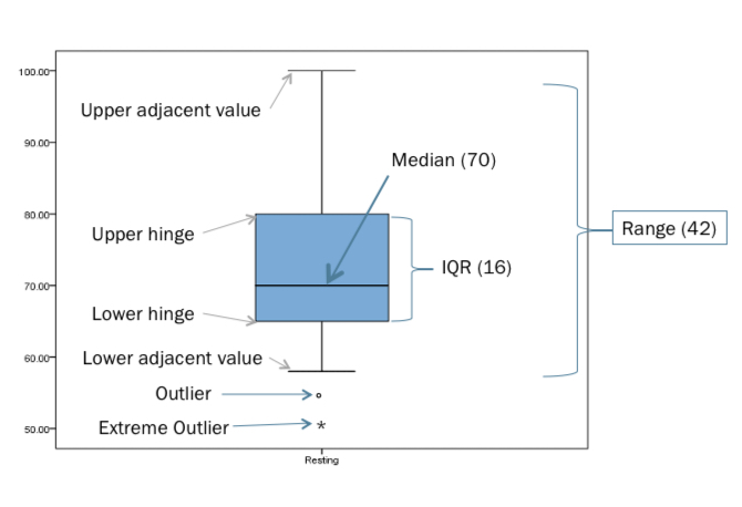
Boxplots
useful for showing median, range, IQR, skewness, etc.
How do you visualise data for frequency distribution?
Histograms
individual bars give the frequency of a given value within a range
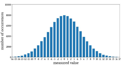
How do you visualise data for probability distribution?
Bell curves
smooth, but segmented by standard deviations
Area under the curve is the probability that value occurs
E.g. can work out likelihood of a person having a health heart rate
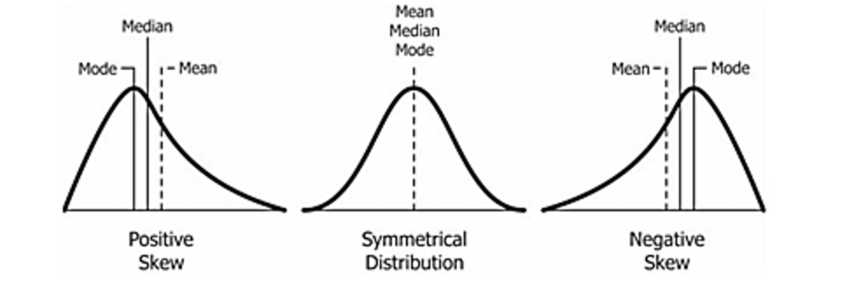
What is skewness?
deviation from symmetry
Histogram shows big difference between mean, median and mode
Some extreme scores are affecting the mean, but not the median
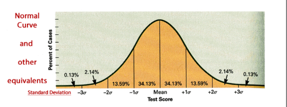
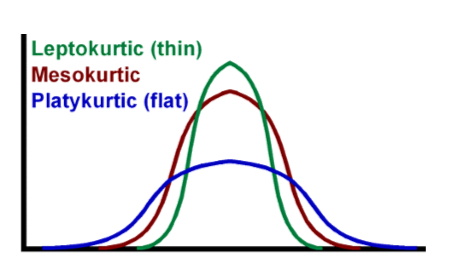
What is kurtosis and what are the 3 types?
measure of the tailedness of a distribution
Tailedness (pointiness)= how often outliers occur
Mesokurtic (normal)
Leptokurtic (positive)- high peak, skinny in middle, fat tails due to outliers
Platykurtic (negative)- flatter distribution, broad in middle, skinny tails due to fewer and less extreme outliers
Which descriptive statistics do you report it data is parametric/ normally distributed?
Mean/ standard deviation
Which descriptive stats do you report when data is non-parametric/ skewed?
Median/range or IQR
What are the ways to determine skewness in R?
skewness statistic
Histogram with normality curve (represents a smoothed distribution)
Probability density curve (follows individual data more closely)
What is a skewness statistic?
A value showing how skewed data is.
0= perfectly normal
Further from 0 a value is, the more skewed it is
If the skewness statistic is less than -1 or more than 1, we conclude data is skewed
-1 to +1 = normal range
How is data illustrated to help others understand it?
tables- good for comparing data. Typically used for descriptive stats.
Figures- e.g. bar charts, scatter plots
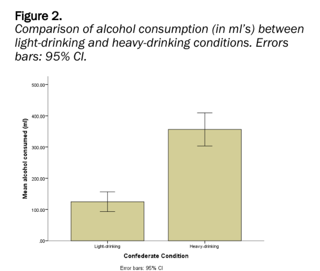
What are error bars?
Visual representation of variability within data on bar charts.
95% confidence intervals are the most commonly presented error bars
95% CI- the percentage of times you expect to produce an estimate within the range E.g. confident that 95 out of 100 times, estimate will fall within upper and lower values specified by CI
When error bars overlap, there is no significant difference between conditions. When they don’t, there is.
Where do figures go that are used to assess data?
In the appendix.
E.g. stem and leaf plots, boxplots
Where do figures go that are used to visually present data analysis for others?
The results section of report.
E.g. bar graphs, scatterplots.
What is a truncated graph?
When writers skew how data is perceived by making the baseline of a graph a difference number. (Baseline is usually 0). This can be misleading and starting at 0 offers a more accurate depiction of data.
Types of misleading figures
omitting baseline
Manipulating y axis to make data seem more or less significant than it is.
Cherry picking data e.g. using a small date range
Going against conventions e.g. using lighter shades on map to depict higher population density