Data visualisation
1/21
There's no tags or description
Looks like no tags are added yet.
Name | Mastery | Learn | Test | Matching | Spaced | Call with Kai |
|---|
No study sessions yet.
22 Terms
Why is data visualisation important?
Create summaries for data
Create charts for interpretation, analysis + learn from data
Useful in identifying data errors/extreme value
Essential in communicating messages
Why tables
associations within table → average between two groups f.e
to look up specific numbers
precision is needed to make comparison between diff values
v important
numbers don’t lie
values being displayed have different units and magnitudes
Why graph
patterned based → less about individual values
visualise pattern trends and development and associations
What are pre-attentive attributes
are characteristics that can be used in a graph for easier interpretation
characteristics are already registered → not much cognitive effort
Colour
size the size doesn’t correlate to number
bubble charts
length is most effective
bar f.e: have a certain length, able to compare magnitudes
number does correlate to the length
shape
Minimise eye travel
make it look visually pleasing
Data ink ratio
interested in development only
horizontal lines can be removed unless you want to emphasise it
Points
scatter charts
important aspect: what does each row represent
each row is turned into a point
graphical representation of the relationship between two quantitative variables
Avoid 3D and many slices in pie charts
Data ink ratio
ink is used to create a graph
related to amount of data ink
the ink is used is important to convey the message
useless ink: not related to data itself
how to increase data ink ratio:
remove the lines in tables → as it doesn’t improved the table
ink is used to create a graph
related to amount of data ink
the ink is used is important to convey the message
useless ink: not related to data itself
how to increase data ink ratio:
remove the lines in tables → as it doesn’t improved the table
Points
scatter charts
important aspect: what does each row represent
each row is turned into a point
graphical representation of the relationship between two quantitative variables
Line charts
when to use it?: used to see developments overtime
interval variable: series of consecutive categories, continuous
no data
shouldn’t do, remove the months or draw a line, keep the months and make clear that there isn’t a data
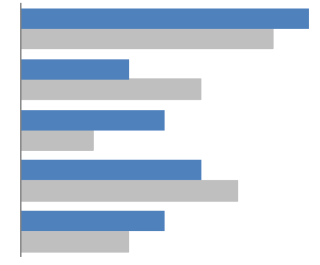
Bar chart
emphasise individual values
suited to compare categorical variables
vs column charts (what is this
horizontal vs vertically → what is more visually pleasing
Stacked column chart
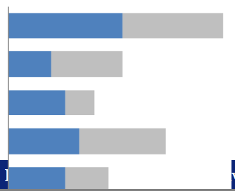
Clustered column chart
Clustered bar chart
100% stacked bar chart
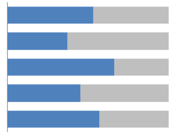
Stacked bar chart
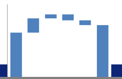
Waterfall chart
Bar vs Column charts
horizontal versus vertical
Often more pleasing to the eye, especially when text labels are long
And when there are many bars to compare
Dual axis chart

Does a line chart need to start a 0?
yes always
unless there is a reason not too
when?: range of measurement is small, negative values
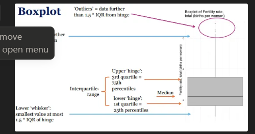
Boxplot
method for graphically depicting numerical data through quartiles
provide visual representation of the spread of the data based on quartiles
indicates central tendency and variability using five summary statistics (the median, two hinges and two ‘whiskers’), and all "outlying" points individually
bar in the middle of the box is median → arranged according to magnitude, not the mean
the distance between the upper and lower hinge is the IQR range
if there are no values that more than 1.5 times the IQR range from the hinge = no outliers will be present and dependent on the distribution of the variable
Boxplots take up less space than Histograms
tells how the data is spread out
useful when comparing distributions between many groups
for easier visual understanding turn it 90 degrees
Pie charts
Avoid pie charts to properly compare categorical data
inferior to bar for comparing data
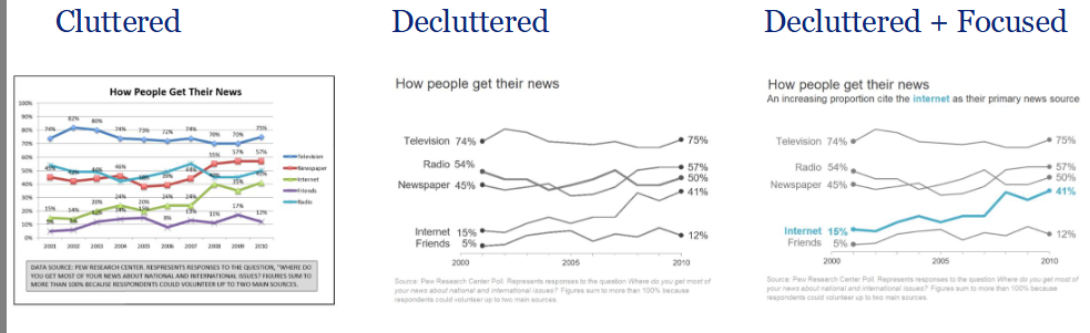
Decluttering
the process of increasing the data-ink ratio
irrelevant data is removed or process to increase data ink ration
Focus is vital
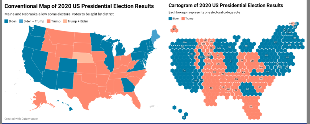
Choropleths
A choropleth map is a geographic visualization that uses different shades colours, or symbols to indicate the values of a quantitative or categorical variable associated with a geographic region or area
Choros (area) and plethos (value)
Problems
Area bias
Solution
Group data
Cartograms
uses geographic positioning but purposefully represents map regions that do not necessarily correspond to land area