Quizlet Flashcards - Statistics: Data Presentation
1/20
There's no tags or description
Looks like no tags are added yet.
Name | Mastery | Learn | Test | Matching | Spaced | Call with Kai |
|---|
No analytics yet
Send a link to your students to track their progress
21 Terms
What are common methods for data presentation?
Frequency distribution tables, Relative frequency distribution, Percentage distribution, Bar chart, Pie chart, Stem and leaf diagram, Box and whisker plot, Line graph, Scatter plot.
When should you use an ungrouped frequency distribution table?
When you have a large set of data but only a few distinct values.
When should you use a grouped frequency distribution table?
When you have a large set of data with many distinct values, and exact values are not needed.
What does a frequency distribution table for qualitative data list?
All categories and the number of elements (frequency) that belong to each category.
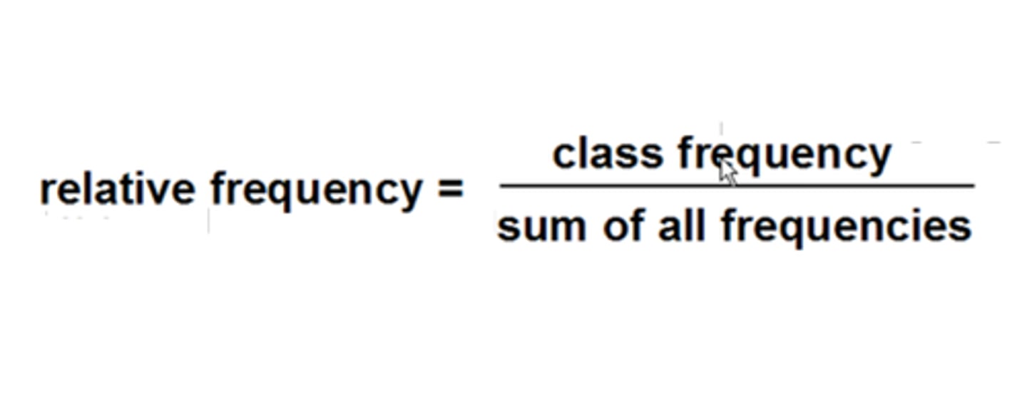
What does a relative frequency distribution show?
The fractional part or proportion of the total frequency that belongs to a corresponding category.
How is Relative frequency calculated?
What does a percentage distribution list?
The percentages for all categories.
: How is Percentage calculated?
Percentage=(relative frequency)∗100
What is a Bar graph?
A graph that presents categorical data with rectangular bars whose heights/lengths are proportional to the values they represent, showing comparisons among distinct categories.
When is a Pie Chart typically used?
For categorical data with few categories, where different frequencies are important.
What is a Pie Chart?
A circle divided into portions that represent the relative frequencies or percentages of a population or sample belonging to different categories.
How do you determine the angle size for a slice in a Pie Chart?
Multiply 360 degrees by the relative frequency of that category.
What is a Stem-and-leaf diagram (or plot)?
A diagram that displays quantitative data values in rows, dividing each value into a 'stem' (largest place values) and a 'leaf' (the rest of the number).
What is an advantage of a Stem-and-leaf diagram over a frequency distribution?
: It allows you to see individual observations (you don't lose information on individual data points).
When is a Stem-and-leaf diagram useful?
When there are not too many data points, when largest place value(s) are repeated, or when there are few distinct largest place values.
When is a Back-to-back stem-and-leaf diagram used?
When comparing two categorical variables, especially with not too many data points and repeated largest place values.
What is a Box-and-Whiskers plot used for?
To show the spread/distribution of data, especially when the 5-number summary is available, there are multiple extreme values, or when comparing multiple distributions.
What are the components of the '5-number summary' used in a Box-and-Whiskers plot?
Minimum, Lower Quartile, Median, Upper Quartile, Maximum.
What is a Line Graph used for?
To show information that changes over time (continuous and chronological data).
Give an example of data suitable for a Line Graph.
Guyana's population count over a century, UG's yearly budget, monthly utility expenses.
What is a scatter plot used for?
show the relationship between two variables