1.1 AP STATS VOCAB
1/19
There's no tags or description
Looks like no tags are added yet.
Name | Mastery | Learn | Test | Matching | Spaced | Call with Kai |
|---|
No analytics yet
Send a link to your students to track their progress
20 Terms
Statistics
the science and art of collecting, analyzing, and drawing conclusions from data
Indiviudal
an object that can be described in a set of data, individuals can be ppl, animals or things
Ex: If a survey collects the SAT scores of high school seniors, the individuals are the students.
Variable
An attribute that can take different values for different individuals
Ex: If a survey collects the SAT scores of high school seniors, the variable are SAT Scores
Categorical Variable
assigns labels that place each individual into a particular group called a category
EX: If I am collecting data on what people’s favorite cuisine; Categorical Variables would be the different types of cuisines like: Indian, Thai, Italian, Mexican
Quantitative Variable
Takes number values that are quantities — counts of measurements
Ex: If a survey collects the SAT scores of high school seniors, their scores are the quantitative variable
Other examples are: heights, weights, age
ASK YOURSELF: Can i take the mean; if you can it’s probably quantitative
Discrete Variable
A quantitative variable that takes a fixed set of possible values with gaps btwn them
Basically can be countable
Ex: Number of siblings, How many langauges one can speak
Continuous Variable
A quantitative variable that can take any value in an interval on the number line
(these things can be measured for example)
Ex: Heights, time, temperature
Distribution
The distribution of a variable tells us what values the variable takes and how often it takes those values
Basically you use SOCV + context when asking to describe distribution
Ex: Example: Test Scores
Suppose 10 students take a quiz, and the scores are:
70, 70, 75, 80, 80, 80, 85, 90, 95, 100
Distribution → shows how the scores are spread:
70 appears 2 times
75 appears 1 time
80 appears 3 times
85 appears 1 time
90 appears 1 time
95 appears 1 time
100 appears 1 time
If you graphed this with a histogram or dotplot, the shape of the graph is the distribution
Frequency Table
shows the # of individuals having each value
Basically this is like a summary of the raw data; example; how many ap classes students at fhs take
Raw Data: 1,3,5,5,6,2,3,4,5,7
Frequency might be like
1: 1
2: 1
3: 2
4: 1
5: 3
6: 1
7: 1
REMEMBER FREQUENCY is not DATA but more like summary
Relative Frequency Table
shows proportion or percent of individuals having each value
Basically like Frequency Table js in proportion or percent
Ex: Raw Data: 1,3,5,5,6,2,3,4,5,7
Frequency might be like
1: 1
2: 1
3: 2
4: 1
5: 3
6: 1
7: 1
Relative frequency:
1/10; 0.1, 10% for 1 ap
1/10; 0.1; 10% for 1 ap
and like yk u get the gist
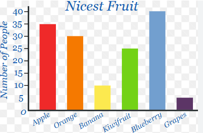
Bar Graph
shows each category as a bar. the heights of the bars show the category frequencies or relative frequencies
Remember: NOT THE SAME AS A HISTOGRAM; Bar for Categorical Data like cuisines while histo for quantitative data
For bar graph; bars DONT touch cuz different categories but they do for histo
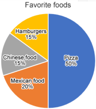
Pie chart
shows each category as a slice of the pie. The areas of slices are proportional to the category frequencies or relative frequencies
Two Way Table
Is a table of counts that summarizes data on the relationship btwn two categorical variables or some group of individuals
Ex: Favorite Cuisine vs Grade Level
Or
Male vs female and Car Type Perference
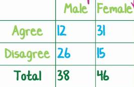
Marginal Relative Frequency
Gives the % or proportion of individuals that have a specific value for one categorical variable
Basically you only look at 1 variable; so if i was measuring grade level and cuisine; i only look at grade level or cuisine
You look at the total sections; or the MARGIN section of the table
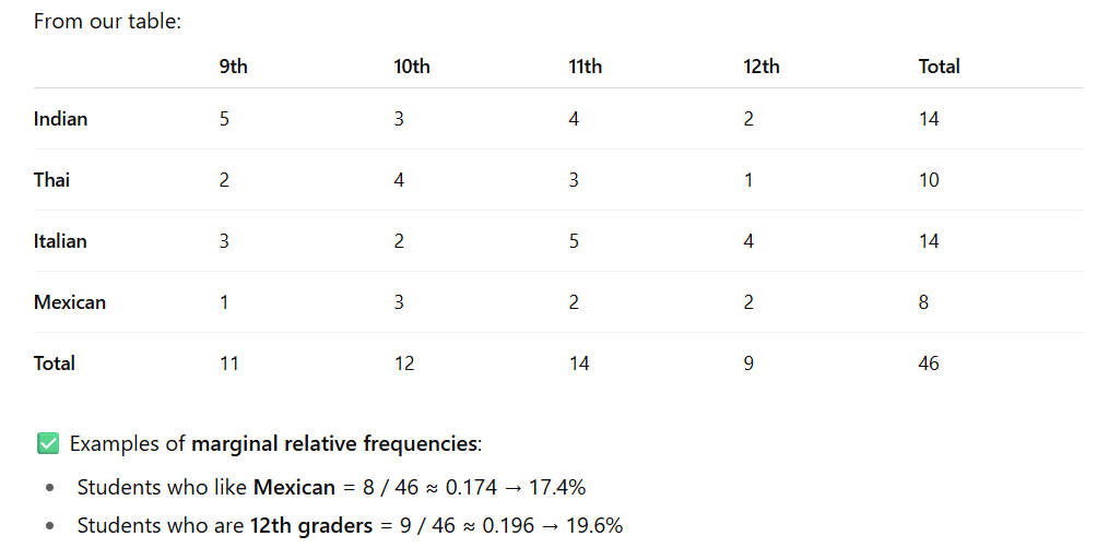
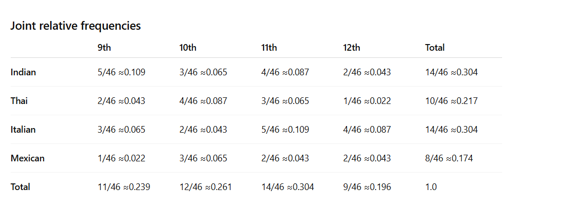
Joint Relative Frequency
Gives the percent or proportion of individuals that have a specific value for one categorical variable and a specific value for another categorical variable
Basically js everything out of total
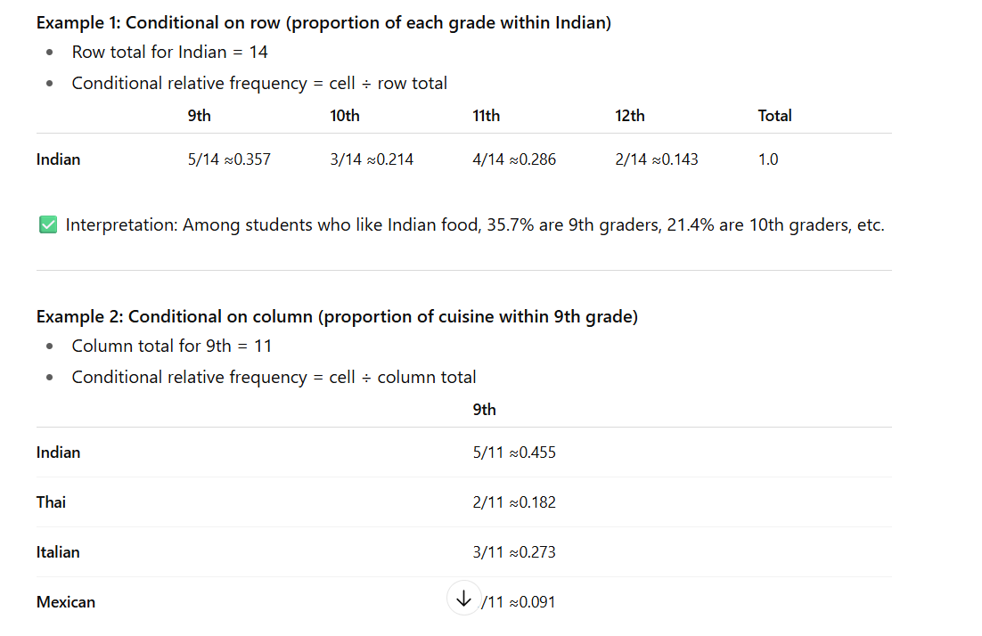
Conditional Relative Frequency
Gives the % or proportion of individuals that have a specific value for one categorical variable among individuals who share the same value of another categorical variable (the condition)
Basically can place a condition on row; where you divide each cell by its total
or place a condition on column where you divide each cell by its total
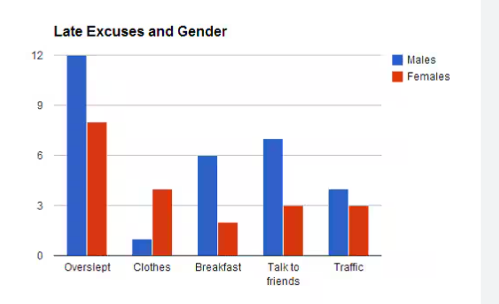
A side-by-side bar graph
displays the distribution of a categorical variable for each value of another categorical variable. The bars are grouped together based on one of the categorical variables and placed side by side
Essentially a two way table but like in bar graph; but both bars are next to each other
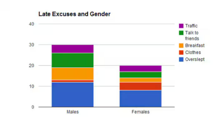
Segmented Bar graph
displays the distribution of a categorical variable as segments of a rectangle, with the area of each segment proportional to the percent of individuals in the corresponding category
Ex: Basically a side - by side bar graph; except like one of the categorical variables are all stacked on top of each other
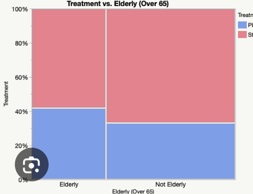
A mosaic plot
a modified segmented bar graph in which the width of each rectangle is proportional to the number of individuals in the corresponding category
This is used when there might not be an equal amount of people surveyed for each category
Ex: if its like grade level and cuisine; but if i have a lot more freshman than juniors; i would make the freshman bar like wider
Association
There is an association btwn 2 variables if knowing the value one variable helps us predict the value of the other. If knowing the value of one variable does not help us predict the value of the other, then there is no association btwn the variables
Ex: Does grade level help predict what cusine?
Typically: Grade level: explanatory variable
Cusiine: Response variable