Psych Paper 3
1/74
There's no tags or description
Looks like no tags are added yet.
Name | Mastery | Learn | Test | Matching | Spaced | Call with Kai |
|---|
No analytics yet
Send a link to your students to track their progress
75 Terms
Independent Variable (IV)
The variable manipulated or controlled by the researcher; placed on the x-axis.
Dependent Variable (DV)
The variable measured as an outcome of the IV; placed on the y-axis.
Line Graph Purpose
Shows changes or trends over time or across conditions.
Line Graph: Trend Direction
Whether the line increases, decreases, or stays stable.
Line Graph: Rate of Change
Steep lines indicate rapid change; gradual slopes show slower change.
Line Graph: Peaks and Troughs
Highest and lowest points on the graph.
Line Graph: Intersection Points
Where lines cross, showing comparison between groups.
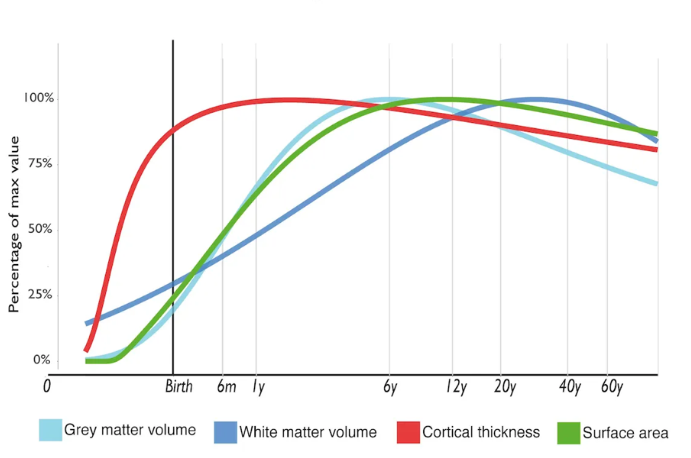
Line Graph Example
Used to show how cognitive development changes with age.
Bar Chart Purpose
Compares average values across different groups or categories.
Bar Chart: Height Differences
Shows which group scored highest or lowest.
Bar Chart: Patterns Across Groups
Identifies similarities and differences between groups.
Bar Chart: Variability
Differences in bar heights showing variability across categories.
Bar Chart Example
Shows how memory scores differ across age groups.
Histogram Purpose
Displays frequency distribution of continuous data.
Scatter Plot Purpose
Shows the relationship or correlation between two variables.
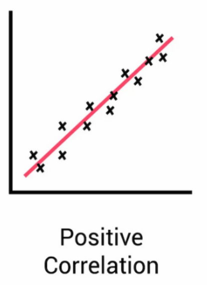
Scatter Plot: Positive Correlation
Dots trend upward (as one variable increases, so does the other).
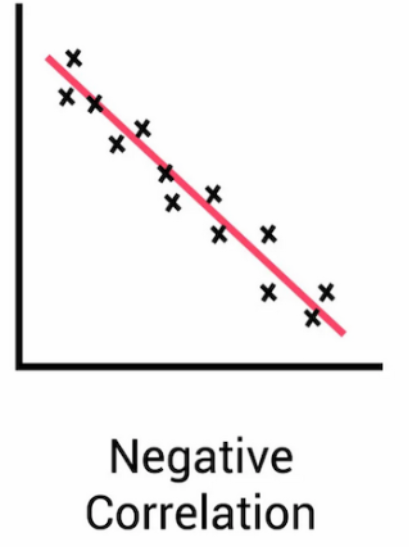
Scatter Plot: Negative Correlation
Dots trend downward (as one increases, the other decreases).
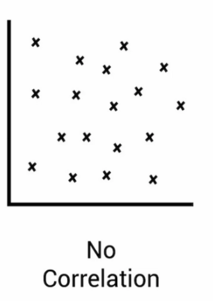
Scatter Plot: No Correlation
Dots appear random with no clear pattern.
Scatter Plot: Strength of Correlation
Tight clusters = strong correlation; wide spread = weak.
Scatter Plot: Outliers
Points far from the trend line.
Scatter Plot Example
Relationship between study time and test performance.
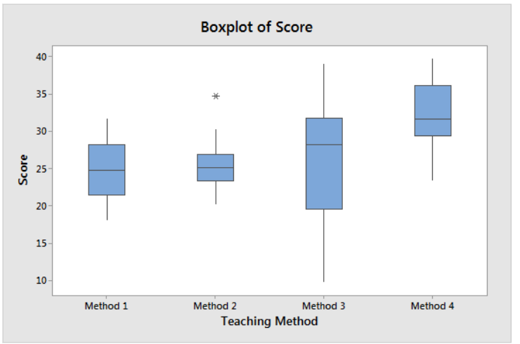
Box Plot Purpose
Shows distribution, central tendency, and spread of data.
Box Plot: Median
The middle line inside the box.
Box Plot: Interquartile Range (IQR)
Width of the box, showing middle 50% of data.
Box Plot: Range
Length of whiskers showing minimum to maximum values.
Box Plot: Outliers
Individual points beyond whiskers.
Box Plot Example
Effect of teaching methods on test scores.
Pie Chart Purpose
Displays proportions or percentages of a whole.
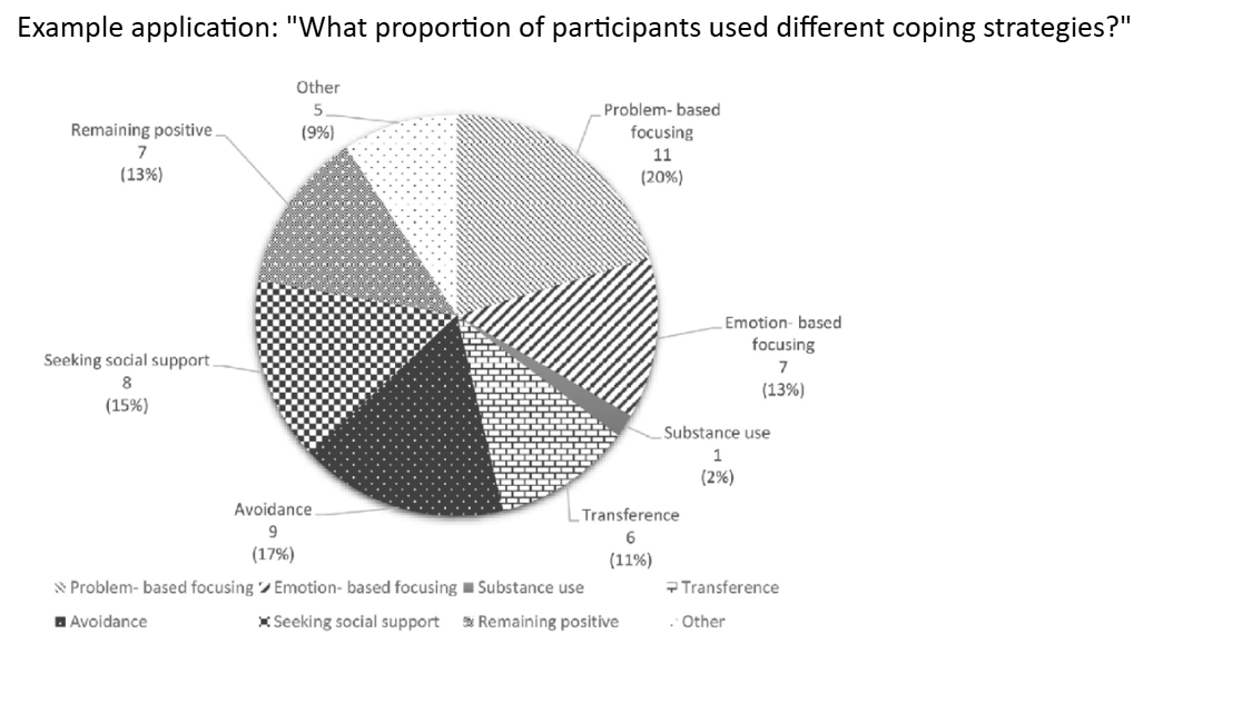
Pie Chart: Slice Sizes
Indicates which category is largest or smallest.
Pie Chart Example
Proportion of participants using different coping strategies.
Area Graph Purpose
Shows cumulative change over time or stacked category changes.
Area Graph: Segment Trends
How each category increases or decreases over time.
Area Graph: Total Change
Combined area showing overall change.
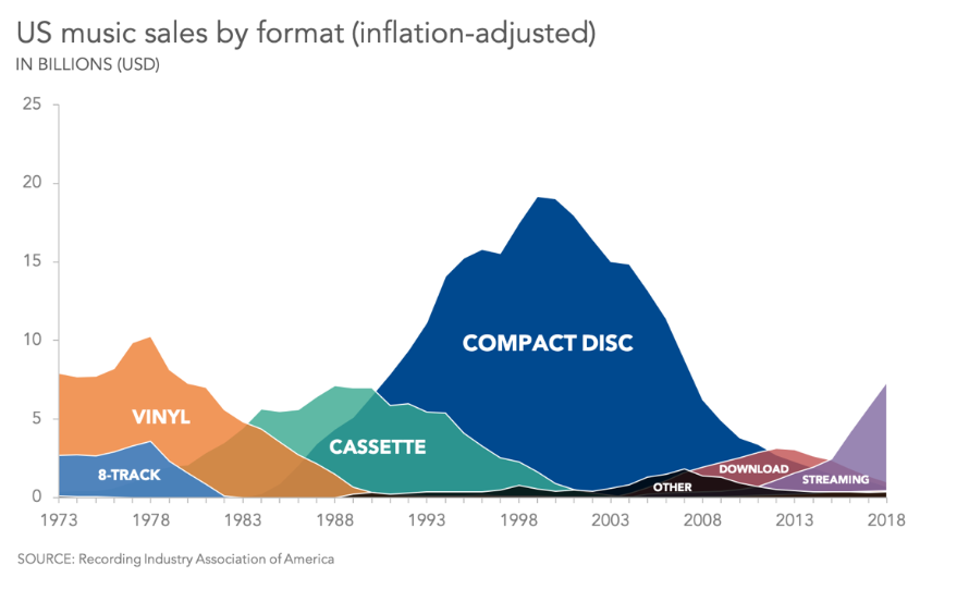
Area Graph Example
Used to show music sales by format over time.
Line Graph Typical Use
Longitudinal studies showing development or changes over time.
Bar Chart Typical Use
Experiments comparing group performance.
Histogram Typical Use
Descriptive studies showing data distribution (e.g., IQ scores).
Scatter Plot Typical Use
Correlational studies.
Box Plot Typical Use
Studies comparing score distributions across groups.
Pie Chart Typical Use
Survey data showing percentages.
Area Graph Typical Use
Time-series data showing cumulative effects.
Graph Reading: Scale
Understand numerical ranges and intervals.
Graph Reading: Trends
Identify increases, decreases, stability.
Graph Reading: Comparisons
How groups or time points differ.
Graph Reading: Anomalies
Look for outliers or unusual data points.
P3 Description: Precise Language
Use terms like increases, decreases, stabilizes, peaks, troughs.
P3 Description: Use Data Points
Reference specific values when describing patterns.
P3 Description: Avoid Vague Statements
Be explicit about what the graph shows.
Positive Correlation
Points rise from left to right (as x increases, y increases, vice versa
Negative Correlation
Points fall from left to right (as x decreases, y decreases)
No correlation
Regression line
helps us to see correlations more clearly (strong, dots cluster closely around line, moderate, dots are more scattered but a trend is still visible, weak, the dots are widely scattered and no trend is visible)
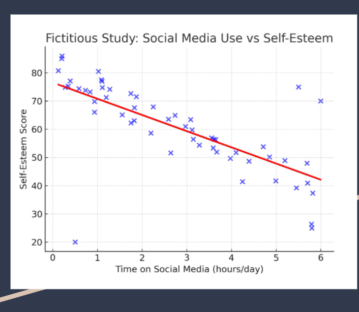
Correlation coefficient
used to determine the strengths of correlation, (1.0 is perfect correlation, -1.0 is perfect negative correlation) and closer to 1 means stronger correlation, closer to -1 is weaker correlation
4 Levels of quantitative data
Nominal, Ordinal, interval, Ratio