Geographical Skills
1/80
Earn XP
Description and Tags
Name | Mastery | Learn | Test | Matching | Spaced | Call with Kai |
|---|
No analytics yet
Send a link to your students to track their progress
81 Terms
How do you calculate the mean?
Add all the numbers then divide by how many numbers there are.
How do you calculate the median?
The middle number when all numbers are put in order.
How do you calculate the mode?
The value that appears the most.
The mode is the most common value in a data set. If two values appear most often, what is this called?
Bimodal.
The mode is the most common value in a data set. If three values appear most often, what is this called?
Trimodal.
How do you calculate the range?
The difference between the highest and lowest values.
How do you calculate the interquartile range?
Order the numbers from smallest to largest.
The lower quartile is the value a quarter of the way through the data.
The upper quartile is the value three quarters of the way through the data.
Inter Quartile Range = UQ - LQ.
When is it best to use the mean?
When you want an overall average that uses all data values.
When is it best to use the range?
To show how varied data is.
When is it best to use the interquartile range?
Useful to show how consistent the data is without being affected by extreme values - outliers.
What are measurements like median, mode and mean a measurement of?
Central tendency.
What is discrete data?
Numerical data that can only take certain/specific values.
How is it suitable to display discrete data? Why?
Bar charts because each bar represents a distinct category or value.
What is continuous data?
Numerical data that can take any value within a given range.
How is it suitable to display continuous data?
Line graphs or histograms.
What is quantative data?
Results that can be expressed using numerical values.
What is qualitative data?
Results that can’t be expressed as numbers e.g. opinions.
State the advantages of using an environmental quality survey.
Easy to read/understand.
Quick to complete so lots of data can be collected and quick to calculate.
Doesn’t require complicated, specialised equipment.
Considers a range of factors.
State the disadvantages of using an environmental quality survey.
Very subjective; based on opinion over fact.
Opportunity for mathematical error.
If people are unsure, then they may automatically give the middle answer.
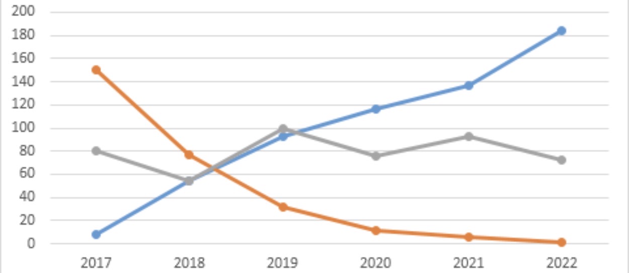
Which data presentation method is shown?
Line graph
Which data presentation method is shown?
Line graph.
Describe a line graph.
A graph that shows continuous changes over a period of time.
Which data presentation method shows change over time?
Line graph.
Is a line graph used to show continuous or discrete data?
Continuous data.
What are the strengths of using a line graph to present data?
Shows trends and patterns clearly.
Easy to interpret.
Anomalies are easy to identify.
What are the limitations of using a line graph to present data?
If there are multiple lines on a graph, it can be confusing.
Can only be used continuous data.
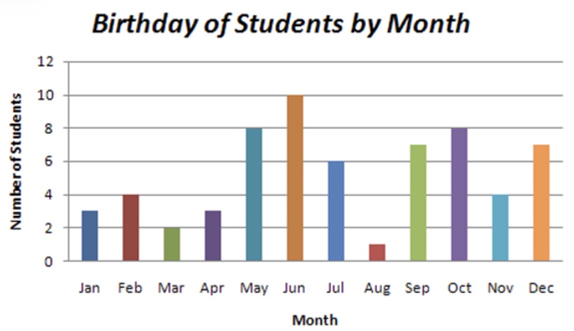
Which data presentation methods is shown?
Bar graph.
Which data presentation methods is shown?
Bar graph.
Is a bar graph used to show continuous or discrete data?
Discrete data.
Do bar graphs have spaces between bars or are they touching?
Spaces.
What are the strengths of using a bar graph to present data?
Easy to interpret and construct.
Shows the trends clearly.
Clear anomalies.
What are the limitations of using a bar graph to present data?
Can only be used with discrete data.
Difficult to represent data that covers a large range between values.
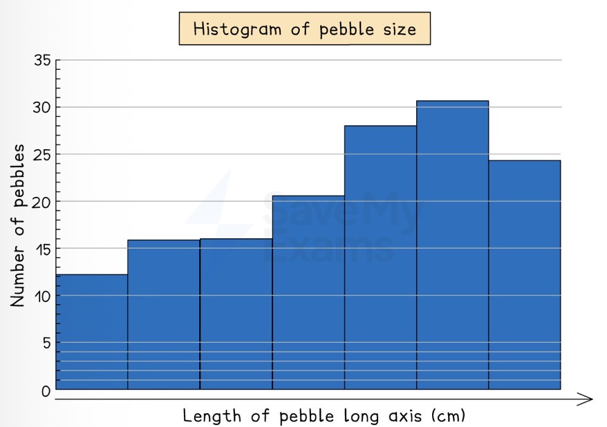
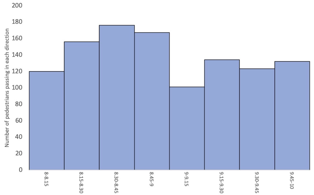
Which data presentation method is shown?
Histogram.
Which data presentation method is shown?
Histogram.
Do histograms have spaces between bars or are they touching?
Touching.
Is a histogram used to show continuous or discrete data?
Continuous data.
What are the strengths of using a histogram to present data?
Large data sets can be displayed.
Easy to compare data.
What are the limitations of using a histogram to present data?
Can be difficult to pinpoint exact data values
Only used with continuous data.
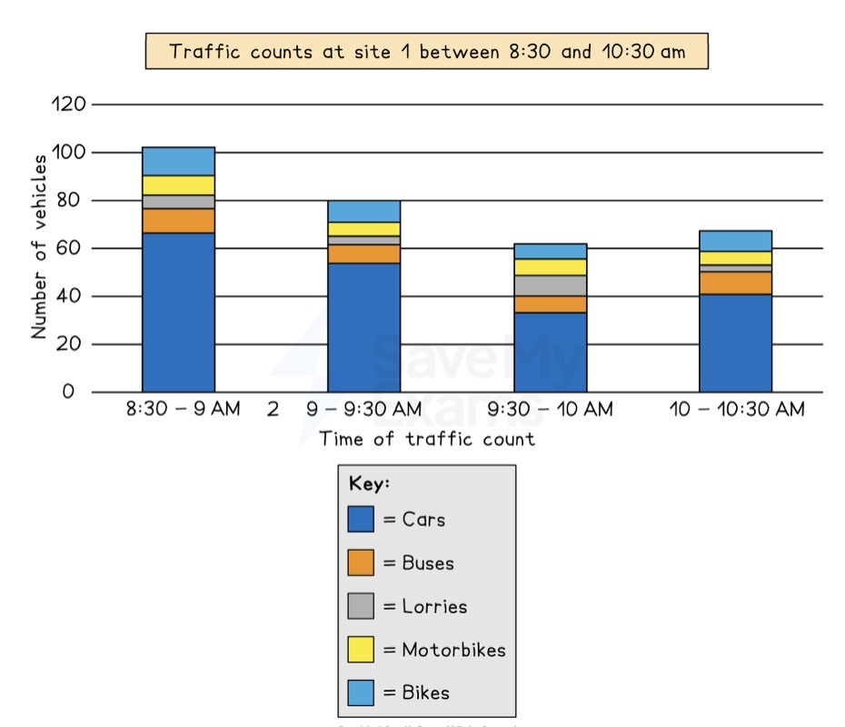
Which data presentation method is shown?
Compound or divided bar chart.
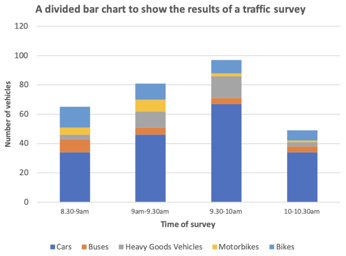
Which data presentation method is shown?
Compound or divided bar chart.
What are the strengths of using a divided bar chart to present data?
A large amount of data can be shown on one graph.
Divided bar charts can display percentages.
What are the limitations of using a divided bar chart to present data?
Small values are hard to identify.
A divided bar chart can be difficult to read and compare if there are multiple segments.
Name a type of histogram.
Population pyramid.
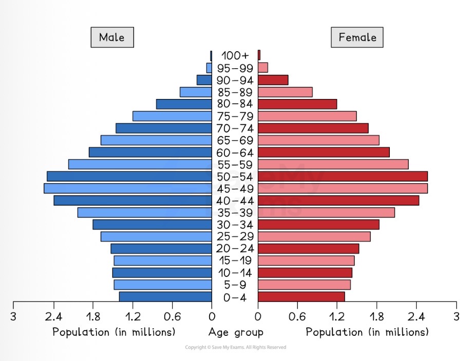
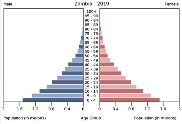
Which data presentation method is shown?
Population pyramid.
Which data presentation method is shown?
Population pyramid.
What are the strengths of using a population pyramid to present data?
Easy to compare the age and sex ratios.
Clear visual representation of the structure of a population.
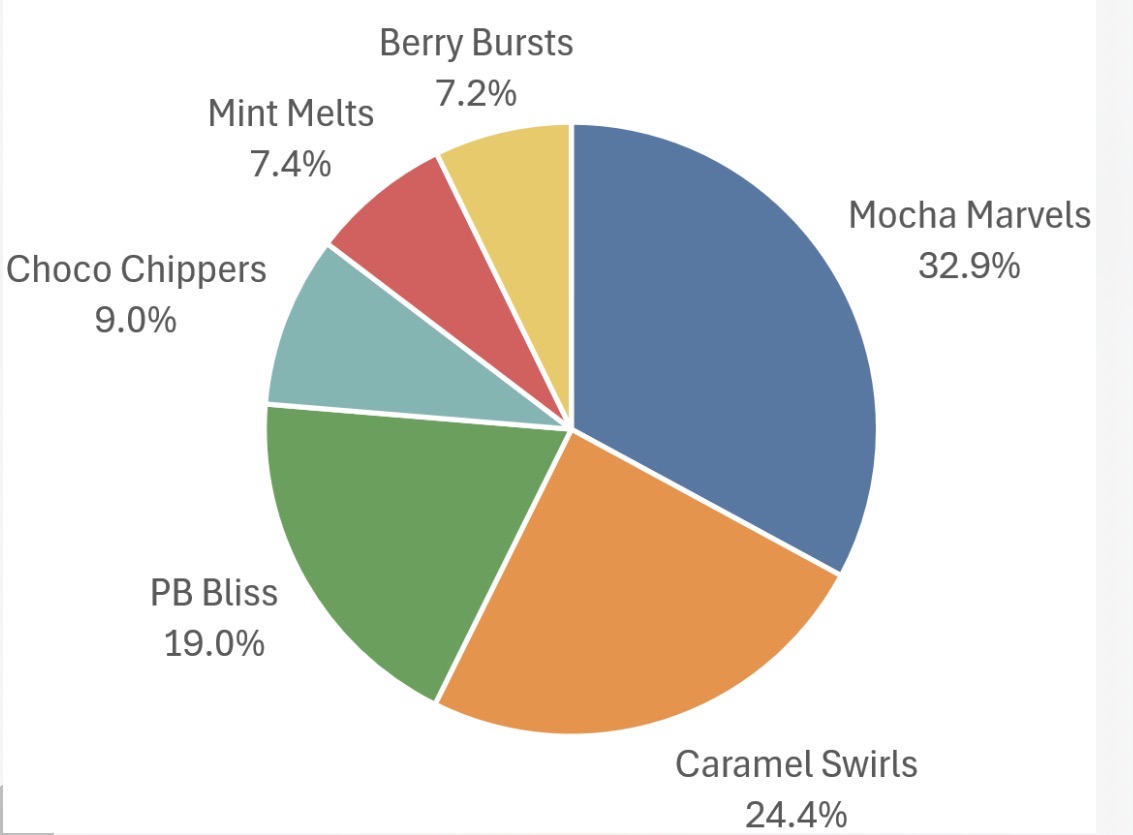
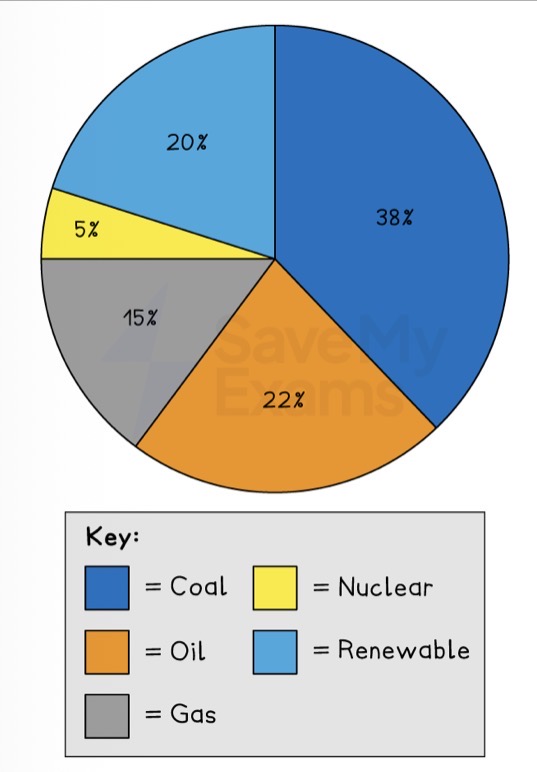
Which data presentation method is shown?
Pie chart.
Which data presentation method is shown?
Pie chart.
What are the strengths of using a pie chart to present data?
Clearly shows the proportion of the whole.
Easy to compare different components.
What are the limitations of using a pie chart to present data?
Difficult to understand without clear labelling.
Calculating the size of each section can be difficult.
Can only be used for a small number of categories; otherwise, lots of segments become confusing.
Which data presentation method is shown?
Dispersion graph.
What is the strength of a dispersion graph?
Able to spot anomalies and compare sets of data.
What is the limitation of a dispersion graph?
Only works with a really large data set.
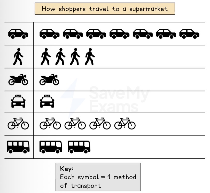
Which data presentation method is shown?
Pictograms.
Which data presentation method is shown?
Pictograms.
What is the strength of using a pictogram to present data?
Easy to understand and interpret due to pictures.
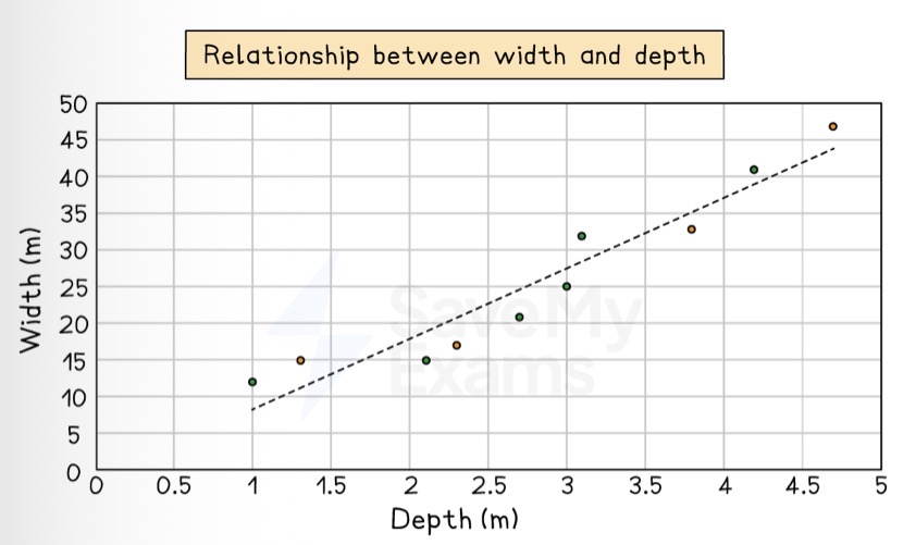
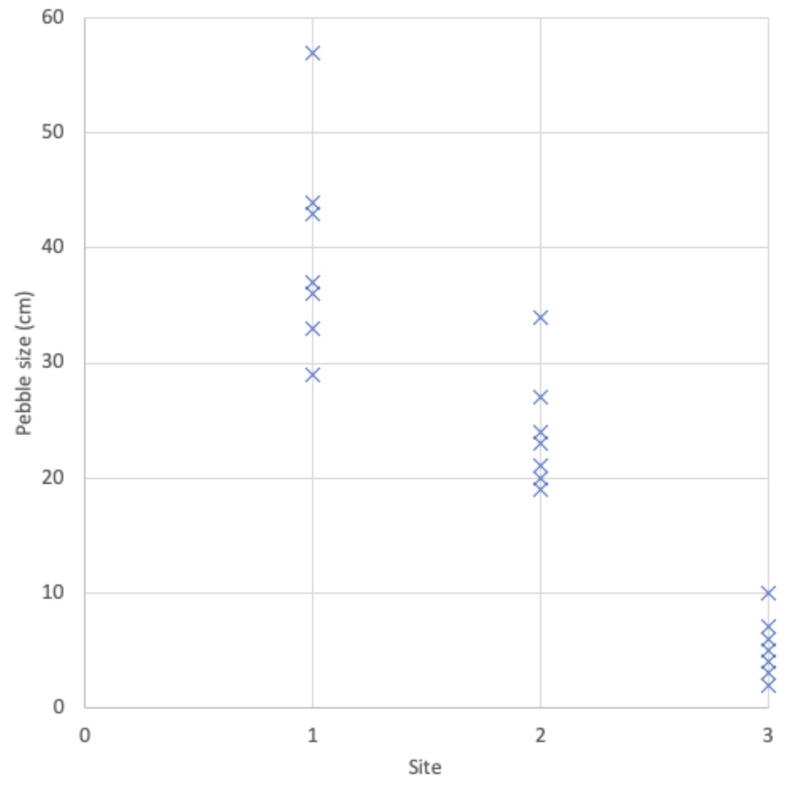
Which data presentation method is shown?
Scattergraph.
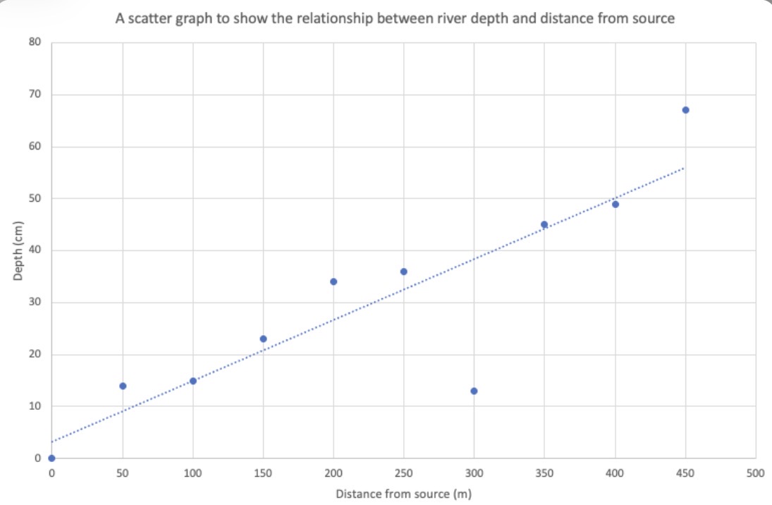
Which data presentation method is shown?
Scattergraph.
What are the strengths of using a scattergraph to present data?
Clearly shows data correlation.
Shows the spread of data.
Makes it easy to identify anomalies and outliers.
What are the limitations of using a scattergraph to present data?
Too many data points can make it difficult to read.
Can only show the relationship between two sets of data.
Line of best fit may be misleading.

A line is moving from the bottom left to top right on a scatter graph. Is this a positive or negative correlation?
Positive correlation.
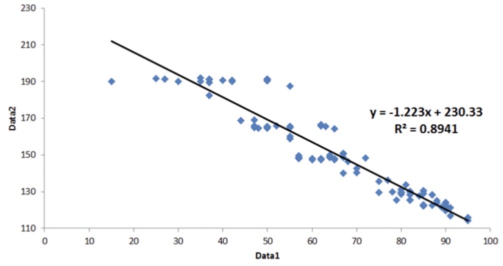
A line is moving from the top left to bottom right on a scatter graph. Is this a positive or negative correlation?
Negative correlation.
Describe the relationship between variables if there is a positive correlation on a scattergraph.
As one variable increases, so does the other.
Describe the relationship between variables if there is a negative correlation on a scattergraph.
As one variable increases, the other decreases.
Which data presentation method is shown?
Rose diagram.
Which data presentation method is shown?
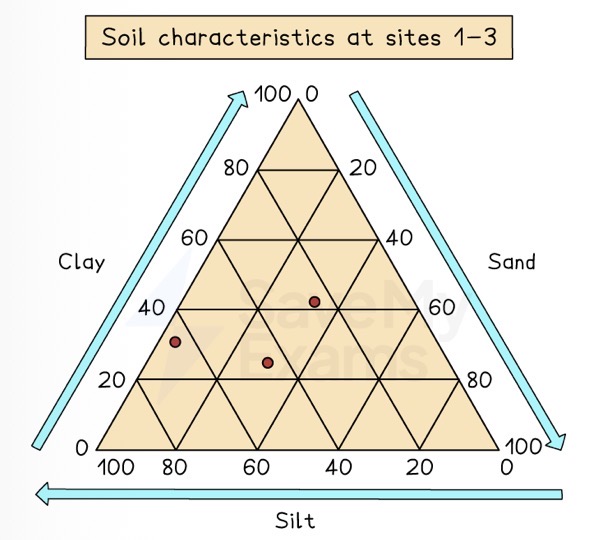
Triangular graph.
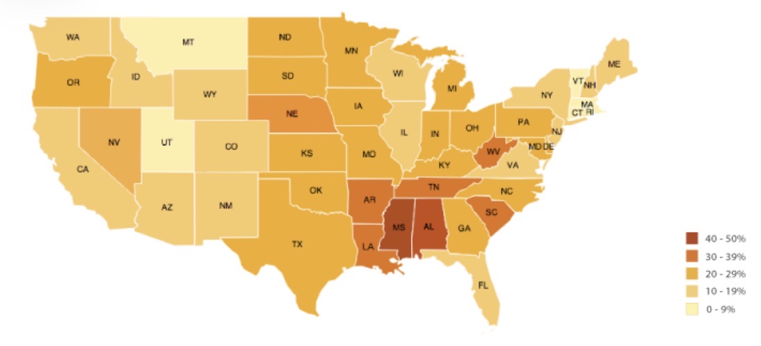
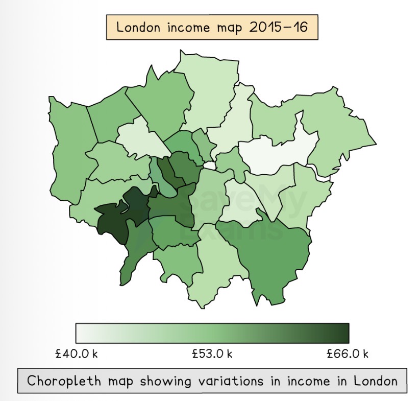
Which map is shown?
Choropleth Map.
Which map is shown?
Choropleth Map.
What are the strengths of using a Choropleth map to present data?
Clear visual impression of changes and patterns.
Shows large amount of data.
What are the weaknesses of using a Choropleth map to present data?
May be difficult to distinguish between shades.
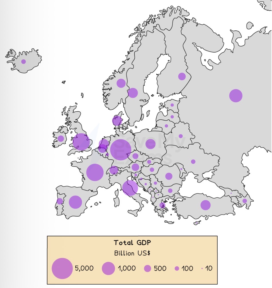
Which map is shown?
Proportional Symbols Map.
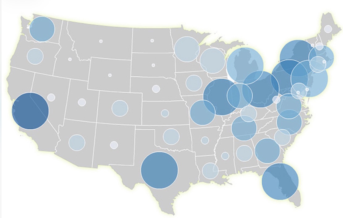
Which map is shown?
Proportional Symbols Map.
What are the strengths of using a proportional symbols map to present data?
Easy to read.
Illustrates differences between many places, making comparison easy.
What are the weaknesses of using a proportional symbols map to present data?
Symbols can hide map detail beneath.
May be difficult to position on the map, particularly with larger symbols.
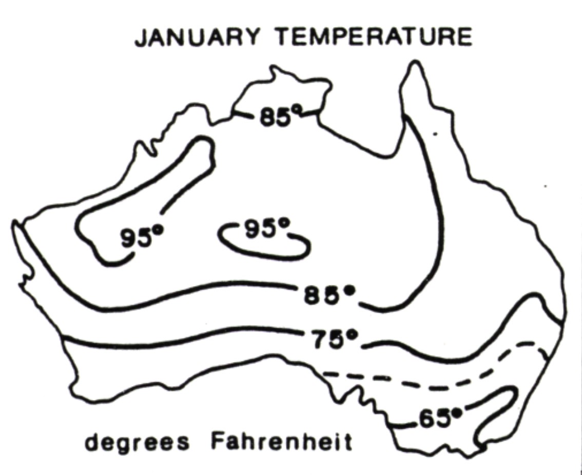
Which map is shown?
Isoline map.
Which map is shown?
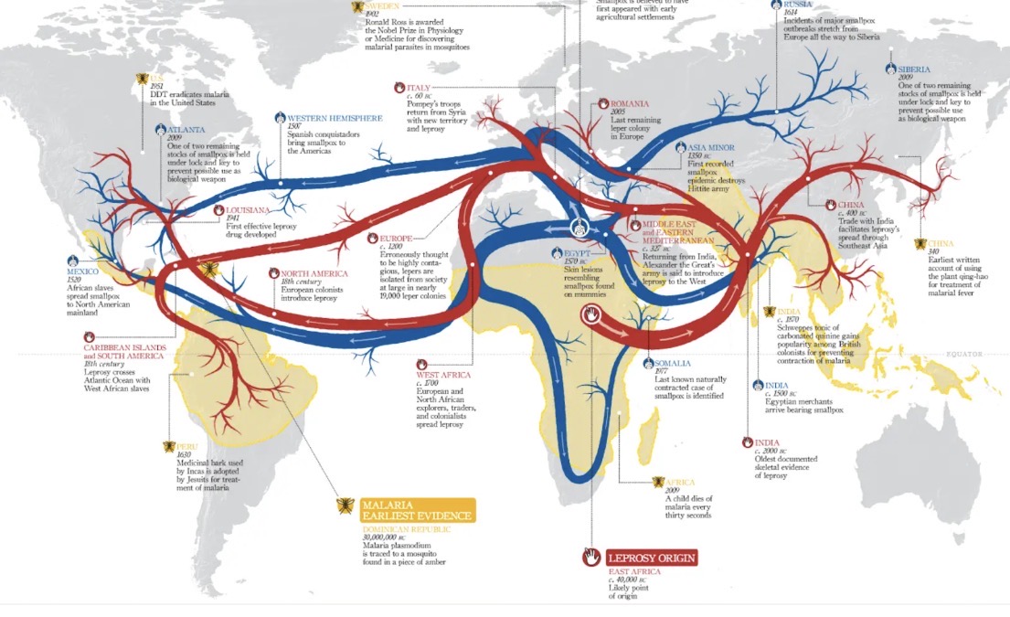
Desire line map.
Which map is shown?
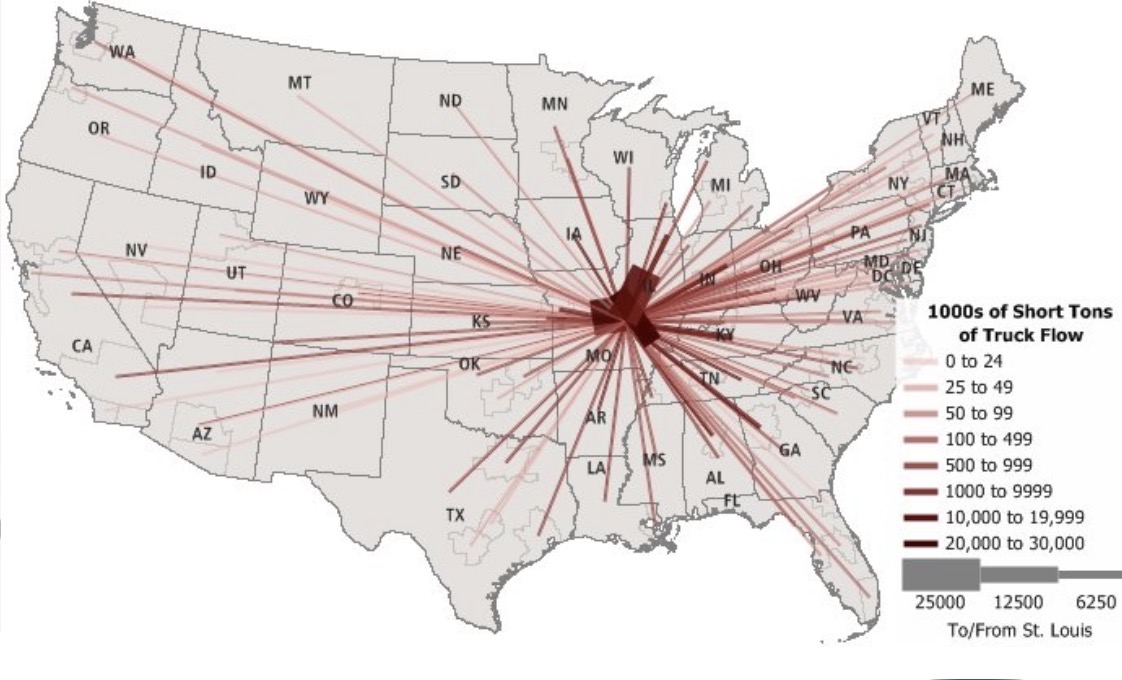
Flow line map.
Which map is shown?
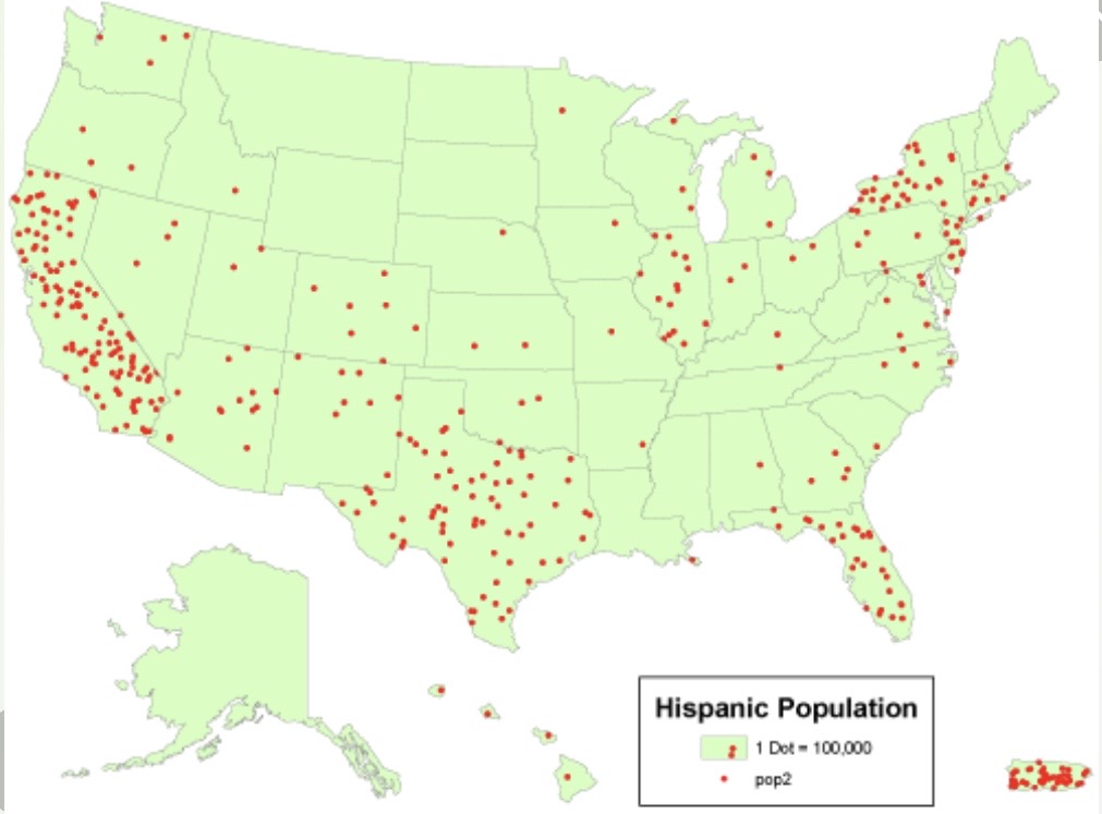
Dot map.
Why may systematic sampling not be used in a fieldwork enquiry?
Land may be difficult to access due to dense vegetation.
Land may be dangerously due to farm animals on fields or lots of traffic in urban areas areas.
Land may be privately owned so we cannot collect data here.
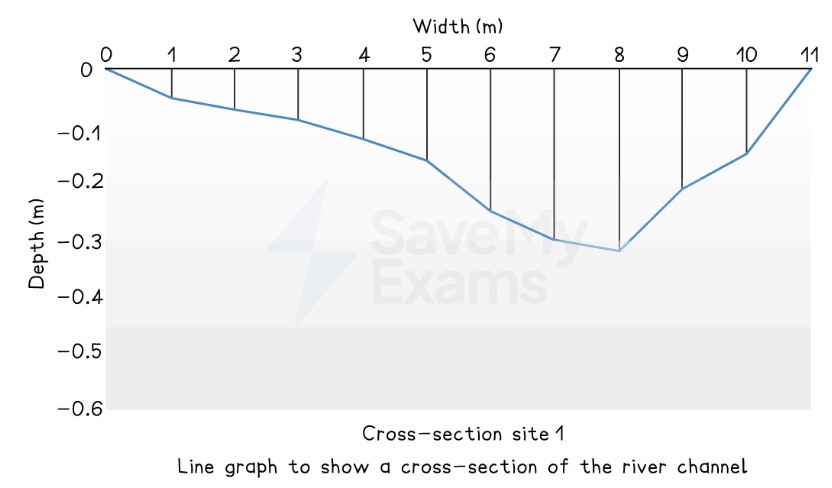
Which piece of equipment will be used to measure the gradient of a river or beach?
Clinometer and two ranging poles.
What is geospatial data?
Any data that links with a specific geographical area or location.