Ch1 - exploring data
1/43
There's no tags or description
Looks like no tags are added yet.
Name | Mastery | Learn | Test | Matching | Spaced | Call with Kai |
|---|
No analytics yet
Send a link to your students to track their progress
44 Terms
Data Analysis
is the process of organizing/showing/summarizing/asking questions about data
individuals
objects described by a set of data
variables
any characteristic of an individual
Categorical Variable
places individuals into one of several groups of categories
zip codes
20s, 30s
bar graphs, pie charts
can still be %
Quantitative Variable
takes numerical values for which it makes sense to find an average
avg age of highschooler
dot plots, stem & leaf plots, histograms
diff from %
in a scenario data can either be
categorical or quantitative
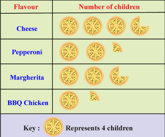
pictographs/bar graphs
visual representations of data using pictures or bars to show frequency or quantity.
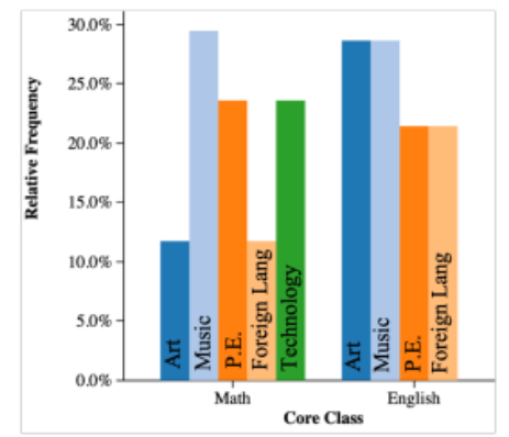
side-by side bar graphs
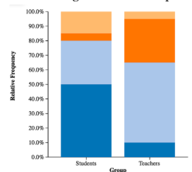
segmented bar graphs
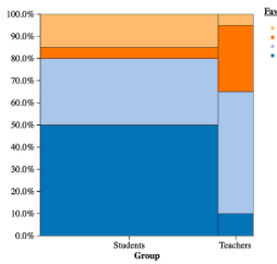
mosaic plot
side-by side bar graphs
shows (relative) frequency proportions of quantitative data, side-by-side
only use a count when sample sizes are the same (two classes of 24)
segmented bar graph
shows (relative) frequency proportions of quantitative data, stacked
only use a count when sample sizes are the same (two classes of 24)
mosaic plot
shows (relative) frequency proportions of quantitative data, with areas that are proportional to the frequencies of categories.
cherrypicking
picking specific data points to show desired graph + changing scaling
Bar Graphs show
categorical data (also shown by pie charts)
in frequency (if same sample size)
and in relative frequency (if diff sample sizes)
frequency
for categorical data = the count (how many) of observations in each category or class
relative frequency
for categorical data = the % of observations in each category or class
Two Way Tables
show the frequency counts for each combination of categories.
show marginal distribution
show conditional distribution
can show association
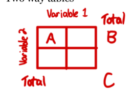
marginal distribution
is the distribution of values of that variable among all individuals described by the table (total)
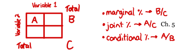
margin
a subset of values in a larger set of data, a variable NOT value
conditional distribution
describes the values of that variable among individuals who have a specific value of another variable (probability)

association
knowing the value of one variable helps predict the value of the other.
Since knowing the favorite core subject will help us predict favorite elective, we say there is an association between the two variables.
is proven stronger when there is a greater difference between the variables of two classes
distribution
the way in which values of a variable are spread across a range.
All the values that the zoologist records for body temperature and how many individual bears have each value.
marginal or conditional
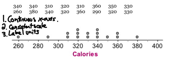
dotplot
display of quantitative data
each data value is shown as a dot above its location on the # line
continuous x-axis
consistent scale
label units
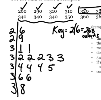
stem & leaf plot
display of quantitative data
the stems must be continuous + 5 min
leaves are single digit
include key for 1st data idem
does not work well w big sets
if split stems, do so equally BY ONES PLACE: 0-1, 2-3, etc
Histogram
display of quantitative data
divide range of data into classes of equal width
Find the count (frequency) or % (relative frequency) of individuals in each class
label & scale axes & draw histogram. adjacent bars touch unless a class contains no individuals
GIVE KEY (,] or [,)
![<p>display of quantitative data</p><ul><li><p>divide range of data into classes of equal width</p></li><li><p>Find the count (frequency) or % (relative frequency) of individuals in each class</p></li><li><p>label & scale axes & draw histogram. adjacent bars touch unless a class contains no individuals</p></li><li><p>GIVE KEY (,] or [,)</p></li></ul><p></p>](https://knowt-user-attachments.s3.amazonaws.com/d1dce06d-b294-4456-a327-bec0acac5ebe.png)
vocab to describe histogram
left bound graph
right bound graph
skyscraper graph
pancake graph
left bound graph
histogram whose buckets include left [left,right) not right
right bound graph
histogram whose buckets include right (left,right] not left
skyscraper graph
too few classes in histogram graph
pancake graph
too many classes in histogram graph
Histogram on calc
List: stat, edit
Make Histogram: 2nd, Y= (STAT PLOT)
press 1, turn on desired plot
press zoom 9
adjust window
press graph (do not press zoom again)
press TRACE to see 5# list
5 descriptors of a graph
dont forget you SOCCS
shape
outliers → “appears to be”
center → median or mean → “middle value”
context → units
spread → range (min-max), spread (min, max), IQR, standard deviation
describing shape
rough symmetry
uniform → height is roughly same for whole graph
right-skewed/left-skewed → which dir. graph tails
AND
unimodal → /\
bimodal → /\/\
multimodal
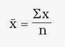
formula for sample mean
“x bar” = sum (all data items)/ # of items
Describing center
The measures that describe the center of the data 5pt)
the median: middle #, resistant to outliers
the mean: avg #, is impacted by outliers
Quartiles: the 25% ‘s
Spread; [9,24] or the range; 24
IQR: measures the range of the middle 50%
![<p>The measures that describe the center of the data 5pt)</p><ol><li><p>the median: middle #, resistant to outliers</p></li><li><p>the mean: avg #, is impacted by outliers</p></li><li><p>Quartiles: the 25% ‘s</p></li><li><p>Spread; [9,24] or the range; 24</p></li><li><p>IQR: measures the range of the middle 50%</p></li></ol><p></p>](https://knowt-user-attachments.s3.amazonaws.com/f1a8a4af-d850-4ede-aab5-2cdc81df5e73.png)
the median
middle # in order, resistant to outliers
the mean
avg #, is impacted by outliers
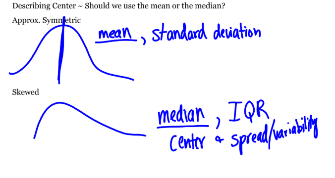
should we use mean or median
when graph is approx symmetric: mean or standard deviation is more accurate
when graph is skewed median/center, or IQR is more accurate bc mean is pulled to skew
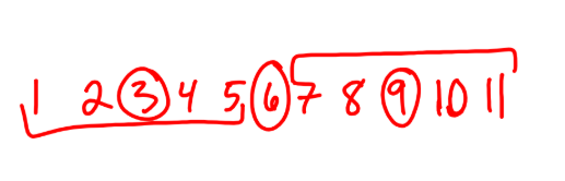
Quartiles
the 25% ‘s
1st quartile = median of lower half
3rd quartile = median of upper half
(if even then include median, if odd then exclude median)
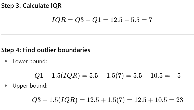
IQR
measures the range of the middle 50%
IQR = Q3-Q1
graphically representing the center (box plot/box & whisker plot)
box plot/box & whisker plot
box shows middle 50%
line is median
lines show quartiles and outliers with *
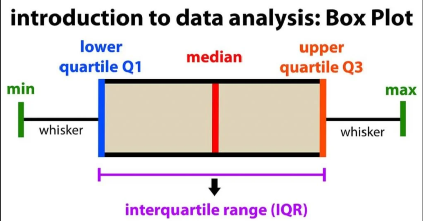
is it an outlier
an observation that falls 1.5 x IQR = outside boundary
above Q3: Q3 + 1.5(IQR)
below Q1: Q1 - 1.5(IQR)
if on boundary its included
standard deviation
measures the avg distance from the mean (should only be used when mean measure of center) always > or = 0
calculated by taking square root of variaance / square root of (Sx²)
= Sx (same units as og observations)
is not resistant - very impacted by skew + outliers bc of square (goes toward skew/outliers)
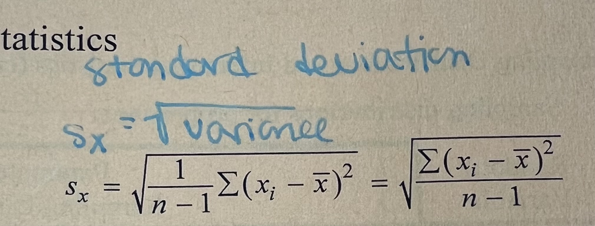
Sx = root (variance), standard deviation
variance
how spread out the data is
(Sx²)
is not resistant - impacted by skew and outliers in the data set (more skew/outliers = greater spread)
measures of center vs variability
center: median, mean
variability: range, spread, IQR, standard deviation