2.3 Data Analysis and Graphing
1/8
There's no tags or description
Looks like no tags are added yet.
Name | Mastery | Learn | Test | Matching | Spaced |
|---|
No study sessions yet.
9 Terms
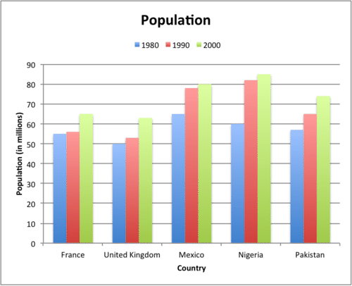
Bar Graph
Displays category-type data, uses bars, typically showing frequency or amount.
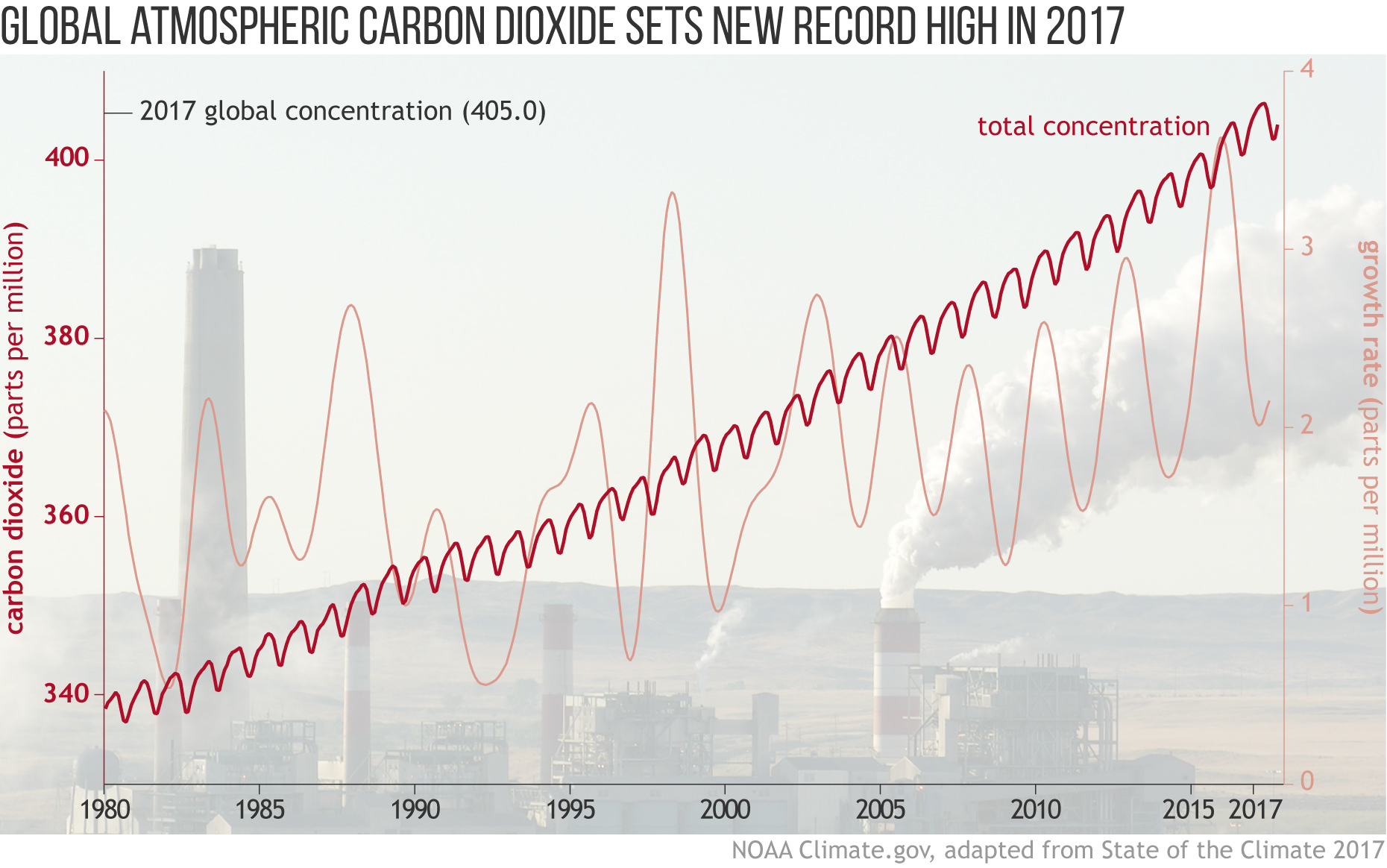
Line Graph
A graph that uses points connected by lines to show how something changes over time or with respect to another continuous variable.
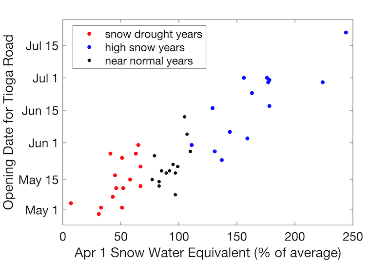
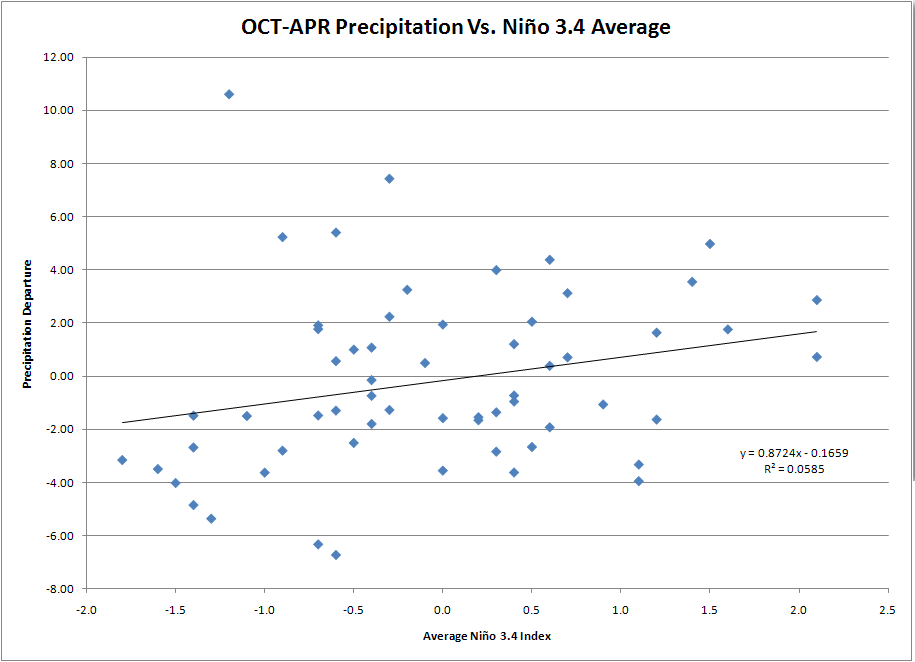
Scatter Plot
A graph that displays individual data points plotted on an x-y axis to show possible correlations, connections or patterns between two variables.
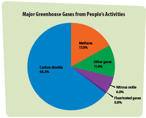
Circle Graph (Pie Chart)
A circular chart split into slices to show proportions, often used to show percentages of a whole.
Independent Variable
The factor that is changed on purpose in an experiment; it is graphed on the x-axis. Also known as the manipulated variable.

Dependent Variable
The factor that is measured in an experiment; it responds to changes in the independent variable and is graphed on the y-axis. Also called the responding variable.

Trend Line
A line added to a graph to indicate the overall direction (increase or decrease) of a dataset over time.
Prediction
An informed estimate about a future data point based on current trends or patterns observed in a graph.
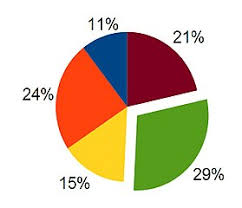
Percent of a Whole
A proportion expressed as a fraction of 100; often shown using circle graphs.