Stat unit 1
1/34
Earn XP
Name | Mastery | Learn | Test | Matching | Spaced | Call with Kai | Chat |
|---|
No analytics yet
Send a link to your students to track their progress
35 Terms
Categorical Variable
Names, labels
ex: marital status, eye color, race
Quantitative Variable
Makes sense to average
ex: height, test scores
Frequency
How many times something occurred
Marginal Distribution
Subset out of the whole sample.
Conditional Distribution
Parts out of a group/subgroup
Individuals
Subjects described by data set
Variable
Characteristic of individual
Association
One variable influences the other. The two are associated, but do not use correlated instead of associated.
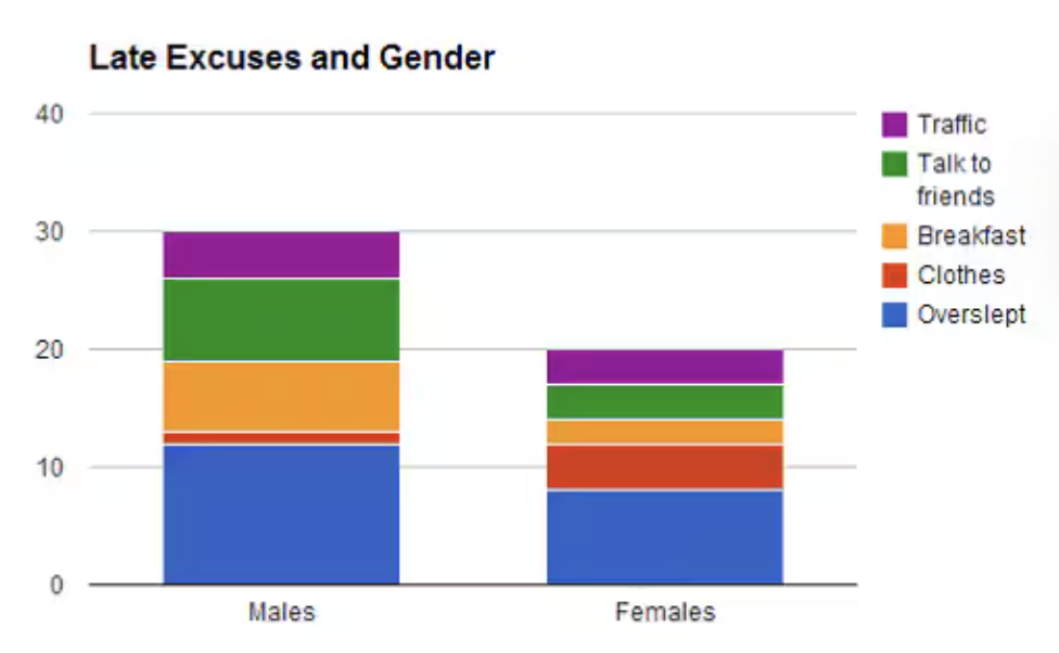
Stacked/Segmented Bar Graph
Displays all components of a whole on top of each other as part of a whole bar.
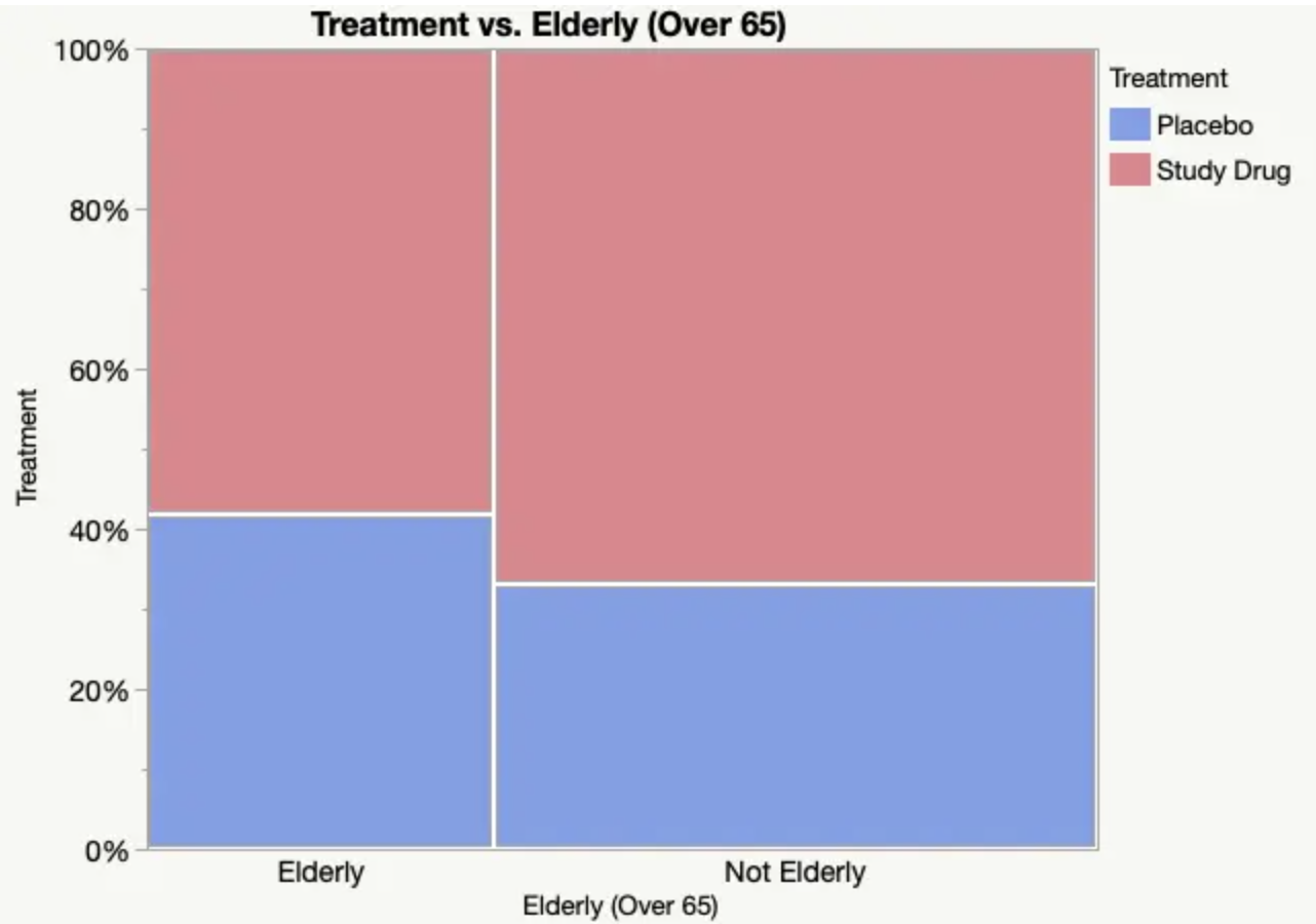
Mosaic Plot
Segmented bar graph but widens the bars to be proportional to their respective sample sizes.
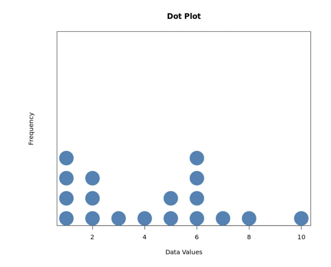
Dot Plot
Each data value is shown as a dot above its respective value on a number line.
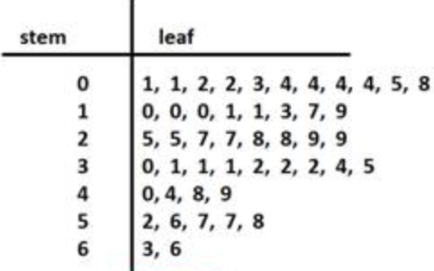
Stem and Leaf Plot
Vertical Bar Graph but denotes the points as numbers with EVENLY SIZED BUCKETS.
Requires a key for the buckets, can just say “5-9” for one bucket
Bar Graph
Denotes the amount of people who answered each response by a vertical y axis.
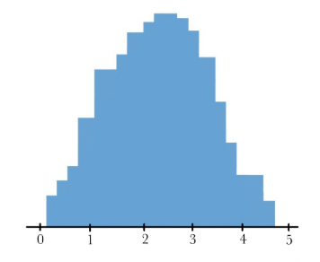
Histogram
Divides points by frequency and graphs similar to a bar graph, but with conjoined bars and buckets.
MUST INCLUDE A KEY FOR THE BUCKET SIZES. Can be 5 - 9
SOCCS
Shape, Outliers, Center, Context, Spread
Shape
Noteworthy features of graph. Unimodal(one hump), Bimodal(two humps), multimodal(many humps), Skew, or irregular(doesn’t fit any description).
Skew
Distribution of individuals on one side or the other of a graph. Usually the lower, more severe portion of the graph determines the skew.
ex: if the graph is a histogram with most people answering 50-60, but a fair few answered 60-70 and 70-80, we would say the graph is skewed right.
Outliers
Points that are statistical anomalies, that are greater than Q3 + 1.5(IQR) or less than Q1 - 1.5(IQR).
Center
Can be median or mean depending on the skew of the graph, but describes the center.
Context
Context behind the data. Say “The (variable) typically varies from the mean by about…(sx with units)“ or “on average, a (variable) is about (sx with units) away from mean.“
Spread
Describes the distribution of the graph. Can use range, standard deviation, or IQR.
Range
Max - Min
IQR
Q3 - Q1
Standard Deviation
Formula given on equation sheet but essentially the average difference between an individual and the mean.
denoted by sx on equation sheets and in writing
Median
The middle term of a distribution.
ex: in a sample of 11 people, the 6th person’s (after ordering from least to greatest) response would be the median. If the group was reduced to 10, the median would be the average of the 5th and 6th people’s answers.
Q3
The median of the upper half of the graph, excluding the median if it is just the middle term. If the median is the average of the two closest terms, take the greater term and include it in the median calculation.
Q1
The median of the bottom half of the graph, excluding the median if it is just the middle term. If the median is the average of the two closest terms, take the lower term and include it in the median calculation.
IQR
Q3 - Q1
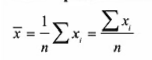
Mean
Average of all responses from the sample. denoted by x with a bar on top in the equation sheet.
5 number summary
Min, Q1, Median, Q3, Max
Box Graph
Uses the 5 number summary to graph the distribution. Uses the Q1, median, and Q3 values to draw the box in the middle, with the median denoting the line in the middle of the graph. Min and Max describe the outer “stops“ of the graph.
Outliers in Box Graphs
Outliers are denoted either by an asterisk if wished, with the max/min being reduced to the next greatest/lowest point. If not denoted, nothing is needed.
Getting 1 Var Stats on graphing calculator
STAT —> CALC —> 1-Var Stats
How to create a list on graphing calculators
STAT —> EDIT —> input values into a list, likely L1
How to graph various graphs with graphing calculator
STAT —> WINDOW(set appropriate range) —> STAT PLOT(turn appropriate list on) —> GRAPH