Stats Unit 1 Vocab
1/42
There's no tags or description
Looks like no tags are added yet.
Name | Mastery | Learn | Test | Matching | Spaced | Call with Kai |
|---|
No analytics yet
Send a link to your students to track their progress
43 Terms
Individual
An object described in a set of data.
Variable
A attribute that can take dif. values for dif. individuals
Categorical Variable
Assigns labels that place individuals into a specific group called category
Quantitative Variable
Takes # values (quantities) ex. counts, measures, age
Discrete Vriaable
A quantitative variable that takes a fixed set of possible values w/ gaps between them. (ex. 1 - 2 - 3)
Continuous Variable
A quantitative variable that can take any value in an interval on the number line (ex. 0- infinity)
Distribution
Tells us what values the variable takes and how often
Frequency Table
shows # of individuals having each value
Relative Frequency Table
shows proportion/percent of individuals having each value
Bar Graph
shows each category as a bar, heights of bars show category frequencies/relative frequencies
Pie Chart
shows each category as a slice of a pie. Areas of slices are proportional to category frequencies/relative frequencies
Two-way-Table
Table of counts that summarizes data on the relationship between two categorical variable for some group of individuals.
Marginal Relative Frequency
Gives the %/proportion of individuals that have a specific value for one categorical variable. (tells you only about one of the variables in a two-way table)
Joint Relative Frequency
Gives the %/proportion of individuals w/ specific values for two categorical variables.
Conditional Relative Frequency
Gives the proportion of individuals that has a specific value for one categorical variable among individuals who share the same value of another categorical variable (the condition).
Association
There is association between two variable if knowing value of one, helps predict the other.
Graphs
Use a side by side bar graph, a segmented bar graph or a mosaic plot to compare the distribution of a categorical variable for two or more groups.
Dotplot
Show each data value as a dot above its location on a #-line
Symmetric Distribution
right side of dot plot = roughly a mirrored version on the left
Skewed Right
Right side is much longer and has less values
Skewed Left
Left side has less values and is much longer
Graph Shape
Ex. The distribution is skewed right with a single peak at 1 goal. There is a gap between 5 and 9.
Outliers
An observation that falls outside of the overall pattern. Ex. Games where 9&10 goals were scored appear to be outliers.
Center
The median is 2 goals scored.
Variability
The data vary from 1 to 10 goals scored.
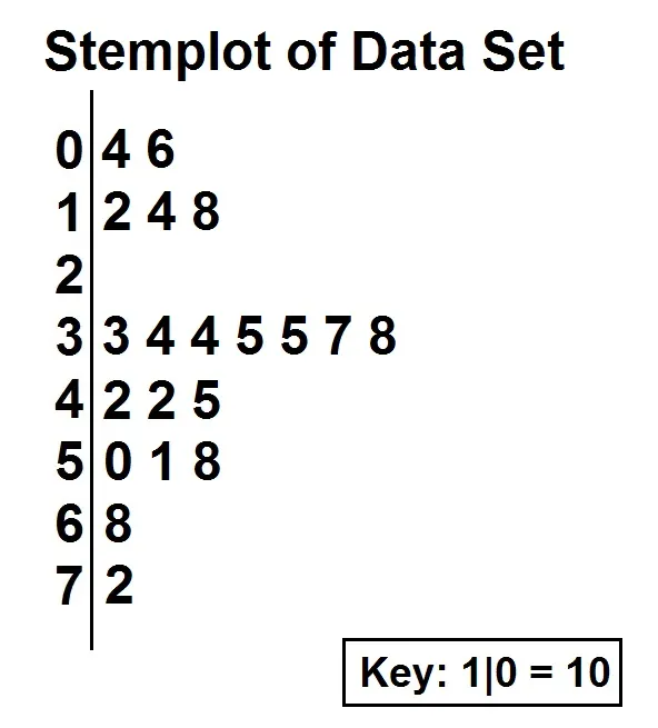
Stemplot
shows each data value separated into two parts.
A stem: consisted of all but the final digit
A Leaf: the final digit
Stems are ordered from lowest to highest in a vertical column
Leaves are ordered from smallest to largest number from the appropriate stems
Histograms
Shows each interval of values as a bar.
Heights of bars show the frequencies or relative frequencies of value in each interval.
Mean
The average of all the individual data values.
Statistic
A # that describes some characteristic of a sample.
Parameter
A # that describes some characteristic of a population.
Resistant
A statistical measure is resistant if it isn’t sensitive to extreme values.
Median
The midpoint of a distribution, half the observations are smaller, half are larger.
Comparing mean and median
Mean < Median : skewed left
Mean = Median : Roughly Symmetric
Mean > Median : skewed right
Range
The distance between the min. & max. value
Range = max - min
Ex. The data varies from 1 to 10 with a range of 9.
St. dev
measures the typical distance of values in a distribution from the mean
always greater of equal to 0
0 when all values in a dsitrubtion = same
increases with increased variation from mean
measures variation about the mean
St dev formula
( value - mean)² = variance
square root variance = st. dev
Quartiles
the values that divide the distribution into 4 groups of roughly equal size. Arrange data least to greatest to find.
1st Quartile
the median of the data values that are left of the median
3rd Quartile
The median of the data values to the right of the median
IQR (interquartile range)
measures the variability in the middle half of the distribution
the distance between the 1st and 3rd quartiles of a distribution
IQR = Q3 - Q1
How to identify outliers
If it falls more than 1.5 x IQR above the 3rd or below the 1st quartile
Low Outliers < Q1 - (1.5 x IQR)
High Outliers > Q3 - (1.5 x IQR)
5 Number Summary
The 5 #;s of a distribution of quantitative data consists of the
minimum, Q1, median, Q3, maximum
Boxplot
A visual representation of the 5 # summary