Graphical Displays of Data
1/9
Earn XP
Description and Tags
Exam 1
Name | Mastery | Learn | Test | Matching | Spaced | Call with Kai |
|---|
No analytics yet
Send a link to your students to track their progress
10 Terms
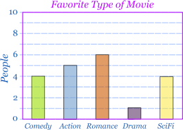
Bar Graph
A graphical display of data where the length of each bar corresponds to the number or percentage of observation in a category or group
Often done with qualitative data
Bars do not touch
Rules of a bar graph
X-axis: Category
Y-axis: # of responses
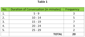
Frequency Distribution
A table that lists data and their coresponding frequencies (counts)
Data can be listed individually (not done that often because of ungrouped frequency where information is not informative because there is not repetition) or grouped into classes
Quantitative data
Rules of Frequency Distribution (tabular)
Left- make ranges that are called classes
when you pick the range, you must stay with the pattern
label in a way that represents all data ex. 20-29.99
Relative Frequency Distribution (tabular)
Represents the proportion of values falling in a given class interval
proportions are decimal points
Formula:
#in a given class (count)/ total # of values
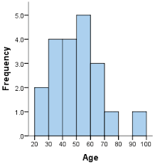
Histogram
A graphical representation of a frequency or relative frequency distribution
Rules of a Histogram
y-axis: represents frequencies or relative frequencies
x-axis: represents class intervals
** bars touch
Stem-and-Leaf Plot
represents data by separating each value into 2 parts: the stem (i.e. all but the
rightmost digit) and the leaf (i.e. the rightmost digit)
make a key** example: 2|26 you can do 2/2=22 not 2/2=2.2
Advantage of Stem-and-Leaf Plot
A stem-and-leaf plot shows the same distributional representation of data as the
histogram but also allows the researcher to see individual score values.
What methods are tabular and graphical?
Tabular- Frequency distribution, Relative Frequency distribution, and Stem-and-Leaf Plot
Graphical- Bar graph, histogram