GEOGRAPHY P3 - Graphs & Maps
1/22
There's no tags or description
Looks like no tags are added yet.
Name | Mastery | Learn | Test | Matching | Spaced | Call with Kai |
|---|
No analytics yet
Send a link to your students to track their progress
23 Terms
Geographical enquiry cycle
1) Hypothesis and Planning
2) Design + carry out data collection (considering bias + sensitivity)
3) Process (organise, clean) + Represent (graphs, summary stats, etc) data
4) Interpret results (draw conclusions, considering reliability)
5) Evaluate (identify weaknesses and refine the process to further investigate hypothesis)
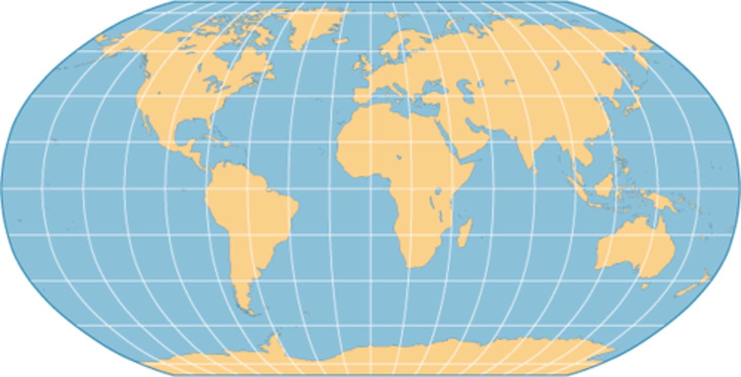
Base maps
Blank maps
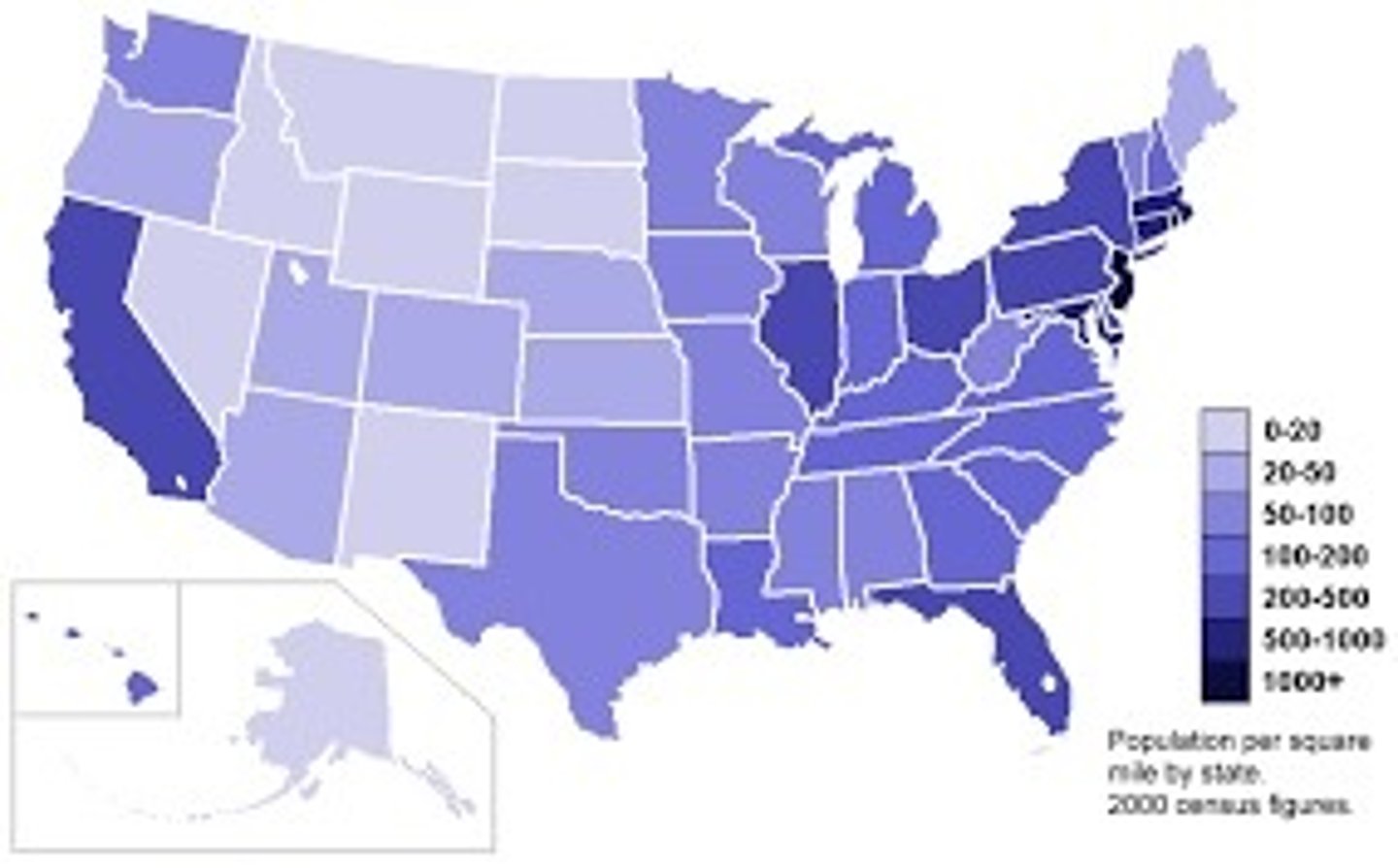
Choropleth maps
Advantages: Very clear to see spatial patterns
Disadvantages:
- No variations within individual areas
- Suggests figures change abruptly at boundaries
- Hard to achieve a large number of shades with only one colour
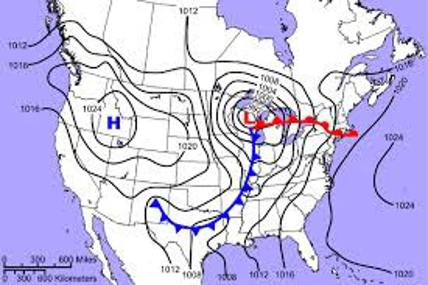
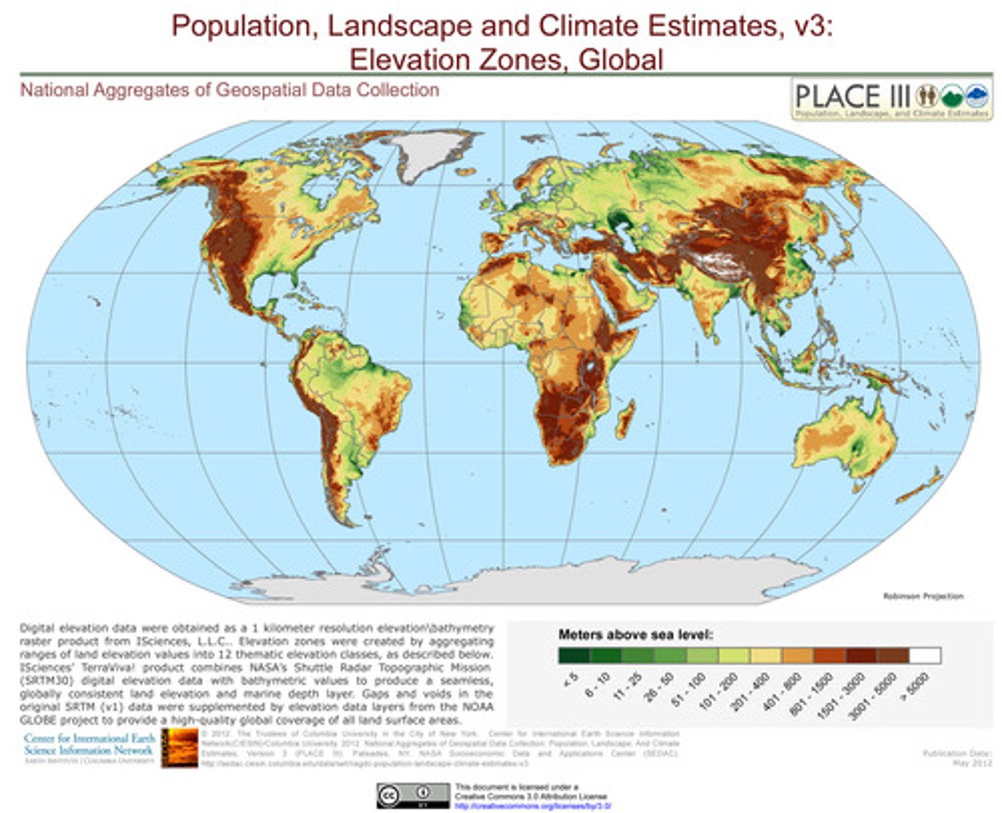
Isoline
E.g., contour lines or ones with pressure (in image)
An isoline is a line which is drawn to link different places of equal value
Advantages: Can interpret general trends
Disadvantages: When drawing, hard to position the lines based on only a few data points so may be subjective
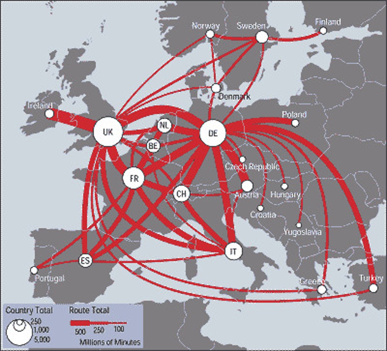
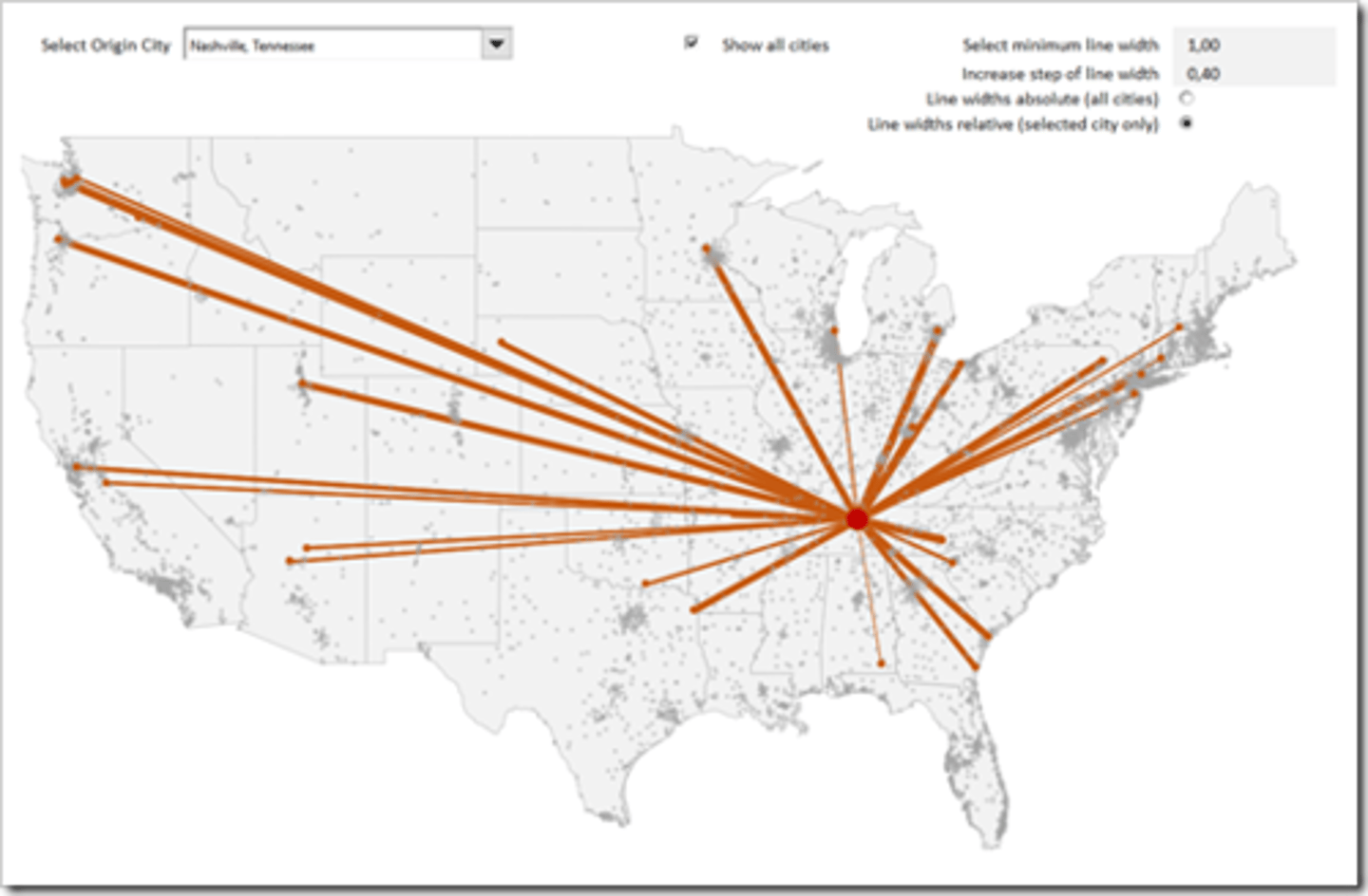
Flow line maps
Shows movement between places - thickness of line = value
Advantages: Shows direction and size of movement visually
Disadvantages: Lacks precision unless specific values given
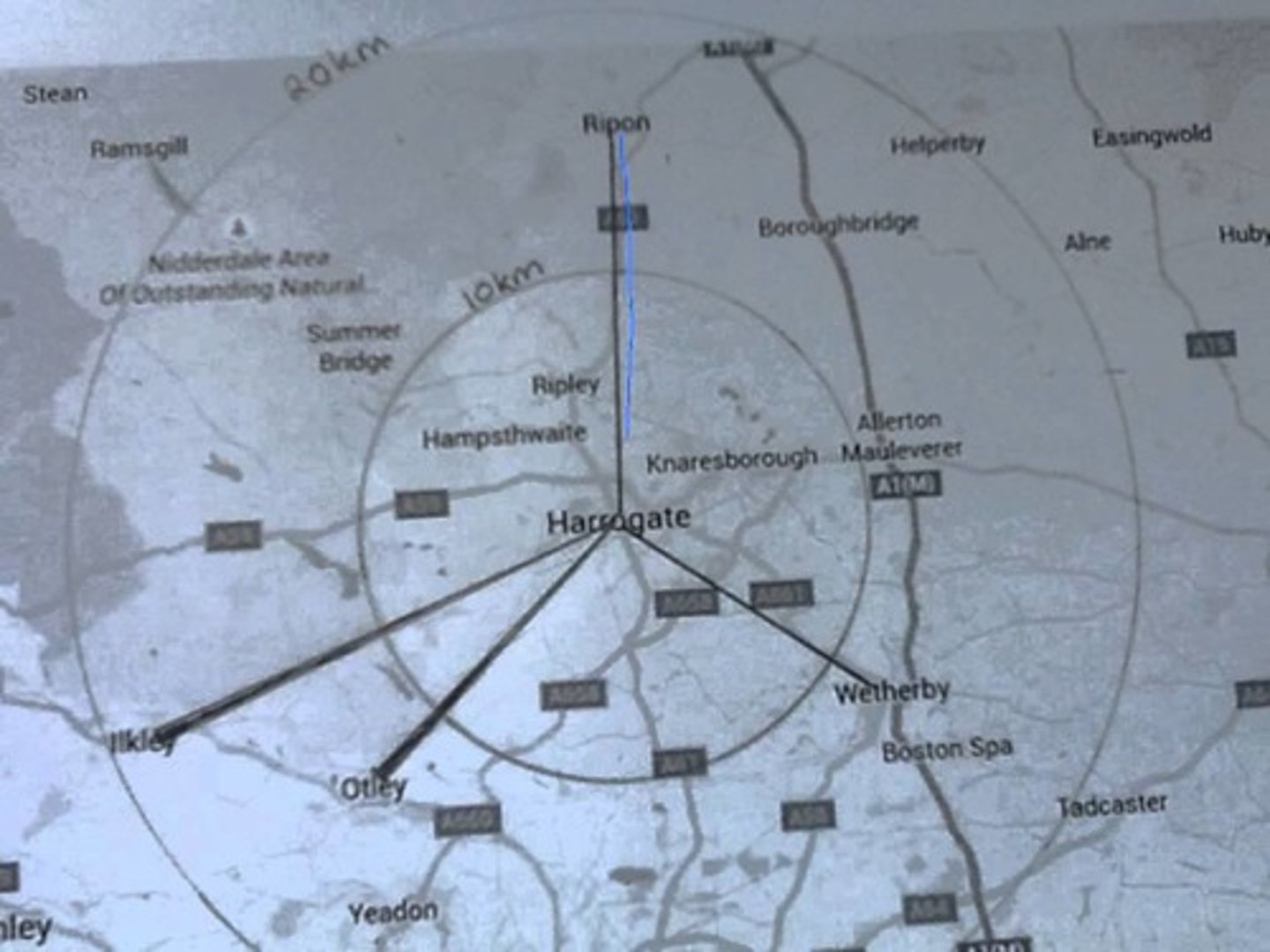
Desire line maps
Shows direction (not size) of movement between places
Advantages: Shows direction visually
Disadvantages:
- Unlike flow line, line is drawn straight from origin to destination, not following actual path of movement and is not prop. to size
- Lots of desire lines may overwhelm the map making it hard to interpret
Sphere of influence map
Often for settlements - sphere of influence is the area from which people come to the town
Advantages: Very visual
Disadvantages: Doesn't show precise data
Thematic maps
Compare nations based on social & economic themes
Route maps
E.g., Road map
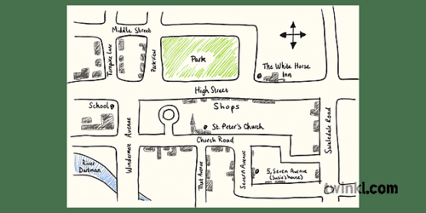
Sketch map
Advantages: Good visual memory aid, especially if annotated
Disadvantages: Not accurate
Tables
Bar charts & histograms
+ Shows trends and patterns/Can read values from scale
+ Easy to construct and interpret visually
- Not much space to label categories
Line graphs
+ Easy to compare more than one set of data
+ Lines drawn can help suggest data between values
- Only continuous data
Scatter graphs
+ Shows correlation
+ Easy to construct
+ Easy to find anomalies
- Too few data points can give unreliable correlation
- Too many data points make it unreadable
- Only shows relationship between two variables
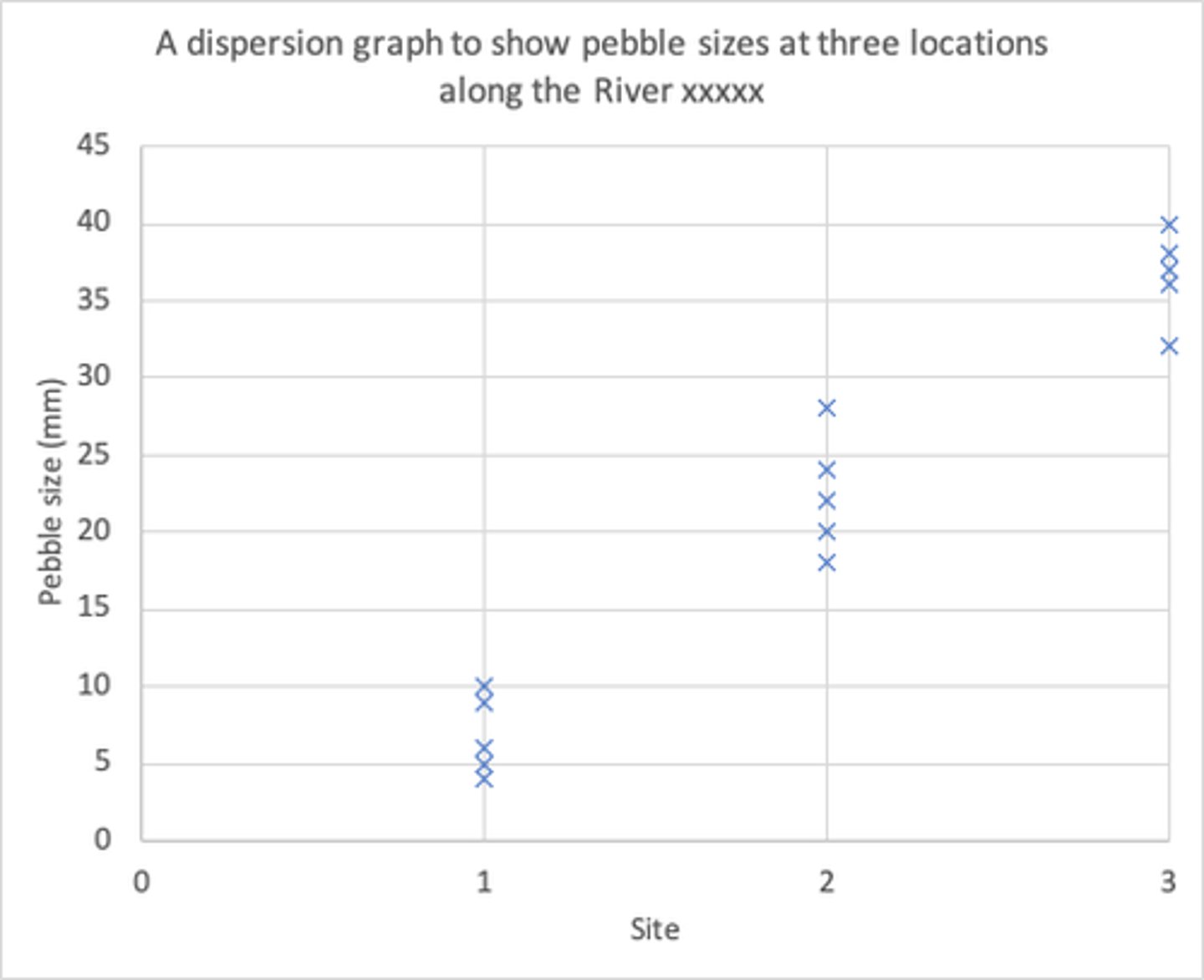
Dispersion graph
+ Easy to see patterns and show spread from the mean (sometimes marked as a separate data point)
+ Good for making comparisons
+ Shows anomalies
- Needs numerical data
Pie charts
+ Good for percentages
+ Visual
+ Easy to construct and interpret
- Does not show accurate data values unless labelled
- Too many sectors make the chart unreadable
- Too small a sector means labels are hard to read
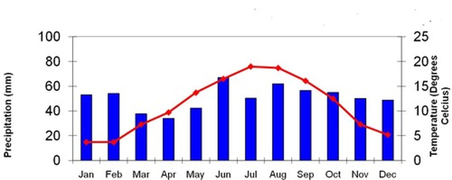
Climate graph
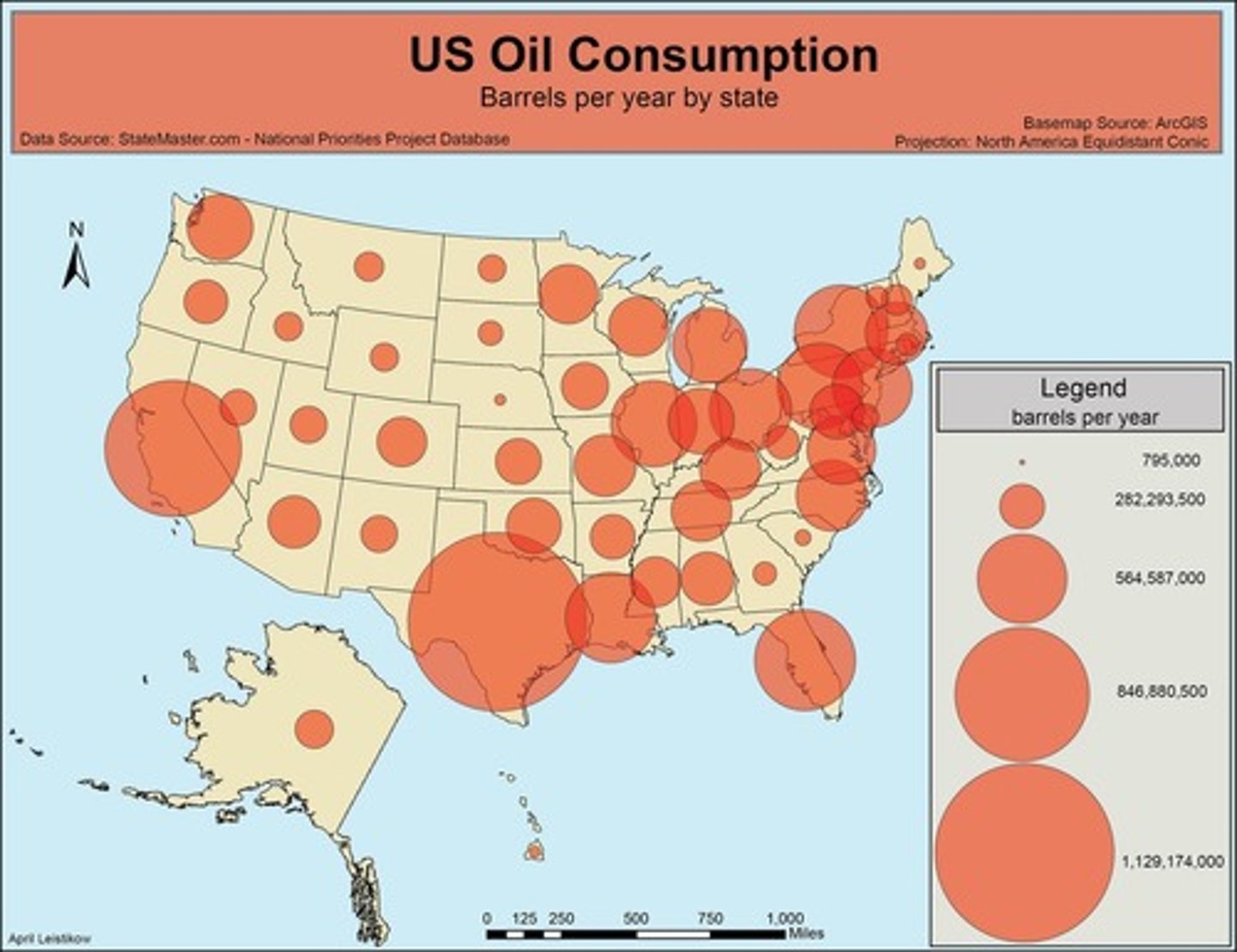
Proportional symbols
+ Good visual representation of data
- Scale needs to be accurate
Pictograms
+ Good visual representation of data
+ Easy to construct and interpret
- Doesn't provide specific numerical data
Cross-sections
Shows view of a segment
Only one moment in time so may not be representative
Population pyramids
+ Shows how population is composed
+ General shape can indicate type of population structure
- Can only use for population structure
- Figures broken into age categories so some detail may be lost within them
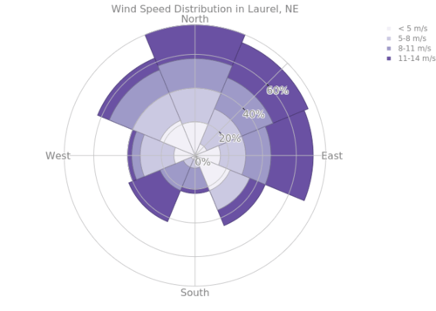
Radial graphs and rose charts
Radial graphs are used for a variable with time or a variable with (compass) directions.
+ Shows different sets of data at once
+ Good visual representation of data
- Can only be used with specific types of data
- Hard to spot anomalies
Rose chart: A type of radial graph that shows the direction the winds blew from and the length of each "spoke" around the circle shows how often the wind blew from that direction.
Why might a graph be misleading?
Scale does not start at zero
Scale has parts missed out/does not increase uniformly
Lines are drawn too thickly to read information
Axes are unlabelled so we do not know what they represent
There is no key so it is impossible to interpret
Colours stand out more than others
Three-dimensional diagrams distort comparisons
Separating sections of a diagram distorts comparisons