Ecology week 4 graphs
1/10
There's no tags or description
Looks like no tags are added yet.
Name | Mastery | Learn | Test | Matching | Spaced | Call with Kai |
|---|
No analytics yet
Send a link to your students to track their progress
11 Terms
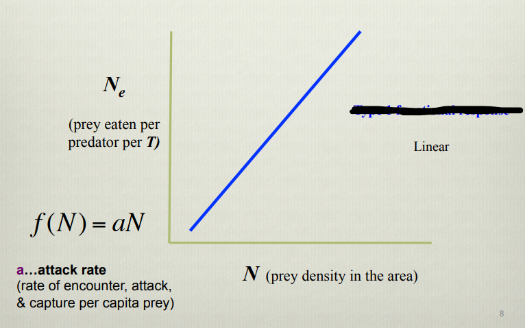
What does this graph show
Type 1 functional response
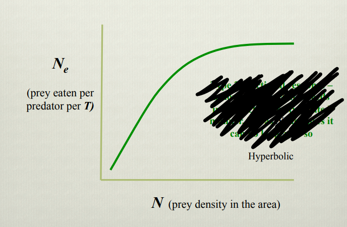
What does this graph show
Type two functional response
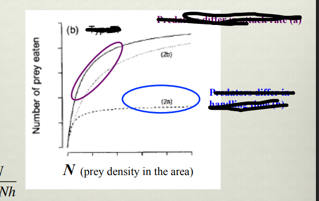
What does this graph show
type 2 functional response. Purple area shows that the rate of consumption is limited by attack rate, blue shows where consumption rate is limited by handling time
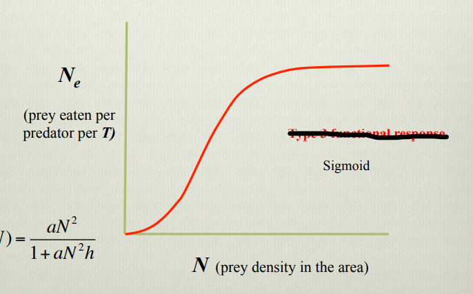
What does this graph show
Type three functional response. At low prey density a large proportion of prey can access refuge, limiting prey density, then consumption increases with density (depending on attack rate) then handling time becomes a limiting factor.
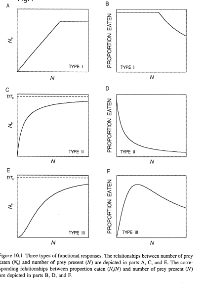
WHat does this graph show
Shows how the predation risk differs depending on functional response. Prey involved in a type one functional response experience consistent predation risk as predation increases proportional to population size. When the predation rate plateaus due to handling time as a limiting factor, predation risk for each individual decreases because while prey population continues to increase, predation rate remains the same.
Prey in a type 2 response demonstrate an ongoing decrease in risk as prey density increases, due to the increasing impact of the limiting factor of handling time
Prey in a type three response show increasing risk as refuge becomes unavailable, until the point where the impact of handling time begins to decrease the risk.
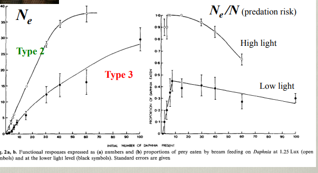
Explain this graph
Demonstrates that functional response can change depending on environmental conditions. This is graphically represented as a functional response graph and a graph of predation risk and shows that at high light levels bream act as type two foragers wheras at low light levels they shift to type three

Explain this graph
Demonstrates that the most abundant prey are preferentially consumed. as gammarus become the largest proportion of two available prey species it becomes more the frequently consumed
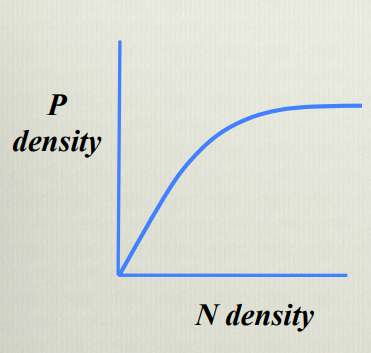
Explain this graph
Shows that an increase in prey density correlates with an increase in predator density, leveling off as handling time becomes a limiting factor
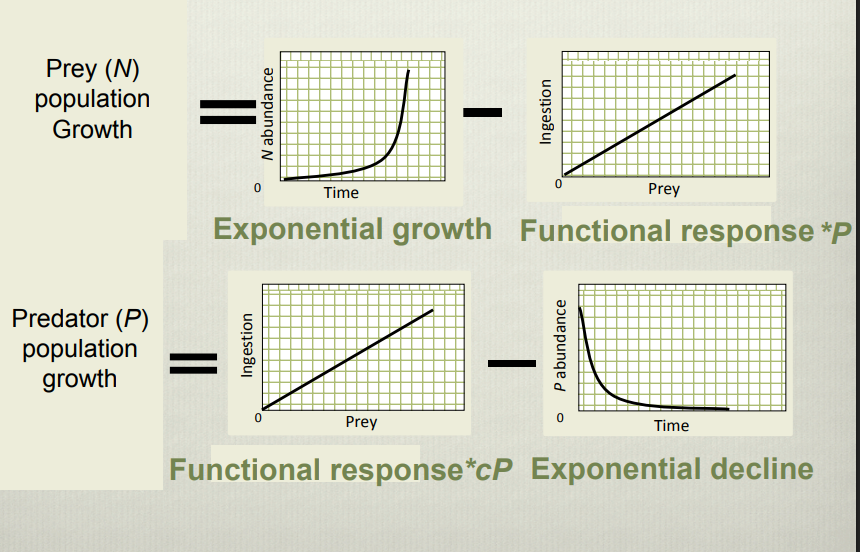
Explain this graph
Visualises the factors affecting predator prey population dynamics and how they are linked as two differential equations. Prey population growth is controlled by exponential growth rate and functional response of predators while predator population growth is controlled by the functional response, energy conversion efficiency and mortality.
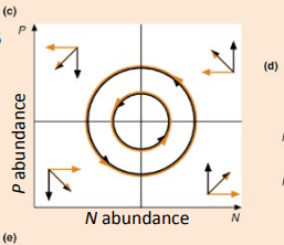
Explain this graph
Zero growth isoclines for a predator and prey populations, showing how populations of predators and prey cycle as the populations attempt to reach equilibrium. The graph shows that prey increase in abundance at low predator density and decrease at higher density.
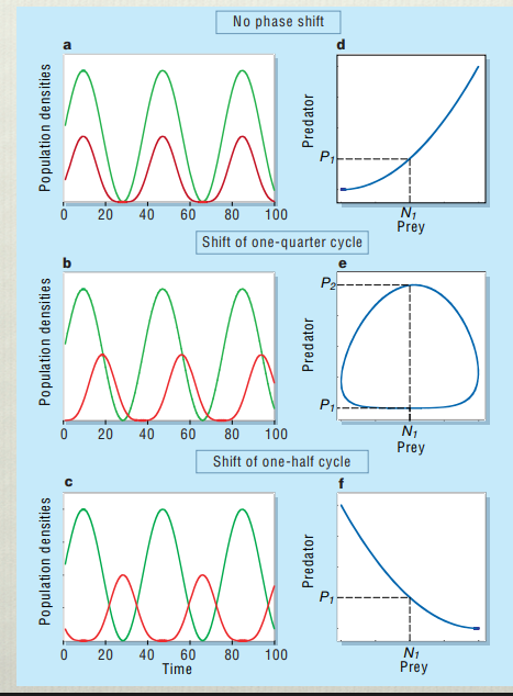
Explain this graph
This shows the predator prey cycle with different amounts of phase shift. Graph C and F are representative of dynamics observed in some real populations which indicates that the cycles are driven by factors other than predator prey dynamics. This is attributed to evolutionary change in the prey