TEAS V7 Reading: Analyzing charts, graphs, and visuals 10-1
1/11
There's no tags or description
Looks like no tags are added yet.
Name | Mastery | Learn | Test | Matching | Spaced |
|---|
No study sessions yet.
12 Terms

Based on the image, what is the title, and where can it be found?
A description of what the graph is about, and can be found at the top of the graph or map

Based on the image, what are the labels on the X and Y axes and where are they located?
They describe what each axis represents.
The X-axis label is located along the horizontal axis at the bottom.
The Y-axis label is located along the vertical axis on the side.
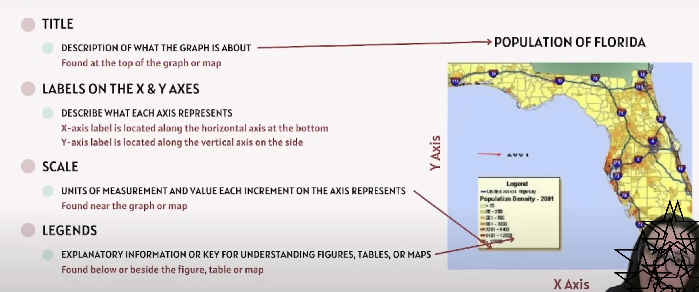
Based on the image what is the scale, and where can it be found?
Units of measurement and value each increment on the axis represents
found near the graph or map

Based on the image, what are legends, and where can they be found?
Explanatory information or key for understanding figures, tables, or maps
found below or beside the figure, table or map
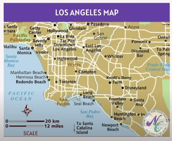
According to the map of Los Angeles, California, what is the distance in kilometers between Torrance and Compton?
a.) 8 kilometers
b.) 10 kilometers
c.) 20 kilometers
d.) 12 kilometers
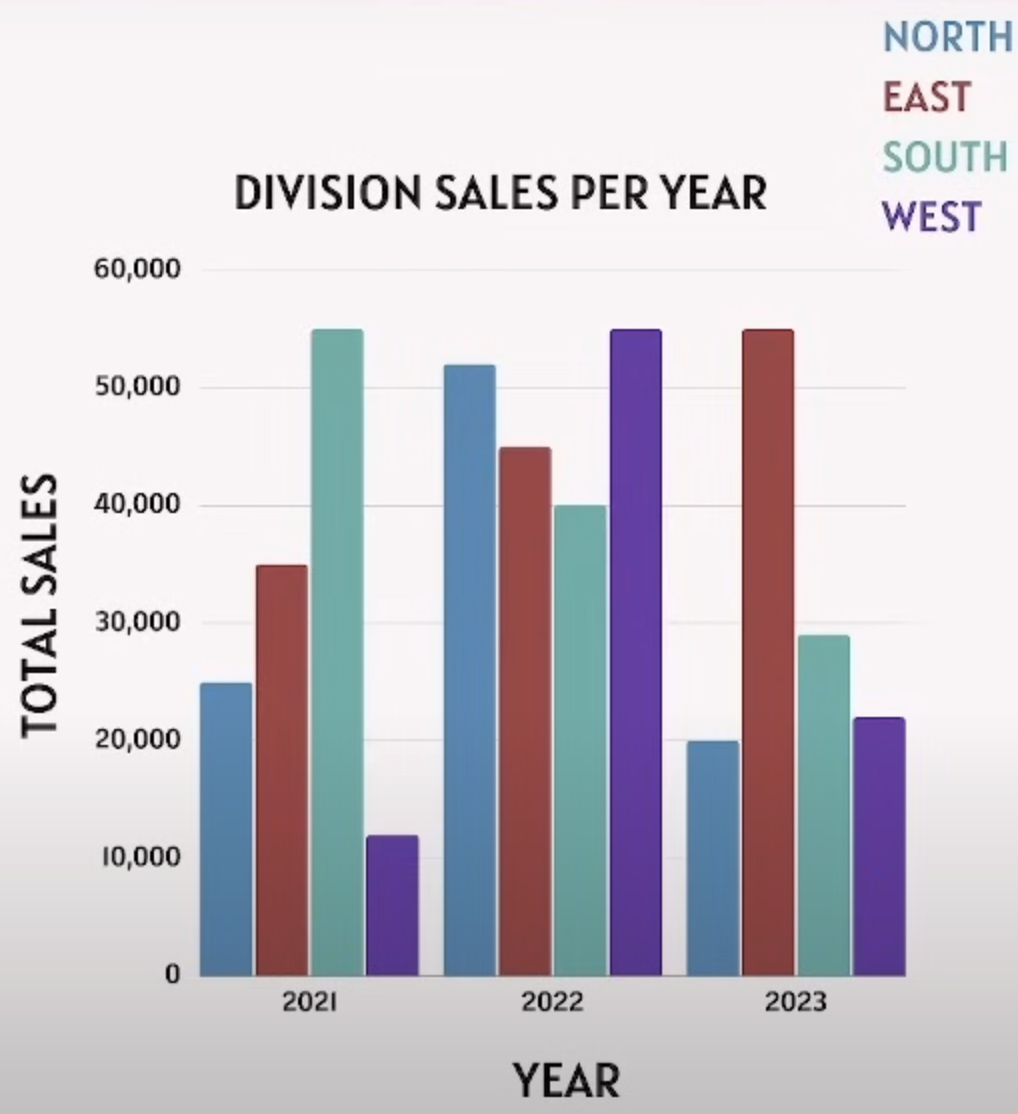
According to the graph, how may sales did the North division make in 2023?
a.) 20,000
b.) 15,000
c.) 30,000
d.) 25,000
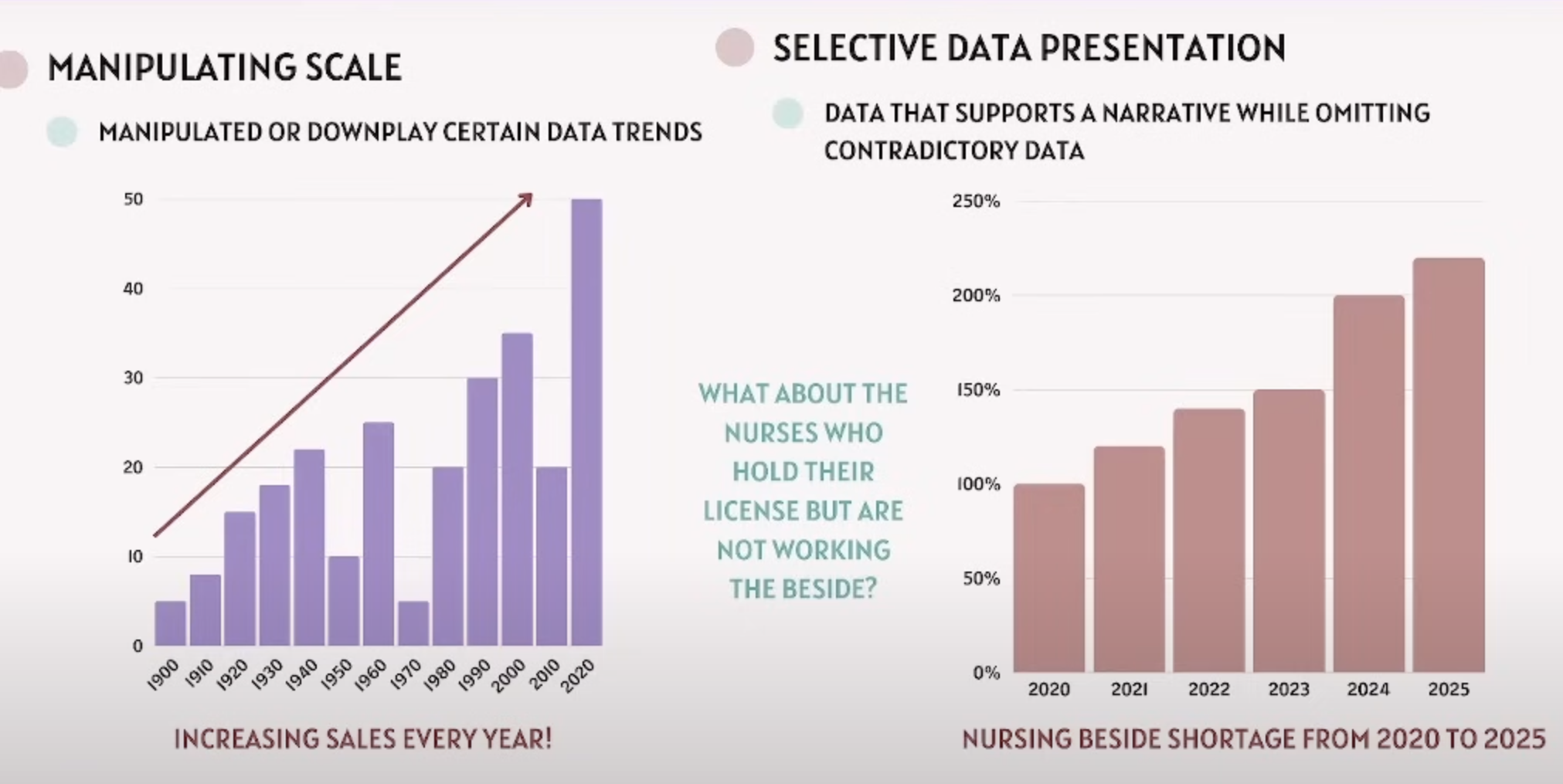
Based on biased or misleading information in graphics, what is the manipulating scale?
It is the manipulated or downplay certain data trends
Based on biased or misleading information, what is selective data representation?
Data that supports a narrative while omtting contradictory data
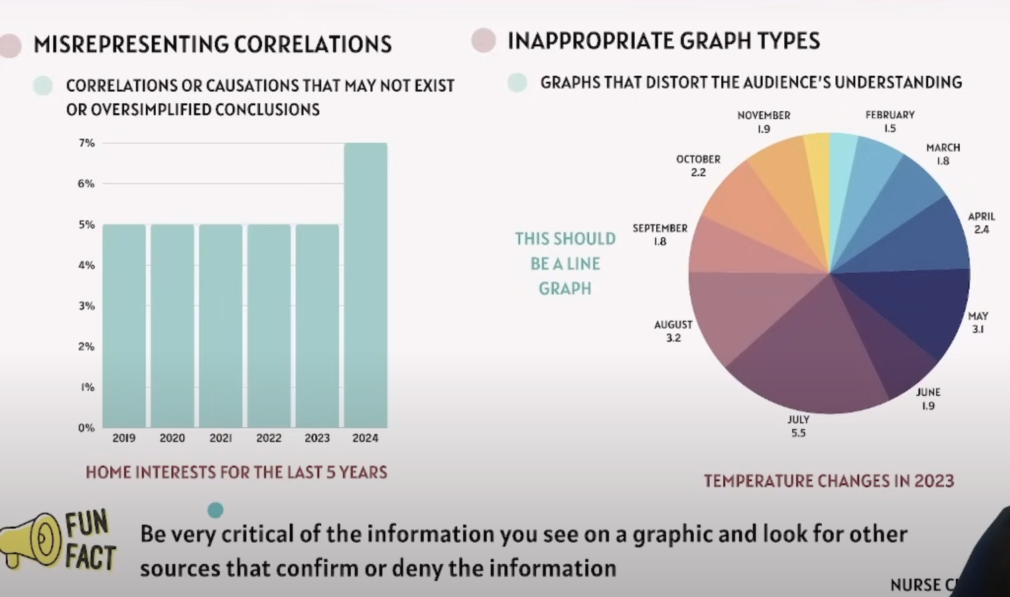
According to biased or misleading information in graphics, what is misrepresenting correlations?
Correlations of causations that may not exist or oversimplified conclusions
According to biased or misleading information in graphics, what are inappropriate graph types?
graphs that distort the audience’s understanding
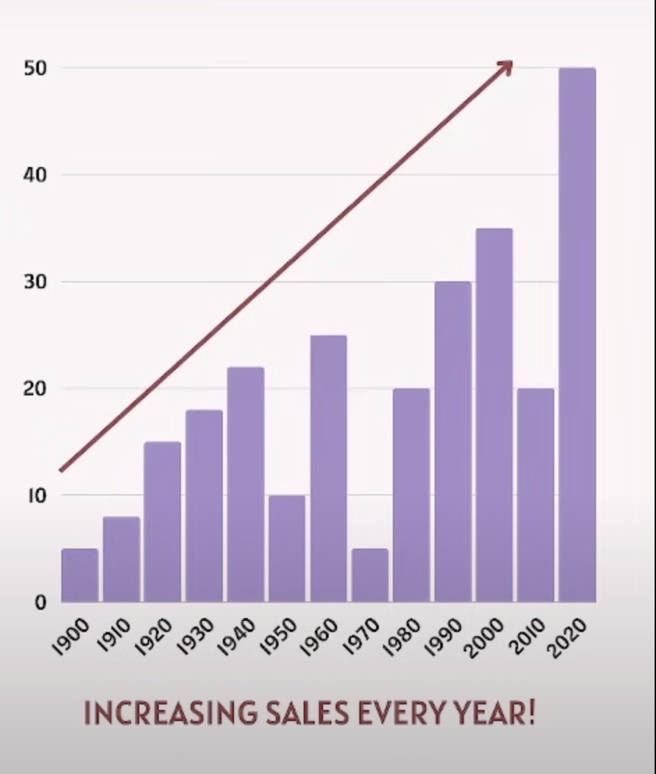
A bar graph displays a company’s annual sales from 1900 to 2020 and states that each year, the sales have increased. How does the bar graph mislead regarding the company sales trend from 1900 to 2020?
a.) by omitting sales data for certain years
b.) by incorrectly showing a continuous increase in sales every year
c.) by using a bar graph instead of a line graph
d.) by not showing sales figures for the years before 1990
How do graphs strengthen arguments?
Graphs strengthen arguments with graphics, enhancing persuasiveness and clarity of a point being made. It conveys trends, comparisons, and relationships that may be less obvious in textual descriptions