STAT 250 GMU EXAM 1
1/56
There's no tags or description
Looks like no tags are added yet.
Name | Mastery | Learn | Test | Matching | Spaced |
|---|
No study sessions yet.
57 Terms
Distribution
Any collection of data will have variation within the data.
Three main components of NUMERICAL distribution
Shape (symmetric, skewed left/right, modes)
Center (typical value)
Variability (horizontal spread)
Two steps when you examine distribution
visualize the data, then summarize the data.
Dotplots Advantages & Disadvantages (2 each)
Advantages
-Shows individual data values
-Helps investigate the shape of the distribution
Disadvantages
-Not as common as histograms and other graphs
-Not great for data with too many individual values
Statistics
the science of collecting, organizing, summarizing, and analyzing data to answer questions and/or draw conclusions.
in short- the science of learning from data
Process of statistics (four steps)
1. Identify the research objective
2. Collect the information needed
3. Organize & summarize the information (descriptive statistics)
4. Draw conclusions from the information (inferential statistics)
Variation
differences or changes in an item
Data
Observations gathered to draw conclusions
Data Analysis
the process of examining collected data to look for patterns or numerical indicators that capture the essence of what the data is telling us.
Population
-Collection of all data values that ever will occur for a group
-Often difficult to obtain all of this information
Sample
-A subset of the population
-Represents the population at large
-Easier to obtain this information
Categorical Variable/Data
-Describes a quality or class
-Can be numbers, but no arithmetic possible
Numerical Variable/Data
Describes a quantity or measurement
Stacked Data
-Data values stored in a spreadsheet format
-Each row contains data for a single individual
-Can store many variables!
Unstacked Data
-Data values are stored in two columns
-Each column is a variable from a different group
-Can only store data for two variables
-Info in a row does NOT correspond to the same individual
Two-Way Tables
-Very common way to organize data
-Displays results from two potentially related variables
-Shows combinations of the various variables
Controlled Experiment
-Researchers assign subjects to a treatment group
-Can show causality
Observational Experiment
Subjects placed into different groups by choice or someone else
Confounding Variable
A variable that has not been accounted for but which is causing a difference in the groups being studied.
Right Skewed Data
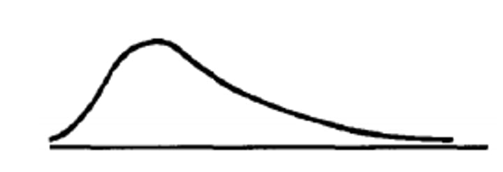
Three types of Mounds:
Unimodal, Bimodal, Multimodal
Outliers
Data values that don't fit the pattern of the rest of the data
Center
The typical data value
Pareto chart
A Bar Chart whose bars are drawn in decreasing order of frequency or relative frequency.
2 main components of categorical distribution
-Mode (typical/ most frequent outcome)
-Variability (or diversity in outcomes)
Appropriate graphs for Numerical data
-Dotplot
-Histogram
-Stemplot
Appropriate graphs for Categorical data
-Pie chart
-Bar graph
Parameters (Notation)
Descriptive measures of populations
(Often (but not always) written using Greek letters)
Statistics (Notation)
Descriptive measures of samples
(Often written using Roman letters)
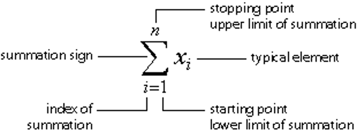
Summation Notation (formula)
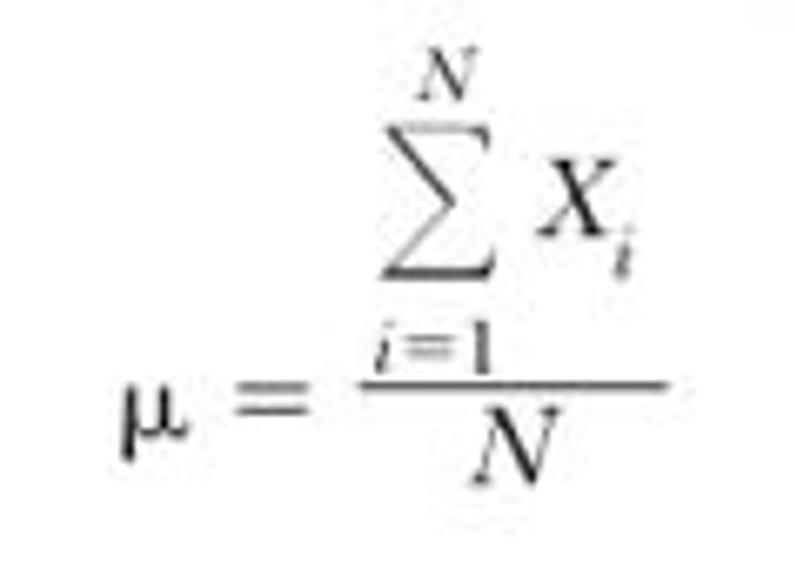
Population Mean (formula)
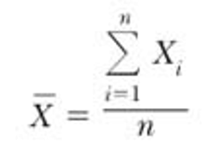
Sample Mean (formula)
Standard Deviation (formula)
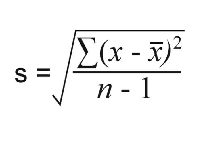
Standard Deviation (definition)
A number that measures how far away the typical observation is from the mean (center)
s = 0 only when all observations have the same value and there is no spread.
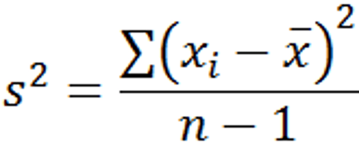
Variance (formula)
The Empirical Rule
a rough guideline for the approximate percentage of data within 1 to 3 standard deviations of the mean in unimodal, symmetric distributions.
Guidelines:
-68% of the data is within 1 standard deviation.
-95% of the data is within 2 standard deviations.
-Almost all(99.7%) of the data is within 3 standard deviations.
mean +/- standard deviation
example:
About 68% of the cities will have smog levels between 8.1 and 13.3 (10.7 ± SD). (SD=2.6)
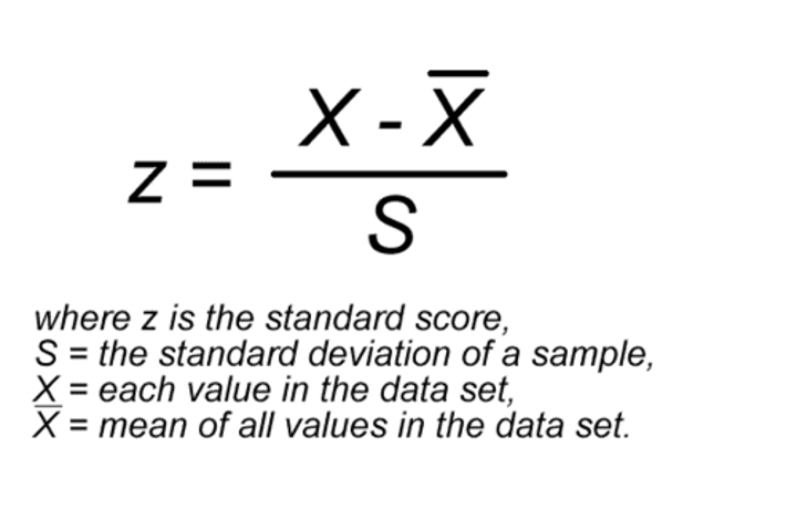
Z-Scores
Standard units used to compare any distribution in relation to spread.
aka
Measures how many standard deviations an observed data value is from the mean.
Needed because we can only compare standard deviations when the means are similar.
Z-Scores (formula)
tip: x-mean= distance from mean
Appropriate measures of center & spread for SKEWED distributions
Center- Median
Spread- Interquartile Range
(The median is not affected by outliers and its value doess not respond strongly to changes in a few observations (no matter how large))
Appropriate measures of center & spread for SYMMETRIC distributions
Center- Mean
Spread- Standard Deviation
Range
difference between the largest and smallest values.
Quartile
Divides the distribution into fourths. Each quartile contains 25% of the data.
-The first quartile Q1 has 25% of the data below it
-Q2 has 50% of the data below it
-The third quartile Q3 has 75% of the data below it.
-Q2 is also known as the median
How to find quartiles
Order the data (smallest to largest) and find the median.
For Q1, look at the lower half of the data values, those to the left of the median location; find the median of this lower half.
For Q3, look at the upper half of the data values, those to the right of the median location; find the median of this upper half.
Interquartile Range (IQR)
The range of the middle 50% of the data.
Formula: Q3-Q1
General rule for finding outliers
Find the fences ("cutoffs" ) for usual data values:
Lower fence = Q1 - 1.5 (IQR)
Upper fence = Q3 + 1.5 (IQR)
Values more extreme than the fences are outliers!
Boxplot
-Help us visualize certain summary statistics.
-Show where the bulk of the data lie.
-The box is drawn from Q1 to Q3 with a line for the median inside the box.
-Whiskers are drawn to the most extreme values within the fences (extreme values that are not outliers).
-Potential outliers are marked with an asterisk.
-CAUTION! Boxplots work best for unimodal distributions
Five Number Summary
The key summary statistics that boxplots reveal are known as the five number summary:
Minimum, Q1, Median, Q3, Maximum
Bivariate data
Each individual in the sample provides two variable values. Objective is to discover a relationship (or lack thereof) between the variables.
To consider the relationship between two quantitative variables.
-Start with a graph (scatterplot)
-Look for an overall pattern and deviations from the pattern
-Use numerical descriptions of the data and overall pattern (if appropriate)
-Consider a mathematical model (regression)
response variable
measures or records an
outcome of a study.
-(Also: y, dependent variable, predicted variable)
explanatory variable
explains changes in
the response variable.
-(Also: x, independent variable, predictor variable)
Scatterplot
a graph displaying the
relationship between two quantitative variables
measured on the same set of individuals.
Generally, the response variable corresponds to the y-axis, and the explanatory variable corresponds to the x-axis.
Correlation Coefficient
A number that measures the strength of a
linear relationship
• Symbol: r
• Always between -1 and +1
Changing the order of the variables does not
change r. • Adding a constant or multiplying by a positive
constant does not affect r. • r is unitless.
• r is only useful to measure a linear trend -
always graph your data first before computing
r to make sure the association is linear!
Regression Line
-a straight line that describes how a response variable y changes as an explanatory variable x changes.
-We often use a regression line to predict the value of the response variable y for a given value of x
-The distinction between the explanatory and response variables is necessary.
Regression Line (formula)
y = a + bx, where
a is the y-intercept
b is the slope
Slope (Regression equation)
tells us how much the y-variable changes when the x-variable is increased by 1 unit.
A slope close to 0 means there is no linear relationship between x and y.
extrapolation
predictions beyond the range of the data.
Coefficient of Determination: r squared
The square of r, the correlation coefficient
• Usually converted to a percentage, so always between 0% and 100%
• Measures how much variation in the response
variable is explained by the explanatory variable
• The larger r2, the smaller the amount of variation or scatter about the regression line