unit 1 info vis
1/63
There's no tags or description
Looks like no tags are added yet.
Name | Mastery | Learn | Test | Matching | Spaced | Call with Kai |
|---|
No analytics yet
Send a link to your students to track their progress
64 Terms
2 purposes of info vis
analysis & presentation
analysis
to better understand ur data and act upon that understanding
presentation
to communicate and inform others more effectively
what does EDA stand for?
exploratory data analysis
when to use EDA
u dont know exactly what ur looking for
u dont have any prior questions
u want to know what to questions to ask
u want to get a better feel for the data
key components of info vis
representation & interaction
representation
chart type
interaction
allowing people to explore (zoom, scroll)
data attributes
columns
data items
rows
basic types of attributes
nominal, ordinal, interval
nominal
2+ categories with specific no order
ordinal
2+ categories that are ordered or on a spectrum
interval
continous numeric (e.g. age)
User tasks
retrieve value, filter, compute derived value, find extremum, sort/rank, determine range, characterize distribution, find anomolies, cluster, correlate
how to compute derived value
given set of data cases, compute total numeric representation of those data cases (aka like avg.)
how to find extremum
find data cases possessing an extreme value of an attribute over its range w/in the data set
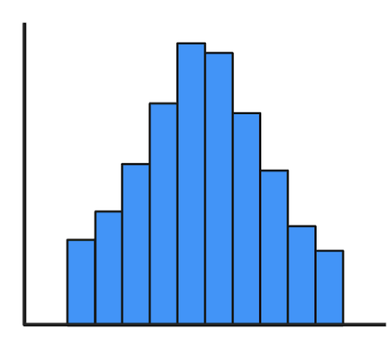
what histogram distribution is this?
normal
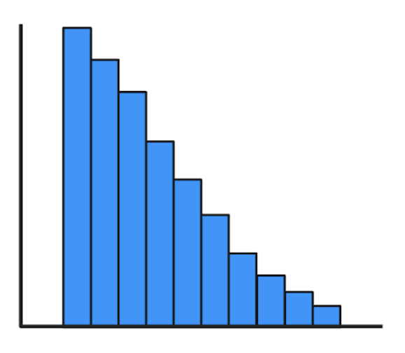
what histogram distribution is this?
right skewed
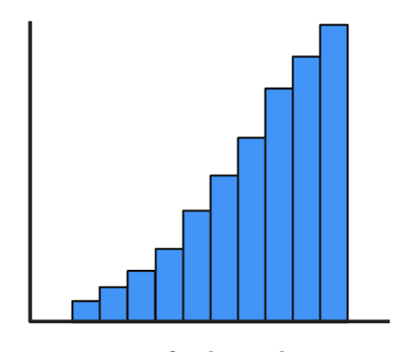
what histogram distribution is this?
left skewed
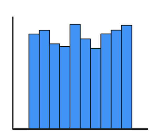
what histogram distribution is this?
uniform
what histogram distribution is this?
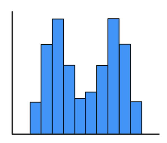
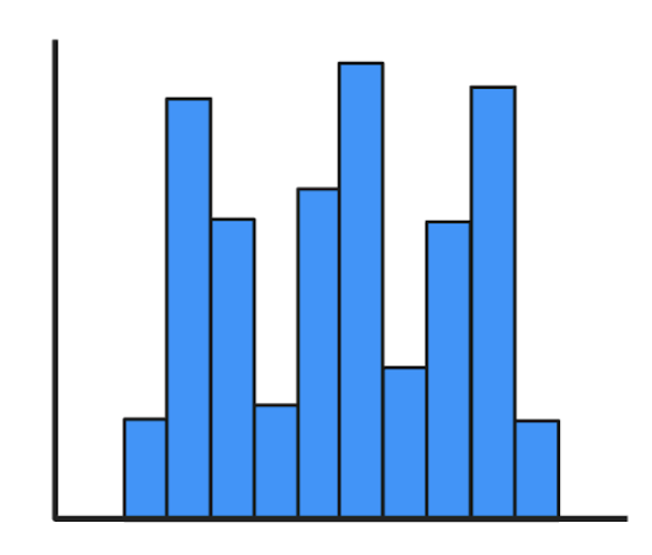
bimodal
what histogram distribution is this?
multimodal
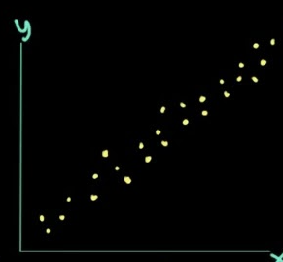
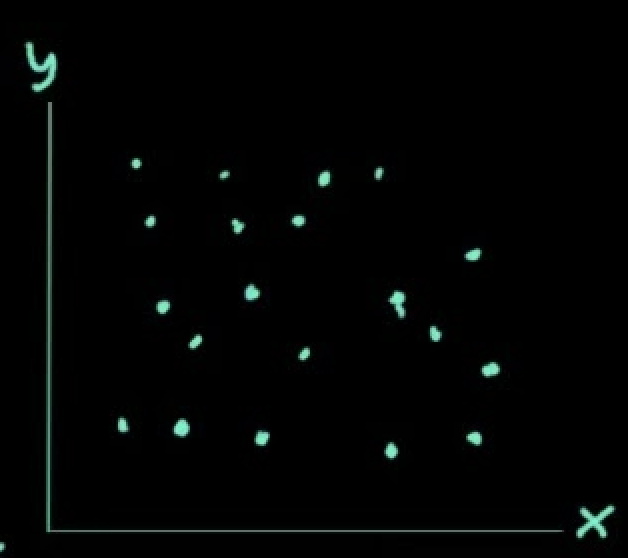
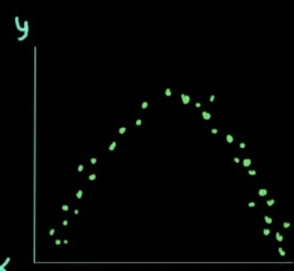
what correlation is this
positive
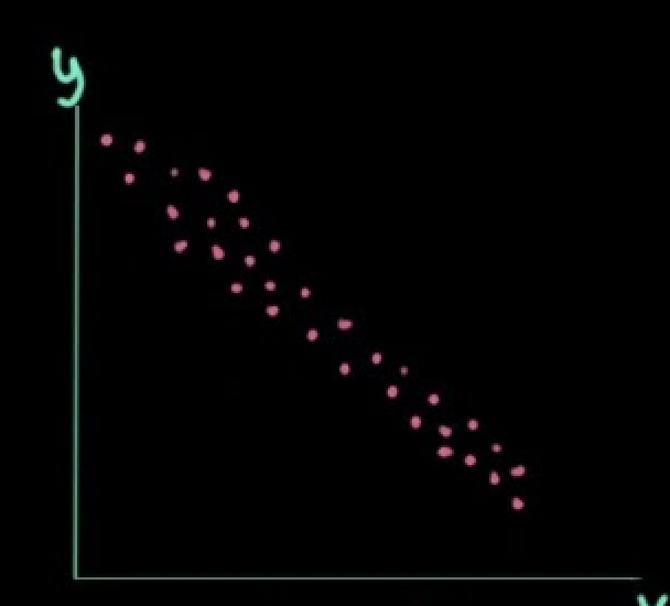
what correlation is this
negative
what correlation is this
no relationship
what correlation is this
curvilinear
how to interpret correlation of scatter plots?
There exists a [strength], [type] association btwn _____ and ______, such that [x] tend to be [y]
Munzner taxonomy
framework of visualization tasks as pairs of actions & targets
Stasko taxonomy
low-level components of analytical activity in info vis (focused on intents & goals ppl have, rather than the UI) - user tasks
how did stasko’s taxonomy come to be
affinity diagramming
what is affinity diagramming?
visual tool that helps u organize info by sorting ideas into diff groups based on their relationship to one another
what makes up actions?
analyze, search, query
what makes up targets?
all data, attributes, network data, spatial data
what is the curse of knowledge
the concept that explains why once you know something, it becomes hard to imagine not knowing it. can cause you to assume the reader has the same knowledge and expertise as u do
mental models
mental constructs that are created based on our experience IRL
reader-driven
overall less messaging and more open interactivity (flexible)
author-driven
order matters, stronger messaging and interactivity can be limited
data story structures
martini glass, interactive slideshow, drill-down story
how many different visual encodings in one visualization?
one for ea attribute
what is this
parallel set
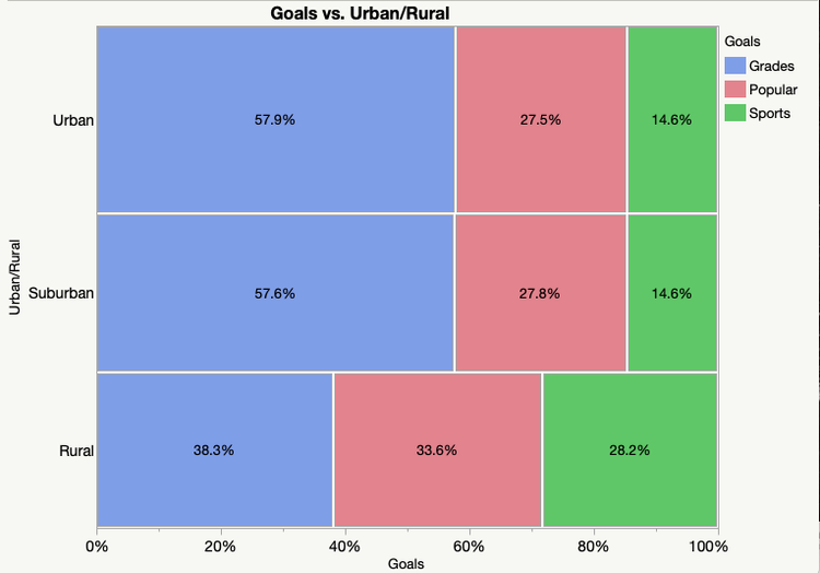
what is this
mosaic plot

what is this
stacked barchart
what is this
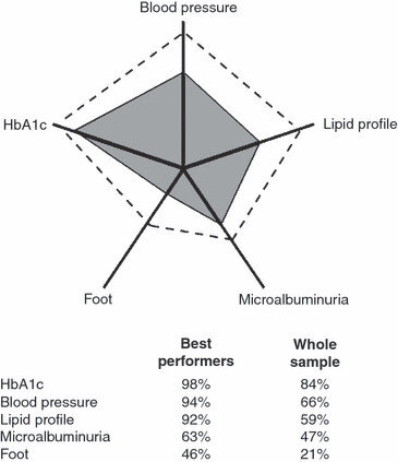
star plot
what is this
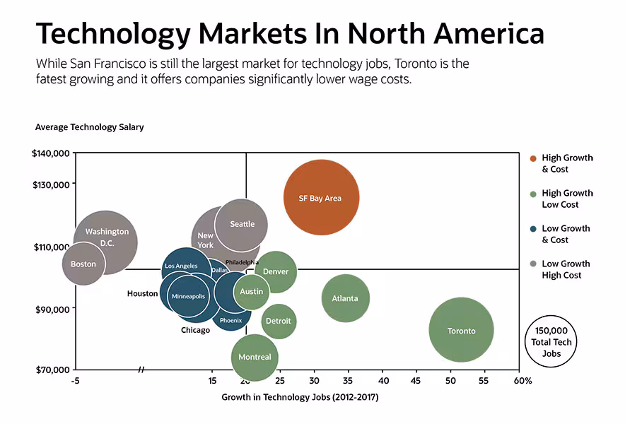
bubble chart
what is this
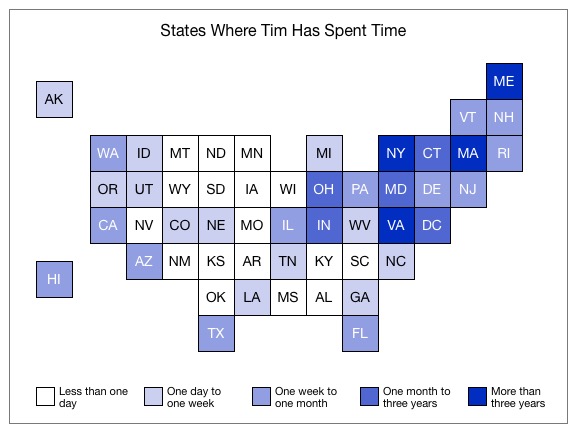
tile map
what is this
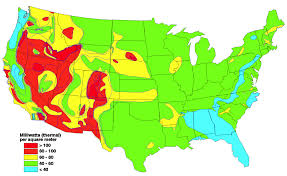
heat map
Edward Tufte
visualizations are a way to explain fancy stats so avg. ppl can understand (graphical excellence)
Nigel Holmes
chart junk isn’t always bad, and embellishments can help enhace engagement
graphical excellence
communicate essence and substance of the data & stats through a chart in a precise and efficient way
graphical integrity
tell the truth about data and do it without diminishing the aethetic experience
Lie factor
size of effect shown in graphic / size of effect in data
data-ink-ratio
ink used to draw data / ink used in graphic
Holme’s 2 tips
declutter & focus
uncertanties
used to describe 3 things, accurracies, precision and reliability
reliability
how likely u r to get the same results thru repetition
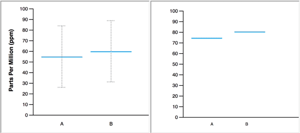
visualizing uncertainty GOOD
gradient or violin plot
visualizing uncertainty BAD
bar chart w/ error bars
effective presentation of uncertainty
as a set of discrete, countable outcome
hypothetical outcome plots
presenting uncertainty as a sample over time, where ea sample is a new frame in an animated visual
plinko dot plots
looks like the plinko game, designed to approvimate the data-generation process
how to evaluate uncertainty visualizations?
does it support the task?
does it match intuitions?
precision range
COSP (color, orientation, size, position)
simpsons paradox
trends that appear individually in subgroups of a dataset reverse when the data are aggregated and looked at as a whole