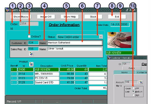
Module 1.2: Running/Working with Forms Builder Environment and its Components
 Call Kai
 Learn
Learn Practice Test
 Spaced Repetition
 Match
Match Flashcards
 Knowt Play
1/20

Earn XP
Description and Tags
Prelim Topic
Name | Mastery | Learn | Test | Matching | Spaced | Call with Kai | Chat |
|---|
No analytics yet
Send a link to your students to track their progress
21 Terms
TRUE
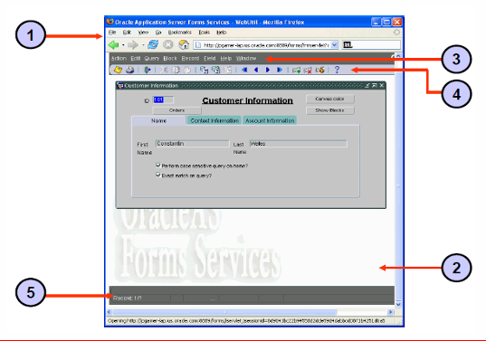
To start an Oracle Forms application, the user must enter the specific URL for it.
Default Menu
(Forms Builder Components)
It is an alternative to keystroke operations. You can replace or customize this to introduce your own functionality into a form module
Part of all Oracle Forms Developer applications.

Menu Toolbar
(Forms Builder Components)
It contains buttons corresponding to menu items. At runtime it appears above any user-defined toolbars.
It executes the same code as menu items, and it is a shortcut to menu commands that does not duplicate code or effort

Console
(Forms Builder Components)
The generic name for the standard features that provide information at run time.
Is displayed at the bottom of the window and consists of: The message line that displays both Forms and application-specific messages, and the status line that displays a variety of indicators to reflect the current state of the form module

Java Applet
2 - The actual thin client contained within the browser window that runs the user interface.
Normal Mode
(Forms Builder modes)
In this mode, you can insert, update, and delete records and commit changes to the database
Enter-Query Mode
(Forms Builder modes)
In this mode, you it allows you: Unrestricted and restricted queries, Query/Where dialog box, Record count by using Query > Count Hits
but it does not allow you to: Insert, update, delete. Navigate our of current data block, Exiting run-time session
The form lets you type search parameters into fields. For example, you can enter %Smith% to find all employees with Smith in their name.
Query Mode / Fetch Processing Mode
(Forms Builder modes)
This mode occurs while Forms is processing a query; The form actively retrieves the matching records from the database
The user cannot interact with the form while this query processing is taking place
Select Action > Save
Is what to do if you want to make changes permanent
Select Action > Clear All
Is what you do to discard changes/ rollback
Help > Display Error
Is what you do to view oracle errors; it shows you the Database Error window, which has the SQL statement and error information
Prompts
1 - Text labels indicating what data belongs in a specific field.
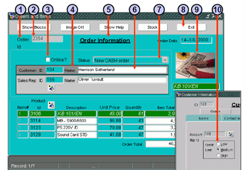
Text Items
2 - Standard input fields where users type or modify text strings.
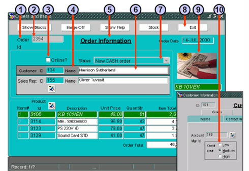
Check Boxes
3 - Used to checkmark an option
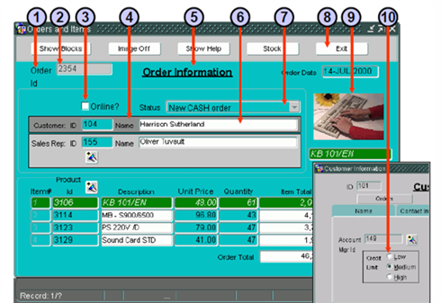
Boilerplate Graphics
4 - Non-interactive shapes, lines, or visual decorations built into the canvas.
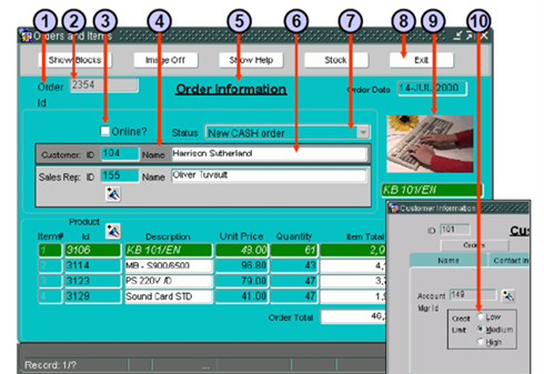
Boilerplate Text
5 - Structural, static text labels hardcoded directly onto the canvas layout.
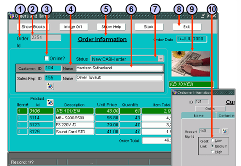
Display Items
6 - Non-navigable, read-only data elements used strictly to output information to the user
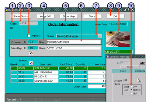
List Items
7 - Allows you to select an item
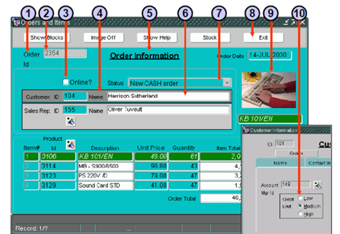
Push Buttons
8 - Are buttons that you click
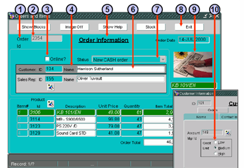
Image Items
9 - Are images displayed
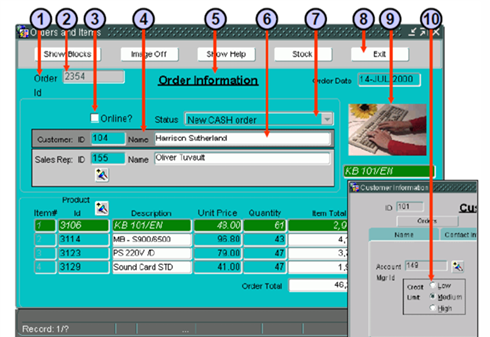
Radio Groups
10 - It serves as a selection component alongside other data elements like check boxes, text items, and list items