Project+ quality and performance charts
1/7
There's no tags or description
Looks like no tags are added yet.
Name | Mastery | Learn | Test | Matching | Spaced |
|---|
No study sessions yet.
8 Terms
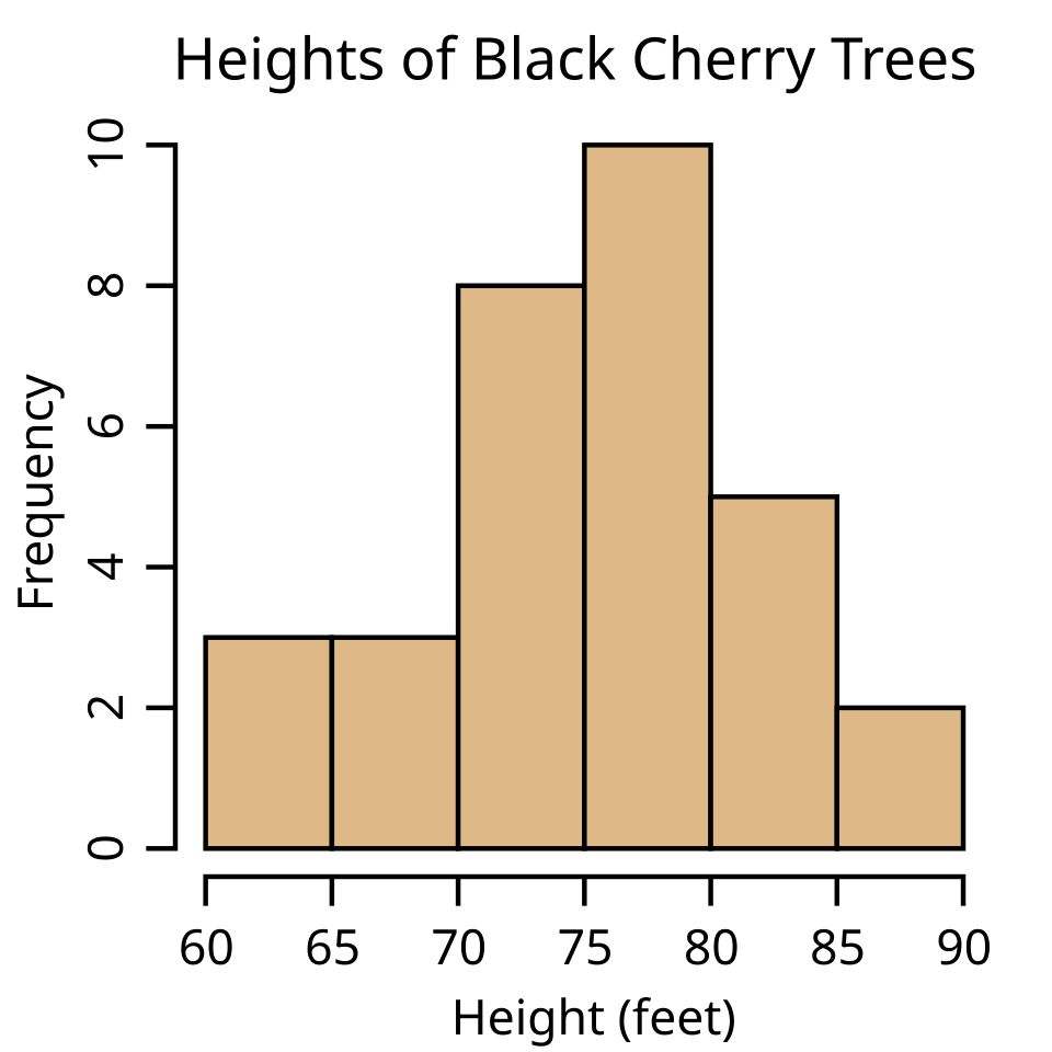
Histogram
What it is:
A bar chart showing the frequency distribution of data.
Use:
Identify patterns, variations, or trends in data.
Common in quality control to see how often defects occur.
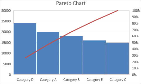
Pareto Chart
What it is:
A bar chart showing causes of problems in descending order with a cumulative line.
Based on the 80/20 rule: ~80% of problems come from ~20% of causes.
Use:
Identify the most significant issues to prioritize improvement efforts.
Example:
Bars: Types of errors
Line: Cumulative percentage of total errors
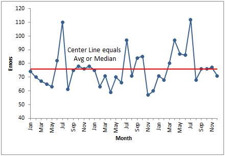
Run Chart
What it is:
A line chart showing data points over time to identify trends or patterns.
Use:
Track performance over time, detect shifts, cycles, or trends.
Example:
X-axis: Time (days/weeks)
Y-axis: Number of defects or performance metric
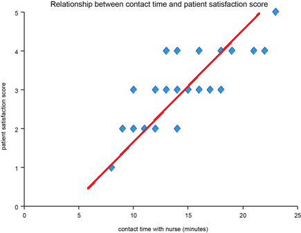
Scatter Diagram
What it is:
A plot of two variables to identify relationships or correlations.
Use:
Determine if changes in one variable affect another.
Helps in root cause analysis and quality improvement.
Example:
X-axis: Hours of training
Y-axis: Number of errors
Pattern shows correlation
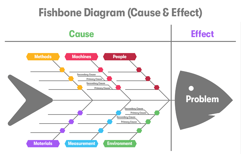
Fishbone / Ishikawa Diagram
What it is:
A cause-and-effect diagram shaped like a fish skeleton.
Use:
Identify root causes of a problem by categorizing potential causes.
Categories often include: People, Process, Materials, Machines, Environment, Methods
Example:
Problem: Software deployment delays
Causes: Lack of training, poor testing process, insufficient resources
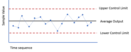
Control Chart
Is used to monitor process performance over time.
It typically shows:
Upper Control Limit (UCL) → the maximum acceptable value
Lower Control Limit (LCL) → the minimum acceptable value
Centerline → average or expected value
If a plot point is above the UCL, it means that the task took longer than expected.
If a point is below the LCL, it means the task was faster than expected.
Occasional points above or below the limits don’t necessarily mean the entire process is out of control—they just indicate specific deviations.
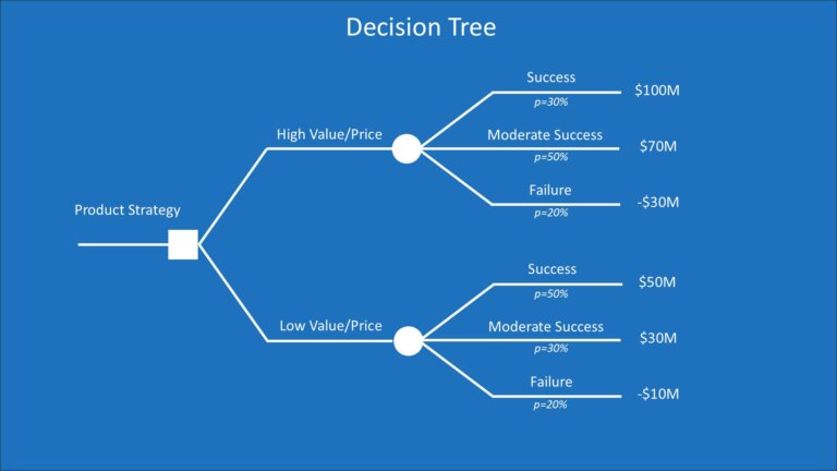
Decision Tree
What it is:
A tree-like diagram used to map decisions and possible outcomes.
Use:
Evaluate options, risks, and consequences.
Assign probabilities and expected values to make informed choices.
Example:
Decision: Build in-house vs. outsource
Branches: Cost, risk, timeline for each option
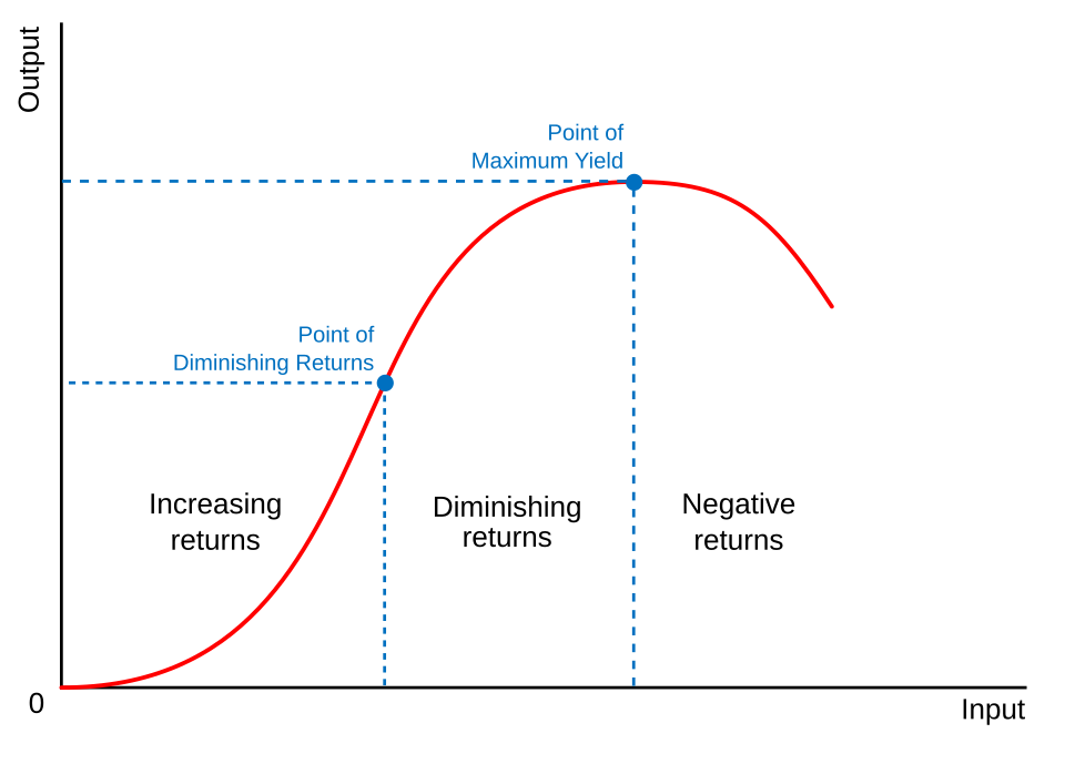
Law of diminishing returns chart
Compare input (cost, effort, resources) against output (benefits, quality improvements)
Visually show the point where additional investment produces smaller incremental gains
Help stakeholders make informed decisions about resource allocation