Fieldwork Key Terms & Process
1/82
There's no tags or description
Looks like no tags are added yet.
Name | Mastery | Learn | Test | Matching | Spaced |
|---|
No study sessions yet.
83 Terms
What is the Enquiry process?
Asking geographical questions to investigate human & physical processes through fieldwork.
List the steps of the fieldwork process in order:
Enquiry question & planning
Data collection
Data presentation & processing
Description, analysis & explanation of data
Conclusion
Evaluation
What is a Hypothesis?
An educated guess or prediction about the relationship between two or more variables that can be tested.
What are variables:
Different factors or characteristics that can be measured, observed or controlled within a geographical study.
Primary Data:
Data collected by you, within your fieldwork, directly from the source.
Secondary data:
Data that has already been collected by someone else, for something else, but can still be used in the investigation.
Primary data examples:
Measurements
Interview info
Tallies
Photographs
Secondary data examples:
Census results
Weather data
Maps
Old photos
Websites
Newspaper articles.
Primary data strengths:
Specific to research needs & enquiry question
Control over data reliability, quality & validity
You can collect as much data as you need
Flexibility over process
It is up to date
Primary data limitations:
Time consuming
Potentially costly if it needs specialist equipment/resources
Sample size needs to be large to be accurate
Potential bias
Secondary data strengths:
Easy & quick to access
Cost effective
Time saving
Large amount of data sources are available
Historical analysis
Secondary data limitations:
Isn’t specific to enquiry question
No/limited control over data quality
Data may be biased
Data may be out of date
Availability issues
Quantitative data:
Data that can be measured or counted and given a numerical value.
Qualitative data:
Data that is non-numeric and describes characteristics or qualities.
Quantitative data strengths:
Possible to have a larger sample size
More objective
More reliable
Easy to reproduce results
Information can often be collected quickly
Clear & precise
Quantitative data limitations:
Data can oversimplify and issue
Heavily dependent on collection accuracy
Human error or equipment error can lead to mistakes in measurement
Data often lacks depth
Qualitative data strengths:
Gives contextual understanding into behaviour
More nuanced & in depth insight into experience
Human-centred approach
Qualitative data limitations:
Data analysis can be complex, difficult to make comparisons
Often a small sample size
Subjective
Low reliability
Time consuming
What is bias?
Anything that can unfairly influence the result of a study, making results less accurate.
Why is bias an issue in fieldwork?
It can distort results, leading to inaccurate or unreliable conclusions.
What is the purpose of Sampling?
Gives an overview of the whole feature/population sampled
There isn’t enough time/equipment/access to measure whole area being investigated
Sampling provides a representative & statistically valid sample of what is being investigated
What are the 3 types of sampling?
Random
Systematic
Stratified
What is random sampling?
Collecting data from randomly selected subsets of a population.
How does random sampling work?
Create a sampling frame (a complete list of all possible sampling points), give each sampling point or person a unique number
Then use a method to generate random numbers - random number generator.
What is systematic sampling?
Collecting data at regular intervals - e.g. every 500m or every 10th person.
How does systematic sampling work?
Identify the boundaries of the area/population group you are studying
Select an interval for sampling (e.g. ever 10metres/ every 5th person)
Select a starting point, collect data at every point at the regular interval chosen
What is stratified sampling?
Dividing a population or area into smaller groups/sites, then selecting samples from each group.
How does stratified sampling work?
Identify the different groups/types within a study area
Decide how many samples you want to take from each group or site
Within each site/group choose to use another sampling method to collect the data
Advantages of random sampling:
Least biased of all sampling - all possible sample sites have an equal chance of being selected
Can be used with a large sample area/population
Disadvantages of random sampling:
Representation of the overall population may be poor if the randomly selected sites miss large areas
Some sites may not be accessible or safe
Advantages of systematic sampling:
Easy & quick - more straightforward than random sampling
Covers whole study area equally
Disadvantages of systematic sampling:
Not all sites have an equal chance of being selected - increases bias
There may be over or under-representation of a particular feature
Advantages of stratified sampling:
Can be used alongside systematic & random sampling
Comparisons can be made between sub-sets
Disadvantages of stratified sampling:
Proportions of sub-sets need to be known & accurate
What are some sources of error?
Measurement Error - mistakes made when collecting data (human error)
Operator Error - differences in the results collected by different people (for subjective data)
Sampling Error - where a sample is biased towards one group, not representative of a whole population
What is validity?
The sustainability of the method used to answer the enquiry question. Valid data is supported by accurate & reliable data obtained using an appropriate method.
What are the 2 types of data in terms of presenting it?
Continuous
Discrete
What is continuous data?
Data that can be any value within a range & can be divided into finer & finer increments. e.g. temperature.
What is discrete data?
Data that is distinct and made of only separate values that cannot be divided further.
Is continuous or discrete data infinite or finite values?
Continuous data = infinite, Discrete data = finite
Is continuous or discrete data measurable or countable?
Continuous = measurable, Discrete = countable
Examples of ways continuous data is represented:
Bar graphs
Pie charts
Examples of ways discrete data is represented:
Line graphs
Histograms
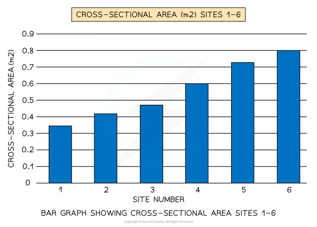
Bar Graph use:
Used to show absolute values.
Bar graph strengths:
Summarises a large set of data
Easy to interpret & construct
Shows trends clearly
Bar graph limitations:
Requires additional information
Does not show causes, effects or patterns
Can only be used with discrete data

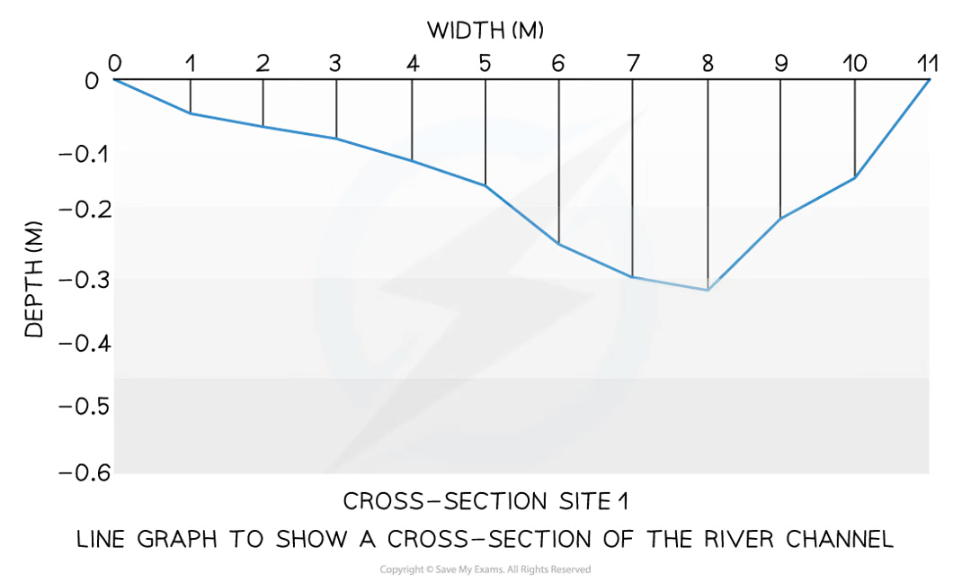
Line graph use:
Used to show continuous data.
Line graph strengths:
Shows trends & patterns clearly
Quicker & easier to construct than a bar graph
Easy to interpret
Requires little written explanation

Line graph limitations:
Does not show causes or effects
Can be misleading if scales on axis are altered
If there are multiple lines on a graph it can be confusing
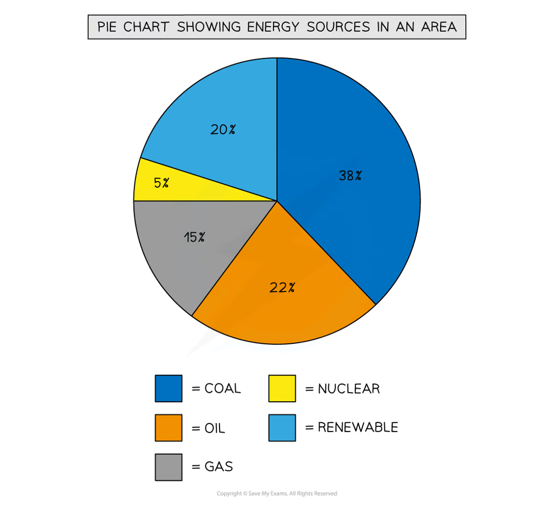
Pie chart use:
Used to represent percentages.
Pie Chart strengths:
Clearly shows the proportion of the whole
Easy to compare different components
Easy to label
Info can be highlighted by separating segments
Pie chart limitations:
Don’t show changes over time
Difficult to understand without clear labelling
Hard to compare two sets of data
Can only be used for a small number of categories or segments become confusing

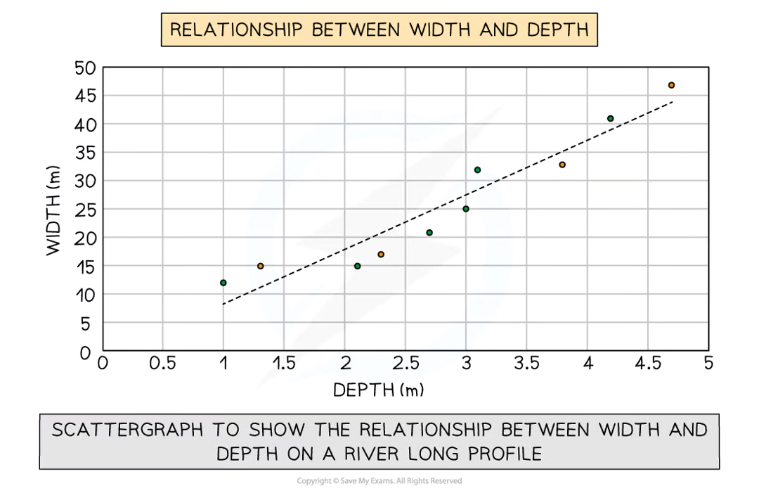
Scatter graph use:
Used to compare 2 sets of data.
Scatter graph strengths:
Clearly shows data correlation
Shows the spread of data
Makes it easy to identify anomalies & outliers
Scatter graph limitations:
Data points can’t be labeled
Too many data points can make it difficult to read
Can only show the relationship between two sets of data

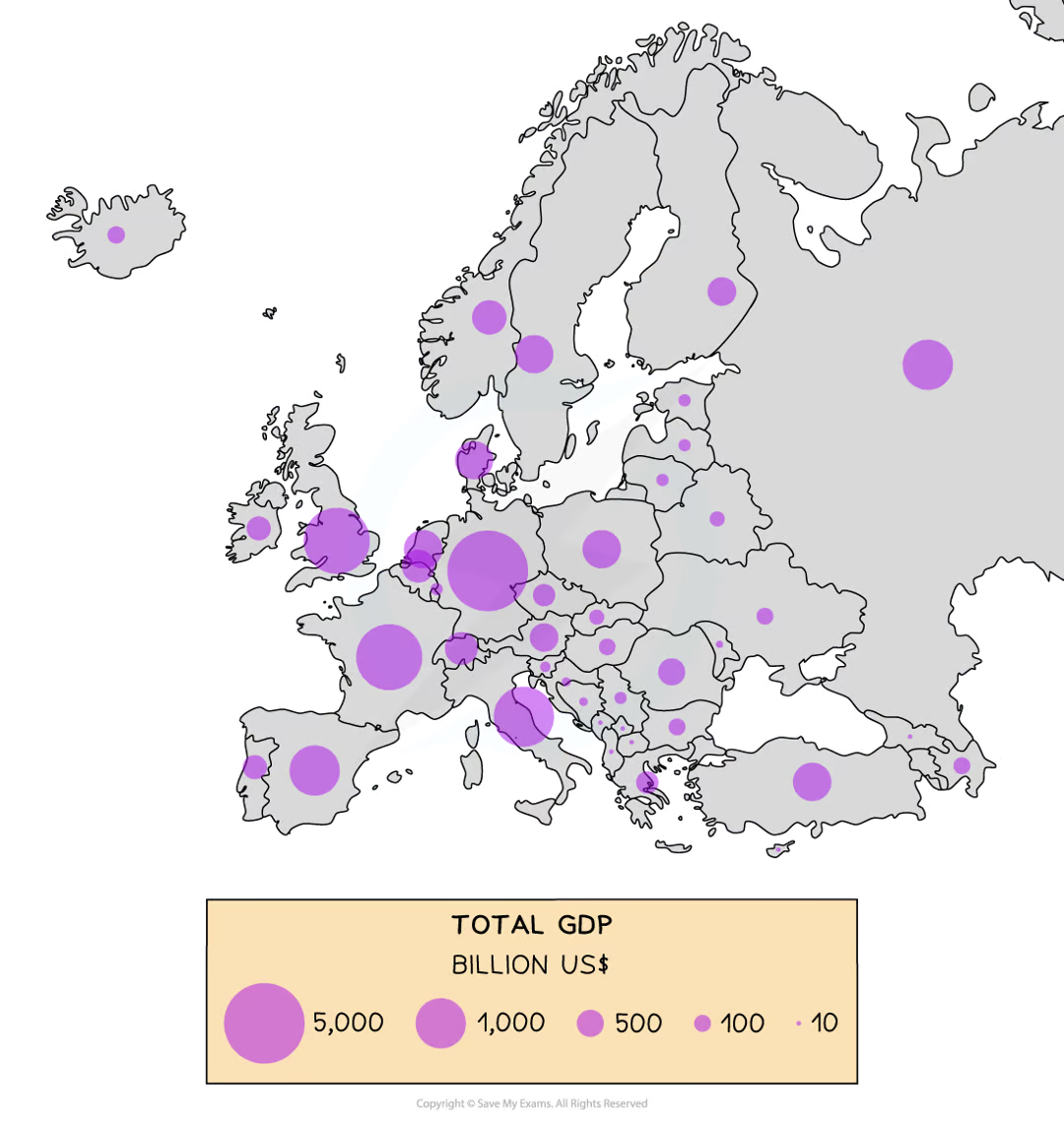
Proportional symbols map use:
Used to show located data.
Proportional symbols map strengths:
Illustrates the differences between many places
Easy to read
Data is specific to particular locations

Proportional symbols map limitations:
Not easy to calculate the actual value
Time-consuming to construct
Positioning on a map may be difficult, especially with larger symbols
Isoline map use:
Used to connect data points of equal value
Isoline map strengths:
Good visual representation of data
Easy to show patterns/trends

Isoline map limitations:
Can be difficult to construct
Small lines & numbers can be difficult to read
Triangular graphs use:
Used to show the relationship between 3 pieces of data.
Triangular graphs strengths:
3 pieces of data can be compared at once
Easy to compare data
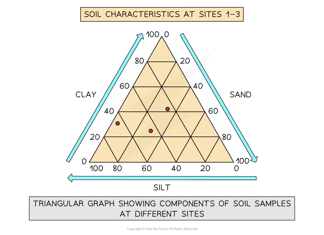
Triangular graphs limitations:
Data must be in percentages
Can be difficult to read & construct

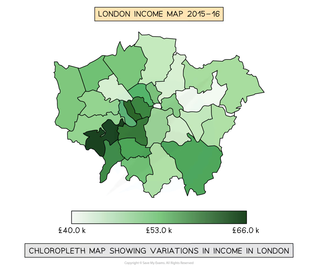
Chloropleth maps use:
Used to show values for different locations
Chloropleth maps strengths:
Gives clear visual impression of the changes over space
Shows a large amount of data
Groupings are flexible

Chloropleth maps limitations:
Makes it seem as if there is an abrupt change in the boundary
Distinguishing between shades can be hard
Variations within value sets are not visible
Photograph strengths:
An accurate record at the time
Can represent things more clearly than numerical data
Can be used to show data collection techniques
Can be used next to historical photos to show changes over time
Helps recall key features
Photograph limitations:
Not all photos are relevant
Can be subjective & biased as student selects what is photographed
Photographs can sometimes contain too much info
Are 2D so judging depth is difficult
Field sketch strengths:
Things can be left out of sketch if not relevant to enquiry
Smaller important details can be more detailed
Gives broad overview of features
Helps recall of key features
Field sketch limitations:
Scale in sketch may be inaccurate
Important details may be missed
Sketch may contain inaccuracies which affect analysis
Define Evaluation:
An honest reflection of the data collection process & consideration on how to improve your practice moving forward.
What to evaluate in your fieldwork:
Relevance
Accuracy
Bias & Error
Scalability
What is relevance?
Whether method aligns with research question.
What is accuracy?
The chance of error when collecting data.
What is evaluation of bias & error?
Evaluating what potential sources of bias & error there were in the data collection.
What is scalability?
Whether the method can be applied to a larger sample if needed.
What are spatial patterns?
Patterns that reveal how variables or phenomena are distributed across a geographic area or spatial dimension.
Examples of spatial patterns:
Clustered
Dispersed
Random
What are linear patterns?
Describe relationships between variables where changes in one variable correspond to changes in another - in a consistent, linear manner.
Examples of linear patterns:
Direct Relationships.
What is accuracy - associated with data collection?
What the chance of error was when collecting data - student error or equipment failure.
What is reliability - associated with data collection?
Whether the data was typical or reproducible. Would it be different on a different day? Was it a suitable sample size? How recent was the data?