BIOSTATS LEC - 01
1/25
There's no tags or description
Looks like no tags are added yet.
Name | Mastery | Learn | Test | Matching | Spaced | Call with Kai |
|---|
No analytics yet
Send a link to your students to track their progress
26 Terms
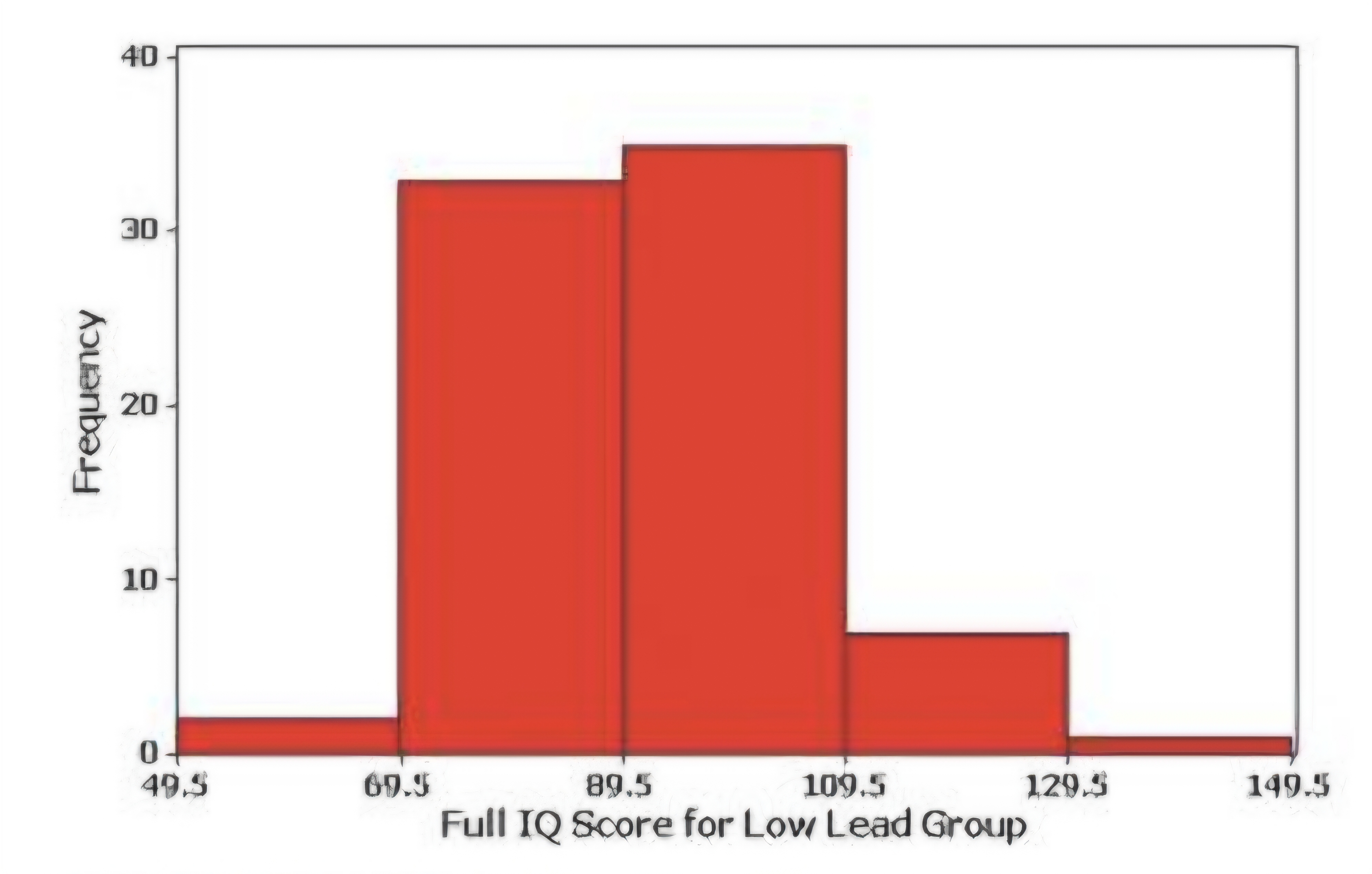
Horizontal scale:
Vertical Scale:
Histogram
1. classes of quantitative data values (class boundaries)
2.represents frequencies
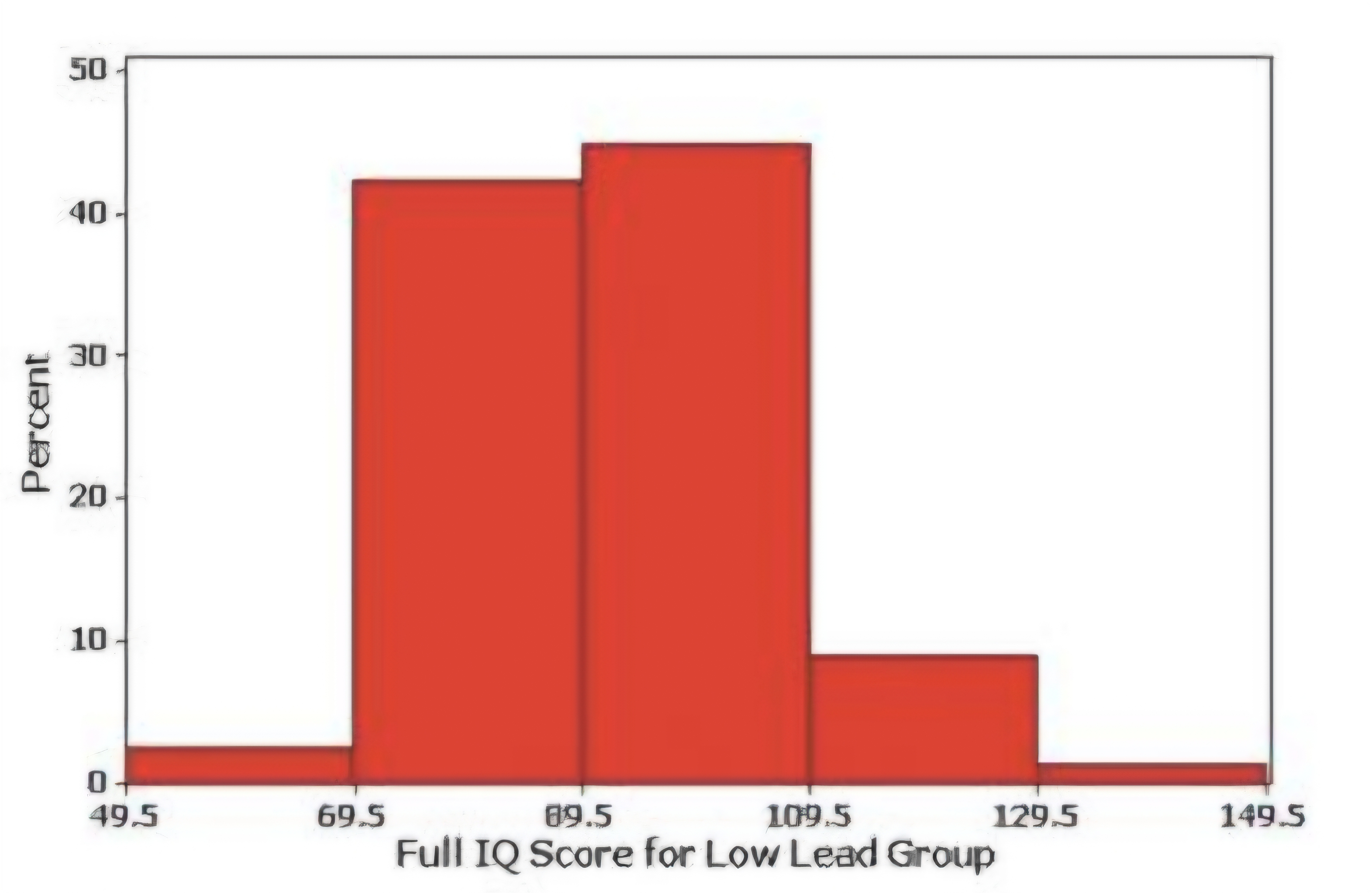
Horizontal scale:
Vertical Scale:
Relative frequency histogram
class boundaries
relative frequencies (percentage)
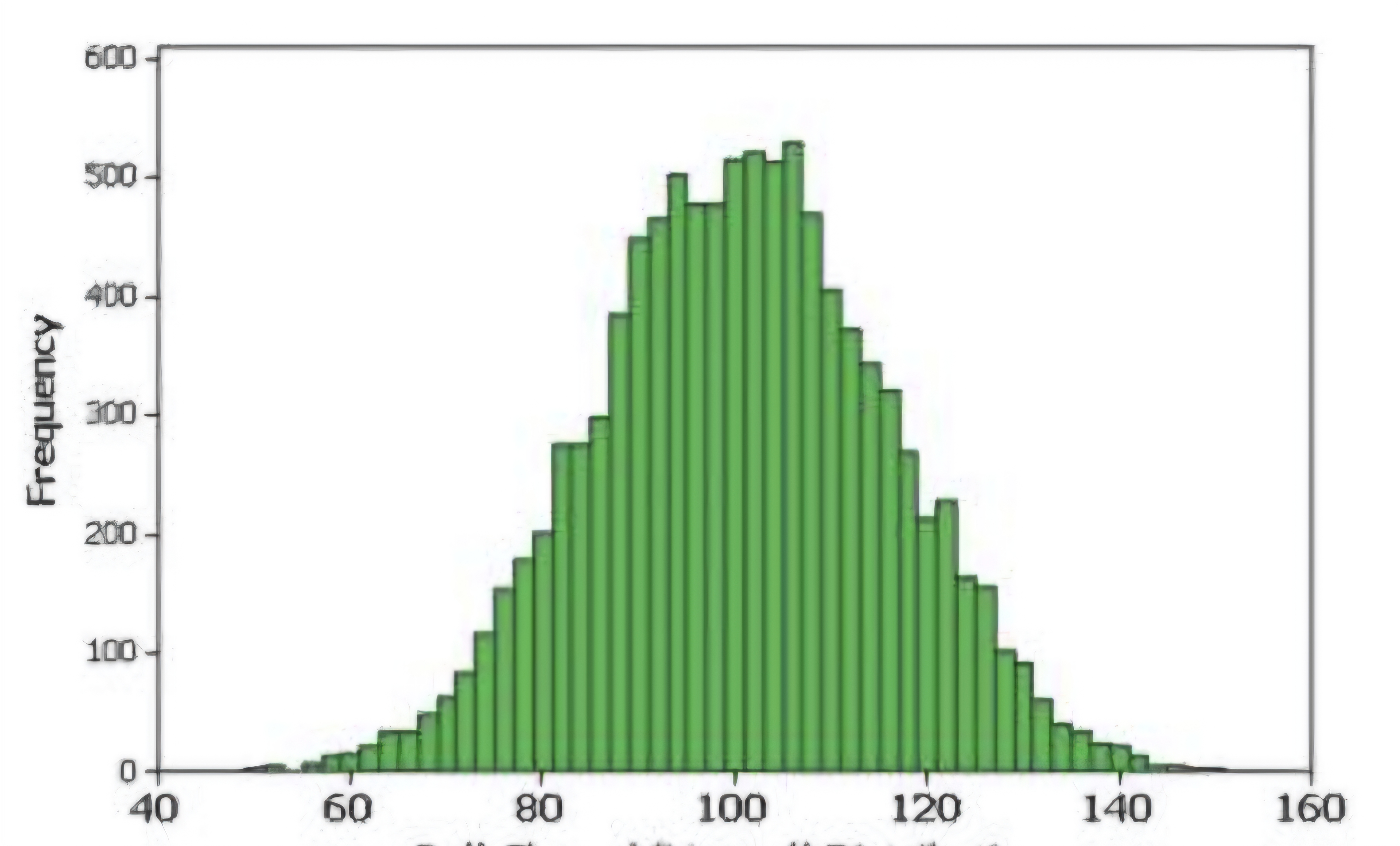
NORMAL (Bell-shape) DISTRIBUTION
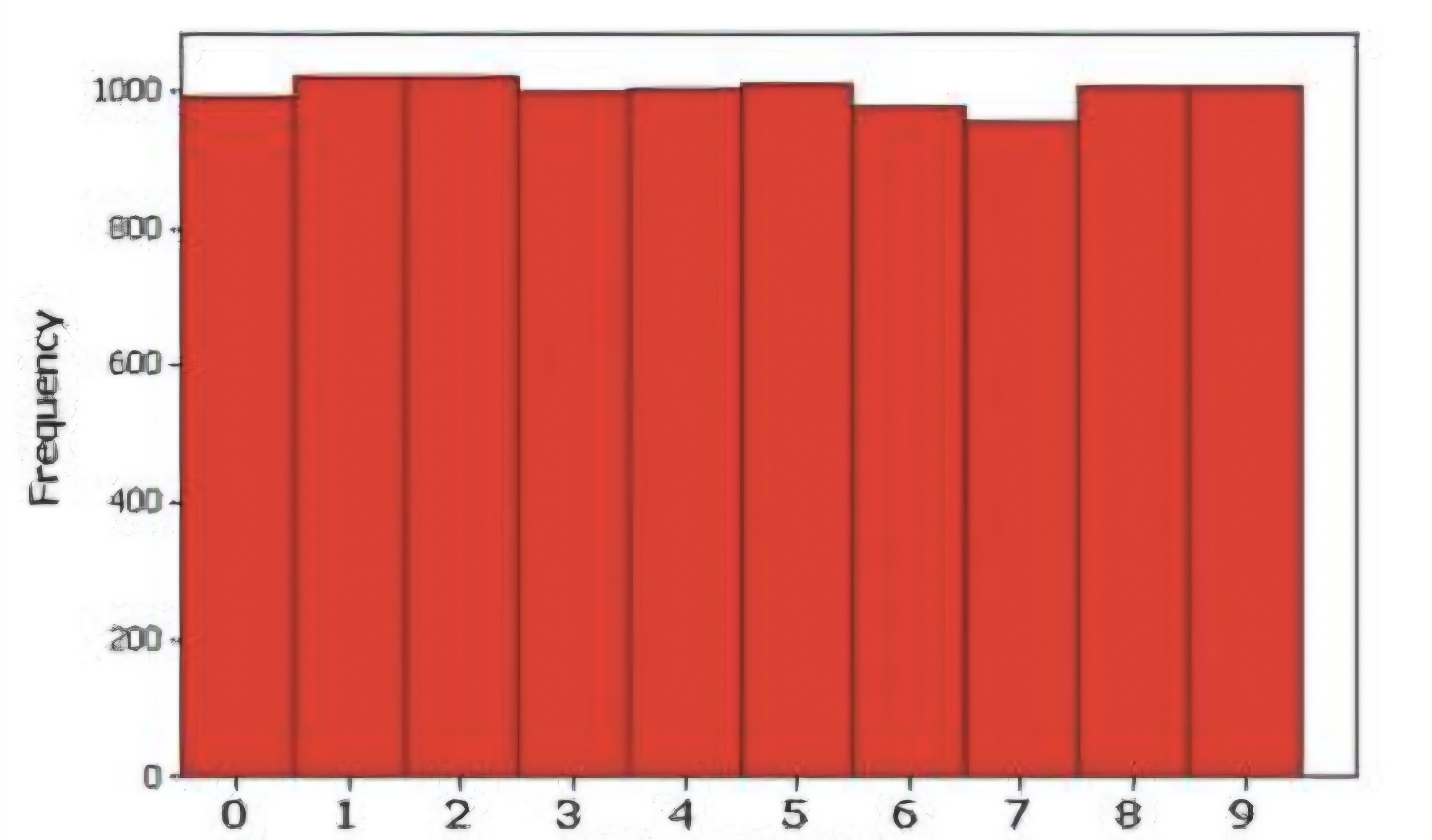
UNIFORM DISTRIBUTION
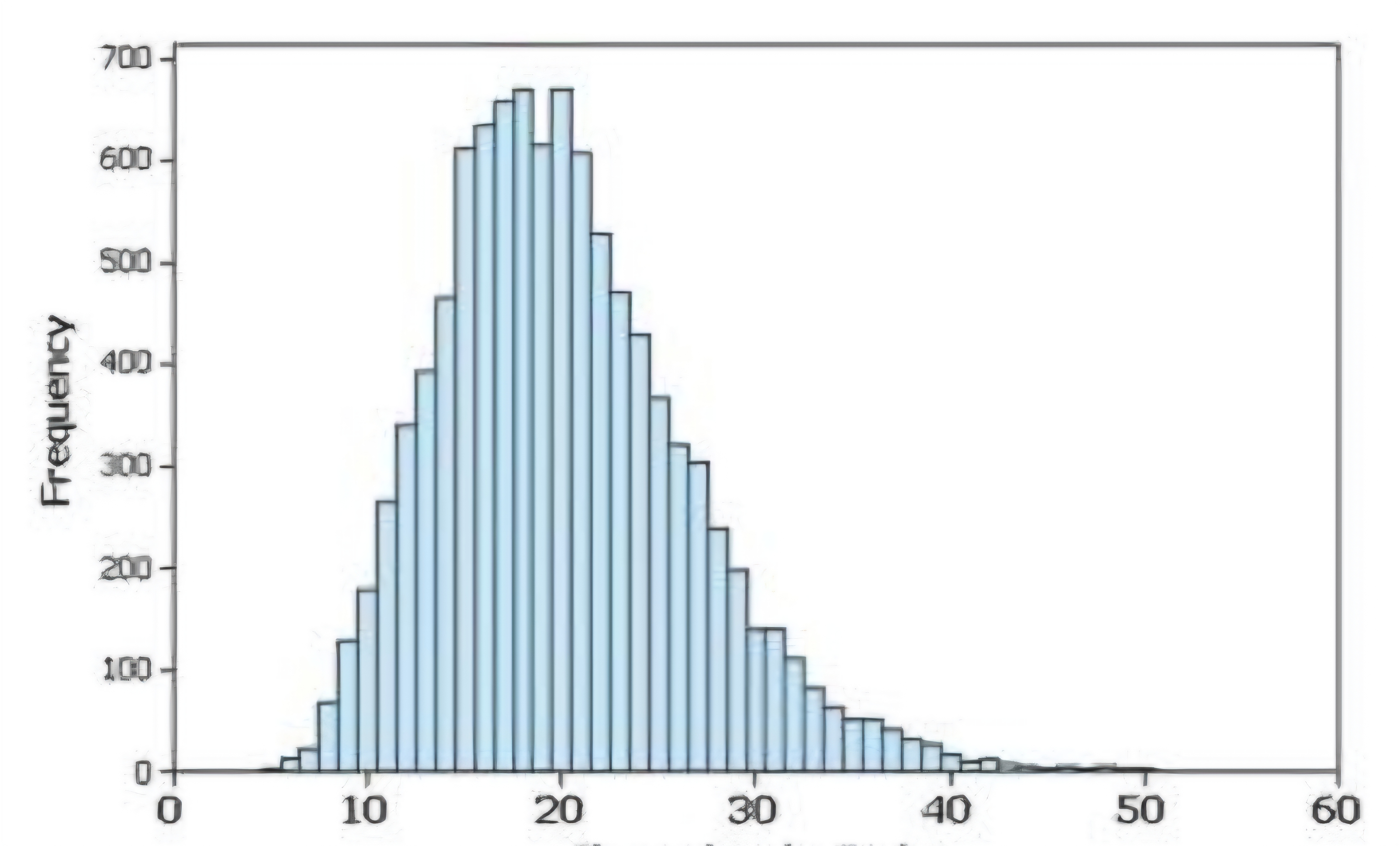
Skewed to the right (positively)
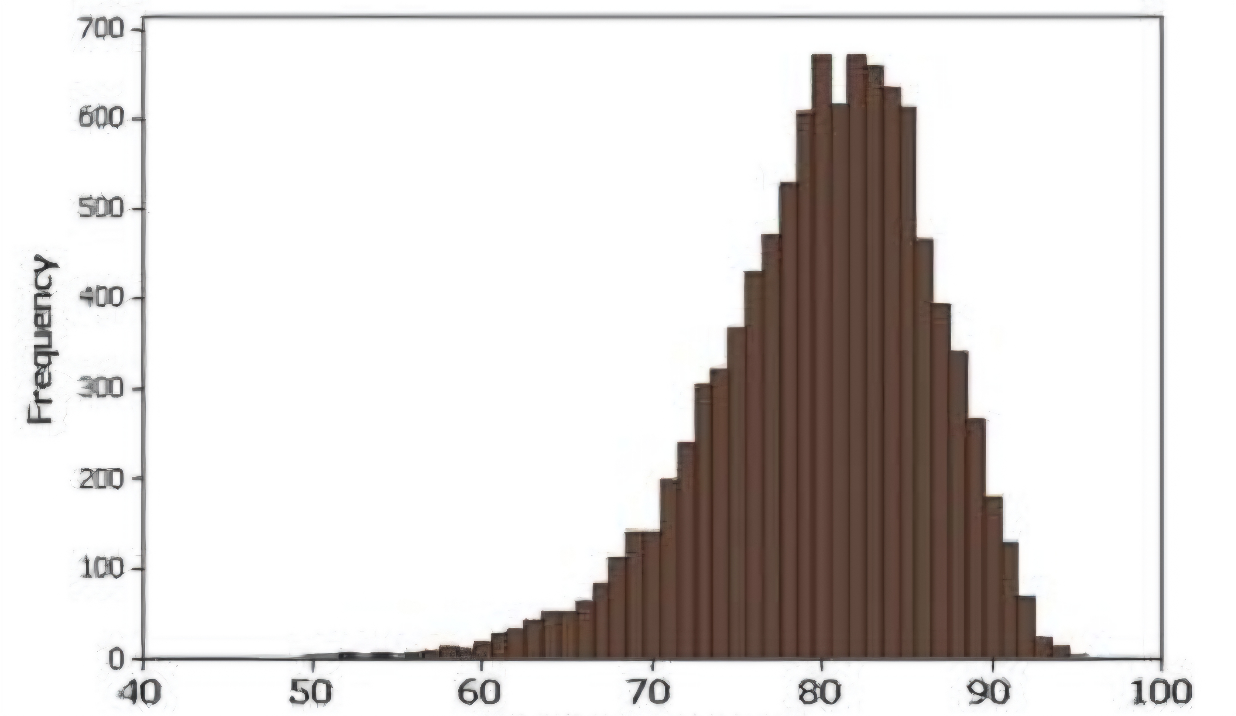
Skewed to the left (negatively skewed)
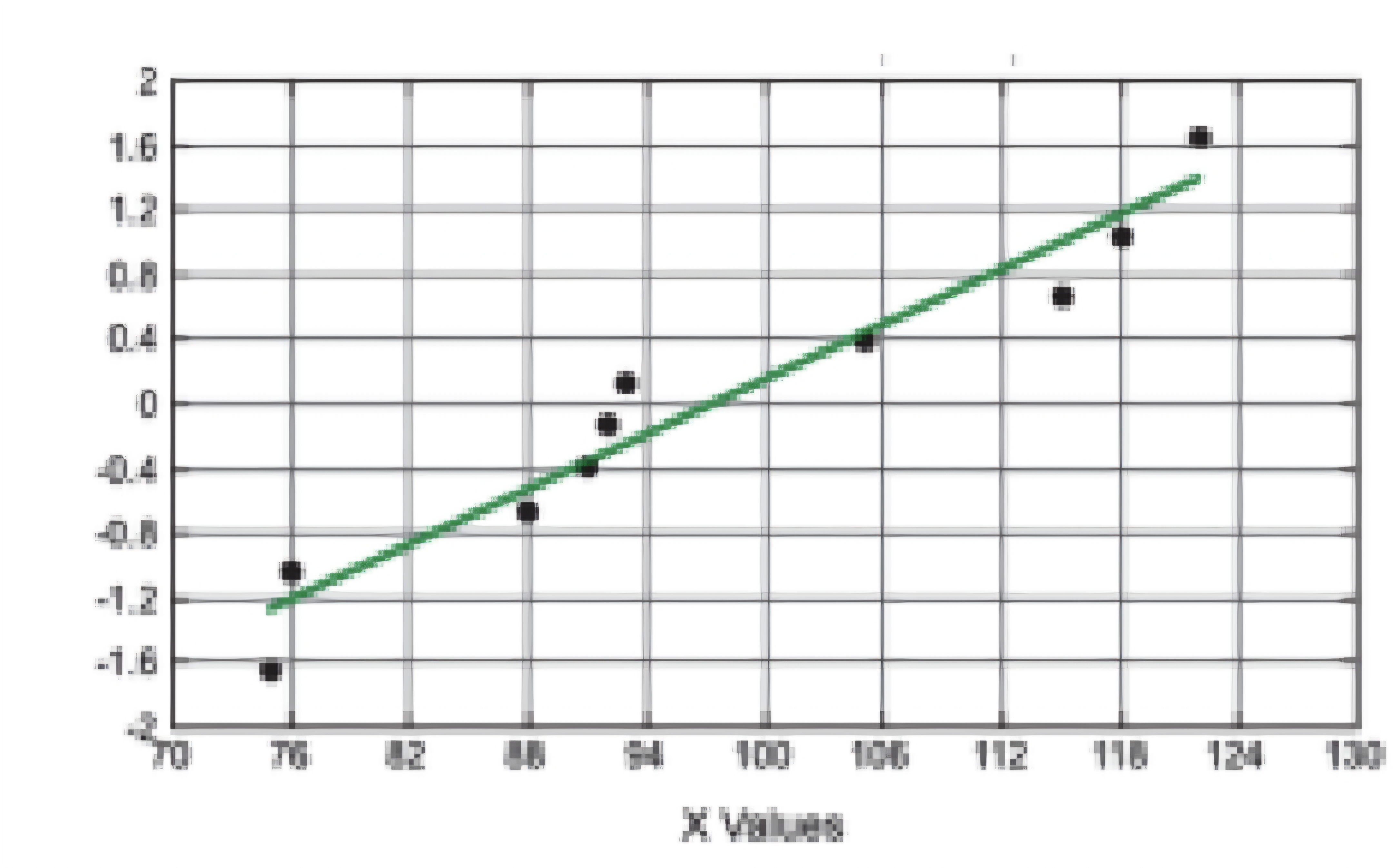
NORMAL QUANTILE PLOT (Normal Distribution)
NORMAL QUANTILE PLOT (Not Normal Distribution)
NORMAL QUANTILE PLOT (Not Normal Distribution)
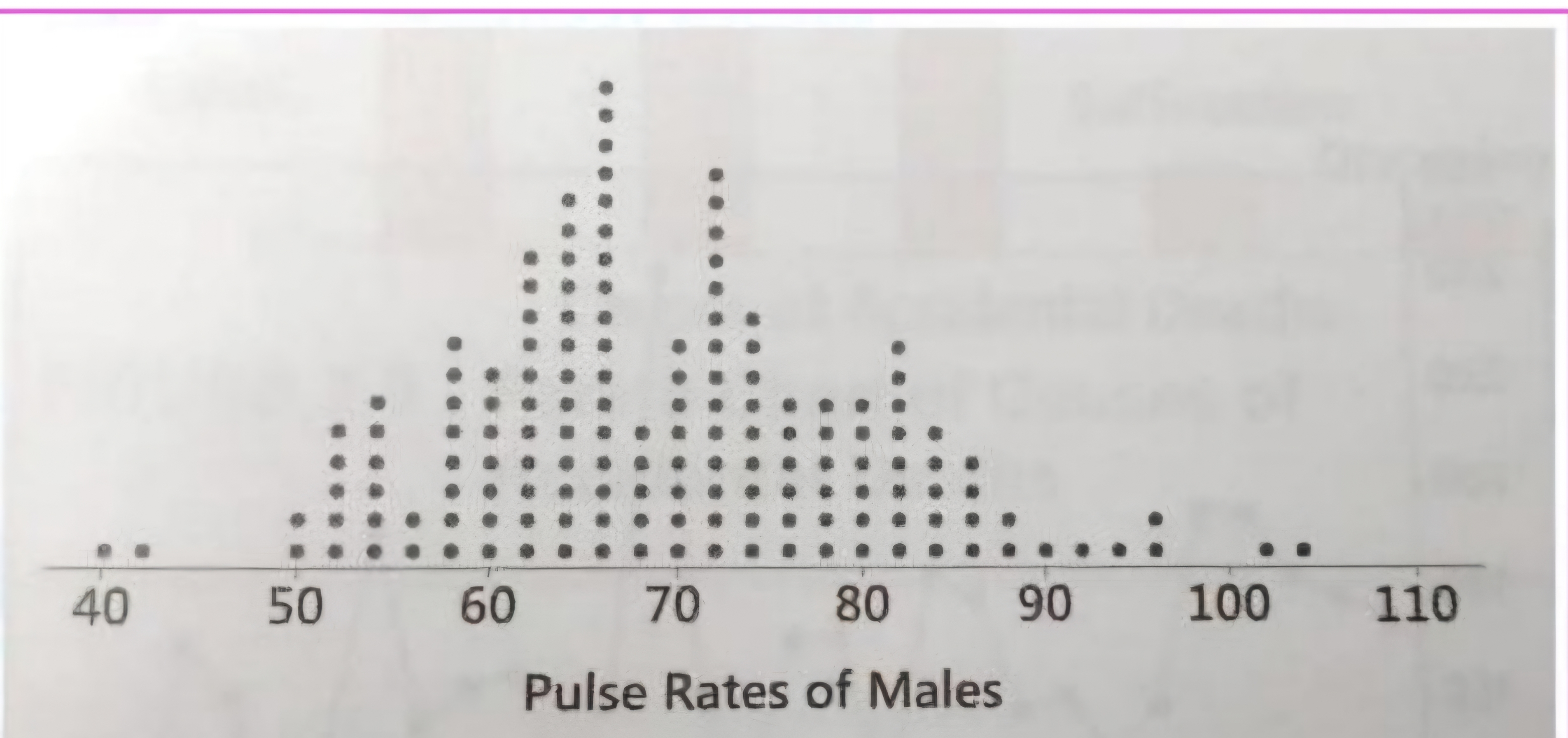
Dotplot
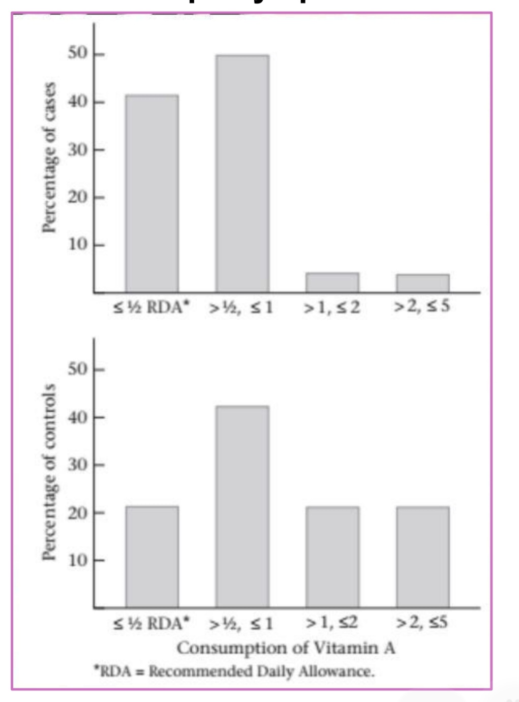
Bar graphs
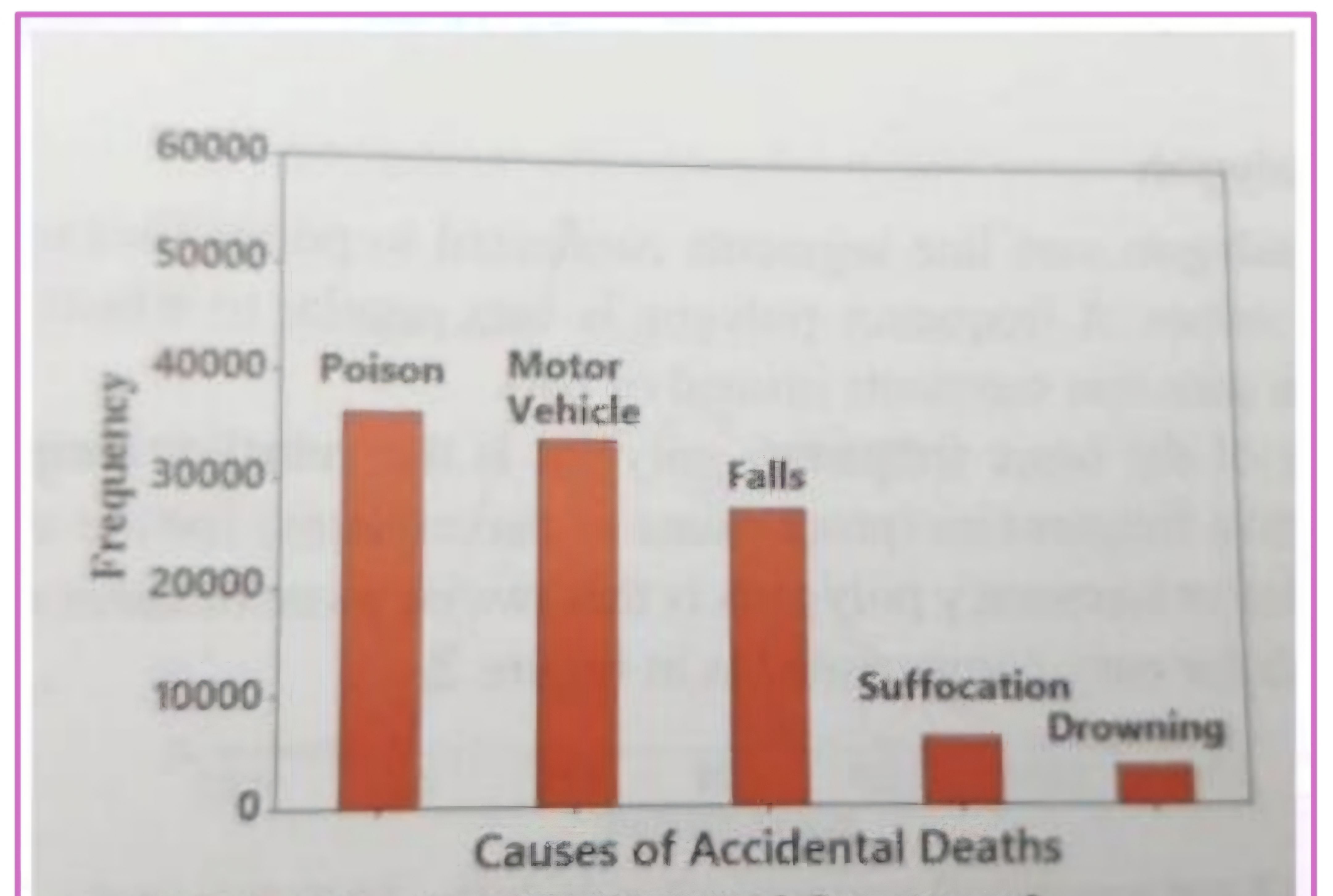
Pareto charts
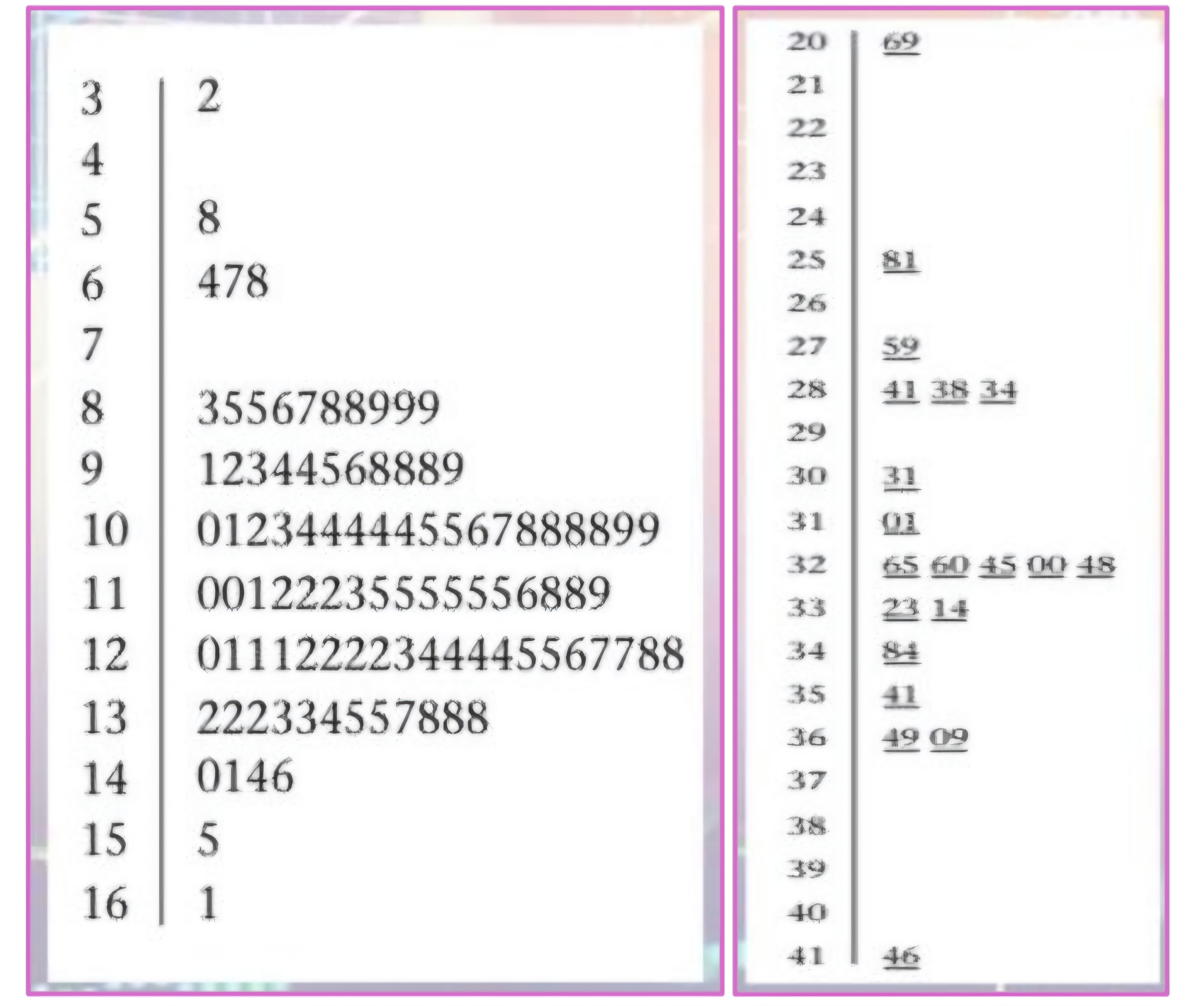
(1) The smallest stem in the data set is
(2) second stem
(3) vertical bar
(4) leaves
(5) w/ underline
Stem-and-leaf plots
(1) displayed in the upper left-hand corner of the plot.
(2) equals the first stem + 1 is displayed, below the first stem.
(3) found to the right of the column of stems
(4) displayed to the right of the vertical bar
(5) decimal point
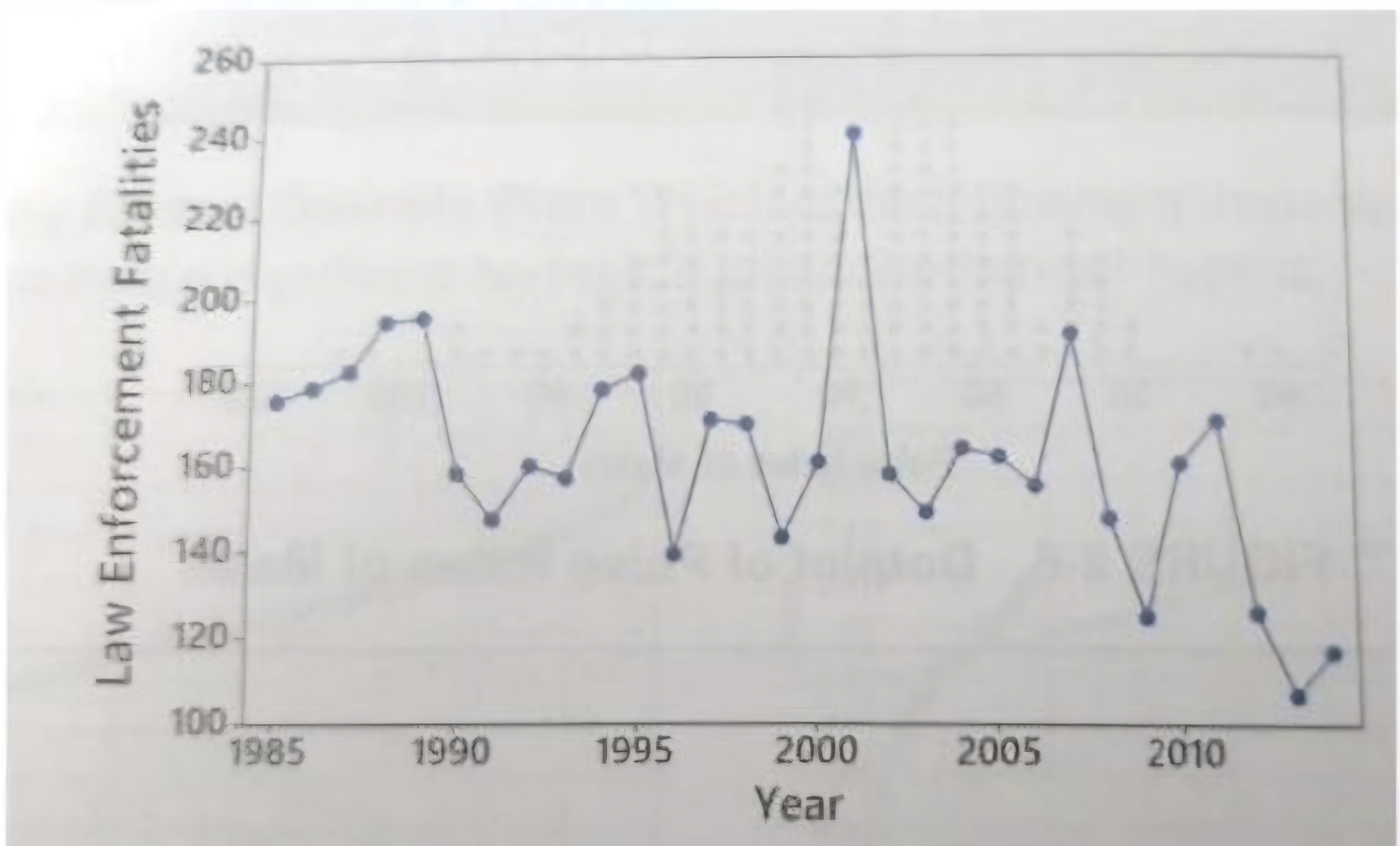
Time-series graph
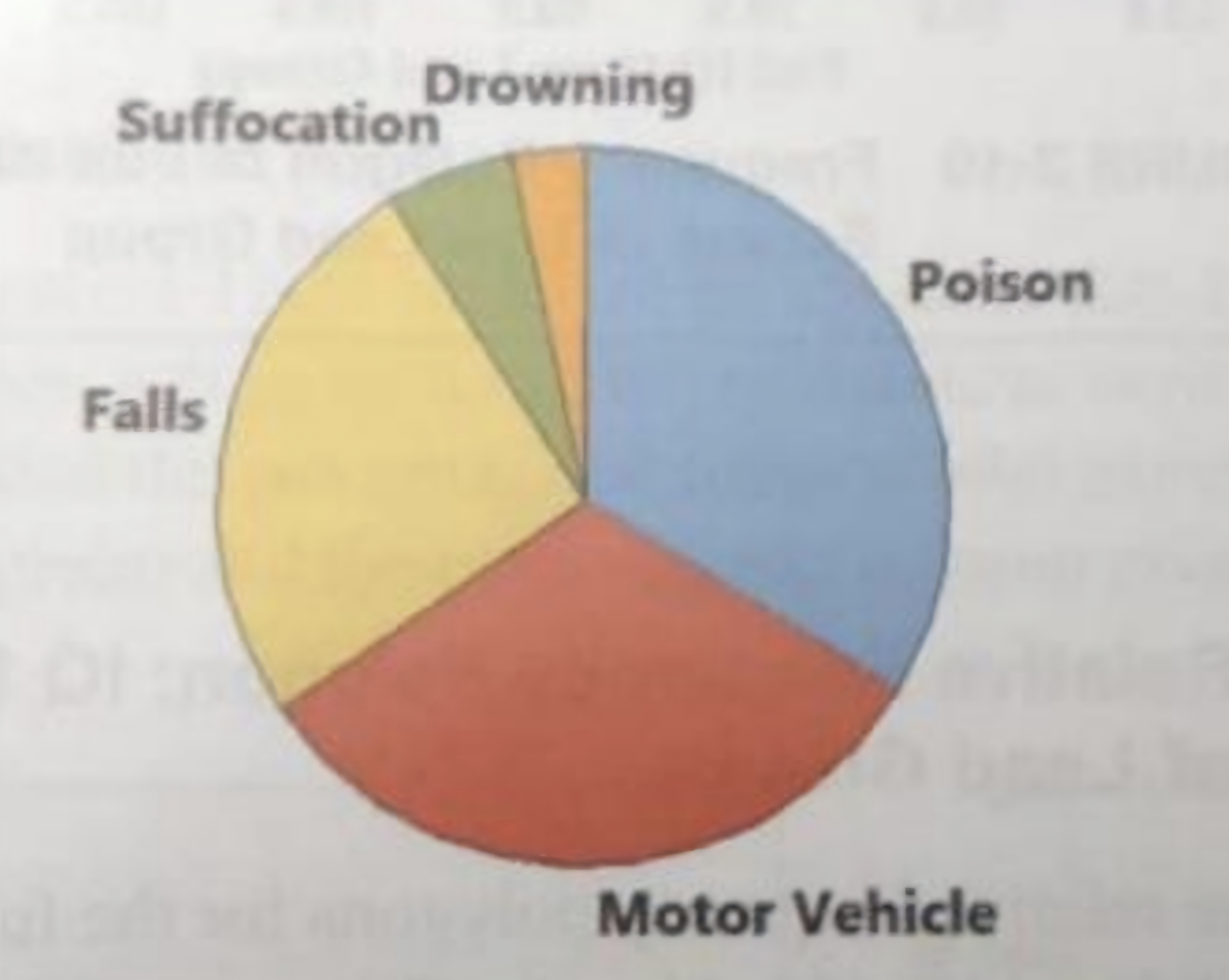
Pie chart
X =
Y =
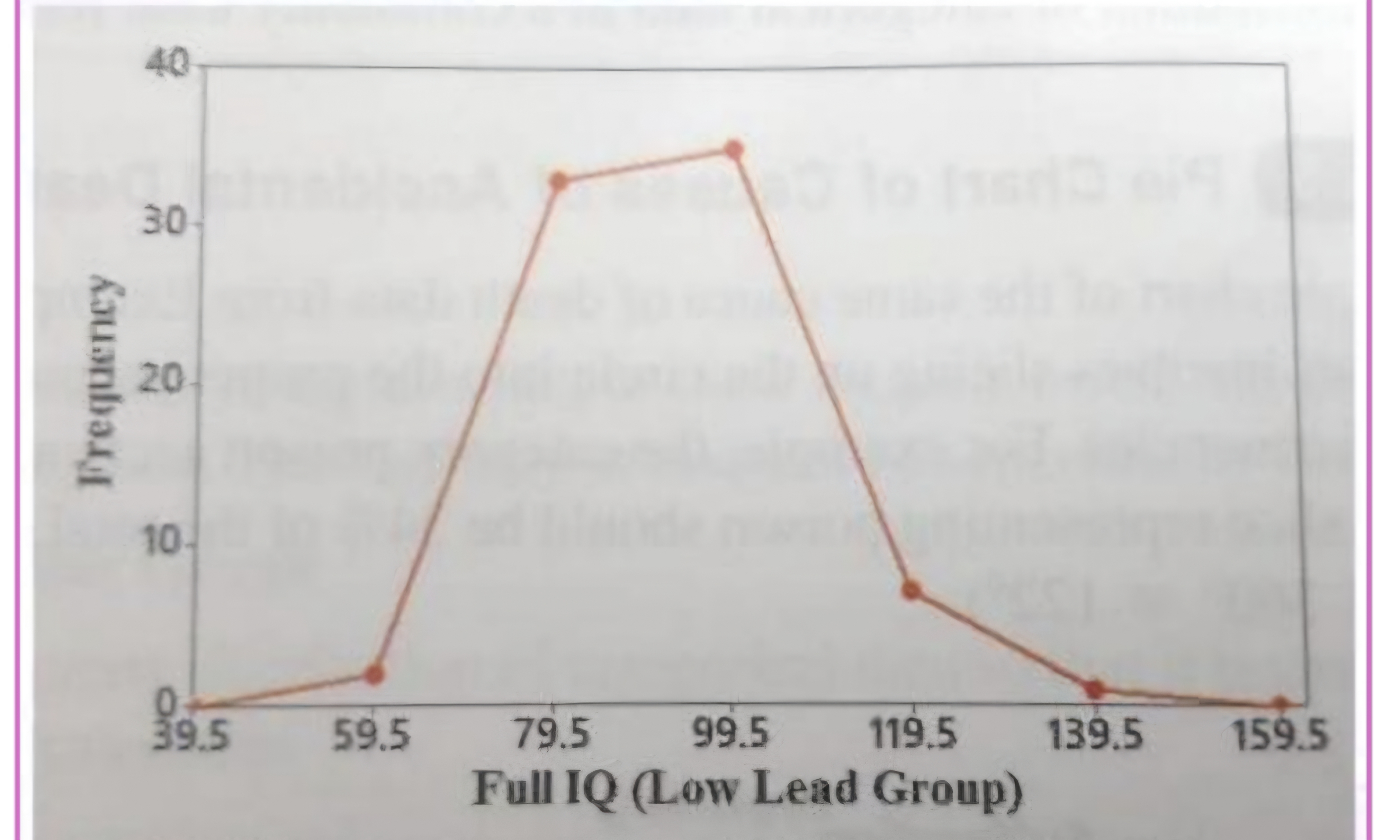
Frequency polygon
class midpoint
frequency
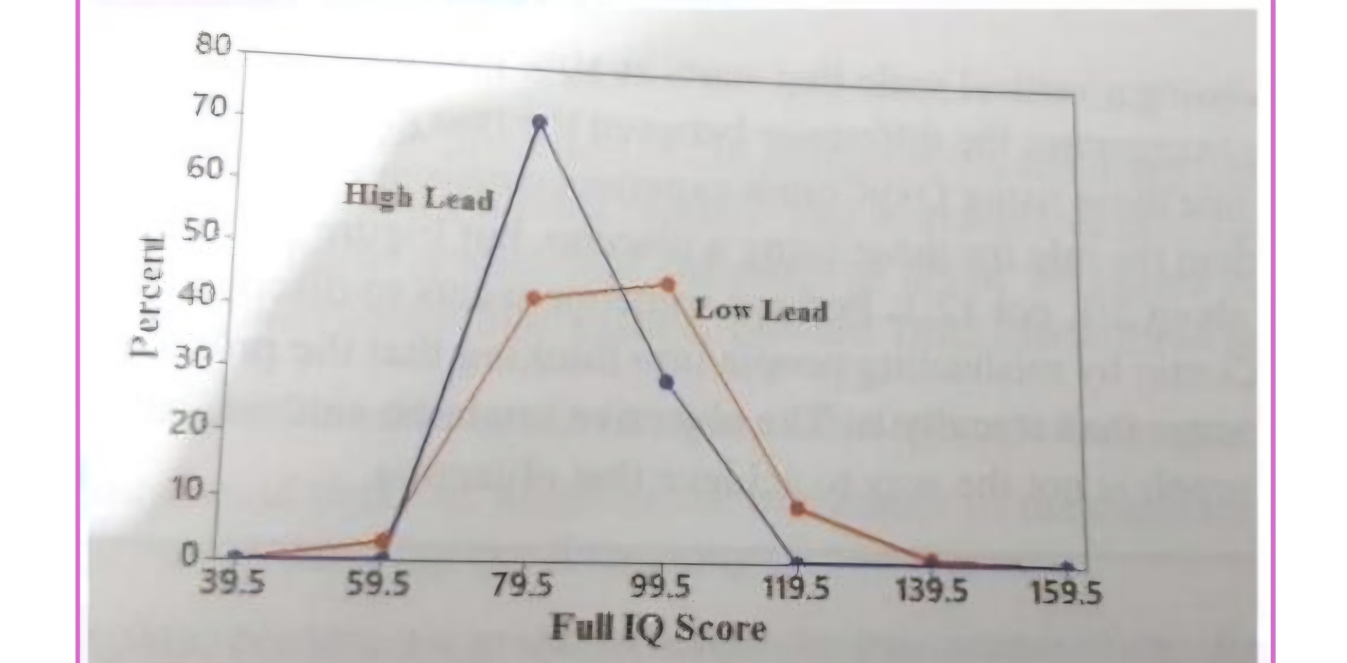
RELATIVE FREQUENCY POLYGON
Lines below =
Lines above =
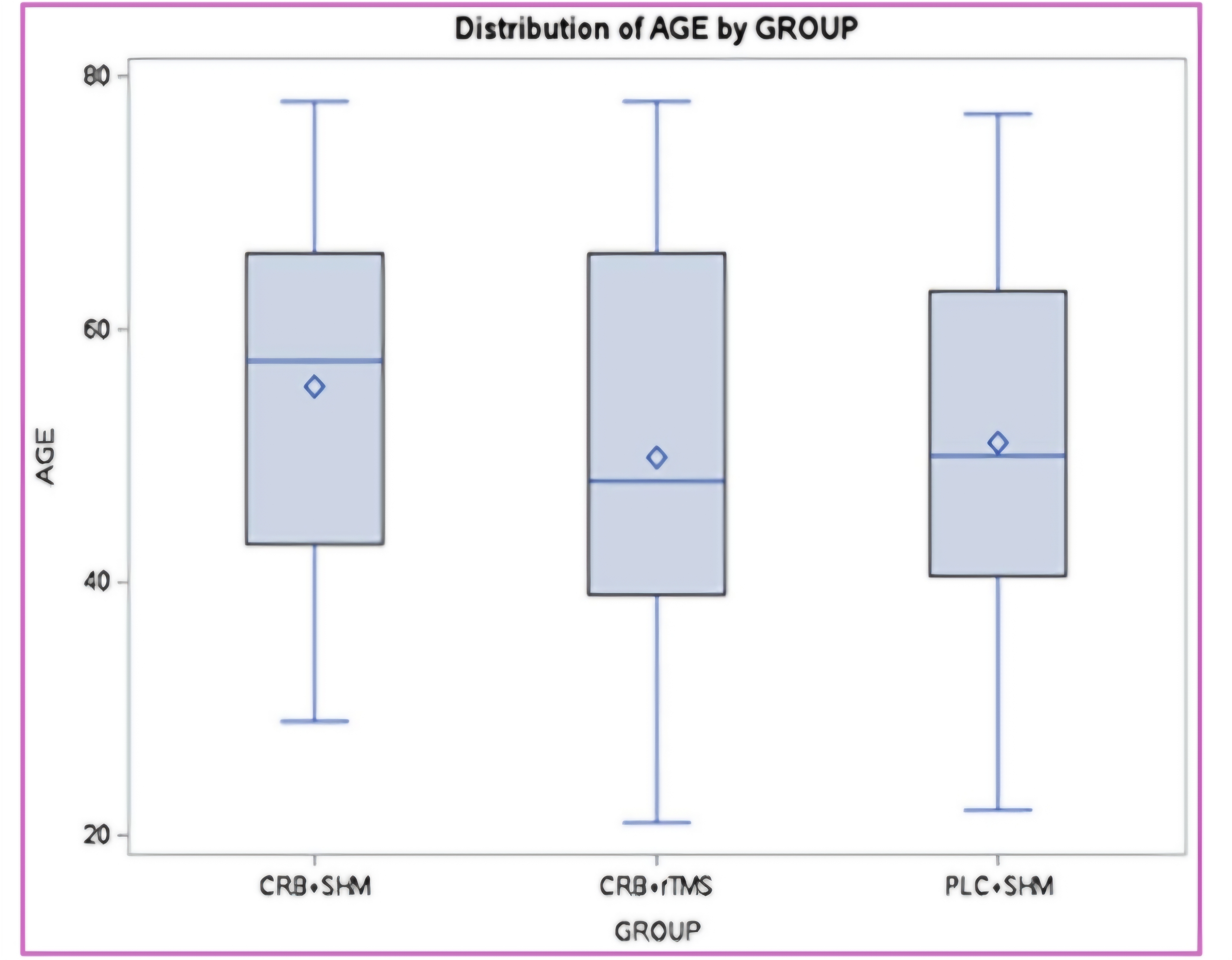
Lowest line of the box =
Highest line of the box =
Blue line inside the box =
Box plot
minimum value of the data
maximum value of the data
Lower quartile
upper quartile
median
can be use in some like
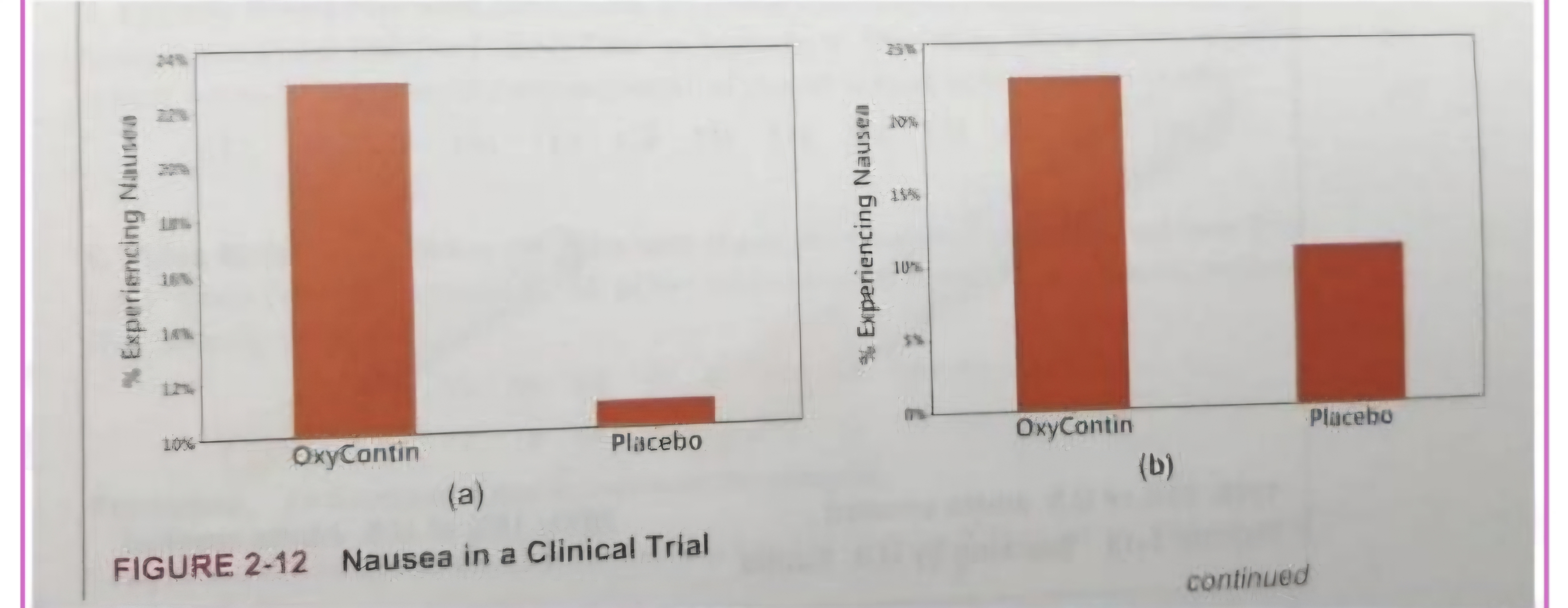
Nonzero vertical axis
Scatterplot bc we’re not comparing, but finding relationship
Problem
Pictographs
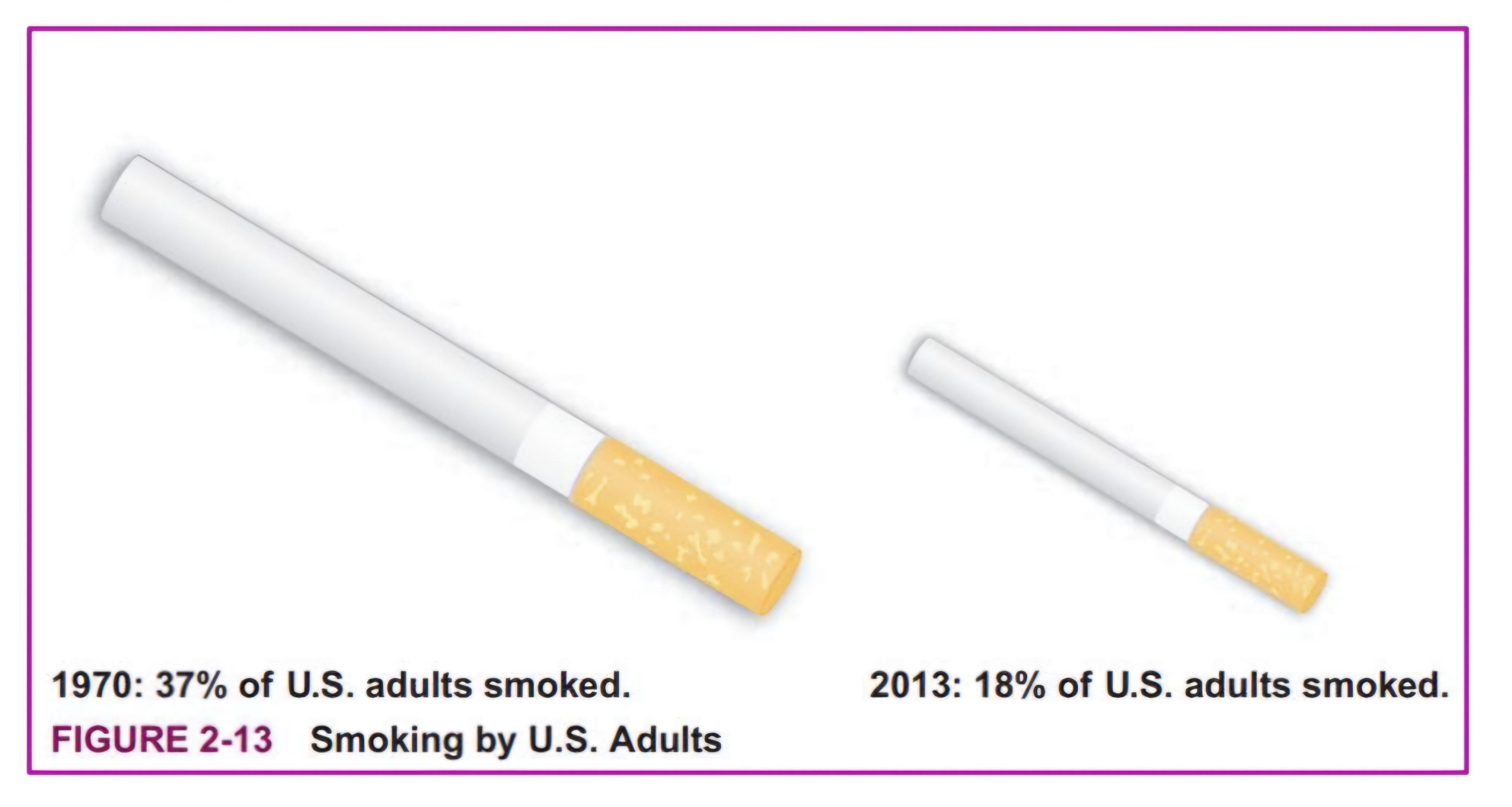
Different years, different populations = not comparable
Percent shouldn’t be used, real figures dapat
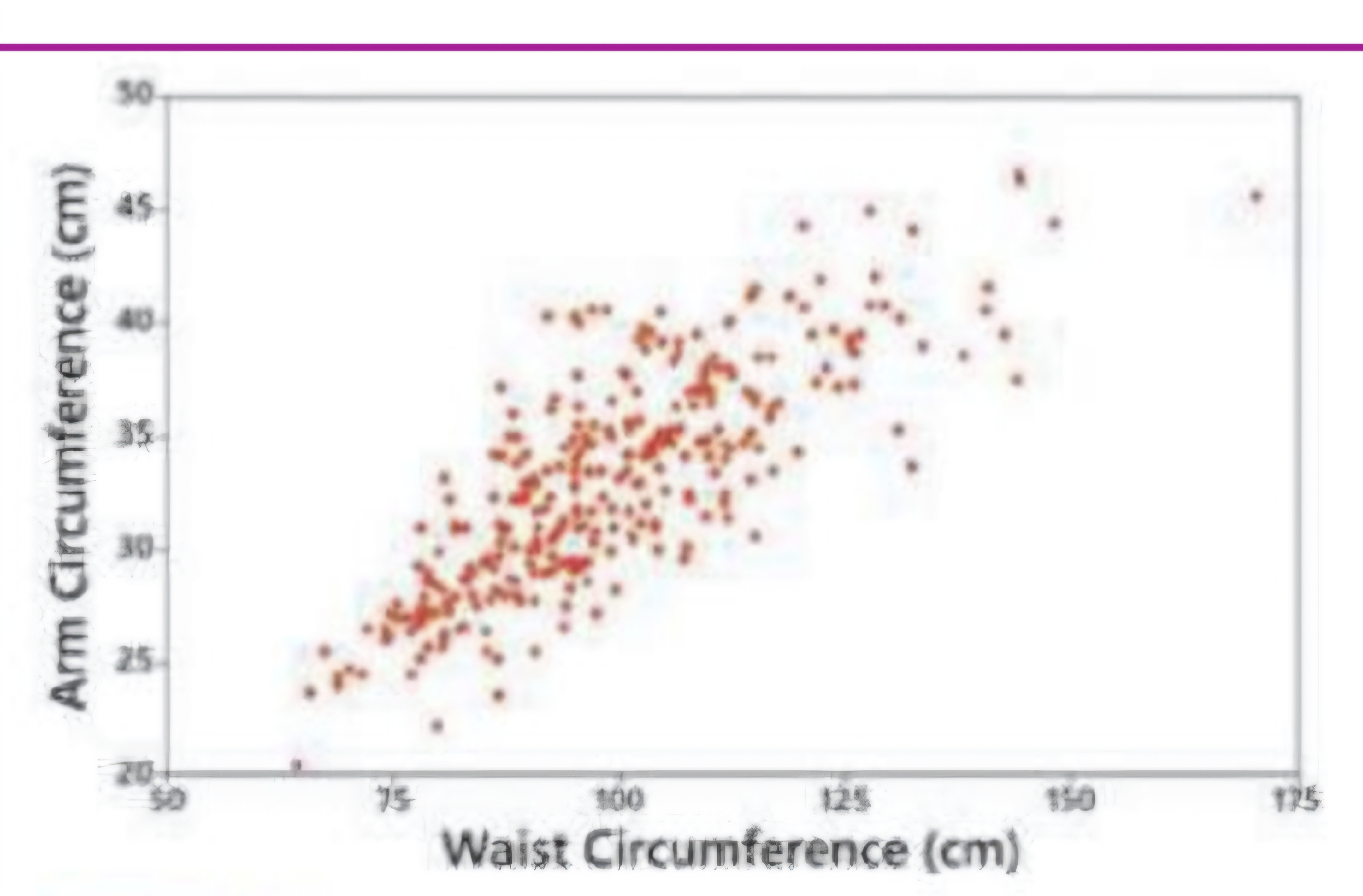
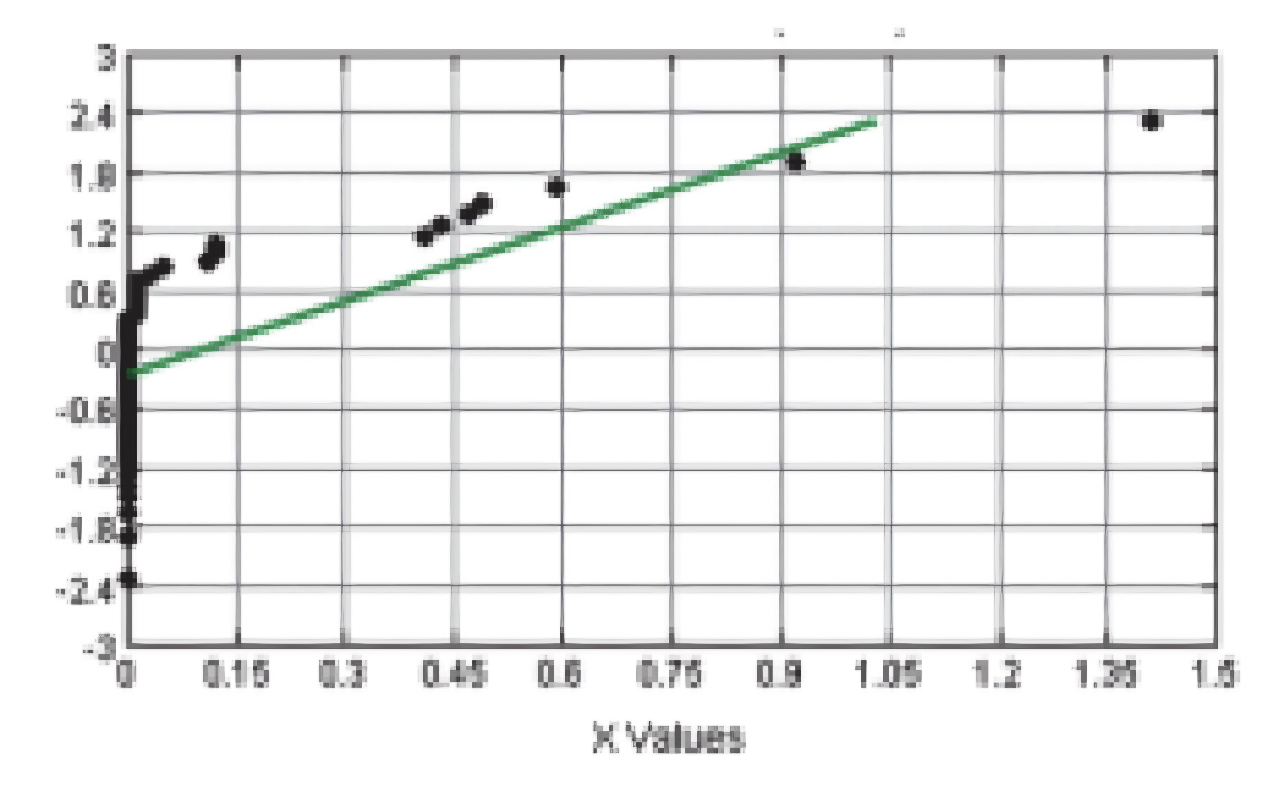
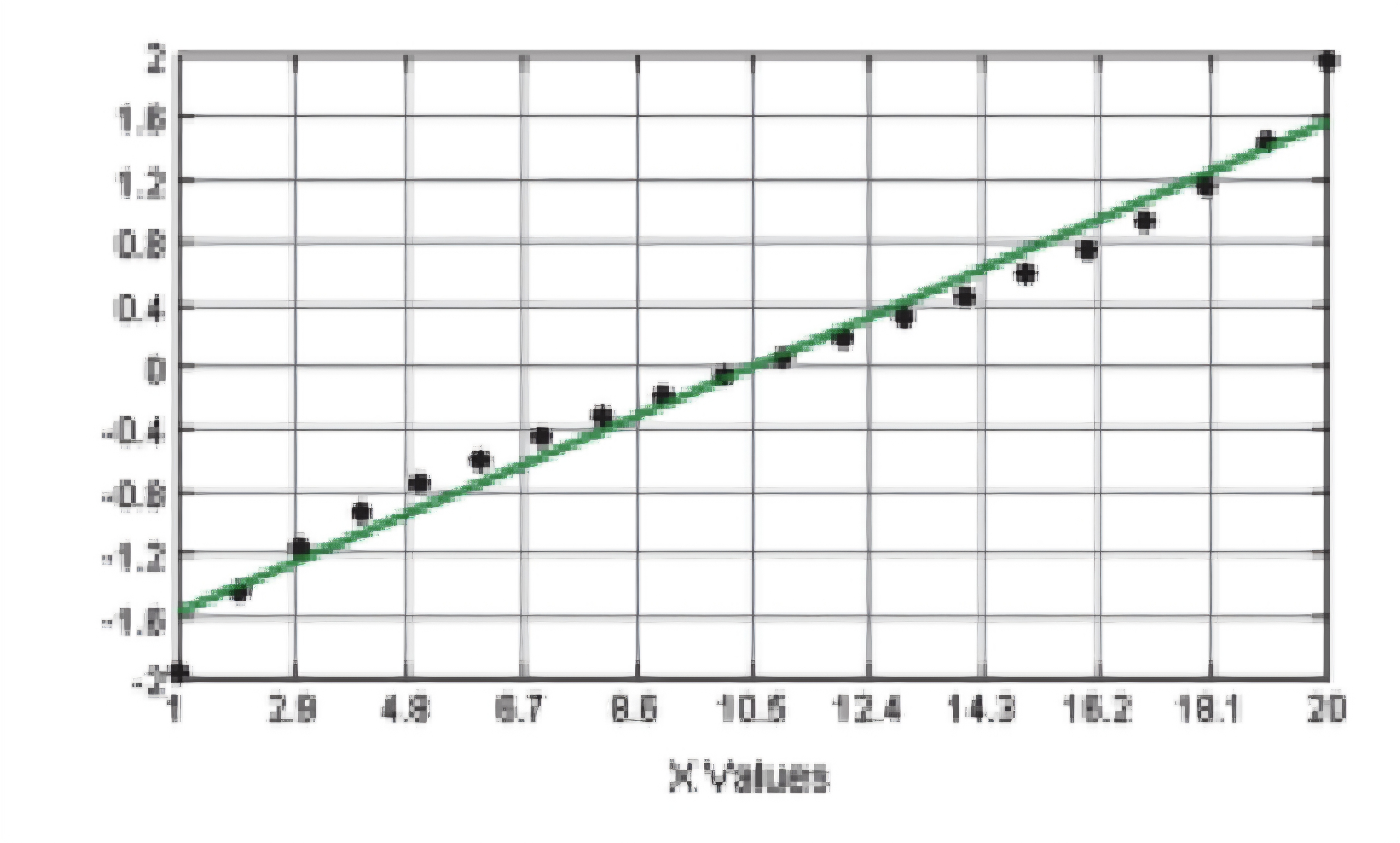
Scatterplot/diagram: Correlation
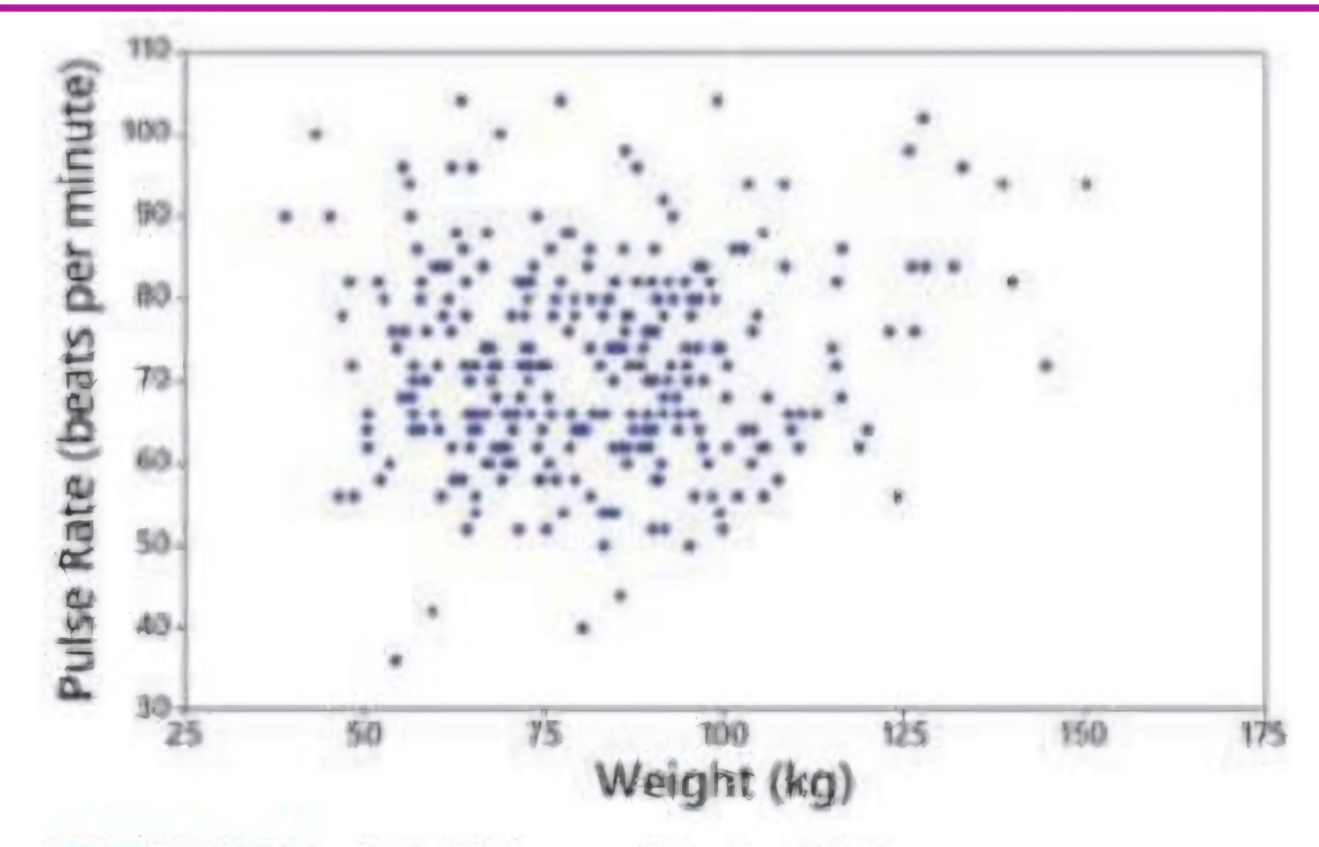
Scatterplot/diagram: No Correlation
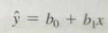
Regression equation / line
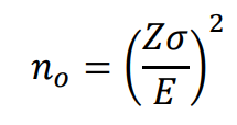
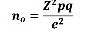
Cochran sample size formula
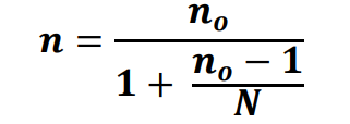
MODIFICATION FOR COCHRAN'S FORMULA IN SMALLER POPULATIONS
FINDING SAMPLE SIZE WITH KNOWN POPULATION STANDARD DEVIATION