econ
0.0(0)
Studied by 56 peopleCard Sorting
1/70
Earn XP
Description and Tags
Last updated 4:17 AM on 12/13/22
Name | Mastery | Learn | Test | Matching | Spaced | Call with Kai | Chat |
|---|
No analytics yet
Send a link to your students to track their progress
71 Terms
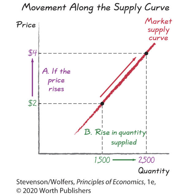
1
New cards
market demand image 1
2
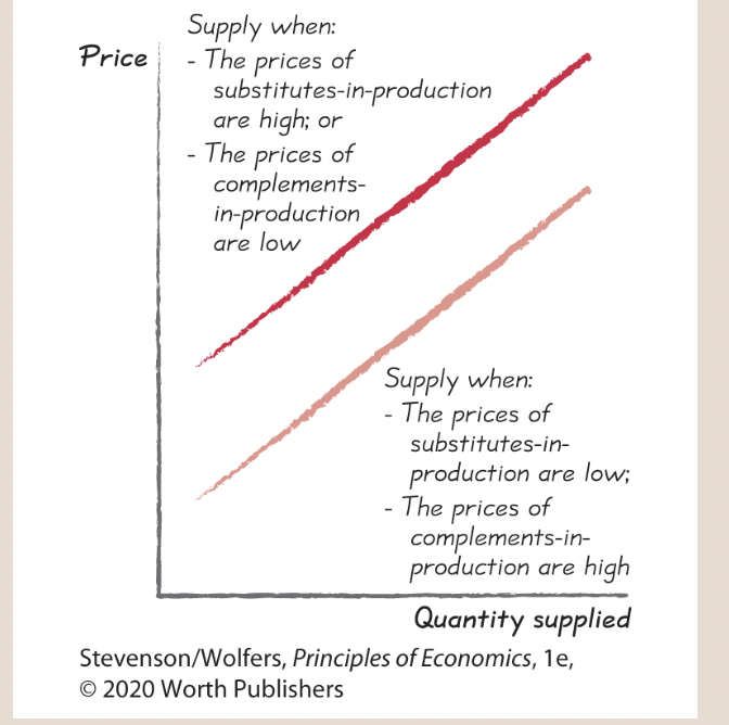
New cards
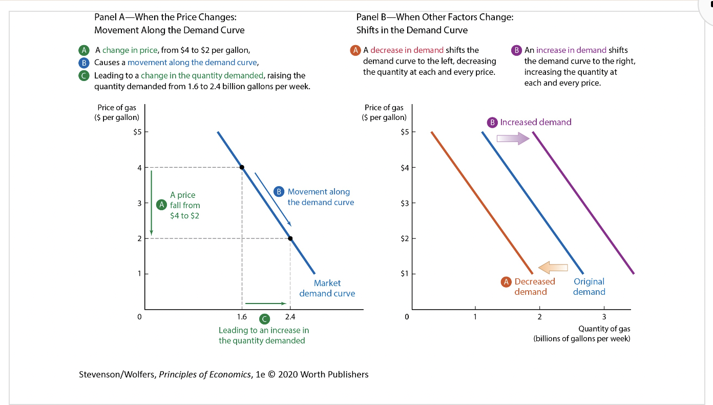
Movements Along the Demand Curve graph
3
New cards
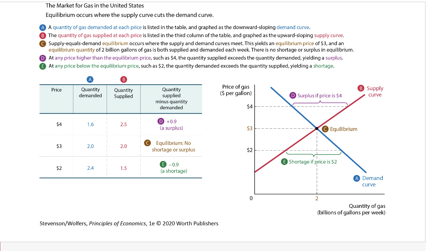
what shifts demand curve
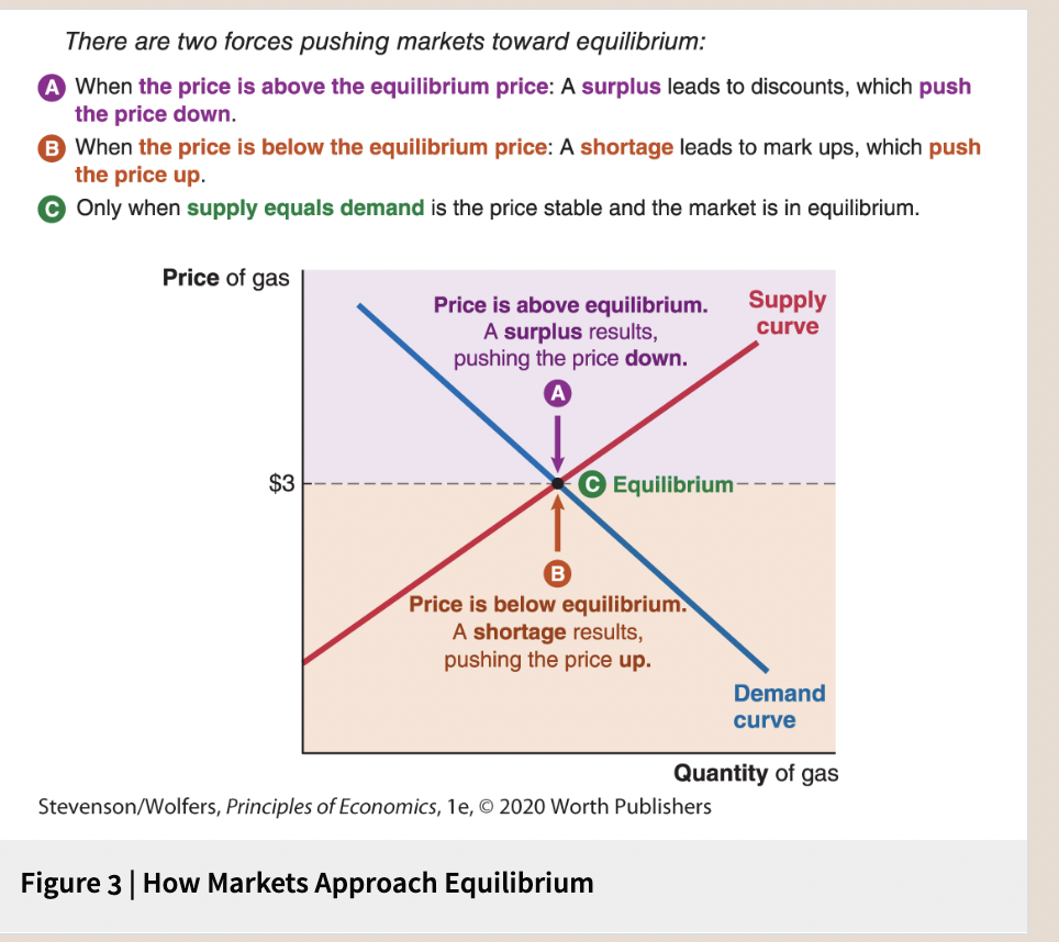
4
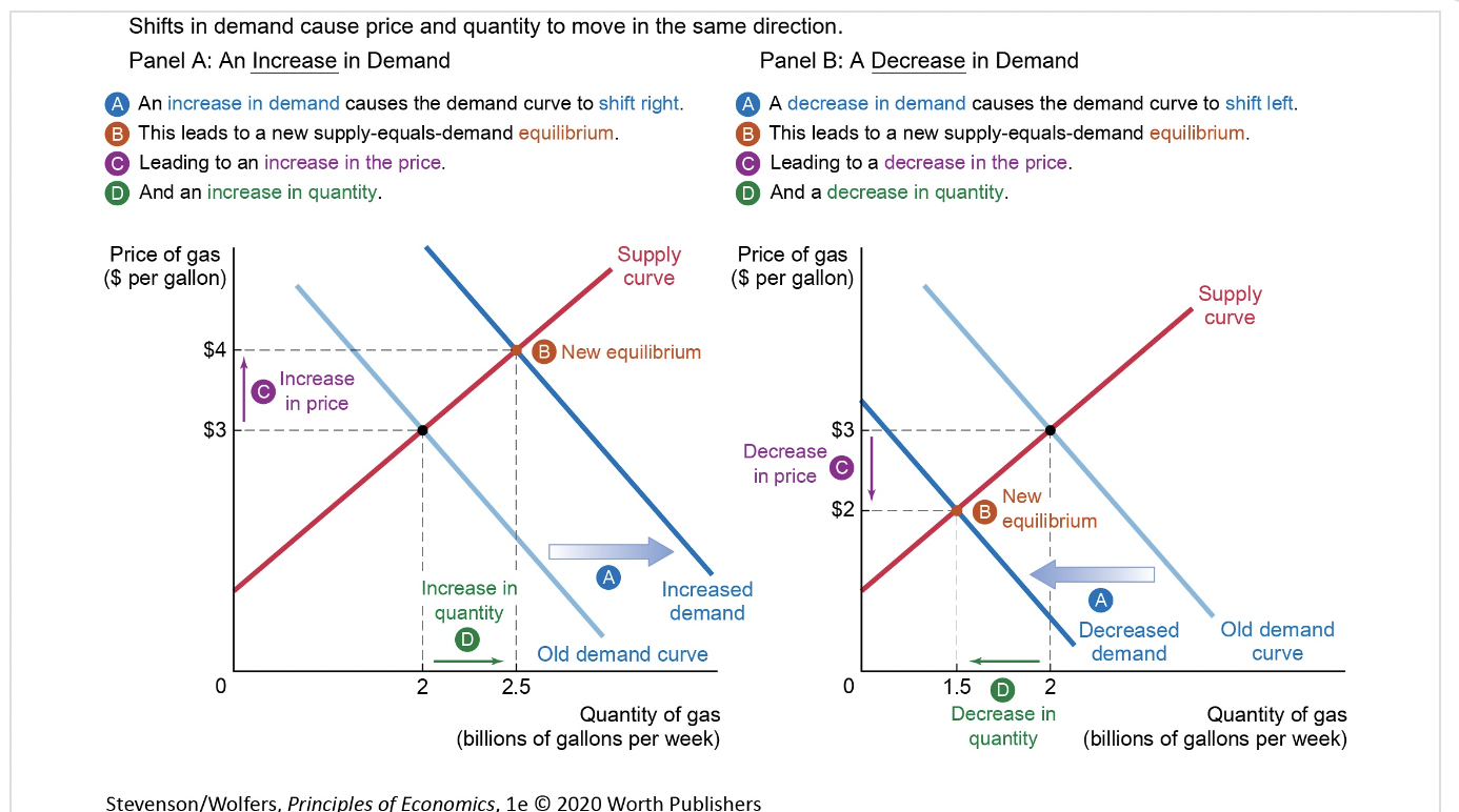
New cards
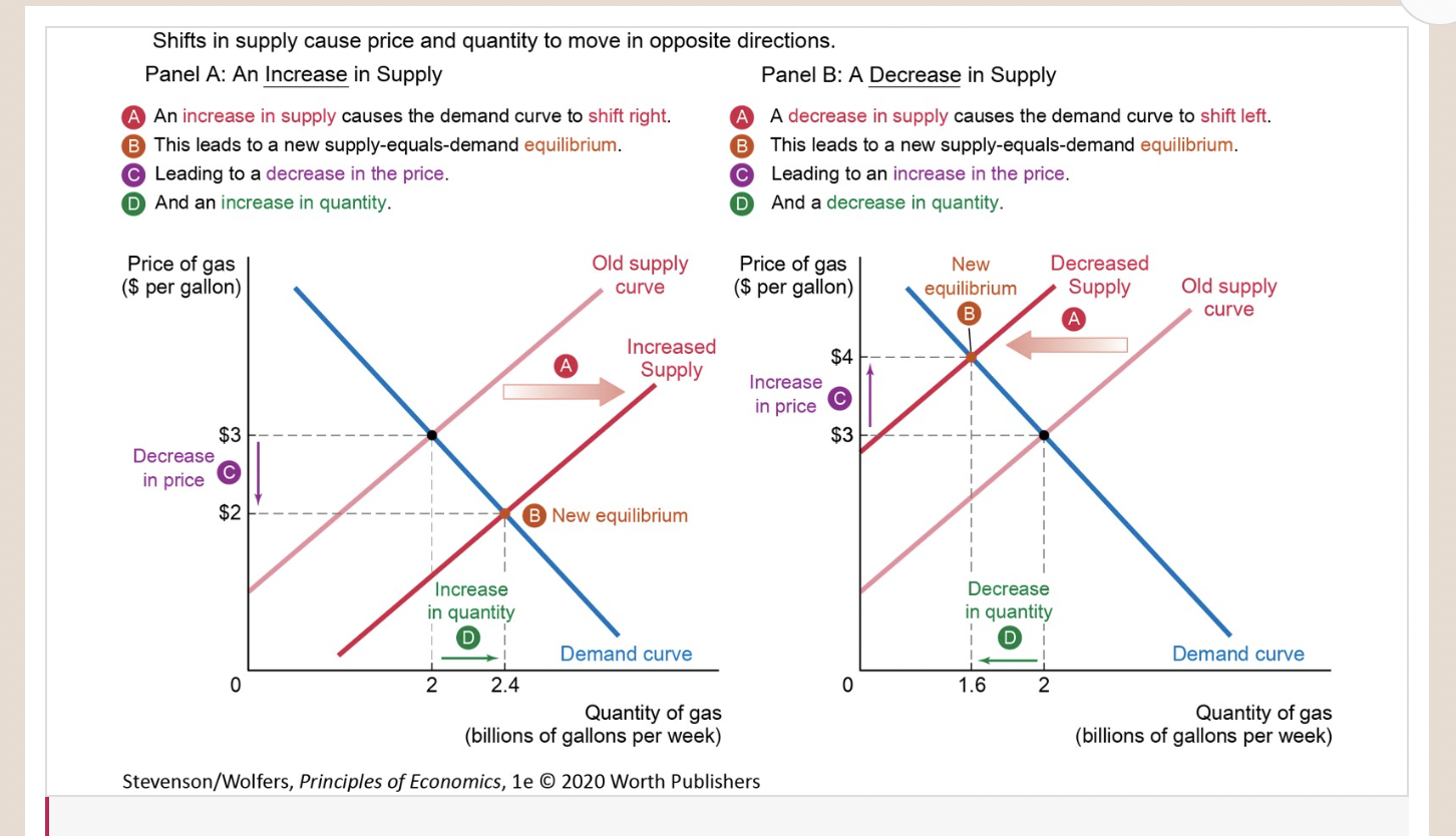
Movements Along the Demand Curve
5
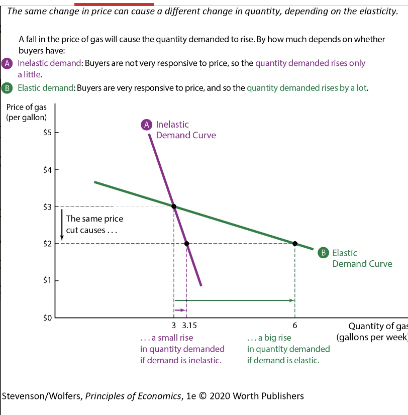
New cards
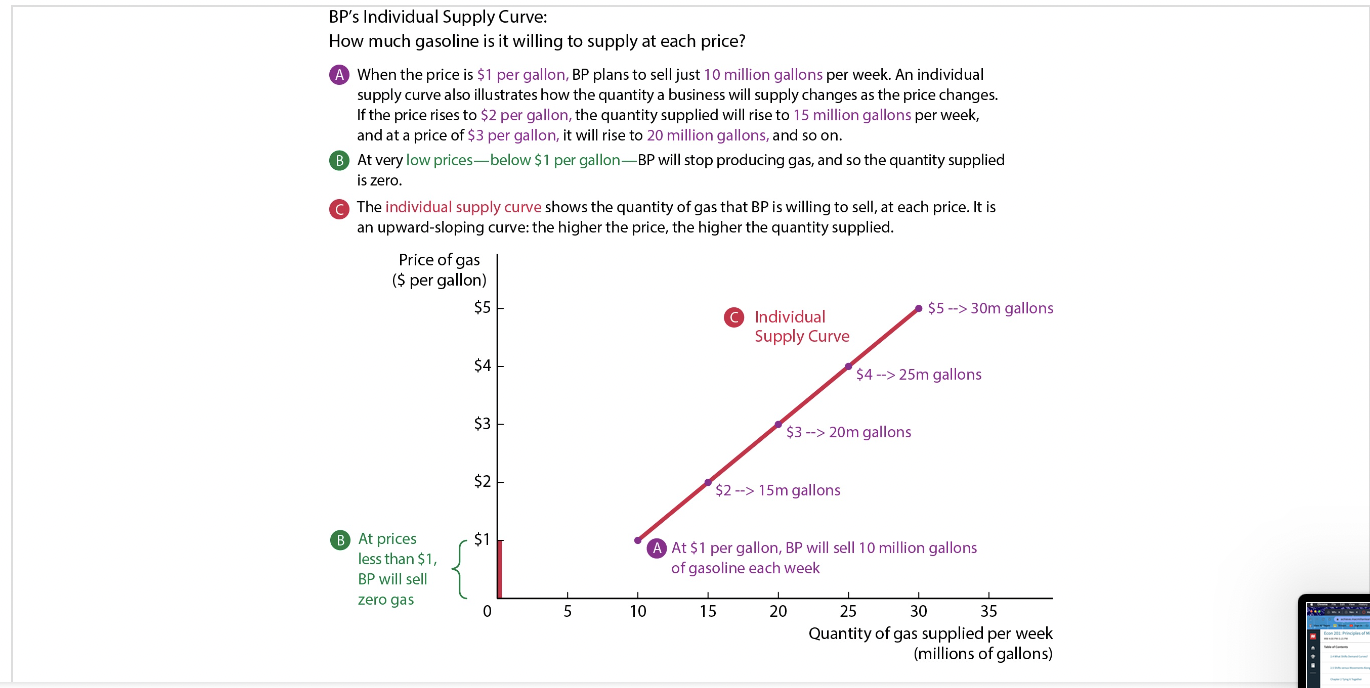
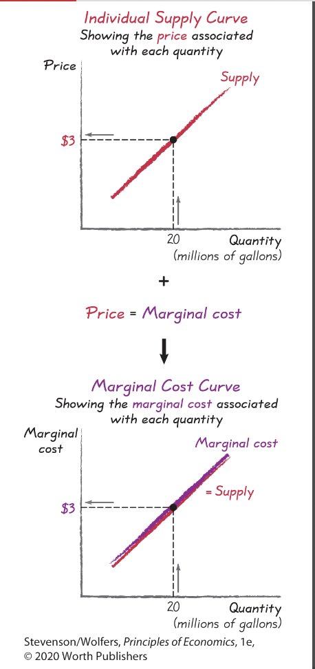
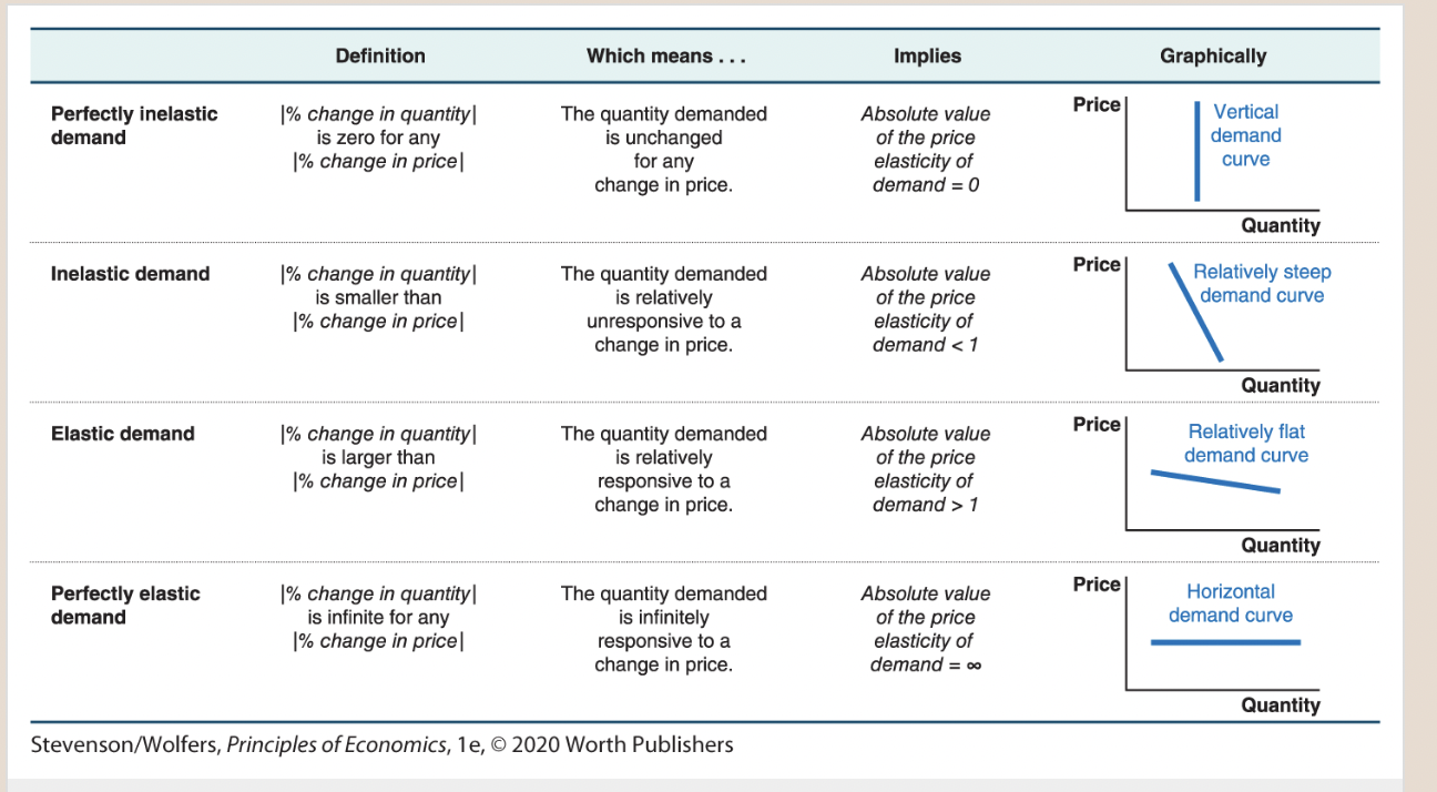
An individual supply curve graphs your selling plans.
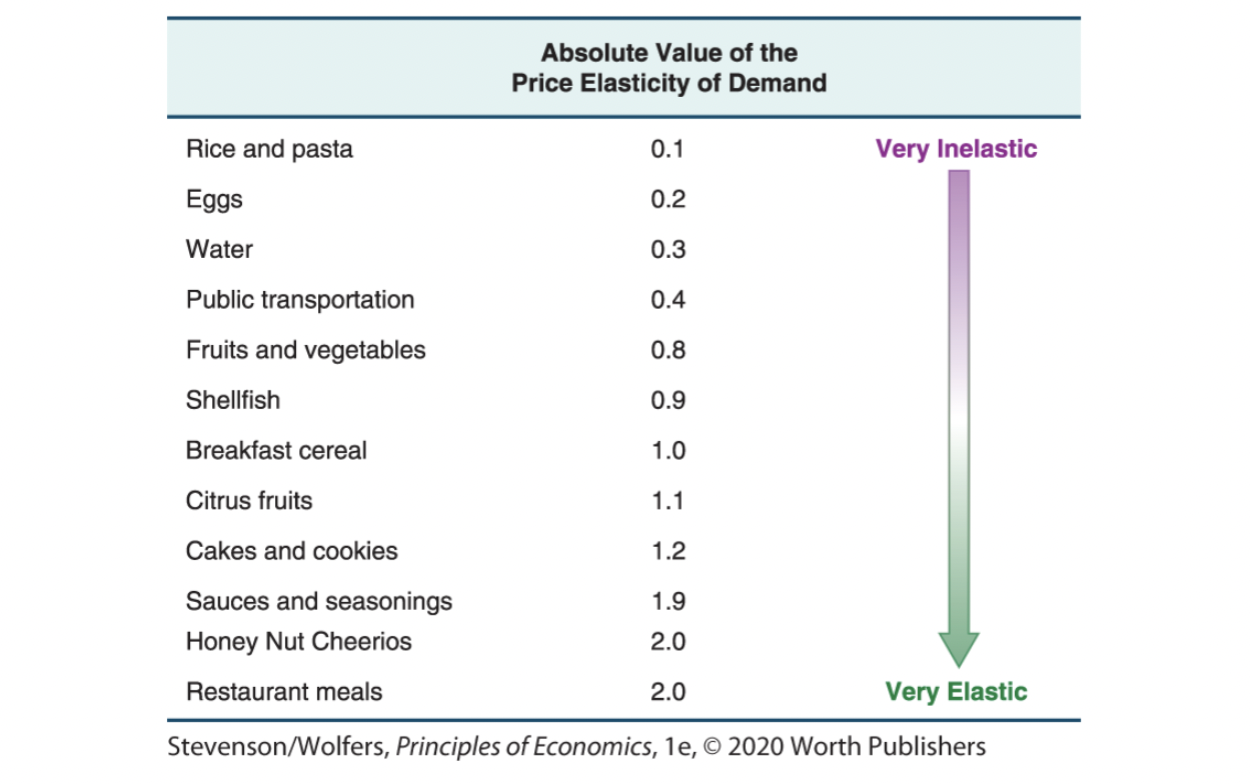
6
New cards
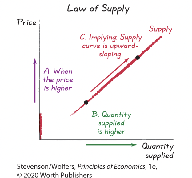
law of supply
7
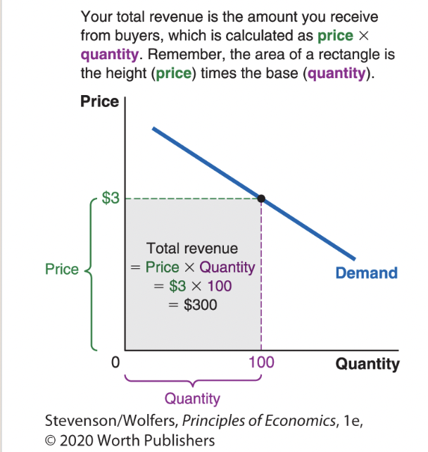
New cards
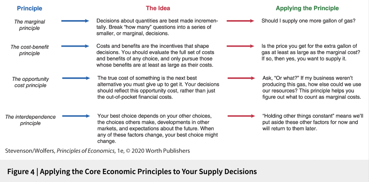
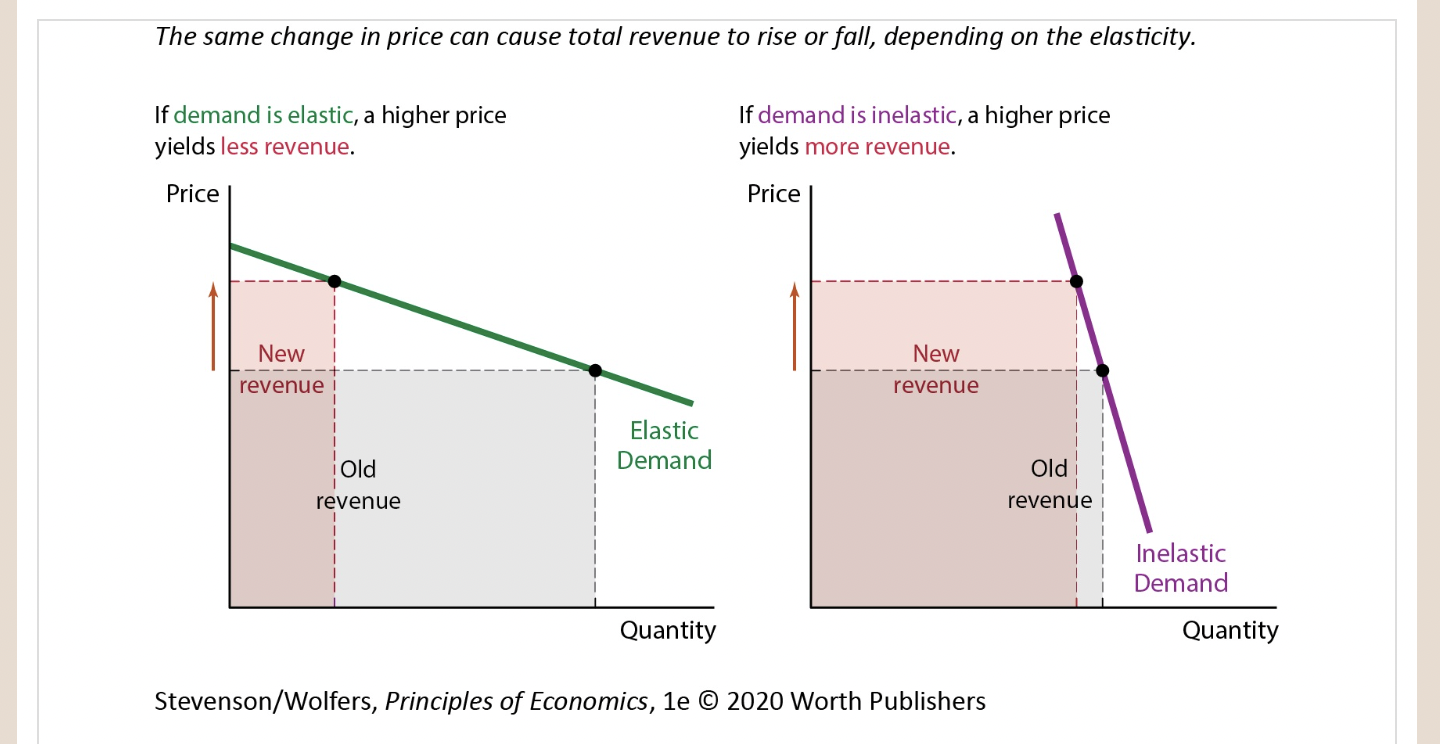
Figure 4 | Applying the Core Economic Principles to Your Supply Decisions

8
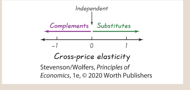
New cards
The Rational Rule for Sellers in Competitive Markets
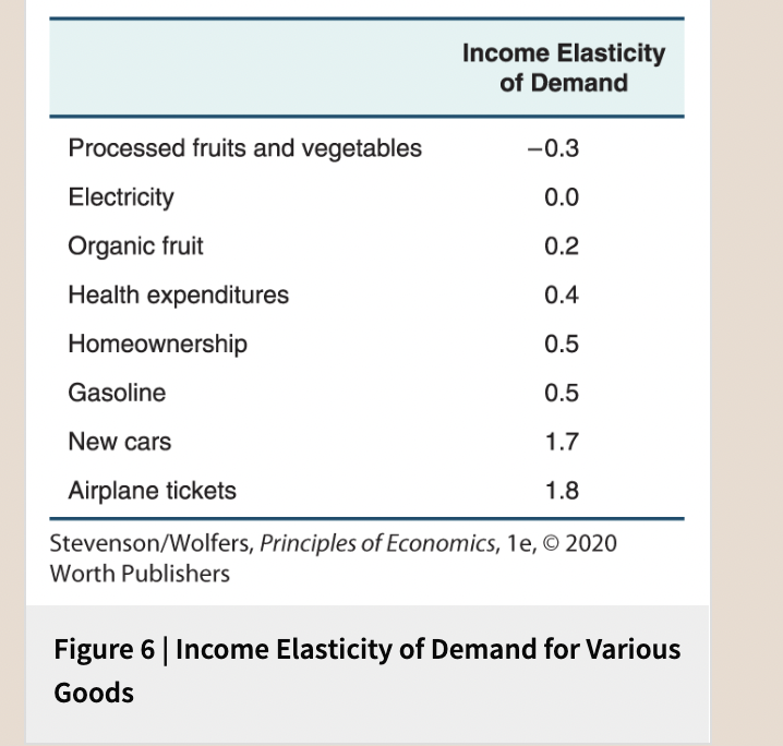
9
New cards
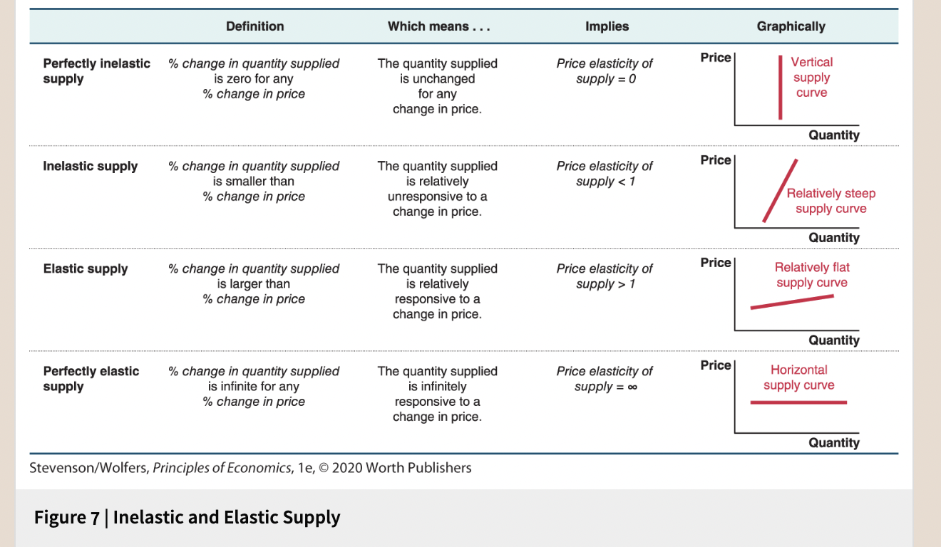
Consequently, you should stop increasing the quantity of gas you supply just before the marginal cost exceeds the price—which occurs in competitive markets when the price equals marginal cost
10
New cards
As a result, supply curves tend to be upward-sloping.

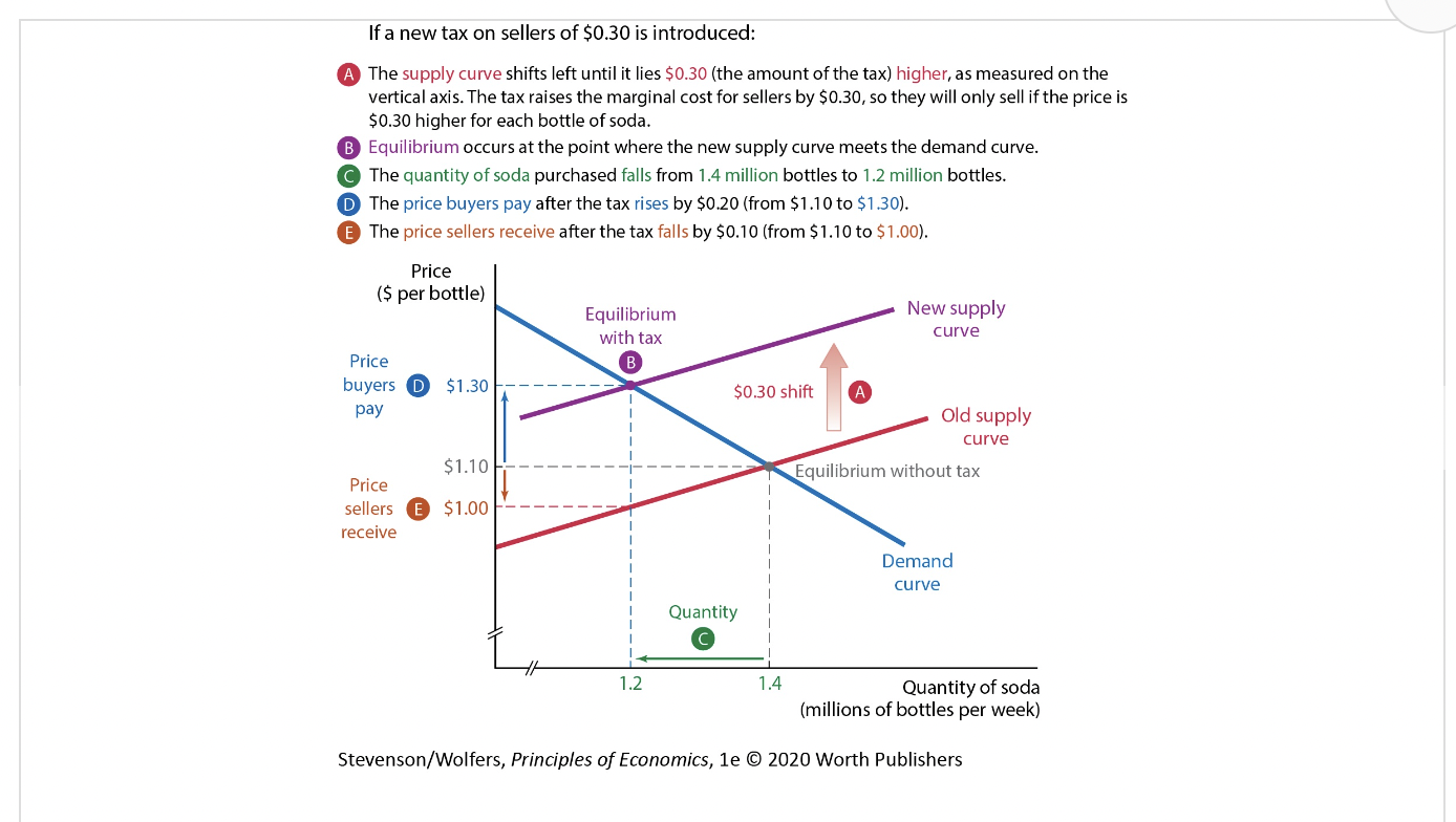
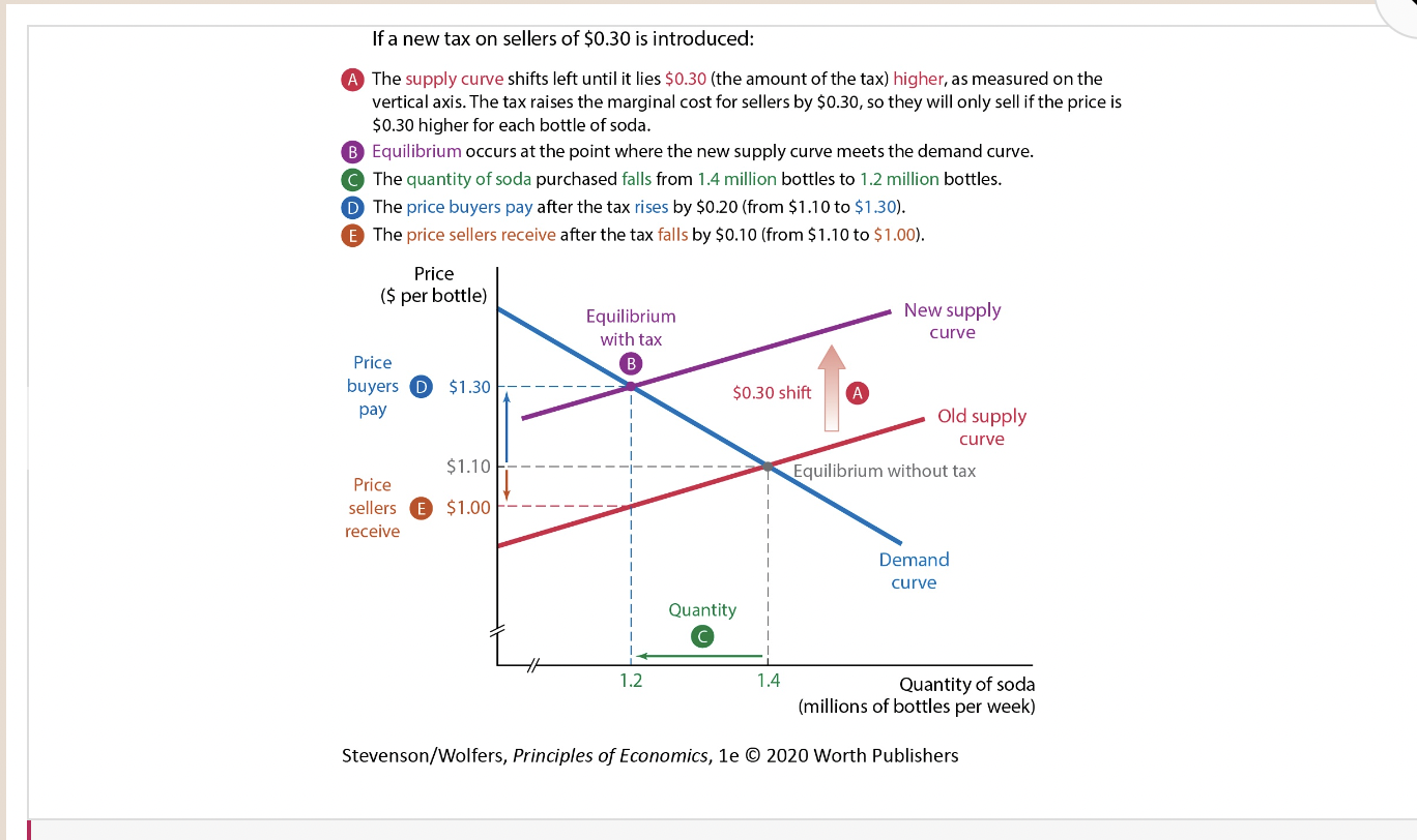
11
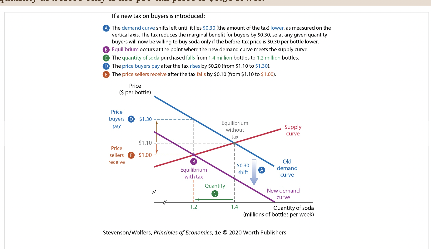
New cards
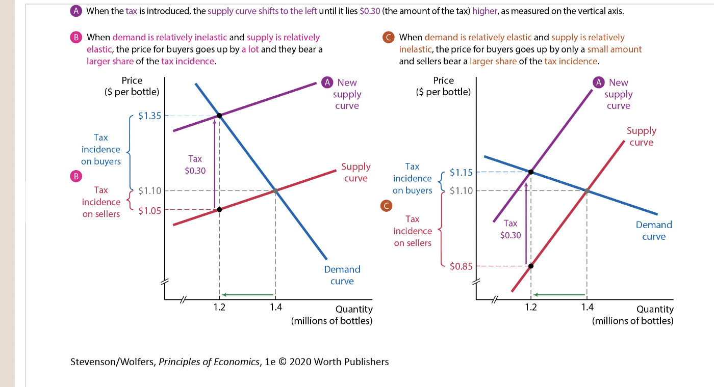
To find the total quantity supplied at a given price, simply add up the quantity supplied by each individual supplier.

12
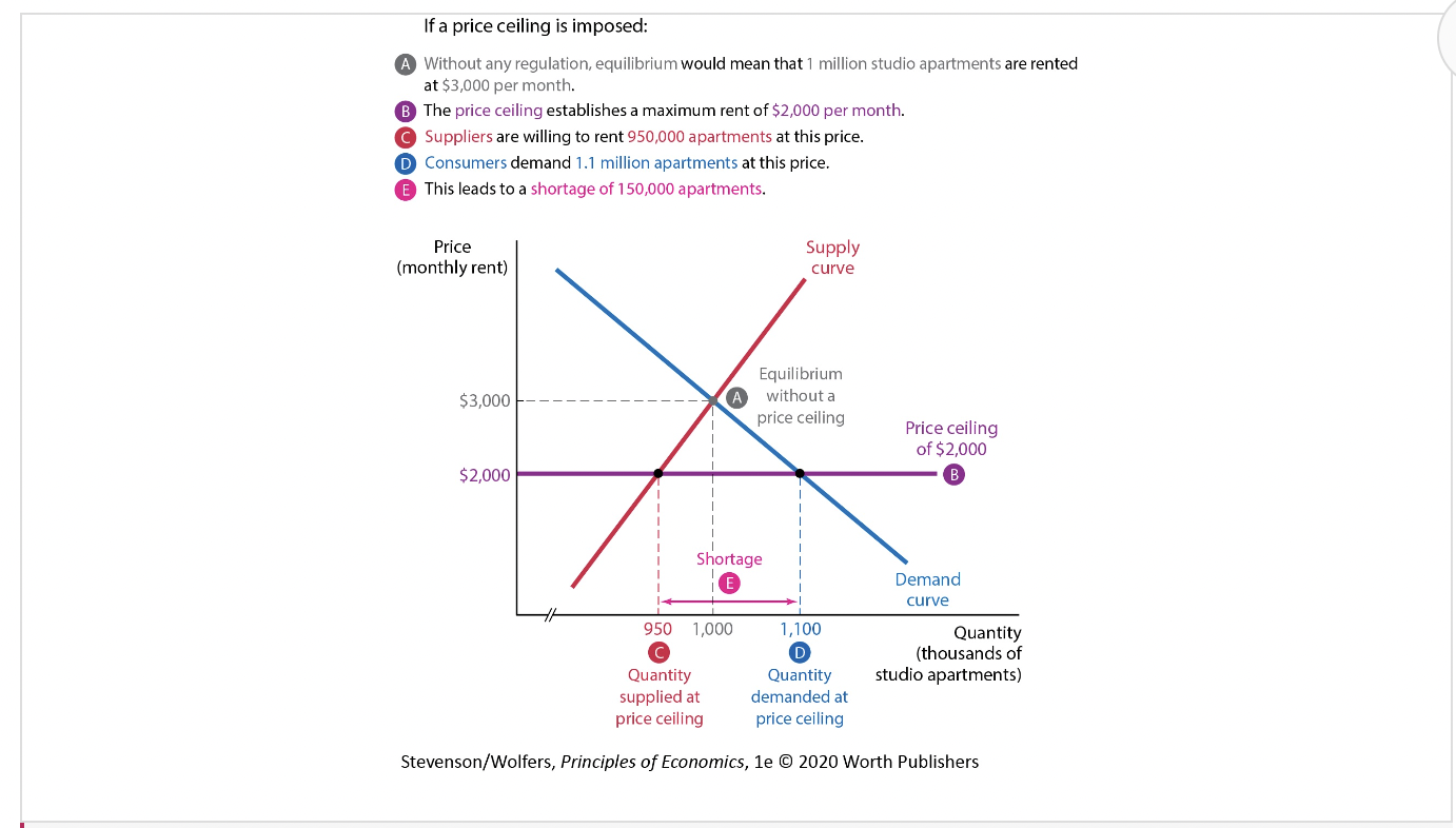
New cards
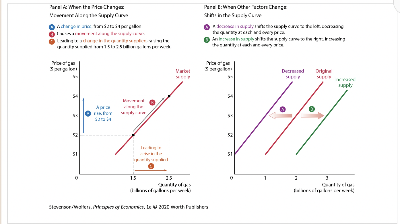
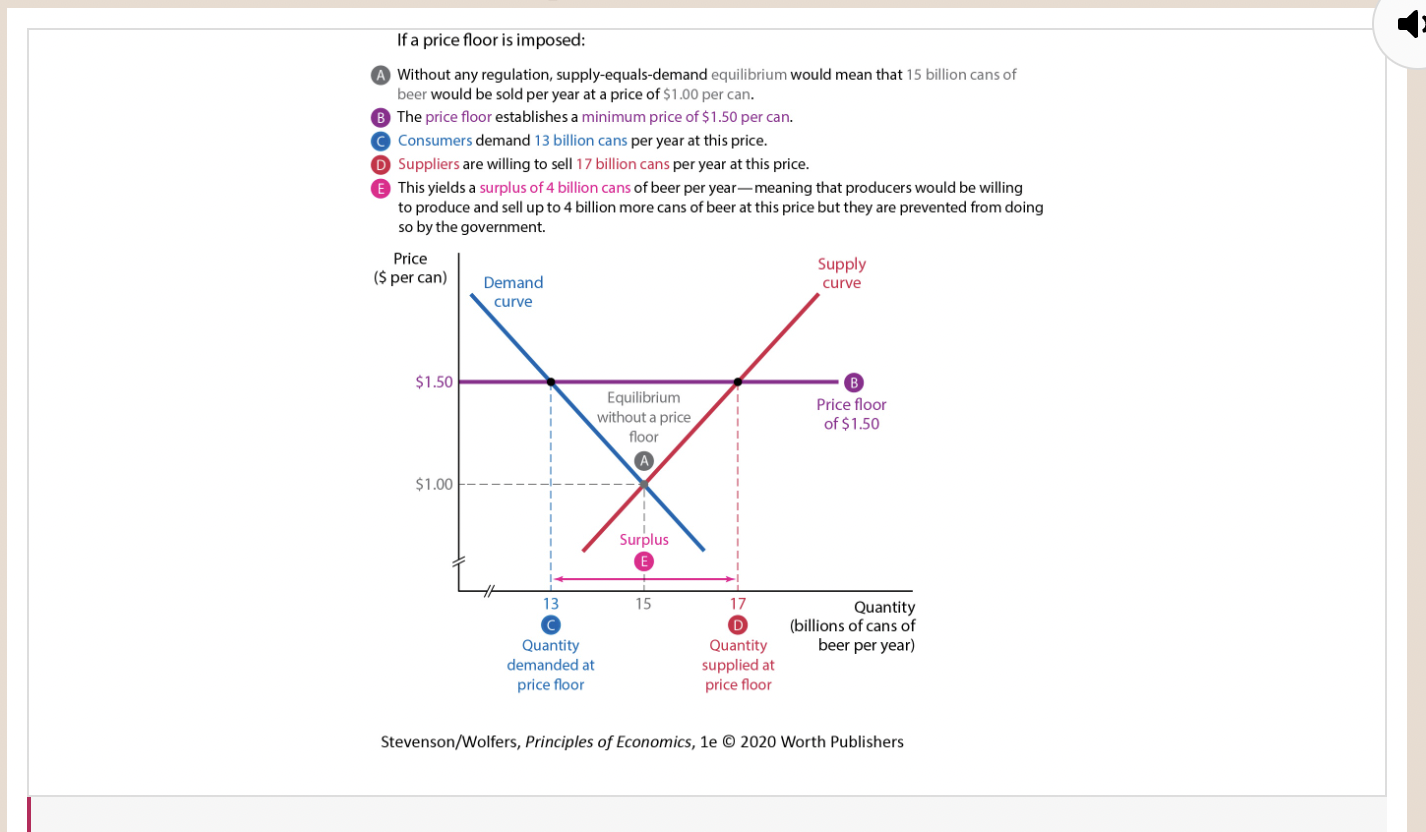
Movements Along the Supply Curve
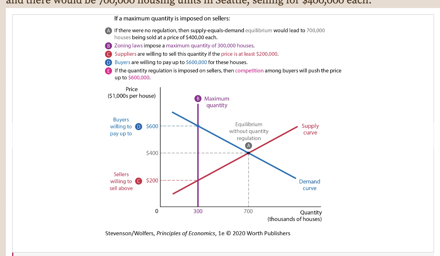
13
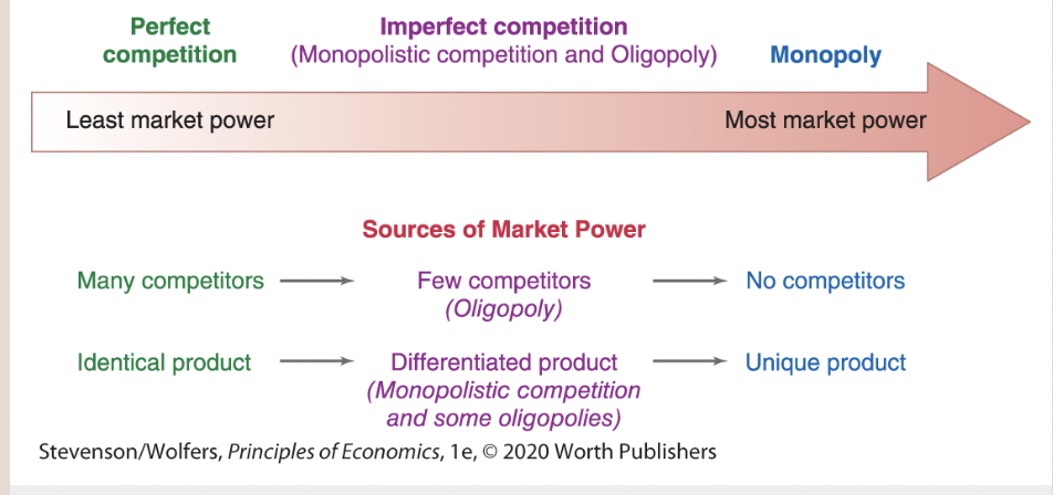
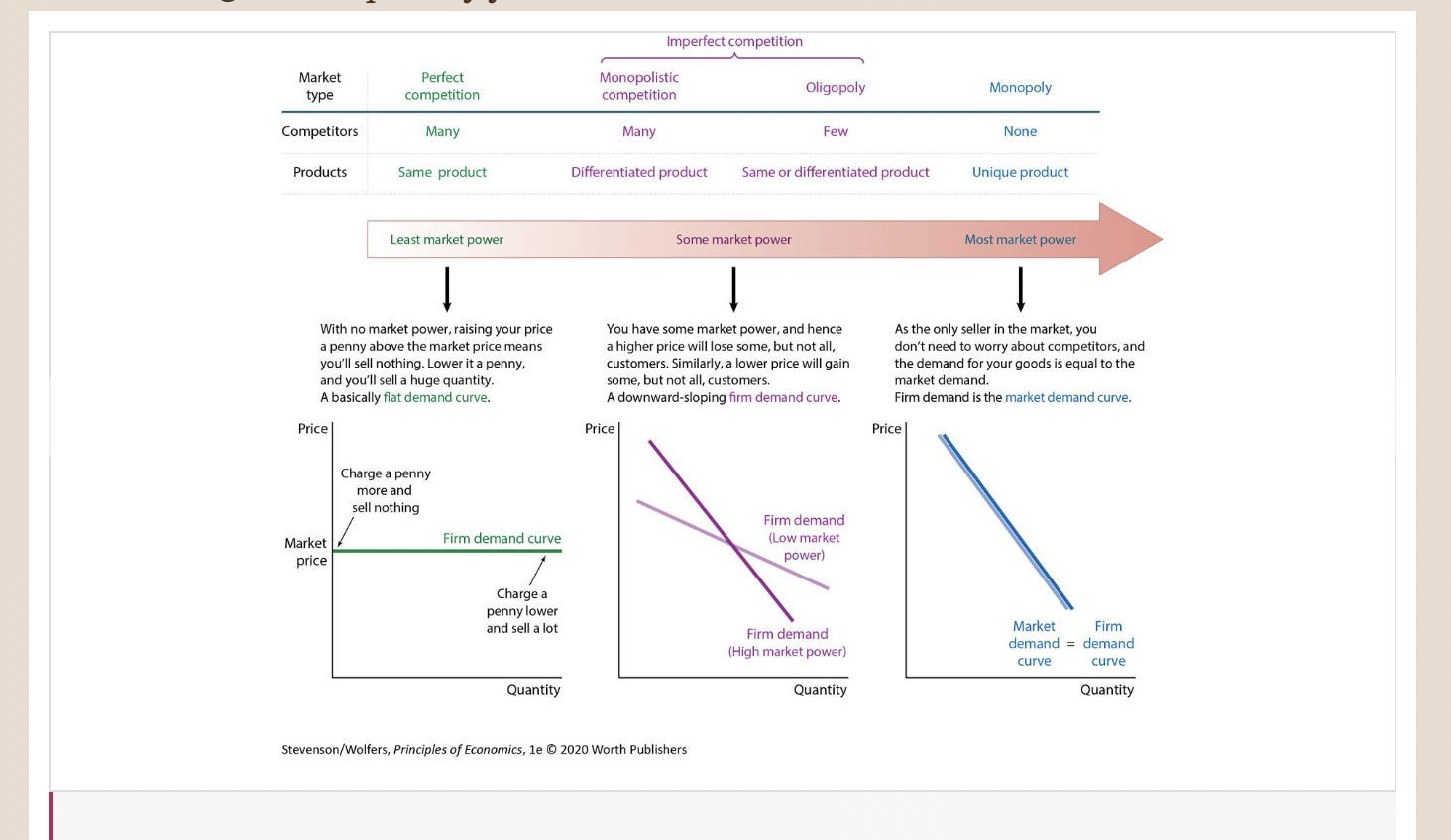
New cards
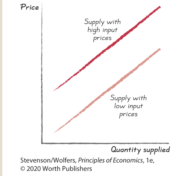
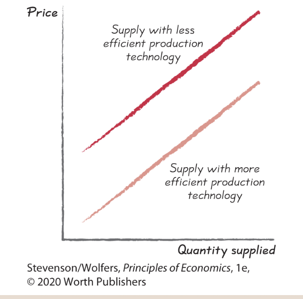
As Figure 6 illustrates, a rightward shift is an increase in supply, because at each and every price, the quantity supplied is higher. A leftward shift is a decrease in supply, because the quantity supplied is lower at each and every price.
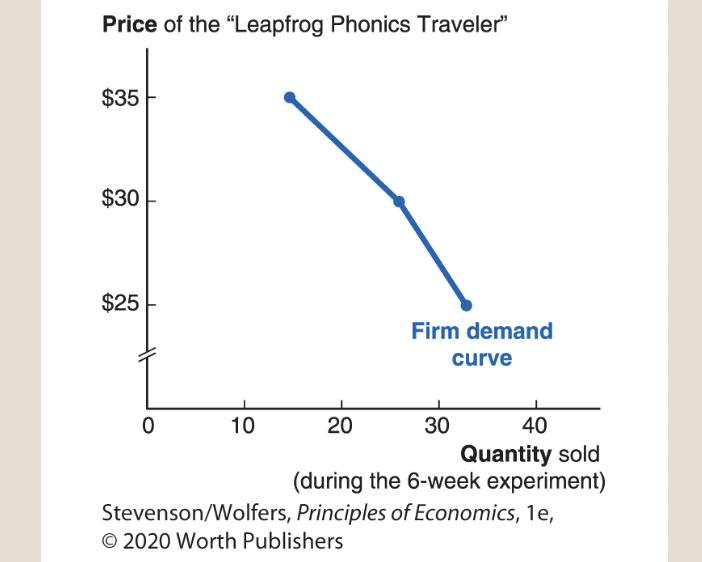
14
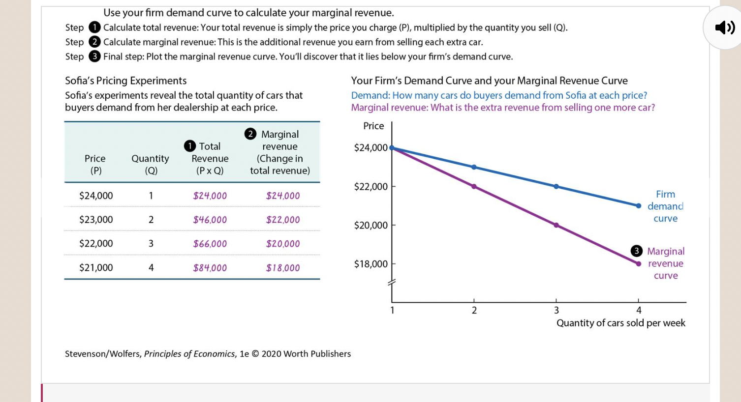
New cards
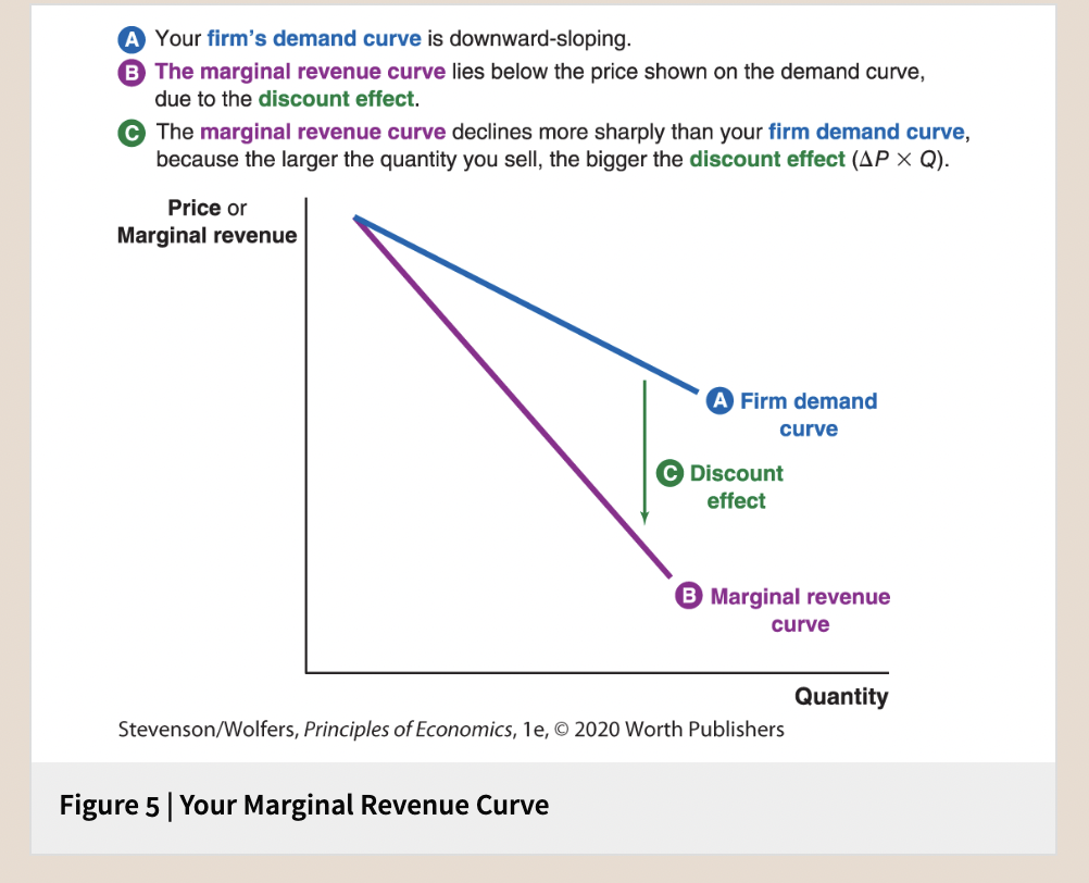
Supply shifter one: Input prices.
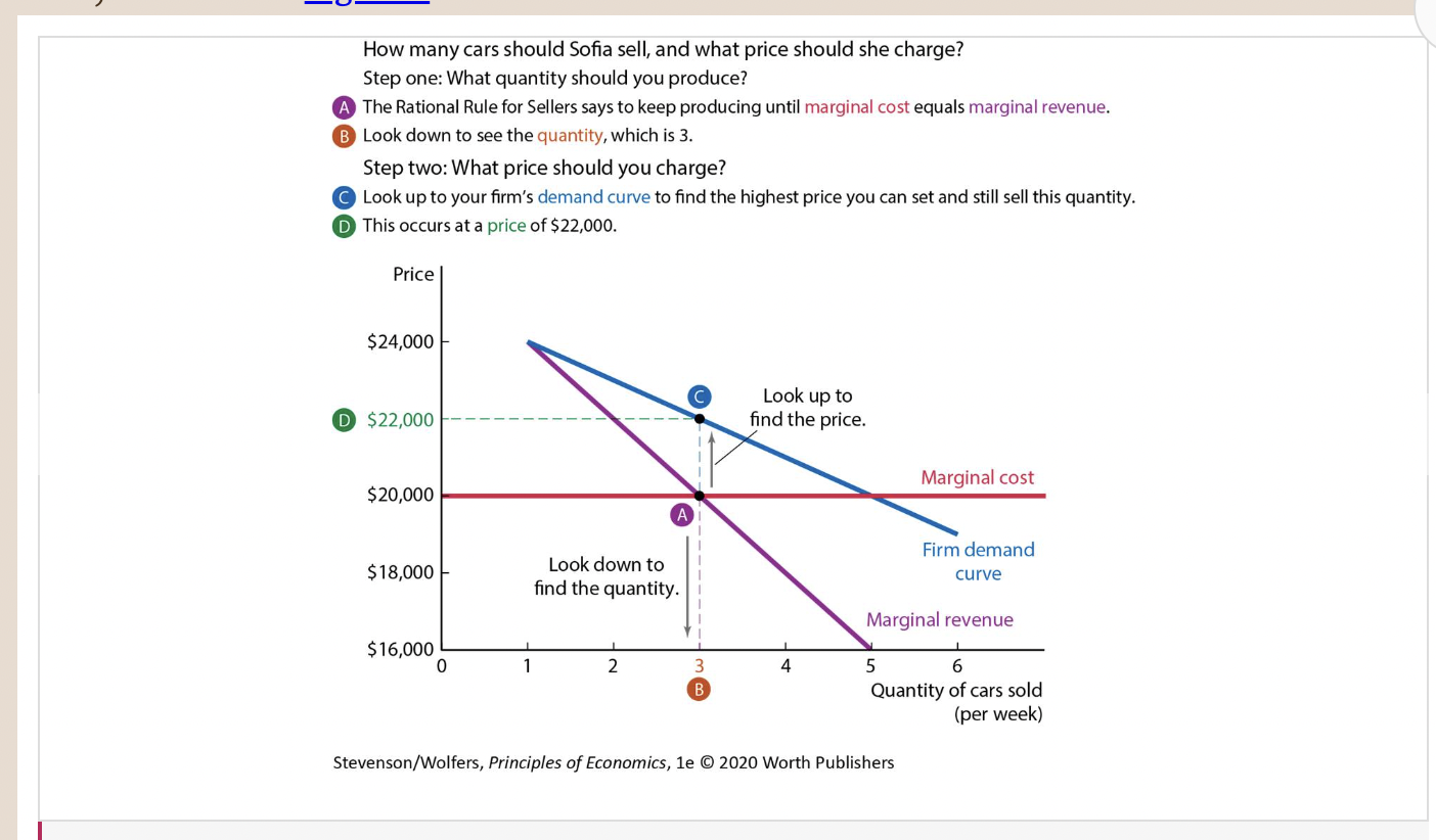
15
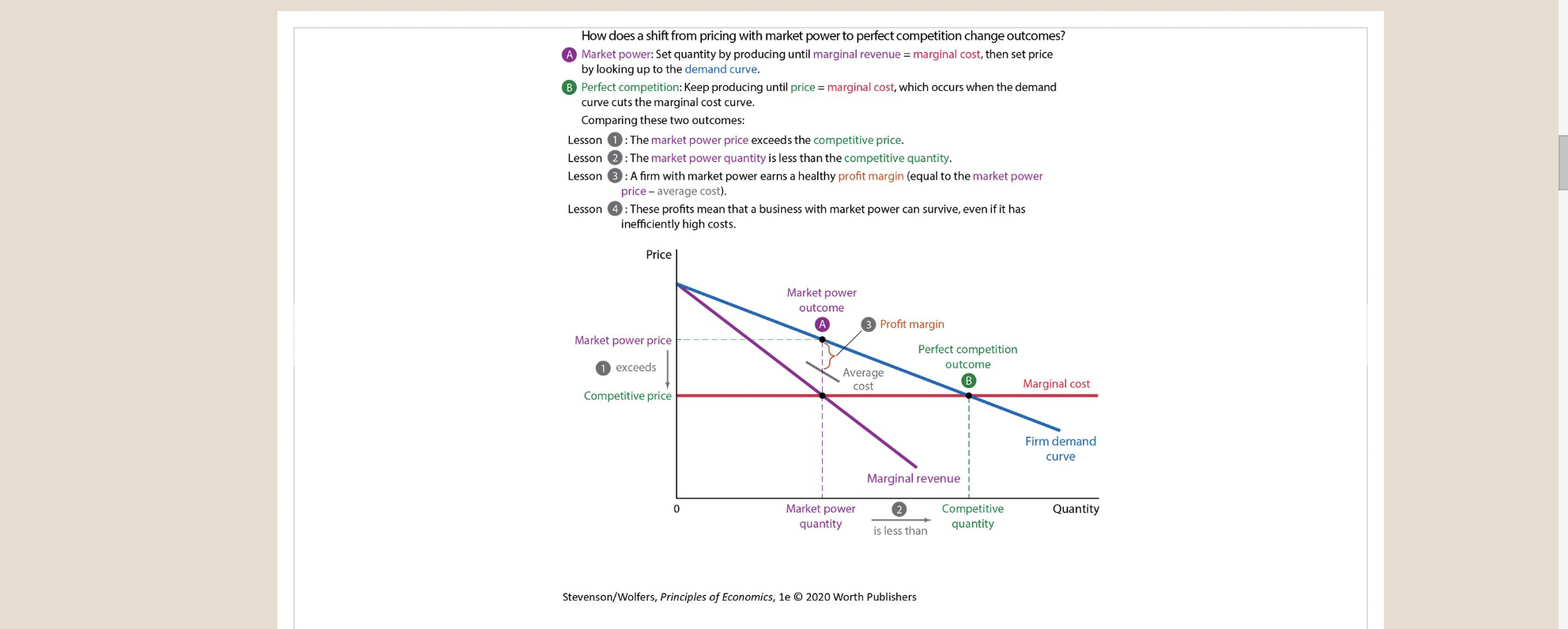
New cards
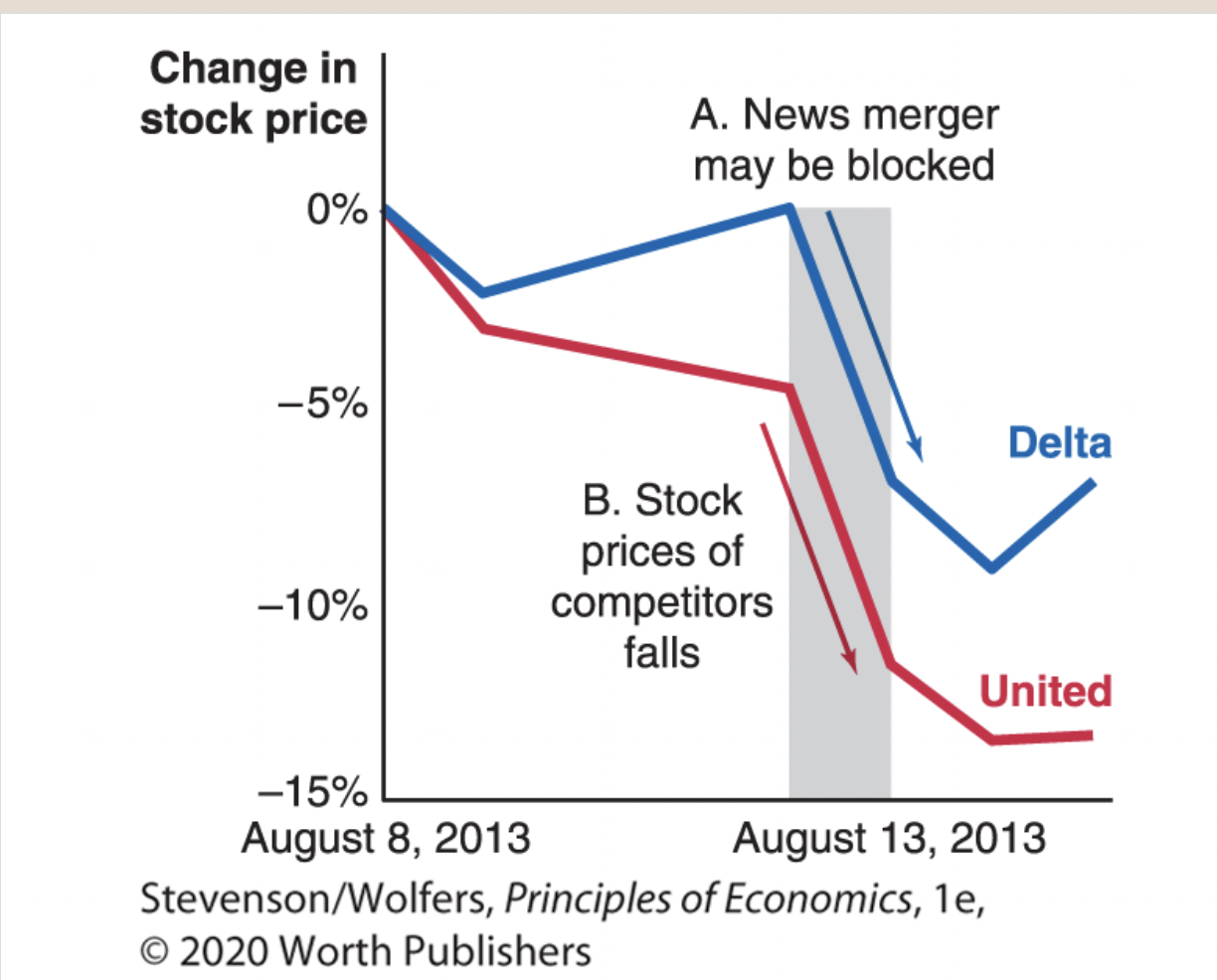
Supply shifter two: Your business’s productivity and technology.
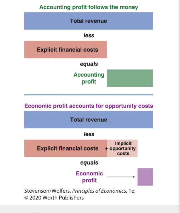
16
New cards
Supply shifter three: Prices of related outputs.
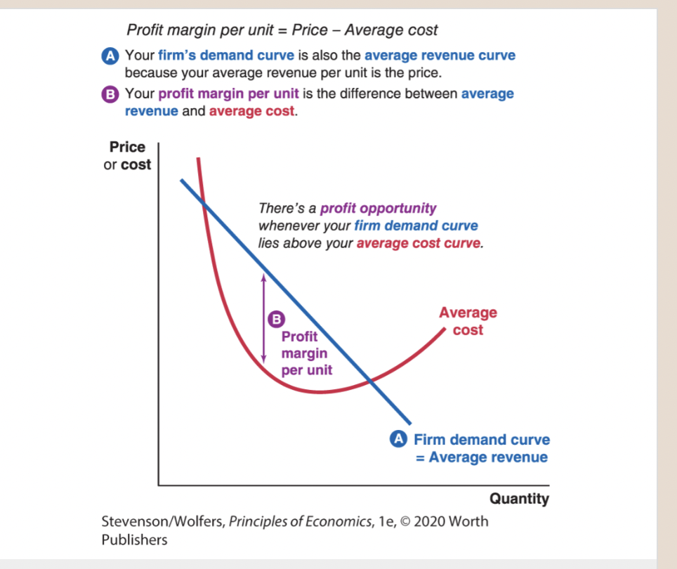
17
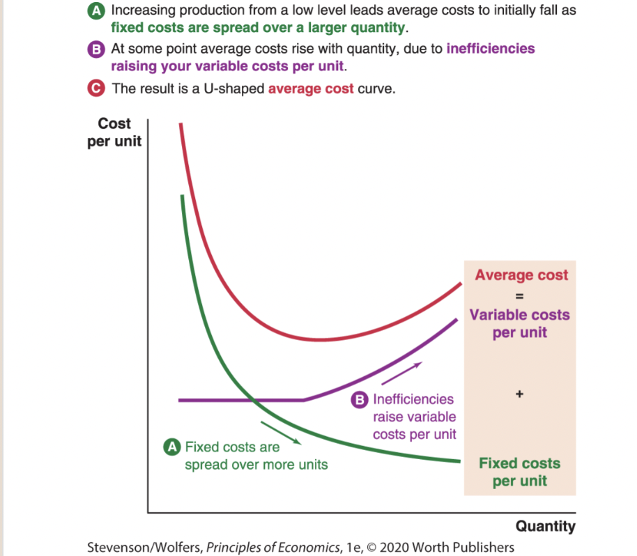
New cards
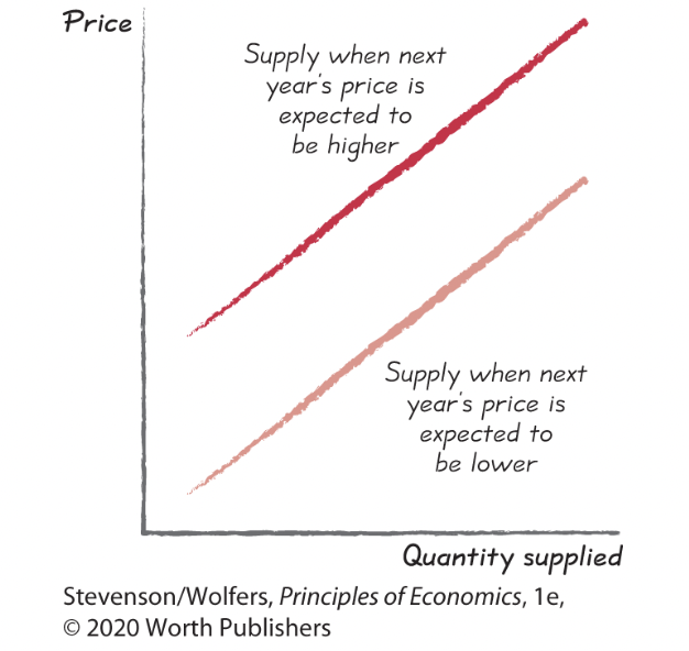
Supply shifter four: Expectations.
18
New cards
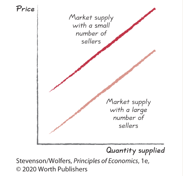
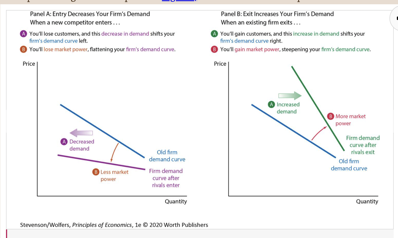
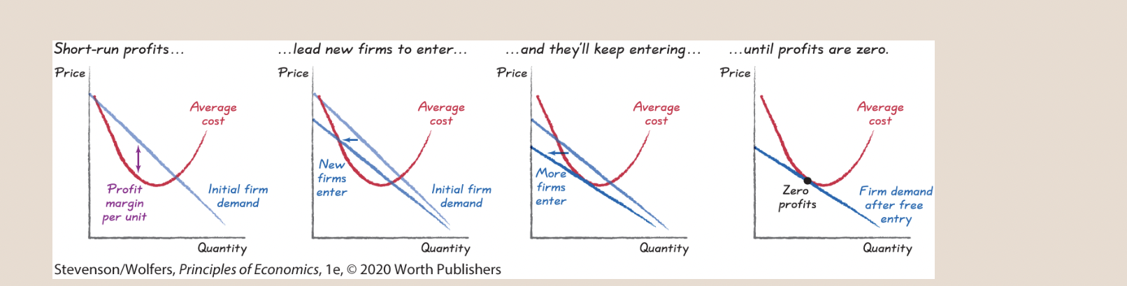
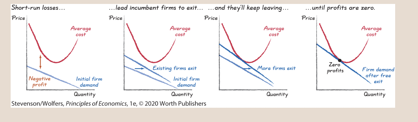
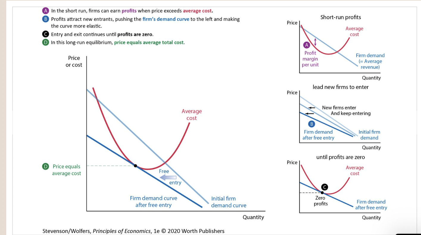
Supply shifter five: The type and number of sellers.
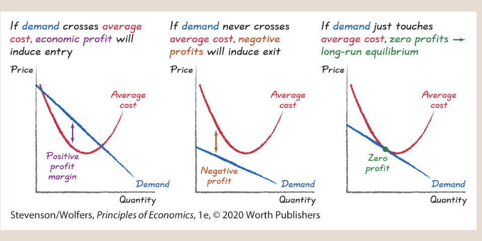
19
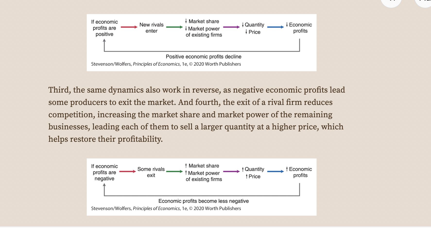
New cards
Movements Along the Supply Curve
20
New cards
Supply Equals Demand
21
New cards
Getting to Equilibrium
22
New cards
shifts in demand
23
New cards
Shifts in Supply
24
New cards
price elasticity of demand

25
New cards
Elastic demand curves are relatively flatter than inelastic demand curves.
26
New cards
The spectrum from perfectly inelastic to perfectly elastic demand.
27
New cards
Price Elasticity of Demand for Consumer Goods
28
New cards
Use the midpoint formula to calculate the percent changes in price and quantity.

29
New cards
Thus the midpoint formula for calculating the percent change in price is:

30
New cards
If you rearrange the formula for price elasticity of demand, you see that

31
New cards
Total revenue is the total amount you receive from buyers, which equals price times quantity:

32
New cards
Total revenue is shown graphically in Figure 4.
33
New cards
Higher prices lead to less total revenue if demand is elastic.
34
New cards
cross-price elasticity of demand
measures how responsive the quantity demanded of one good is to price changes of another.

35
New cards
The cross-price elasticity is near zero for independent goods.
36
New cards
income elasticity of demand
measures how responsive your demand for a good is to changes in your income.

37
New cards
Income Elasticity of Demand for Various Goods
38
New cards
To measure the price elasticity of supply, observe how the quantity supplied responds to a price change. Specifically, you can measure the price elasticity of supply as the ratio of the percent change in quantity supplied to the percent change in price as you move along your supply curve. That is:

39
New cards
Figure 7 | Inelastic and Elastic Supply
40
New cards
Thus, the formula for calculating the percent change in quantity is:

41
New cards
Thus the formula for calculating the percent change in price is:

42
New cards
Figure 1: Effects of Taxing Soda Sellers in Philadelphia
43
New cards
A tax on buyers shifts the demand curve.
44
New cards
Figure 3: Price Elasticity and Tax Incidence
45
New cards
Price Elasticity and Tax Incidence
46
New cards
Rent Control and the Market for New York City Apartments
47
New cards
Figure 6: Scotland’s Price Floor on Alcohol
48
New cards
Figure 7: Zoning Laws and the Seattle Housing Market
49
New cards
The Spectrum of Market Power
50
New cards
Your Firm’s Demand Curve Depends on the Type of Competition You Face
51
New cards
Estimating Zany Brainy’s Firm Demand Curve
52
New cards
Discover Your Firm’s Marginal Revenue Curve
53
New cards
| Your Marginal Revenue Curve
54
New cards
Figure 6: Setting Prices and Quantities with Market Power
55
New cards
Comparing Market Power and Perfect Competition
56
New cards
How Competitors Responded to News the Merger Between US Airways and American Airlines Might Be Blocked
57
New cards
accounting profit

58
New cards
economic profit—which is total revenue less both the explicit financial costs that accountants focus on and the implicit opportunity cost of the entrepreneur’s time and money:

59
New cards
Two Perspectives on Profit
60
New cards
average revenue

61
New cards
average cost

62
New cards
| Average Cost Curve
63
New cards
Your profit margin per unit is the price less average cost.

64
New cards
Profit Margins
65
New cards
Figure 4: Entry and Exit Shift Your Firm’s Demand Curve
66
New cards
Economic Profits Tend to Zero
67
New cards
New rivals will continue to enter as long as economic profits are positive, with each additional competitor pushing profits down a bit further.
68
New cards
Managers will keep leaving as long as economic profits remain negative, with each additional exit improving the profitability of those that remain.
69
New cards
In the long run with free entry (and exit), price equals average cost.

70
New cards
Free Entry Continues Until Price Equals Average Cost
71
New cards
To see why the two curves have to just touch, realize that if any part of the demand curve lies above average costs, there’s a profit opportunity—because price exceeds average costs. Free entry will continue until this opportunity is eliminated. And, if the demand curve lies entirely below average costs, then incumbent businesses must be making losses because price is always below average costs. Incumbent businesses will exit until these losses are eliminated. When the two curves touch, the best a company can do is make zero economic profits, which is a long-run equilibrium, because it’ll lead the industry to neither expand (through entry) nor contract (through exit).