National 5 art and design
1/35
Earn XP
Name | Mastery | Learn | Test | Matching | Spaced | Call with Kai |
|---|
No analytics yet
Send a link to your students to track their progress
36 Terms

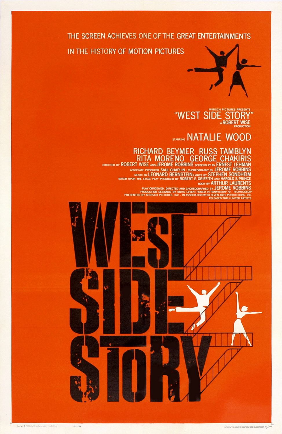
Purpose and function of the West Side Story poster
Advertise a movie musical and encourage people to see the film, It is retelling of Romeo and Juliet with tony and Maria and two rival gangs, Told through songs and dance, Tragic ending

Materials and techniques for west side story
Paper cut out shapes and silhouettes were combined with hand drawn typography
The screen printing process was used- means they force ink through a mesh screen onto paper. You can use stencils to create shapes by blocking the ink from getting onto the paper

Market and target audience
Aimed at musical fans
The bold, simplistic, urban style looked very contemporary at the time it was made.
This appealed to both young men and women because of the brightness and the energy in the poster

Style
This poster reflects style of Swiss graphic design in the 50s
He uses simple and geometric shapes and their symbolism to reflect this work
Saul uses a stencil technique to create the large text in the title

Imagery
Bass is famous for his use of simple silhouettes and symbolism.
In this case he is trying to create an urban setting
The fire escape runs down the right hand side of the title to communicate that the movie is set in Brooklyn.
The two figures with outstretched arms who are dancing look very energetic which appeals to the target audience

Layout
The top half is mostly small white text it’s names of the actors
The bottom half is mostly filled with the title
Their are four dancers, two black and two white
This represents the rival gangs

Lettering
Typography has been chosen carefully to reflect the urban theme and location
The font is uppercase and bold and looks stencilled (like graffiti)
Two Ts were extended as if they were part of the fire escape

Visual elements
Limited palette
Colour and shape
Black and white are a Strong contrast to the energetic orangey red
Silohettes

Visual impact
Powerful visual impact
Bold, clear and graphic
Contrasting colours entice viewers
Unusual layout makes it memorable
Bold and simplistic and their dynamic poses communicate the energy of the film

why west side story poster is more successful
is more simplistic which makes the marketing easier and also easier to recognise. This leads to it successfully being associated with the film and its content
The poster reveals the bare minimum about the film on the surface however the poster has many hidden double meanings which can be spotted easier after seeing the film

Purpose/Function
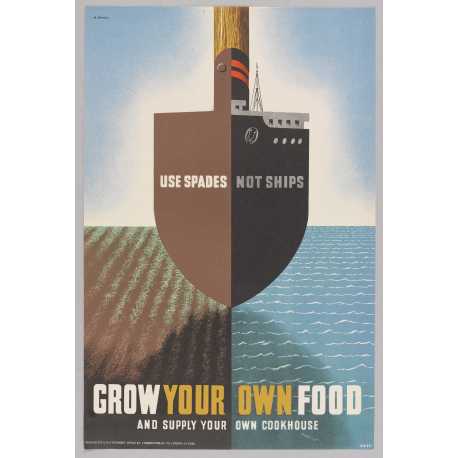
Encourage British people to grow own food
It’s a propaganda poster from ww2
Encourage people to plant their own food

Materials and techniques
Sketching on a small scale first
Read the posters from a distance to make them stand out more
Lithography is a printing process which uses a metal plate so multiple versions of the poster can be produced

Market and target audience
dynamic layout and visual puzzle of combining two objects appeals to a wide audience.
Games met the propaganda design brief by making this appeal to a wide audience

Style
These had to work on a small scale and they had to be seen from faraway
‘Maximum meaning through minimal means’
Simple bold and eye catching.

Imagery
Image of a ship and a spade combined, one visual repping two things
Lines and textures help provide a feeling of movement
The poster is split into 4

Layout
A frontal view of the ship
Divided symmetrically in half and is balanced on both halves
A figure of eight shape is created with the ship, the spade and the shadow

Typography
Uppercase sans serif
Simple in style and the ‘your own’ are yellow to directly address the audience

Visual elements
Colour line and tone
Uses primary secondary and neutral colours
Designed around the vertical axis and the horizon line

Visual impact
Intriguing image with 2 meanings
Centered, symmetrical and divided into quarters
‘Your own’ speaks to the audience because it has a brighter colour

Influence 1
Influenced by surrealist art, specifically Salvador Dali
For example in Dalis painting ‘An apparation of a face and a fruit dish on a beach’ we can see a vase but also a face
This double meaning can be seen in the ‘Use spades not ships’ poster

Influence 2
Abram games was Jewish and was aware of the Nazis use of propaganda
He was one of the first to see images of concentration camps
In hundreds of the war posters he made you can see the social conscience that Abram games has and how he thinks he should use his skill for good.

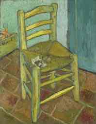
Van goghs chair subject matter
made this painting at the yellow house in arles when his bestie Gaughin was staying with him
Van gogh also painted Gaughins chair and they are often described as portraits
Van Goghs chair is more simple then Gaughin and shows his connection with the poorer end of society

Composition
At the centre of the painting sits the yellow chair in a kitchen
Battered tiles cover the foreground and middleground of the painting
the focal point is the is the collection of tobacco and the piece of crumpled paper sitting on the chair (pipe smoking could help with depression)
the feeling of depth/perspective in the picture is uncanny and makes it seem as if their is a lack of space in the environment

Style
Van gogh is described as a post impressionist
instead of the window into the outside world (such as impressionism) it acted as a window into the artists mind and soul (deep)
it was all about colour- the bolder the better despite it looking unnatural (homophobes)

Technique
the visible brushstrokes create a feeling of texture (pun) on the tiles in the kitchen showing their wear even more.
the faded paint on the wall can also be textured with the smoother brushstrokes he used
the paint was either applied using a brush or a palette knife that created an impasto technique which means the paint was layered on thicc
Directional marks have also been used on the tiles and legs on the chair

Visual elements
colour
the chair is outlined in a blue-green line that reflects the wall colour yet contrasts the dull brown tiles
the yellow chair also both contasts the wall and its own outline which helps it to look more 3D and stand out in the painting
the warm colours (chair, onion box, tiles) and cool colours (walls, outline) create a sunny and positive atmosphere
texture
the straw that makes up the chair is made with short linear brushstrokes
the crumpled paper is created with curved brushstrokes
both help to create the feeling that you could touch the painting

mood and atmosphere
the chair has a certain honesty and simplicity to it
this completely contrasts the painting he made for his gay friend Gaughin which uses darker and harsher reds and greens
The positioning of Van goghs chair shows what you see is what you get
these chairs act as portraits of the artists and reflect the artists
This potrays Van Gogh as sunny and optimistic

influence 1- life
This was painted in the house of Arles which Van Gogh was hoping to set up as an artist colony and he had many hopes for this project
This painting and others around this time take place during the day and feature very bright colours and blue skies

Influence 2- other artist
A illustration in a magazine by Luke Fildes mourning the death of Charles Dickins
The chair in this illustrated piece is also pulled out and empty which also helps to provide the feeling of solitude that Van Gogh conveyed
The pulling out of the chair also shows the vulnerability of the artist, just as Charles was vulnerable toward Luke Fildes so too was van gogh vulnerable by showing so much of himself in this portrait.
This idea that a chair could act as a portrait inspired Van Gogh

Subject matter
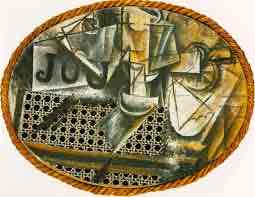
It is difficult to make out what is in the photo but we can see a knife blade & handle which appears to have cut a citrus fruit
Near the fruit we can also see a napkin
We also see the word ‘Jou’ on a piece of paper which appears to seem to say Journal if it is fully unfolded

Composition
Due to this being a cubist painting none of the normal rules of perspective apply.
the foreground, middle ground and background are not obvious within the painting.
We may be viewing the painting from above through the glass table (can tell with the caning and layered objects)
the focal point is the word ‘Jou’ on the newspaper

Style
Could be described as a cubist collage
Cubism is a subject which is painted as seen from different viewpoints on the same painting
These viewpoints appear abstract and our minds begin to understand by looking at these paintings the objects we are seeing and how it would feel to experience them
Cubism was hugely popularised by Picasso

Technique
This was the first collage that picasso made
He used materials such as an ACTUAL PIECE OF CHAIR CANING and rope to create the collage
He also used oil paints in thick layers to create a chalkier texture
Also uses strong diagonal markings
all these materials and markings make the painting visually confusing as if we are seeing each individual layer

Visual elements
shape
the shape of the entire painting (an oval) is very unusual
the shape is similar to one of a cafe table however cafe tables are usually more circular
this could be used to further confuse the audience as if we are seeing more viewpoints from the table
colour
the tones used in this are earthy
the left side is monochrome while the right side is made of a more brown and gold pallette
This could represent the morning light creeping into the cafe and the objects in the picture are classic breakfast foods and utensils
This could have also been done to provide unity to an otherwise confusing painting

mood and atmosphere
Appears to be set in a france cafe
the monochrome pallette creates a darker mood while the right side helps to create a warm relaxing atmosphere (just like the sun peeking through into a cafe in the morning would)
The theme is to do with breakfast as it features items such as a mans pipe, a croissant and a napkin

why picassos piece is more successful
more intriguing to the viewer because if what seems like visual mess can actually be understood and interpreted
Has a greater sense of atmosphere because of the different conveyed viewpoints and the differences in colour accross the painting