AP Bio Unit 4

studied byStudied by 46 people
5.0(1)
learn
LearnA personalized and smart learning plan
exam
Practice TestTake a test on your terms and definitions
spaced repetition
Spaced RepetitionScientifically backed study method
heart puzzle
Matching GameHow quick can you match all your cards?
flashcards
FlashcardsStudy terms and definitions
Get a hint
Hint
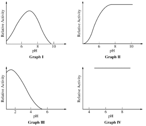
<p>Enzymes with their highest activity at an alkaline (basic) pH are represented by which of the following graphs?</p>

Enzymes with their highest activity at an alkaline (basic) pH are represented by which of the following graphs?

1 / 78

79 Terms

1
<p>Enzymes with their highest activity at an alkaline (basic) pH are represented by which of the following graphs?</p>

Enzymes with their highest activity at an alkaline (basic) pH are represented by which of the following graphs?

II only

New cards
2
<p><span>Graphs representing enzymes sensitive to changes in pH include which of the following?</span></p>

Graphs representing enzymes sensitive to changes in pH include which of the following?

I, II, and III only

New cards
3
<p><span>The most likely explanation for the results shown in Graph I is that</span></p>

The most likely explanation for the results shown in Graph I is that

pH affects the shape of the active site of the enzyme

New cards
4

Pyruvate dehydrogenase is an enzyme that converts pyruvate to acetyl-CoA. Acetyl-CoA is further metabolized in the Krebs cycle. A researcher measured the accumulation of acetyl-CoA in a reaction containing pyruvate and pyruvate dehydrogenase under several different conditions (Figure 1).

The figure presents a line graph. The horizontal axis is labeled Time, in seconds, and the numbers 0 through 90, in increments of 10, are indicated. The vertical axis is labeled “Acetyl-Co A, in micromoles”, and the numbers 0 through 70, in increments of 10, are indicated. Three lines of data are shown on the graph, labeled Condition 1, Condition 2, and Condition 3. The data represented in the graph are as follows. Note that all values are approximate. The line labeled Condition 1 begins at the origin and moves upwards and to the right at a constant rate until reaching the point 60 seconds comma 60 micromoles, after which it begins to level off to move horizontally to the right at the point 70 seconds comma 65 micromoles. It continues to move horizontally until it ends at the point 90 seconds comma 65 micromoles. The line labeled Condition 2 begins at the origin and curves gradually upwards and to the right, passing through the point 50 seconds comma 30 micromoles, after which it curves even more gradually upwards and to the right, ending at the point 90 seconds comma 38 micromoles. The line labeled Condition 3 begins at the origin and moves steeply upwards and to the right until reaching the point 20 seconds comma 55 micromoles, after which it begins to curve upwards and to the right, leveling off at 30 seconds comma 65 micromoles, and moving horizontally to the right until ending at the point 90 seconds comma 65 micromoles.

Figure 1. Accumulation of acetyl-CoA under different conditions

Which of the following best describes the cellular location where pyruvate dehydrogenase is most likely active?

The mitochondrial matrix

New cards
5

Pyruvate dehydrogenase is an enzyme that converts pyruvate to acetyl-CoA. Acetyl-CoA is further metabolized in the Krebs cycle. A researcher measured the accumulation of acetyl-CoA in a reaction containing pyruvate and pyruvate dehydrogenase under several different conditions (Figure 1).

The figure presents a line graph. The horizontal axis is labeled Time, in seconds, and the numbers 0 through 90, in increments of 10, are indicated. The vertical axis is labeled “Acetyl-Co A, in micromoles”, and the numbers 0 through 70, in increments of 10, are indicated. Three lines of data are shown on the graph, labeled Condition 1, Condition 2, and Condition 3. The data represented in the graph are as follows. Note that all values are approximate. The line labeled Condition 1 begins at the origin and moves upwards and to the right at a constant rate until reaching the point 60 seconds comma 60 micromoles, after which it begins to level off to move horizontally to the right at the point 70 seconds comma 65 micromoles. It continues to move horizontally until it ends at the point 90 seconds comma 65 micromoles. The line labeled Condition 2 begins at the origin and curves gradually upwards and to the right, passing through the point 50 seconds comma 30 micromoles, after which it curves even more gradually upwards and to the right, ending at the point 90 seconds comma 38 micromoles. The line labeled Condition 3 begins at the origin and moves steeply upwards and to the right until reaching the point 20 seconds comma 55 micromoles, after which it begins to curve upwards and to the right, leveling off at 30 seconds comma 65 micromoles, and moving horizontally to the right until ending at the point 90 seconds comma 65 micromoles.

Figure 1. Accumulation of acetyl-CoA under different conditions

The maximum production rate of acetyl-CoA under condition 1 is closest to which of the following?

1 micromole/sec

New cards
6

Pyruvate dehydrogenase is an enzyme that converts pyruvate to acetyl-CoA. Acetyl-CoA is further metabolized in the Krebs cycle. A researcher measured the accumulation of acetyl-CoA in a reaction containing pyruvate and pyruvate dehydrogenase under several different conditions (Figure 1).

The figure presents a line graph. The horizontal axis is labeled Time, in seconds, and the numbers 0 through 90, in increments of 10, are indicated. The vertical axis is labeled “Acetyl-Co A, in micromoles”, and the numbers 0 through 70, in increments of 10, are indicated. Three lines of data are shown on the graph, labeled Condition 1, Condition 2, and Condition 3. The data represented in the graph are as follows. Note that all values are approximate. The line labeled Condition 1 begins at the origin and moves upwards and to the right at a constant rate until reaching the point 60 seconds comma 60 micromoles, after which it begins to level off to move horizontally to the right at the point 70 seconds comma 65 micromoles. It continues to move horizontally until it ends at the point 90 seconds comma 65 micromoles. The line labeled Condition 2 begins at the origin and curves gradually upwards and to the right, passing through the point 50 seconds comma 30 micromoles, after which it curves even more gradually upwards and to the right, ending at the point 90 seconds comma 38 micromoles. The line labeled Condition 3 begins at the origin and moves steeply upwards and to the right until reaching the point 20 seconds comma 55 micromoles, after which it begins to curve upwards and to the right, leveling off at 30 seconds comma 65 micromoles, and moving horizontally to the right until ending at the point 90 seconds comma 65 micromoles.

Figure 1. Accumulation of acetyl-CoA under different conditions

Which of the following observations provides the best evidence that acetyl-CoA negatively regulates pyruvate dehydrogenase activity?

The rate of the pyruvate dehydrogenase–catalyzed reaction is slower in the presence of a higher concentration of acetyl-CoA.

New cards
7

Pyruvate dehydrogenase is an enzyme that converts pyruvate to acetyl-CoA. Acetyl-CoA is further metabolized in the Krebs cycle. A researcher measured the accumulation of acetyl-CoA in a reaction containing pyruvate and pyruvate dehydrogenase under several different conditions (Figure 1).

The figure presents a line graph. The horizontal axis is labeled Time, in seconds, and the numbers 0 through 90, in increments of 10, are indicated. The vertical axis is labeled “Acetyl-Co A, in micromoles”, and the numbers 0 through 70, in increments of 10, are indicated. Three lines of data are shown on the graph, labeled Condition 1, Condition 2, and Condition 3. The data represented in the graph are as follows. Note that all values are approximate. The line labeled Condition 1 begins at the origin and moves upwards and to the right at a constant rate until reaching the point 60 seconds comma 60 micromoles, after which it begins to level off to move horizontally to the right at the point 70 seconds comma 65 micromoles. It continues to move horizontally until it ends at the point 90 seconds comma 65 micromoles. The line labeled Condition 2 begins at the origin and curves gradually upwards and to the right, passing through the point 50 seconds comma 30 micromoles, after which it curves even more gradually upwards and to the right, ending at the point 90 seconds comma 38 micromoles. The line labeled Condition 3 begins at the origin and moves steeply upwards and to the right until reaching the point 20 seconds comma 55 micromoles, after which it begins to curve upwards and to the right, leveling off at 30 seconds comma 65 micromoles, and moving horizontally to the right until ending at the point 90 seconds comma 65 micromoles.

Figure 1. Accumulation of acetyl-CoA under different conditions

Pyruvate dehydrogenase deficiency is a genetic disease most commonly linked to a mutation in the α-subunit of the mitochondrial enzyme that causes the enzyme to cease functioning. As a result of the mutation, affected individuals build up dangerous amounts of lactic acid. Which of the following best explains the buildup of lactic acid in individuals with the mutation?

Cells undergo fermentation because pyruvate cannot be metabolized to proceed into the Krebs cycle.
New cards
8
<p>The diagram below shows energy changes in a specific chemical reaction with and without the addition of an enzyme to the reaction.</p><p>Which of the following questions can best be answered by the diagram?</p>

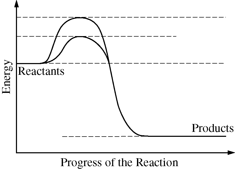
The diagram below shows energy changes in a specific chemical reaction with and without the addition of an enzyme to the reaction.

Which of the following questions can best be answered by the diagram?

Does the addition of an enzyme reduce the activation energy required for a reaction?

New cards
9

A researcher proposes a model of an enzyme-catalyzed reaction in which a reactant is converted to a product. The model is based on the idea that the reactant passes through a transition state within the enzyme-substrate complex before the reactant is converted to the product.

Which of the following statements best helps explain how the enzyme speeds up the reaction?

The enzyme’s active site binds to and stabilizes the transition state, which decreases the activation energy of the reaction.

New cards
10

Alcohol dehydrogenase (ADH) is an enzyme that aids in the decomposition of ethyl alcohol (C2⁢H5OH) into nontoxic substances. Methyl alcohol acts as a competitive inhibitor of ethyl alcohol by competing for the same active site on ADH. When attached to ADH, methyl alcohol is converted to formaldehyde, which is toxic in the body.

Which of the following statements best predicts the effect of increasing the concentration of substrate (ethyl alcohol), while keeping the concentration of the inhibitor (methyl alcohol) constant?

Competitive inhibition will decrease because the proportion of the active sites occupied by substrate will increase.

New cards
11

Amylase is a protein that catalyzes the conversion of starch to simple sugars. Amylase activity in an aqueous solution can be measured by using iodine as a starch indicator. A solution containing iodine and starch will have a dark-blue color, whereas a solution containing iodine but no starch will have a light-brown color. The color change of an iodine solution from dark blue to light brown can be used to measure the rate at which starch is converted to simple sugars.

A student designs an experiment to investigate the effect of environmental pH on amylase function. The design of the experiment is presented in Table 1.

Table 1. An experiment for investigating the effect of pH on amylase function

Test Tube

Environmental pH

Starch Added

Amylase Added

Iodine Added

Pretreated by Boiling

I

5

Yes

Yes

Yes

No

II

6

Yes

Yes

Yes

No

III

7

No

Yes

Yes

No

IV

7

Yes

No

Yes

No

V

7

Yes

Yes

Yes

Yes

VI

7

Yes

Yes

Yes

No

VII

8

Yes

Yes

Yes

No

VIII

9

Yes

Yes

Yes

No

Which of the following statements best justifies the inclusion of test tube V as a control in the experiment?

It will show the color change that occurs in the absence of enzyme activity.

New cards
12

Directions: This group of questions consists of five lettered headings followed by a list of phrases or sentences. For each phrase or sentence, select the one heading to which it is most closely related. Each heading may be used once, more than once, or not at all.

This group of questions refers to molecules of the following substances.


(A) Cytochrome
(B) FADH2
(C) NAD+
(D) NADP+
(E) Oxygen (O2)

An intermediate electron acceptor for oxidations that occur in both glycolysis and in Krebs cycle reactions

NAD+

New cards
13

Directions: This group of questions consists of five lettered headings followed by a list of phrases or sentences. For each phrase or sentence, select the one heading to which it is most closely related. Each heading may be used once, more than once, or not at all.

This group of questions refers to molecules of the following substances.

(A) Cytochrome
(B) FADH2
(C) NAD+
(D) NADP+
(E) Oxygen (O2)

Coenzyme that transfers electrons from the Krebs cycle to the mitochondrial electron-transport chain at a lower energy level than that of electrons entering at the beginning of the chain

FADH2

New cards
14

A researcher claims that the synthesis of ATP from ADP and inorganic phosphate (Pi) is essential to cellular function.

Which of the following statements best helps justify the researcher’s claim?


ATP hydrolysis is an energy-releasing reaction that is often coupled with reactions that require an input of energy.

New cards
15

ATP serves as a common energy source for organisms because

its energy can be easily transferred to do cellular work

New cards
16

During respiration, most ATP is formed as a direct result of the net movement of

protons down a concentration gradient
New cards
17
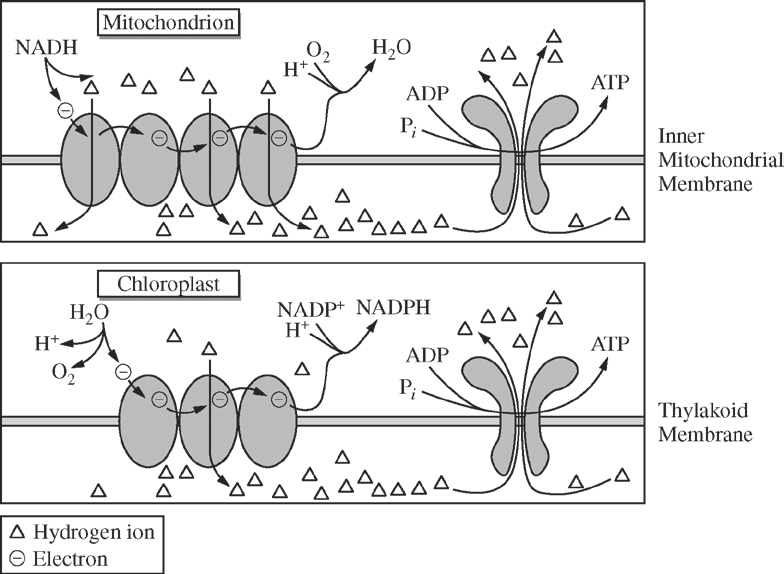
<p>The figures below illustrate the similarities between ATP synthesis in mitochondria and chloroplasts.</p><p>The figures can best assist in answering which of the following questions?</p>

The figures below illustrate the similarities between ATP synthesis in mitochondria and chloroplasts.

The figures can best assist in answering which of the following questions?

Do electron transport chains create a gradient so that ATP synthase can generate ATP molecules?

New cards
18

To investigate bacterial metabolism, a researcher divided a population (culture) of Staphylococcus capitis bacteria into two sets of culture tubes containing glucose. The researcher added a chemical to one set of tubes and measured the pH of the cultures at 5-minute intervals as the bacteria metabolized the glucose into lactic acid. The data are shown in Table 1.

TABLE 1. AVERAGE CHANGE IN pH IN CONTROL AND TREATMENT GROUPS OVER A 40-MINUTE PERIOD

Time (min)

Average pH of Control(±2 SEx¯)

Average pH of Treatment(±2 SEx¯)

0

8.04±0.05

8.04⁢±⁢0.06

5

7.96±⁢0.03

7.91⁢±0.04

10

7.88⁢±⁢0.02

7.85±⁢0.04

15

7.82±⁢0.02

7.79⁢±⁢0.06

20

7.76⁢±⁢0.03

7.70±⁢0.04

25

7.71⁢±⁢0.04

7.67⁢±⁢0.02

30

7.63⁢±⁢0.03

7.63⁢±⁢0.02

35

7.65±⁢0.02

7.60±⁢0.02

40

7.65⁢±⁢0.01

7.59⁢±⁢0.02

Which of the following best describes the process by which the bacteria are breaking down the glucose to produce lactic acid?

The bacteria are breaking down sugars in the absence of oxygen.

New cards
19

To investigate bacterial metabolism, a researcher divided a population (culture) of Staphylococcus capitis bacteria into two sets of culture tubes containing glucose. The researcher added a chemical to one set of tubes and measured the pH of the cultures at 5-minute intervals as the bacteria metabolized the glucose into lactic acid. The data are shown in Table 1.

TABLE 1. AVERAGE CHANGE IN pH IN CONTROL AND TREATMENT GROUPS OVER A 40-MINUTE PERIOD

Time (min)

Average pH of Control(±2 SEx¯)

Average pH of Treatment(±2 SEx¯)

0

8.04±0.05

8.04⁢±⁢0.06

5

7.96±⁢0.03

7.91⁢±0.04

10

7.88⁢±⁢0.02

7.85±⁢0.04

15

7.82±⁢0.02

7.79⁢±⁢0.06

20

7.76⁢±⁢0.03

7.70±⁢0.04

25

7.71⁢±⁢0.04

7.67⁢±⁢0.02

30

7.63⁢±⁢0.03

7.63⁢±⁢0.02

35

7.65±⁢0.02

7.60±⁢0.02

40

7.65⁢±⁢0.01

7.59⁢±⁢0.02

Which of the following was the dependent variable in the researcher’s experiment?

pH

New cards
20

To investigate bacterial metabolism, a researcher divided a population (culture) of Staphylococcus capitis bacteria into two sets of culture tubes containing glucose. The researcher added a chemical to one set of tubes and measured the pH of the cultures at 5-minute intervals as the bacteria metabolized the glucose into lactic acid. The data are shown in Table 1.

TABLE 1. AVERAGE CHANGE IN pH IN CONTROL AND TREATMENT GROUPS OVER A 40-MINUTE PERIOD

Time (min)

Average pH of Control(±2 SEx¯)

Average pH of Treatment(±2 SEx¯)

0

8.04±0.05

8.04⁢±⁢0.06

5

7.96±⁢0.03

7.91⁢±0.04

10

7.88⁢±⁢0.02

7.85±⁢0.04

15

7.82±⁢0.02

7.79⁢±⁢0.06

20

7.76⁢±⁢0.03

7.70±⁢0.04

25

7.71⁢±⁢0.04

7.67⁢±⁢0.02

30

7.63⁢±⁢0.03

7.63⁢±⁢0.02

35

7.65±⁢0.02

7.60±⁢0.02

40

7.65⁢±⁢0.01

7.59⁢±⁢0.02

Which of the following graphs best represents the data in Table 1 ?

The figure presents a graph of two lines in a plane. The horizontal axis is labeled time in minutes and the numbers 0 through 40, in increments of 5, are indicated. The vertical axis is labeled p H and the numbers 7.5 through 8.2, in increments of 0.1, are indicated. A key indicates that one line represents control p H and one line represents treatment p H. The line that represents Control p H has 9 data points as follows. 0 comma 8.04 plus or minus 0.05, 5 comma 7.96 plus or minus 0.03, 10 comma 7.88 plus or minus 0.02, 15 comma 7.82 plus or minus 0.02, 20 comma 7.76 plus or minus 0.03, 25 comma 7.71 plus or minus 0.04, 30 comma 7.63 plus or minus 0.03, 35 comma 7.65 plus or minus 0.02, and 40 comma 7.65 plus or minus 0.01. The line that represents Treatment p H has 9 data points as follows. 0 comma 8.04 plus or minus 0.06, 5 comma 7.91 plus or minus 0.04, 10 comma 7.85 plus or minus 0.04, 15 comma 7.79 plus or minus 0.06, 20 comma 7.70 plus or minus 0.04, 25 comma 7.67 plus or minus 0.02, 30 comma 7.63 plus or minus 0.02, 35 comma 7.60 plus or minus 0.02, and 40 comma 7.59 plus or minus 0.02.

New cards
21

To investigate bacterial metabolism, a researcher divided a population (culture) of Staphylococcus capitis bacteria into two sets of culture tubes containing glucose. The researcher added a chemical to one set of tubes and measured the pH of the cultures at 5-minute intervals as the bacteria metabolized the glucose into lactic acid. The data are shown in Table 1.

TABLE 1. AVERAGE CHANGE IN pH IN CONTROL AND TREATMENT GROUPS OVER A 40-MINUTE PERIOD

Time (min)

Average pH of Control(±2 SEx¯)

Average pH of Treatment(±2 SEx¯)

0

8.04±0.05

8.04⁢±⁢0.06

5

7.96±⁢0.03

7.91⁢±0.04

10

7.88⁢±⁢0.02

7.85±⁢0.04

15

7.82±⁢0.02

7.79⁢±⁢0.06

20

7.76⁢±⁢0.03

7.70±⁢0.04

25

7.71⁢±⁢0.04

7.67⁢±⁢0.02

30

7.63⁢±⁢0.03

7.63⁢±⁢0.02

35

7.65±⁢0.02

7.60±⁢0.02

40

7.65⁢±⁢0.01

7.59⁢±⁢0.02

Based on the data in Table 1, which of the following is the earliest time point at which there is a statistical difference in average pH between the control and treatment groups?

35 minutes

New cards
22

To investigate bacterial metabolism, a researcher divided a population (culture) of Staphylococcus capitis bacteria into two sets of culture tubes containing glucose. The researcher added a chemical to one set of tubes and measured the pH of the cultures at 5-minute intervals as the bacteria metabolized the glucose into lactic acid. The data are shown in Table 1.

TABLE 1. AVERAGE CHANGE IN pH IN CONTROL AND TREATMENT GROUPS OVER A 40-MINUTE PERIOD

Time (min)

Average pH of Control(±2 SEx¯)

Average pH of Treatment(±2 SEx¯)

0

8.04±0.05

8.04⁢±⁢0.06

5

7.96±⁢0.03

7.91⁢±0.04

10

7.88⁢±⁢0.02

7.85±⁢0.04

15

7.82±⁢0.02

7.79⁢±⁢0.06

20

7.76⁢±⁢0.03

7.70±⁢0.04

25

7.71⁢±⁢0.04

7.67⁢±⁢0.02

30

7.63⁢±⁢0.03

7.63⁢±⁢0.02

35

7.65±⁢0.02

7.60±⁢0.02

40

7.65⁢±⁢0.01

7.59⁢±⁢0.02

According to the data, which of the following best explains the results of the experiment?

The pH of the treatment culture was lower than the pH of the control because the chemical increased the bacterial metabolic rate.

New cards
23

Which of the following statements about mitochondrial chemiosmosis is NOT true?

Heat energy is required to establish the electron transport chain.

New cards
24

According to the chemiosmotic theory (chemiosmotic coupling), the energy required to move protons from the mitochondrial matrix to the intermembrane space against a concentration gradient comes most directly from

electrons flowing along the electron transport chain

New cards
25

Which of the following best describes the function
of the coenzymes NAD+ and FAD in eukaryotic
cellular respiration?

They accept electrons during oxidation-reduction reactions.

New cards
26

Within the cell, many chemical reactions that, by themselves, require energy input (have a positive free-energy change) can occur because the reactions

may be coupled to the hydrolysis of ATP

New cards
27
The figure presents a diagram of the electron transport chain and A T P synthase in the membrane of mitochondria. The mitochondrial membrane is shown with 6 embedded or associated molecules. From left to right, the molecules are as follows: a transmembrane molecule labeled 1, a molecule that is embedded in the lower half of the membrane and is labeled 2, a transmembrane molecule labeled 3, a small molecule sitting on the outer surface of the top half of the membrane, a transmembrane molecule labeled 4, and separated a bit from the first five molecules, a final transmembrane molecule that extends well below the lower half of the membrane. Many protons are shown above the membrane while somewhat fewer are shown below the membrane. Starting from the left side of the figure, N A D H is shown being converted below the membrane to N A D with a positive charge and two protons by molecule 1. Electrons from N A D H are being transferred to molecule 1. A proton is also shown moving through molecule 1 from below the membrane to above the membrane. Moving to the right, F A D H 2 is shown being converted below the membrane to F A D and two protons by molecule 2. Electrons from F A D H 2 are being transferred to molecule 2. Moving to the right, protons are shown moving through molecules 3 and 4 from below the membrane to above the membrane. A long arrow runs from molecule 1 through molecule 2, then molecule 3, then the unnumbered small molecule on the outer surface of the top of the membrane, then molecule 4, and finally to the space below the membrane. The end of the arrow points to another arrow below the membrane showing that O 2 plus 4 protons are converted to 2 H 2 O. On the far right of the membrane, a proton is shown moving through the final transmembrane molecule from above the membrane to below the membrane. A second arrow below the membrane touches the base of this transmembrane molecule and shows that A D P plus P I are converted to A T P.

Figure 1. Diagram of the electron transport chain and ATP synthase in the membrane of mitochondria

On average, more ATP can be produced from an NADH molecule than can be produced from a molecule of FADH2. Based on Figure 1, which of the following best explains the difference in ATP production between these two molecules?

The electrons of FADH2 are transferred through three complexes of the electron transport chain whereas those of NADH are transferred through all four complexes.

New cards
28
<p>A scientist determined the rate of an enzyme-catalyzed reaction by measuring the amount of product formed over time. The following curve was generated from the data collected.</p><p>During which time interval is the reaction rate lowest?</p>

A scientist determined the rate of an enzyme-catalyzed reaction by measuring the amount of product formed over time. The following curve was generated from the data collected.

During which time interval is the reaction rate lowest?

4-5 minutes

New cards
29

Newborn babies and hibernating animals contain a large amount of brown adipose (fat) tissue (BAT). Certain proteins in the BAT cells increase the permeability of the inner mitochondrial membrane to protons, disrupting the proton gradient.

Which of the following best predicts the effect of disrupting the proton gradient in BAT?

Electron transport and oxidative phosphorylation will be decoupled, generating more heat but less ATP.

New cards
30

Melanocytes are skin cells that can become cancerous and develop into a cancer known as melanoma. Some cancerous melanocytes have developed resistance to the drugs currently used to treat melanoma. As a result, researchers are investigating the effects of a new compound (drug X) on four different melanoma cell lines. Researchers analyzed cell survival in two cell lines (Figure 1) and oxygen consumption in the presence of drug X in all four cell lines (Figure 2). Figure 3 shows the proposed mechanism by which drug X affects cells.

Figure 1 presents a graph with three curves showing the percent survival of normal melanocytes and cancerous melanocyte (melanoma) lines 1 and 2 after treatment with different concentrations of drug X. The horizontal axis is labeled Concentration of Drug X, micromolar, and the numbers 0 through 200, in increments of 50, are indicated. The vertical axis is labeled Percent Cell Survival and the numbers 0 through 100, in increments of 10, are indicated. All data points are approximate. A curve representing the survival of normal melanocytes starts at the point 0 comma 100 and moves horizontally and only very slightly downward to end at the point 180 comma 98. A second curve representing cell line 1 starts at 0 comma 100 and moves steeply down and to the right, passing through data points that include 25 comma 62, 40 comma 19 and 52 comma 10. The curve starts to level off as it approaches the horizontal axis with points at 120 comma 2 and finally 170 comma 4. A third curve representing cell line 2 starts at the point 0 comma 92 and moves approximately horizontally to the point 20 comma 92, after which it moves steeply down and to the right, passing through data points that include 30 comma 71 and 50 comma 42. The curve then moves more slowly down as it continues to the right, passing through data points that include 80 comma 30, 105 comma 28, 140 comma 27 and finally 180 comma 26.

Figure 1. Percent survival of normal melanocytes and cancerous melanocyte (melanoma) lines 1 and 2 after treatment with different concentrations of drug X

Figure 2 presents a bar graph of oxygen consumption per cell in four melanoma lines after treatment with either solvent alone or solvent containing drug x. The horizontal axis is labeled Cell Line and the numbers 1 through 4 are shown. The vertical axis is labeled “Picomoles O 2 Consumed per Cell after Treatment”, and the numbers 0.0 through 0.6, in increments of 0.2 are indicated. All data points are approximate. For cell line 1, the bar representing solvent alone reaches 0.2 with an error bar from 0.18 to 2.2 and the bar representing solvent with drug reaches 0.05 with an error bar from 0.025 to 0.075. For cell line 2, the bar representing solvent alone reaches 0.32 with an error bar from 0.26 to 0.38 and the bar representing solvent with drug reaches 1.0 with an error bar from 0.065 to 1.035. For cell line 3, the bar representing solvent alone reaches 0.26 with an error bar from 0.2 to 0.32 and the bar representing solvent with drug reaches 0.09 with an error bar from 0.08 to 1.0. For cell line 4, the bar representing solvent alone reaches 0.23 with an error bar from 0.18 to 0.28 and the bar representing solvent with drug reaches 0.05 with an error bar from 0.01 to 0.06.

Figure 2. Oxygen consumption per cell in four melanoma lines after treatment with either solvent alone or solvent containing drug X. Error bars represent ±2⁢SEx¯.

Figure 3 shows a model of a pathway leading to cell survival, growth, and proliferation and the likely effect of drug X. The components of the pathway are Molecule A, Complex B, and Molecule C. A description of the pathway is as follows: Molecule A is represented on the far left as an oval. An arrow points from Molecule A to Complex B that is represented as a large oval plus two smaller ovals. A horizontal line with a perpendicular bar at its right end is positioned between Complex B and Molecule C to its immediate right. Molecule C is also represented as an oval. An arrow points from Molecule C to the words Cell survival, growth and proliferation. Below the pathway, two arrows extend from a box labeled “Drug X” to Complex B. A note next to Drug X states “Drug X leads to activation of complex B.”

Figure 3. Pathway leading to cell survival, growth, and proliferation and the likely effect of drug X

Based on the information presented, which of the following best explains why the researchers measured oxygen consumption as an indicator of the effectiveness of drug X?

Oxygen accepts electrons in oxidative phosphorylation, a process necessary for melanoma cell survival

New cards
31

Melanocytes are skin cells that can become cancerous and develop into a cancer known as melanoma. Some cancerous melanocytes have developed resistance to the drugs currently used to treat melanoma. As a result, researchers are investigating the effects of a new compound (drug X) on four different melanoma cell lines. Researchers analyzed cell survival in two cell lines (Figure 1) and oxygen consumption in the presence of drug X in all four cell lines (Figure 2). Figure 3 shows the proposed mechanism by which drug X affects cells.

Figure 1 presents a graph with three curves showing the percent survival of normal melanocytes and cancerous melanocyte (melanoma) lines 1 and 2 after treatment with different concentrations of drug X. The horizontal axis is labeled Concentration of Drug X, micromolar, and the numbers 0 through 200, in increments of 50, are indicated. The vertical axis is labeled Percent Cell Survival and the numbers 0 through 100, in increments of 10, are indicated. All data points are approximate. A curve representing the survival of normal melanocytes starts at the point 0 comma 100 and moves horizontally and only very slightly downward to end at the point 180 comma 98. A second curve representing cell line 1 starts at 0 comma 100 and moves steeply down and to the right, passing through data points that include 25 comma 62, 40 comma 19 and 52 comma 10. The curve starts to level off as it approaches the horizontal axis with points at 120 comma 2 and finally 170 comma 4. A third curve representing cell line 2 starts at the point 0 comma 92 and moves approximately horizontally to the point 20 comma 92, after which it moves steeply down and to the right, passing through data points that include 30 comma 71 and 50 comma 42. The curve then moves more slowly down as it continues to the right, passing through data points that include 80 comma 30, 105 comma 28, 140 comma 27 and finally 180 comma 26.

Figure 1. Percent survival of normal melanocytes and cancerous melanocyte (melanoma) lines 1 and 2 after treatment with different concentrations of drug X

Figure 2 presents a bar graph of oxygen consumption per cell in four melanoma lines after treatment with either solvent alone or solvent containing drug x. The horizontal axis is labeled Cell Line and the numbers 1 through 4 are shown. The vertical axis is labeled “Picomoles O 2 Consumed per Cell after Treatment”, and the numbers 0.0 through 0.6, in increments of 0.2 are indicated. All data points are approximate. For cell line 1, the bar representing solvent alone reaches 0.2 with an error bar from 0.18 to 2.2 and the bar representing solvent with drug reaches 0.05 with an error bar from 0.025 to 0.075. For cell line 2, the bar representing solvent alone reaches 0.32 with an error bar from 0.26 to 0.38 and the bar representing solvent with drug reaches 1.0 with an error bar from 0.065 to 1.035. For cell line 3, the bar representing solvent alone reaches 0.26 with an error bar from 0.2 to 0.32 and the bar representing solvent with drug reaches 0.09 with an error bar from 0.08 to 1.0. For cell line 4, the bar representing solvent alone reaches 0.23 with an error bar from 0.18 to 0.28 and the bar representing solvent with drug reaches 0.05 with an error bar from 0.01 to 0.06.

Figure 2. Oxygen consumption per cell in four melanoma lines after treatment with either solvent alone or solvent containing drug X. Error bars represent ±2⁢SEx¯.

Figure 3 shows a model of a pathway leading to cell survival, growth, and proliferation and the likely effect of drug X. The components of the pathway are Molecule A, Complex B, and Molecule C. A description of the pathway is as follows: Molecule A is represented on the far left as an oval. An arrow points from Molecule A to Complex B that is represented as a large oval plus two smaller ovals. A horizontal line with a perpendicular bar at its right end is positioned between Complex B and Molecule C to its immediate right. Molecule C is also represented as an oval. An arrow points from Molecule C to the words Cell survival, growth and proliferation. Below the pathway, two arrows extend from a box labeled “Drug X” to Complex B. A note next to Drug X states “Drug X leads to activation of complex B.”

Figure 3. Pathway leading to cell survival, growth, and proliferation and the likely effect of drug X

Which of the following best describes the data in Figure 1 ?

At a concentration above μ10 μM, drug X reduces melanoma cell survival.

New cards
32

Melanocytes are skin cells that can become cancerous and develop into a cancer known as melanoma. Some cancerous melanocytes have developed resistance to the drugs currently used to treat melanoma. As a result, researchers are investigating the effects of a new compound (drug X) on four different melanoma cell lines. Researchers analyzed cell survival in two cell lines (Figure 1) and oxygen consumption in the presence of drug X in all four cell lines (Figure 2). Figure 3 shows the proposed mechanism by which drug X affects cells.

Figure 1 presents a graph with three curves showing the percent survival of normal melanocytes and cancerous melanocyte (melanoma) lines 1 and 2 after treatment with different concentrations of drug X. The horizontal axis is labeled Concentration of Drug X, micromolar, and the numbers 0 through 200, in increments of 50, are indicated. The vertical axis is labeled Percent Cell Survival and the numbers 0 through 100, in increments of 10, are indicated. All data points are approximate. A curve representing the survival of normal melanocytes starts at the point 0 comma 100 and moves horizontally and only very slightly downward to end at the point 180 comma 98. A second curve representing cell line 1 starts at 0 comma 100 and moves steeply down and to the right, passing through data points that include 25 comma 62, 40 comma 19 and 52 comma 10. The curve starts to level off as it approaches the horizontal axis with points at 120 comma 2 and finally 170 comma 4. A third curve representing cell line 2 starts at the point 0 comma 92 and moves approximately horizontally to the point 20 comma 92, after which it moves steeply down and to the right, passing through data points that include 30 comma 71 and 50 comma 42. The curve then moves more slowly down as it continues to the right, passing through data points that include 80 comma 30, 105 comma 28, 140 comma 27 and finally 180 comma 26.

Figure 1. Percent survival of normal melanocytes and cancerous melanocyte (melanoma) lines 1 and 2 after treatment with different concentrations of drug X

Figure 2 presents a bar graph of oxygen consumption per cell in four melanoma lines after treatment with either solvent alone or solvent containing drug x. The horizontal axis is labeled Cell Line and the numbers 1 through 4 are shown. The vertical axis is labeled “Picomoles O 2 Consumed per Cell after Treatment”, and the numbers 0.0 through 0.6, in increments of 0.2 are indicated. All data points are approximate. For cell line 1, the bar representing solvent alone reaches 0.2 with an error bar from 0.18 to 2.2 and the bar representing solvent with drug reaches 0.05 with an error bar from 0.025 to 0.075. For cell line 2, the bar representing solvent alone reaches 0.32 with an error bar from 0.26 to 0.38 and the bar representing solvent with drug reaches 1.0 with an error bar from 0.065 to 1.035. For cell line 3, the bar representing solvent alone reaches 0.26 with an error bar from 0.2 to 0.32 and the bar representing solvent with drug reaches 0.09 with an error bar from 0.08 to 1.0. For cell line 4, the bar representing solvent alone reaches 0.23 with an error bar from 0.18 to 0.28 and the bar representing solvent with drug reaches 0.05 with an error bar from 0.01 to 0.06.

Figure 2. Oxygen consumption per cell in four melanoma lines after treatment with either solvent alone or solvent containing drug X. Error bars represent ±2⁢SEx¯.

Figure 3 shows a model of a pathway leading to cell survival, growth, and proliferation and the likely effect of drug X. The components of the pathway are Molecule A, Complex B, and Molecule C. A description of the pathway is as follows: Molecule A is represented on the far left as an oval. An arrow points from Molecule A to Complex B that is represented as a large oval plus two smaller ovals. A horizontal line with a perpendicular bar at its right end is positioned between Complex B and Molecule C to its immediate right. Molecule C is also represented as an oval. An arrow points from Molecule C to the words Cell survival, growth and proliferation. Below the pathway, two arrows extend from a box labeled “Drug X” to Complex B. A note next to Drug X states “Drug X leads to activation of complex B.”

Figure 3. Pathway leading to cell survival, growth, and proliferation and the likely effect of drug X

Based on Figure 2, which of the following best supports the claim that drug X inhibits oxygen consumption?

Melanoma line 3 consumes statistically less oxygen per cell in the presence of drug X than it does in the presence of the solvent alone.

New cards
33

Melanocytes are skin cells that can become cancerous and develop into a cancer known as melanoma. Some cancerous melanocytes have developed resistance to the drugs currently used to treat melanoma. As a result, researchers are investigating the effects of a new compound (drug X) on four different melanoma cell lines. Researchers analyzed cell survival in two cell lines (Figure 1) and oxygen consumption in the presence of drug X in all four cell lines (Figure 2). Figure 3 shows the proposed mechanism by which drug X affects cells.

Figure 1 presents a graph with three curves showing the percent survival of normal melanocytes and cancerous melanocyte (melanoma) lines 1 and 2 after treatment with different concentrations of drug X. The horizontal axis is labeled Concentration of Drug X, micromolar, and the numbers 0 through 200, in increments of 50, are indicated. The vertical axis is labeled Percent Cell Survival and the numbers 0 through 100, in increments of 10, are indicated. All data points are approximate. A curve representing the survival of normal melanocytes starts at the point 0 comma 100 and moves horizontally and only very slightly downward to end at the point 180 comma 98. A second curve representing cell line 1 starts at 0 comma 100 and moves steeply down and to the right, passing through data points that include 25 comma 62, 40 comma 19 and 52 comma 10. The curve starts to level off as it approaches the horizontal axis with points at 120 comma 2 and finally 170 comma 4. A third curve representing cell line 2 starts at the point 0 comma 92 and moves approximately horizontally to the point 20 comma 92, after which it moves steeply down and to the right, passing through data points that include 30 comma 71 and 50 comma 42. The curve then moves more slowly down as it continues to the right, passing through data points that include 80 comma 30, 105 comma 28, 140 comma 27 and finally 180 comma 26.

Figure 1. Percent survival of normal melanocytes and cancerous melanocyte (melanoma) lines 1 and 2 after treatment with different concentrations of drug X

Figure 2 presents a bar graph of oxygen consumption per cell in four melanoma lines after treatment with either solvent alone or solvent containing drug x. The horizontal axis is labeled Cell Line and the numbers 1 through 4 are shown. The vertical axis is labeled “Picomoles O 2 Consumed per Cell after Treatment”, and the numbers 0.0 through 0.6, in increments of 0.2 are indicated. All data points are approximate. For cell line 1, the bar representing solvent alone reaches 0.2 with an error bar from 0.18 to 2.2 and the bar representing solvent with drug reaches 0.05 with an error bar from 0.025 to 0.075. For cell line 2, the bar representing solvent alone reaches 0.32 with an error bar from 0.26 to 0.38 and the bar representing solvent with drug reaches 1.0 with an error bar from 0.065 to 1.035. For cell line 3, the bar representing solvent alone reaches 0.26 with an error bar from 0.2 to 0.32 and the bar representing solvent with drug reaches 0.09 with an error bar from 0.08 to 1.0. For cell line 4, the bar representing solvent alone reaches 0.23 with an error bar from 0.18 to 0.28 and the bar representing solvent with drug reaches 0.05 with an error bar from 0.01 to 0.06.

Figure 2. Oxygen consumption per cell in four melanoma lines after treatment with either solvent alone or solvent containing drug X. Error bars represent ±2⁢SEx¯.

Figure 3 shows a model of a pathway leading to cell survival, growth, and proliferation and the likely effect of drug X. The components of the pathway are Molecule A, Complex B, and Molecule C. A description of the pathway is as follows: Molecule A is represented on the far left as an oval. An arrow points from Molecule A to Complex B that is represented as a large oval plus two smaller ovals. A horizontal line with a perpendicular bar at its right end is positioned between Complex B and Molecule C to its immediate right. Molecule C is also represented as an oval. An arrow points from Molecule C to the words Cell survival, growth and proliferation. Below the pathway, two arrows extend from a box labeled “Drug X” to Complex B. A note next to Drug X states “Drug X leads to activation of complex B.”

Figure 3. Pathway leading to cell survival, growth, and proliferation and the likely effect of drug X

A researcher has identified a compound that reverses the effect of drug X. Based on Figure 3, which of the following best explains how the compound acts in the pathway to reverse the effects of drug X?

The figure shows a model of a possible mechanism by which a compound acts in the pathway to reverse the effects of drug X. The components of the pathway are Molecule A, Complex B, and Molecule C. A description of the pathway is as follows: Molecule A is represented on the far left as a sphere. An arrow points from Molecule A to Complex B that is represented as a large sphere plus two smaller spheres. A horizontal line with a perpendicular bar at its right end is positioned between Complex B and Molecule C to its immediate right. Molecule C is also represented as a sphere. An arrow points from Molecule C to the words Cell survival, growth and proliferation. Below the pathway, two arrows extend from a box labeled “Drug X” to Complex B. A note next to Drug X states “Drug X leads to activation of complex B.” Finally, a vertical line with a perpendicular bar at its lower end is positioned between a box labeled “Compound” and Molecule B below the box.

New cards
34

Scientists were interested in testing the effects of rotenone, a broad-spectrum pesticide, on a cell culture. Cell culture A was used as a control, while culture B was treated with rotenone. After a period of time, the scientists measured the concentration of several metabolites in the mitochondria of cells in both cultures. Their results are shown in the table below.

Metabolites

MetabolitesConcentration in Culture A (μM)

Concentration in Culture B (μM)

Pyruvate

25

 25

NADH

55

550

NAD+

55

  5

ATP

85

  5

ADP+Pi

55

100

FADH2

25

 26

FAD

25

 25

Based on the data in the table, which of the following best explains the effects of rotenone on cellular respiration?

Treated cells are not able to break down NADH because certain enzymes of the electron transport chain are inhibited.

New cards
35

Certain chemicals, including sodium fluoride (NaF), are capable of inhibiting specific steps of glycolysis. Figure 1 shows the steps of the glycolysis pathway, indicating where various macromolecules enter the pathway as well as the specific reaction inhibited by NaF.

The figure shows key steps in the metabolic pathway of glucose. An arrow indicates that glucose enters a cell by crossing the cell membrane through a Glucose Transporter. A series of straight arrows indicate the steps in the pathway, starting with Glucose and ending with the Krebs Cycle. Curved arrows adjacent to some of the straight arrows indicate other reactions that occur simultaneously with the reactions indicated by the straight arrows. Starting with Glucose, an arrow points to Glucose-6-phosphate, and an adjacent curved arrow points from A T P to A D P.  An arrow points from Glucose-6-phosphate to Fructose-6-phosphate. An arrow points from Fructose-6-phosphate to Fructose-1,6-diphosphate, and an adjacent curved arrow points from A T P to A D P. Another arrow labeled Phosphofructokinase points to the arrow between Fructose-6-phosphate and Fructose-1,6-diphosphate. An arrow points from Fructose-1,6-diphosphate to Two Glyceraldehyde-3-phosphate. An arrow points from Two Glyceraldehyde-3-phosphate to Two 1,3-Diphosphoglycerate, and an adjacent curved arrow points from 2 N A D with a positive 1 charge to 2 N A D H. An arrow points from Two 1,3-Diphosphoglycerate to Two 3-Phosphoglycerate, and an adjacent curved arrow points from 2 A D P to 2 A T P. An arrow points from Two 3-Phosphoglycerate to Two 2-Phosphoglycerate. An arrow points from Two 2-Phosphoglycerate to Two Phosphoenolpyruvate, and a dashed arrow labeled “Na F Inhibits” points to this arrow between Two 2-Phosphoglycerate and Two Phosphoenolpyruvate. An arrow points from Two Phosphoenolpyruvate to Pyruvate, and an adjacent curved arrow points from 2 A D P to 2 A T P. An arrow labeled “Amino Acids Enter Here” points to the arrow between Two Phosphoenolpyruvate and Pyruvate. An arrow points from Pyruvate to Acetyl Co A, and an arrow labeled “Amino Acids and Fatty Acids Enter Here” points to the arrow between Pyruvate and Acetyl Co A. A final arrow points from Acetyl Co A  to Krebs Cycle.

Figure 1. Key steps in the metabolic pathway of glucose

If NaF is added to cells undergoing cellular respiration, which of the following will most likely accumulate in the cells?

2-phosphoglycerate

New cards
36

Certain chemicals, including sodium fluoride (NaF), are capable of inhibiting specific steps of glycolysis. Figure 1 shows the steps of the glycolysis pathway, indicating where various macromolecules enter the pathway as well as the specific reaction inhibited by NaF.

The figure shows key steps in the metabolic pathway of glucose. An arrow indicates that glucose enters a cell by crossing the cell membrane through a Glucose Transporter. A series of straight arrows indicate the steps in the pathway, starting with Glucose and ending with the Krebs Cycle. Curved arrows adjacent to some of the straight arrows indicate other reactions that occur simultaneously with the reactions indicated by the straight arrows. Starting with Glucose, an arrow points to Glucose-6-phosphate, and an adjacent curved arrow points from A T P to A D P.  An arrow points from Glucose-6-phosphate to Fructose-6-phosphate. An arrow points from Fructose-6-phosphate to Fructose-1,6-diphosphate, and an adjacent curved arrow points from A T P to A D P. Another arrow labeled Phosphofructokinase points to the arrow between Fructose-6-phosphate and Fructose-1,6-diphosphate. An arrow points from Fructose-1,6-diphosphate to Two Glyceraldehyde-3-phosphate. An arrow points from Two Glyceraldehyde-3-phosphate to Two 1,3-Diphosphoglycerate, and an adjacent curved arrow points from 2 N A D with a positive 1 charge to 2 N A D H. An arrow points from Two 1,3-Diphosphoglycerate to Two 3-Phosphoglycerate, and an adjacent curved arrow points from 2 A D P to 2 A T P. An arrow points from Two 3-Phosphoglycerate to Two 2-Phosphoglycerate. An arrow points from Two 2-Phosphoglycerate to Two Phosphoenolpyruvate, and a dashed arrow labeled “Na F Inhibits” points to this arrow between Two 2-Phosphoglycerate and Two Phosphoenolpyruvate. An arrow points from Two Phosphoenolpyruvate to Pyruvate, and an adjacent curved arrow points from 2 A D P to 2 A T P. An arrow labeled “Amino Acids Enter Here” points to the arrow between Two Phosphoenolpyruvate and Pyruvate. An arrow points from Pyruvate to Acetyl Co A, and an arrow labeled “Amino Acids and Fatty Acids Enter Here” points to the arrow between Pyruvate and Acetyl Co A. A final arrow points from Acetyl Co A  to Krebs Cycle.

Figure 1. Key steps in the metabolic pathway of glucose

Based on Figure 1, the net number of ATP molecules produced during glycolysis from the metabolism of a single glucose molecule is closest to which of the following?

2

New cards
37

Certain chemicals, including sodium fluoride (NaF), are capable of inhibiting specific steps of glycolysis. Figure 1 shows the steps of the glycolysis pathway, indicating where various macromolecules enter the pathway as well as the specific reaction inhibited by NaF.

The figure shows key steps in the metabolic pathway of glucose. An arrow indicates that glucose enters a cell by crossing the cell membrane through a Glucose Transporter. A series of straight arrows indicate the steps in the pathway, starting with Glucose and ending with the Krebs Cycle. Curved arrows adjacent to some of the straight arrows indicate other reactions that occur simultaneously with the reactions indicated by the straight arrows. Starting with Glucose, an arrow points to Glucose-6-phosphate, and an adjacent curved arrow points from A T P to A D P.  An arrow points from Glucose-6-phosphate to Fructose-6-phosphate. An arrow points from Fructose-6-phosphate to Fructose-1,6-diphosphate, and an adjacent curved arrow points from A T P to A D P. Another arrow labeled Phosphofructokinase points to the arrow between Fructose-6-phosphate and Fructose-1,6-diphosphate. An arrow points from Fructose-1,6-diphosphate to Two Glyceraldehyde-3-phosphate. An arrow points from Two Glyceraldehyde-3-phosphate to Two 1,3-Diphosphoglycerate, and an adjacent curved arrow points from 2 N A D with a positive 1 charge to 2 N A D H. An arrow points from Two 1,3-Diphosphoglycerate to Two 3-Phosphoglycerate, and an adjacent curved arrow points from 2 A D P to 2 A T P. An arrow points from Two 3-Phosphoglycerate to Two 2-Phosphoglycerate. An arrow points from Two 2-Phosphoglycerate to Two Phosphoenolpyruvate, and a dashed arrow labeled “Na F Inhibits” points to this arrow between Two 2-Phosphoglycerate and Two Phosphoenolpyruvate. An arrow points from Two Phosphoenolpyruvate to Pyruvate, and an adjacent curved arrow points from 2 A D P to 2 A T P. An arrow labeled “Amino Acids Enter Here” points to the arrow between Two Phosphoenolpyruvate and Pyruvate. An arrow points from Pyruvate to Acetyl Co A, and an arrow labeled “Amino Acids and Fatty Acids Enter Here” points to the arrow between Pyruvate and Acetyl Co A. A final arrow points from Acetyl Co A  to Krebs Cycle.

Figure 1. Key steps in the metabolic pathway of glucose

An increase in the concentration of protons in the cytosol will most likely have which of the following effects on glycolysis?

Glycolytic enzymes will denature as a result of the increased H+ concentration.

New cards
38

Certain chemicals, including sodium fluoride (NaF), are capable of inhibiting specific steps of glycolysis. Figure 1 shows the steps of the glycolysis pathway, indicating where various macromolecules enter the pathway as well as the specific reaction inhibited by NaF.

The figure shows key steps in the metabolic pathway of glucose. An arrow indicates that glucose enters a cell by crossing the cell membrane through a Glucose Transporter. A series of straight arrows indicate the steps in the pathway, starting with Glucose and ending with the Krebs Cycle. Curved arrows adjacent to some of the straight arrows indicate other reactions that occur simultaneously with the reactions indicated by the straight arrows. Starting with Glucose, an arrow points to Glucose-6-phosphate, and an adjacent curved arrow points from A T P to A D P.  An arrow points from Glucose-6-phosphate to Fructose-6-phosphate. An arrow points from Fructose-6-phosphate to Fructose-1,6-diphosphate, and an adjacent curved arrow points from A T P to A D P. Another arrow labeled Phosphofructokinase points to the arrow between Fructose-6-phosphate and Fructose-1,6-diphosphate. An arrow points from Fructose-1,6-diphosphate to Two Glyceraldehyde-3-phosphate. An arrow points from Two Glyceraldehyde-3-phosphate to Two 1,3-Diphosphoglycerate, and an adjacent curved arrow points from 2 N A D with a positive 1 charge to 2 N A D H. An arrow points from Two 1,3-Diphosphoglycerate to Two 3-Phosphoglycerate, and an adjacent curved arrow points from 2 A D P to 2 A T P. An arrow points from Two 3-Phosphoglycerate to Two 2-Phosphoglycerate. An arrow points from Two 2-Phosphoglycerate to Two Phosphoenolpyruvate, and a dashed arrow labeled “Na F Inhibits” points to this arrow between Two 2-Phosphoglycerate and Two Phosphoenolpyruvate. An arrow points from Two Phosphoenolpyruvate to Pyruvate, and an adjacent curved arrow points from 2 A D P to 2 A T P. An arrow labeled “Amino Acids Enter Here” points to the arrow between Two Phosphoenolpyruvate and Pyruvate. An arrow points from Pyruvate to Acetyl Co A, and an arrow labeled “Amino Acids and Fatty Acids Enter Here” points to the arrow between Pyruvate and Acetyl Co A. A final arrow points from Acetyl Co A  to Krebs Cycle.

Figure 1. Key steps in the metabolic pathway of glucose

Which of the following describes why a glucose transporter is needed to move glucose into the cell?

Glucose is large and polar and cannot pass through the phospholipid layer

New cards
39

Certain chemicals, including sodium fluoride (NaF), are capable of inhibiting specific steps of glycolysis. Figure 1 shows the steps of the glycolysis pathway, indicating where various macromolecules enter the pathway as well as the specific reaction inhibited by NaF.

The figure shows key steps in the metabolic pathway of glucose. An arrow indicates that glucose enters a cell by crossing the cell membrane through a Glucose Transporter. A series of straight arrows indicate the steps in the pathway, starting with Glucose and ending with the Krebs Cycle. Curved arrows adjacent to some of the straight arrows indicate other reactions that occur simultaneously with the reactions indicated by the straight arrows. Starting with Glucose, an arrow points to Glucose-6-phosphate, and an adjacent curved arrow points from A T P to A D P.  An arrow points from Glucose-6-phosphate to Fructose-6-phosphate. An arrow points from Fructose-6-phosphate to Fructose-1,6-diphosphate, and an adjacent curved arrow points from A T P to A D P. Another arrow labeled Phosphofructokinase points to the arrow between Fructose-6-phosphate and Fructose-1,6-diphosphate. An arrow points from Fructose-1,6-diphosphate to Two Glyceraldehyde-3-phosphate. An arrow points from Two Glyceraldehyde-3-phosphate to Two 1,3-Diphosphoglycerate, and an adjacent curved arrow points from 2 N A D with a positive 1 charge to 2 N A D H. An arrow points from Two 1,3-Diphosphoglycerate to Two 3-Phosphoglycerate, and an adjacent curved arrow points from 2 A D P to 2 A T P. An arrow points from Two 3-Phosphoglycerate to Two 2-Phosphoglycerate. An arrow points from Two 2-Phosphoglycerate to Two Phosphoenolpyruvate, and a dashed arrow labeled “Na F Inhibits” points to this arrow between Two 2-Phosphoglycerate and Two Phosphoenolpyruvate. An arrow points from Two Phosphoenolpyruvate to Pyruvate, and an adjacent curved arrow points from 2 A D P to 2 A T P. An arrow labeled “Amino Acids Enter Here” points to the arrow between Two Phosphoenolpyruvate and Pyruvate. An arrow points from Pyruvate to Acetyl Co A, and an arrow labeled “Amino Acids and Fatty Acids Enter Here” points to the arrow between Pyruvate and Acetyl Co A. A final arrow points from Acetyl Co A  to Krebs Cycle.

Figure 1. Key steps in the metabolic pathway of glucose

Tarui disease is an inherited disorder that is caused by mutations in P⁢F⁢K⁢M, the gene that encodes a subunit of phosphofructokinase, an enzyme in the glycolysis pathway. Individuals with Tarui disease produce little or no functional phosphofructokinase in skeletal muscle cells. Based on Figure 1, which of the following best explains why a low carbohydrate diet is recommended for those with Tarui disease?

Carbohydrates metabolism requires all the reactions of glycolysis, and amino acids and fatty acids do not.

New cards
40
The figure presents the graph of 4 curves in the coordinate plane, labeled Lines 1 through 4. The horizontal axis is labeled Reaction Progress. The left end of the horizontal axis is labeled Reactants, and the right end is labeled Products. The vertical axis is labeled Energy. Curve 1 starts about two thirds of the way up the vertical axis, moves horizontally for a very short while in the area labeled Reactants, then moves up and to the right for a brief period before moving steeply down, almost to the horizontal axis, and to the right. Close to the horizontal axis, it moves parallel to the axis in the area labeled Products. Curve 2 parallels Curve 1 for its entire length, but it is always just a tiny bit below Curve 1. Curve 3 starts just above the horizontal axis in the area labeled Reactants, then moves steeply up and to the right, to a maximum height that is a small amount greater than the maximum height of Curve 1. The curve then moves to the right and down to a height approximately equal to the maximum height of Curve 1. Curve 3 ends in the area labeled Products, where it briefly moves to the right parallel to the horizontal axis. Curve 4 starts immediately under Curve 3 just above the horizontal axis in the area labeled Reactants. It then moves up and to the right but reaches a maximum height that is about two thirds that of curve 3. It then moves down slightly and to the right parallel to the horizontal axis at a height about half that of curve 3.

Figure 1. Change in energy over the course of four chemical reactions

Based on the data in Figure 1, which of the following most likely represents the change in energy that occurs when ATP hydrolysis is coupled with the phosphorylation of a substrate?

Line 1 represents ATP hydrolysis, and line 4 represents phosphorylation of a substrate.

New cards
41
<p>For following group of questions first study the description of the data and then choose the one best answer to each question following it and fill in the corresponding oval on the answer sheet.</p><p>To study the actions of the enzyme catalase on hydrogen peroxide, students performed the following experiment. Catalase was extracted from potatoes by blending raw potatoes in a blender with cold distilled water. The filtrate was stored on ice. The following hydrogen peroxide solutions were made: 1 percent, 5 percent, 10 percent, and 15 percent. Filter paper disks were soaked in the catalase filtrate and dropped into beakers containing the various solutions. The activity of the enzyme was measured by the amount of time it took for the disks to float to the surface of the solution on the bubbles produced by the reaction. The following data were obtained.</p><p>Which of the following best describes why the disks rose to the surface faster in the more concentrated hydrogen peroxide solutions?</p>

For following group of questions first study the description of the data and then choose the one best answer to each question following it and fill in the corresponding oval on the answer sheet.

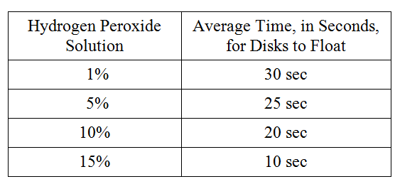
To study the actions of the enzyme catalase on hydrogen peroxide, students performed the following experiment. Catalase was extracted from potatoes by blending raw potatoes in a blender with cold distilled water. The filtrate was stored on ice. The following hydrogen peroxide solutions were made: 1 percent, 5 percent, 10 percent, and 15 percent. Filter paper disks were soaked in the catalase filtrate and dropped into beakers containing the various solutions. The activity of the enzyme was measured by the amount of time it took for the disks to float to the surface of the solution on the bubbles produced by the reaction. The following data were obtained.

Which of the following best describes why the disks rose to the surface faster in the more concentrated hydrogen peroxide solutions?

The higher substrate concentrations in the more concentrated solution speeded the reaction

New cards
42
<p>For following group of questions first study the description of the data and then choose the one best answer to each question following it and fill in the corresponding oval on the answer sheet.</p><p>To study the actions of the enzyme catalase on hydrogen peroxide, students performed the following experiment. Catalase was extracted from potatoes by blending raw potatoes in a blender with cold distilled water. The filtrate was stored on ice. The following hydrogen peroxide solutions were made: 1 percent, 5 percent, 10 percent, and 15 percent. Filter paper disks were soaked in the catalase filtrate and dropped into beakers containing the various solutions. The activity of the enzyme was measured by the amount of time it took for the disks to float to the surface of the solution on the bubbles produced by the reaction. The following data were obtained.</p><p>Which of the following experimental designs should the students use as a control for the experiment?</p>

For following group of questions first study the description of the data and then choose the one best answer to each question following it and fill in the corresponding oval on the answer sheet.

To study the actions of the enzyme catalase on hydrogen peroxide, students performed the following experiment. Catalase was extracted from potatoes by blending raw potatoes in a blender with cold distilled water. The filtrate was stored on ice. The following hydrogen peroxide solutions were made: 1 percent, 5 percent, 10 percent, and 15 percent. Filter paper disks were soaked in the catalase filtrate and dropped into beakers containing the various solutions. The activity of the enzyme was measured by the amount of time it took for the disks to float to the surface of the solution on the bubbles produced by the reaction. The following data were obtained.

Which of the following experimental designs should the students use as a control for the experiment?

Place a catalase-soaked disk in a beaker of water

New cards
43
<p>For following group of questions first study the description of the data and then choose the one best answer to each question following it and fill in the corresponding oval on the answer sheet.</p><p>To study the actions of the enzyme catalase on hydrogen peroxide, students performed the following experiment. Catalase was extracted from potatoes by blending raw potatoes in a blender with cold distilled water. The filtrate was stored on ice. The following hydrogen peroxide solutions were made: 1 percent, 5 percent, 10 percent, and 15 percent. Filter paper disks were soaked in the catalase filtrate and dropped into beakers containing the various solutions. The activity of the enzyme was measured by the amount of time it took for the disks to float to the surface of the solution on the bubbles produced by the reaction. The following data were obtained.</p><p>Which of the following best describes why ice was used during this experiment?</p>

For following group of questions first study the description of the data and then choose the one best answer to each question following it and fill in the corresponding oval on the answer sheet.

To study the actions of the enzyme catalase on hydrogen peroxide, students performed the following experiment. Catalase was extracted from potatoes by blending raw potatoes in a blender with cold distilled water. The filtrate was stored on ice. The following hydrogen peroxide solutions were made: 1 percent, 5 percent, 10 percent, and 15 percent. Filter paper disks were soaked in the catalase filtrate and dropped into beakers containing the various solutions. The activity of the enzyme was measured by the amount of time it took for the disks to float to the surface of the solution on the bubbles produced by the reaction. The following data were obtained.

Which of the following best describes why ice was used during this experiment?

To retard the breakdown of the catalase
New cards
44
<p>For following group of questions first study the description of the data and then choose the one best answer to each question following it and fill in the corresponding oval on the answer sheet.</p><p>To study the actions of the enzyme catalase on hydrogen peroxide, students performed the following experiment. Catalase was extracted from potatoes by blending raw potatoes in a blender with cold distilled water. The filtrate was stored on ice. The following hydrogen peroxide solutions were made: 1 percent, 5 percent, 10 percent, and 15 percent. Filter paper disks were soaked in the catalase filtrate and dropped into beakers containing the various solutions. The activity of the enzyme was measured by the amount of time it took for the disks to float to the surface of the solution on the bubbles produced by the reaction. The following data were obtained.</p><p>If the potato solution was boiled for 10 minutes and cooled for 10 minutes before being tested, the average time for the disks to float to the surface of the hydrogen peroxide solution would be</p>

For following group of questions first study the description of the data and then choose the one best answer to each question following it and fill in the corresponding oval on the answer sheet.

To study the actions of the enzyme catalase on hydrogen peroxide, students performed the following experiment. Catalase was extracted from potatoes by blending raw potatoes in a blender with cold distilled water. The filtrate was stored on ice. The following hydrogen peroxide solutions were made: 1 percent, 5 percent, 10 percent, and 15 percent. Filter paper disks were soaked in the catalase filtrate and dropped into beakers containing the various solutions. The activity of the enzyme was measured by the amount of time it took for the disks to float to the surface of the solution on the bubbles produced by the reaction. The following data were obtained.

If the potato solution was boiled for 10 minutes and cooled for 10 minutes before being tested, the average time for the disks to float to the surface of the hydrogen peroxide solution would be

more than 30 seconds

New cards
45

Which of the following statements best helps explain the reaction specificity of an enzyme?

The shape and charge of the substrates are compatible with the active site of the enzyme.

New cards
46

Which of the following can be used to determine the rate of enzyme-catalyzed reactions?

Rate of disappearance of the substrate

New cards
47
Figure 1 shows the graph of a curve in the first quadrant of a coordinate plane. The horizontal axis is labeled “Substrate Concentration, in micromolar,” and the numbers 0 through 1,000, in increments of 200, are indicated. The vertical axis is labeled “Product Produced After 5 Minutes, in micromoles,” and the numbers 0 through 240, in increments of 40, are indicated. The curve begins at the origin and moves upward and to the right at a near constant rate, passing through the point with coordinates 100 comma 80. It begins to level off slightly, passing through the point with coordinates 200 comma 120, after which it continues horizontally to the right until the end of the horizontal axis.

Figure 1. Rate of an enzyme-catalyzed reaction

Researchers investigated the dynamics of a reaction catalyzed by an enzyme. The researchers prepared a series of reactions, each with the same concentration of enzyme but with different concentrations of substrate. The researchers measured the amount of product in each reaction mixture after 5 minutes. The results are shown in Figure 1.

Which of the following best describes how an increase in the concentration of substrate in the reaction mixture affected the frequency of enzyme‑substrate interactions?

The frequency o enzyme-substrate interactions increased until all of the active sites were interacting with substrate.

New cards
48
Figure 1 shows the graph of a curve in the first quadrant of a coordinate plane. The horizontal axis is labeled “Substrate Concentration, in micromolar,” and the numbers 0 through 1,000, in increments of 200, are indicated. The vertical axis is labeled “Product Produced After 5 Minutes, in micromoles,” and the numbers 0 through 240, in increments of 40, are indicated. The curve begins at the origin and moves upward and to the right at a near constant rate, passing through the point with coordinates 100 comma 80. It begins to level off slightly, passing through the point with coordinates 200 comma 120, after which it continues horizontally to the right until the end of the horizontal axis.

Figure 1. Rate of an enzyme-catalyzed reaction

Researchers investigated the dynamics of a reaction catalyzed by an enzyme. The researchers prepared a series of reactions, each with the same concentration of enzyme but with different concentrations of substrate. The researchers measured the amount of product in each reaction mixture after 5 minutes. The results are shown in Figure 1.

Which of the following experimental designs would best allow researchers to investigate the effect of pH on the rate of the enzyme-catalyzed reaction?

Measure the reaction rates at different pH levels when the enzyme concentration remains the same and the concentration is 100⁢μM.

New cards
49
Figure 1 shows the graph of a curve in the first quadrant of a coordinate plane. The horizontal axis is labeled “Substrate Concentration, in micromolar,” and the numbers 0 through 1,000, in increments of 200, are indicated. The vertical axis is labeled “Product Produced After 5 Minutes, in micromoles,” and the numbers 0 through 240, in increments of 40, are indicated. The curve begins at the origin and moves upward and to the right at a near constant rate, passing through the point with coordinates 100 comma 80. It begins to level off slightly, passing through the point with coordinates 200 comma 120, after which it continues horizontally to the right until the end of the horizontal axis.

Figure 1. Rate of an enzyme-catalyzed reaction

Researchers investigated the dynamics of a reaction catalyzed by an enzyme. The researchers prepared a series of reactions, each with the same concentration of enzyme but with different concentrations of substrate. The researchers measured the amount of product in each reaction mixture after 5 minutes. The results are shown in Figure 1.

Which of the following questions best addresses whether a particular inhibitor is competitive or noncompetitive?

Does the inhibitor bind to allosteric site or the active site of the enzyme

New cards
50
Figure 1 shows the graph of a curve in the first quadrant of a coordinate plane. The horizontal axis is labeled “Substrate Concentration, in micromolar,” and the numbers 0 through 1,000, in increments of 200, are indicated. The vertical axis is labeled “Product Produced After 5 Minutes, in micromoles,” and the numbers 0 through 240, in increments of 40, are indicated. The curve begins at the origin and moves upward and to the right at a near constant rate, passing through the point with coordinates 100 comma 80. It begins to level off slightly, passing through the point with coordinates 200 comma 120, after which it continues horizontally to the right until the end of the horizontal axis.

Figure 1. Rate of an enzyme-catalyzed reaction

Researchers investigated the dynamics of a reaction catalyzed by an enzyme. The researchers prepared a series of reactions, each with the same concentration of enzyme but with different concentrations of substrate. The researchers measured the amount of product in each reaction mixture after 5 minutes. The results are shown in Figure 1.

Which of the following graphs predicts the most likely rate of the enzyme-catalyzed reaction if the concentration of the enzyme in the mixture were doubled?

The figure shows the graph of a curve in the first quadrant of a coordinate plane. The horizontal axis is labeled “Substrate Concentration, in micromolar,” and the numbers 0 through 1,000, in increments of 200, are indicated. The vertical axis is labeled “Product Produced After 5 Minutes, in micromoles,” and the numbers 0 through 240, in increments of 40, are indicated. The curve begins at the origin and moves upward and to the right at a near constant rate at first, passing through the point with coordinates 100 comma 120 and continuing upward and to the right to the point with coordinates 200 comma 240. It then levels off rapidly and continues horizontally to the right until the end of the horizontal axis.

New cards
51
The figure shows a diagram of an electron transport chain of cellular respiration. The diagram includes five molecules embedded in a mitochondrial membrane. The first four molecules, from left to right, are labeled complex 1, complex 2, complex 3, and complex 4. The fifth molecule has no label. All molecules except complex 2 extend across both surfaces of the membrane. Complex 2 is embedded within the lower surface of the membrane. A curved arrow touches complex 1 below the membrane. The arrow points from N A D H to N A D with a positive one charge plus H with a positive one charge. Two small squares labeled e with a negative one charge are shown on complex 1 adjacent to the curved arrow. Another curved arrow touches complex 2 below the membrane. The arrow points from F A D H 2 to F A D plus 2 H with a positive one charge. Two small squares labeled e with a negative one charge are shown on complex 2 adjacent to the curved arrow.  A series of bold arrows that represent the path of electron flow in mitochondria start at complex 1. The first bold arrow points from the complex 1 squares labeled e with a negative one charge to complex 2, where an arrow points from the squares labeled e with a negative one charge to the bold arrow. The bold arrow then points to complex 3 and continues on to pass through a very small molecule on the upper surface of the membrane and then to pass through complex 4. A final bold arrow below complex 4 points to a curved arrow shown below the complexes and the membrane. The curved arrow points from O 2 plus 4 H with a positive one charge to 2 H 2 O. Small circles labeled H with a positive one charge are shown below complex 1, complex 3, and complex 4. Arrows extend from these circles up through the complexes to the upper surface of the membrane where they point to identical small circles labeled H with a positive one charge. A small circle labeled H with a positive one charge is shown on the upper surface of the membrane above the final unlabeled complex. An arrow crosses down through the unlabeled molecule and points from the labeled circle above the membrane to an identical small circle labeled H with a positive one charge below the membrane. A final curved arrow below the membrane touches the unlabeled complex and points from A D P plus P subscript i to A T P.

Figure 1. The electron transport chain of cellular respiration. The bold arrows passing through the complexes in the membrane represent the path of electron flow in mitochondria.

Compound X binds to complex IV of the mitochondrial electron transport chain and prevents complex IV from accepting electrons.

Based on Figure 1, which of the following best explains why the cells of an animal exposed to compound X have an increased ratio of NADH to NAD+?


NADH cannot be oxidized to NAD+ because complexes I, II, and III cannot accept electrons if electrons cannot be passed to complex IV.

New cards
52

Gelatin is a protein that is derived from collagen which is found in the bones, skin, and connective tissue of animals. To investigate the ability of various enzymes to digest gelatin, a group of students set up an assay involving camera film. Camera film contains gelatin and appears black when exposed to light but turns clear as the gelatin gets broken down. The students incubated pieces of exposed camera film in test tubes, each containing one of three different enzyme solutions (trypsin, lipase, or amylase) as indicated in Figure 1. The students recorded the time it took for the enzymes to digest the gelatin in each test tube, turning the film from black to clear.

The figure presents a beaker partially filled with a liquid. A thermometer and a test tube containing a piece of exposed camera film in an enzyme solution are partially submerged in the beaker. A note indicates that the enzymes tested are Trypsin, Lipase, and Amylase.

Figure 1. Diagram of experimental setup.

Which of the following would be the most appropriate control for this experiment?

A test tube containing a piece of exposed camera film submerged in water

New cards
53

The enzyme hexokinase catalyzes the conversion of glucose to glucose-6-phosphate, which is an important step in glycolysis. The reaction involves the transfer of a phosphate group from ATP to glucose.

Either a glucose molecule or a water molecule can fit in the active site of hexokinase. The presence of a water molecule in hexokinase’s active site would result in the hydrolysis of ATP to ADP instead of the conversion of glucose to glucose-6-phosphate.

Which of the following statements best helps explain the reaction specificity of hexokinase?

Glucose has the right shape and charge to cause hexokinase to undergo a structural change needed for catalysis, whereas water does not.

New cards
54

Pyruvate kinase, a key enzyme in the glycolysis pathway, is inhibited by the amino acid alanine. The ability of alanine to inhibit the enzyme is not affected by increasing the concentration of substrate.

Which of the following best explains the mechanism by which alanine inhibits pyruvate kinase activity?

Alanine binds to an allosteric site of the enzyme, changing the shape of the enzyme’s active site.

New cards
55

In an experiment, a scientist isolates mitochondria from living cells and suspends them in two different buffered solutions. One solution is maintained at pH 4, while the other solution is maintained at pH 9. The scientist finds that mitochondria in the solution at pH 4 continue to produce ATP but those in the pH 9 solution do not.

The results of the experiment can be used as evidence in support of which of the following scientific claims about mitochondrial activity?

ATP production in mitochondria requires a hydrogen ion gradient that favors movement of protons into the mitochondrial matrix.
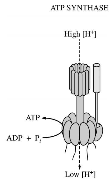
New cards
56
<p>Which of the following questions will best direct an investigation of the mechanism of ATP synthase?</p>

Which of the following questions will best direct an investigation of the mechanism of ATP synthase?

Is the phosphorylation of ADP by ATP synthase dependent on the formation of a proton gradient?

New cards
57

Which of the following describes a metabolic consequence of a shortage of oxygen in muscle cells?

A buildup of lactic acid in the muscle tissue due to fermentation
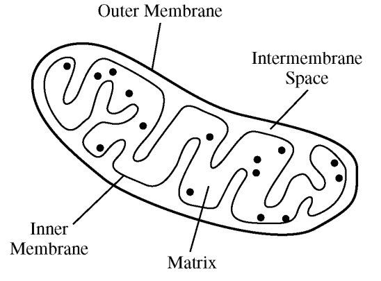
New cards
58
<p>The figure above shows an organelle typically found in eukaryotic cells. Which of the following best describes the function of the double membrane system of this organelle?</p>

The figure above shows an organelle typically found in eukaryotic cells. Which of the following best describes the function of the double membrane system of this organelle?

The inner membrane has specialized proteins that create a hydrogen ion concentration gradient between the inter-membrane space and the matrix.

New cards
59

Muscle contraction depends on ATP hydrolysis. During periods of intense exercise, muscle cells rely on the ATP supplied by three metabolic pathways: glycolysis, mitochondrial respiration, and the phosphagen system. Figure 1 shows the rates at which the three metabolic pathways produce ATP following the start of an intense period of exercise.

The figure presents the graph of three curves in the first quadrant of the coordinate plane. The horizontal axis is labeled Time, in seconds, and the numbers 0 through 100, in increments of 10, are indicated. The vertical axis is labeled A T P Production, in kilocalories per kilogram per minute, and the numbers 0 through 45, in increments of 5, are indicated. The three curves are described as follows. Note that all values are approximate. The first curve, labeled Phosphagen, begins at the origin, and moves sharply upwards, reaching a peak at the point 2, comma 42.5. The curve then moves downwards and to the right at a decreasing rate, passing through the point 10, comma 25, the point 30, comma 8, and the point 60, comma 1, ending just above the horizontal axis at the point 100, comma 0. The second curve, labeled Glycolysis, begins at the origin, and moves steeply upwards and to the right, passing through the point 10, comma 23, and reaching a peak at the point 17, comma 25. The curve then moves downwards and to the right at a decreasing rate, passing through the point 50, comma 13, and ending at the point 100, comma 6. The third curve, labeled Mitochondrial respiration, begins at the origin, and moves gradually upwards and to the right at a decreasing rate, passing through the point 30, comma 8 and the point 50, comma 12, then ending at the point 100, comma 15.

Figure 1. ATP production by three metabolic pathways following the start of an intense period of exercise

Which of the following correctly uses the data to justify the claim that the phosphagen system is an immediate, short-term source of ATP for muscle cells?

ATP production by the phosphagen system increases and decreases rapidly following the start of the exercise period.

New cards
60

Two nutrient solutions are maintained at the same pH. Actively respiring mitochondria are isolated and placed into each of the two solutions. Oxygen gas is bubbled into one solution. The other solution is depleted of available oxygen. Which of the following best explains why ATP production is greater in the tube with oxygen than in the tube without oxygen?

The rate of proton pumping across the inner mitochondrial membrane is lower in the sample without oxygen.

New cards
61
The figure presents a graph of two curves in the first quadrant of a coordinate plane. The horizontal axis is labeled p H, and the numbers 1 through 11, in increments of 2, are indicated. The vertical axis is labeled Enzyme Activity, and no values are indicated, but an arrowhead is present at the top end of the axis. One curve is labeled Pepsin. It begins at a p H of 1, close to the top of the vertical axis, and moves slightly upward and to the right until it reaches a peak at a p H of approximately 2.5. It then moves steeply downward and to the right until it begins to level off as it approaches the horizontal axis at a p H of approximately 7. It moves almost horizontally to the right just above the horizontal axis until it ends close to a p H of 11. The other curve is labeled Trypsin. It begins at a p H of approximately 2.8, just above the horizontal axis, and moves steeply upward and to the right. It continues upward until it reaches a peak close to the top of the vertical axis at a p H of approximately 8. The curve then moves steeply downward and to the right until it ends at a p H of 11 about halfway up the vertical axis.

Figure 1. Activity levels of two digestive enzymes over a range of pH

Trypsin and pepsin are enzymes that function in different areas of the digestive tract. One functions in the stomach, where the pH is between 1.5 and 3.5, while the other functions in the small intestines, where the pH is between 6 and 8.

Based on Figure 1, which of the following best describes where each enzyme functions?

Pepsin works in the stomach because the optimal pH for pepsin is acidic

New cards
62

Oxygen consumption can be used as a measure of metabolic rate because oxygen is

necessary for ATP synthesis by oxidative phosphorylation

New cards
63


A researcher claims that different enzymes exhibit maximal function over different pH ranges. To test the claim, the researcher carries out an experiment that includes three different enzymes: pepsin, salivary amylase, and arginase. The results of the experiment are represented in Figure 1.

The figure presents the graph of three lines in the first quadrant of the coordinate plane. The lines represent the enzymes pepsin, salivary amylase, and arginase. The horizontal axis is labeled p H, and the numbers 0 through 12, in increments of 1, are indicated. The vertical axis is labeled Percent of Enzyme Activity, and the numbers 0 through 100, in increments of 20, are indicated. The data represented in the graph are as follows. Note that all values are approximate. The line labeled Pepsin begins at the point 0, comma 50. The line then moves upwards and to the right to the point 2, comma 100, then moves steeply downwards and to the right to the point 5, comma 0. The line then moves to the right along the horizontal axis, and ends at the point 12, comma 0. The line labeled Salivary Amylase begins at the point 0, comma 0 and moves to the right along the horizontal axis until the point 3, comma 0. The line then moves steeply upwards and to the right to the point 7, comma 100. The line then moves steeply downwards and to the right to the point 10, comma 0. The line then moves to the right along the horizontal axis and ends at the point 12, comma 0. The line labeled Arginase begins at the point 0, comma 0 and moves to the right along the horizontal axis until the point 5, comma 0. The line then moves steeply upwards and to the right to the point 10, comma 100. The line then moves steeply downwards and to the right to end at the point 12, comma 70.

Figure 1. The effect of pH on three different enzymes

Which of the following actions will provide the most appropriate negative control for the experiment?

Repeating the experiment with denatured enzymes

New cards
64

The enzyme peroxidase is found in many organisms. It catalyzes the breakdown of hydrogen peroxide into water and oxygen gas. The rate of peroxidase activity at different pH values was assessed by students in the lab. The students’ results are shown in graph 1.

The figure presents a bar graph with 4 bars. The horizontal axis is labeled p H, and the four bars are labeled 3, 5, 7, and 9. The vertical axis is labeled Relative Peroxidase Activity, and no numbers are indicated along it, but an arrowhead is present at the top of the axis. The relative heights of each bar, with respect to the vertical axis, are approximately as follows. The bar for p H 3 reaches a height equivalent to one third of the vertical axis. The bar for p H 5 reaches the top of the vertical axis. The bar for p H 7 reaches a height equivalent to two thirds of the vertical axis. The bar for p H 9 reaches a height equivalent to one quarter of the vertical axis.

Graph 1. Effect of pH on peroxidase activity

If the experiment is repeated at pH 11, the observed activity level of the enzyme will most likely be

lower than the level at pH 9
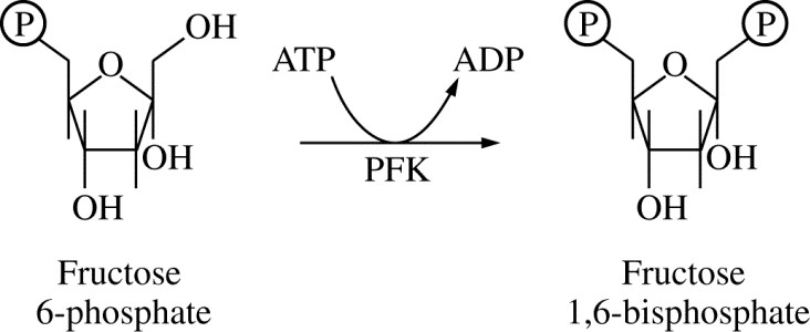
New cards
65
<p class="text-center" style="text-align: center">Figure 1. Reaction catalyzed by phosphofructokinase (PFK) during glycolysis</p><p>Phosphofructokinase (PFK) is an enzyme that catalyzes the conversion of fructose 6-phosphate to fructose 1,6-bisphosphate during glycolysis, as represented in Figure 1.</p><p>PFK can be allosterically inhibited by ATP at high concentrations. Which of the following is the benefit of regulating glycolysis by the concentration of ATP?</p>

Figure 1. Reaction catalyzed by phosphofructokinase (PFK) during glycolysis

Phosphofructokinase (PFK) is an enzyme that catalyzes the conversion of fructose 6-phosphate to fructose 1,6-bisphosphate during glycolysis, as represented in Figure 1.

PFK can be allosterically inhibited by ATP at high concentrations. Which of the following is the benefit of regulating glycolysis by the concentration of ATP?

Glycolysis proceeds when the intracellular concentration of ATP is low, which provides ATP to drive cellular reactions

New cards
66

When hydrogen ions are pumped out of the mitochondrial matrix, across the inner mitochondrial membrane, and into the space between the inner and outer membranes, the result is

the creation of a protein gradient

New cards
67
  • Directions: Each group of questions below concerns an experimental or laboratory situation or data. In each case, first study the description of the situation or data. Then choose the one best answer to each question following it.

The figure shows a graph in the first quadrant with the horizontal axis labeled time in minutes and the vertical axis labeled rate of pyruvic acid formation in moles per liter per minute. The horizontal axis is labeled zero to thirty-four; the vertical axis is not labeled. There are two lines on the graph. The pyruvic acid produced is a solid line that starts at some point up the vertical axis, then increases to a wide peak labeled A around eleven minutes, decreases to a point labeled B at sixteen minutes that is slightly higher than the starting point, increases to the same level as A at a point labeled C around twenty-two minutes, decreasing to the same level as B at a point labeled D at twenty-six minutes, and continuing this pattern until thirty-four minutes. The pyruvic acid produced by the second culture with substance x is represented by a dotted line and begins at a point on the vertical axis lower than the first culture, increases slightly at two minutes, the decreases to almost zero by eight minutes, and remains at this constant rate until thirty-four minutes.

A tissue culture of vertebrate muscle was provided with a constant excess supply of glucose under anaerobic conditions starting at time zero and the amounts of pyruvic acid and ATP produced were measured. The solid line in the graph above represents the pyruvic acid produced in moles per liter per minute. ATP levels were also found to be highest at points A and C, lowest at B and D. A second culture was set up under the same conditions, except that substance X was added, and the results are indicated by the dotted line.

Which of the following best accounts for the shape of the solid line between points A and D?

ATP acted as an allosteric inhibitor on one or more of the enzymes

New cards
68
  • Directions: Each group of questions below concerns an experimental or laboratory situation or data. In each case, first study the description of the situation or data. Then choose the one best answer to each question following it.

The figure shows a graph in the first quadrant with the horizontal axis labeled time in minutes and the vertical axis labeled rate of pyruvic acid formation in moles per liter per minute. The horizontal axis is labeled zero to thirty-four; the vertical axis is not labeled. There are two lines on the graph. The pyruvic acid produced is a solid line that starts at some point up the vertical axis, then increases to a wide peak labeled A around eleven minutes, decreases to a point labeled B at sixteen minutes that is slightly higher than the starting point, increases to the same level as A at a point labeled C around twenty-two minutes, decreasing to the same level as B at a point labeled D at twenty-six minutes, and continuing this pattern until thirty-four minutes. The pyruvic acid produced by the second culture with substance x is represented by a dotted line and begins at a point on the vertical axis lower than the first culture, increases slightly at two minutes, the decreases to almost zero by eight minutes, and remains at this constant rate until thirty-four minutes.

A tissue culture of vertebrate muscle was provided with a constant excess supply of glucose under anaerobic conditions starting at time zero and the amounts of pyruvic acid and ATP produced were measured. The solid line in the graph above represents the pyruvic acid produced in moles per liter per minute. ATP levels were also found to be highest at points A and C, lowest at B and D. A second culture was set up under the same conditions, except that substance X was added, and the results are indicated by the dotted line.

The rate of pyruvic acid formation fluctuates because

the reaction is affected by negative feedback

New cards
69
  • Directions: Each group of questions below concerns an experimental or laboratory situation or data. In each case, first study the description of the situation or data. Then choose the one best answer to each question following it.

The figure shows a graph in the first quadrant with the horizontal axis labeled time in minutes and the vertical axis labeled rate of pyruvic acid formation in moles per liter per minute. The horizontal axis is labeled zero to thirty-four; the vertical axis is not labeled. There are two lines on the graph. The pyruvic acid produced is a solid line that starts at some point up the vertical axis, then increases to a wide peak labeled A around eleven minutes, decreases to a point labeled B at sixteen minutes that is slightly higher than the starting point, increases to the same level as A at a point labeled C around twenty-two minutes, decreasing to the same level as B at a point labeled D at twenty-six minutes, and continuing this pattern until thirty-four minutes. The pyruvic acid produced by the second culture with substance x is represented by a dotted line and begins at a point on the vertical axis lower than the first culture, increases slightly at two minutes, the decreases to almost zero by eight minutes, and remains at this constant rate until thirty-four minutes.

A tissue culture of vertebrate muscle was provided with a constant excess supply of glucose under anaerobic conditions starting at time zero and the amounts of pyruvic acid and ATP produced were measured. The solid line in the graph above represents the pyruvic acid produced in moles per liter per minute. ATP levels were also found to be highest at points A and C, lowest at B and D. A second culture was set up under the same conditions, except that substance X was added, and the results are indicated by the dotted line.

It is most reasonable to hypothesize that, in the breakdown of glucose, substance X is

an inhibitor

New cards
70
  • Directions: Each group of questions below concerns an experimental or laboratory situation or data. In each case, first study the description of the situation or data. Then choose the one best answer to each question following it.

The figure shows a graph in the first quadrant with the horizontal axis labeled time in minutes and the vertical axis labeled rate of pyruvic acid formation in moles per liter per minute. The horizontal axis is labeled zero to thirty-four; the vertical axis is not labeled. There are two lines on the graph. The pyruvic acid produced is a solid line that starts at some point up the vertical axis, then increases to a wide peak labeled A around eleven minutes, decreases to a point labeled B at sixteen minutes that is slightly higher than the starting point, increases to the same level as A at a point labeled C around twenty-two minutes, decreasing to the same level as B at a point labeled D at twenty-six minutes, and continuing this pattern until thirty-four minutes. The pyruvic acid produced by the second culture with substance x is represented by a dotted line and begins at a point on the vertical axis lower than the first culture, increases slightly at two minutes, the decreases to almost zero by eight minutes, and remains at this constant rate until thirty-four minutes.

A tissue culture of vertebrate muscle was provided with a constant excess supply of glucose under anaerobic conditions starting at time zero and the amounts of pyruvic acid and ATP produced were measured. The solid line in the graph above represents the pyruvic acid produced in moles per liter per minute. ATP levels were also found to be highest at points A and C, lowest at B and D. A second culture was set up under the same conditions, except that substance X was added, and the results are indicated by the dotted line.

Which of the following is most likely to result if oxygen is added to the tissue culture?

For each glucose molecule consumed, more ATP will be formed

New cards
71
The figure presents a line graph in the first quadrant of a coordinate plane. The horizontal axis is labeled “Time, in minutes,” and the numbers 0 through 5 are indicated. The vertical axis is labeled “Relative Concentration of Product,” and the numbers 0 through 10 are indicated. The line graph connects 10 points of data, beginning at approximately 0.25 comma 1.25 and increasing steeply upward and to the right. The sixth data point is at approximately 2 comma 7.75. From here, the line graph starts to almost flatten out, moving more gradually upward and to the right until it ends with the tenth data point at approximately 5 comma 9.25.

Figure 1. Change in the relative concentration of product over time

Figure 1 shows the amount of product produced in an enzyme-catalyzed reaction over five minutes. Which of the following best explains how the rate of the reaction changes over time?

The rate decreases because the ratio of product to substrate increases

New cards
72

The reaction of glycolysis occurs in the

cytosol

New cards
73

Which metabolic process is common to both aerobic cellular respiration and alcohol fermentation?

Glycolysis

New cards
74

An experiment to measure the rate of respiration in crickets and mice at 10o C and 25o C was performed using a respirometer, an apparatus that measures changes in gas volume. Respiration was measured in mL of O2 consumed per gram of organism over several five-minute trials, and the following data were obtained.

The figure shows a table with 3 columns and 5 rows. The top row contains the column labels from left to right; column 1, Organism; column 2, Temperature (degree Celsius); column 3, Average respiration (milliliter of oxygen per gram per minute). From top to bottom, the data is as follows; Row 2; Organism, Mouse; Temperature, 10; Average respiration, 0.0518. Row 3; Organism, Mouse; Temperature, 25; Average respiration, 0.0321. Row 4, Organism, Cricket; Temperature, 10; Average respiration, 0.0013. Row 5, Organism, Cricket; Temperature in degrees Celsius, 25; Average respiration, 0.0038.

During aerobic cellular respiration, oxygen gas is consumed at the same rate as carbon dioxide gas is produced. In order to provide accurate volumetric measurements of oxygen gas consumption, the experimental setup should include which of the following?

A substance that removes carbon dioxide gas

New cards
75

An experiment to measure the rate of respiration in crickets and mice at 10o C and 25o C was performed using a respirometer, an apparatus that measures changes in gas volume. Respiration was measured in mL of O2 consumed per gram of organism over several five-minute trials, and the following data were obtained.

The figure shows a table with 3 columns and 5 rows. The top row contains the column labels from left to right; column 1, Organism; column 2, Temperature (degree Celsius); column 3, Average respiration (milliliter of oxygen per gram per minute). From top to bottom, the data is as follows; Row 2; Organism, Mouse; Temperature, 10; Average respiration, 0.0518. Row 3; Organism, Mouse; Temperature, 25; Average respiration, 0.0321. Row 4, Organism, Cricket; Temperature, 10; Average respiration, 0.0013. Row 5, Organism, Cricket; Temperature in degrees Celsius, 25; Average respiration, 0.0038.

According to the data, the mice at 10o C demonstrated greater oxygen consumption per gram of tissue than did the mice at 25o C. This is most likely explained by which of the following statements?

The mice at 10ºC had a higher rate of ATP production than the mice at 25ºC.

New cards
76

An experiment to measure the rate of respiration in crickets and mice at 10o C and 25o C was performed using a respirometer, an apparatus that measures changes in gas volume. Respiration was measured in mL of O2 consumed per gram of organism over several five-minute trials, and the following data were obtained.

The figure shows a table with 3 columns and 5 rows. The top row contains the column labels from left to right; column 1, Organism; column 2, Temperature (degree Celsius); column 3, Average respiration (milliliter of oxygen per gram per minute). From top to bottom, the data is as follows; Row 2; Organism, Mouse; Temperature, 10; Average respiration, 0.0518. Row 3; Organism, Mouse; Temperature, 25; Average respiration, 0.0321. Row 4, Organism, Cricket; Temperature, 10; Average respiration, 0.0013. Row 5, Organism, Cricket; Temperature in degrees Celsius, 25; Average respiration, 0.0038.

According to the data, the crickets at 25o C have greater oxygen consumption per gram of tissue than do the crickets at 10o C. This trend in oxygen consumption is the opposite of that in the mice. The difference in trends in oxygen consumption among crickets and mice is due to their

mode of internal temperature regulation
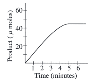
New cards
77
<p>A scientist determined the rate of an enzyme-catalyzed reaction by measuring the amount of product formed over time. The following curve was generated from the data collected.</p><p>The rate of the reaction could also be determined by</p>

A scientist determined the rate of an enzyme-catalyzed reaction by measuring the amount of product formed over time. The following curve was generated from the data collected.

The rate of the reaction could also be determined by

measuring the change in the amount of substrate

New cards
78

Protein digestion in humans is primarily carried out by three enzymes. Pepsin is found in the stomach (pH2), where it aids in the breakdown of large proteins into smaller peptides, while trypsin and chymotrypsin are found in the small intestine (pH8), where they aid in the further breakdown of the proteins into amino acids and dipeptides that can be absorbed into the bloodstream. Graph 1 shows the effect of pH on the activity levels of the three enzymes.

The figure presents the graph of three curves in the first quadrant of the coordinate plane. The lines represent the enzymes pepsin, chymotrypsin, and trypsin. The horizontal axis is labeled p H, and the numbers 0 through 11, in increments of 1, are indicated. The vertical axis is labeled Enzyme Activity, and no numbers are indicated, but an arrowhead is present at the top of the axis. The three curves are described as follows. The curve labeled Pepsin begins with a high level of enzyme activity at p H 1 and moves slightly upwards and to the right, reaching a peak at p H 2. The curve then moves steeply downwards and to the right until it ends with minimal enzyme activity at p H 6. The curve labeled Chymotrypsin begins with minimal enzyme activity at p H 3.5 and moves steeply upwards and to the right, reaching a peak at p H 7.7. The curve then moves steeply downwards and to the right until it ends with minimal enzyme activity at p H 11.  The curve labeled Trypsin begins with minimal enzyme activity at p H 3.5 and moves upwards and to the right, reaching a peak at p H 9.5. The curve then moves steeply downwards and to the right and ends with a moderate amount of enzyme activity at p H 11.

Graph 1. Relative activity of pepsin, trypsin, and chymotrypsin at pH 0 through 11

Which of the following best predicts how the structure and function of pepsin will change as it enters the small intestine?

Pepsin will change in shape because of the basic environment of the small intestine; therefore, its enzymatic activity will decrease

New cards
79
The figure shows a graph of six box-and-whisker plots. The graph is divided vertically into two sections, one labeled 30 degrees Celsius and one labeled 35 degrees Celsius. The horizontal axis is labeled “Yeast Species” and is divided into two parts, one for each of the two temperatures. Yeast species Q, R, and S are indicated for each of the temperatures. The vertical axis is labeled “Rate of O 2 uptake, in milliliters per milligram per minute,” and the numbers 0.0 through 2.2, in increments of 0.2, are indicated. The data for the yeast species are as follows. 30 degrees Celsius: Yeast species Q: the box extends from 0.4 to 0.61 with a horizontal line inside the box at 0.45. A whisker extends down from 0.4 to 0.38, and another whisker extends up from 0.61 to 0.63. Yeast species R: the box extends from 0.9 to 1.2 with a horizontal line inside the box at 1.0. A whisker extends down from 0.90 to 0.85, and another whisker extends up from 1.2 to 1.3. Yeast species S: the box extends from 0.85 to 1.42 with a horizontal line inside the box at 1.4. A whisker extends down from 0.85 to 0.8, and another whisker extends up from 1.42 to 1.8. 35 degrees Celsius: Yeast species Q: the box extends from 0.4 to 0.65 with a horizontal bar in the box at 0.6. A whisker extends down from 0.4 to 0.39, and another whisker extends up from 0.65 to 0.66. Yeast species R: the box extends from 0.9 to 1.3 with a horizontal line inside the box at 1.0. A whisker extends down from 0.9 to 0.7, and another whisker extends up from 1.3 to 1.4. Yeast species S: the box extends from 1.1 to 2.0 with a horizontal line inside the box at 1.3. A whisker extends down from 1.1 to 0.75, another whisker extends up from 2.0 to 2.05.

Figure 1. The rate of O2 uptake for three species of Saccharomyces yeast at 30°C and 35°C

Researchers studied the effect of increased temperature on the rate of respiration of three species of Saccharomyces yeast (Q, R, and S) by measuring the rate of oxygen uptake in each species at 30°C and at 35°C (Figure 1).

Based on Figure 1, which of the following statements about the effect of the temperature increase on the respiratory rate of one of the species, Q, R, or S, is most likely true?

The median O2 uptake rate for species S at 35°C is μ0.1 μL·mg-1⁢·min-1 less than it is at 30°C.

New cards
robot