HCI Lecture Notes Review
1/54
Earn XP
Description and Tags
Flashcards for review of Human-Computer Interaction lecture notes.
Name | Mastery | Learn | Test | Matching | Spaced |
|---|
No study sessions yet.
55 Terms
Human-centered computing
A discipline concerned with understanding human beings and with the design of computational artifacts.
Want to make tech Usable, Useful and Meaningful
Human-Computer Interaction (HCI)
discipline concerned with the design, evaluation and implementation of interactive computing systems for human use.
User Experience (UX)
Includes all aspects of the end-users interaction with the company, its services, and its products.
Interactive Design (IxD)
The design of interactive products and services in which a designer’s focus goes beyond the item in development to include the way users will interact with it.
User-Centered Design (UCD) Process
Collection of systematic way of understanding and design for users
Iterative process
End users are involved in every step
Understand context - Specify requirements - create design solutions - evaluate designs
Usability Components/goals
Learnability - how easy for users to accomplish basic tasks the first time they encounter the design
Efficiency - once learned the design, how quickly can they perform task
Memorability - reestablish proficiency after some time?
Errors(prevention/recovery) - frequency, severity and ease of recovery
Satisfaction - how pleasant to use the design
Common Design Principles
Visibility: make relevant parts/meaning/needs obvious
Feedback: tell user what action cause in timely manner and what has been done
Constraints: restrict possible actions that can be perfomed
Consistency:design to use similar elements for similar tasks
Internal consistency: behave the same within an app
External consistency: behave the same across apps
Affordance (real vs perceived(for computer interfaces)-->mimic): attributes to allow people know how it should be used
Utility vs Usability
Utility: whether it provides the features you need
Usability: How easy & pleasant these features are to use
Usability + Utility = Useful
The UX Pyramid
Meaningful —> top(qualitative - Experiences)
Pleasurable
Convenient
Usable
Reliable
Functional(Useful) —> bottom(Quantitiable - Tasks)
Cognition - 2 modes
Process by which knowledge and understanding is developed in the mind
Experiential
Reflective
Experiential Cognition
State of mind where we perceive & react to the events around us efficiently and effectively → requires a certain level of expertise and engagement → characterized by instinctiveness, reflexiveness, effortlessness → can be practiced by experience
Experiential Cog
Design implications
Danger of not designing enough
Danger of designing Ex for Ref
make sensory stimulations readily available to minimize need for logical deduction
turns simple task into problem solving
Users might act too quickly without thinking when they should reflect.
Reflective Cognition
State of mind where we compare & contrast things and make decisions→ requires mental effort & attention → characterized by novelty, sound-reasoning and creativity → learned primarily by being taught or observation
Ref Cog
Design implications/tips
Danger of not designing enough
Danger of designing Reflective for Experiential
Help users see, compare, and explore choices easily
Users may struggle to make informed decisions
Users might overthink and never take action
Cognitive Processes
Attention: visual and audio —> salience(make things stand out)
Perception:
Memory
Other: Learning, Reading+Speaking+Listening, Problem-Solving+Planing+Reasoning+Decision-Making
Perception - Mcgurk effect
Process of acquiring info from the environment via our senses and transforming into experiences
Simultaneous senses could conflict with each other → McGurk effect
implications: boarders, spaces, audio cues, visual variables
Memory - 2 types
Process of encoding and later retrieving knowledge
Short term memory: has limited capacity and duration
Long term memory : transferred through usage and repetition
implications: recognition over recall:
Break complicated tasks into steps
Hide non-crucial information but make them readily accessible
Make it explicit to the user about their progress and what is next
Distributed Cognition and Edwin Hitchings proposed framework
Knowledge and cognition distributed across individual, artifacts and internal/external representations connected through interactions amongst them and the environment
Edwin Hitchings proposed framework → navigation team observed in other team-based cognitive activities
2 Theoretical Principles in Distributed Cognition
The boundary of cognition is not limited to the brain alone:
Thinking doesn’t just happen in your head — it can happen across people, tools, and the environment.
Example: A pilot uses a checklist, cockpit instruments, and help from a co-pilot — all these together form one thinking system.
Cognitive events are not limited to memory processes:
It’s not only about remembering things — it also includes using tools (like notes, maps, screens) to support and organize thinking.
Example: A calendar app reminds you of events and helps you plan, not just remember.
External Cognition
When a task becomes more complex and people start using external representations to help the cognitive process involved
Embodied Interaction
Interaction itself carries meaning. Physical actions and bodily experience shape how we understand interfaces Eg: Support stylus in content creation process (instead of just typing)
Mental Models
We make sense of things by forming mental models that help explain how things work, and thus predict what happens – particularly useful when using something new/abstract. theory of how a system works, what its signals mean, and what the outcomes of different user actions will be. To save time, most people rely on their past experiences to quickly build mental models for new systems.
We use metaphors to understand things
Don Norman Action Cycle
Execution: Start with a goal (e.g., turn on the lights, boil some water, change the temperature of the room) • Plan (intend to act, think of options, determine one) • Specify (think of sequences of action/steps to carry out that plan & achieve that goal) • Perform (carry out the specified steps)
Start from the world (e.g., change in the environment, change in the state of something) • Perceive (observe what happened in the world) • Interpret (try to make sense of the observation) • Compare (compare what happened with what was wanted)
- We can use the gaps between the goal and the world to explain why something is “difficult to use”
Gulf of Execution
the difference between the intentions of the user (goal) and what the system allows them to do or how well the system supports those actions (“how do I work this?”, “what can I do?”) • As the gulf widens, the worse the interface becomes
Computer User Interface types
Command line interfaces (CLIs) → usually for admin/maintenance → hard to learn
- Input: keyboard with commands
- Output: screen display
Benefit: fast, precise, require less resources
Drawbacks: hard to learn, look intimidating
WIMP/GUIs → Windows, Icons, Menu, Pointing Device
- Input: pointing device(in theory) and keyboard (in practice)
- Output: graphical displays using WIMs
Benefit: easy, metaphorical
Drawback: slower, content occupies more space, pointing precision
Mobile: pervasive in many diff forms and ways to interact
- Input:touch, movements, voice, proximity
- Output: screen display, audio
Benefit: direct and engaging interaction
Drawback:typically small screens with limited control space
Fat finger problem
Speech/Voice
- Input: voice
- Output: voice and sometimes visuals
Benefit: handsfree, better accessibility, more natural
Drawback: susceptible to noise and tone, privacy concern
Wearable on body,
- Input: motion, bio metrics
- Output:audio, haptics
Benefit: always on/available
Drawback: limited in interaction
AR/VR for educational/instructiona/entertainement
- Input: movements/gestures
- Output: screen, sound
Benefit: immersive experience
Drawback: prone to out of sync, VR motion sickness
MR/XR mixed reality —> interactive experience with virtual objects and physical environments
The Cortical Homunculus
A distorted representation of the human body based on a neurological “map” of the areas and proportions of the human brain dedicated to processing motor functions, or sensory functions, for different parts of the body.
Shows opportunities on how we can design interfaces that best cater the capability of different parts of our body
Skeuomorphism
term that is used to describe interface objects that mirror real-world counterparts in how they appear and/or how the user can interact with them. This design concept capitalizes on users’ existing knowledge and mental models of an actual object so they don’t need to learn a new interface.
Interaction Paradigms
Batch Processing
Interactive Computing
WIMP/GUIs
Direct Manipulation
Multi-Modality
Cross-Device
Spatial Interaction
Ubiquitous Computing
Agent - Based Computing
Batch Processing
No interaction; users submit tasks and wait for results.
Required expertise and advance planning.
Interactive Computing
Command-line interfaces; system responds to typed input.
Feels like a dialogue with the machine
think of computer as a operator on the other end
WIMP
Graphical user interfaces; desktop metaphor: relating what happens in the comp with the real world activities/artifacts.
Enabled multitasking and more intuitive interactions.
Think of computer as a multipurpose toolbox
Strategies in mapping icons to what they are referring to
Similarity → most effective but can’t do abstract concepts Eg: file icon rep a file
Analogical → for abstract concepts like actions/representations Eg: scissors for cut
Arbitrary → requires learning or familiarity of existing conventions Eg: X for delete
Direct Manipulation(DM)
Provides the user the feeling that they are directly affecting the virtual representations of objects in the system as if they were doing it in the real-world
Users interact directly with visual objects (e.g., drag-and-drop).
Immediate feedback and sense of control.
think of computers as simulation/extension of the real world
Principles of DM
Continuous representation of the object of interest → persistently shown on screen → high visibility
Physical actions or labeled button presses instead of complex syntax → actions instead of words → easier to learn &remember
Rapid, incremental, reversal operations whose impact on the object of interest is immediately visible → like things in real-life user can control speed, plaxing & replacing and get instant feedback
Layered or spiral approach to learning that permits usage with minimal knowledge → novice can learn set of commands and build expertise
Multi - Modality (MM)
Simultaneous use of multiple channels for input and output
Multiple input/output types (e.g., touch + voice + visual).
Supports diverse user needs and contexts.
Think of computers a a multimedia hub for everyone
Cross - Device
Interaction across multiple interconnected devices
Each device may offer different roles or functions
Think of computers as a network or medium
Spatial Interaction(SI)
input based on user’s position or motion in 3D space(VR/AR)
Computer react based on proximity or gestures
think of computers as an environment that reacts to us
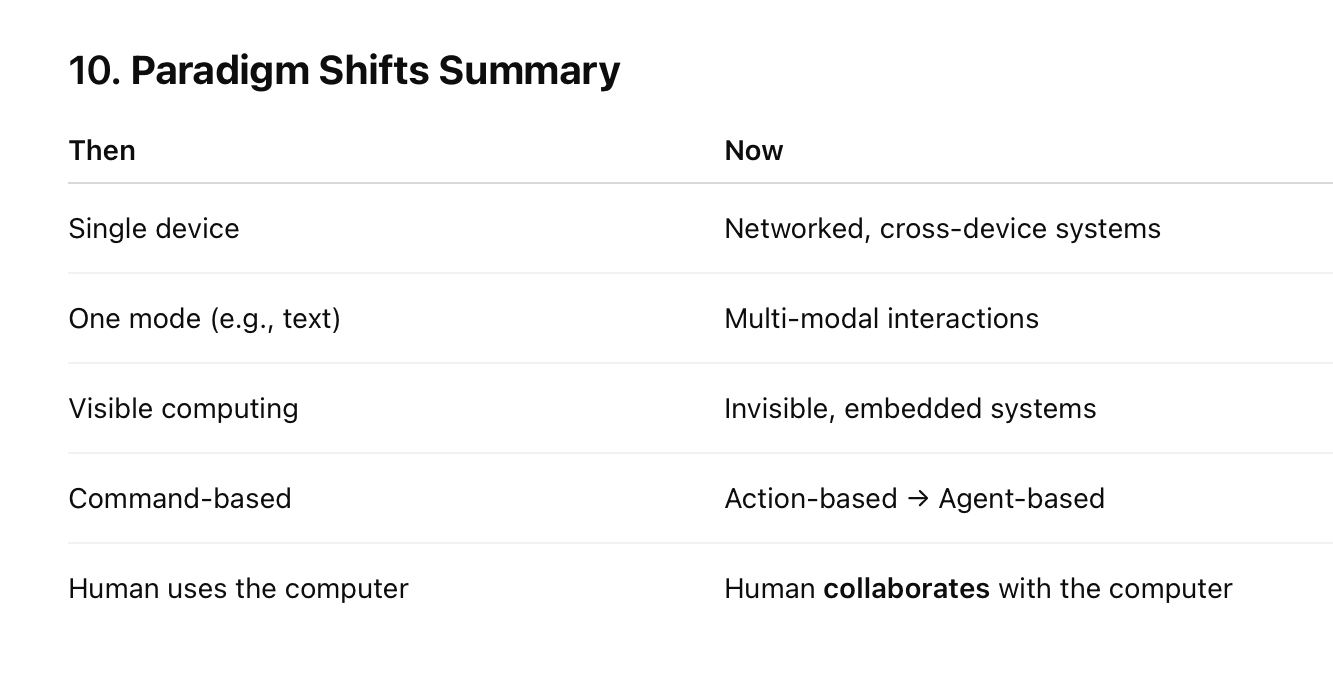
Ubiquitous Computing and the 3 main points
Tech becomes invisible and embedded in everyday life → emphasizes context-awareness and seamless integration.
think of computers as an integral part of our lives or an extension of us
3 main:
Transparency (explain system behavior)
balance btw user control and automation
accountability(logs, undo options)
Agent - Based Computing
Computers act on behalf of the user with intelligence.
Example: AI assistants.
Shift from command-based → action-based → agent-based.
ethical considerations
think of computers as an intelligent & proactive avatar
Paradigm shift
Analytical Evaluation
No users involved, experts predict issues —> He, cognitive walkthroughs, fits law
Heuristic evaluation - steps/pros/cons
HE is part of the Discount Usability:
- Simplify usability testing – fewer participants, focus on qualitative measurements, use of think-aloud
- Narrowed-down prototypes – simple prototypes that support a few single paths through the UI
Heuristic evaluation – evaluate UIs by inspecting them against established usability guidelines
3 steps of Heuristic Evaluation:
3-5 evaluators inspect the UI individually
Each identifies violations(sometimes adherence) to the heuristics
Communicate and aggregate findings , suggest improvements
Pros:
- Fast, simple, low-cost
- No users needed
- Leverages expert knowledge
Cons:
- Biased by evaluator knowledge
- Doesn’t provide quantitative data
- Only catches issues related to listed heuristics
Nielsen’s 10 heuristics
Visibility of system status: keep users informed about what is going on in the system → feedback within reasonable time
Match btw system and real world: speak user’s language → follow real-world conventions for showing information(metaphors)
user control and freedom: “emergency exit” → undo/redo
consistency and standards: use the same wording, actions mean the same thing as frequently as possible —> same layout/commands
recognition rather than recall: minimize users memory load → history/auto-fill previously inputed info
error prevention: eliminate error-prone conditions → check with users using confirmation before committing
flexibility and efficiency of use: provide multiple ways of different efficiencies to do the same thing
aesthetic and minimal design: Keep content focus on the essential through good graphics/color
help users with errors: indicate errors in ways to help users recognize, diagnose and recover from errors
Help and documentation: provide users assistance at appropriate time → help page/getting started
GUI
is the dominant UI → popular because easy to manufacture(improve), compatible with many media formats and easy to learn/use when designed well
3 Visual Design Principles
(focus on placement of visual components)
Spacing → areas without content(negative space) → helps focus attention, reduce
- Macro white space: space between major layout elements
- Micro white space: space within content elements
Grouping based on law of proximity → Elements that are close together are perceived as related → proper grouping helps scanning, understanding and error prevention
3. 3. Simplicity → avoid visual clutter, focus on what's necessary
- Hide infrequent options
- Use good defaults
4 C.R.A.P Principles
(guide how visual elements are presented)
- Contrast → communicate differences/importance
- Repetition → repeat conventions through to tie elements together → consistency in ways
of presenting information
- Alignment → visually associate related elements by lining them up → sense of unity
- Proximity → group related elements, separated unrelated elements → sense of
organization
7 Gestalt Principles (Visual perception)
Build on the theory: an organized whole is perceived as a greater than the sum of its parts
People are attuned to look for or follow these when these are presented
Proximity - groups closer together
Common Region - same closed region
Similarity - share same characteristics
Closure - prefer closed shapes
Symmetry - arranged symmetrically
Continuation
Common Fate - same direction
UX Laws
Reminders instead of must haves
- Hick’s Law – the time it takes to make a decision increases with the number & complexity of choices → minimize number of choices, or break them down into smaller/simpler steps
- Jakob’s Law – users spend most of their time on other sites → make your interface work the same way as the others
- Miller’s Law – the average person can only keep 7 (+/- 2) items in their working memory → organize content into smaller chunks (but don’t fixate on the number...varier per individual & context)
- Fitts’ Law – the time to acquire a target is a function of the distance & size of the target → design selectable targets in ways that can reduce execution time (many applications with this law, more later)
Prototype, Fidelity, Storyboard
Prototype: the original/model on which something is based/formed →
mock-up/simulation/demo-piece
Fidelity: amount of functionality, details and performance relative to the final product
Storyboards(form of sketches) for HCC: use sequence of frames as a snapshot to illustrate interplay btw user and UI
Structure:
- Critical events: goal and key moments
- Key components: actions/objects/people
- Summarize
Usability Testing
evaluation with end-users done in a lab → on conceptual models, early prototypes but more often on closer to completion ones(mid to high fidelity prototypes)
- Identity problems in the design
- Uncover opportunities to improve
- Learn about user → how they do things → closer to their expectations
- About 5 participants for most cases (qualitative measurements)
Issues about Usability Testing
- Reliability and validity
- Availability of representative users
- Ethics
Forms of measurement
- Qualitative (subjective, Exploratory):
- in early stages of development → data gathered by observation and interviews → quotes stories
- Techniques to collect:
- Think-aloud
- Note-taking
- After task → open-end questions
- Analyzing Collected Data
- Thematic analysis: themes/patterns of meaning with data
- Affinity diagramming: group related data together to form clusters of
similar meaning
- Reporting evaluation results
- Thematic analysis: themes/patterns → sections, paragraphs
- Affinity diagramming: summarizing titles → sections, paragraphs
- Quantitative (Objective, Measurable):
- In later stages → data gathered by logging and questionnaires → tables/charts
- Techniques to collect:
- Metrics measurements (completion time, error rates)measure in smallest unit
- Logging
- After task → Questionnaires → start with demographic eg age,experience
- Analyzing Collected Data
- Descriptive statistics: summarize and describe main features of the data (mean, median)
- Statistical analysis: use statistical models to extract relationships (before vs after)
- Reporting evaluation results
- Descriptive statistics:charts and graphs along with descriptions of
trends
- Statistical analysis: inference of relationship supported by statistical
tools
User Centered design
Involve users as much as possible in the design process → goals, tasks, constraints and emotions, feedback used to guide decisions and iterate designs
Main UCD steps
Context & Users
Context: the situation or environment that influence decisions
- When/where: time, geo and physical location
- Who: role, who needs to be notified/affected/involved
- What: regulations, policies, dependency
- How: protocols, standards, norms, challenges
- Together ^ impose Constraints and implications
Users: the people who carry out tasks & make decisions
- Demographics → describe the type of the users
- Characteristics: gender, age, group. Education background, capabilities - Insight into their approach or attitude towards an interface →
novice/expert
- System use: novice/expert/casual/frequent
- Hopes & fears → describe the mental/emotional state the user is in affecting their judgement
2 kinds of requirements
- Functional requirements: what the design/product will do
- Non-Functional requirements: the characteristics(sometimes called constraints)
Ways to gather requirements
allows to understand the context and users
- Typical interview
- Probes: prompt users into action by interacting with a provided artifact
- Contextual Inquiry: 1 to 1 on site interview → researchers learning from those theyinterview → put into the scenario/context and learn how it operates
- Brainstorming → use storyboarding or SWOT(Strength, Weaknesses, Opportunities,Threads) Analysis
Medium Fidelity Prototyping
closer to actual material/platform —> use Sigma
- Narrow down to a few design ideas,show fine-tuned UI components
- - use realistic sample data
- Simulate actual interactions → showcasing flows and interactions