Type Ch 13, 15& 16 & Proofreaders' Marks + Fonts
 Call Kai
 Learn
Learn Practice Test
 Spaced Repetition
 Match
Match Flashcards
1/210

There's no tags or description
Looks like no tags are added yet.
Name | Mastery | Learn | Test | Matching | Spaced | Call with Kai | Chat |
|---|

211 Terms
When Setting a Divider Head in Type
1. Space above, NOT below the head. 2. No Paragraph indent after 3. Write to fit on one line.
How are titles set?
In italic.
When be aware of rivers?
In Justified copy.
Justified copy
Copy that's flush on left and right.
Rivers
Large word spaces aligning vertically in text.
Why are Rivers in Justified copy?
Space from end of each line are spread over word spaces.
Why do readers re-read the same line?
The leading is too tight.
Four options for aligning type
Flush left, Flush right, Centered, or Justified.
Easiest alignment of type to read
Flush left.
Flush Left type
Easiest to read; we're accustomed to it, line beginning is consistent.
Tracking of text type
Global kerning of text type.
Leading between lines
Allows reader to get to left margin to start next line.
Get to know a few fonts well
When you know a few fonts, you learn to use them well.
Running Headers
Small type at top of each page; left page has title of book, right has chapter name.
Running Footers
Small type at the bottom of each page; often hold Folio and Dateline.
Dateline
Type with name of publication, month and year.
Folio
Page number.
Typographic Hierarchy
Order in which we see and read the type on the page.
Standfirst
Fiirst line or two is set larger than the text type.
Initial Cap
First character is enlarged for emphasis.
Pull Quote
Line from article is repeated large to attract reader.
Subhead or Deck
Type that's smaller than the Headline.
Headline
Largest, main type to be read first
Limiting the fonts in a publication?
Use a Serif and a Sans Serif family.
Dingbats and Flourishes?
Small ornate typographic elements to add decoration.
Runovers after Bullets should be set
Flush with type next to the Bullet.
Use Bullets
Items that don't need to be numbered.
Callouts
Bold terms followed by a definition.
When setting a form that needs to be filled in?
At least 20 points of leading to allow room for writing.
Divider Heads
One-line heads within text to break it into sections.
Caption
Copy that describe the photo.
Photo Credit
Name of the photographer or illustrator.
Author Byline
Name of author who wrote the article.
Credit
4-6 point all caps sans serif
Credit Line
Name of illustrator or photographer
Sidebars
Information related to main article, goes at side or bottom.
Head Space
Margin at the top of page.
Foot Space
Margin at the bottom of page.
Thumb Space
Outer margins where we hold a book.
Gutter
Central margin where pages are bound.
Alley
Space between columns of type.
Facing Pages
Two pages with mirror image margins; with a thin gutter create a unified spread.
Non-Facing Pages
Two pages whose margins are the same regardless of which side of the spread they are on; DO NOT create a unified spread
Contrast of Style
Roman vs. Italic
Contrast of Weight
Light vs. Bold
Contrast of Structure
Serif vs. Sans Serif
Contrast of Case
Uppercase vs. Lowercase
Contrast of Width
Condensed vs. Extended
Mix & Match
Serif and a Sans Serif Family of fonts in a publication.
Reverse a Character
Reverse a character out of a shape.
Add to a Character
Add a visual element to a character like horns, leaves, etc
Replace a Character
Replace letter with a hand or a standing figure.
Image Overlap
Allow an image to overlap the type.
Vary Leading
Arrange lines to show movement or speeding of time.
Vary Format Shape
Design using a circle or diamond instead of a rectangle.
Using Rules & Dingbats
Small flourishes added to add ornamentation.
Vary Type Sizes
Use dramatic scale differences.
Break from Perpendicular
Allow the alley between columns of type to be serpentine
Using White Space
Allow space to take up a significant part of the layout.
Textured Type
Fill type with a texture of water or stones or stars.
Active Type
Type on a path that appears to move
Expressive Type
Type looks appropriately rough, aged or textured.
Integrate Image into Type
Allow part of the image to overlap the type.
Large Letterform as Image
One large letter as the dominant design.
Abstracted Letterforms
Use hand lettering or computer to change the look of letters.
Fill in a Counter
Use an image to fill the counter of a letter.
Hand lettered Type
Can fit any shape or space; customized to the layout.
Untraditional Layout Shape
Try a layout in a fan shape, or an umbrella shape.
Vary Alignment
Run text on a path or an angle, break from the expected.
Hand Rendered Type
Handcrafted, gives vintage feel.
Type as Illustration
Mix unusual fonts, use unexpected font for one word or letter.
Interpretive Type
Type SHOWS what it is saying by getting larger or smaller or bolder, or drippy.
Drop Shadow Fonts
Only drop shadow thicker typefaces
Engraved Type
Fill engraved type to distinguish it from the background.
Outline Type
Fill outline type with a color to separate from background.
Americana
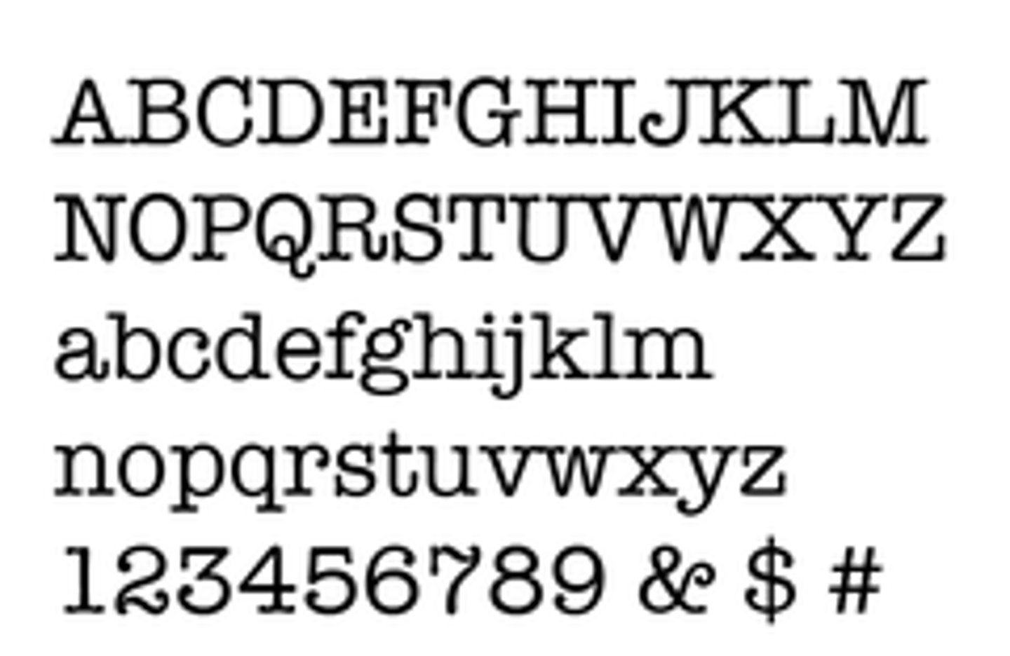
American Typewriter
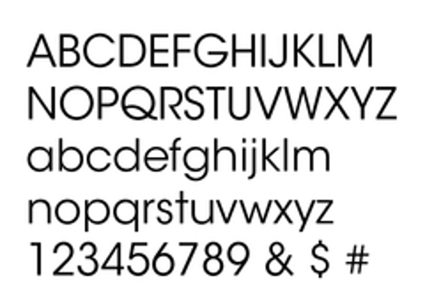
Avant Garde
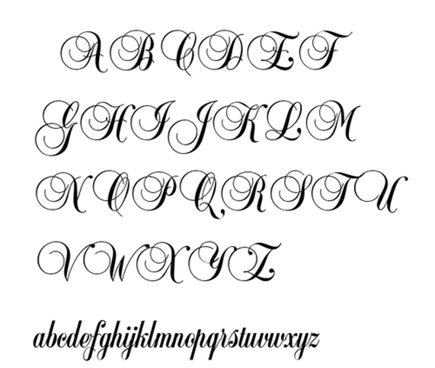
Balmoral
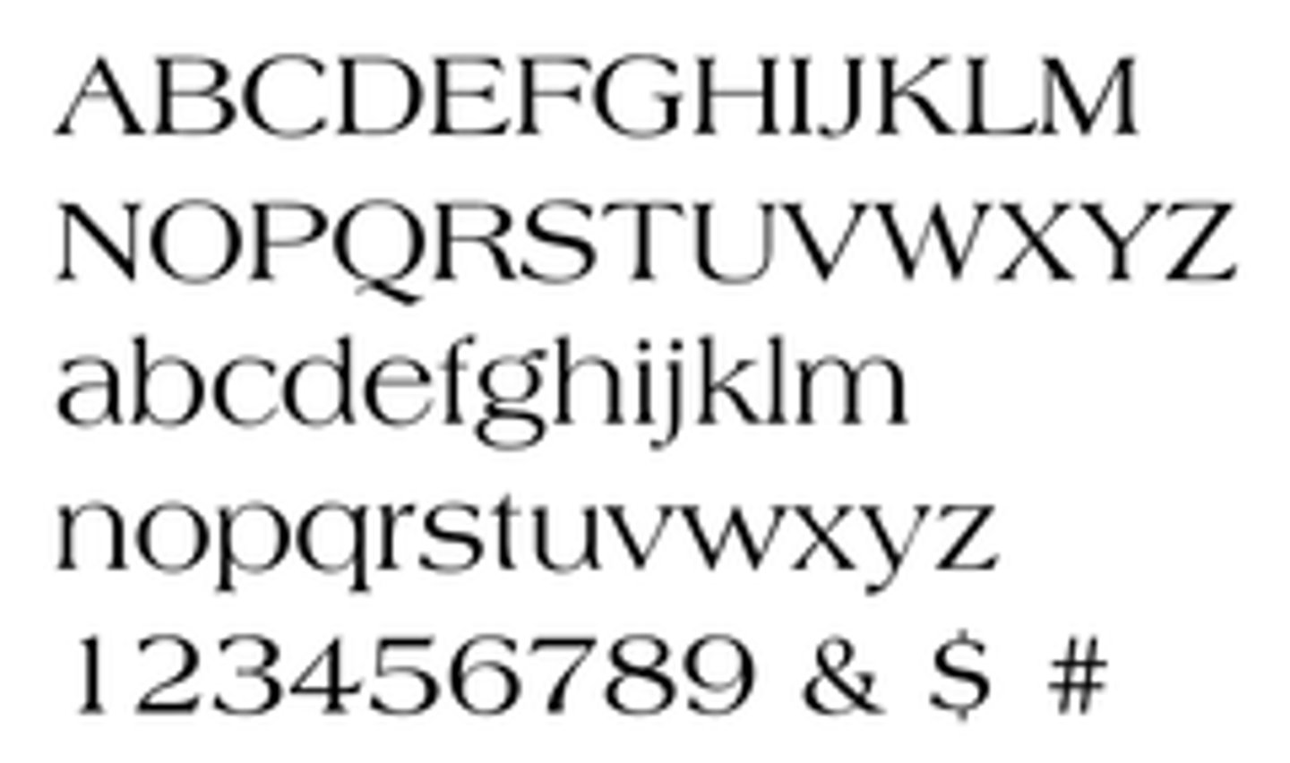
Baskerville
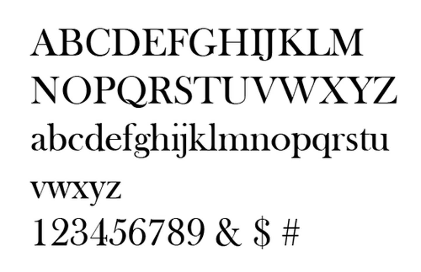
Belwe
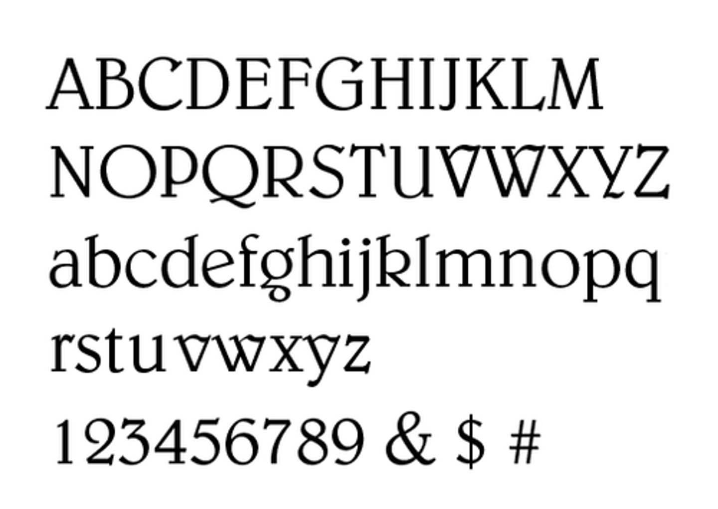
Benguiat
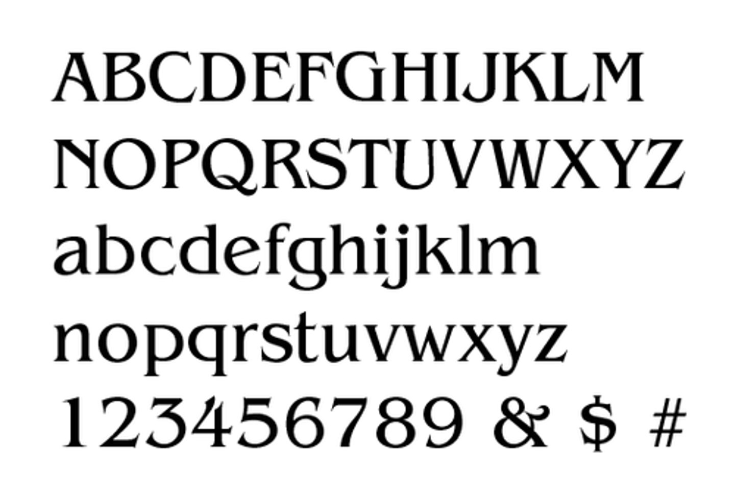
Bellevue
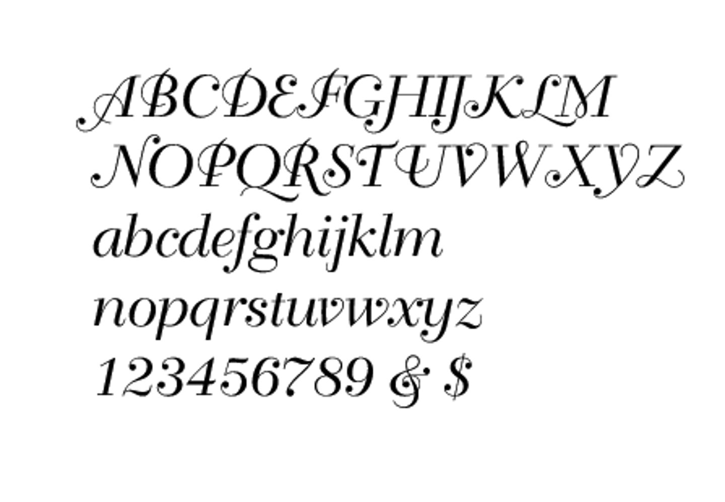
Berkeley
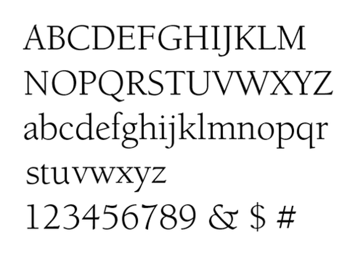
Bernhard Modern
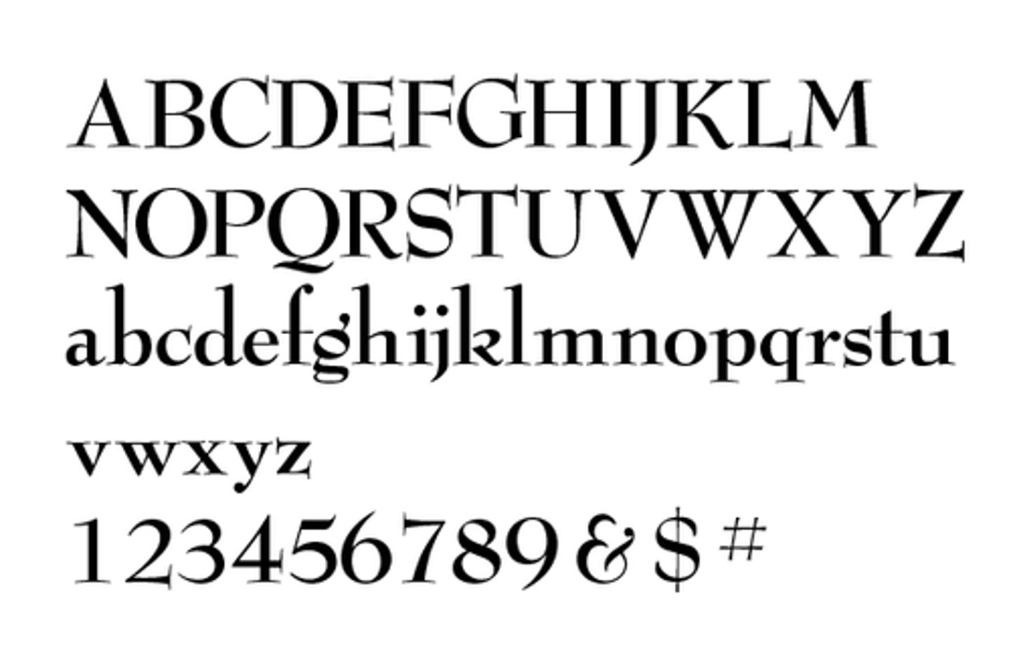
Berthold
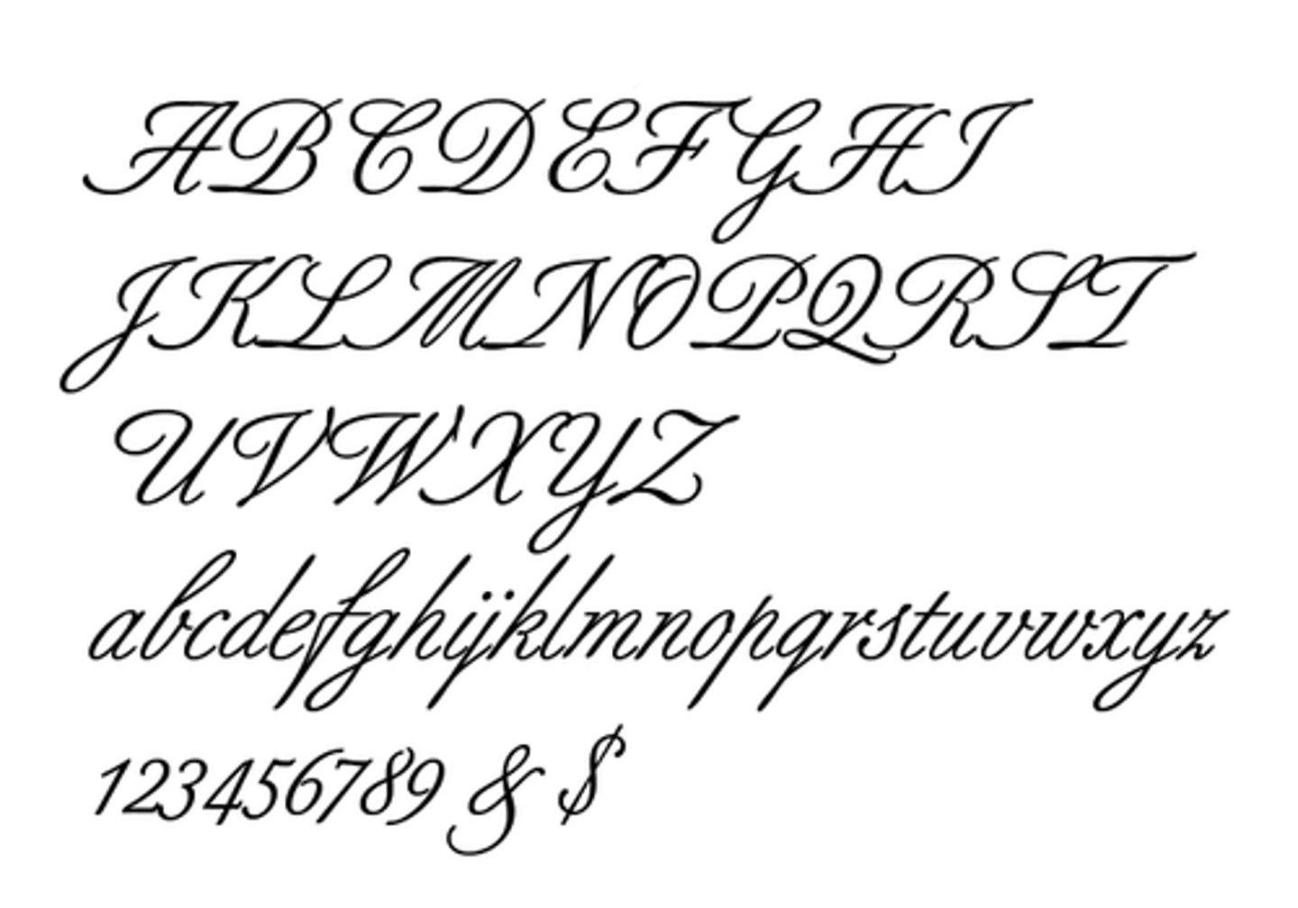
Bodoni
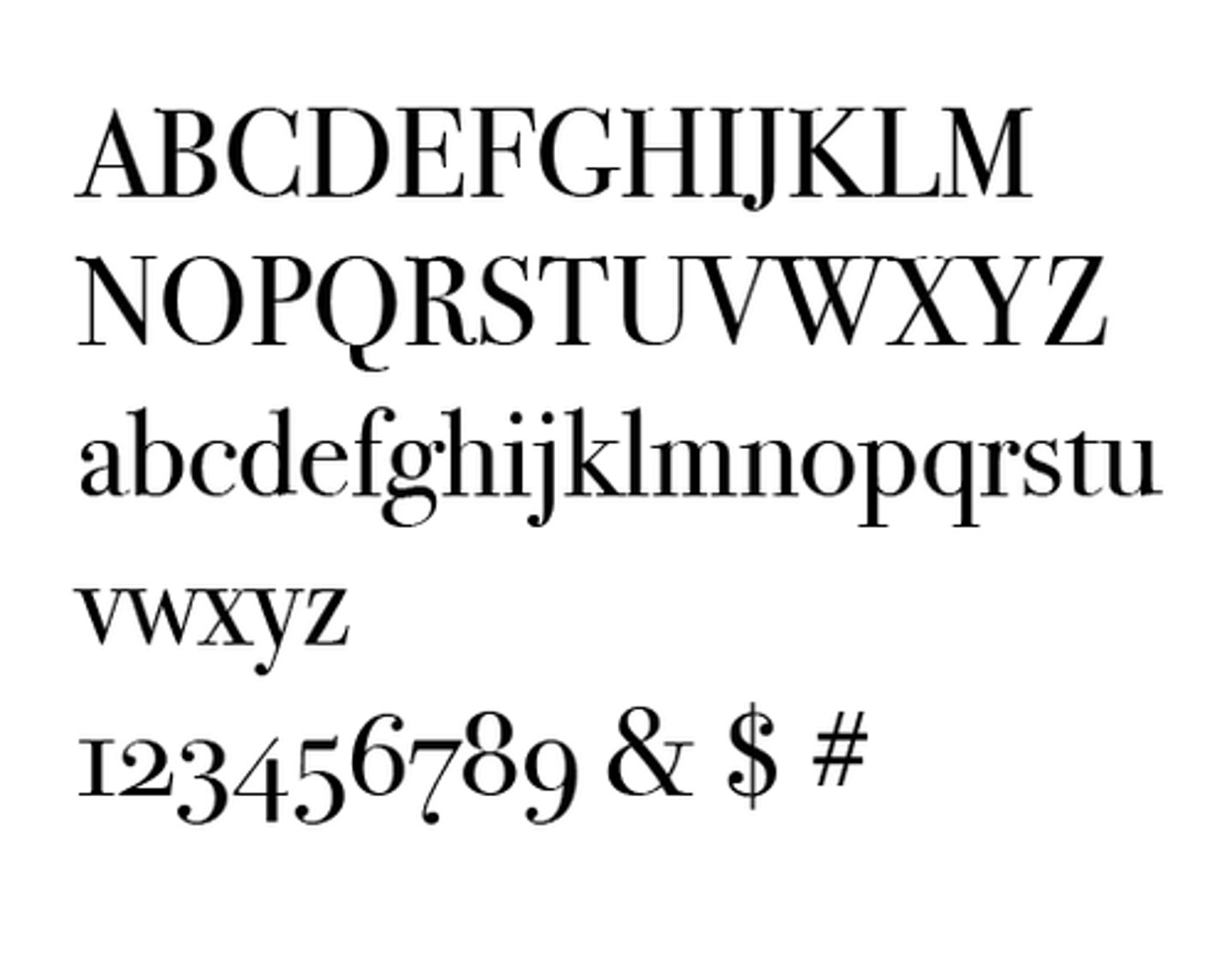
Bookman
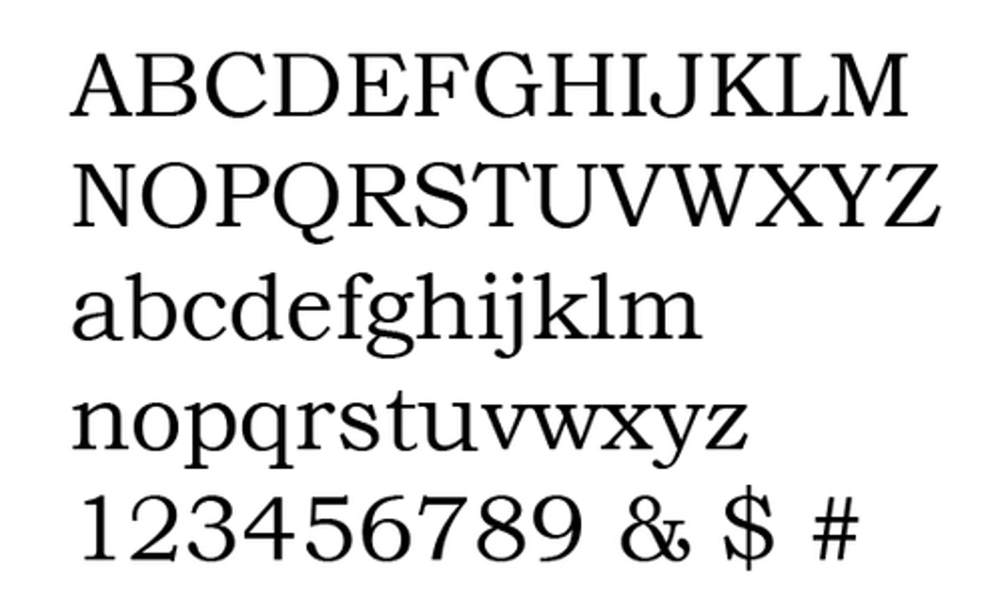
Caslon 540
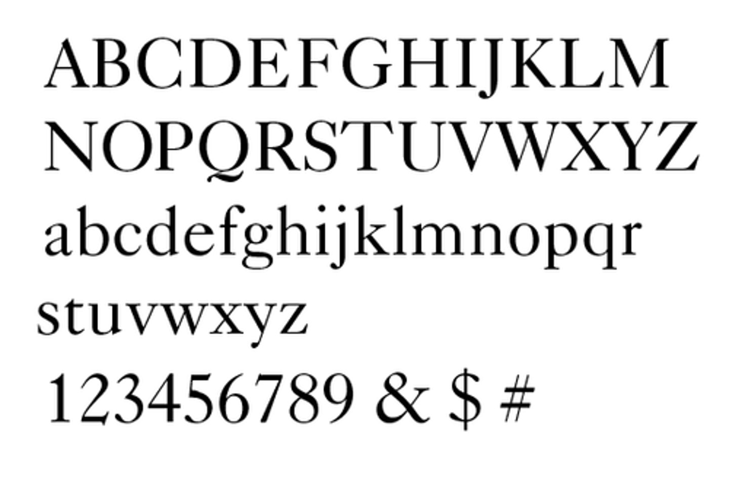
Centennial
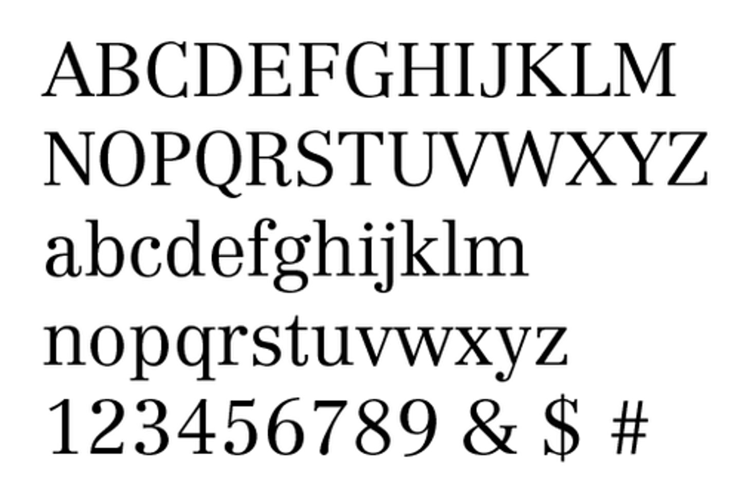
Legibility
Design of the typeface, the length of ascenders and descenders, terminals, the x-height, etc.
Readability
Point size, leading, line length, font, font color, etc
Readability
Determined by the layout designer
Denotation
Definition of the font, the technical details, x-height, stroke width, bracketing, serifs, character shape, etc.
Connotation
Associations we have of the font based on the way it looks
Resonance
Cultural associations and historic references based on where when you're born.
Legibility
Determined by typeface designer
Line Length
The longer the line length, the wider the leading needs to be.
Which affects readability more, Increased leading or increased point size?
Increased Leading.
How are titles of full works such as books, scripts, names of newspapers set in text?
In italic