Chapter 2: Frequency distributions
1/21
There's no tags or description
Looks like no tags are added yet.
Name | Mastery | Learn | Test | Matching | Spaced |
|---|
No study sessions yet.
22 Terms
what is a Raw score?
is a data point that has not yet been transformed or analyzed
what is the frequency distribution?
-In stats we organize raw scores into frequency distributions: which describe a set of numbers by displaying a count or proportion for each possible value of a variable
what are the 3 different ways to organize information about a single variable or raw scores???
-Frequency tables: Is a visual depiction of data that shows how often each value occurred, that is how many scores were at each value (see lecture notes on how to create one lecture 2)
A frequency table is the best way to create an easy-to-understand distribution of data
-Grouped frequency tables: A visual depiction of data that reports frequencies within a given interval rather than frequencies for a specific value, which makes sense when data covers a huge range
-Histograms +
what is an outlier?
A value in a data set that is much less or much greater than the rest of the data. An outlier is 1.5 times the interquartile range less than the lower quartile or greater than the upper quartile.
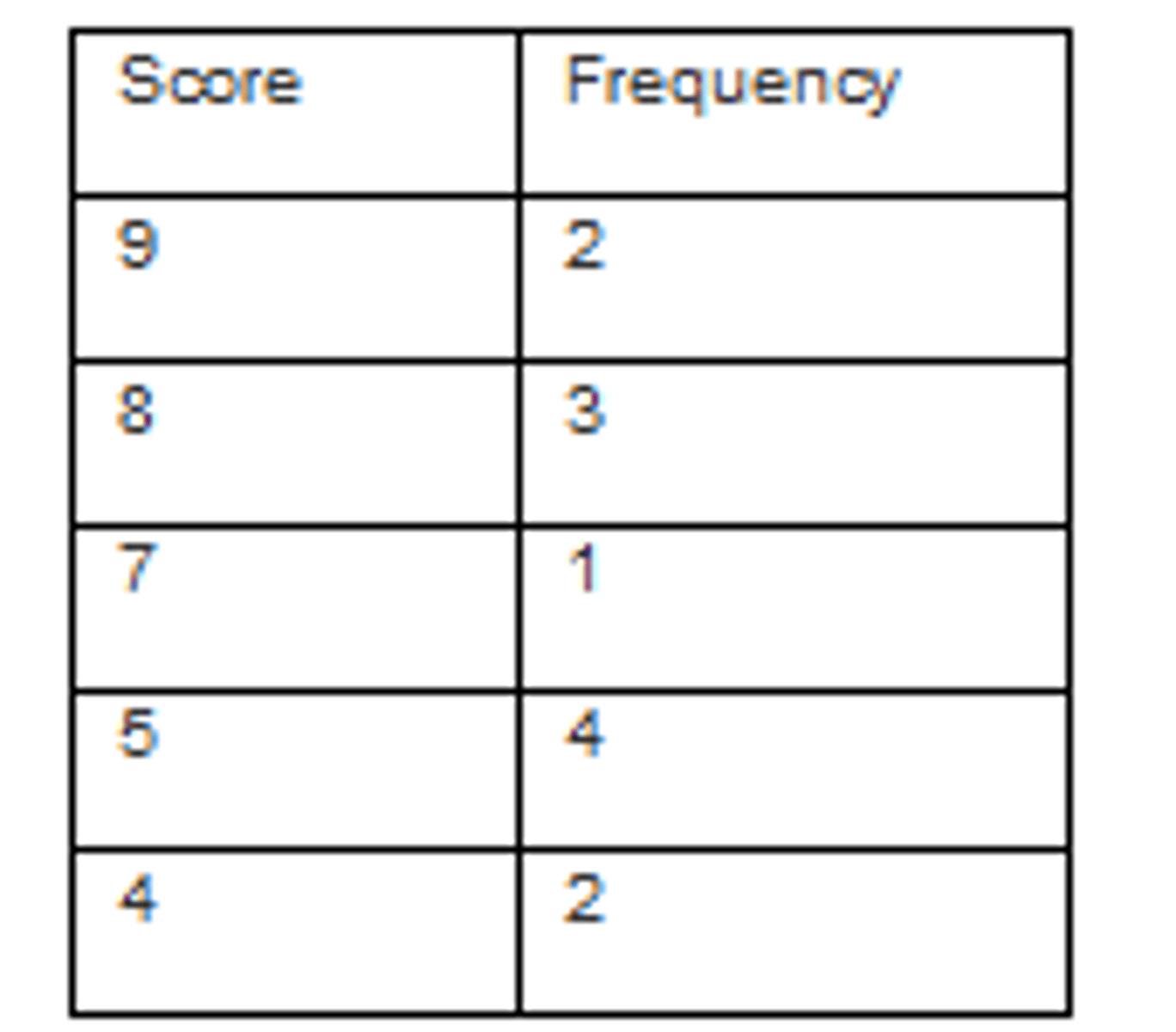
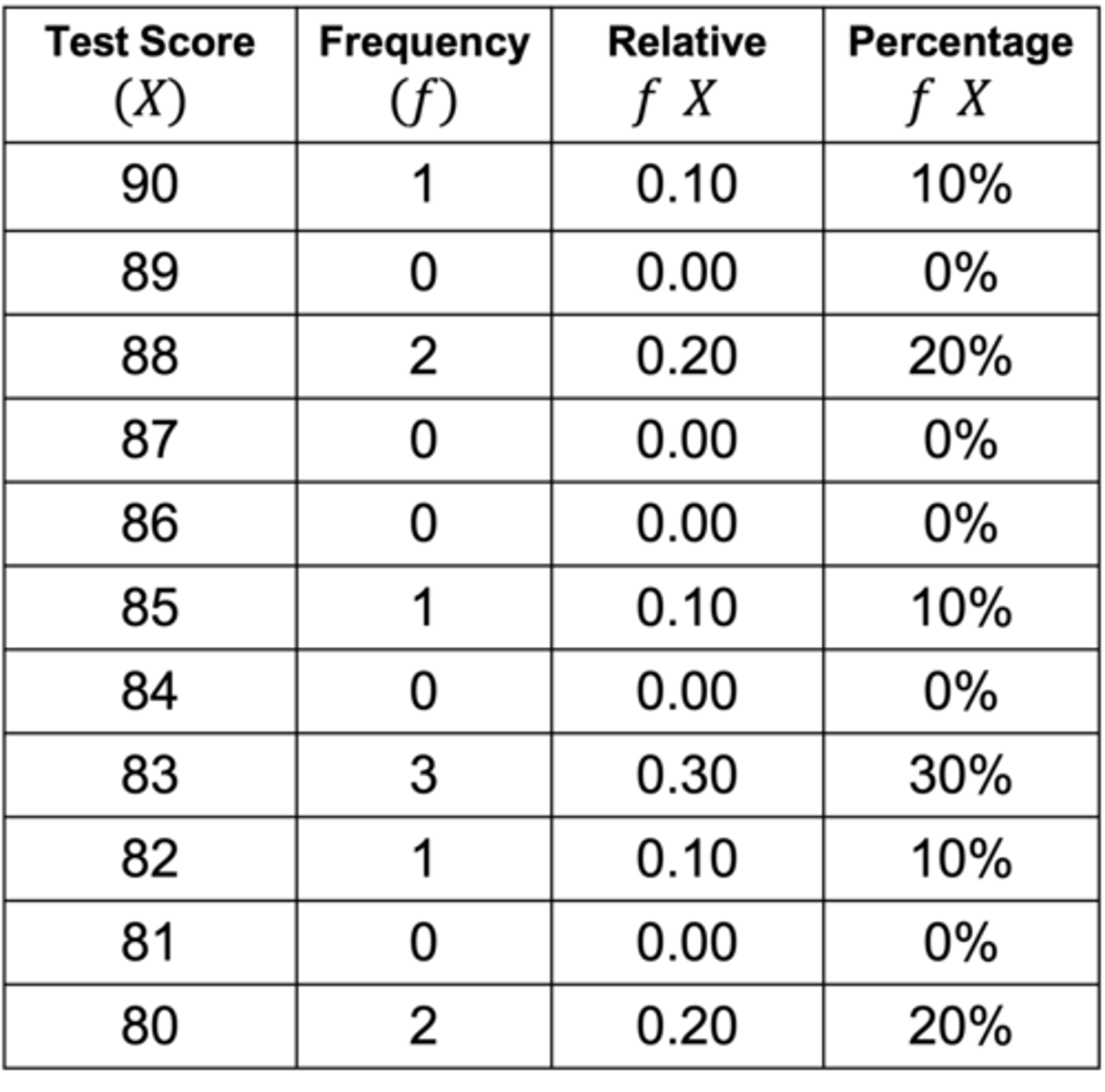
How to create a frequency table
ex: 10 students wrote a test: their scores were: 80,83,90,82,80,83,85,83,88
1)determine the highest and lowest score
highest 90, lowest 80
2)create two columns: label the first with the variable name and the other with frequency
3)list the full range of values that encompass all the scores in the data from highest to lowest
4)count the number of scores at each values, and write those numbers in the frequency column
5)add a column for each relative frequency or percentage frequency (relativef (x)=f(x)/N, and you can multiply the 100 for percentage
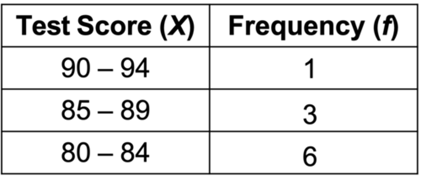
what is a grouped frequency table?
a visual depiction of data that reports frequencies within a given interval rather than the frequencies for a specific value
-makes sense when covering a huge range
Creating a Grouped Frequency Table
ex: 10 students wrote a test: their scores were: 80,83,90,82,80,83,85,83,88
1) find the highest and lowest scores of the frequency distribution highest 90, lowest 80
2) get the full range of data: Range = Xhighest - X lowest +1
(90-80)+1 = 11
3) determine the # of intervals and the best interval size
interval size v=5
number of intervals = (11/5)= 2.2 or 3 intervals
4a)figure out the number that will be the bottom of the interval
important must be a multiple of 5 i choose 80
4b)figure out the lower limit of the next interval: l(i)=l(i-1)+v
4c) determine the upper limits of each interval: each interval contains 5 numbers ex:80,81,82,83,84
5)finish the table by listing the intervals from highest to lowest and then counting the numbers of each
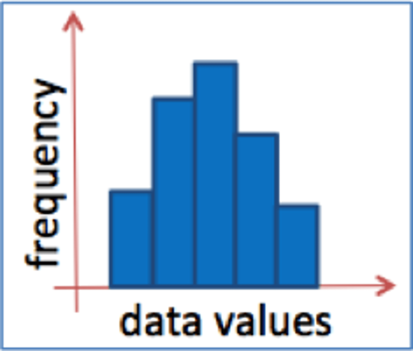
what are histograms?
-A graph that depicts frequency data for one variable, usually based on scale data, with the values of the variable on the x axis and the frequencies on the y axis
Values of the variable on the x axis (horizontal line)
Frequencies on the y axis (vertical line)
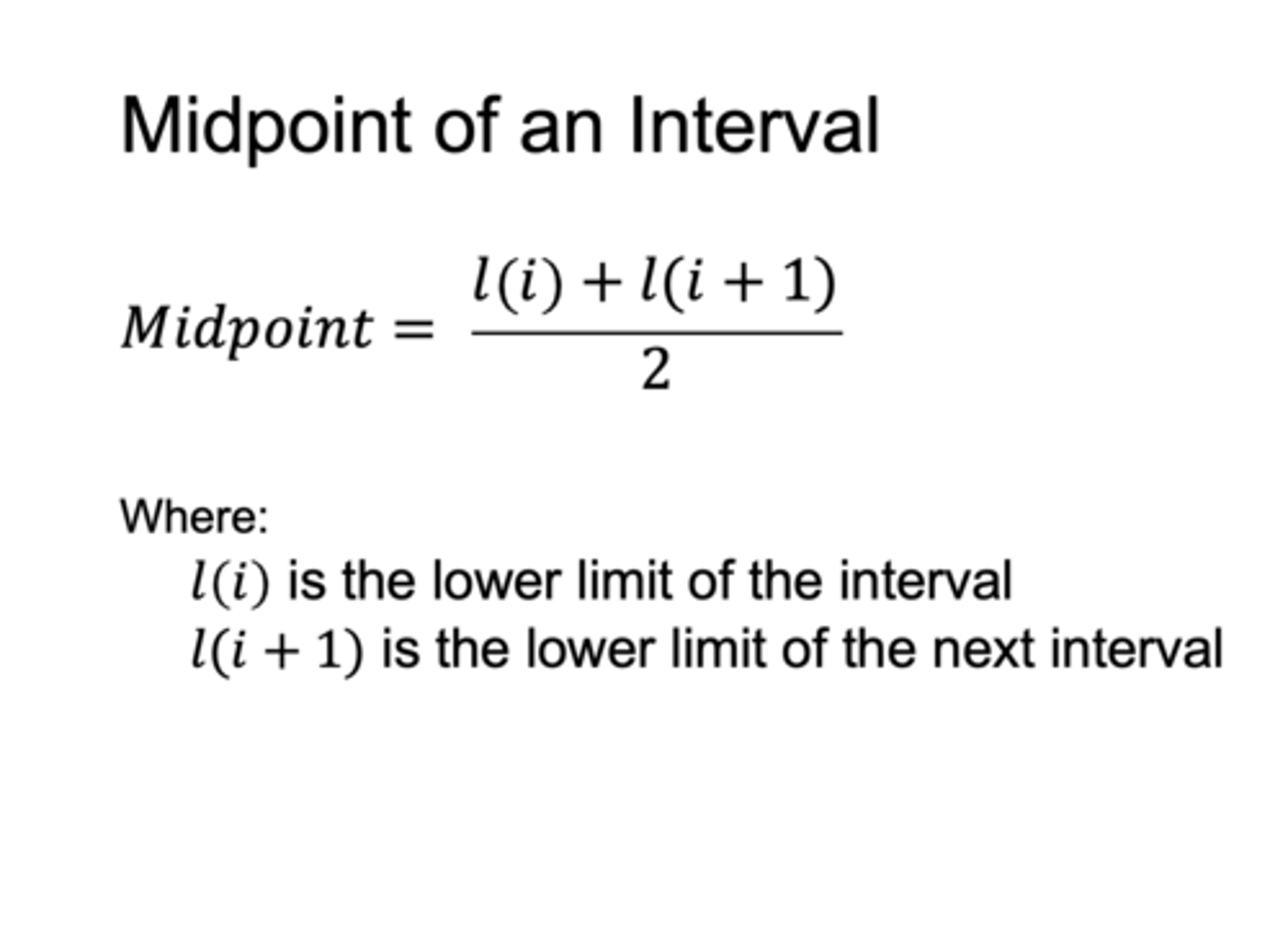
Midpoint of an interval formula
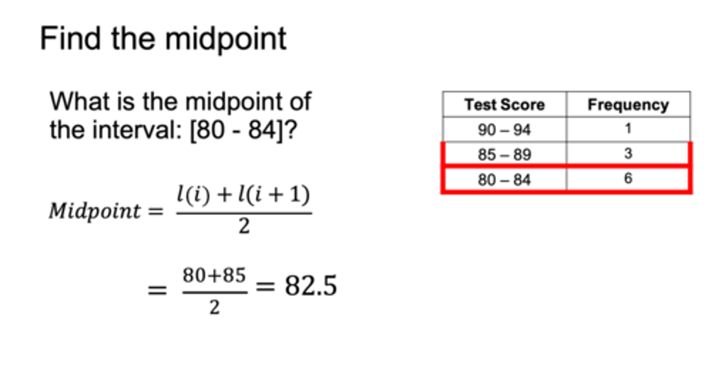
what is the midpoint of the interval 80-84?
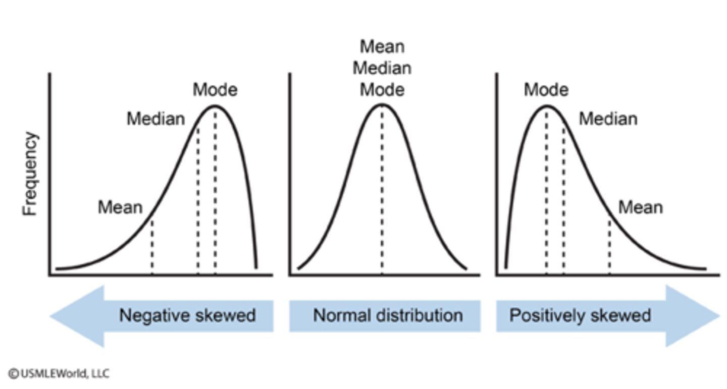
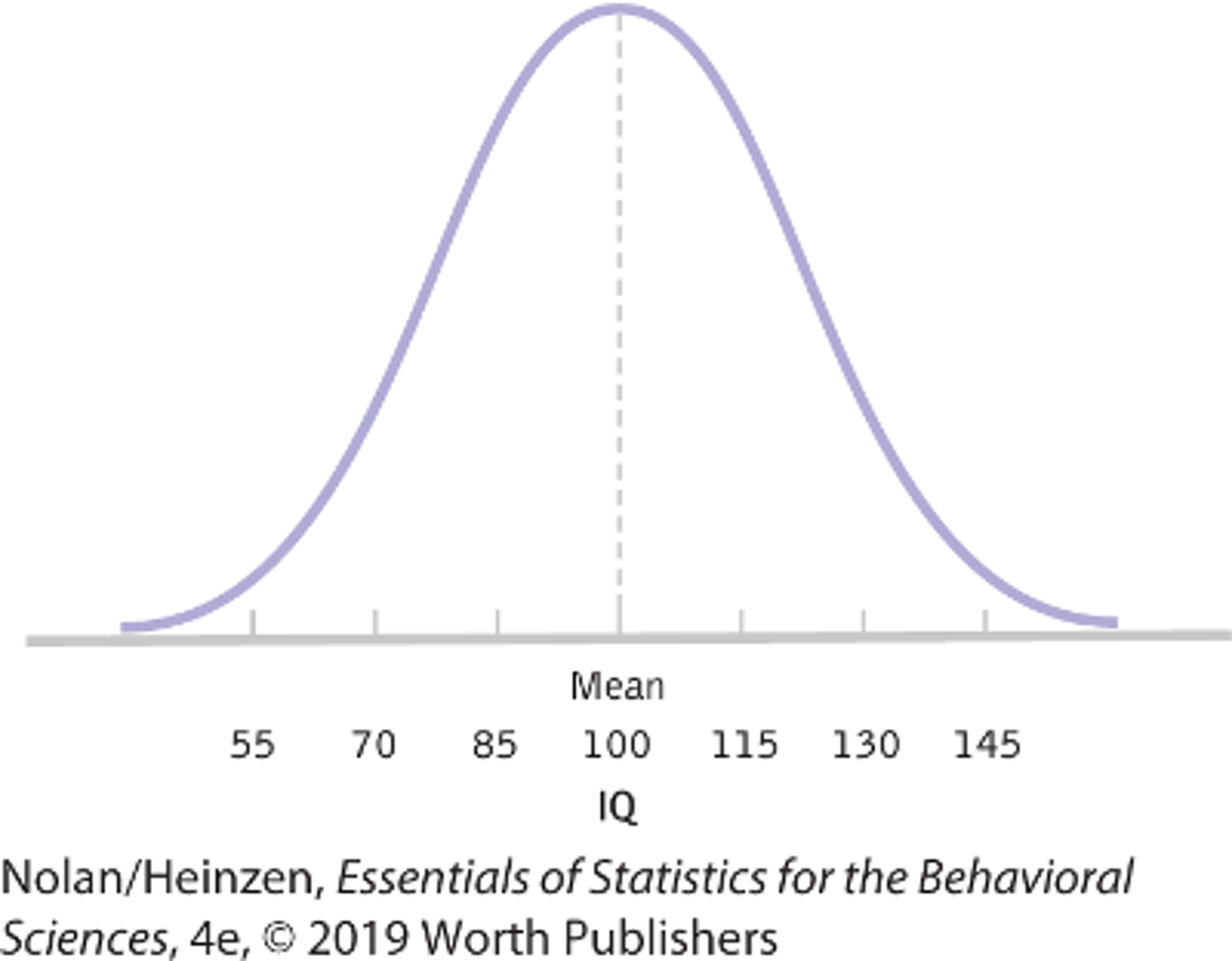
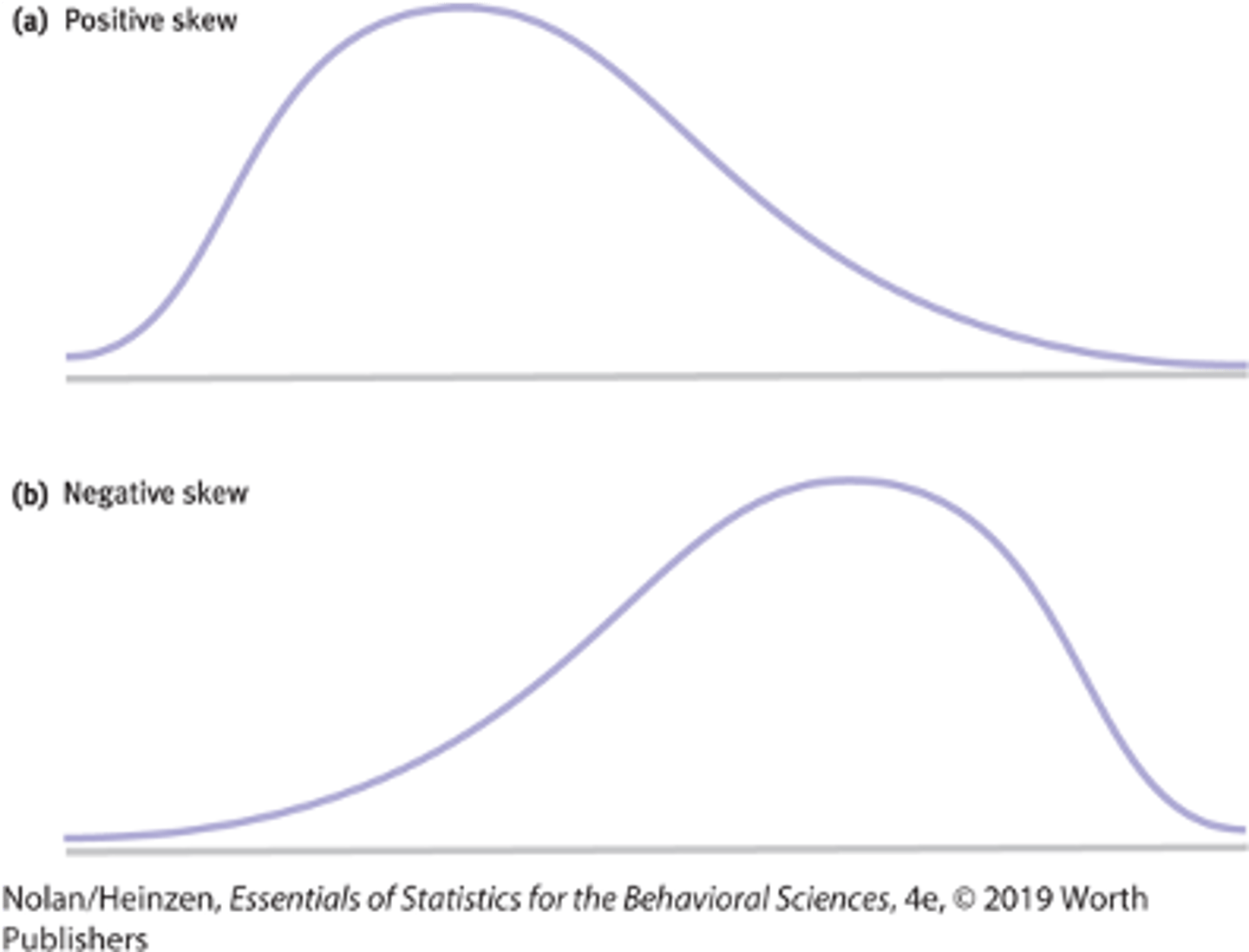
normal distribution (bell curve)
A specific frequency distribution that is a bell shaped symmetric, with a unimodal curve
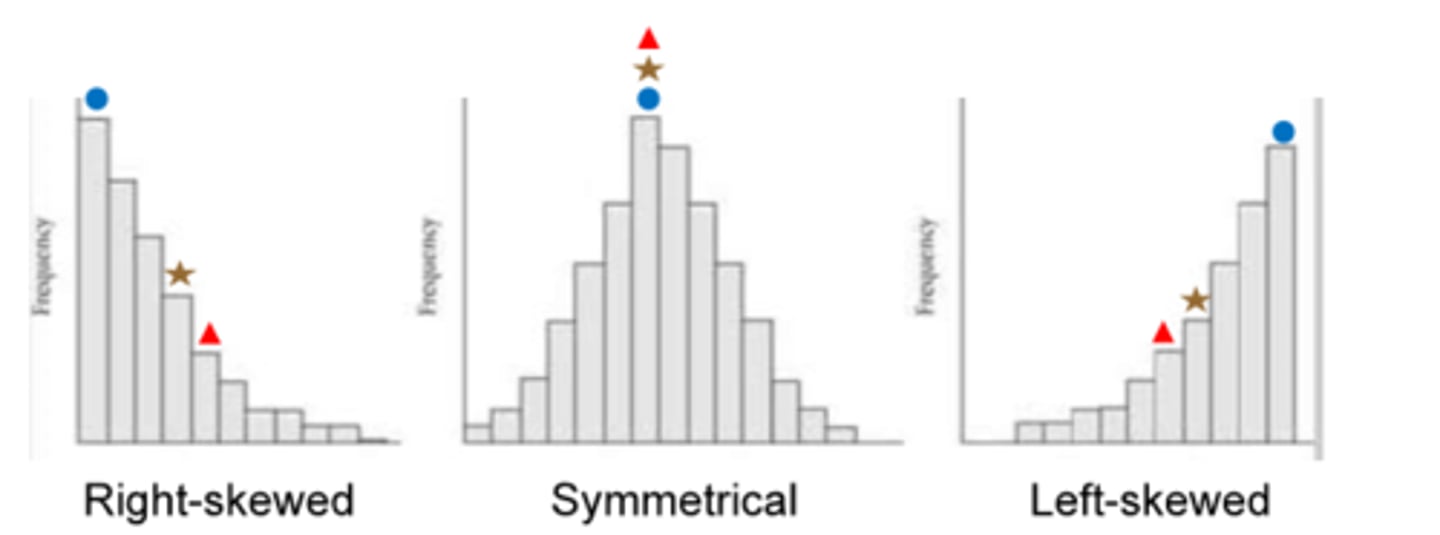
when data is not symmetrical, one of the tails of the distribution is pulled away from the centre, a positive skew is towards the?
a negative skew is towards the?
-tail to the right
-tails to the left
what is the difference between frequencies and grouped frequencies?
-a frequency is a count of how many times a score appears, a grouped frequency is a count for a defined interval or group of scores
when the bulk of data cluster together but the data tails off to the left the skew is?
when data tails off to the right the skew is?
-is a negative skew
-positive skew
Alzheimer's disease is typically diagnosed in adults older than the age of 70, cases diagnosed sooner are called early onset:
a)assuming that these early-onset cases represent unique tailing off of data on one side, would the skew be positive or negative?
b)does this data represent a ceiling effect or a floor effect?
a)early onset of Alzheimer's disease would create a negative skew in the distribution for age onset
b) represents a ceiling effect, because eventually all humans pass away
what is the difference between a histogram and a bar graph?
-bar graphs typically score for nominal data, and are not arranged in order where
-histograms provide frequencies for scale data and are arranged in order and are lowest to highest
what are the typical labels for the x -axis and the y-axis in a histogram?
a histogram looks like a bar graph but is usually to depict scale data, with the values(independent variable) or intervals of the variables on the x -axis (horizontal line)wheres the frequency (dependant variable) goes on the y-axis (vertical line)
what is floor effect ?and how does it affect a distribution?
-is a situation where a constraint prevents a variable from taking on values below a certain point,
-and when a distribution is positively skewed, the tail of the distribution extends to the right is usually a floor effect
What is the ceiling effect? and how does it affect a distribution?
-occurs when there are no scores above a certain point,
-the ceiling effect leads to a negatively skewed distribution because the upper part of the distribution is constrained
convert the following to percentages: 7 out of 39 and 122 out of 300?
a) 7/39=0.1794 x 100= 17.94%
b) 122/300=0.4066 x 100 = 40.66%
if you have data that range from 2 to 68 and you wanted seven intervals in a grouped frequency table, what would the intervals be?
1) find the range: x highest - x lowest + 1
68-2 + 1 = 67
2) divide the 67 by the 7 intervals desired
67/7= 9.57, round that up to 10
3)the seven intervals are: 0-9,10-19, 20-29,30,39,40-49,50-59,60-69
if the average person convicted of murder killed only one person, serial killers would create what kind of skew?
-serial killers would create a positive skew, adding high numbers of murders to the data that are clustered around 1