LESSON 2: GRAPHING QUALITATIVE VARIABLES
 Call Kai
 Learn
Learn Practice Test
 Spaced Repetition
 Match
Match Flashcards
 Knowt Play
1/9

There's no tags or description
Looks like no tags are added yet.
Name | Mastery | Learn | Test | Matching | Spaced | Call with Kai | Chat |
|---|
No analytics yet
Send a link to your students to track their progress
10 Terms
Graphing Qualitative Variables
- No pre-established ordering
- refers to using visual tools to present and describe categorical data that has no pre-established or numerical ordering.
RESEARCH DESIGN ISSUE: allowing participants in your research to give more than one answer to a question.
• Statistics in general do not handle multiple responses very well.
• The totals in a table exceed the number of participants in the research
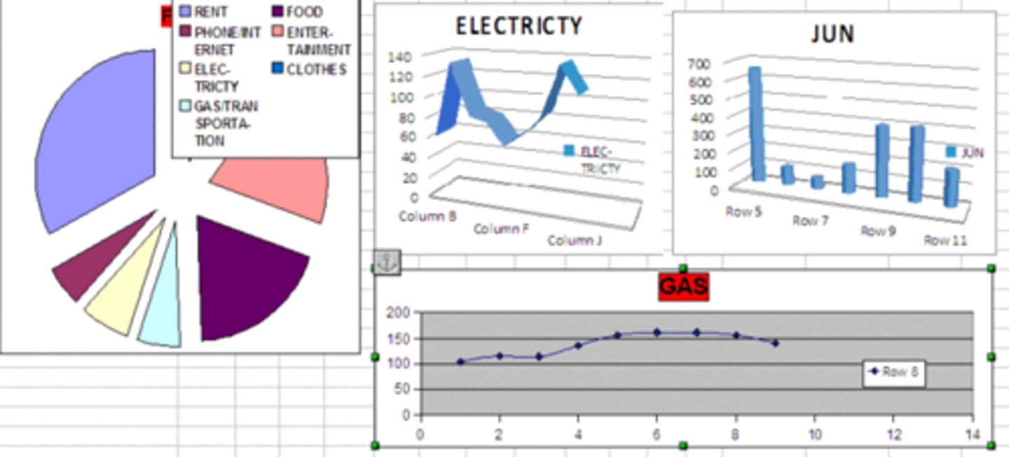
FREQUENCY TABLES
- shows the frequencies of the various response categories
- also shows the relative frequencies, which are the proportion of responses in each category
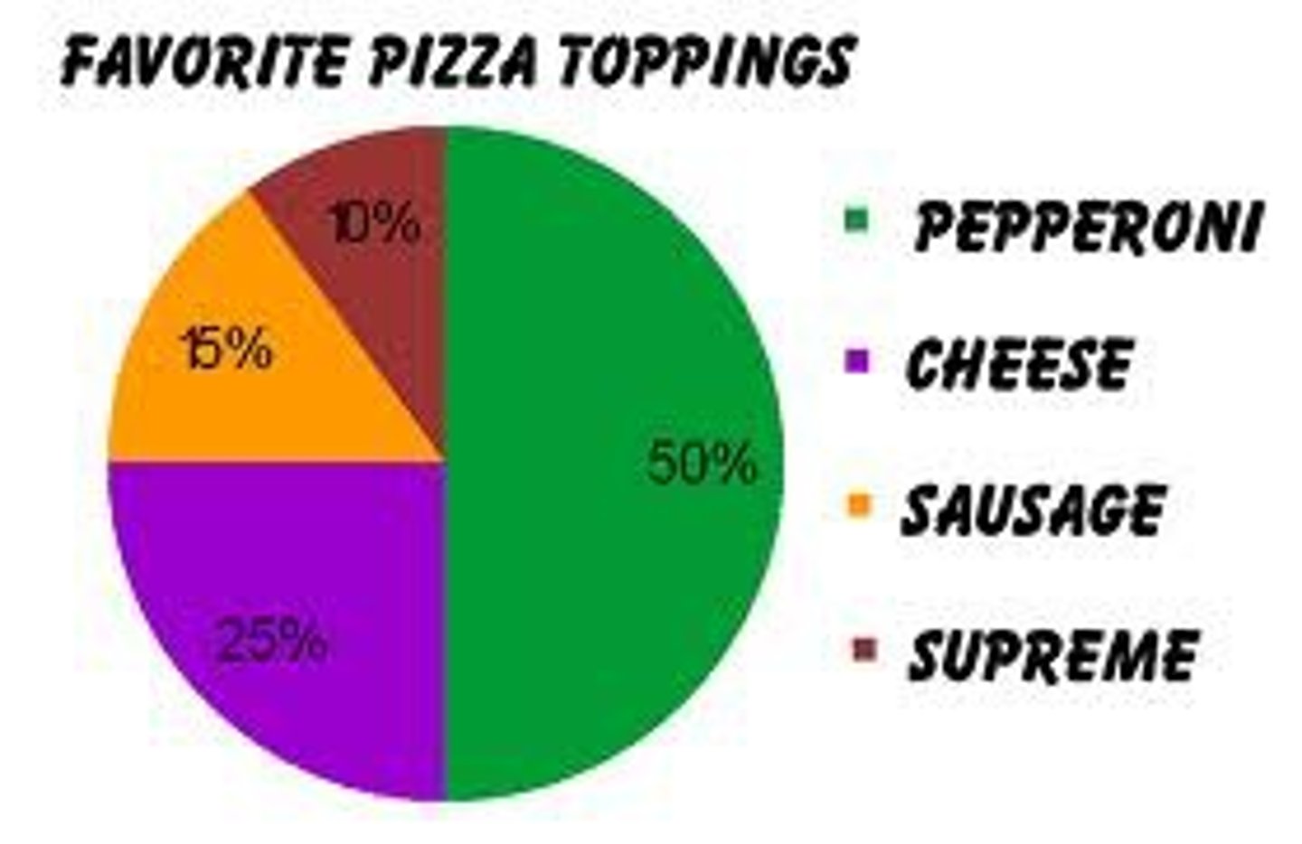
PIE CHARTS
• Each category is represented by a slice of the pie.
• The area of the slice is proportional to the percentage of responses in the category.
• simply the relative frequency multiplied by 100
• effective for displaying the relative frequencies of a small number of categories
DON'TS:
- Too many small slices are identified by different shading patterns, and the legend takes time to decode.
- Don't use it to compare the outcomes of two different surveys or experiments
- Don't label the ___ with percentages if they are based on a small number of percentages
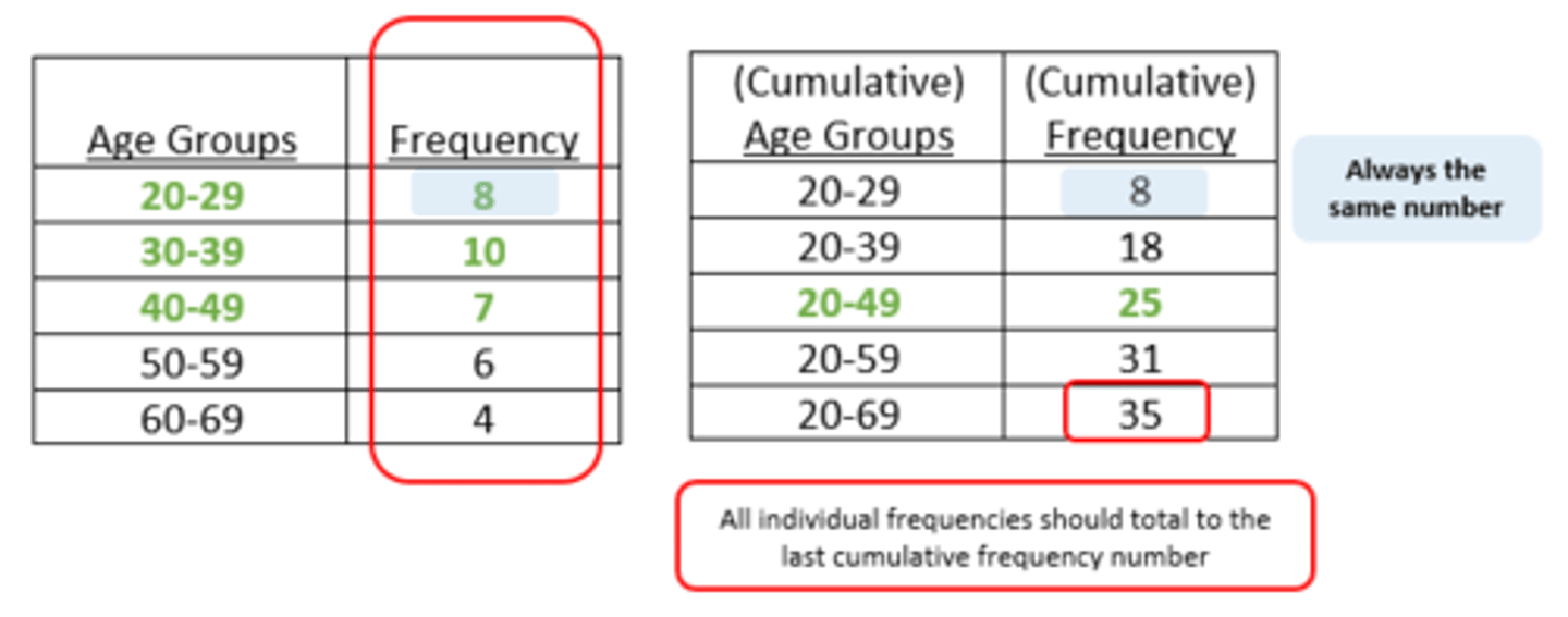
BAR CHARTS
- can also be used to represent frequencies of different categories
- have a standard space separating them--spaces indicate that the categories are not in a numerical order; they are frequencies of categories, not scores.
THINGS TO REMEMBER:
- The heights of the bars represent frequencies (number of cases)in a category. q Each bar should be clearly labeled as to the category it represents. - Too many bars make bar charts hard to follow.
- Avoid having many empty or near-empty categories, which represent very few cases.
- Nevertheless, if important categories have very few entries, then this needs recording.
- Make sure that the vertical axis (the heights of the bars) is clearly marked as being frequencies or percentage frequencies.
- The bars should be of equal width
- Don't set the baseline to a value other than zero!
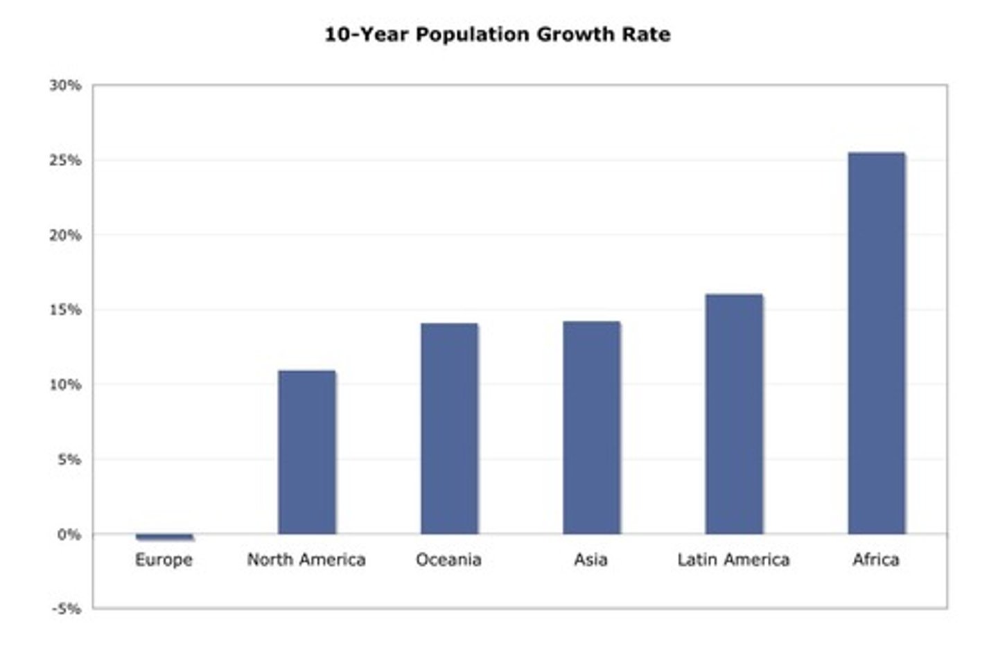
Y-axis
shows the number of observations in each category.
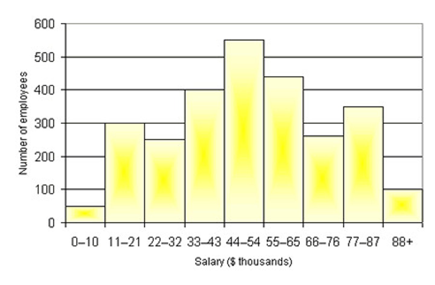
COMPARING DISTRIBUTIONS
To compare the results of different surveys, or of different conditions within the same overall survey
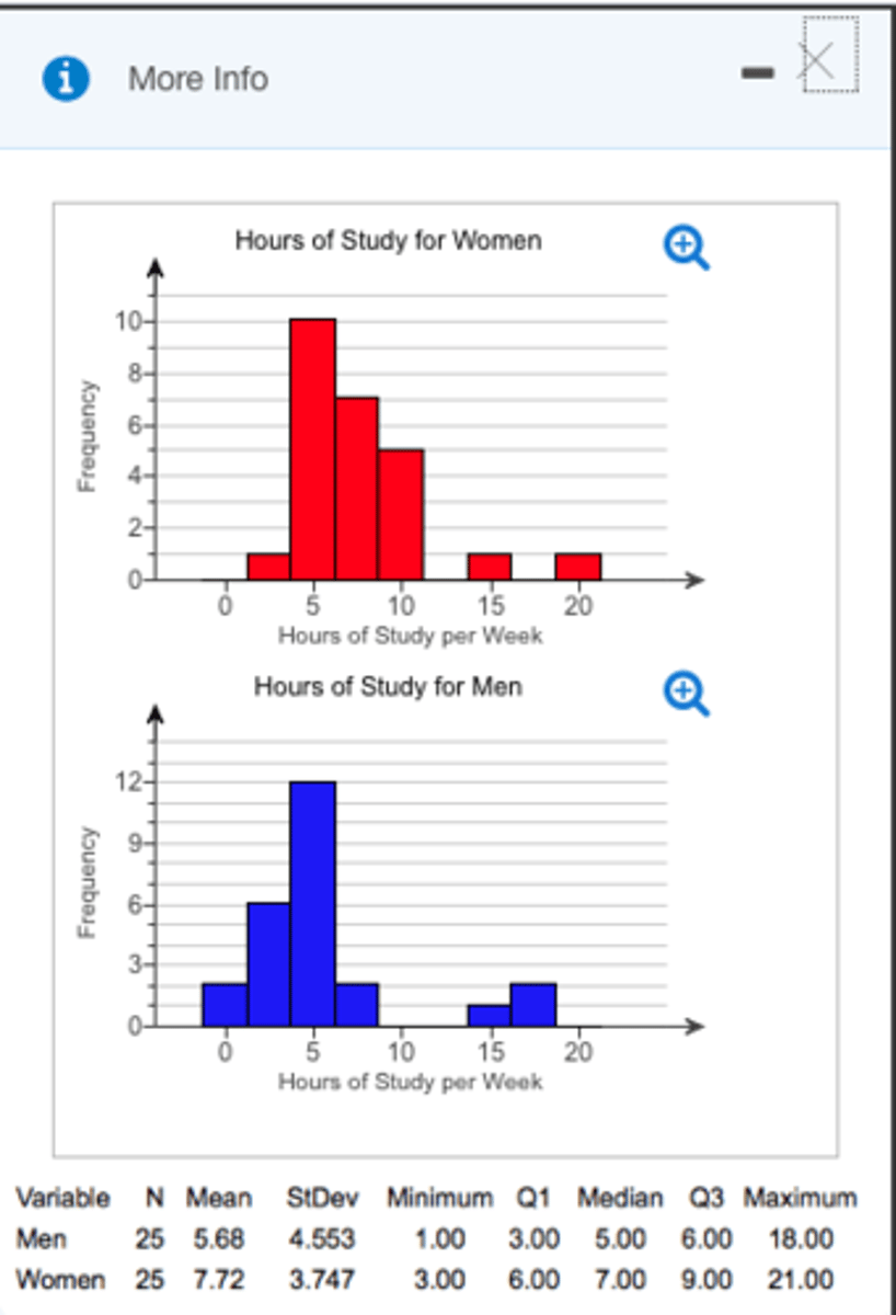
horizontal format
- It is useful when you have many categories because there is more room for the category labels.
simplified explanation: turning that entire chart sideways! Instead of climbing up toward the sky, the bars grow sideways from left to right like cars zooming down a racetrack.
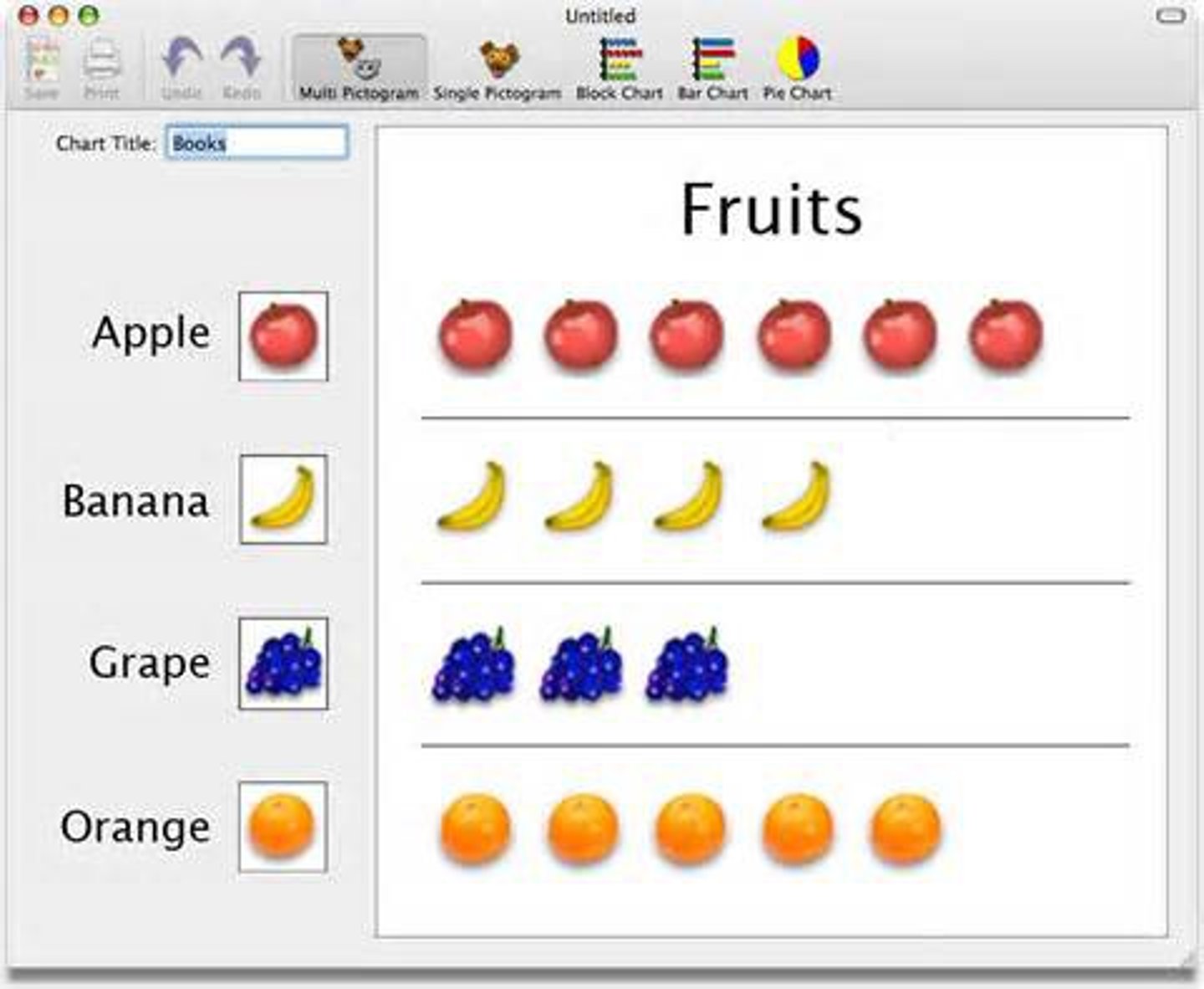
pictogram
Simplified definition: It is a type of chart that uses meaningful images or little drawings instead of normal colored bars to show amounts.
For example, instead of a plain blue bar showing how many apples were sold, a pictogram might stack up drawings of actual apples.
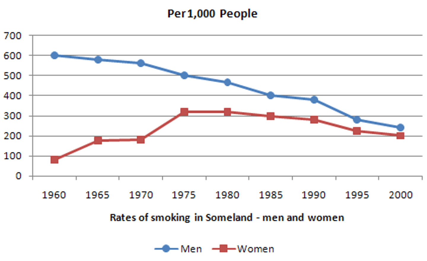
Line graph
bar graph with the tops of the bars represented by points joined by lines (the rest of the bar is suppressed)
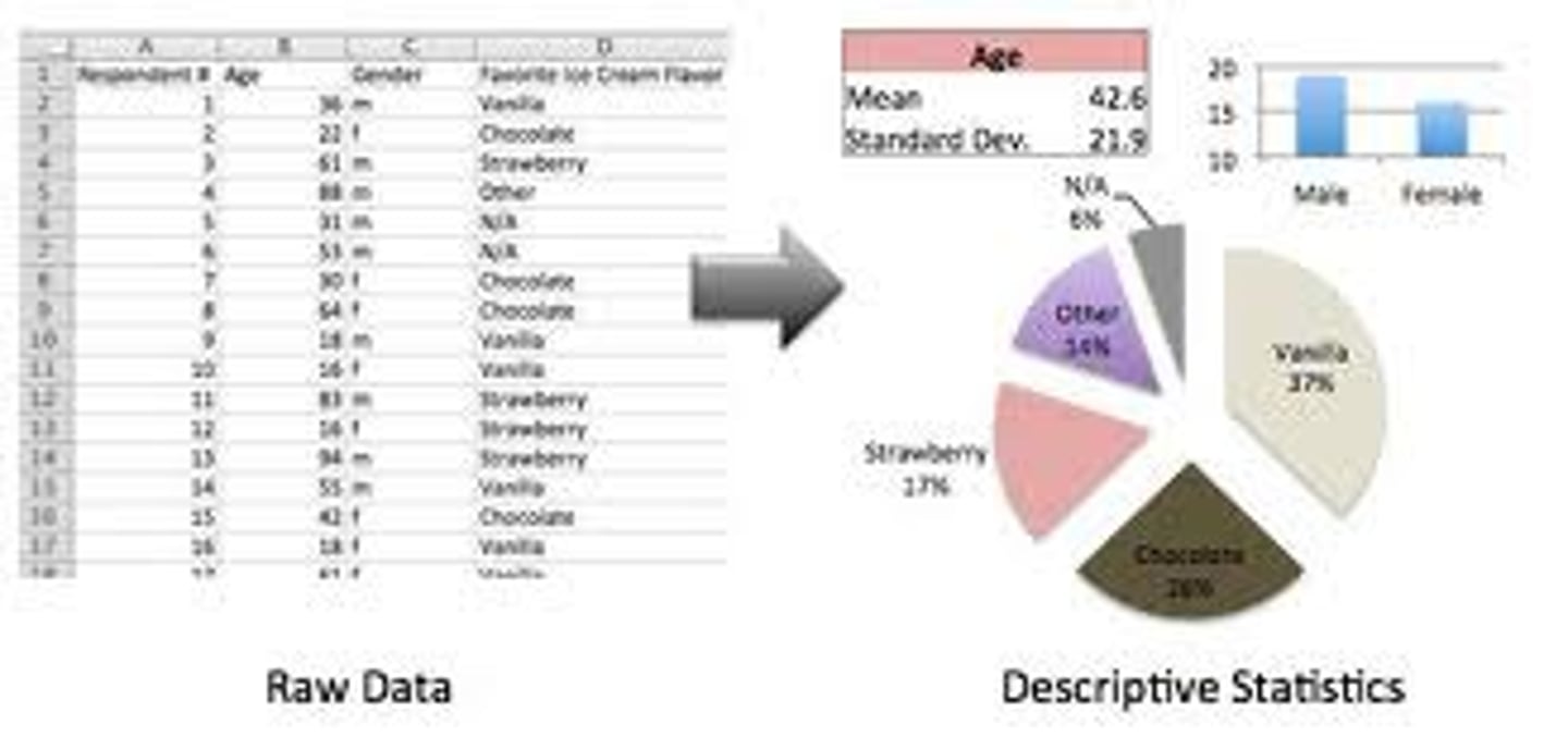
Descriptive statistics
- They are, by and large, relatively simple visual and numerical techniques for describing the major features of one's data
simplified explanation: It is a set of simple visual techniques (like drawing a colorful chart) and numerical techniques (like finding the average) that help you describe the major features of your massive pile of information.