Introduction to Statistics
1/74
There's no tags or description
Looks like no tags are added yet.
Name | Mastery | Learn | Test | Matching | Spaced |
|---|
No study sessions yet.
75 Terms
What is statistics?
The art and science of learning from data; It deals with collection, classification, analysis, and interpretation of information or data
3 main components of statistics
• Study design: Planning how to obtain data to help answer the questions of interest (Data Collection)
• Description: Exploring and summarizing patterns in the data (Data Analysis)
• Inference: Making decisions and predictions on a population based on data/known evidence (Inference)
Types of data collection
Interviews, observations, surveys, usage data, focus groups
Types of statistics
Descriptive: Involves organizing, displaying, and describing data (graphs, bar charts, etc.)
Inferential: Consists of methods for estimating and drawing conclusions about a population based on a sample or a subset drawn from that population (hypothesis testing, confidence intervals, etc.)
What is data?
Systematically recorded information such as numbers, characters, images, or labels, along with its context, which explains who, what, when, where, how, and why it is being measured.
Types of data
Tabular, networks/graphs, spatio, and images/video
Tabular Data
A collection of objects and their attributes. An object (record or observation) is what is described, and an attribute (variable or feature) is a property of that object
Types of variables
Numerical and categorical
Numerical/Quantitative variable
A variable that records measurable numerical values with units. It represents amounts or degrees of something, and operations like adding or averaging make sense.
Discrete (numerical) variable
A type of quantitative variable that takes on a finite or countably infinite set of values. Ex) number of students in a class.
Continuous (numerical) variable
A type of quantitative variable that can take on infinitely many values within a range. Example: age, height, or weight
Categorical/Qualitative variable
A variable that classifies observations into groups or categories, with each case placed into one group. Ex) favorite color, marital status, gender, area code, SSN
Nominal (categorical) variable
Categories that have no natural order. Ex) favorite color, soda brand, yes/no questions.
Ordinal (categorical) variable
Categories that follow a logical order. Ex) drink sizes (small, medium, large), Olympic ranks (gold, silver, bronze).
Transforming numerical into categorical
A numerical variable can be grouped into ranges and treated as categories. Ex) age reported as 18–24, 25–34, 35–44, 45+
Population
The total group of individuals or objects you want to make conclusions about in a statistical study. Ex) all students at Columbia University.
Sample
A subset of the population used to draw conclusions, often a small fraction of the whole. Ex) 1000 randomly surveyed Columbia students.
Parameter
A summary value calculated from a population. Ex) the average age of
all students at Columbia.
Statistic
A summary value calculated from a sample. Ex) the average age of students in one statistics class.
Why can’t we usually observe an entire population?
Studying every individual is often impractical because it takes too long, costs too much, may destroy the items being measured, or is otherwise impossible
A bad sample
A sample that is not representative of the population and lead to biased results. Ex) using income data from only Manhattan households to represent the entire U.S.
Sampling
A method that allows researchers to study a population by investigating a subset instead of every individual. Ex) estimating MLB player salaries by surveying part of the league.
Probability sampling
A method where every individual in the population has a known, nonzero chance of being selected. Ex) simple random sampling of students from a complete roster.
Non-probability sampling
A method where not all individuals have a chance of being selected,
which may lead to bias. Ex) surveying only volunteers.
Sampling Methods
Simple Random Sampling, Stratified Sampling, Cluster Sampling, Systematic Sampling, and Convenience Sampling
Simple Random Sample (SRS)
A sample where every individual has the same chance of being chosen and every possible sample has the same chance of selection. Ex) giving each participant in a sample a number and drawing numbers at random.
Stratified Sampling
The population is divided into subgroups (strata) with similar characteristics, then a random sample is taken from each subgroup. Ex) grouping participants’ hair color and randomly sampling from each group
Cluster Sampling
The population is divided into clusters, but there is more variation within the clusters than between them, so a few clusters are randomly selected and every individual in those clusters is studied. Ex) grouping participants by neighborhoods and randomly selecting a few neighborhoods
Systematic Sampling
Individuals are chosen at regular intervals from an ordered list, starting from a random point. Ex) selecting every n-th participant after picking a random starting number from 1-n.
Convenience Sampling
Participants are chosen based on availability or willingness, making results prone to bias. Ex) surveying students in nearby classes or friends.
Snowball Method
Recruiting one or a few respondents, and they bring in their friends to participate, who bring in their friends to participate, etc. Introduces bias as people usually associate with people similar to themselves, instead of a huge variation
Sampling Frame
A complete list of all individuals or units in the population who are eligible to be selected in a sample. Ex) a university registrar’s list of enrolled students.
Characteristics of a Good Sampling Frame
Comprehensive, up-to-date, non-duplicated, and accessible
Bar Plot
A graph that shows the frequency of each category of a categorical variable using bars
Proportion (p-hat vs p)
The proportion of cases in a category is cases in category ÷ total cases.
The sample proportion is written as p-hat, and the population proportion as p.
Contingency Table
A table that shows the frequency of cases for combinations of two categorical variables. Ex) class year (rows) by early class status (columns).
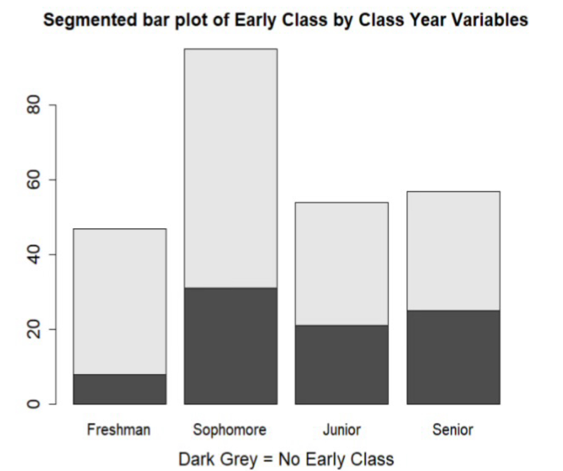
Segmented Bar Plot
A graph that compares groups by placing separate bars for each category of a second variable next to each other. Ex) separate bars for early vs no early class shown side by side within each class year.
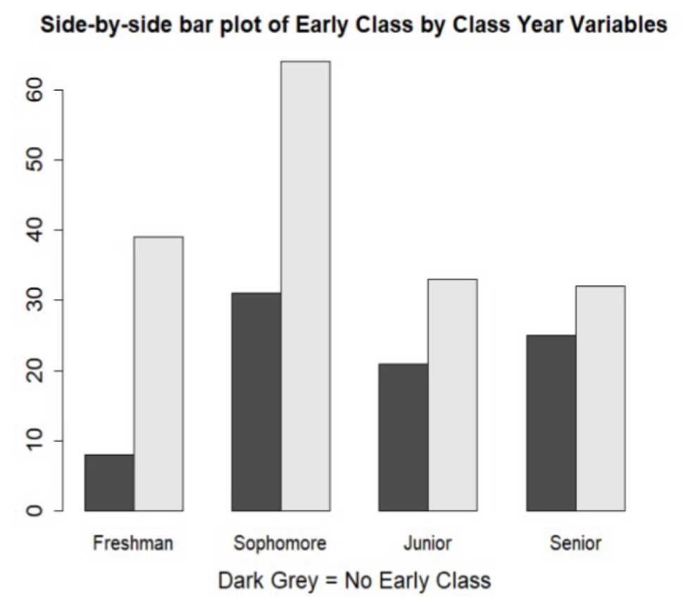
Side-by-Side Bar Plot
A graph that compares groups by placing separate bars for each category of a second variable next to each other. Ex) separate bars for early vs no early class shown side by side within each class year.
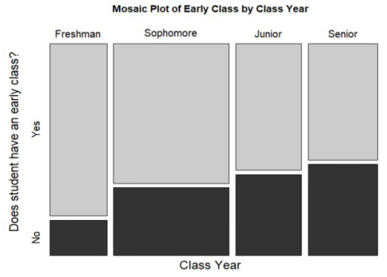
Mosiac Plot
A graph that uses the area of rectangles to show relationships between two or more categorical variables, and the width of the columns shows the frequency for the respondent. Ex) showing how sleep duration varies by profession.
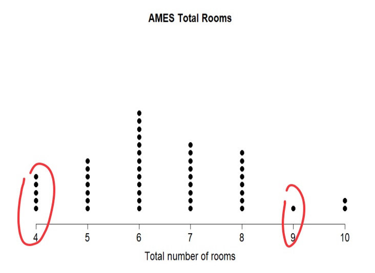
Dot Plot
A simple graph where each observation is shown as a dot along a number line. Ex) number of rooms in 45 homes displayed with one dot per home.
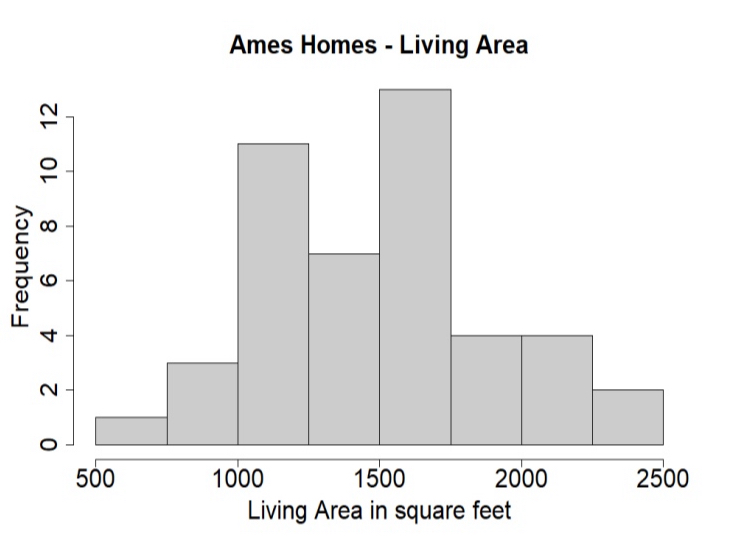
HIstogram
A graph that groups numerical data into intervals of equal width and shows how many cases fall in each interval. Ex) living area of homes grouped into 250-sq-ft bins.
How to Interpret Histograms
Look at the overall shape, range, and density of the data. Higher bars show where values are more common, and smooth curves can help visualize the general distribution.
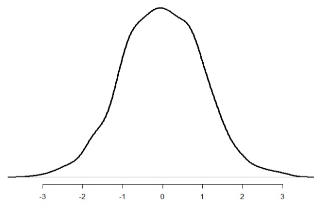
Symmetric/Bell-Shaped
Data is clustered in the middle with roughly equal smaller and larger values. Ex) heights of adults
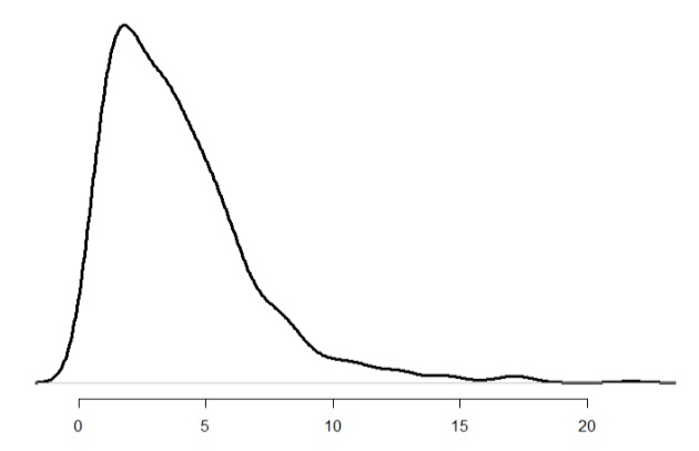
Right-skewed
Most values are small, with a few very large values stretching the tail to the right. Ex) household income
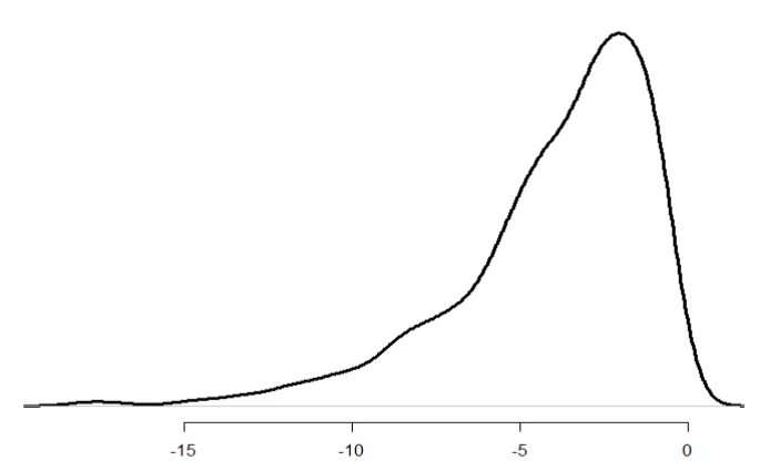
Left-skewed
Most values are large, with a few very small values stretching the tail to the left. Ex) age at retirement in some professions
Symmetric but Not Bell-Shaped
Values on one side of the distribution mirror the other, but not clustered in the center
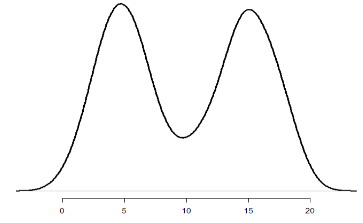
Unimodal, Bimodal, Multimodal
A histogram with one peak is unimodal, with two peaks bimodal, and with three or more peaks multimodal.
Two Main Measures of Central Tendency
Mean: the numerical average.
Median: the middle value when data are arranged from smallest to largest.
Both describe the “center” of a distribution in different ways.
Mean
x\left(bar\right)=\frac{x1+x2+\cdots+xn}{n}=\frac{1}{n}\Sigma^{n}_{x=i}x_{i}
Represents the arithmetic average of all observations. Sensitive to extreme values.
Median
Arrange data from smallest to largest. If n is odd → take the middle value. If n is even → take the average of the two middle values. Robust to outliers and skewed data.
Choosing Between Mean and Median
Mean: use for symmetric data without outliers.
Median: use for skewed data or with outliers.
Variation
Reporting only the average hides how much individual values differ. A measure of variation shows how tightly or loosely data cluster around the center, revealing the amount of spread in a dataset. Variation is essential for understanding data. Two datasets can share the same mean but differ greatly in spread. A measure of variability helps describe this spread and is crucial in most statistical analyses.
Range
Formula: Range = Maximum - Minimum
The range measures how spread out data are by subtracting the smallest value from the largest. The range only uses two data points and ignores all others. Because of this, it can give a misleading picture of variability when outliers are present.
Percentiles
Percentiles divide data into 100 equal parts. The pth percentile is the value below which p percent of the observations fall. Percentiles help describe relative position within a dataset.
Interquartile Percentages
25th percentile (Q1): median of the lower half of the data
50th percentile: the median of the full data set
75th percentile (Q3): median of the upper half of the data
Interquartile Range (IQR)
IQR = Q3-Q1
The IQR measures the spread of the middle 50 percent of a dataset. The IQR reduces the influence of outliers and extreme values by focusing only on the central half of the data. It is considered a robust measure of variation.
Boxplots
A boxplot is a visual summary of a dataset that displays its central tendency, spread, and outliers. It is based on five key statistics: minimum, Q1, median, Q3, and maximum. The length of the box and whiskers indicates the amount of variation, and dots may mark outliers.
Variance
Measures how far each data point is from the mean on average. It is found by averaging the squared deviations from the mean, giving a sense of how spread out data are. It is sensitive to outliers.
Population Variance vs. Sample Varinace
Population Variance:\sigma^2=\frac{\Sigma_{i=1}^{n}\left(x_{i}-xbar\right)^2}{n}
Sample Variance:s^2=\frac{\Sigma_{i=1}^{n}\left(x_{i}-xbar\right)^2}{n-1}
Standard Deviation
The standard deviation is the square root of variance that describes the average distance of data points from the mean. Smaller s means values cluster near the mean, larger s means they are more spread out. Like the mean, it is sensitive to outliers.
s=\sqrt{s^2}
The Empirical Rule
The empirical rule describes how data are distributed in a symmetric, bell-shaped pattern. For normal distributions:
About 68% of observations fall within 1 standard deviation of the mean.
About 95% fall within 2 standard deviations.
About 99.7% fall within 3 standard deviations.
Robust Statistics vs. Sensitive Statistics
Robust statistics are unaffected by extreme values or skewness. Examples: median (center) and IQR (spread).
Sensitive statistics change significantly in the presence of outliers, they are better for normally-distributed data. Examples: mean, standard deviation, and range.
Controlled Experiments
A controlled experiment imposes a treatment on one group (the treatment group) and withholds it from another (the control group). This setup allows researchers to study whether differences in outcomes can be attributed to the treatment itself.
Explanatory and Response Variables
The explanatory is the variable manipulated by researchers. The response variable is the outcome that is measured or observed.
The Placebo Effect
A fake treatment or inert substance that has no therapeutic value. A placebo can be given to the control group in an experiment to prevent subjects from knowing whether they are receiving an active treatment.People often show improvement simply because they believe they are receiving treatment. To separate psychological effects from true treatment effects, researchers use a placebo
Randomized Controlled Experiments
When participants are assigned to groups using an objective chance method, which limits bias and strengthens the credibility of causal conclusions.
Confounding factors
Outside variables can influence both the condition being tested and the measured outcome, making it hard to tell what truly caused the change.
Comparative Experiments
Two or more groups experience different conditions under otherwise similar circumstances. The contrast between their outcomes reveals the true effect of the condition being tested.
Principles of a Well-Designed Experiment
Reliable studies depend on keeping conditions consistent, assigning participants randomly, including enough data for confirmation, and limiting knowledge of group assignments to avoid bias.
Blind Experiements
Participants do not know which group they are in, preventing expectations from influencing their behavior or responses.
Double-Blind Experiments
Neither participants nor researchers know who receives the treatment, reducing both subject and researcher bias.
Observational Studies
Researchers collect information without altering participants’ behavior or an assigning treatments which reveals patterns and relationships but cannot establish direct causation.
Retrospective Studies
Data are gathered from past records or memories to compare previous exposures or conditions among groups.
Prospective studies
Participants are tracked forward in rime to see how future outcomes differ amount groups with different initial characteristics. No treatment is applied; researchers simply observe what occurs naturally.