History and Features of European Typefaces and Printing Styles
 Call Kai
 Learn
Learn Practice Test
 Spaced Repetition
 Match
Match Flashcards
 Knowt Play
1/31

There's no tags or description
Looks like no tags are added yet.
Name | Mastery | Learn | Test | Matching | Spaced | Call with Kai | Chat |
|---|
No analytics yet
Send a link to your students to track their progress
32 Terms
Blackletter
- Handwritting style of northern european scribes later adapted to typefaces
-12th - 17th century most popular
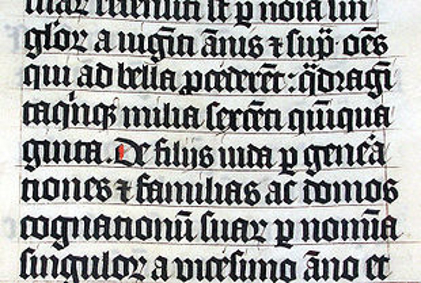
Humanist Miniscule (Roman script)
- Late 1400s Italy
- Designed by punch cutters
- Less complex and dense than blackletter
- Made books more legible and accesible
Humanist Type
- typeface inspired by Renaissance calligraphy and classic roman proportions
-mimic the neutral angles and flow of a broad-nib pen
- feeling of warmth and personality
Aldus Manutius
- Most important figure in venetian printing
-Founded Aldine Press
- Commissions first italic type
- Published great thinkers of the Greek and Roman worlds
Francesco Griffo
- Comissioned by Aldus Manutius to create italic type around 1945
- Designs Bembo
Bembo
- Imitates the Humanist Minuscule handwriting style from 15th-century Italy.
- Associated with literature, clasisism, and the middle ages
-Francessco Griffo
- Commissioned by Maniutius
-Late 15th century
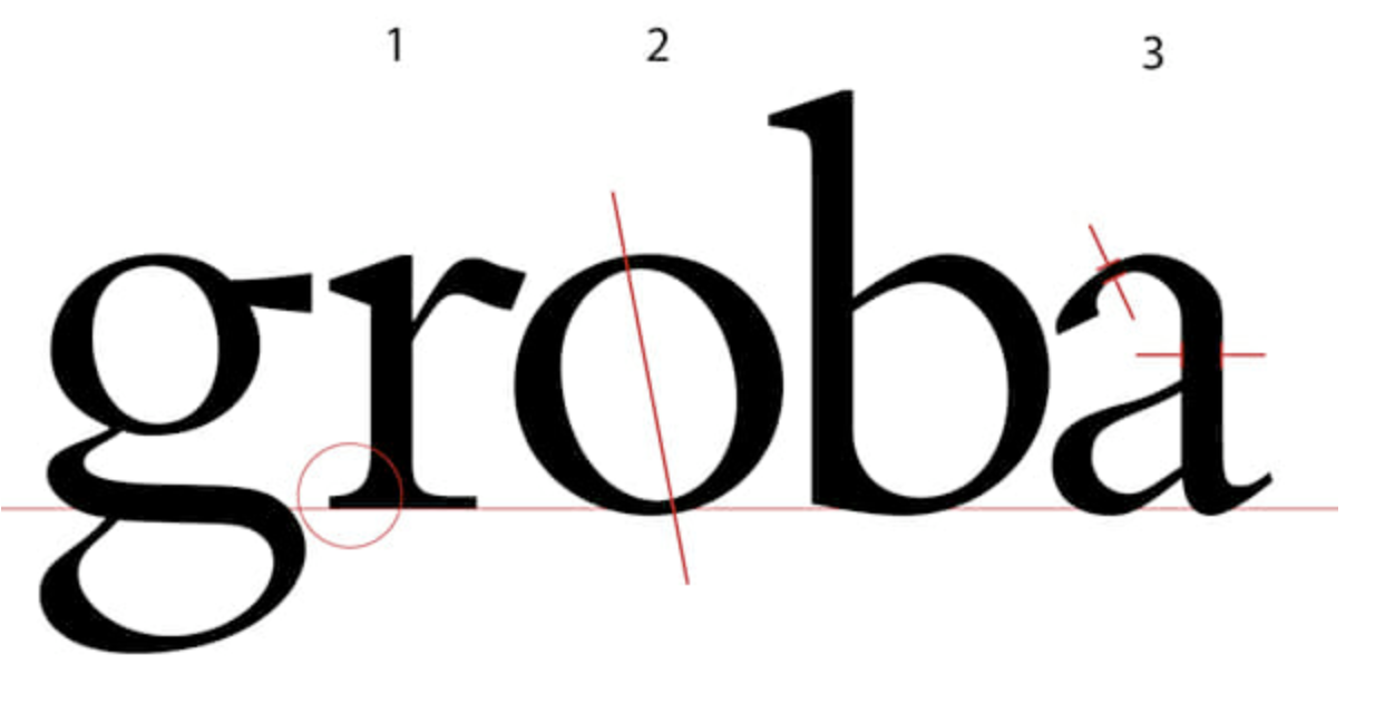
Bembo features
- Old-style serif typeface
- Tilted axis
- Small x-height
-Bracketed Serifs
Old Style Type
- Evolution of humanist type made for the printing press
- Early roman type face from the 15th and 16th century
Italics
- og made to save space by Francessco Griffo
-comissioned by aldus Manutius
- Shapes of the letters themselves are different
- Not initially made to go with Roman type
How were were books printed before paper?
expensive vellum, animal skin,
Didot
- 300 years after bembo, late 18th century
- Called Didones or Modern Serifs
- Last stage in a long evolution of traditional Roman books
- No longer show traces of human hand
- Popular in fashion
- Designed by Fimin Didot, French
Old Style Type Features
- Tilted axis
- Bracketed Serifs
- Small x-height
Bodoni
- similar to didot
- used in western fashion
Firmin Didot
- Parisian Punch cutter
- creates didot
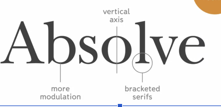
Modern Serif Features
- Vertical axis
- non bracketed serifs (straight connection to the letter, not curved)
-strong modulation, thin and thick contrast
Bracketed Serif
- curves serifs
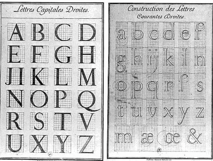
Romain du Roi, Kings Roman
- First true rationalist typeface
- Commissioned by Louis XIV in 1692 - official typeface of the Royal French Print office
- Designed by committee of designers, not punch cutters
- derived from a mathematically precise grid
- Engraved rather than letter pressed printing, for more detail
John Baskerville
- developed innovations to print type faces with more more delicate strokes
- Designed Baskerville in 1757
Baskerville
- Developed by John Baskerville
- Trransitional serif
- Evolution between old style to modern serif
Transitional Serifs
Between old serif and modern type
-Vertical Axis
- More Modulation than an oldstyle
- Bracketed Serifs
Darius Wells
- American
- 1823
- Develops process for manufacturing type out of wood.
Founders
Companies that produce type
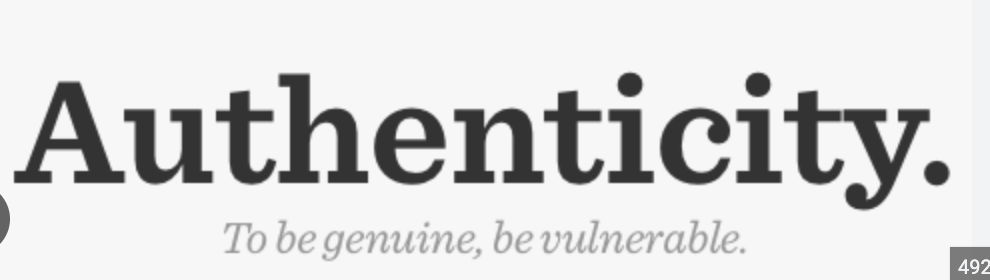
Egyptian Type/Slab Serif
- Thick, block like serifs
- Designed around 1845 by Robert Besley
- Vertical Axis, large x Height
Futura
- Geomtric Sans Serif
-1927, german designer Paul Renner
- applies ideas of constructivism
- deconstructed traditional letter forms into simple geometric shapes
- pinch curved strokes
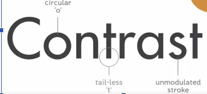
Geometric Sans-serif
- minimal geometric forms
- apparent circular o (usually)
- unmodulated stroke
-tail-less T
Helvetica
- Neo Grotesque or rational sans serif
- Switzerland, 1957, Max Miedinger and Eduardo Hoffman
-Default typeface
Neo-grotesque
- highly legible, minimalist
- 1950s swiss design movement
Naue Grafik
- clear, objective, and neutral
without ornament or aesthetic flourishes.
-Uses visual principles of hierarchy and spacial organization
- Basel School of design
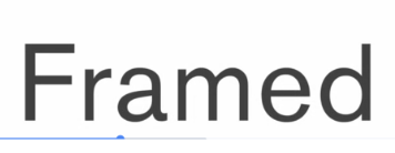
Grotesque Sans Serif
- large X Height
- Fairly unmodulated stroke
Scala Sans
- sans serif
- slightly tilted axis
- shapes and proportions are reminiscent of and old style type face
- warmth of hyumanist type, mechanical look of a rational sans serif
-1992, dutch, martin majoor
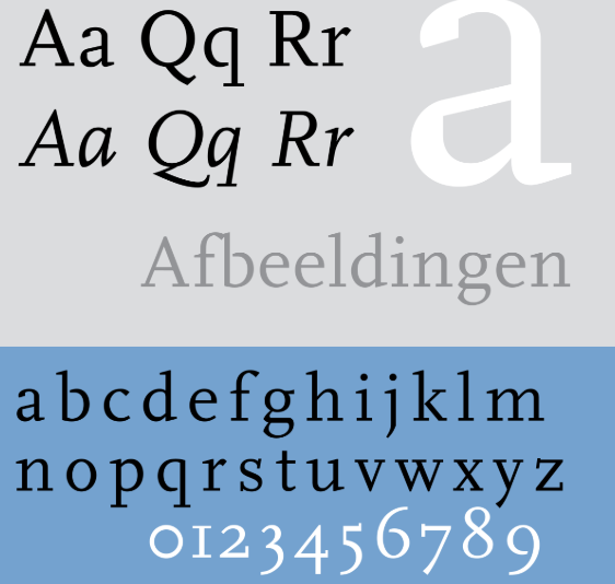
Scala
- Scala-sans serif couterpart
-matin majoor, dutch, 1990
- diferent strokes and stylistic flourishments
Super Families
- Typefaces of different styles that are meant to go together