Graph checklist
1/25
Earn XP
Description and Tags
Graphs and what you need to mention to get maximum points
Name | Mastery | Learn | Test | Matching | Spaced |
|---|
No study sessions yet.
26 Terms
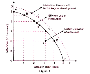
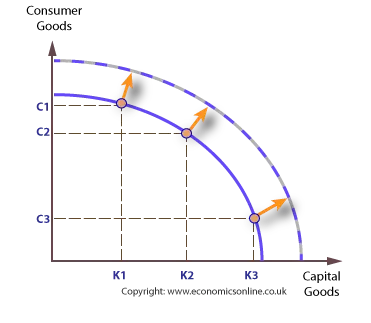
Production Possibility curve (PPC)
Illustrates scarcity, choice, opportunity cost and efficiency. The points on the curve are the potential output, aka the max output that can be achieved for the two products if the resources are allocated perfectly. Points inside of the curve illustrate inefficiency, while outside of the curve is unattainable at the moment.
What is this called?
Growth in production possibilities. It is represented by an outward growth in the PPC curve.
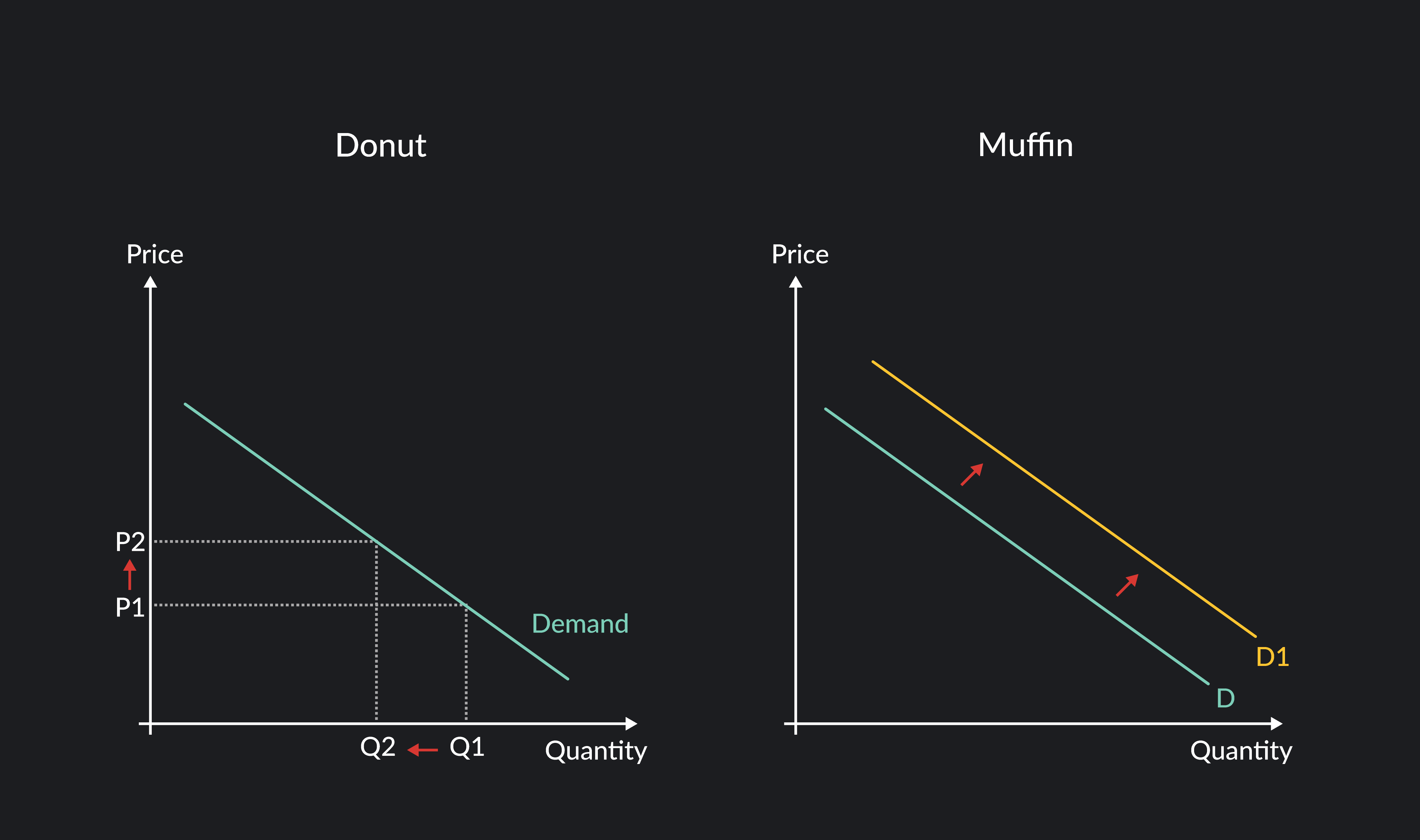
Which graph is this and how does it move?
Demand curve.
On the first one, the quantity gets bigger the lower the price is, indicating that it is following the law of demand (less price, more demand). A movement like this along the curve means that only price is being changed.
On the second, we have a positive shift to the right, creating a new demand curve (D2). All prices now get an increase in quantity without having been meddled with. This is because of a change in the non-price determinants of demand: income, price of related goods, tastes and preferences, future price expectations, and number of consumers.
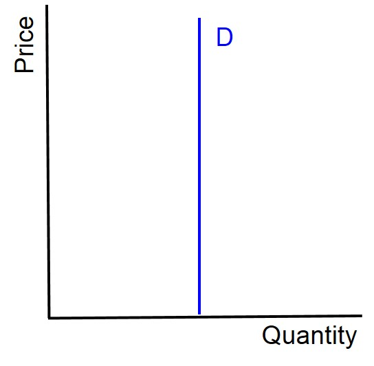
What value (and for which type) is this graph representing? What does this mean?
Price elasticity of demand (PED), with the value 0. This is indicating that the quantity will never change despite a price change. The producer can give any price and the same amount of people are willing to buy it.
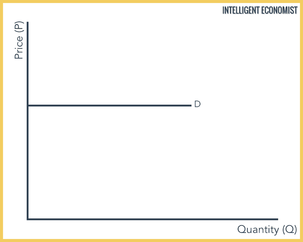
What value (and for which type) is this graph representing? What does this mean?
Price elasticity of demand (PED), with the value infinity. Price is very sensitive now, as any price change can infinitely change the quantity. Anything above the current P will mean no quantity is demanded, while anything below P means an infinite amount of consumers want it.
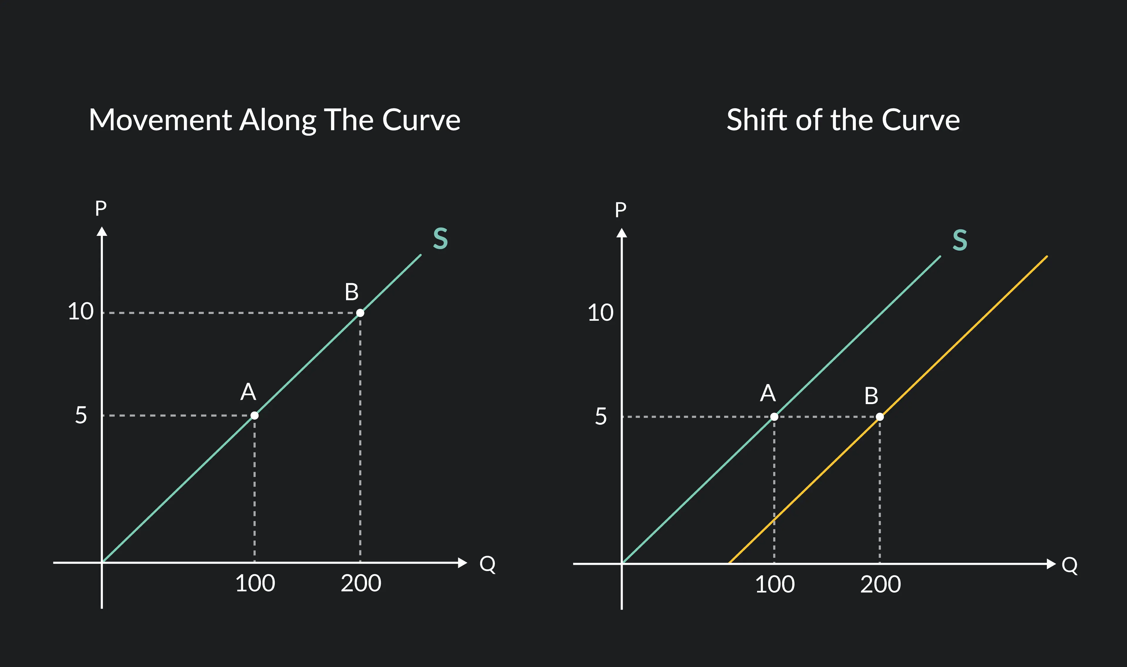
What graph is this and what does its movements mean?
Supply curve.
First curve. This curve follows the law of supply, which states that as price goes up, more quantity is supplied of the product. This assumes that all producers are profit-seeking. That is why the supply curve is always upwards sloping. A movement along the supply curve indicates that only price has changed as a factor.
Second curve. This graph shows a positive shift to the right, showing that more quantity is supplied for each of the prices. A shift in the supply curve means that a non-price determinant of supply has changed: cost of factors of production, price of related goods, government intervention, expectations about future prices, changes in technology and weather or natural disasters. Remember WET PUG!!
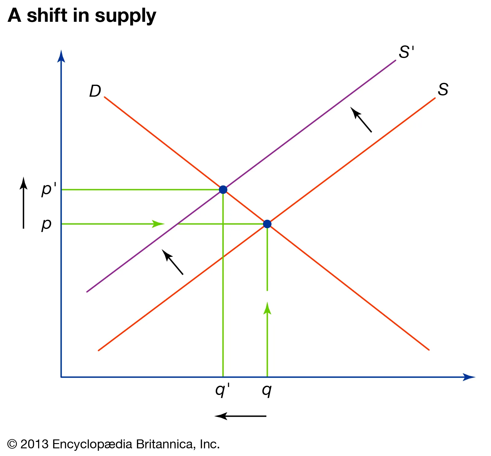
What is moving? And what does this do to price and quantity?
There is a shift in the supply curve, meaning there has been a change in one of the non-determinants of supply. Quantity has regressed from Q to Q1, while the price has risen from P to P1. Demand looks pretty elastic because of its horizontally shaped line, meaning there has been a significant change with consumer’s demand.
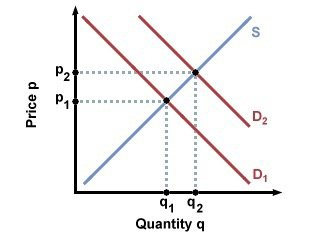
What is moving? And what does this do to price and quantity?
It shows the shifting of a demand curve, meaning there has been a change in one of the non-determinants of demand. Quantity has increased because of the increased price that follows it (law of supply), and the changed demand curve has created a new equilibrium along the supply curve.
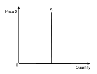
What value (and for which type) is this graph representing? What does this mean?
Price elasticity of supply (PES), with value of 0. This means that no change in price will affect the quantity supplied, so the law of supply is not in effect here. An example of this is only having 1000 tickets available at a concert. You can link this to scarcity.
What value (and for which type) is this graph representing? What does this mean?
Price elasticity of supply (PES), with value of infinity. This is showing that if the price even falls with a cent, all supply will turn to zero. If going above, the quantity will be changed to even more infinity.
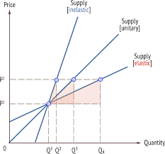
Explain what this graph teaches us.
A supply curve is turned into three examples.
The inelastic one has a value between 0 and 1, and it comes from the x-axis. It’s gradient is less than 1, so it moves one to the left and less than one up. Look at triangle.
The elastic one has a value greater than 1, and it comes from the y-axis. It’s gradient is more than 1, so it moves one to the left and more than one up. Look at triangle.
The unit elastic one has a value of 1, and it comes from the origin. It’s gradient is one, aka it goes one to the left and then one up. Look at triangle.
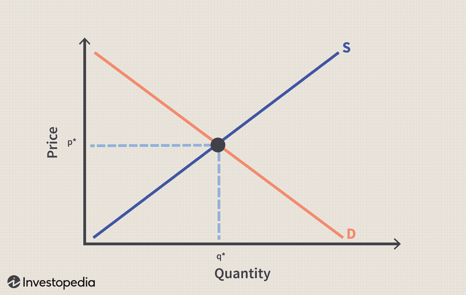
What is this graph called? What does the point in the middel represent?
A supply-demand curve. The point in the middel represents the equilibrium point, the point where the market is in peace. The amount that is supplied is being demanded in the market. Qe is the market equilibrium (the place where the peace exists) and Pe is the price, also called the market clearing price, which is needed for that equilibrium. It will stay in peace until an ‘outside disturbance‘ comes along. An ‘outside disturbance‘ is a change in the non-determinants of either demand or supply.
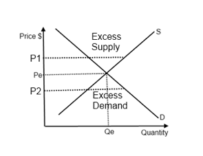
What do they mean by excess?
Any price below the equilibrium point will cause excess demand, meaning too little is supplied (producers are assumed to follow the law of supply) and there exists too much demand.
Excess supply is the opposite problem — there is too much supply and too little demand. You can see how much excess there is by evaluating the difference in quantities for demand and supply.
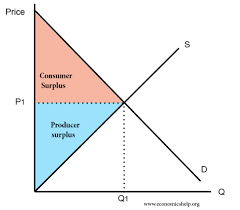
Explain this graph and the highlighted areas.
Consumer surplus is the highlighted red area. Consumers are assumed to only be driven by self-interest, and therefore they seek the most utility. The whole thing is saying that some consumers are willing to pay a higher price than what the equilibrium point is that, but they don’t have to, as the equilibrium point is the only one they are legally obliged to purchase at. This gives them extra satisfaction from the thought of having to pay a lower price than intended, creating this surplus.
Producer surplus is the highlighted blue area. Producers are believed to follow the invisible hand of self-interest, meaning they are there to maximize profits. Some producers are willing to supply at points below the equilibrium point, aka with lower prices, but not much. However, these producers are not obliged to set their prices below, as the equilibrium automatically lets them sell at a higher price. This gives them an excess of actual earnings from now being able to produce output at a better price than they had intended.
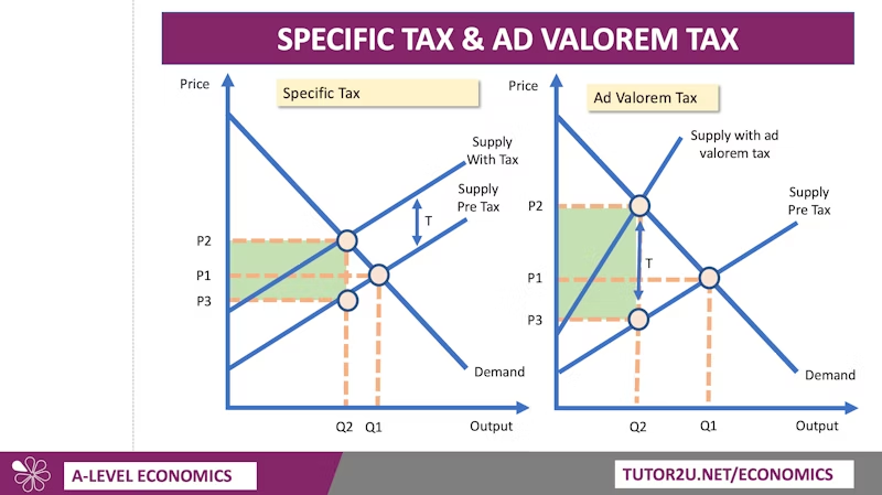
Why are they both shaped like that?
This drawing illustrates specific tax (left) and ad valorem tax (percentage tax).
Specific tax is meant by the government interviening and setting a fixed tax for each unit of product. You can for example set a tax of 1 dollar per unit; this will shift the supply curve vertically upwards, overall increasing the minimum price at all quantities.
A percentage tax is when they set a fixed percentage of tax on the selling price, meaning the more expensive the product is, the more tax is needed to pay on top of that. This creates a vertical shift upwards, but the new line will become steeper the higher the selling price is, creating this wonky line.
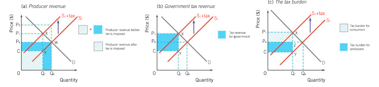
Mention the meaning of the sketched areas
The first graph shows the producers revenue. The sketched box + the highlighted blue area shows the producer’s revenue before the tax is given. Here the W was the equilibrium point, meaning that everything the consumers bought went straight into the producer’s pockets. When the tax was introduced, the supply curve shifted verticly upwards and now asked for a new equilibrium point, X. X got rid of the profit from the last equilibrium point, therefore taking away the Y portion of the producer’s revenuet. The blue between C and Pe is now the producer’s tax burden, and now producer’s only receive C per unit of output. Price P2 is the price in which all the tax burden goes to the consumers, but that would create excess supply and therefore it falls to the equilibrium point X.
The second graph only shows the tax revenue of the government, given that a new equilibrium point has been made. The quantity Qe has regressed to quantity Q1, and the price Pe has now risen to P1. So the price has increased for the consumers and the quantity supplied has decreased as well.
The third graph shows the sharing of the tax burden between the consumer and the producer. Since the price has risen from Pe to P1 and the consumers are the ones that must pay for it, the sketched area is the consumers tax burden. The highlighted remains as the tax burden for the consumers.
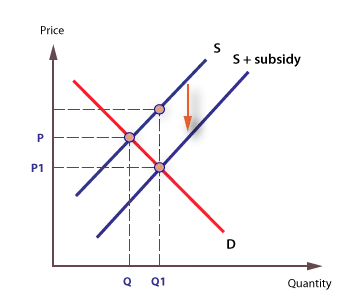
What graph is this and what is happening?
This graph represents a subsidy, which is when the government grants a firm money. When it is granted, the supply curve shifts vertically downwards, reducing the costs of production and increasing the quantity supplied. This also works to eliminate any potential excess supply, as the government now allows them to increase quantity and lower price while still keeping the profits.
You can connect this to opportunity cost, as the government is spending money on a subsidy for a company when they could have used that money somewhere else.
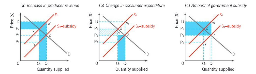
Look at the sketched areas and explain
The first graph is showing us the increase in producer revenue. Before the new equilibrium point, the producer had been producing at Pe and Qe and therefore had the revenue of the entire blank space. After the subsidy, the producers are now able to produce at P1 and Q1, increasing their width of revenue with the added blue rectangle. Also, since the subsidy given by the government (blue rectangle on top, which only shows the producer’s benefit) is also used to do more production, that is also considered to be a part of the producer’s revenue. So the producer receives revenue from D to Q1, making their revenue much larger.
The second graph only shows the consumer’s benefit from having now gotten a price decrease. It hasn’t changed drastically like for the producers, but it is still a positive thing for the consumers. But we also have to take into account the increase in quantity and the lower price lower price at that point, because this blue rectangle illustrates the consumer expenditure (more money used for goods and services). Which means that maybe consumers haven’t exactly changed their spending habits and may still be spending more money, only now that same money buys more goods than before.
The third graph only shows the governemnt’s subsidy. This takes the top part of the producer’s revenue and combines it with the consumer’s benefit.
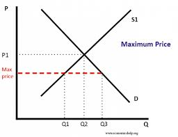
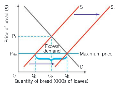
What does this graph tell us? And how do we fix the problems that arise?
This is called a maximum price, meaning that producers cannot go over this price when trying to sell their products. It is always given under the equilibrium point so as to help consumers buy goods (often necessities or merit goods that would not have been provided if market was a free market). The whole purpose of this is to try and increase the consumption of the product.
There is a big problem with this approach. When the price gets that low, producers are not motivated to supply at the equilibrium price or above it, and therefore will set their quantity supplied at a lower range, Q1 instead of Qe. This will decrease the consumption of the product, going against the government’s wishes. To prevent this, governments will have to either subsidize, do direct provision (supply the good themselves) or release their stored products, to shift the supply curve all the way to the right. This will land them on the quantity Q2, which is effectively a larger quantity consumed and supplied.
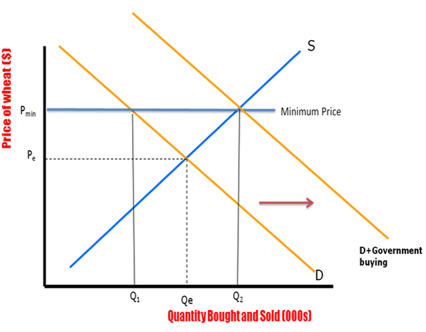
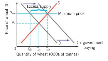
What does this graph tell us? And how do we solve the problem that arises?
A minimum price is set above the equilibrium price, meaning there will be excess supply if demand doesn’t change. This is usually done to increase incomes for producers of e.g agricultural products (essentially protecting them), to make sure the consumers stop consuming a large amount of a product, or to ensure that workers get a suitable minimum wage.
The problem with this is that the high price doesn’t get as much demand, meaning there is excess supply. Q1 will be demanded while Q2 wll be supplied. To get rid of this, governments buy the surplus and therefore shift the demand curve to D + government buying. Or they could advertise the product while also giving protection policies that don’t allow foreign competition.
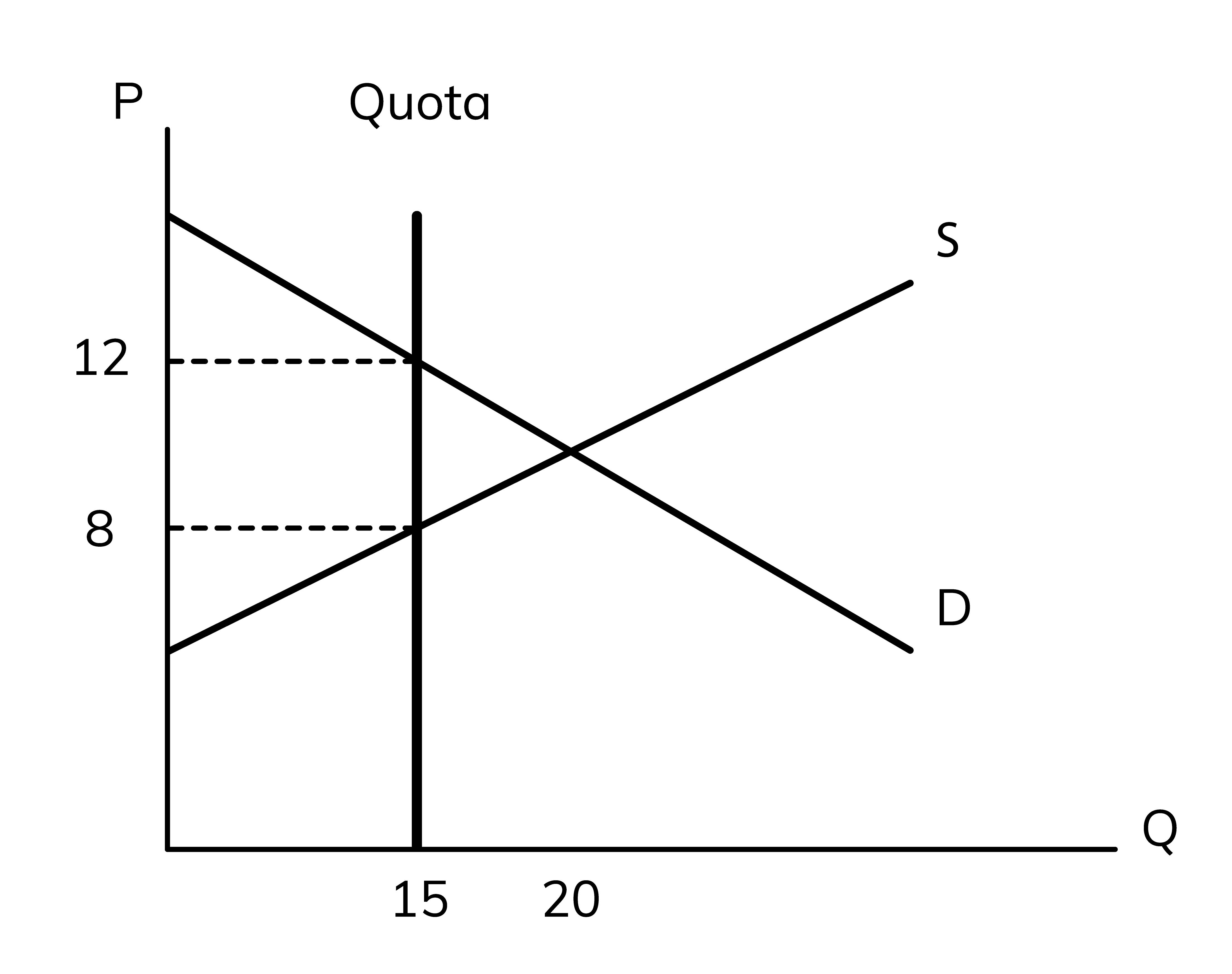
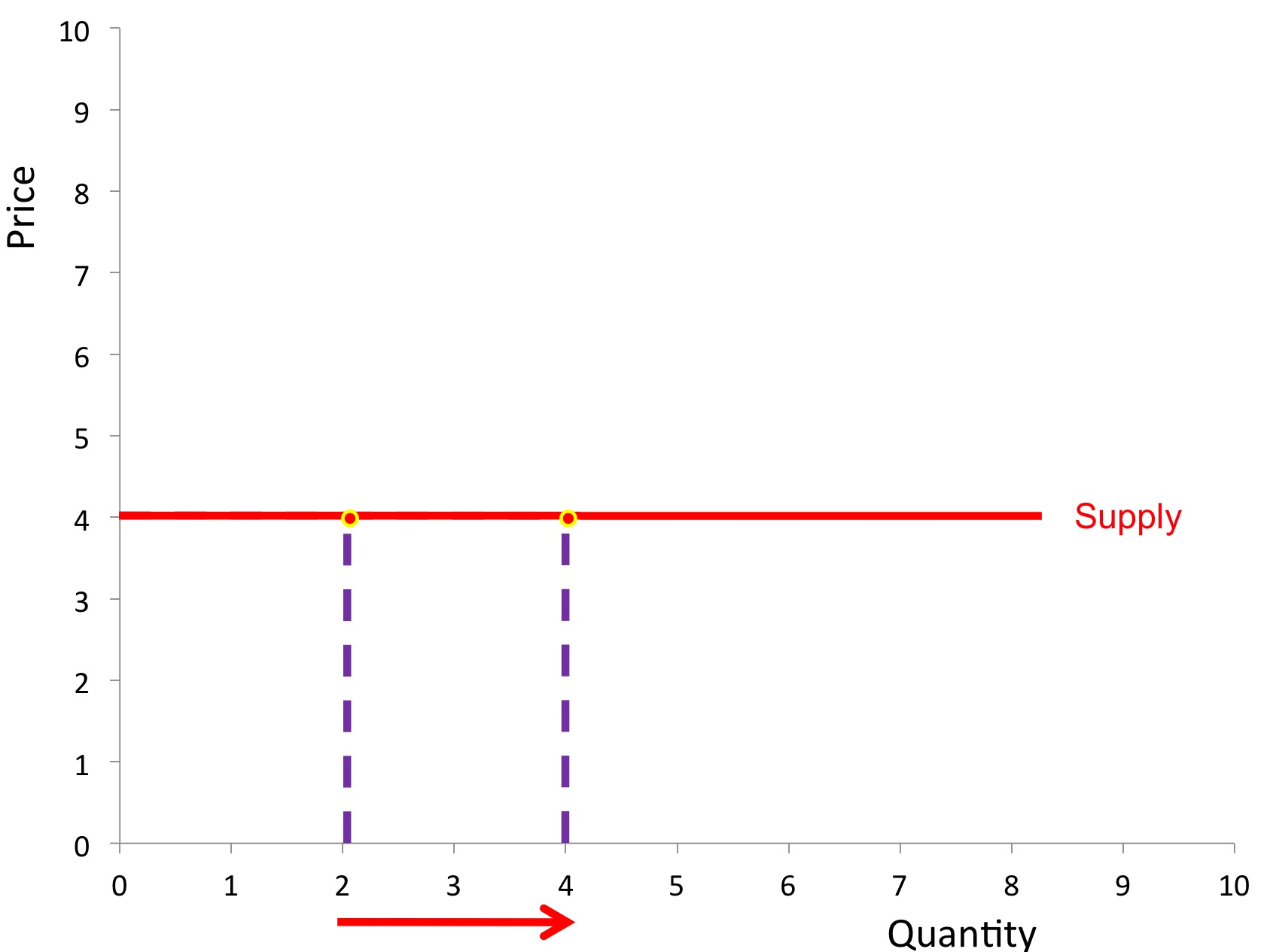
What does the vertical line do?
This demonstrates the quota, e.g the quantity the producer is allowed to produce at. This is usually given in minimum prices so that excess supply is not achieved, as such high prices often give low demand. On the diagram, the quota is on 15 units, meaning the producer cannot (and should not) be allowed to produce more in any price range.
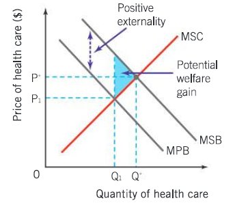
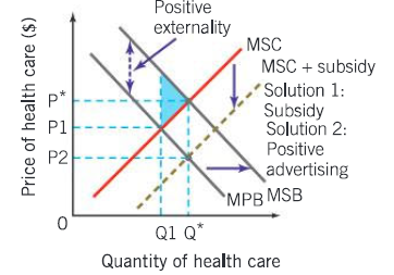
Which externality is this, explain it, and explain how it becomes like this. What can fix it?
This graph shows a positive externality of consumption. We can see that with how there are two different demand curves, one with private benefits and one with social benefits. A positive externality is when a consumption or production of a good has lots of benefits to society, and therefore there is a need for more production or demand of that that good. In this case, there is too little demand and therefore too little quantity consumed.
To make this socially efficient, the MSB has to be equal to the MSC. The shaded rectangle shows the potential welfare gain, aka the perfect spot for allocation of resources. Therefore the market has underallocated its resources, not meeting the requirements fully. If consumption increases, that potential welfare gain will lessen and the society will gain welfare. An example of this is the benefits of consuming merit goods.
The whole point of this is to reach a certain quantity. Not achieving this results in market failure.
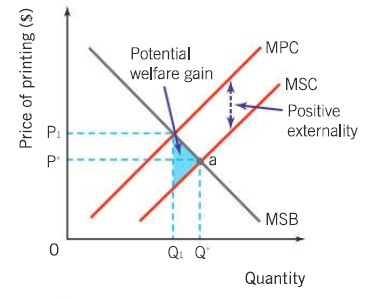
Which externality is this, explain it, and explain how it becomes like this. What can fix it?
This shows the positive externality of production, which means that a production of a certain good or service gives benefits to a third party. In this case the production of the good is not enough, and so it only lands on quantity Q1 when optimum is Q*. Since the private benefits are less than social benefits, the firm stays at its price P1 (higher price) and Q1 (lower supply), when it could have increased its supply and lessen its cost. It doesn’t do that since the firm itself doesn’t benefit much from the production.
To fix this, we could subsidize so that the firm thinks more production= profitable (government intervention, gov makes a choice, opportunity cost because other projects could be funded). Or they could do direct provision, aka supply the product themselves (wouldn’t be as efficient because they are not better than the firms, will cost alot).
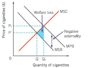
Which externality is this, explain it, and explain how it becomes like this. What can fix it?
This shows a negative externality of consumption. We can see this by how the MSB is lower than the MPB, therefore landing on a lower quantity. A negative externality has a bad effect on third parties, meaning that it is harmful to them. They will continue consuming at the higher quantity despite the negative externality, an overconsumption happening between Q1 and Q*. Too many resources are allocated in this market and the good is overproduced. Demerit goods (harmful to consumers) can create these negative externalities. Negative externalitites cause threats to sustainability.
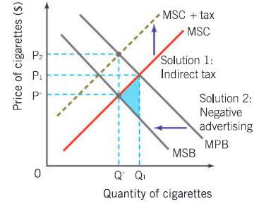
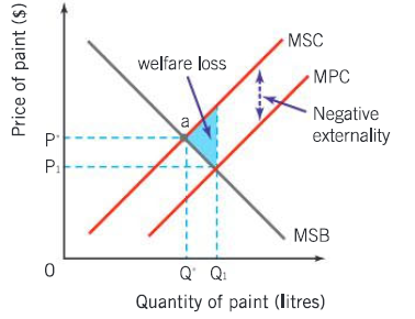
Which externality is this, explain it, and explain how it becomes like this. What can fix it?
This is the negative externality of production, which means the production of a good causes external costs to third parties. This is mostly used when talking about damaging sustainability. Such an externality happens when profit-seeking firms only think about their own costs and therefore discard thoughts of external costs. The MSC is equal to the MSB + external costs. Production will happen at Q1 instead of the lower Q*, and the price will motivate firms more to produce Q1 in constrast to the higher cost P*.
To fix this, we might need agreements and international cooperation. This makes way for interdependance. Different agreements like the Kyoto Protocol (strict pollution control to cut greenhouse gases by 5%, targeting heavy industrialized countries) or the Paris agreement (countries can choose how much they want to decrease emissions, but to promise to increase those goals every five years). We could also use tradeable permits, which uses the Cap and Trade scheme where each country has a limited amount of permits. The trading of these permits will push for cleaner technology and therefore less negative externality. We can also use carbon taxes (tax on burned fossil fuels), making them pay for the external costs that are not included in the market price.
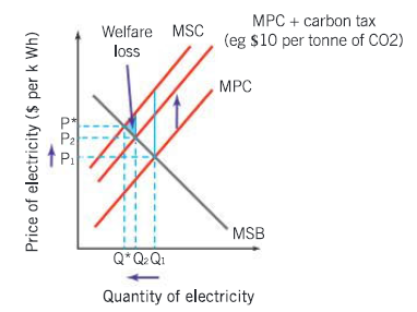
What tax is on this graph and why this amount/what does it do to the whole graph?
This graph illustrates the use of carbon tax. A carbon tax is a market-based approach to decreasing the negative externality of production, but is very hard to calculate the right amount for. Instead, we try to get as close to the MSC curve, decreasing the welfare loss as much as possible. Even though we don’t reach the optimum Q* quantity with the P* price, we still decrease the quantity by a lot and increase the costs to discourage the firm. The new MPC is now MPC + carbon tax.