(L9) IMED2003 - Summarising Research Data
 Call Kai
 Learn
Learn Practice Test
 Spaced Repetition
 Match
Match Flashcards
 Knowt Play
1/69

There's no tags or description
Looks like no tags are added yet.
70 Terms
What are the five learning outcomes for summarising research data?
1. Understand the different types of data.
2. Describe and understand data distribution.
3. Describe, calculate and interpret measures of central tendency: mean, median and mode.
4. Describe, calculate and interpret measures of dispersion: range, interquartile range (IQR), standard deviation (SD), and plots, especially boxplots.
5. Describe, calculate and interpret the empirical 68-95-99.7 rule for normally distributed data.
Lecturer emphasis:
The main goal is interpretation: understand what the data mean and whether the statistical analysis matches the data type, rather than extensive number-crunching.
How did John Snow's cholera investigation illustrate a case-control study?
John Snow compared:
- People with the outcome: cholera-like illness.
- People without the outcome.
.
He then looked backwards for the suspected exposure:
- Drinking water from the Soho/Broad Street pump.
He also plotted outbreak locations to identify links with exposure.
This is a case-control approach because it begins with outcome status and then investigates exposure.
Why is Dr John Snow described as the "Father of Epidemiology" in this lecture?
His investigation of the London Broad Street water-pump outbreak used health data to:
- Compare affected and unaffected people.
- Investigate possible exposure.
- Map where cases occurred.
- Establish links between exposure and outcome.
Modern epidemiology would support this with more sophisticated statistical tools.
How did John Snow's follow-up investigation illustrate a prospective cohort study?
After identifying populations exposed and unexposed to different water sources, he followed people forward to see whether they developed the outcome.
Lecturer explanation:
This would now be called a prospective cohort study.
The lecturer also noted that deliberately assigning suspected contaminated water would be unethical today.
What is the difference between a population and a sample?
Population:
The entire group sharing one or more characteristics that researchers are interested in.
.
Sample:
A representative subset of the larger population that researchers actually study.
.
Example:
The Raine Study cohort is a sample of the broader population living in Boorloo (Perth).
Why do researchers usually study a sample rather than an entire population?
It is generally not practical to reach every member of the population of interest.
Researchers therefore study a representative sample and may use inferential statistics to generalise from that sample back to the target population.
What is data, and what is biostatistics used for?
Data, singular datum:
What researchers collect through research.
.
Biostatistics:
Methods that allow researchers to compare data collected from sampled people and make generalisations from those data.
What are the four main data types covered in the lecture?
1. Ordinal data (order) (no defined interval)
2. Nominal data
3. Discrete quantitative data
4. Continuous quantitative data
Continuous quantitative data can be further described as ratio or interval data.
What is ordinal data?
Ordinal data consist of ordered categories.
Examples:
- Likert-scale responses.
- First, second and third place.
- Pain severity: minimal, moderate, severe.
The order is meaningful, but the distance between categories is not defined.
What is nominal data?
Nominal data consist of categories without an inherent numerical order.
Also called:
Categorical data.
.
Examples:
- Gender
- Yes/no responses
- Language
- Race
- Preferred chocolate type
What is discrete quantitative data?
Discrete quantitative data can take only specific numerical values.
.
Examples:
- Number of children.
- Number of pregnancies.
- Number of hospital admissions.
Values occur as countable numbers rather than any possible value between them.
What is continuous quantitative data?
Continuous quantitative data can take any value within an interval.
.
Example:
A value such as 1.25333.
Subtypes discussed:
- Ratio data
- Interval data
What is ratio data?
Ratio data are quantitative data where the numerical differences between values are meaningful and consistent.
.
Examples from the lecture:
- Height
- Weight
Lecturer explanation:
The distance between 1 cm and 3 cm is the same as between 3 cm and 5 cm.
.
type of continuous data
What is interval data as described in the lecture?
Interval data were described as having no true zero and no real upper or lower limit.
Examples given:
- Temperature
- Blood pressure
- Total bacterial count
Lecturer explanation:
A value of zero does not necessarily mean the measured phenomenon is completely absent.
.
type of continuous data
How are discrete and continuous quantitative data often treated statistically?
They are often analysed similarly in a statistical sense.
Lecturer explanation:
The exact analysis still depends on the study question and assumptions, but both are numerical data types.
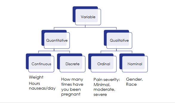
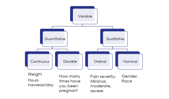
How did the "novel2025" chemotherapy example classify different variables?
Research question:
What are the side-effects of the chemotherapy drug "novel2025" in patients with stage four breast cancer?
.
Quantitative continuous:
- Weight
- Hours nauseous per day
.
Quantitative discrete:
- How many times have you been pregnant?
.
Qualitative ordinal:
- Pain severity: minimal, moderate, severe
.
Qualitative nominal:
- Gender
- Race
What is the difference between descriptive and inferential statistics?
Descriptive statistics:
Describe the sample that was actually collected, including its centre and spread.
Inferential statistics:
Use sample data to make inferences or generalisations about the broader population.
What assumptions must be considered when moving from a sample to a population?
Examples discussed:
- Whether the data meet assumptions for parametric analysis.
- Whether the sample represents the population.
- Whether confounding variables have been controlled.
.
Lecturer explanation:
Researchers may not explicitly label an analysis "descriptive" or "inferential"; readers are expected to recognise the distinction.
What descriptive statistics are commonly used for quantitative continuous data?
Measures of central tendency:
- Mean
- Median
- Mode
.
Measures of dispersion:
- Range
- Interquartile range (IQR), especially for skewed data
- Standard deviation (SD), especially for normally distributed/symmetrical data
- Plots, with a focus on boxplots

What three features should be considered when describing a data distribution?
1. Shape:
Is the distribution symmetrical?
.
2. Location:
Where is the data concentrated?
.
3. Spread:
How widely is the data distributed around the central point?


What defines a normal distribution?
When plotted as a frequency histogram:
- The data are symmetrical around the mean.
- The data are concentrated centrally and spread similarly to both sides.
- Mean ≈ median ≈ mode.
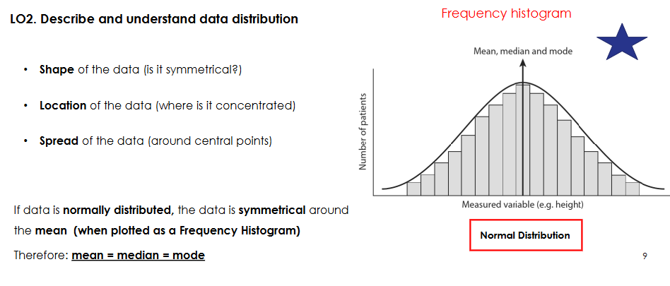
How can researchers initially assess whether data appear normally distributed?
Plot the data, for example using a frequency histogram.
A symmetrical, bell-shaped distribution with the centre concentrated around one point suggests approximate normality.
Lecturer explanation:
The empirical rule later in the lecture provides another way of checking whether data behave like a normal distribution.
What is the mean, and when is it most appropriate?
Mean:
Sum of all values ÷ sample size (n).
Use:
Most appropriate for symmetrical or normally distributed data.
Limitation:
It is strongly influenced by outliers.
What is the median, and when is it most appropriate?
Median:
The central number after values are placed in numerical order.
Use:
Particularly useful for skewed datasets and many health datasets because it is less affected by extreme values than the mean.
How is the median found for odd versus even sample sizes?
Odd number of observations:
Use the single middle value.
.
Even number of observations:
Average the two central values.
Position formula shown:
(n + 1) / 2
What is the mode?
The mode is the most frequently occurring value in a dataset.

How do the mean, median and mode relate in normally distributed data?
They are approximately equal and occur at the centre of the distribution.


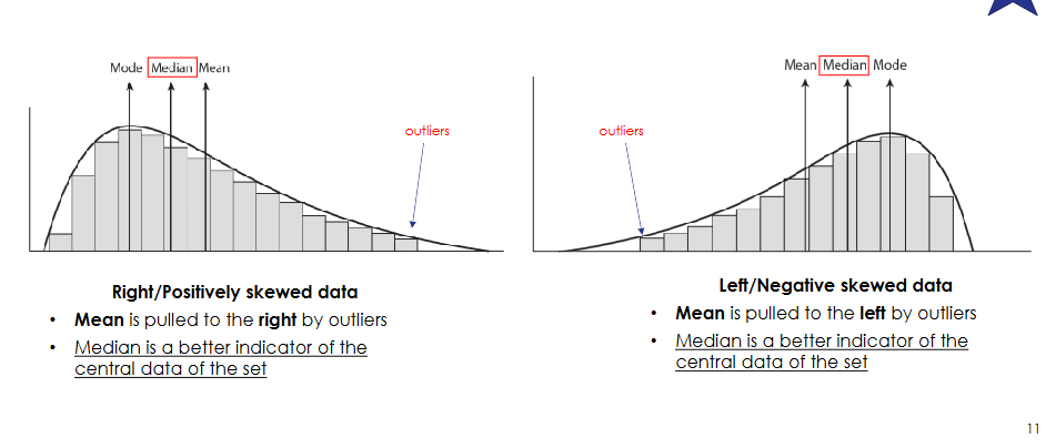
What characterises right or positively skewed data?
The distribution has a long tail to the right.
Outliers on the right pull the mean to the right.
The median is usually a better representation of the centre.
.
Typical order shown:
Mode → Median → Mean


What characterises left or negatively skewed data?
The distribution has a long tail to the left.
Outliers on the left pull the mean to the left.
The median is usually a better representation of the centre.
Typical order shown:
Mean → Median → Mode

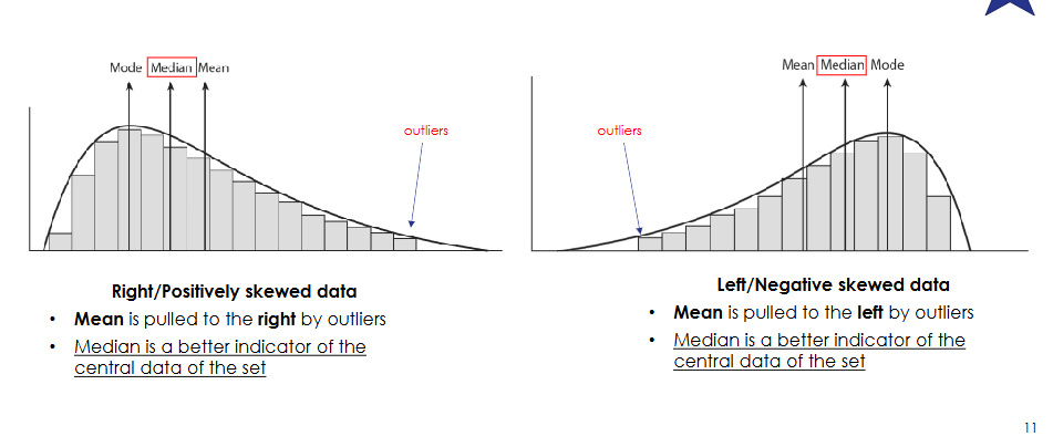
Why is the median usually preferable to the mean for skewed data?
The mean is strongly pulled toward outliers in the tail.
The median moves less and therefore usually better represents where most observations lie.
Lecturer memory aid:
"The meanies follow the outlaws" — the mean follows the outliers.

What were the nausea data values in the chemotherapy example?
Hours of nausea/day for 20 clients:
1, 1, 2, 3, 2, 1, 3, 3, 5, 2, 2, 4, 2, 7, 2, 3, 4, 2, 3, 0
.
Ordered:
0, 1, 1, 1, 2, 2, 2, 2, 2, 2, 2, 3, 3, 3, 3, 3, 4, 4, 5, 7


What descriptive statistics were calculated for the chemotherapy nausea dataset?
Sample size:
n = 20
Sum:
52
Mean:
52 / 20 = 2.6
Median:
2
Minimum:
0
Maximum:
7
The value 7 acts as an outlying high value and pulls the mean above the median.


Why are median house prices commonly reported instead of mean house prices?
Property-price data are often skewed.
A very expensive property can pull the mean far upward, while the median remains more representative of the price experienced by a typical buyer or renter.
Lecturer example:
Perth housing-market data were reported using medians.

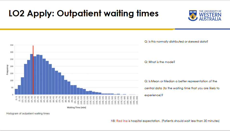
For the outpatient waiting-time histogram, what should be identified about the distribution, mode and best central measure?
Distribution:
Right-skewed.
.
Mode:
Approximately the 25-30 minute category.
.
Best measure of centre:
Median, because the long right tail pulls the mean upward.
.
The red line represents the hospital expectation that patients should wait less than 30 minutes.


What would the median waiting time be?
A. 25-35
B. 35-45
C. 45-55
D. 55-65
Correct answer:
B. 35-45
Why it is correct:
The median is the point that divides the observations approximately in half. The lecturer confirmed that the visual midpoint of the skewed histogram lies between 35 and 45 minutes.
.
Why the other options are incorrect:
A. 25-35 is too far left of the distribution's halfway point.
C. 45-55 is to the right of the median.
D. 55-65 is even further into the right-hand tail.
Lecturer explanation:
Ignore the red hospital-expectation line when estimating the median.


Why was reporting the mean waiting time misleading in the outpatient waiting-time study?
The waiting-time distribution was right-skewed.
The paper reported a mean of about 54 minutes, but this was pulled upward by a small number of very long waits.
.
Most patients experienced shorter waits.
The study should also have reported the median.
Lecturer emphasis:
The AIHW reports waiting times using medians for this reason.

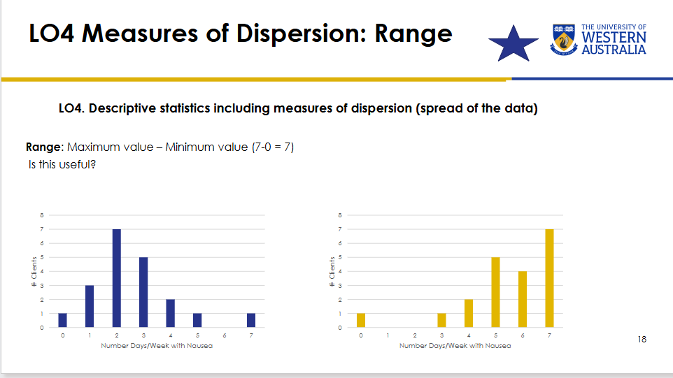
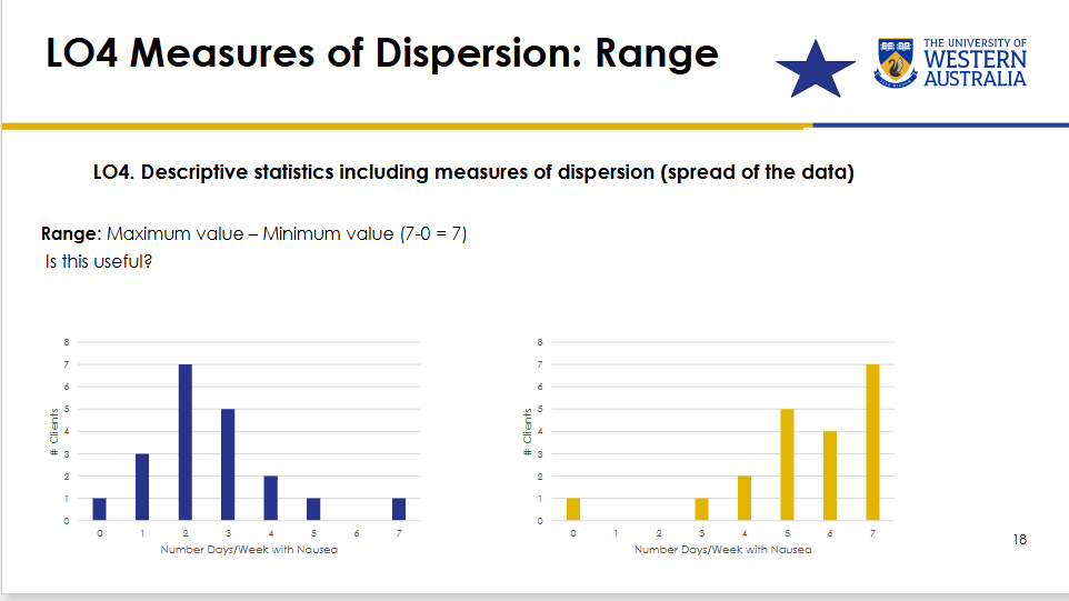
What is the range, and what is its limitation?
Range:
Maximum value − minimum value.
Example:
7 − 0 = 7.
.
Limitation:
It shows only the extremes.
Two datasets can have the same range while having very different distributions and typical experiences.
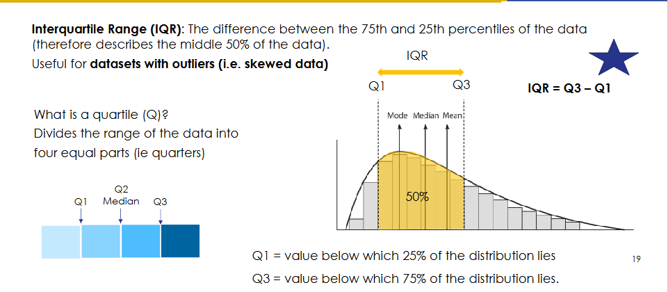
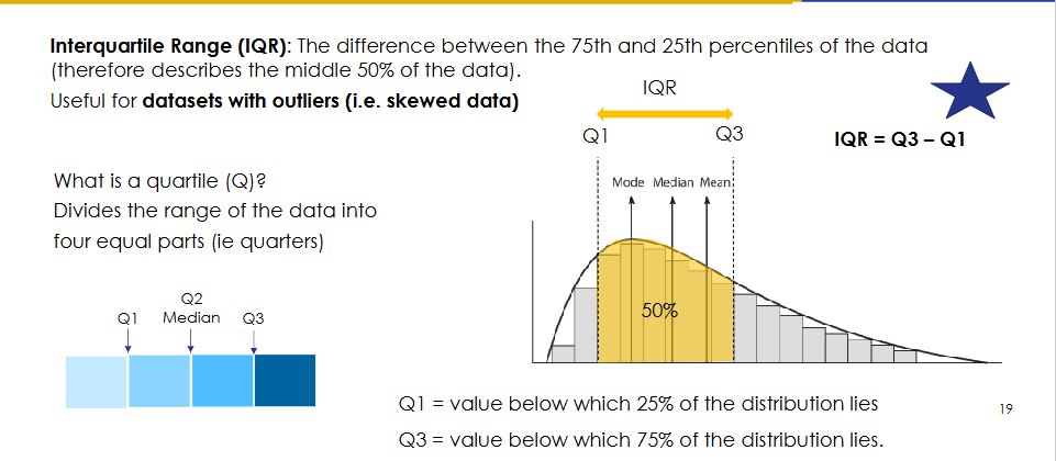
What is the interquartile range (IQR)?
IQR:
The difference between the 75th percentile and the 25th percentile.
.
Formula:
IQR = Q3 − Q1
It describes the spread of the middle 50% of the data and is especially useful for skewed datasets with outliers.
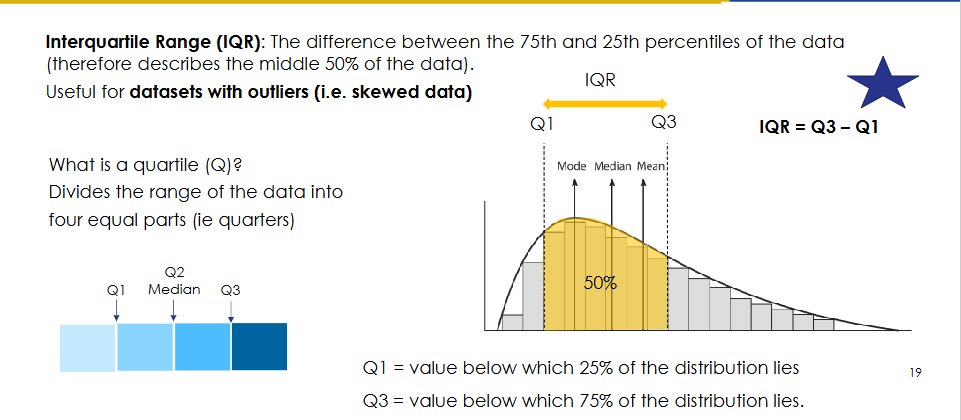

What are Q1, Q2 and Q3?
Q1:
Value below which 25% of the distribution lies.
Q2:
The median; 50% of observations lie below it.
Q3:
Value below which 75% of the distribution lies.
.
Quartiles divide the ordered dataset into four equal parts.
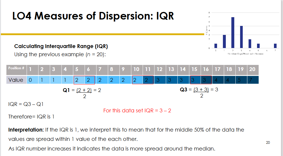
How was the IQR calculated for the 20-person nausea dataset?
Ordered data:
0, 1, 1, 1, 2, 2, 2, 2, 2, 2, 2, 3, 3, 3, 3, 3, 4, 4, 5, 7
.
Q1:
(2 + 2) / 2 = 2
.
Q3:
(3 + 3) / 2 = 3
.
IQR:
3 − 2 = 1
.
Interpretation:
The middle 50% of observations span 1 unit.

How should the size of an IQR be interpreted?
Smaller IQR:
The middle 50% of the data are more tightly clustered around the median.
.
Larger IQR:
The middle 50% are more widely dispersed around the median.

How are the Q1 and Q3 positions located using the lecture's formulas?
Q1 position:
(n + 1) / 4
For n = 20:
(20 + 1) / 4 = 5.25
.
So Q1 lies between the 5th and 6th positions.
Q3 position:
3(n + 1) / 4
For n = 20:
3(21) / 4 = 15.75
So Q3 lies between the 15th and 16th positions.

What should be done when a quartile position falls on a whole number versus between positions?
If the calculated quartile position is a whole number:
Use the value occupying that position.
If it falls between positions:
Use the relevant neighbouring values to determine the quartile.
.
Lecturer explanation:
This becomes especially useful for larger datasets where the quartile locations are not obvious.
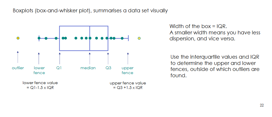
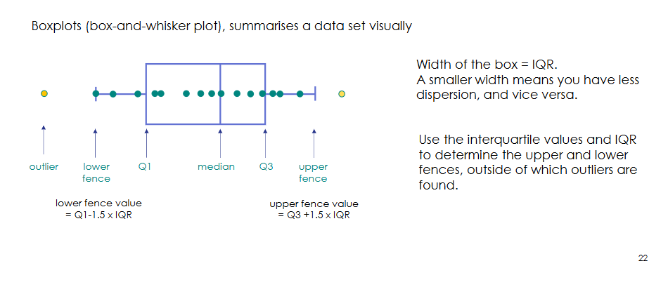
What information does a boxplot display?
A boxplot visually summarises a dataset using:
- Q1
- Median
- Q3
- Lower fence
- Upper fence
- Outliers
The box represents the middle 50% of the data.

How does box width relate to dispersion?
Width of the box = IQR.
Shorter box:
Less dispersion around the median.
.
Longer box:
Greater dispersion around the median.

How are the lower and upper fences of a boxplot calculated?
Lower fence:
Q1 − 1.5 × IQR
.
Upper fence:
Q3 + 1.5 × IQR
Observations beyond these fences are treated as outliers.
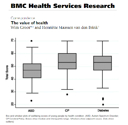
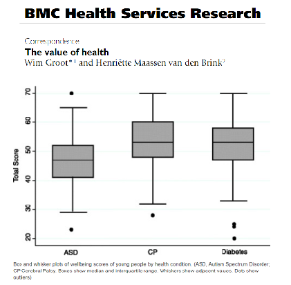
What did the wellbeing-score boxplot example illustrate?
The boxplots compared total wellbeing scores for young people with:
- Autism spectrum disorder (ASD)
- Cerebral palsy (CP)
- Diabetes
.
Shorter boxes indicate less spread.
The ASD group showed a shorter box than the CP group.
Extensive overlap among boxes suggested that large between-group differences were unlikely.
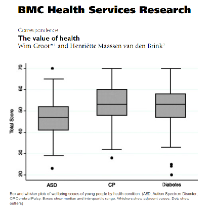

What did the lecturer say overlapping boxplots imply before formal significance testing?
When boxes and ranges overlap substantially, a clear statistical difference between groups is less likely.
Lecturer explanation:
The graph can therefore provide a quick visual impression before inferential testing, although formal testing would be needed to establish statistical significance.
Which dispersion measure should be paired with skewed versus normally distributed data?
Skewed data:
Use IQR, which describes spread around the median.
.
Normally distributed data:
Use variance and standard deviation, which describe spread around the mean.

What are variance and standard deviation?
Both measure dispersion around the mean for normally distributed data.
Variance:
Average squared spread around the mean.
.
Standard deviation:
Square root of the variance.
.
Because SD is in the same units as the original data, it is generally easier to interpret.
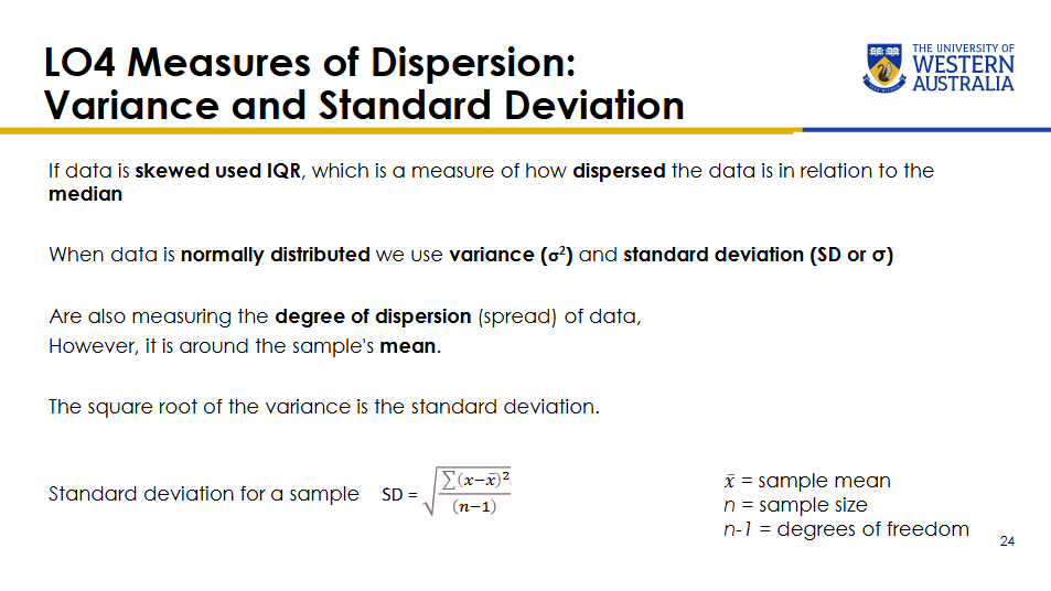

What formula was shown for the sample standard deviation?
SD = √[Σ(x − x̄)² / (n − 1)]
Where:
x̄ = sample mean
n = sample size
n − 1 = degrees of freedom
Lecturer explanation:
Students were not expected to calculate SD manually; understanding its interpretation was the priority.
![<p>SD = √[Σ(x − x̄)² / (n − 1)]</p><p>Where:</p><p>x̄ = sample mean</p><p>n = sample size</p><p>n − 1 = degrees of freedom</p><p>Lecturer explanation:</p><p>Students were not expected to calculate SD manually; understanding its interpretation was the priority.</p>](https://assets.knowt.com/user-attachments/3cac49f4-b9e3-48b1-97a9-c3d4682e5a87.png)
Why is standard deviation usually reported instead of variance?
Standard deviation is expressed in the same units as the original dataset.
Variance is expressed in squared units and therefore produces larger, less intuitive values.
Research therefore commonly reports SD.

What notation distinguishes sample from population data in the lecture?
Sample:
- Usually represented by lowercase n.
- Sample standard deviation written as SD.
.
Population:
- Usually represented by uppercase N.
- Population standard deviation written as σ.
- Population variance written as σ².
.
Lecturer explanation:
This notation is common but not always followed perfectly in published literature.
What assumptions are important when using standard deviation and parametric tests?
- The data should be approximately normally distributed.
- Parametric tests generally assume group variances are roughly equal.
- Applying normality-dependent methods directly to clearly non-normal data is poor practice.
Skewed data can sometimes be transformed to approximate normality before analysis.
Is transforming skewed data before parametric analysis considered inappropriate?
No.
Lecturer explanation:
Transforming skewed data so that it better satisfies normality assumptions is accepted practice when done appropriately.
Researchers may report that the data were transformed before applying statistical tests.
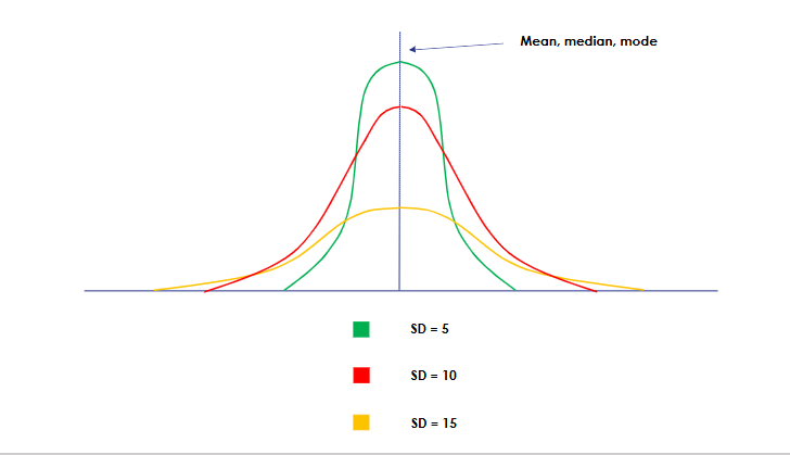
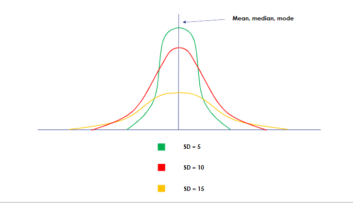
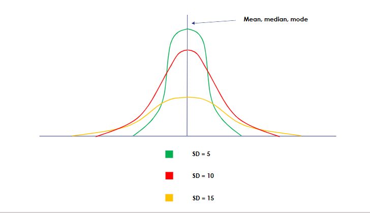
How should different standard deviations be interpreted when distributions have the same mean?
Smaller SD:
Observations cluster more tightly around the mean.
Larger SD:
Observations are more widely dispersed around the mean.
Example shown:
SD = 5 was narrowest.
SD = 10 was intermediate.
SD = 15 was widest.
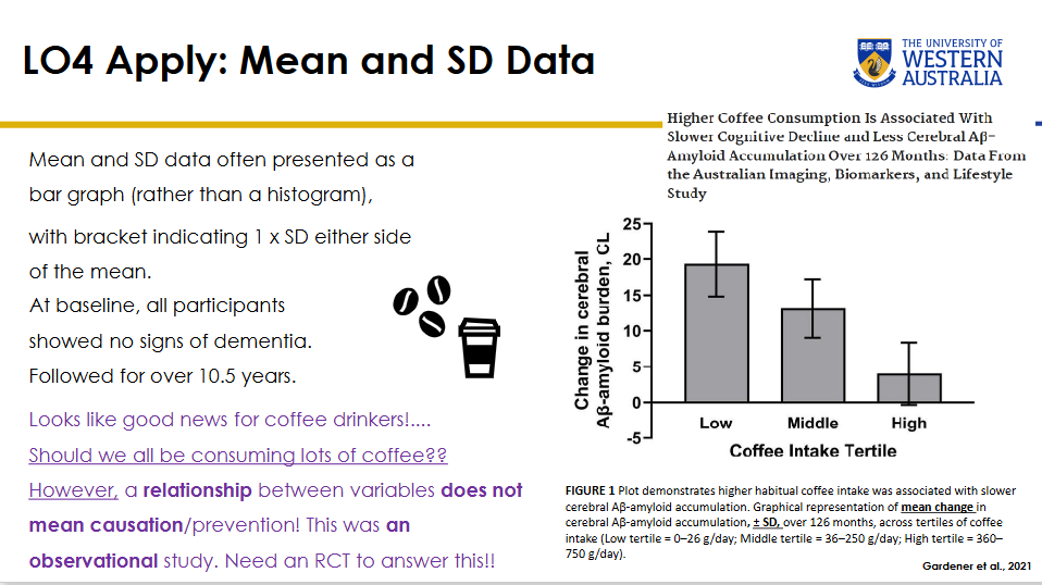
How are mean and SD often displayed graphically?
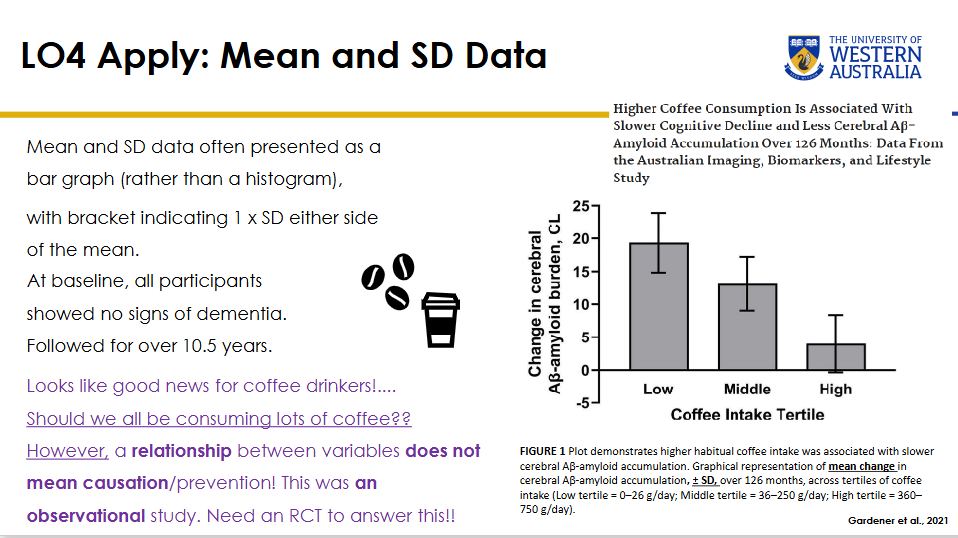
Mean and SD data are often shown with:
- A bar representing the mean.
- Error bars extending approximately 1 SD above and below the mean.
This is different from a histogram, which displays the frequency distribution of raw observations.
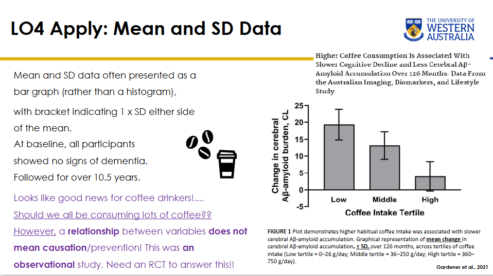

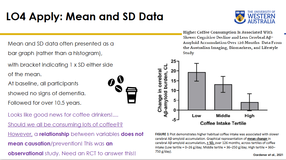
What did the coffee and cerebral Aβ-amyloid study report?
At baseline:
Participants showed no signs of dementia.
.
Follow-up:
Over 10.5 years, equivalent to 126 months.
.
Coffee-intake tertiles:
- Low: 0-26 g/day
- Middle: 36-250 g/day
- High: 360-750 g/day
Finding:
Higher habitual coffee intake was associated with slower cerebral Aβ-amyloid accumulation.
The graph showed mean change ± SD.
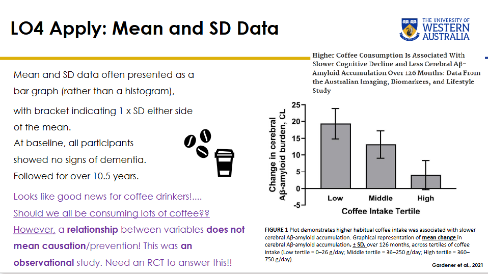
Why does the coffee-Aβ-amyloid association not prove that coffee prevents cognitive decline?
The study was observational.
An association between two variables does not establish causation or prevention.
Other characteristics of coffee drinkers could explain the difference.
Lecturer example:
Higher coffee intake might be associated with more social or cognitively active lifestyles.
Lecturer emphasis:
An RCT would be needed to directly test whether coffee itself causes the observed effect.

What is the empirical 68-95-99.7 rule?
For normally distributed data:
- About 68% of observations lie within ±1 SD of the mean.
- About 95% lie within ±2 SD.
- About 99.7% lie within ±3 SD.
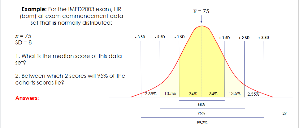

How is the normal distribution divided across standard-deviation bands in the empirical-rule diagram?
From the mean outward on each side:
- Mean to ±1 SD: about 34% on each side.
- Between 1 and 2 SD: about 13.5% on each side.
- Between 2 and 3 SD: about 2.35% on each side.
Totals:
±1 SD = 68%
±2 SD = 95%
±3 SD = 99.7%


How can the empirical rule help assess whether data behave as normally distributed?
If observed frequencies approximately follow the expected:
- 68% within ±1 SD
- 95% within ±2 SD
- 99.7% within ±3 SD
then the distribution is behaving in a way consistent with normality.
Lecturer explanation:
This complements visual inspection of the histogram.

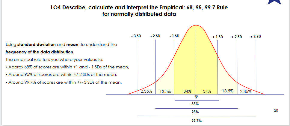
For normally distributed IMED2003 exam heart rates with x̄ = 75 bpm and SD = 8 bpm, what is the median?
Median = 75 bpm.
Why:
In a normal distribution, mean ≈ median ≈ mode.


For normally distributed IMED2003 exam heart rates with x̄ = 75 bpm and SD = 8 bpm, where should approximately 95% of values lie?
95% lie within ±2 SD.
2 SD = 2 × 8 = 16 bpm.
Lower limit:
75 − 16 = 59 bpm.
Upper limit:
75 + 16 = 91 bpm.
Therefore:
Approximately 95% lie between 59 and 91 bpm.

What are the main take-home rules for choosing descriptive statistics?
Normally distributed quantitative data:
- Centre: mean, median and mode are similar.
- Spread: SD or variance.
.
Skewed quantitative data:
- Mean is pulled toward outliers.
- Centre: median is more representative.
- Spread: IQR is preferred.
- Boxplots can visually summarise the distribution and outliers.
.
Lecturer emphasis:
Choose descriptive statistics that match the distribution of the data.
Q1 Which variable is an example of ordinal data?
A. Height in cm
B. Number of hospital admissions
C. Pain severity rated as mild, moderate or severe
D. Blood pressure
Correct answer:
C. Pain severity rated as mild, moderate or severe
Why it is correct:
The categories have a meaningful order from lower to higher severity, but the distances between categories are not defined.
Why the other options are incorrect:
A. Height in cm is quantitative continuous ratio data.
B. Number of hospital admissions is discrete quantitative data.
D. Blood pressure is quantitative continuous data.
Q2 A dataset of emergency department waiting times has a long right tail. Which measure best represents the centre of the data?
A. Mean
B. Median
C. Range
D. Standard deviation
Correct answer:
B. Median
Why it is correct:
A long right tail indicates right-skewed data. The median is less affected by extreme high values and better represents the central experience.
Why the other options are incorrect:
A. The mean is pulled toward the right-hand outliers.
C. Range measures spread, not centre.
D. Standard deviation measures spread and is mainly used with approximately normal data.
Q3 What is the mode of a dataset?
A. Average value
B. Middle value
C. Most frequently occurring value
D. Difference between largest and smallest values
Correct answer:
C. Most frequently occurring value
Why it is correct:
The mode is the value that appears most often.
Why the other options are incorrect:
A. Average value describes the mean.
B. Middle value describes the median.
D. Difference between largest and smallest values describes the range.
Q4 For a skewed dataset with outliers, which measure of dispersion is most appropriate?
A. Standard deviation
B. Variance
C. Data Range
D. Interquartile range
Correct answer:
D. Interquartile range
Why it is correct:
The IQR describes the middle 50% of the data and is resistant to extreme outliers, making it suitable for skewed distributions.
Why the other options are incorrect:
A. Standard deviation is generally paired with normally distributed data.
B. Variance is also a measure of dispersion around the mean and assumes an approximately normal distribution in this context.
C. Range uses only the minimum and maximum and is strongly influenced by extremes.
Q5 In a normally distributed dataset, approximately what percentage of observations lie within ±2 SD of the mean?
A. 68%
B. 75%
C. 95%
D. 99.7%
Correct answer:
C. 95%
Why it is correct:
The empirical rule states that about 95% of normally distributed observations fall within ±2 SD of the mean.
Why the other options are incorrect:
A. 68% corresponds to ±1 SD.
B. 75% is not one of the empirical-rule percentages.
D. 99.7% corresponds to ±3 SD.