Lecture 2 - Data Summary and Visualization
1/17
There's no tags or description
Looks like no tags are added yet.
Name | Mastery | Learn | Test | Matching | Spaced | Call with Kai |
|---|
No analytics yet
Send a link to your students to track their progress
18 Terms
How do measures of central tendency fall?
In normal distribution, mean = median = mode
In skewed/multimodal distribution, mean, median, and mode differ
when distributions are highly skewed → median is a better measure
when distributions are multimodal, this indicates the presence of multiple groups
we can use modes to describe the ‘center’ or non-numeric data
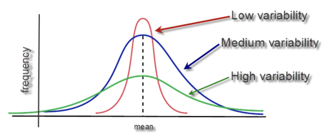
Standard deviation features
when sd is low, points are clustered to the mean
when there’s high variability, the points are more spread out
observations that are a lot higher or lower than the mean are going to be common in a distribution with high variability
Good vs bad graph features
Good
clean
informative AND
easy to understand
Bad
confusing
misleading BAD
OR meaningless
Pie Charts
to show proportions of different categorical and mutually-exclusive options
Proportions need to add up to 1 (percentages need to add up to 100%)
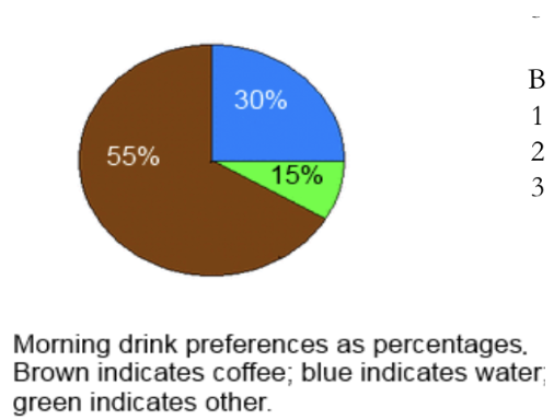
Good or bad graph?
Good graph! It’s possible to describe the graph
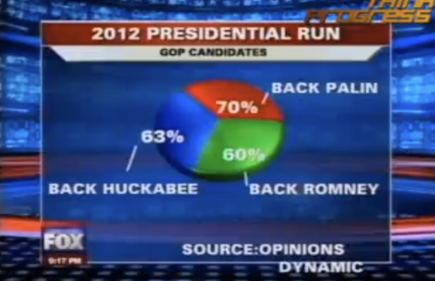
Good or bad graph?
Bad graph! the percentages need to add up to 100%
Bar plots
to compare values associated with separate (usually categorical) variables
These can be any sort of numeric variable that we are looking for differences across groups, such as means, counts/frequencies, medians, or percentages
In some cases, either a bar plot or pie chart can be used (i.e. if we can calculate percentages that sum to 100)
Can be vertical or horizontal
Can quickly become overwhelming if too many categories
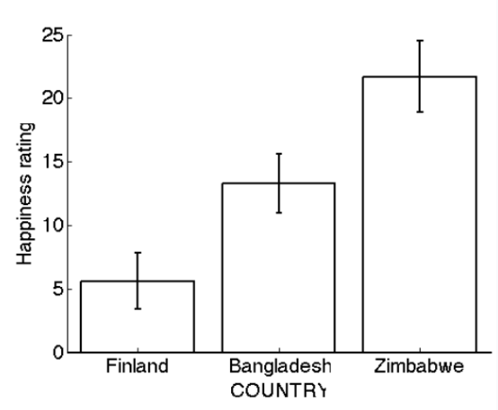
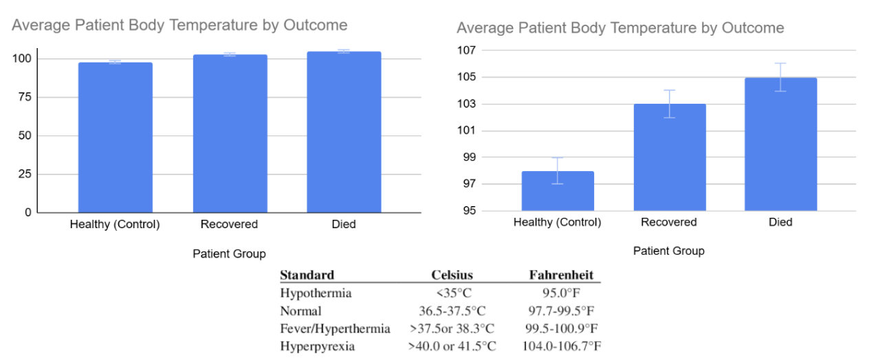
Error bars
show uncertainty (or confidence) in the average
Wider bar = more variation/uncertainty
Narrower bar = less uncertainty (or more confidence)
*Imagine a distribution on the side of the bar
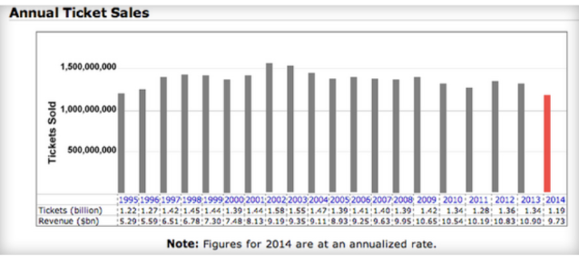
Good or bad graph?
Bad graph! Too much and redundant info, could use a line plot.
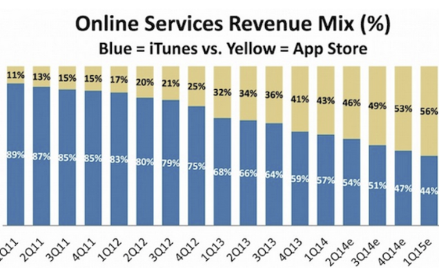
Good or bad graph?
Bad graph! Too much and redundant info
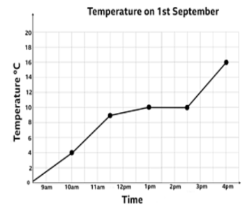
Line graphs
only appropriate when x values are linear
Frequently used for time-series data →
Can involve 2 y-axes (with caution)
Can have error bars/bands
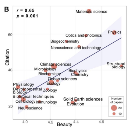
Scatterplots
shows every data point; can help show relationships between variables while looking at all the data
They can easily be overwhelming when there’s lots of data
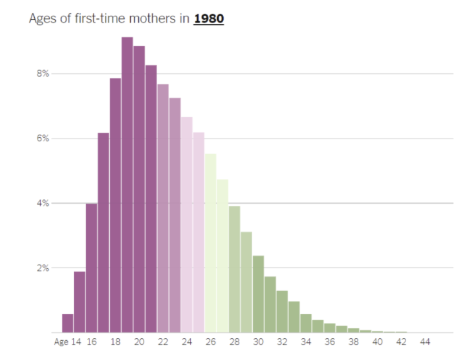
Histograms
bar plots specifically that plot frequency (i.e. the number of times a certain value occurs in the data)
The x-axis has a variable, and y-axis is always frequency
Plot shapes are readability can depend extensively on bin widths
Guide for Choosing a graph
Are we looking at percentages of different categories on a single variable that sum to 100? (one variable)
Pie chart
Are we looking at a numeric variable by groups of different categories? (two variables)
Bar graph
Are we looking at a numeric variable over a series of time? (two variables)
Line graph
Are we looking at the relationship between two different numeric variables? (two variables)
Scatterplot
Are we looking at the distribution of a numeric variable? (one variable)
Histogram
When is it okay to truncate axes?
it’s okay to truncate axes to the reasonable range for a measure
Ex: 95 is a good temp, 99.5 and above indicates fever → when values are so close, it makes sense to truncate to get a sense what the real meaningful difference is
it’s okay when you want to show change over time
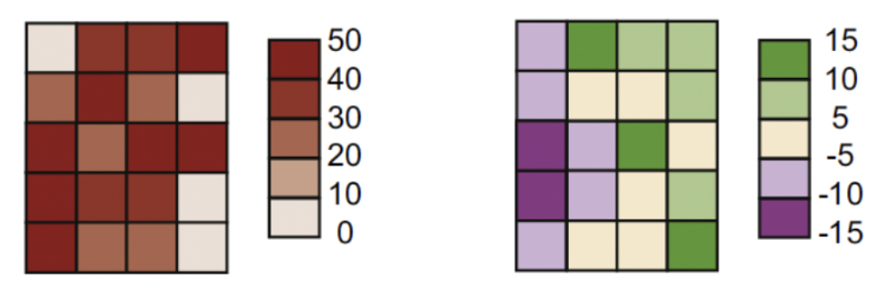
Basic elements of color for representation
Magnitude (low to high; 0-50) = light to dark shade of same color (ex: light red to dark red)
Divergent/bidirectional (negative to positive; -15 to 15) = dark shade of color 1 to dark shade of color 2 (ex: dark blue to white to dark red)
Categorical = different colors
Consider audience and accessibility (ex: colorblind population)
Aspect ratio
ratio of width to height
Widening the x-axis (see x-axis numbers on left panel) makes the slope look steeper, implying a greater increase, and affects our interpretation
How to make a good plot
Logical representation
Labeled axes
No redundancy
All plot elements are clearly visible
Clean presentation
Sufficiently large font
Avoid clutter
No unnecessary color
Include a title
Include a legend (if necessary)