Data Visualization basics
1/3
There's no tags or description
Looks like no tags are added yet.
Name | Mastery | Learn | Test | Matching | Spaced |
|---|
No study sessions yet.
4 Terms
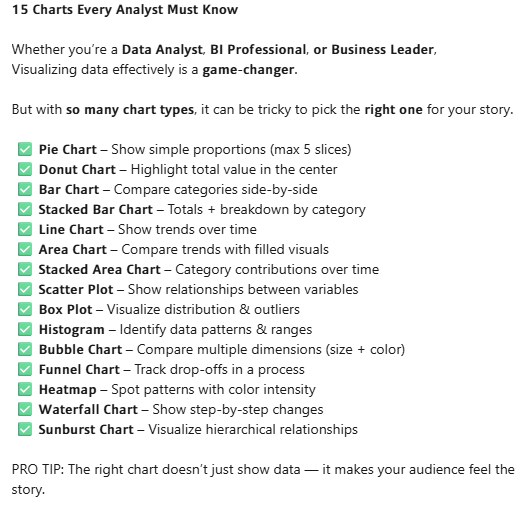
What are the 15 visual charts all Data professionals must know and what story do they tell?
✅ 𝗣𝗶𝗲 𝗖𝗵𝗮𝗿𝘁 – Show simple proportions (max 5 slices)
✅ 𝗗𝗼𝗻𝘂𝘁 𝗖𝗵𝗮𝗿𝘁 – Highlight total value in the center
✅ 𝗕𝗮𝗿 𝗖𝗵𝗮𝗿𝘁 – Compare categories side-by-side
✅ 𝗦𝘁𝗮𝗰𝗸𝗲𝗱 𝗕𝗮𝗿 𝗖𝗵𝗮𝗿𝘁 – Totals + breakdown by category
✅ 𝗟𝗶𝗻𝗲 𝗖𝗵𝗮𝗿𝘁 – Show trends over time
✅ 𝗔𝗿𝗲𝗮 𝗖𝗵𝗮𝗿𝘁 – Compare trends with filled visuals
✅ 𝗦𝘁𝗮𝗰𝗸𝗲𝗱 𝗔𝗿𝗲𝗮 𝗖𝗵𝗮𝗿𝘁 – Category contributions over time
✅ 𝗦𝗰𝗮𝘁𝘁𝗲𝗿 𝗣𝗹𝗼𝘁 – Show relationships between variables
✅ 𝗕𝗼𝘅 𝗣𝗹𝗼𝘁 – Visualize distribution & outliers
✅ 𝗛𝗶𝘀𝘁𝗼𝗴𝗿𝗮𝗺 – Identify data patterns & ranges
✅ 𝗕𝘂𝗯𝗯𝗹𝗲 𝗖𝗵𝗮𝗿𝘁 – Compare multiple dimensions (size + color)
✅ 𝗙𝘂𝗻𝗻𝗲𝗹 𝗖𝗵𝗮𝗿𝘁 – Track drop-offs in a process
✅ 𝗛𝗲𝗮𝘁𝗺𝗮𝗽 – Spot patterns with color intensity
✅ 𝗪𝗮𝘁𝗲𝗿𝗳𝗮𝗹𝗹 𝗖𝗵𝗮𝗿𝘁 – Show step-by-step changes
✅ 𝗦𝘂𝗻𝗯𝘂𝗿𝘀𝘁 𝗖𝗵𝗮𝗿𝘁 – Visualize hierarchical relationships
.
.
.
.
.
.