Type Ch 9, 10, 11
 Call Kai
 Learn
Learn Practice Test
 Spaced Repetition
 Match
Match Flashcards
1/97

There's no tags or description
Looks like no tags are added yet.
Name | Mastery | Learn | Test | Matching | Spaced | Call with Kai | Chat |
|---|

98 Terms
Name five qualities of an Old Style font.
1. Stem and hairline strokes are the close in weight.
2. Ascenders are taller than the cap height.
3. Heavily bracketed serifs
4. Cupped serifs
5. Small height to the lowercase letters.
6. Oblique stress in the characters
7. Terminals on some lowercase letters are teardrop shaped.
Name five qualities of Transitional font
1. Pointed serifs
2. Finely bracketed serifs
3. Wide lowercase letters
4. Strong difference between weight of stem and hairline strokes.
5. Small height to the lowercase letters.
6. Almost vertical stress to the letters.
7. Capitals are same height as lowercase ascenders.
Name five qualities of a Modern font
1. Extreme contrast to stem and hairline strokes.
2. No bracketing on serifs
3. Strong vertical stress
4. Lowercase has small body height
5. Terminals on some letters are circular.
Name five qualities of an Egyptian font
1. Consistent stroke weight throughout the letters
2. Large x-height
3. Thick squarish slab serifs
4. Little or no bracketing
5. Vertical stress to the letters
Name Five qualities of a Sans Serif font
1. No serifs
2. Stem and hairline strokes appear even
3. Large body height in proportion to cap height
4. Often squared-off terminals
Name eight types of Display fonts
1. Scripts
2. Ornate faces
3. Historic typefaces
4. Western faces
5. Circus faces
6. Illuminated initials
7. Inline, contour and shaded
8. Rustic, textured faces
Name a Transitional typeface.
Baskerville
Name a Modern typeface.
Bodoni and Didot
Name an Old Style typeface.
Garamond and Caslon
Name a Sans Serif font.
Helvetica
What do type designers do to the horizontal strokes of letters?
Make them thinner than verticals because of how our eyes perceive them.
What do type designers do to circular and angular characters?
They make them larger because they only touch the baseline and cap line at small place.
What do type designers do to strokes when they come together?
Taper the strokes as they come together.
What do type designers do to negatives of letters in photocomposition?
Pinch the corners of the negatives so the corners stay crisp.
What does it mean to bastardize type?
To condense or extend it using the computer.
What happens if you stroke a font to try to bold it?
It makes the hairline strokes too thick.
What is reversed type?
Reversed Type is white type on a black background
What are the characteristics of an italic font?
1. Letters slant to the right
2. The f gets a descender
3. There are hooked finials on the letters
4. There is a single story g
5. There is a single story a
6. There is a loop on the lowercase k.
What is a Typeface?
Design of the upper and lowercase letters
What is a Font?
Design of uppercase and lowercase letters, numerals, monetary symbols, mathematical symbols, and punctuation.
What is a Family of Type?
All styles and weights of the font.
What is a Typestyle?
The italic, roman, all the weights of a font and condensed and extended versions of the font
What is a Superscript?
Numbers used as exponents, or the numerator in a fraction
What is Subscript?
Numbers in a chemical formula, or the denominator in a fraction
What are Old Style figures?
Numbers that have ascenders and descenders
What are Lining figures?
Numbers that align top and bottom
What is unique about the Univers family?
The entire family was designed by one man, Adrian Frutiger. It uses numbers to designate weight, condensed and extended fonts.
What do we mean by designing with two families of type?
Use a serif and a sans serif family
How many points are in a Pica?
12
How many Picas in an inch?
6
How many points in an inch?
72
What are the strips of lead placed between lines of type called?
Leading
What does an Old Style Serif look like?
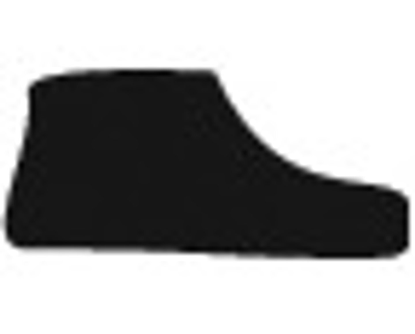
What does a Transitional Serif look like?
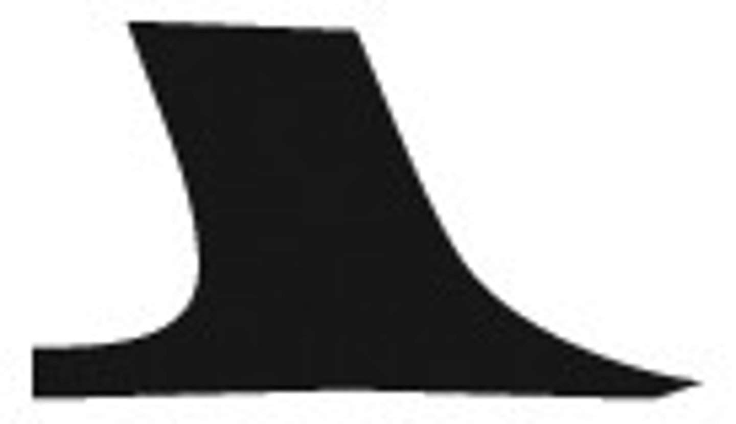
What does a Modern Serif look like?
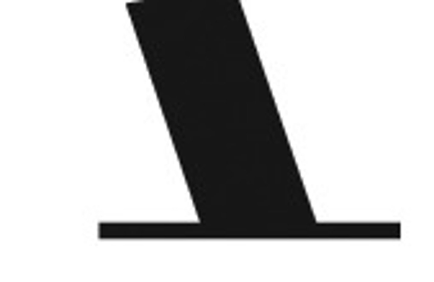
What does an Egyptian Serif look like?
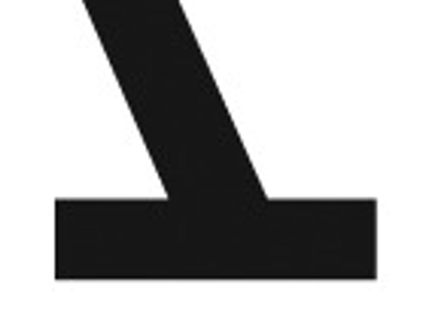
What determines the visual size of type?
The x-height
What is the tracking of type?
The tightening of text type to make word units easier to read.
Which is easier to read, all caps or cap and lowercase text?
Cap and lowercase is easier to read because the ascenders and descenders create unique word shapes.
What is the difference between a Typestyle and a Typeface?
Typestyle refers to the weight, italic, condensed or extended versions of a font. Typeface is the unique design of the upper and lowercase letters.
What is ITC?
ITC is the International Typeface Corporation; takes classic fonts and redesigns them with a large x-height to make them easily readable at text sizes.
From what lines is point size measured?
From Ascender line to Descender Line this comes from the way lead type had to be measured.
What are two advantages of Cold type over Hot type?
Cold type can be overlapped, enlarged, curved, twisted, etc because lenses create the type.
What kind of type is made with photocomposition?
Cold type is made with photocomposition.
How is x-height measured?
X-height is measured from the Waistline to the Baseline.
How is leading measured?
Leading is measured from Baseline to Baseline.
What is Negative Leading?
When the point size of leading is lower than the point size of the type 120/80.
What is the standard point size of text type we read?
Text type is 8.5 to 10 point.
What kinds of characters need special kerning?
Letters with an overhang -- P, T or Y or angled characters --A, W, V, or round characters --- O, C, G, Q need special kerning.
What are kerning pairs?
Kerning pairs are ligatured -- tt, if, ff, ww, or those with angled or overhanging parts such as Ya, Yi, Ye, Yo, Yu, Ti, Ta, Te, To, Tu, etc.
What is the rule of thumb for word spacing in headlines?
The width of a lowercase l.
What is phrasing in headlines?
Break the headlines into segments with natural pauses.
What do you do with bullets and parentheses in all caps copy?
Bullets and parentheses have to be baseline shifted up in all caps copy.
What does set solid mean?
The point size of type and leading are the same.
What determines the visual size of type?
X-height determines the visual size of type.
Who invented metal printing type in Europe?
Johannes Gutenberg
When was moveable reuseable type introduced in Europe?
1450
Where was moveable, reuseable type introduced in Europe?
Mainz, Germany
Which is easier to read, black on white or white on black type?
Black type on white.
Which have a bolder stroke real small caps or computer sized small caps?
Real Small caps are drawn with a stroke weight the same as the capitals.
Why is condensing type on the computer wrong?
It makes the horizontal strokes too thick.
Do human eyes perceive horizontals or verticals as wider?
We perceive horizontals as wider.
What is Leading between lines useful for?
Allows readers to follow back to the left margin to start next line.
What is white on black type called?
Reversed type
What do you do to quotes in headlines
Hang them in the margin
What do you do to size of quotes in a headline?
Make them a bit smaller
How can you tell if a headline uses negative leading?
The descenders of one line and ascenders of next line share space
What is kerning?
Tightening of letter spacing
What is tracking?
Widening of letterspacing
How do Real Small Caps differ from computer small caps?
Real small caps are the same stroke weight as the capital letters.
Computer Condensed type can be detected because
The horizontals are too thick and verticals too thin
Computer Extended type can be detected because
The horizontals are too thin and the verticals are too thick
Which is larger a font or a typeface?
The Font has many more characters
What is a family of type?
A typeface and all the related typestyles
What is a typestyle?
A variation of a typeface, such as different weights, the roman, italic, the condensed and extended.
How does the italic of a font differ from just sheering the Roman?
The k gets an upper loop, the f gets a descender, there are hooked finials, single story a and g.
How can you detect computer bolded type?
The hairline strokes are too thick
Why are horizontal strokes thinner in type?
Our eyes perceive them as wider, more rods
Which letters are slightly larger to appear the same size?
Pointed and curved characters
Name an Egyptian typeface
Clarendon
⌘ R
Hide/Show Ruler
⌘ Y
Outline View
⌘ ⇧ O
Outline type
⌘ ⇧ P
Place
⌘ S
Save
⌘ P
⌘ C
Copy
⌘ V
Paste
⌘ X
Cut
⌘ Z
Undo
⌘ ⇧ Z
Redo
⌘ ⇧ S
Save As
V
Move Tool
A
Open Arrow tool
⌘ g
Group
⌘ ⇧ g
Ungropu
⌘ W
Close document
⌘ Q
Quit Program