Typography and composition basics/notes
1/57
There's no tags or description
Looks like no tags are added yet.
Name | Mastery | Learn | Test | Matching | Spaced | Call with Kai |
|---|
No analytics yet
Send a link to your students to track their progress
58 Terms
Typography
making impressions with writing
what are some characteristics of typography?
includes the
arrangement,
style
appearance of text
what is an type in photoshop?
a specififc type face (ex: arial or georgia)
what are the anatomy of type
baseline
capline,
x-height,
Stress,
Descender,
Ascender,
Counter,
Crossbar
Baseline
imaginary horizontal line of which most characters sit.
Capline
the imaginary line that marks the height of all capital letters in typeface and is below the maximum height of the typeface.
x-height
imaginary horizontal line that marks the height of the line. it is a distance between the baseline and the meanline of a typeface. In CSS it is a relative measurement (ex)
Stress
imaginary line drawn from top to bottom of a glyph bisecting the upper and lower strokes is the axis
Descender
The lower portion of the lowercase letters that extend below the baseline of a typeface.
Ascender
the tops of most lowercase letters from an imaginary line. Some lowercase letters have this which is an extension that rises above the meanline.
Counter
The negative space within a letter
Crossbar
a stroke that connects two lines in the capital letterforms
what is a font
specfifc characteristics of a type size style weight
what is an example of font?
Italic
what is an old style type
earliest example of printed type
what are some facts about the old style type
used in 12th-17th centuries
serifs that maintain shapes similar to cuts made by the chisels of Roman stonemasons.
what are some characteristics of the old style type
serifs,
larger x heights,
diagonal stress,
transition from thick to thin strokes
what is transitional type
between modern and old style
what are some facts about transitional type
began around 1600 and early 1700
half step between the characteristics of old style and modern type
another word for this is serif fonts
referred as the fonts created by pen and ink.
what are some transitional type of characteristics
Higher contrast between thick and thin strokes
Vertical stress
The edges of the serifs are usually squared off.
what is modern type
has more mechanical appearance than the earlier kinds of type
what are some facts about modern type fonts
not contemporary fonts.
fonts appear later in the beginning of the 18th century.
what are some characteristics about modern type fonts
severe transitions from thick to thin
serifs are thin and horizonal,
vertical stress
what is moderen fonts used for
big type elegant looking letters, but they are hard to read in small sizes
Legibility
We don’t read every character, we read the entire word.
slab serifs
designed to be extremely readable from a distance
what are some facts about slab serifs
Egyptian
These fonts appear in 1800s, as advertising, posters, and flyers to catch people’s attention.
These fonts have an industrial voice of strength and fortitude
not traditional fonts
what are some characteristics of slab serifs
thick
squared serifs,
subtle difference between thick and thin strokes
sans serifs type
more softer
what are some facts about sans serifs
appeared in the early 1800.
didn’t gain popularity until the beginning of the 20th century with the evolvement of modernism after WWI.
designed for the screen use
COMBINING TYPES
In type there is usually more than one element on a page – even if it’s a plain text for About us page. We have headings and subheadings, quotations in italic fonts
How is serif font and sans serif font different?
Serif font is older style and traditional
sans serifs are softer and more contemporary look
CAPS TYPE
associated with the Power and stability
bigger and more demanding; they have fewer round elements and softer forms
Italic fonts
associated with more personal human voice and is also display fonts
Script font
emulates cursive handwriting; in most cases, these fonts are used as display fonts
what is the major attribute that script types have
a look of continuity from one character to the next, as a word was written without lifting the pen
TEXT TYPE
designed to be legible and readable at small sizes.
what are some characteristics of text type
usually implies fairly clean, consistent, uncomplicated design features
more open spacing than a display face
thin strokes that hold up at smaller sizes
DISPLAY TYPE
includes fonts that have been designed to look good at large point sizes
often for use in headlines
what are some facts about display type fonts
NOT as readable at smaller sizes for large amounts of text
HAVE a stronger personality, more expressive shapes, and are more stylish.
DECORATIVE (NOVELTY) TYPE
is reserved in its own category as a display fonts
type could have many attributes in common with other types or it could be more illustrative
Composition
art defined as the way the elements of arts and the principles of design are arranged in a work or art
what are examples of composition
Avoid dead center
Stay out of the corners
stay off bottom paper
crop
why should avoid the dead center when putting images/pictures on the canvas
The eye automatically goes to the middle of picture plane as it seeks for balance. When you place the focal point off center, the eye has a tendency to stay a little a bit longer than the average three-second viewing
why should we avoid putting the image in the corners of the canvas
Lines or shapes that extend to the exact corner of the picture plane have a tendency to lead the eye off the page.
stay off bottom paper
Lift the image up off the bottom of the paper.
what is leading in photoshop
determines how text is spaced vertically in lines.
what is kerning in photoshop
the space of the distance between two letters
what is tracking in photoshop
adjusting the spacing throughout the entire word.
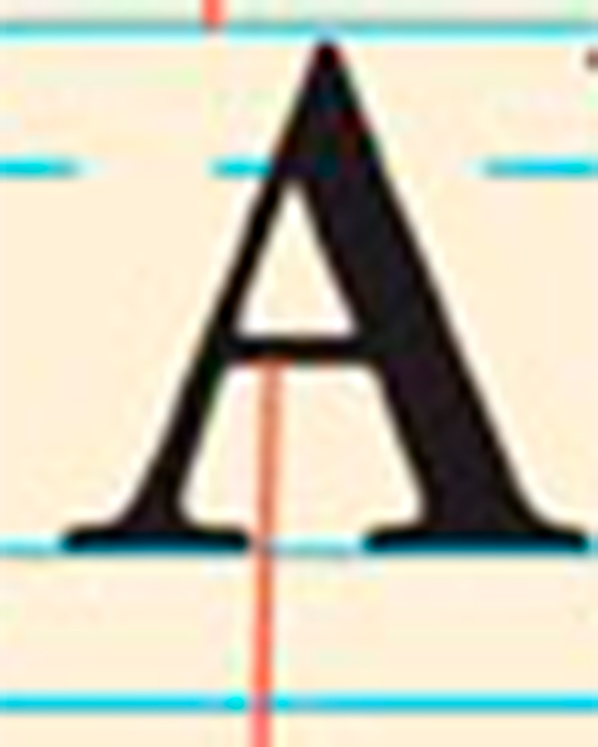
what is this line pointing to in this example
crossbar
what is this line pointing to in this example
ascender
what is this line pointing to in this example
capline
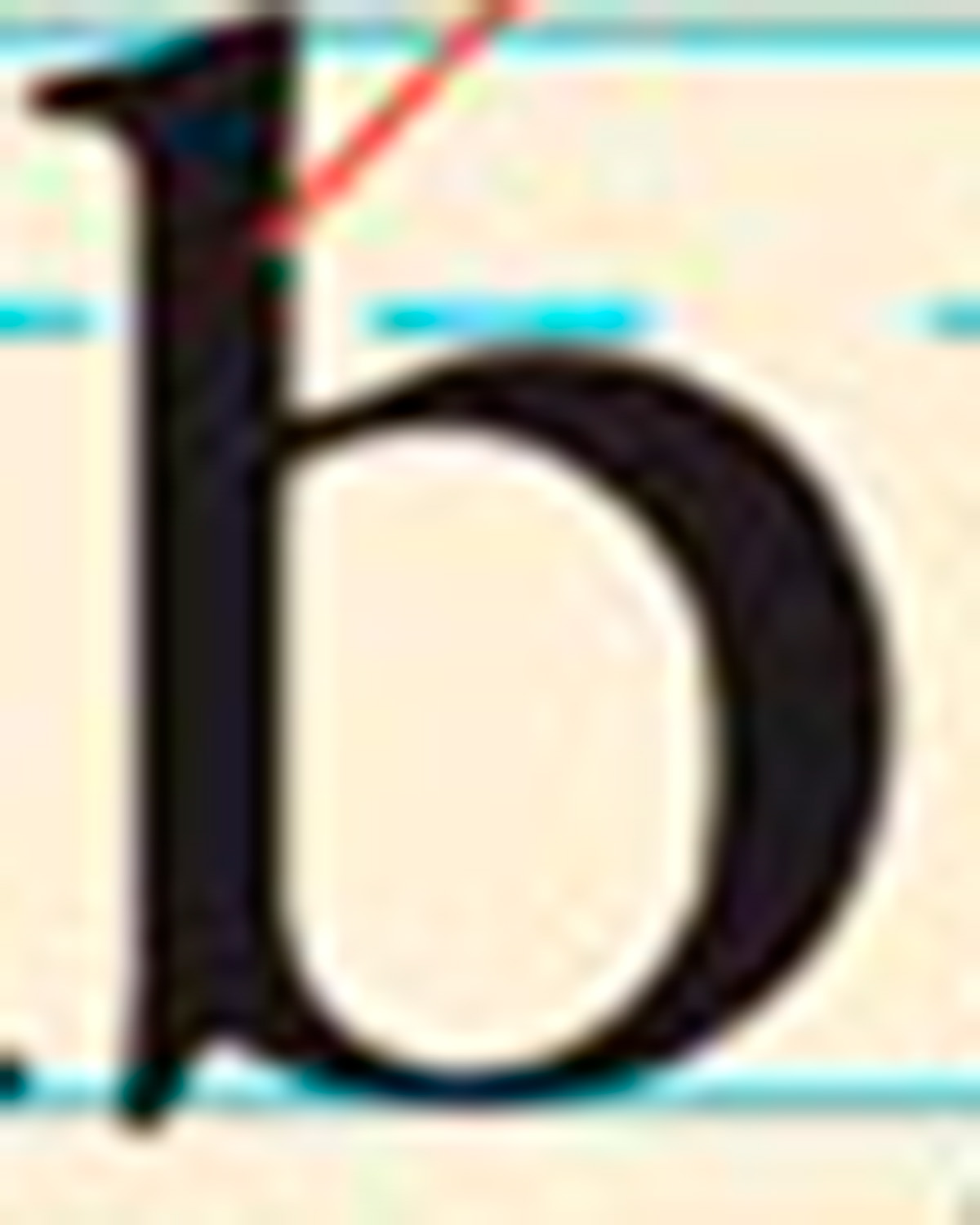
what is this line pointing to in this example
serif
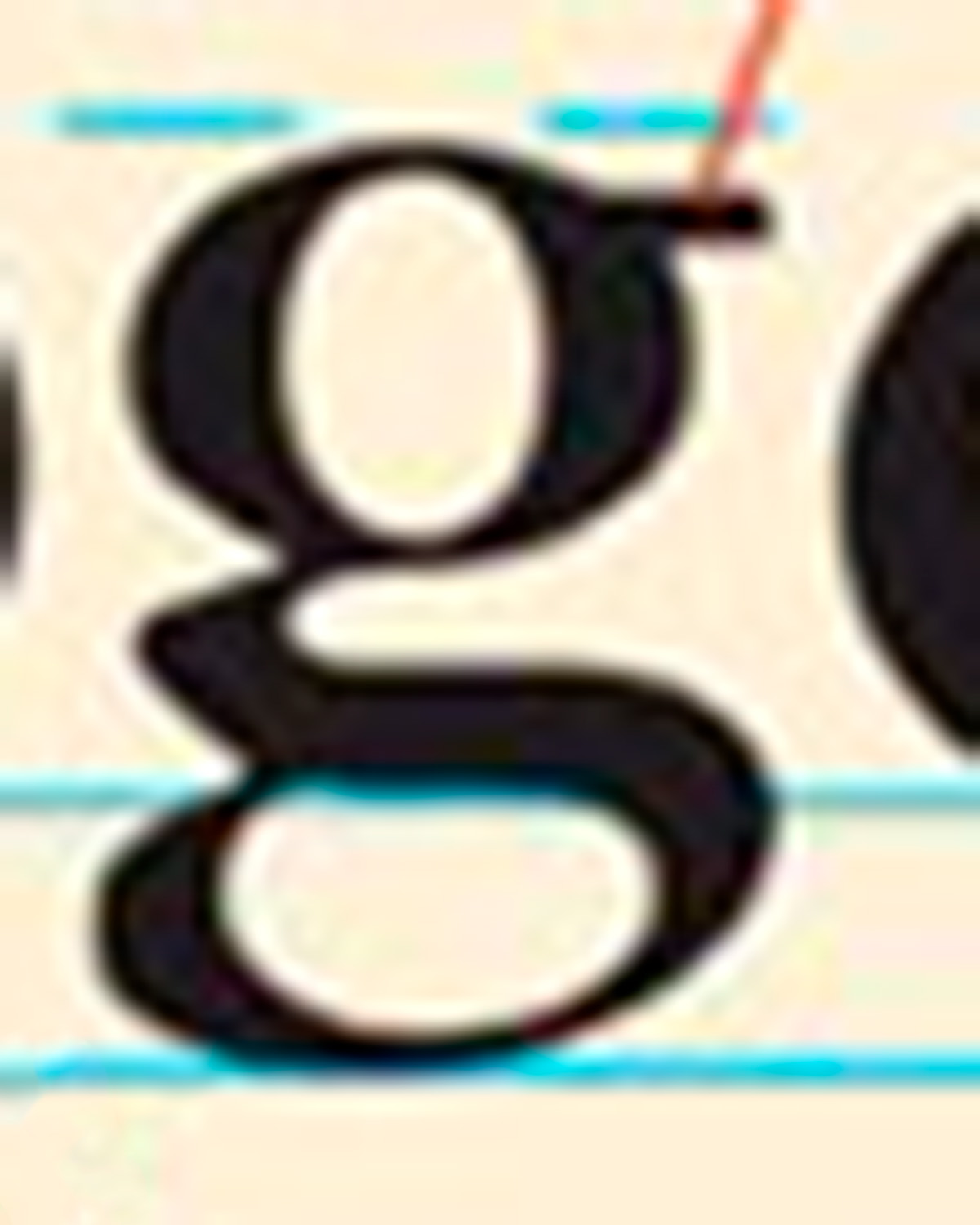
what is this line pointing to in this example
ear
what is this line pointing to in this example
x height
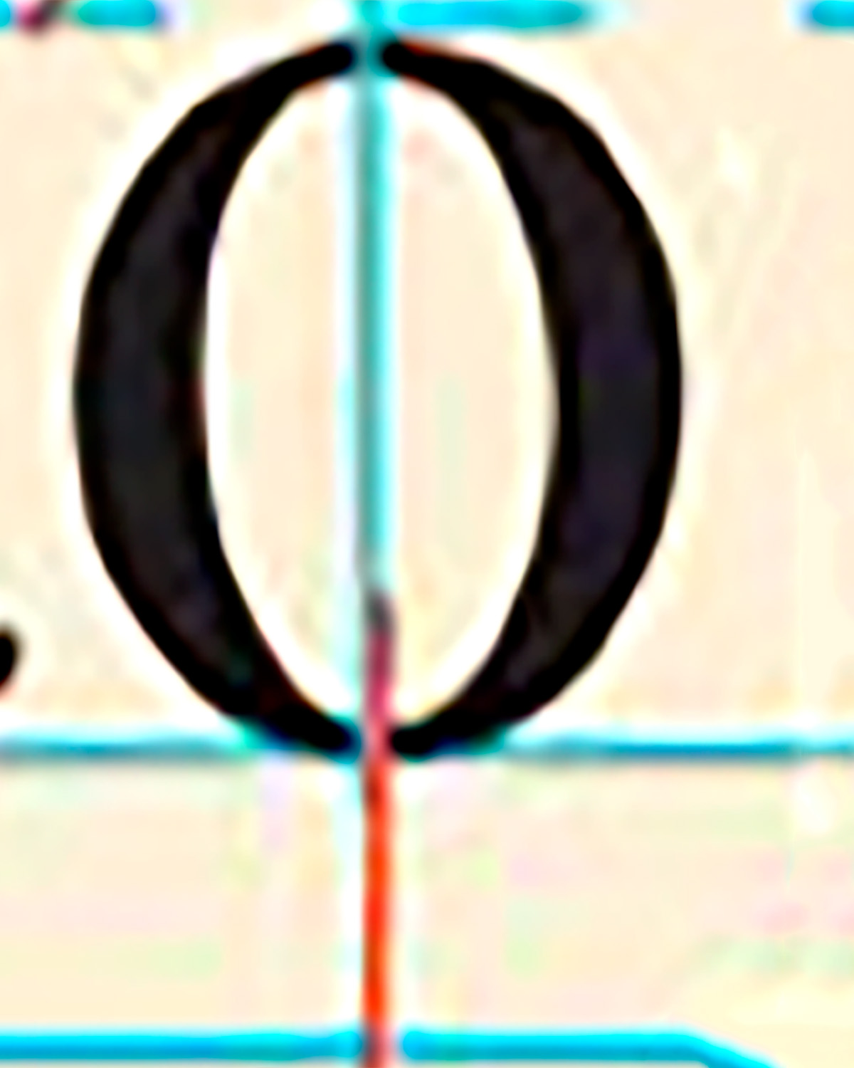
what is this line pointing to in this example
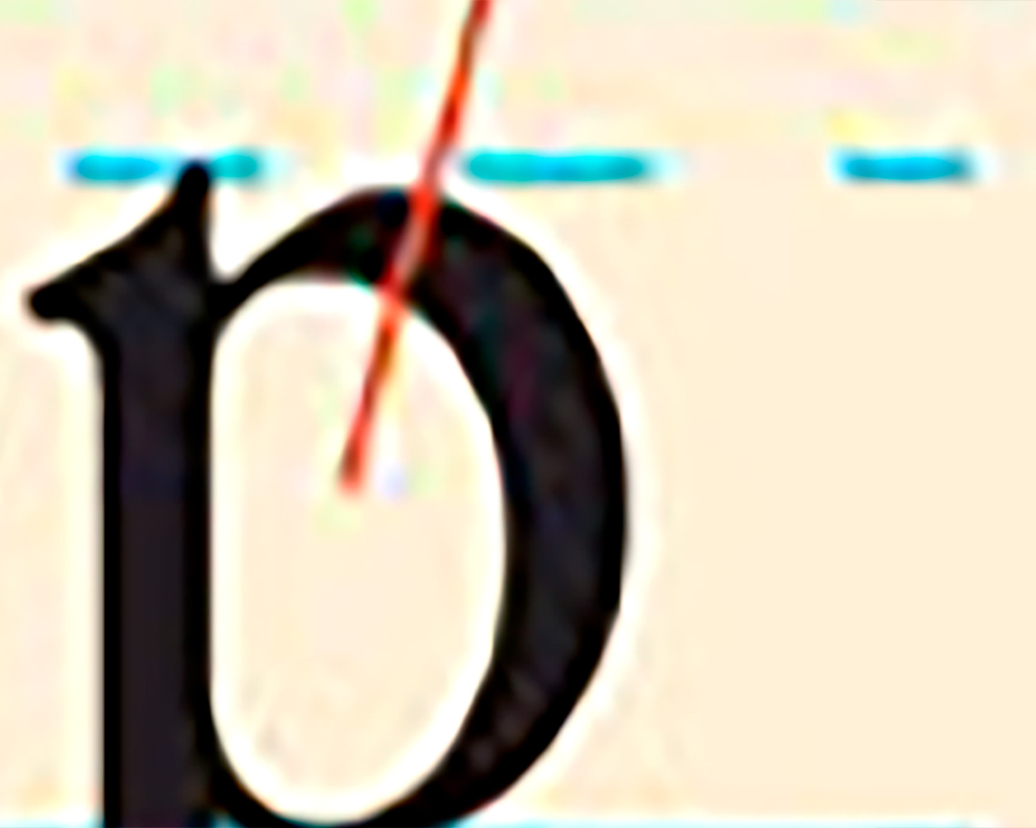
stress
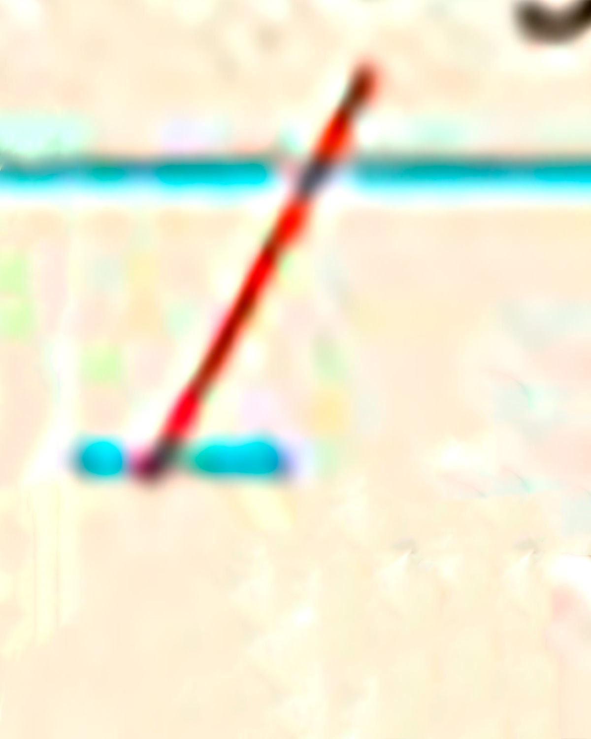
what is this line pointing to in this example
descend
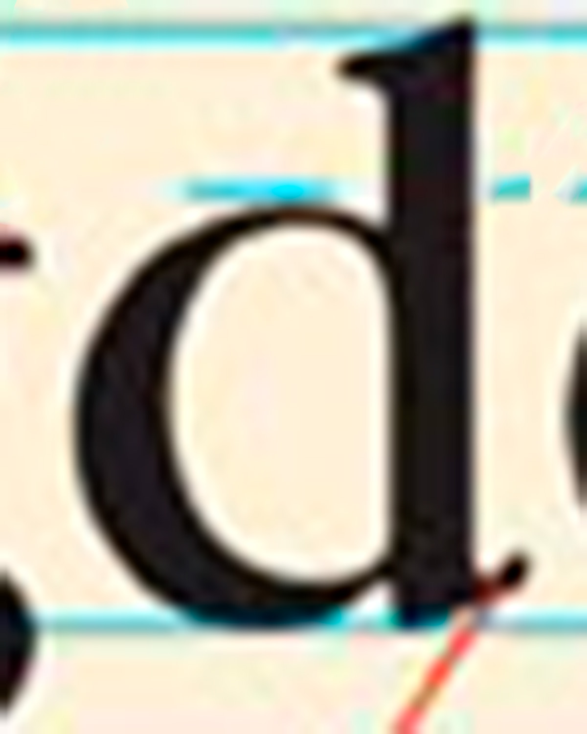
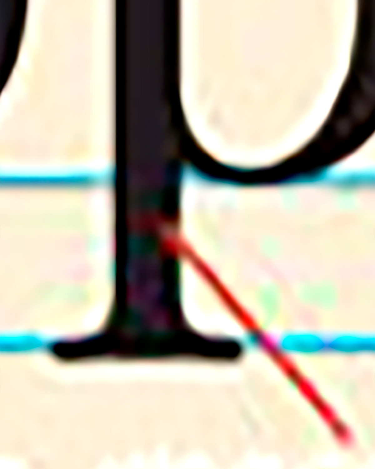
what is the line pointing to in this example
counter