AP STATS UNIT 1 - DATA ANALYSIS
1/82
Earn XP
Description and Tags
Name | Mastery | Learn | Test | Matching | Spaced | Call with Kai |
|---|
No study sessions yet.
83 Terms
Statistics
The science and art of collecting, analyzing, and drawing conclusions from data.
Individual
An object described in a set of data. Individuals can be people, animals, or things.
Variable
An attribute that can take different values for different individuals.
Categorical variable
Assigns labels that place each individual into a particular group, called a category.
Quantitative variable
Takes number values that are quantities—counts or measurements.
Discrete variable
A quantitative variable that takes a fixed set of possible values with gaps between them. (ex. Number of siblings)
Continuous variable
A quantitative variable that can take any value in an interval on the number line. (ex. height of person)
Distribution
Of a variable, tells us what values the variable takes and how often it takes those values.
Frequency table
Shows the number of individuals having each value.
Relative frequency table
Shows the proportion or percent of individuals having each value.
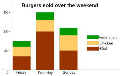
Bar graph
Shows each category as a bar. The heights of the bars show the category frequencies or relative frequencies.
Pie chart
Shows each category as a slice of the "pie." The areas of the slices are proportional to the category frequencies or relative frequencies.
Two-way table
A table of counts that summarizes data on the relationship between two categorical variables for some group of individuals.
Marginal relative frequency
Gives the percent or proportion of individuals that have a specific value for one categorical variable.
Joint relative frequency
Gives the percent or proportion of individuals that have a specific value for one categorical variable and a specific value for another categorical variable.
Conditional relative frequency
Gives the percent or proportion of individuals that have a specific value for one categorical variable among individuals who share the same value of another categorical variable (the condition).
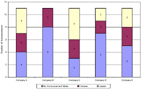
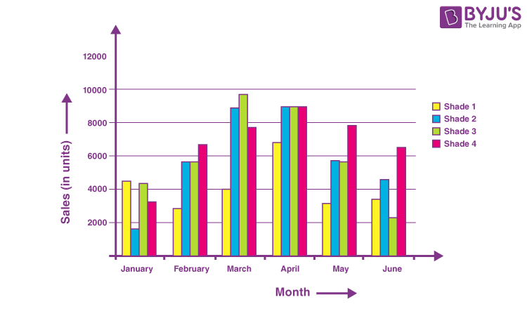
Side-by-side bar graph
Displays the distribution of a categorical variable for each value of another categorical variable. The bars are grouped together based on the values of one of the categorical variables and placed side by side.
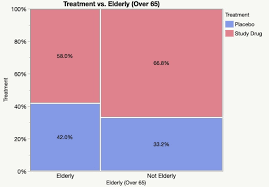
Segmented bar graph
Displays the distribution of a categorical variable as segments of a rectangle, with the area of each segment proportional to the percent of individuals in the corresponding category. Must add up to 100%. Association occurred if graphs are different.
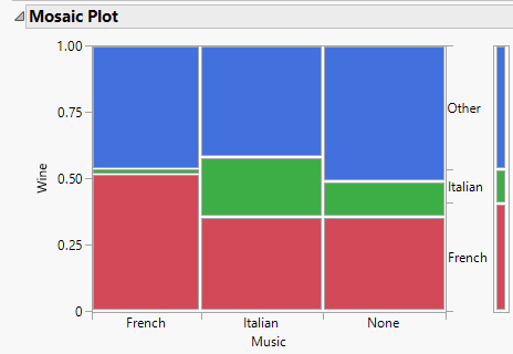
Mosaic plot
A modified segmented bar graph in which the width of each rectangle is proportional to the number of individuals in the corresponding category.
Association
There is an association between two variables if knowing the value of one variable helps us predict the value of the other. If knowing the value of one variable does not help us predict the value of the other, then there is no association between the variables.
Dotplot
Shows each data value as a dot above its location on a number line.
Symmetric distribution
A distribution is roughly symmetric if the right side of the graph (containing the half of observations with the largest values) is approximately a mirror image of the left side. (center is mean). Mean is equal to median.
Skewed distribution
A distribution is skewed to the right if the right side of the graph is much longer than the left side. A distribution is skewed to the left if the left side of the graph is much longer than the right side. (center is median)
Stemplot
Shows each data value separated into two parts: a stem, which consists of all but the final digit, and a leaf, the final digit. The stems are ordered from lowest to highest and arranged in a vertical column. The leaves are arranged in increasing order out from the appropriate stems.
Histogram
Shows each interval of values as a bar. The heights of the bars show the frequencies or relative frequencies of values in each interval. Good for large sets of data.
Mean
The mean of a distribution of quantitative data is the average of all the individual data values. To find the mean, add all the values and divide by the total number of data values.
Statistic
A number that describes some characteristic of a sample.
Parameter
A number that describes some characteristic of a population.
Resistant
A statistical measure is resistant if it isn't sensitive to extreme values. (ex. median and IQR)
Non-resistant
Statistical measures that can be greatly influenced by extreme values/outliers in a dataset. (ex. mean, SD, range)
Median
The midpoint of a distribution, the number such that about half the observations are smaller and about half are larger. To find the median, arrange the data values from smallest to largest. — If the number n of data values is odd, the median is the middle value in the ordered list.; If the number n of data values is even, use the average of the two middle values in the ordered list as the median.
Range
The range of a distribution is the distance between the minimum value and the maximum value. That is, Range = Maximum - Minimum
Standard deviation
Measures the typical distance of the values in a distribution from the mean. It’s calculated by finding an average of the squared deviations and then taking the square root.
Variance
The average squared deviation.
Quartiles
The quartiles of a distribution divide the ordered data set into four groups having roughly the same number of values. To find the quartiles, arrange the data values from smallest to largest and find the median.
First quartile Q1
The first quartile Q1 is the median of the data values that are to the left of the median in the ordered list.
Third quartile Q3
The third quartile Q3 is the median of the data values that are to the right of the median in the ordered list.
Interquartile range (IQR)
The distance between the first and third quartiles of a distribution. In symbols: IQR = Q3 - Q1
Five-number summary
The five-number summary of a distribution of quantitative data consists of the minimum, the first quartile Q1, the median, the third quartile Q3, and the maximum.
How to write the distribution
SOCV - Shape, Outliers (gaps, clusters), center, variance + context
Explanatory variable (independent variable)
manipulated variable
Response variable (dependent variable)
changes as a result of the manipulated variable
Boxplot
A visual representation of the five-number summary.
Unusual
Outliers, Peaks, Gaps
Center
Mean/X bar, Median
Spread
Range, Standard Deviation, Variance
Shape
Skewed right/left, Symmetric, Unimodal, Bimodal
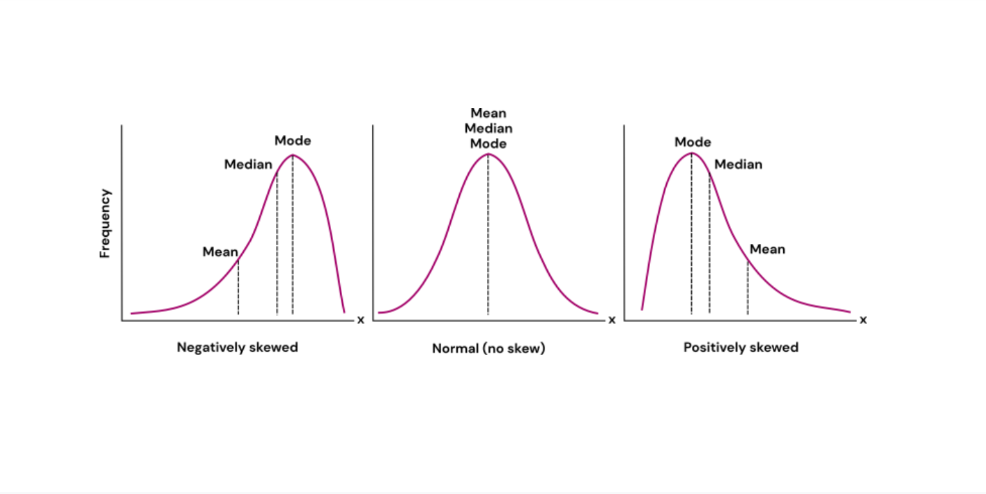
Distribution is skewed right
Mean is greater than median.

Distribution is skewed left
Mean less than median.
Boxplot Advantages
- Organizes large amounts of data into five number summary + outliers. - Splits data into quartiles.
Boxplot Disadvantages
- Doesn’t show every individual value. - Can hide certain features of shape of distribution. (clusters and gaps) - Only quantitive data.
Histogram Disadvantages
- Doesn’t show every individual value. - Use only with continuous data.
Determining relative position (for distributions with any shape)
Percentile and Standardized Score.
Percentile
Percent of values less than or equal to given value. Only use if know data and/or if normal
Percentile Interpretation Example
“The value of __ is at the pth percentile. About p% of the values are less than or equal to __.”
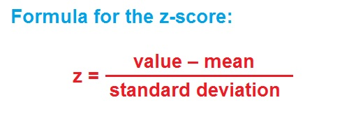
Standardized Score (z-score)
Show position relative to other values in distribution.
Standardized Score Interpretation Example
“The value of ___ is (z-score) standard deviations above/below the mean”
Normal distribution
- Mound-shaped (bell curve) and symmetric. - Determined by mean and SD.
Empirical rule (for normal distributions)
Percent of data values within, one (68%), two (95%), and three (99.7%) standard deviations of the mean.
Low outlier(s)
Q1-(1.5*IQR)
High outlier(s)
Q3+(1.5*IQR)
Types of ways to show distribution:
Dot plot, stemplot, histogram, box plot, segmented bar graph, mosaic, bar graph, pie charts
Dot plot Advantages
- Shows every individual value. - Shows range, shape, minimum & maximum, gaps & clusters, and outliers easily. - Quick analysis.
Dot plot Disadvantages
- Not great for larger sets of data. - continuous quantitive data.
Stemplot Advantages
- Concise representation of data. - Shows range, shape, outliers, minimum & maximum, gaps, & clusters, easily. - Can handle extremely large data sets.
Stemplot Disadvantages
- Key can be hard to understand at times. - Discrete/continuous quantitive data.

Segmented Bar Graph Advantages
Help you display how a larger category is divided into smaller sub-categories and their relationship to the whole.
Segmented Bar Graph Disadvantages
Doesn't tell the total frequency of respondents in each category. - categorical data.

Mosaic Graph Advantages
Identifies correlations between distinct variables. For example, independence is demonstrated when all of the boxes in the same category have the same areas.
Mosaic Graph Disadvantages
- Hard to focus on either the heights or widths individually. - Strictly categorical and don’t work well with continuous data.
Bar Graph Advantages
- Easy to compare multiple data sets.

Bar Graph Disadvantages
- Best used with categorical discrete data.
Pie Chart Advantages
- Visually appealing. - Shows percent of total for each category.
Pie Chart Disadvantages
- No exact numerical data. - Hard to compare multiple data sets. - Works best with categorical data.
Standardizing a distribution
Same shape, mean=0, SD=1.
Linear transformation of shape
Stays the same.
linear transformation of center (mean/median)
Changes when constant is added/subtracted/multiplied/divided in data set.
linear transformation of variability
Only adjusts when data set multiplied/divided by a constant.
linear transformation of standard deviation
Only adjusts when data set is multiplied/divided by a constant.
Cumulative Relative Frequency Graph
Q1=25% Med=50% Q3=75%
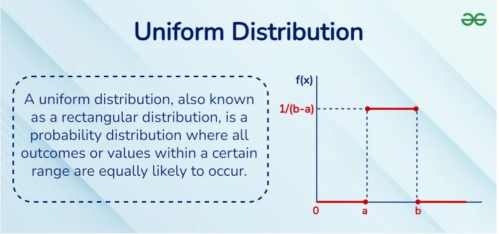
Uniform distribution
Mean = Median.
Normal Distribution Calculation: Finding proportion on calculator
normalcdf
Normal Distribution Calculation: Finding boundary value on calculator
invNorm (remember to change percentage to decimal)