Biostatistics310 - Midterm 1
1/236
There's no tags or description
Looks like no tags are added yet.
Name | Mastery | Learn | Test | Matching | Spaced | Call with Kai |
|---|
No analytics yet
Send a link to your students to track their progress
237 Terms
Nominal
order of categories irrelevant (also called unordered)
Ordinal
order of categories is meaningful (also called ordered)
Binary
Special case of categorical variable - only 2 possible values (also called dichotomous)
Discrete
Values equal to integers
Continuous
Values on a continuum
Is nominal data categorical or ordinal?
Categorical
Is blood type categorical or ordinal
Categorical
Is died of cancer binary or nonbinary
Binary
What are types of categorical data
Nominal, ordinal, binary
What are types of quantitative data
Discrete and continuous
Continuous examples
Blood pressure
Weight
Age
Lead
Quantitative examples
Number of babies out of 100 births who have low birth weight
Number of admissions to the emergency room
For a discrete variable, it isn’t sensible to
consider a value between two numbers (e.g. 1.5 heart attacks doesn’t make sense)
Although a continuous variable may be measured in whole numbers, it is still sensible
to consider a value between two numbers (age – 16.5 years old)
A quantitative measurement may be categorized and treated as a categorical variable
for the purpose of summaries (>25 years etc.)
Categorical variables are sometimes called ____, especially in stats classes
factors
A categorical with inherent logical ordering (age brackets) may be treated as
nominal in some analysis
Categorical data is usually summarized by:
The proportion (percent) of observations in each of the categories
The number in each category (frequency / count)
Important to provide the totals (denominators of percentages)
N or n is often used to represent the total
N = sample size
Pie graphs represent a
categorical variable pictorial
Pie graphs display
data as a percentage of the whole
Pie graphs require
proportional reasoning
Pie graphs are especially difficult with
Ordinal data
Pie graphs are
not the best way to summarize data, but are common in media/non-expert reports
Pie graphs are most appropriate
And better when
When the aim is to convey the relative size of the parts of a whole
Better when there are not too many categories (3-7)
Bar graphs present a
summary measure for each category by a bar
BARGRAPHS: For an ordinal categorical variable, order the bars
in the order of the categories
BARGRAPHS: For a nominal categorical variable, choose
an ordering that aids understanding (for ex, alphabetical or lowest to highest)
For quantitative data, we are usually interested in
The distribution of the observations
What are the most common or average values (center of the data?)
How spread out are the data? (variability of the data)
Are there some values far from the bulk of the data (outliers?)
Strategies for distribution of quantitative data
Visualize the distribution of the data with a graph
Summarize key aspects of the distribution with descriptive statistics, numerical descriptions of the center and spread of the data
Bar graphs can be
Stacked
Stacked bar graph methods
Can do totals, percent out of 100, or other
The histogram is a
graphical display of the distribution of quantitative data
Histogram: Horizontal scale (x) corresponds
to the values of the quantitative variable
Histogram: The x-axis is broken into a
contiguous series of sub-intervals (“classes” or “bins”)
Histogram: Bars are drawn that indicate the
frequencies or percentages of observations within each interval
Histogram:
The area of each bar corresponds to the number of observations in each bin
If all bins have same width, then heights of the of bars also correspond to the number of observations in each bin
Information from a histogram
Typical values
How much variation is present
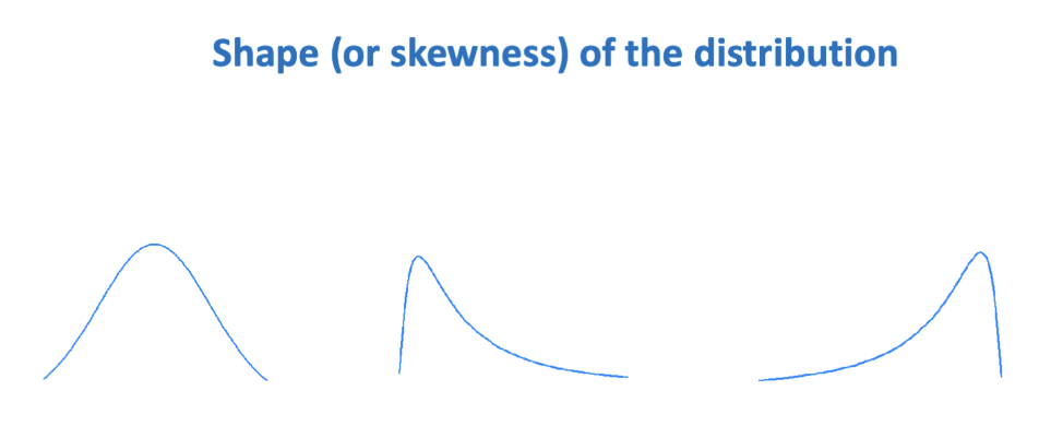
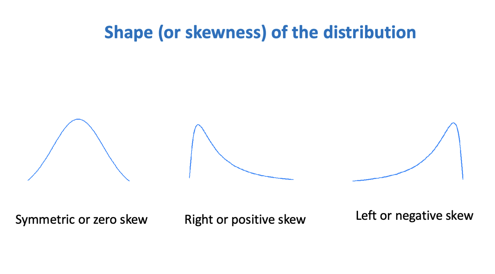
Shape of the distribution
Unusual or outlying values
Approximate frequency or percentage in a given range
Histograms can be sensitive to bin width (or cut-points)
Rule of thumb:
use number of bins = square root of number of observations
In a histogram, each observation is given
one unit of area
With unequal bin widths, easier
to use a bar graph
Unequal intervals are really a
Similarly for ordinal variable, more common to use term
bar chart – does not necessarily show shape of distribution
bar chart (concept of the distribution not the same as for quantitative variables)
We reserve the term histogram for
quantitative variables
Opposite of everyday use
One difference between histogram and bar-graph is that the number of observations is shown
by the area under the curve, or the integral of the category
Reason would have longer data is
less observations
If you have the data, use
equal size bins
In a proper histogram, each observation is
given one unit of area so the histogram reflects the shape of the distribution
In a bar graph, observations may not always be given the same unit of area so the bar graph
may not reflect the shape of the distribution
Histogram needs to show
SHAPE OF DISTRIBUTION!! (not equal sized bins)
Histograms for
quantitative data and to represent shape
Similarly for ordinal variable, more common to use the
term bar chart
We will reserve the term histogram for
quantitative variables
Stem and leaf plot:
another graph for quantitative data;
STEM AND LEAF:
Decimal point is 1 digit to the left of |
(S&P) 0 | 2 2 3 =
0.02, 0.02, 0.03
Numerical summaries for quantitative data
Central tendency and variation
Central tendency
The “middle” of the data
Variation
How “spread out” the data is
X bar
average/mean
Median
Middle point; half bigger half smaller
Mode
Most common value in the dataset
X bar = formula
(summation i=1 to n (Xsubi)) over n
Xsubi means the ith ordered observation in the data
Reasons why something can be the mode in a lead detection study
Lowest point to be detected could be why
Mean is sensitive to
Outliers
For right (positively) skewed data:
mean > median
For left (negatively) skewed data:
median > mean
Median is ___ to outliers
resistant
If symmetrical
Mean=median
Range
Smallest and largest, sometimes shown as difference between them
Interquartile range
25th and 75th percentiles, sometimes shown as difference between them
Computing IQR for 25th percentile
33 x .25.= 8.25, choose the 9th value
Value with 25% of data below it
Range and standard deviation
are sensitive to outliers
IQR is
less sensitive to outliers
B&W: top of box =
75th percentile
B&W: line in middle of box =
median
B&W: line in bottom of box =
25th percentile
B&W: whisker at top
largest value less than Q3 + 1.5 IQR
B&W: whisker at bottom
Smallest value greater than Q1 - 1.5IQR
B&W: dots
Outliers
Can use ___ box plots to show categories
Side by side
Cumulative incidence
Is the proportion (fraction) of individuals newly acquiring the disease (outcome) over a specified period of time
Cumulative incidence =
number of new cases / number at risk
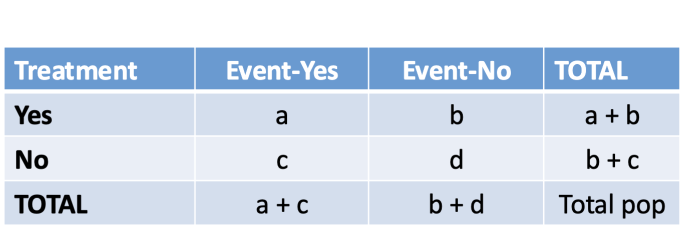
Contingency table
Summarizes the information from two categorical variables (think treatment, cold-yes, cold-no, and total)
Risk factor
Variable that may increase or decrease the chance (risk) of outcome
Difference between treatment, risk factor, and exposure
Treatment is just type, but can be risk factor if it increases/decreases risk; exposure is just whether they were exposed (and would curtail exposed / unexposed categories)
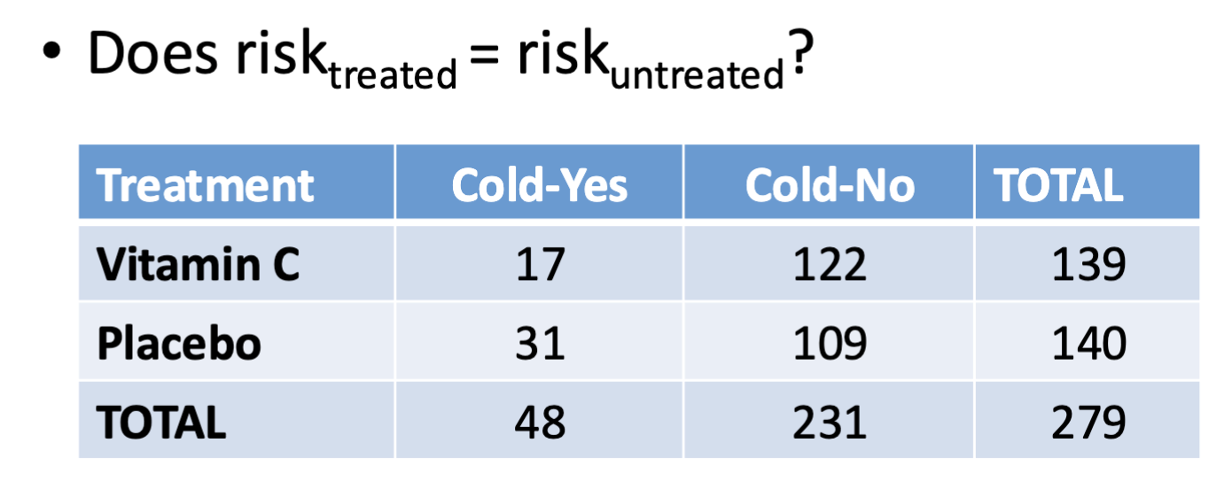
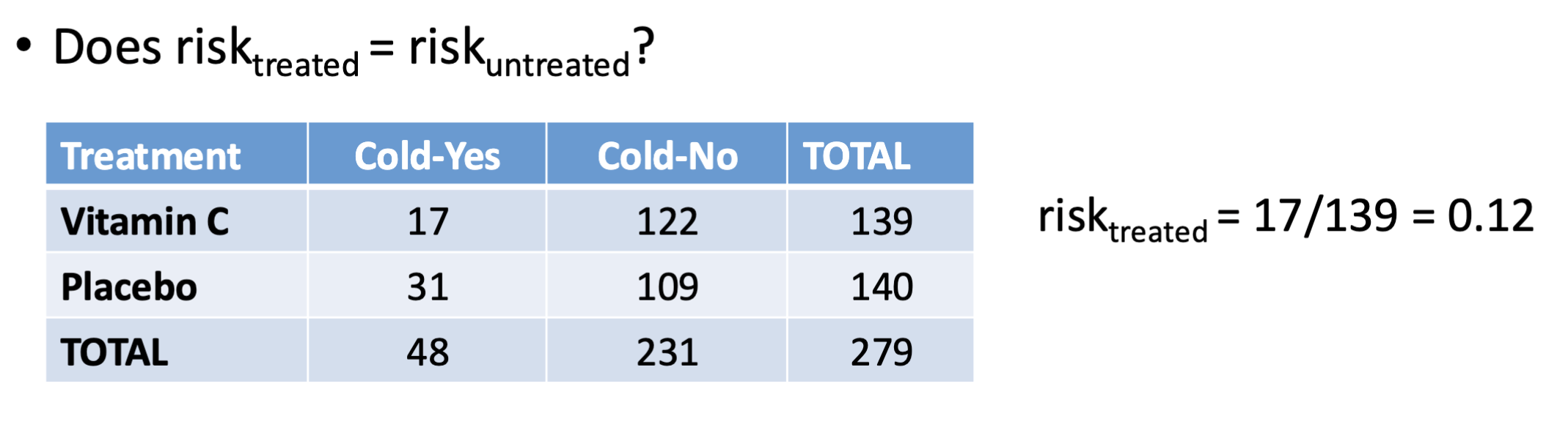
Relative risk formula
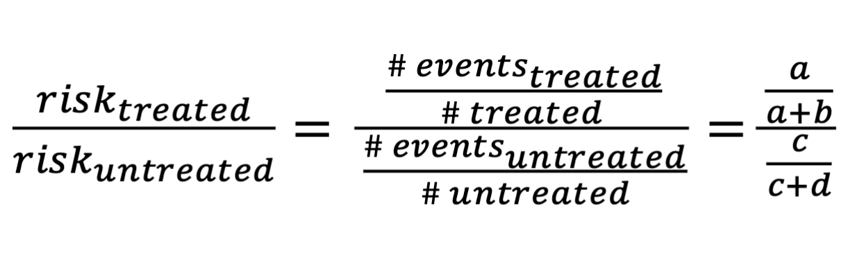
Relative risk table
Relative risk is
Risk of treated over risk of untreated, max can be 1
Summary measure of association between risk factor and outcome; 0 <= RR <= infinity
If RR <1
Treatment is associated with lower risk of outcome
If RR > 1
Treatment is associated with higher risk of outcome
If RR = 1
No association of treatment with outcome
Depending on study design, RR may have a
Causal interpretation:
If <1, treatment lowers risk; treatment is beneficial
If RR >1, treatment increases risk
If RR = 1, no effect on outcome
RR = 1.1
10% higher risk
RR = 2.5
150% higher risk
RR = 0.6
40% lower risk
Risk difference formula
Risk treated - risk untreated = (a over a+b), - (c over c+d)
Risk difference, RD
Summary measure of association between risk factor and outcome
__ <= RD <= __
-1, 1
If RD < 0
Treatment is associated with lower risk of outcome