TOPIC #2: Data and graphical summaries
1/16
Name | Mastery | Learn | Test | Matching | Spaced |
|---|
No study sessions yet.
17 Terms
What is data?
information about the set of subjects being studied. Data most commonly refers to the sample (part of the information) of the population.
What is IDA (initial data analysis)
a first general look at the data, without formally answering the research questions.
What is involved in an IDA
Data background - checking the quality and integrity of the data,
Data structure - what information has been collected?
Data wrangling - scraping, cleaning, tidying, reshaping etc data
Data summaries - Graphical and numerical
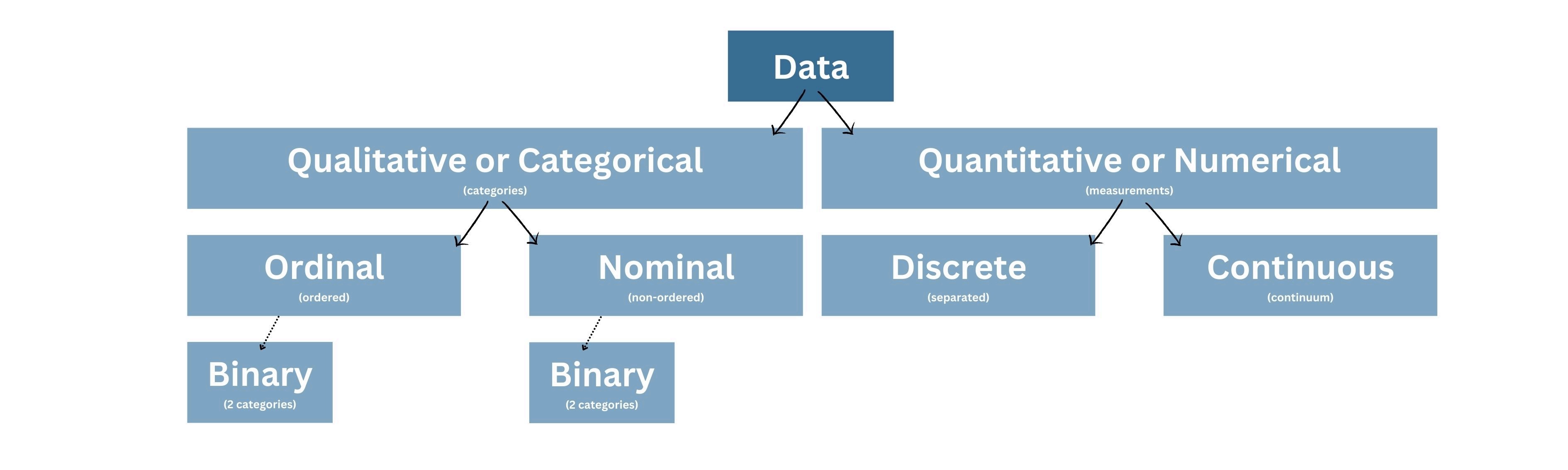
What are types of variables?
quant (quantitative or numerical)
qual (qualitative or categorical)
Describe the categories of data
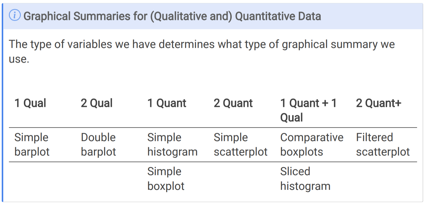
How is one variable of qualitative data commonly summarised?
By a single barplot, where the categories are on the x axis.
How are two variables of qualitative data commonly summarised?
a double barplot, where the 2nd variable is the colour within the bars
What is a simple histogram used for?
Used to summarise quantitative data, to see how a variable is distributed across different class intervals.
what are the two types of histograms?
standard histogram - the y axis represents the number of subjects in each class interval
density/probability histogram - the area of each block represents the percentage of subjects in a particular class interval
What does a simple boxplot show?
the distribution of a single quantitative variable, based on percentiles.
explain a simple boxplot
the box contains the middle 50% of data (between the 25th and 75th percentiles), with a line for the 50% percentile (the median data point).
the lower and upper thresholds represent the minimum and maximum values, excluding outliers. Outliers are typically plotted as individual points outside the whiskers.
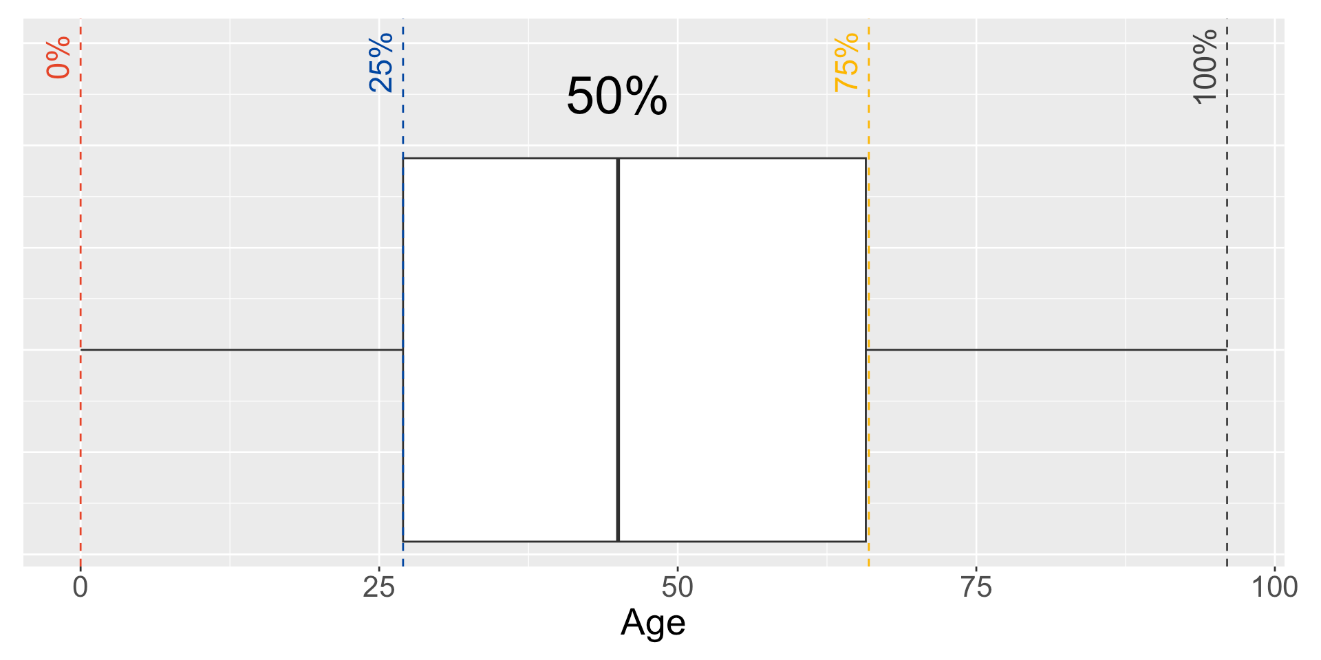
How do u calculate the IQR
75th percentile - 25th percentile
How do you calculate the lower threshold?
The lower threshold is calculated as the 25th percentile - 1.5 x IQR
How do you calculate the upper threshold?
The upper threshold is calculated as the 75th percentile + 1.5 x IQR
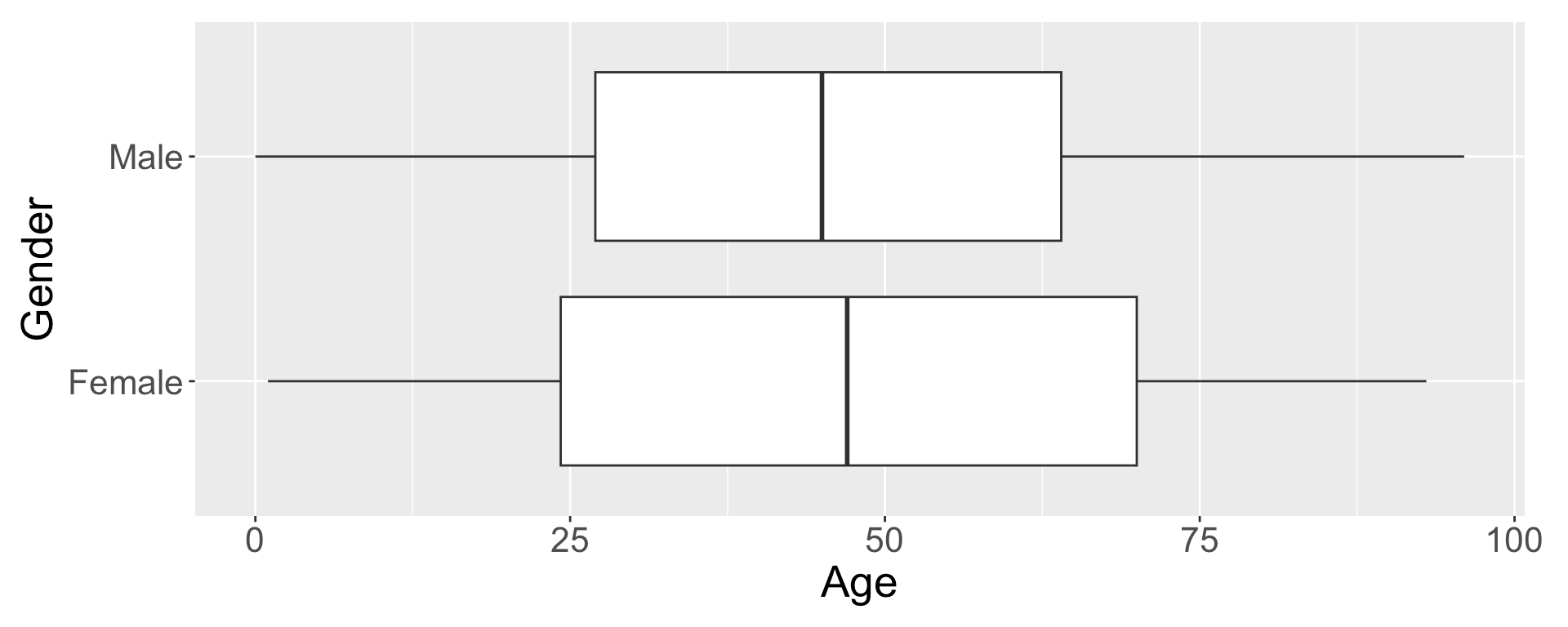
What is a comparative boxplot?
they take a quantitative variable and divide or filter it by a qualitative variable.
What is a simple scatterplot?
examines the relationship between two quantitative variables, plotting them on the x x and y axes.
Summarise how the type of variables we have, determines what type of graphical summary we use.