basic quality management tools
1/15
There's no tags or description
Looks like no tags are added yet.
Name | Mastery | Learn | Test | Matching | Spaced |
|---|
No study sessions yet.
16 Terms
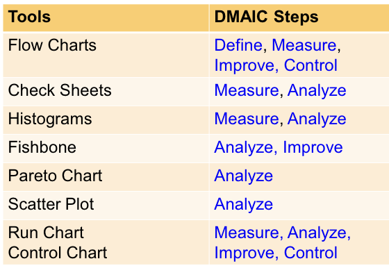
To visually document a process, show the sequence of activities, and identify redundancies or improvement opportunities.
plus compares and contrasts actual versus ideal flow of a process → objective assessment based on data
What is a flowchart used for?
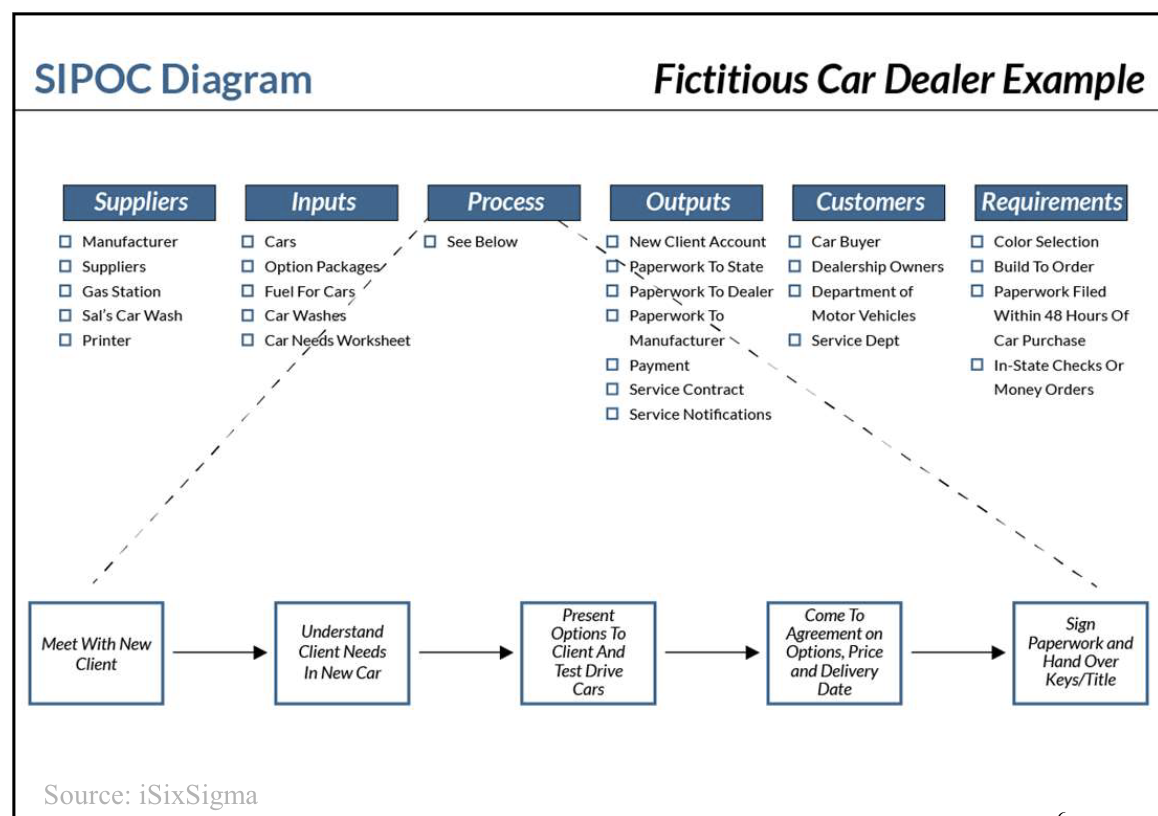
supplier input process output customer (SIPOC) diagram - flowcharts
identify basic elements of a process and project boundaries
transferring customer requirements into output requirements
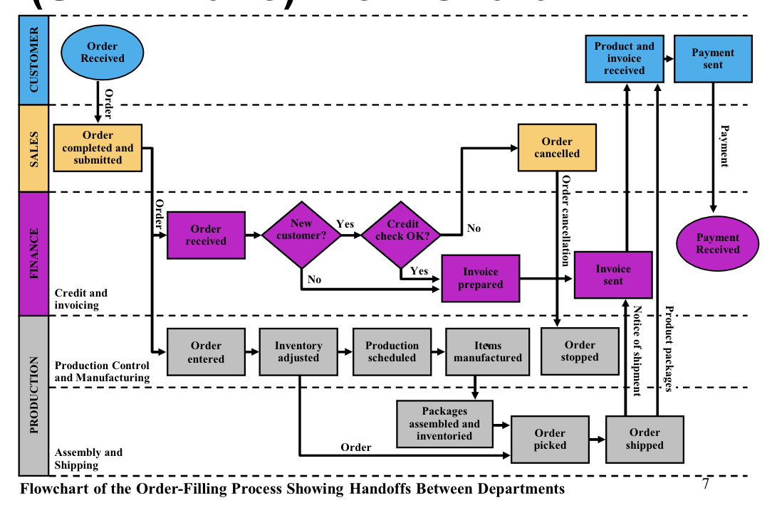
swim lane flowchart
when the process goes across different functions or departments
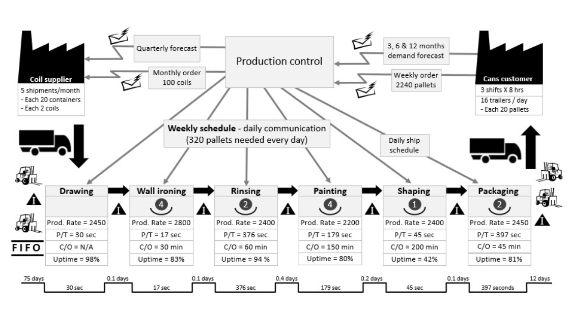
value stream mapping
process map with data (such as time, error rate, etc).
process flow, material flow, information flow,
foundation for Lean
check sheet
data collection tool
creates easy-to-understand data
determine the time period to be covered
— day, week, shift, quarter, etc
data are collected and recorded for specific conditions or events of interest → tracking
makes patterns in the data become obvious
builds with each observation a clearer picture of the facts
histogram
displays large amounts of data that are difficult to interpret in tabular form
charts frequency of occurrence
— shows centering, variation, and shape
— illustrates the underlying distribution of the data
— normality check for further statistical analysis
provides info for evaluating and predicting performance
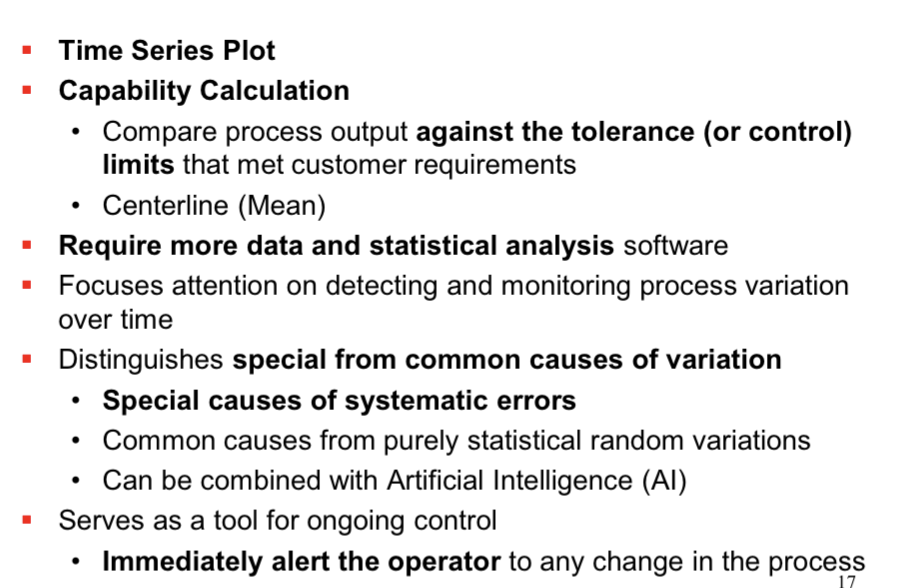
variation analysis tools
identify the source and existence of variations to take care of
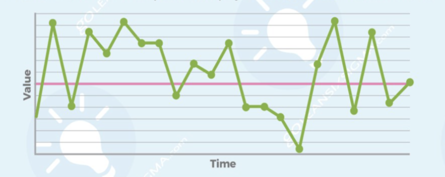
run chart
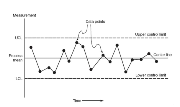
control chart
run chart
time-series chart
simple, quick, and easy charts that require calculation only of a median
monitors the performance of processes over time to detect trends, shifts, and cycles
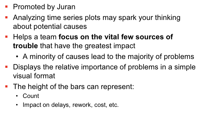
focuses attention on truly vital changes in the process
allows a team to compare performance before and after implementation of a solution to measure its impact
control chart
identifying causes
cause-and-effect diagram (fishbone)
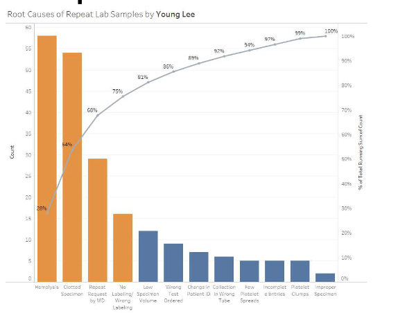
pareto chart
verifying causes
scatter plots
regression
ANOVA
design of experiments
cause and effect diagram
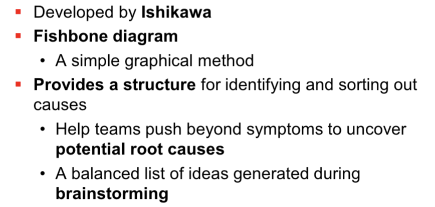
fishbone diagram’s 4M
manpower
EX] workforce
machinery
EX] facilities and equipment, technology
material
EX] raw materials, information
methods
EX] processes, policies
![<ul><li><p>manpower</p></li></ul><p><span style="color: rgb(255, 140, 15);"><strong>EX] </strong></span>workforce </p><ul><li><p>machinery</p></li></ul><p><span style="color: rgb(255, 140, 15);"><strong>EX]</strong> </span>facilities and equipment, technology </p><ul><li><p>material </p></li></ul><p><span style="color: rgb(255, 140, 15);"><strong>EX]</strong> </span>raw materials, information </p><ul><li><p>methods</p></li></ul><p><span style="color: rgb(255, 140, 15);"><strong>EX] </strong></span>processes, policies </p><p></p>](https://knowt-user-attachments.s3.amazonaws.com/0a93af2f-dcce-4086-a98e-bbbde5b7827c.png)
pareto diagram
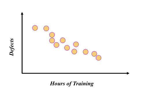
scatter diagram
check if two variables are elated
provides both a visual and statistical means to test the strength of a relationship
— without calculating correlation
— helps create or refine hypotheses
application of the basic tools in six sigma