Ch. 1 R for Data Science
1/97
There's no tags or description
Looks like no tags are added yet.
Name | Mastery | Learn | Test | Matching | Spaced | Call with Kai |
|---|
No analytics yet
Send a link to your students to track their progress
98 Terms
Name the steps of a data science project.
Import
Tidy
Understand
-Transform
-Visualize
-Model
Communicate
Note: The steps contained in “Understand” form a cycle, which can be repeated as many times as desired.
API
Application Programming Interface. Similar to a user interface, but instead of allowing a user to interface with a program, an API allows a program to interface with another program.
In a “tidy” dataset, columns represent what?
Variables
In a “tidy” dataset, rows represent what?
Observations about the variables.
Give 3 examples of “Transforming” data.
Narrowing focus to certain variables
Calculating new variables from existing variables
ex: speed = distance/time
Calculating summary statistics
ex: mean, standard deviation, etc.
IDE
Integrated Development Environment. Basically a text-editor for programming.
In RStudio, R code is typed into the … pane
console
In RStudio, how do your run code from the console pane?
Enter
RStudio: clear console
CTRL+L
Function for installing packages.
install.packages(“packagename“)
Statement to install Tidyverse
install.packages(“tidyverse“)
CRAN
Comprehensive R Archive Network. Database from which R and all it’s packages are installed.
To use the functions in an R package, you must first …1… and …2…
Install the package onto your computer from CRAN
Load the package into your R session
Statement to load a package into an R session
library(package_name)
What does this mean:
Some functions in tidyverse have the same name as functions in base R. Code will still function, these are basically overrides.
Function that returns whether or not there is an update for tidyverse.
tidyverse_update()
Invoke a function by specifying it’s package name
package::function()
ex:
dplyr::mutate()
Data frame
Data set arranged in a matrix, with variables in columns and observations in rows
Variable
a quantity, quality, or property you can measure
Value
The state of a variable when you measure it.
Observation
A set of measurements made under similar conditions. An observation will contain several values, each associated with a different variable.
Observations are also referred to as…
Data points
Tabular Data
A set of values, each associated with a variable and an observation.
Tabular data is considered “tidy” if…
if each value is in it’s own cell, each variable is in it’s own column, and each observation is in it’s own row.
How do you preview a data frame in the console?
Enter it’s name in the console
Function that lets you view a dataframe with the rows and columns swapped
glimpse(dataframe)
Function that opens up an interactive viewer for a dataframe. (RStudio only)
View(dataframe)
Open the help page for a dataframe
?dataframe
Standard function for creating plots.
ggplot()
ggplot argument for which dataframe to use
data
ggplot argument for layout of plot
mapping
Set of functions for choosing the shape of data points in a plot
geom_point/bar/line/etc()
Function used as the value for the “mapping” argument in ggplot()
aes(x = x_axis_data, y = y_axis_data)
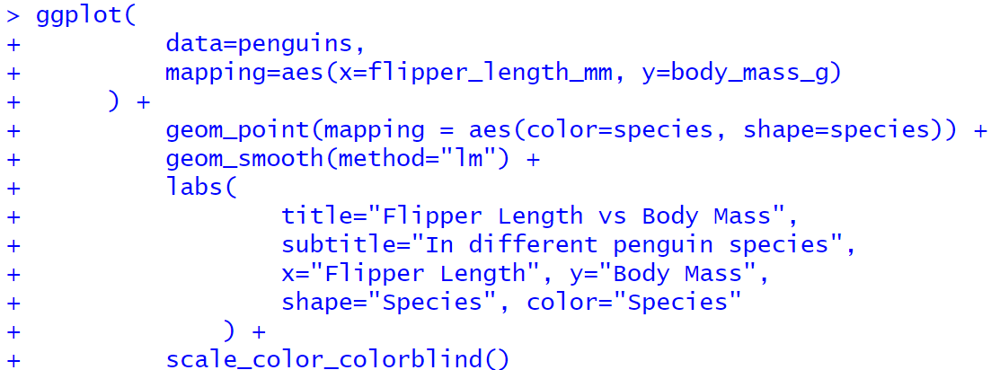
Create a basic scatterplot for the “palmerpenguins” data set
> ggplot(
+     data = penguins,
+     mapping = aes(x = flipper_length_mm, y = body_mass_g)
+ ) +
+     geom_point()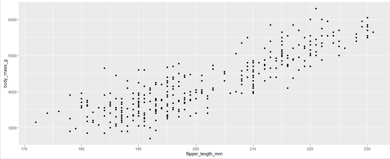
Function for displaying data in bar graph form
geom_bar()
Function for displaying data in line graph form
geom_line()
Function for displaying data in boxplot form
geom_boxplot()
Function for displaying data in scatterplot form
geom_point()
Add a newline in the console, without executing code
SHIFT + ENTER
Argument that tells aes() to automatically display data points in different colors based on the value of a specific variable.
color = variable
Scaling
Scaling is when you assign a variable as the value of an argument in aes(), and each value of that variable is automatically assigned a unique aesthetic (like a unique color, for example).
ggplot() layer that generates a smooth curve based on a linear model.
+geom_smooth(method=”lm”)
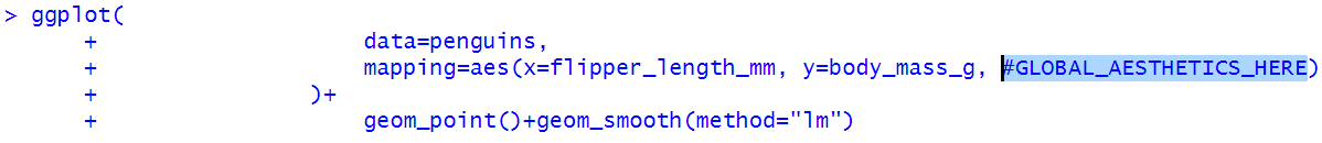
Global level
Applies aesthetic mapping to the entire plot. Setting aesthetics at this level will effect points, bars, lines, etc all at the same time.
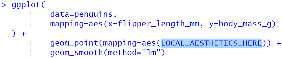
Local level
Applies aesthetic mapping only to specific parts of a plot (only the points/ only the lines/ etc)
Where are global aesthetics defined?
Where are local aesthetics defined?
Write a layer for ggplot() that changes the shape of points only based on a specific variable.
+geom_point(mapping=aes(shape=variable))
Add a new layer to a plot
ggplot() + new_layer() + new_layer + new_layer()
ggplot() layer for customizing the labels on a plot.
labs()
labs() argument for specifying the title of a plot
title = “title”
labs() argument for specifying the subtitle of a plot
subtitle = “subtitle”
labs() argument for specifying the x and y axis labels of a plot
x = “label”
y = “label”
labs() argument for specifying the legend title of a plot
shape = “label” or color = “label”
ggplot() layer that adds a colorblind-safe color palette
+scale_color_colorblind()
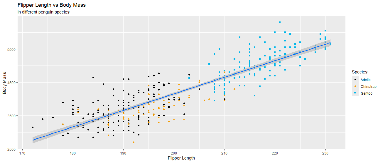
Recreate this plot, using the palmerpenguins data set:
geom_() argument that excludes missing values from the plot
geom_(na.rm=TRUE)
labs() argument to add a caption to a plot
caption=”label”
Can a dataframe be set locally with ggplot2?
Yes, dataframes may be set locally in a specific layer, or globally in ggplot().
What are the first two arguments in ggplot()?
data
mapping
Do you have tot write the names of arguments to assign them?
No. ggplot(data=penguins) is the same as ggplot(penguins).
Categorical variable
A variable representing a category, which can only contain a limited number of possible values.
ex: kingdom = plantae/animalia/fungi/etc
Which plot is best for examining the distribution of categorical variables?
Bar chart
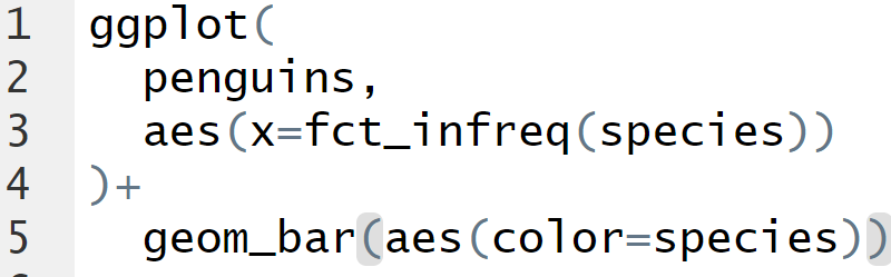
Function that allows you to transform a variable into a factor which is ordered by frequency.
fct_infreq(variable)
Plot a bar chart for species of penguin, ordered by frequency.
Numerical variables
Variables with numerical values, for which it would make sense to add/subtract/take averages of those values
Numerical variables are also called…
Quantitative variables
Numerical variables can be… or…
Continuous of Discrete
Histogram
Plot that divides the x-axis into equal “bins”, with the y-axis representing the number of observations per bin.
ggplot() layer that displays data as a histogram
+geom_histogram()
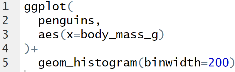
geom_histogram() argument that specifies the width of the bins
geom_histogram(binwidth=numericalvalue)
Make a histogram of penguin body mass
Density plot
A “smoothed-out” version of a histogram, which is more useful for continuous variables.
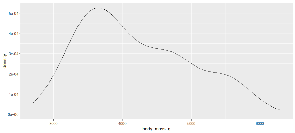
ggplot() layer for density plots
+geom_density()
Boxplot
A plot that uses boxes, “whiskers”, and points to categorize observations by percentiles.
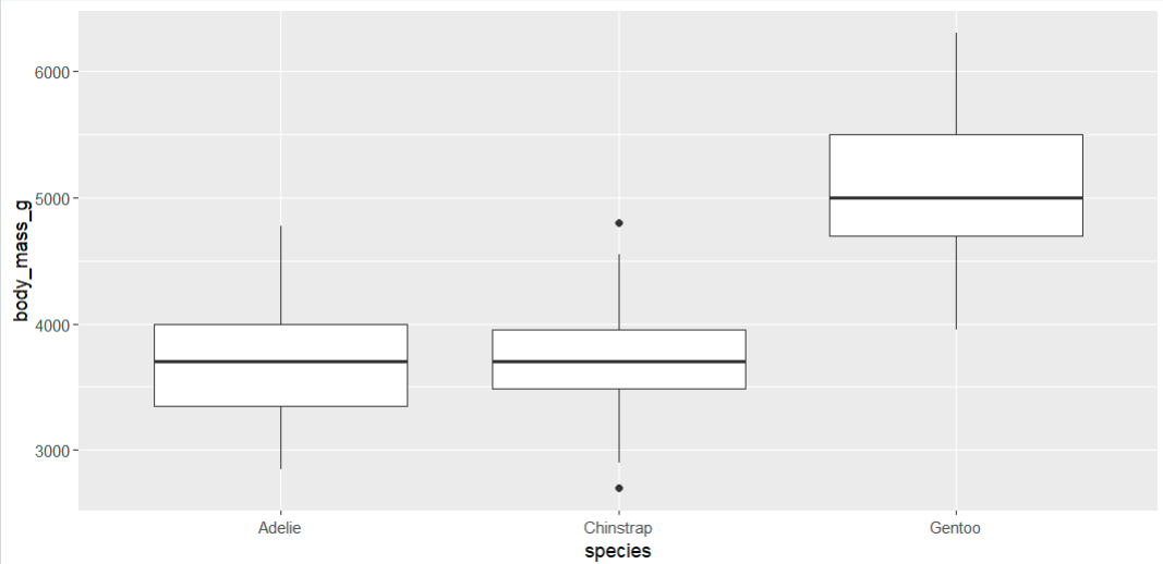
Interquartile Range
The “middle half” of a variable, consisting of all observations between the 25th and 75th percentiles.
What does the horizontal line on a boxplot represent?
The median (50th percentile)
What do the “whiskers” on a boxplot represent?
Values outside the Interquartile Range (IQR) which are not outliers.
What do the points on a boxplot represent?
Outliers.
On a boxplot, a datapoint is considered an outlier if…
…it is separated from the IQR by a distance of 1.5 * IQR.
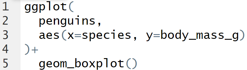
Make a boxplot of penguin body mass by species.
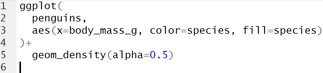
Draw density curves of body mass for different species of penguin.
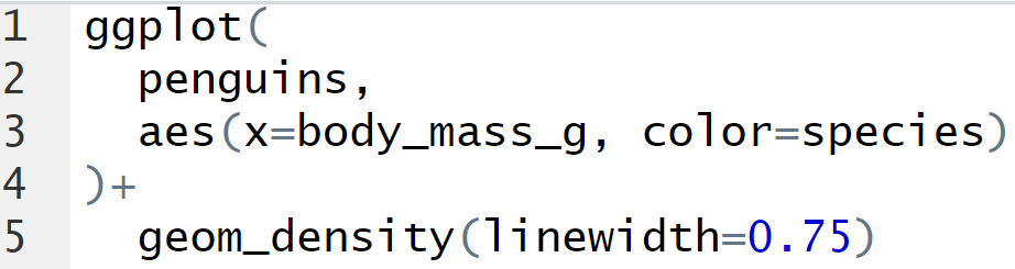
geom_() argument for customizing the width of a line.
linewidth=numericalvalue
Aesthetic that fills in the space underneath a variable’s curve.
fill=variable
Aesthetic that makes the fill underneath a curve transparent.
alpha=value_between_0_and_1
Draw filled, transparent density curves for the body mass of different penguin species.
Mapping an aesthetic means…
That aesthetic will be determined by the values of a variable.
Setting an aesthetic means…
The aesthetic will be determined by a user-defined value.
Using the Palmer Penguins data, create a bar graph of islands, with the bars stacked by species.

Using Palmer Penguin data, create a stacked bar graph of the relative frequency of species per island.

Run an entire R script in RStudio
CTRL+SHIFT+ENTER
Facets
Sub-plots that display a subset of the data.

Character that creates a formula
~
ggplot layer that splits a plot into facets.
+facet_wrap(~variable)
The what kind of variable should you pass to facet_wrap() ?
Categorical.
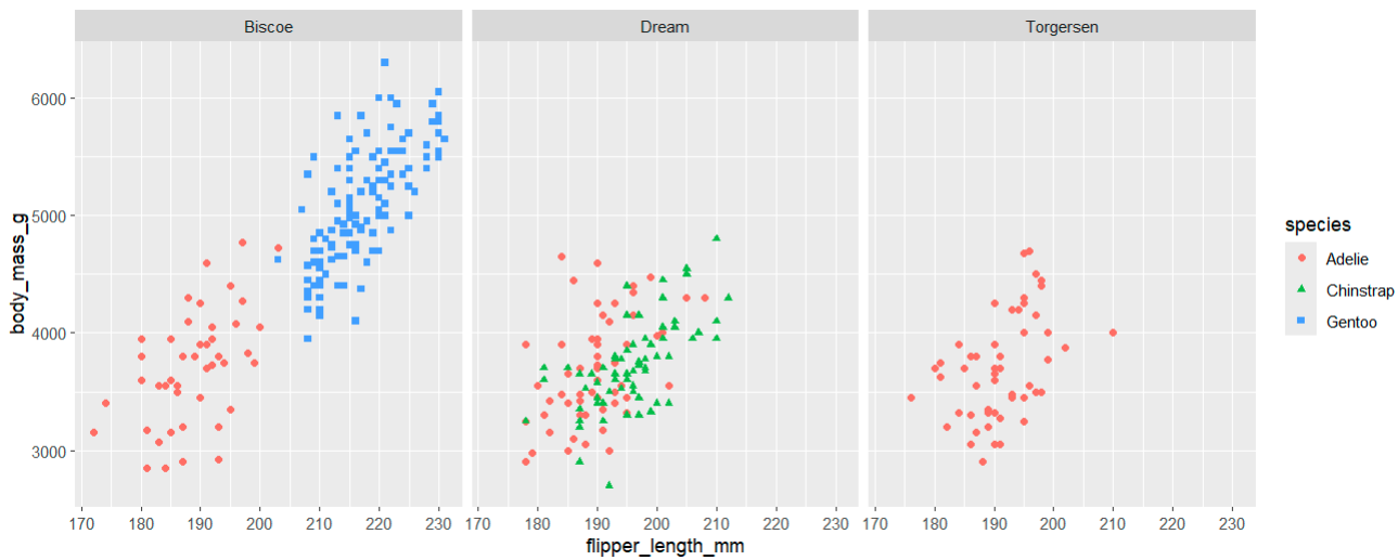
Create plot:
Scatterplot
Flipper length and body mass
Shape and color the points by species
Divide into facets by island
ggplot(penguins, aes(x=flipper_length_mm, y=body_mass_g))+
geom_point(aes(color=species, shape=species))+
facet_wrap(~island)
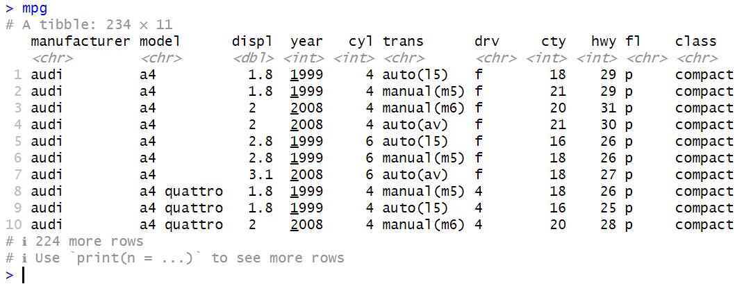
Observe this data frame. Which variables are categorical? Which variables are numerical?
Function that saves the last plot you created to the current working directory.
ggsave(filename = “file name”)