CHAPTER 2 : Describing Data Using Graphs and Tables
1/7
There's no tags or description
Looks like no tags are added yet.
Name | Mastery | Learn | Test | Matching | Spaced | Call with Kai |
|---|
No study sessions yet.
8 Terms
Frequency Distribution
A flashcard for Frequency Distribution:
Definition: A way to organize and display data by showing the number of times each value occurs in a dataset. It provides a summary of the data's distribution and helps identify patterns and outliers.
Relative frequency
The relative frequency of a particular category of a qualitative variable is its frequency divided by the sample size.
Relative frequency distribution
A relative frequency distribution for a qualitative variable is a listing of all values that the variable can take, together with the relative frequencies for each value.
Bar Graphs
A bar graph is used to represent the frequencies or relative frequencies for categorical data. It is constructed as follows:
1. On the horizontal axis, provide a label for each category.
2. Draw rectangles (bars) of equal width for each category. The height of each rectangle represents the frequency or relative frequency for that category. Ensure that the bars are not touching each other.
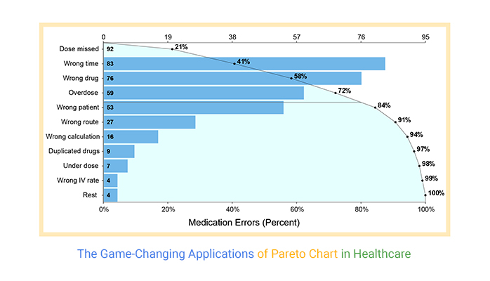
Pareto chart
A Pareto chart is a bar graph in which the rectangles are presented in decreasing order from left to right.
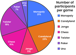
Pie Charts
Visual representation of data using circular graphs divided into sectors, each representing a proportionate part of the whole. Used to show percentages or relative sizes of different categories or data points.
Crosstabulation
A statistical technique used to analyze the relationship between two categorical variables. It creates a table that displays the frequency distribution of each variable's categories and examines how they intersect. Crosstabulation helps identify patterns, associations, and dependencies between variables in research or data analysis.
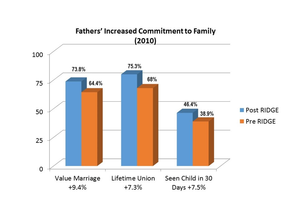
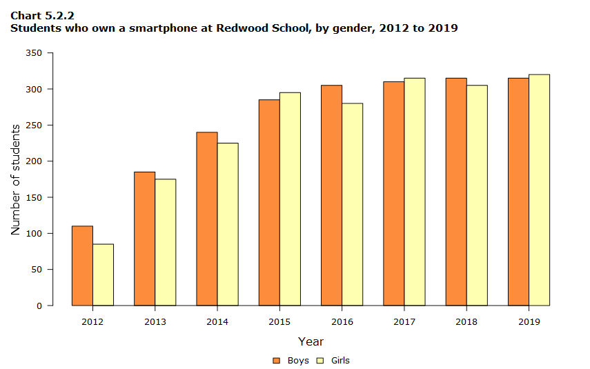
Clustered bar graphs
A type of graph that displays multiple bars next to each other, representing different categories. It is used to compare data within each category and across different categories.