Data Analysis
1/18
There's no tags or description
Looks like no tags are added yet.
Name | Mastery | Learn | Test | Matching | Spaced |
|---|
No study sessions yet.
19 Terms
What is Data Analysis?
Data analysis is the information
i.e. (facts and figures)
that have been collated in a way that allows them to be used to inform decision making.
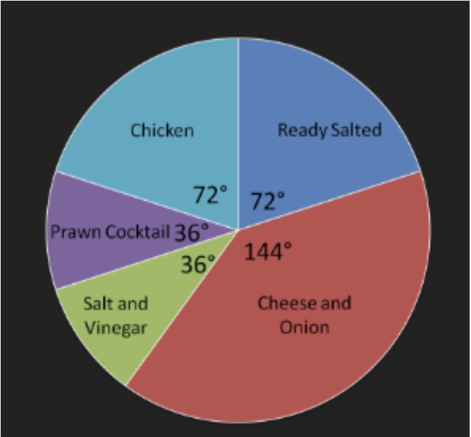
What are Pie Charts?
A chart that is split into sectors to show:
percentages/relative value of different categories of data.
How to calculate data as a proportion of 360° and amount of ________ sold?
Example
If the total sales of crisps in 2016 were 500,000 packets 40% of these were Cheese and Onion.
144/360 x 100 = 40%
From there you can work out how many packets were sold for “Cheese and Onion”
500,000 x 0.40 = 200,000 packets sold were “Cheese and Onion”.
When to use a Pie Chart?
For visual representation
Great demonstration for market share
Can compare sales of (e.g ice-cream/crisp flavours)
When NOT to use a Pie Chart?
If needed to show increases/decreases of proportion overtime ——>(trends are not shown)
Trying to identify relationship between 2 things
What is a Bar Chart?
Data is usually grouped into categories using rectangular bars with the height of the bar representing the frequency for the category
These bars can be presented vertically/horizontally
One axis will show the categories being compared and the other axis will show the frequency.
When to use a Bar Chart?
Data grouped into categories
Summarise a large amount of date clearly
Comparisons between different years
When NOT to use a Bar Chart?
Needs to show qualitative data
Oversimplifies data and further explanations may be needed
What is a Histogram?
It’s the distribution of quantitative data by showing frequency of data points
Represented through rectangles to show how frequently an outcomes occurs when data interval are successive
When to use a Histogram?
Shape or distribution of large data set
Displays chronological categories of numerical data
If all data is numerical you can spot large differences in shape of the data
When NOT to use a Histogram ?
Need to compare between different years
Need to use exact values as the data is grouped into intervals
Need to use large ranges
What is a Line Graph?
Displays information using data points connected by line segments
It shows trends and continuous changes over a continuous period
When to use a Line Graph?
Need to compare 2 or more variables
Need to present economic/financial data
Need to show the business performance and analyse market trends
Need to show changes overtime periods
When NOT to use a Line Graph?
Need to use a large range of data then they become more difficult
Start values of data are very different
If you don’t have a lot of data otherwise line will imply you have more data than you collected
What is a Map?
A map is only used to areas and geographical locations
It uses clear shading ,clear keys and indicators
Can be used to compare different regions
When to use a Map?
If data is geographical
Need to compare different countries/regions
Need to present data in an attractive and effective way
When NOT to use a Map?
If data does not relate to geographical areas
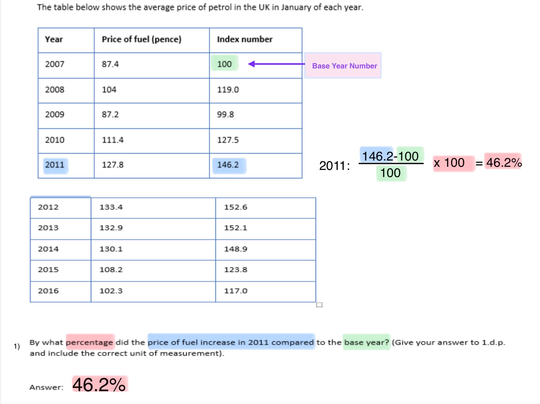
What are Index Numbers?
Index numbers are used in order to make numerical data easier to understand
They are a useful method of showing changes overtime in data
E.g. price levels, consumer income levels or economic output.
Using index numbers allows data to be standardised overtime so that the data is easily comparable.
How to work out questions using Index Numbers?
Worked Out Example: